Visualized charts can help you display data analysis results intuitively and clearly. This topic describes the applicable scenarios of different types of charts and the chart types supported by different editions to help you quickly select appropriate charts for data presentation and display.
The Quick BI provides more than 40 chart styles, including table, indicator, line /surface, column /bar, pie /ring, bubble /scatter, funnel /transformation relationship, geography and other categories. It covers six analysis categories: trend, comparison, distribution, relationship, space and time series, and supports custom chart types. It can meet your flexible and diverse visual analysis requirements.
Applicable scenarios of charts
Each chart has its applicable scenarios and data elements (that is, the fields that make up the chart). For example, a map is mainly used to view the distribution of a data metric in different geographic regions. Its core data elements must contain a geographic dimension. Therefore, understand the applicable scenarios of different charts and the core data elements to help you quickly select an appropriate chart.
The following section describes the scenarios, data elements, and sample displays of various types of charts.
Table
Chart name
Example
Scenario
Data Elements
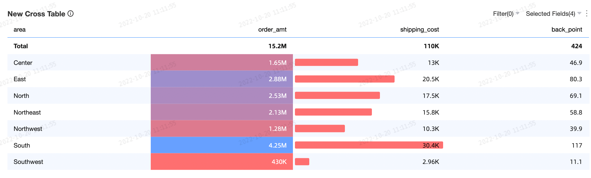
Cross tables are used to analyze the relationships between multiple dimensions and measures to help decision-making.
N/A
Columns
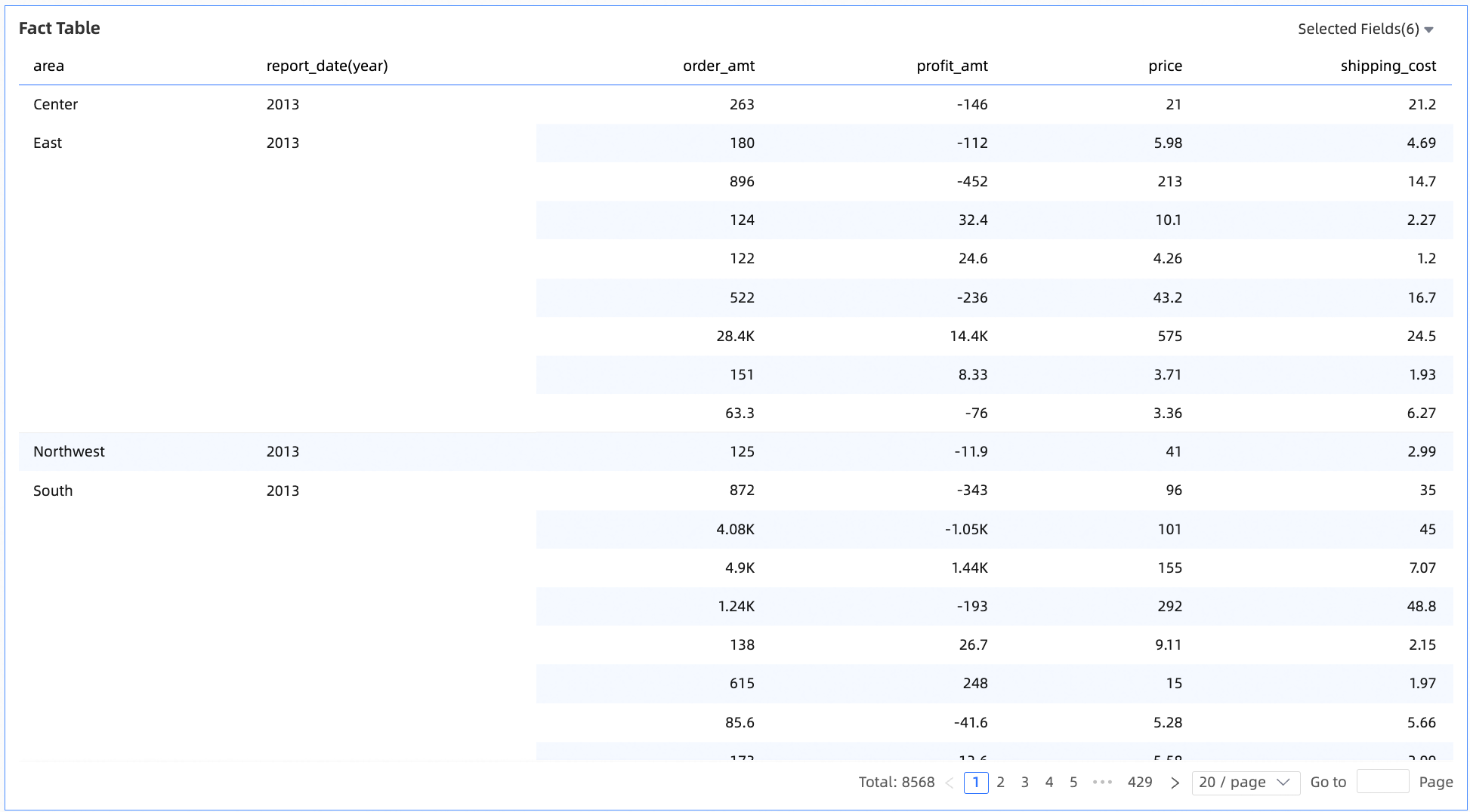
It is used in analysis scenarios where metrics display detailed data in dimensions. It analyzes and makes decisions based on detailed data from different perspectives, such as distribution and ranking order.
N/A
Columns
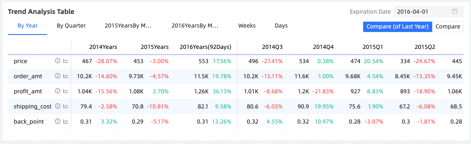
In most cases, a trend analysis table is used to analyze metrics at a macro level. You can use a trend analysis table to analyze data of a year, a quarter, a month, a week, and the previous seven days. You can also use a trend analysis table to compare metrics and analyze the trends, mean values, and normalization of individual metrics.
Metrics
Comparison
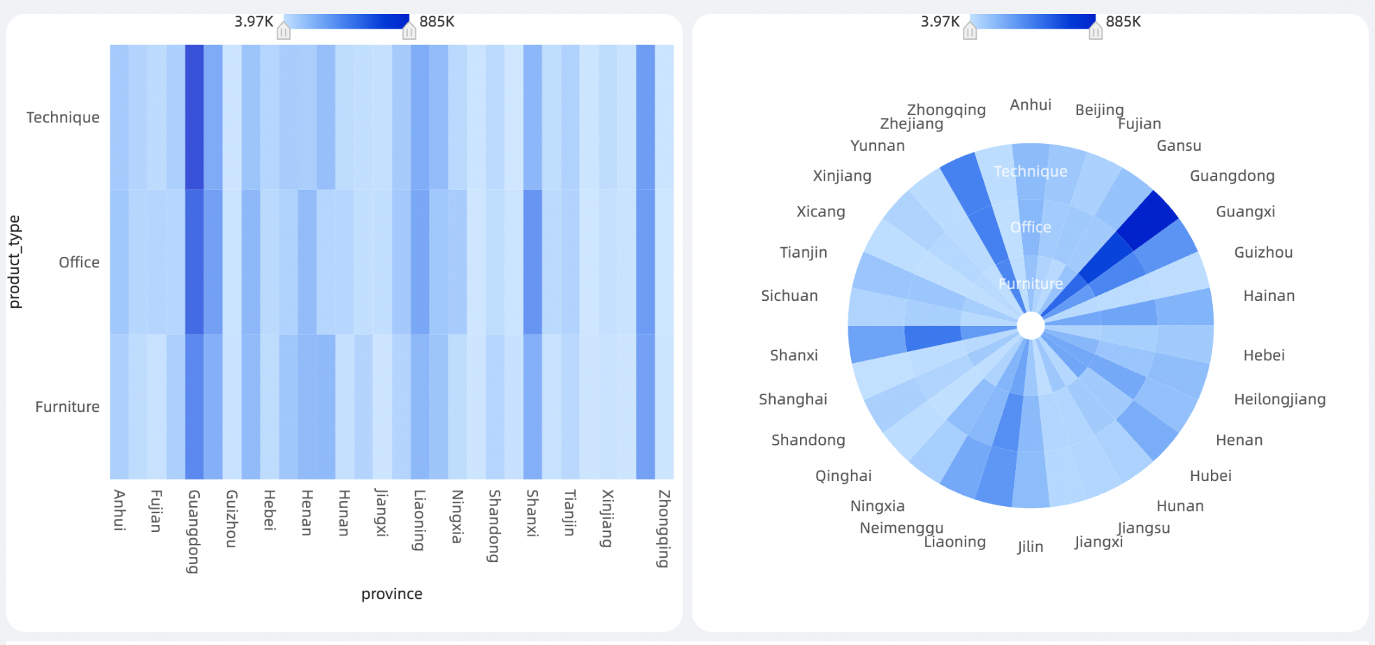
heatmap are often used to show the correlation of different dimensions and can be used in models such as shopping basket analysis.
X-axis
Y-axis
Thermal depth
Metric
Chart name
Example
Scenario
Data Elements
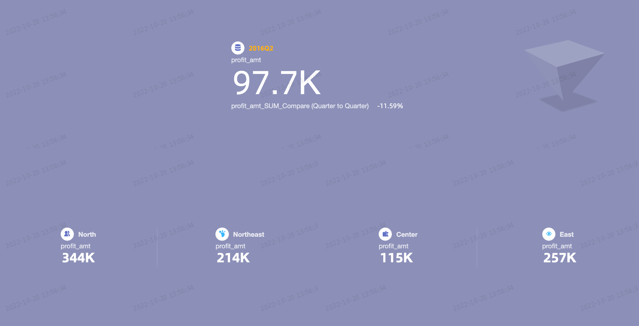
A Scorecard is used to display one or more measures in a dimension, especially in scenarios in which accurate numbers need to be displayed for metrics.
Metrics
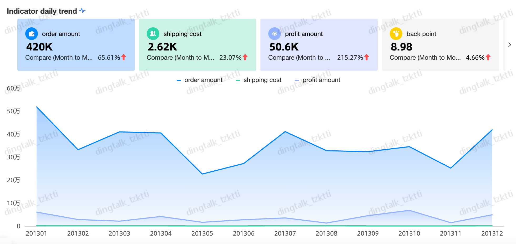
An indicator trend chart is often used to display the changes of multiple indicators over a period of time. You can quickly determine whether business exceptions are found based on the changes of the indicators.
The date.
Metrics

It is often used in scenarios where a single metric is displayed, focusing on enterprises or businesses. You can quickly determine whether business exceptions are found based on the changes in the metrics.
Indicator (Measures)

It is often used in scenarios such as progress, metrics, and trends. It focuses on enterprises and businesses. You can quickly determine whether there are business exceptions based on the changes in metrics.
Pointer (Mea.)
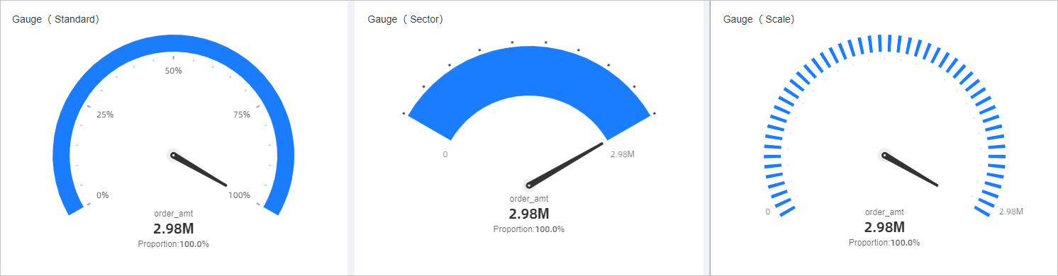
It is mostly used in scenarios such as progress, indicators, and trends, focusing on the business of an enterprise. You can quickly determine whether there are business exceptions based on the changes in indicators.
Pointer Angle (Mea.)
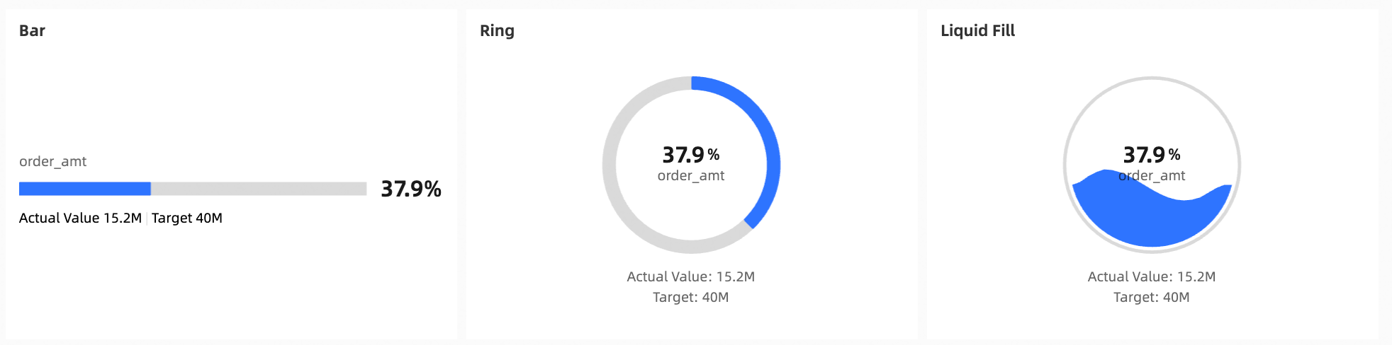
It is often used in scenarios such as progress, metrics, and trends. It focuses on enterprises and businesses. You can quickly determine whether there are business exceptions based on the changes in metrics.
Pointer (Mea.)
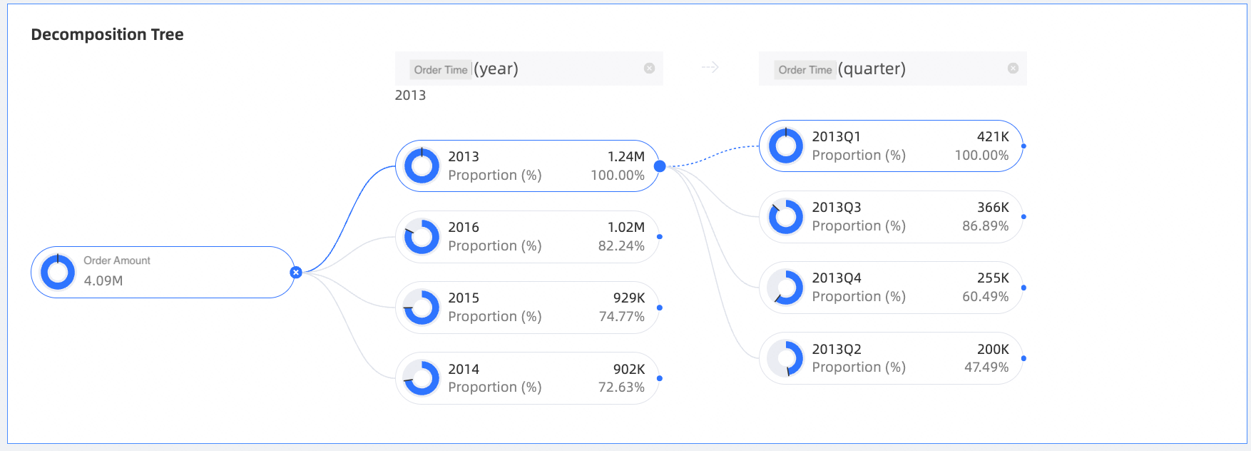
The metric disassembly tree is used to disassemble dimensions and measures. With dimension disassembly, you can easily view the contribution of each part to the whole.
Analytics
Disassembly basis
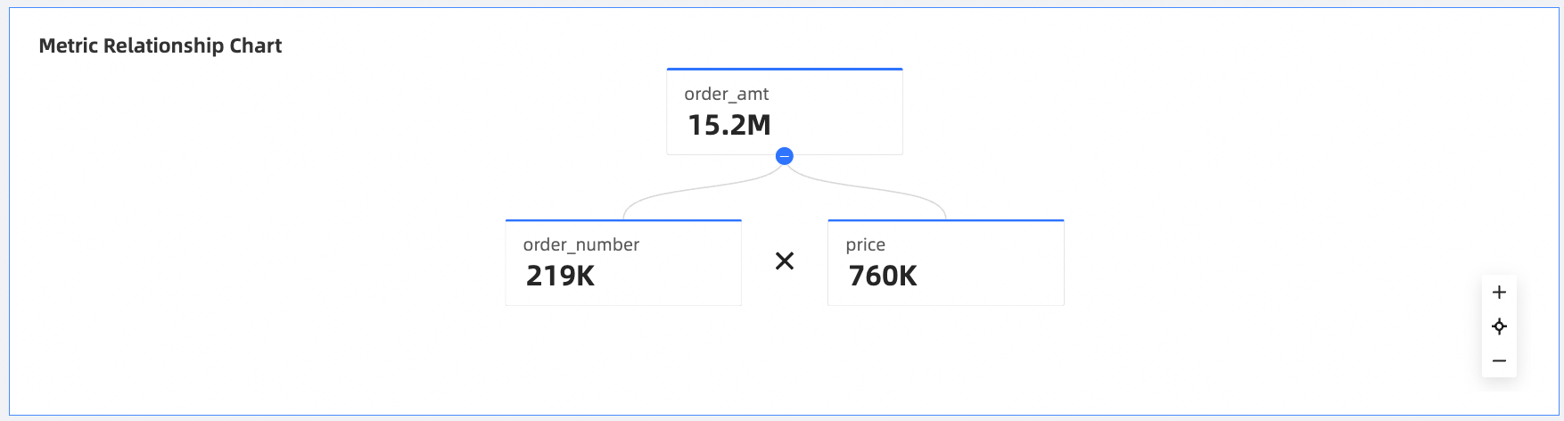
The metric relationship diagram is used to edit the relationship between metrics and is displayed through the relationship diagram.
Metrics
Relationship
Line /Plane Graph Class
Chart name
Example
Scenario
Data Elements
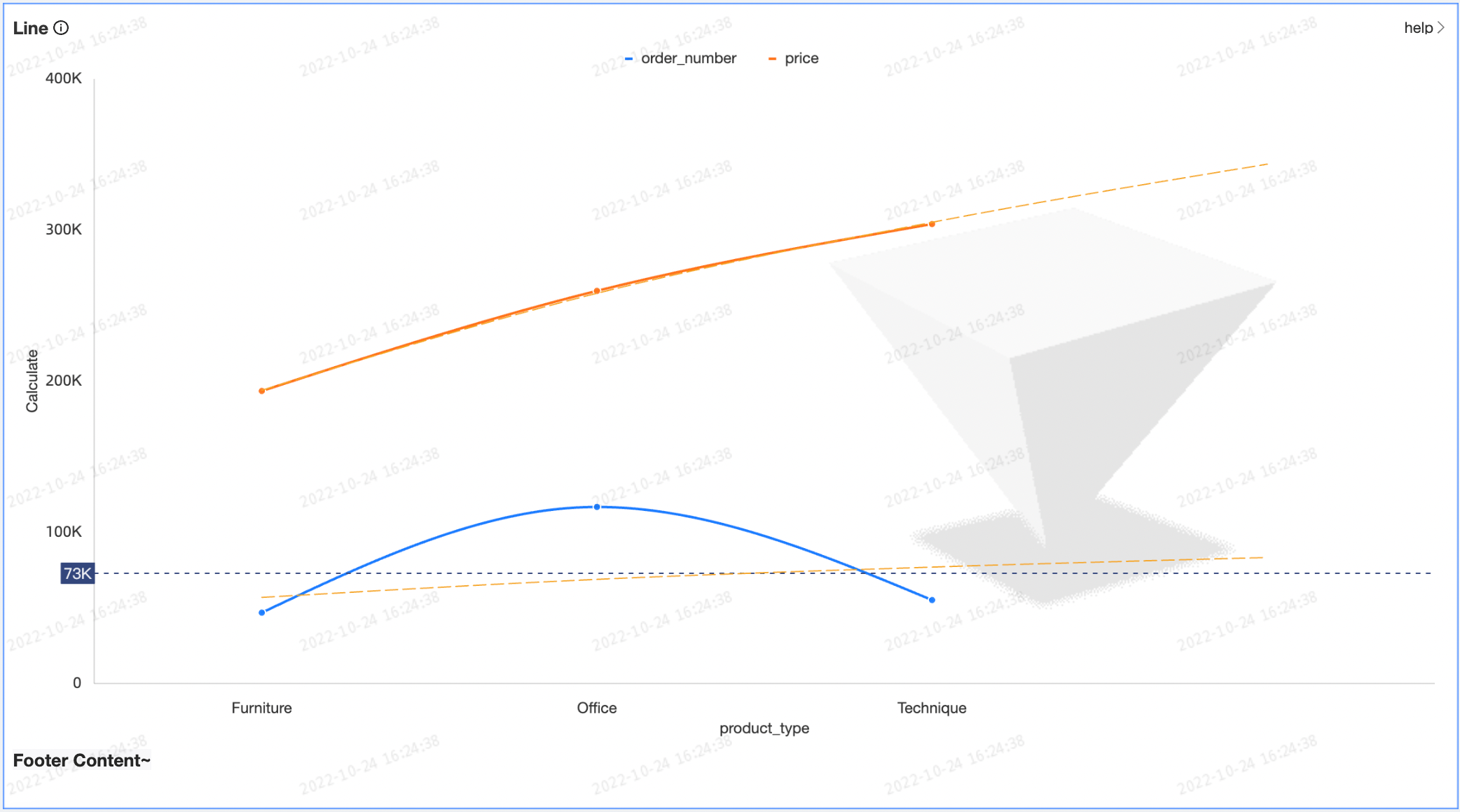
A line chart is used to show the trend of data at equal time intervals. For example, to analyze changes in product sales over time and predict future sales.
Category Axis
Value Axis
Color legend
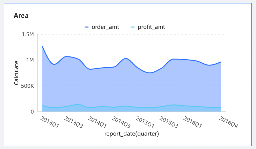
Similar to a line chart, area chart are used to show the trend of data over a certain period of time and the proportion of area they occupy.
Category Axis
Value Axis
Color legend
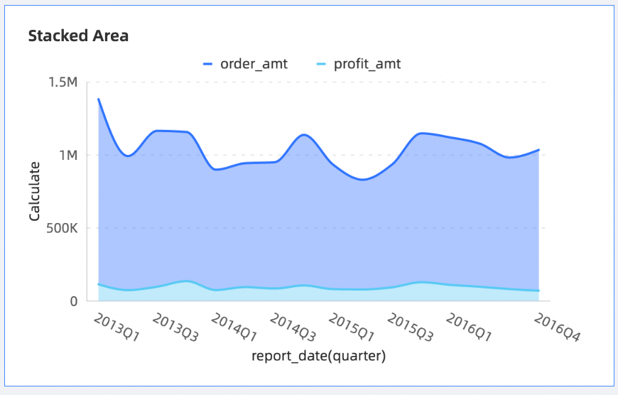
Similar to area chart, the difference is that the starting point of each data set on the stacked area chart is different. The starting point is based on the previous data set. It is used to show the trend line of the size of each value over time or category, and shows the relationship between the part and the whole.
Category Axis
Value Axis
Color legend
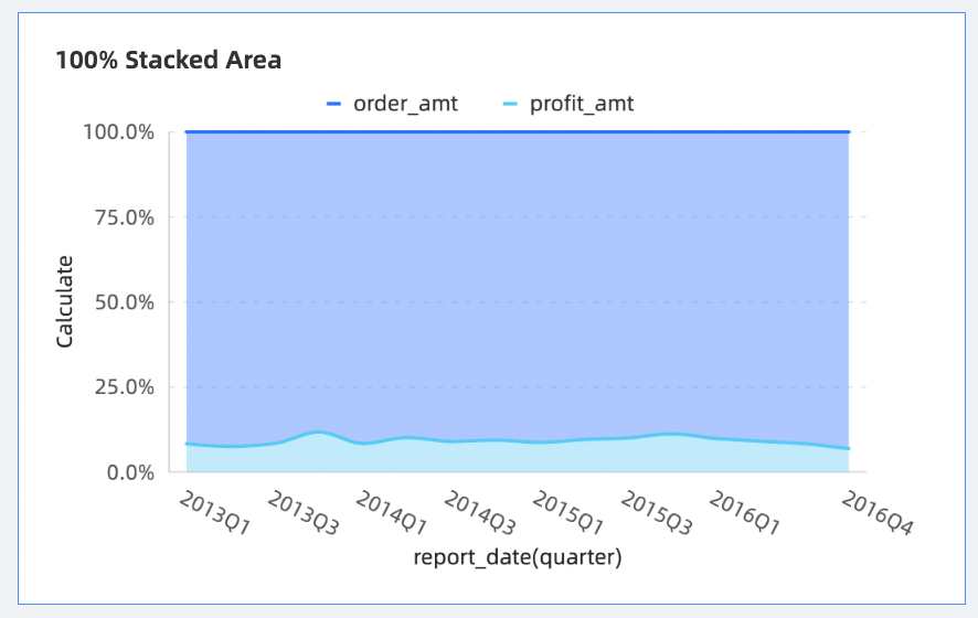
A 100% stacked area is an enhancement of the stacked area chart. In the 100% stacked area chart, the dependent variables of each area are accumulated to obtain the grand total.
Category Axis
Value Axis
Color legend
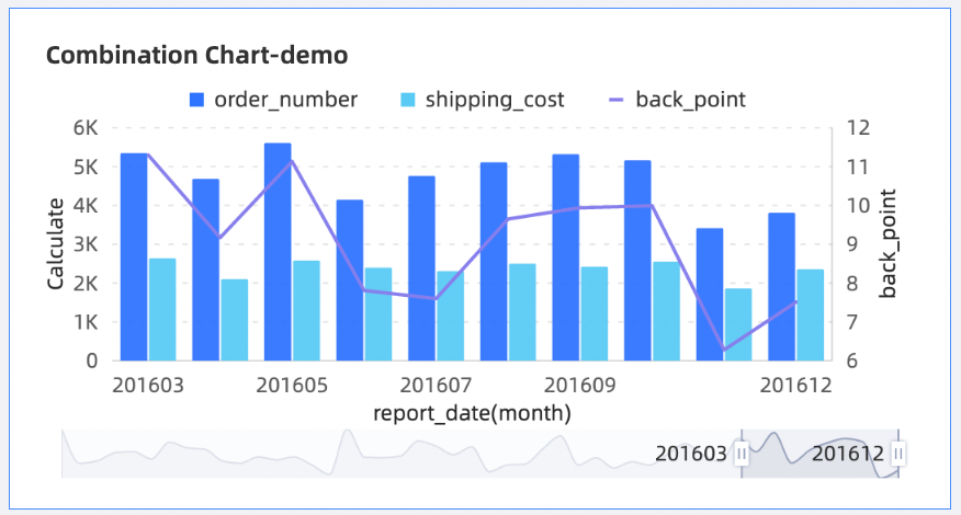
A combination chart provides a dual y-axis and allows you to plot two different types of charts, such as line charts, vertical bar charts, area charts, and charts in stacked and 100% stacked modes.
Principal Value Axis
Secondary value axis
Category Axis
Color legend
Column /bar chart category
Chart name
Example
Scenario
Data Elements
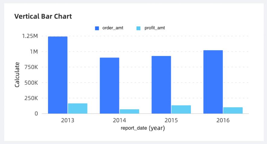
A vertical bar chart compares data of different categories and visualizes the changes of data over a period of time.
Category Axis
Value Axis
Color legend
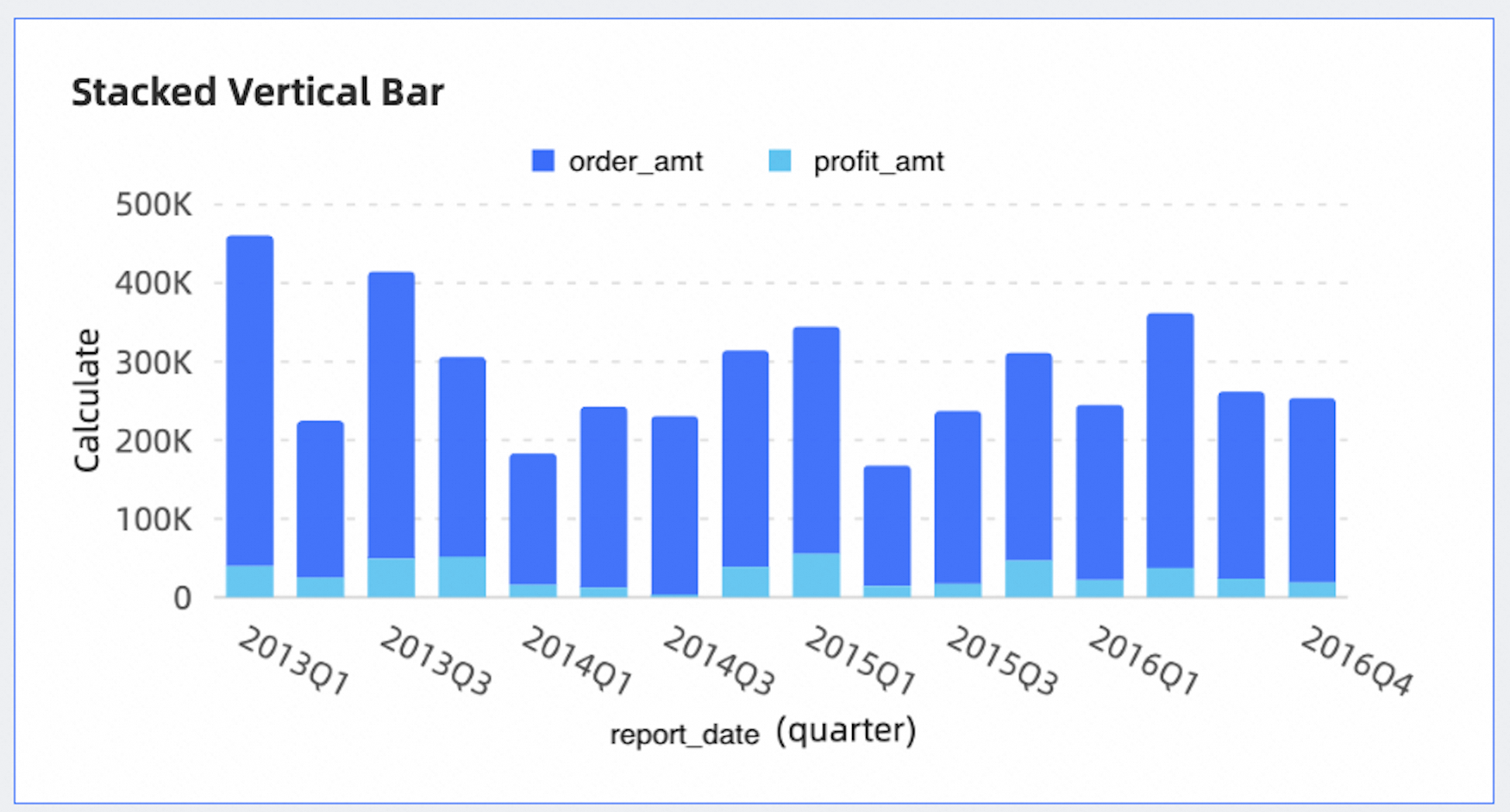
In a stacked vertical bar chart, each bar represents a whole, and the segments in the bar represent different parts or categories of that whole.
Category Axis
Value Axis
Color legend
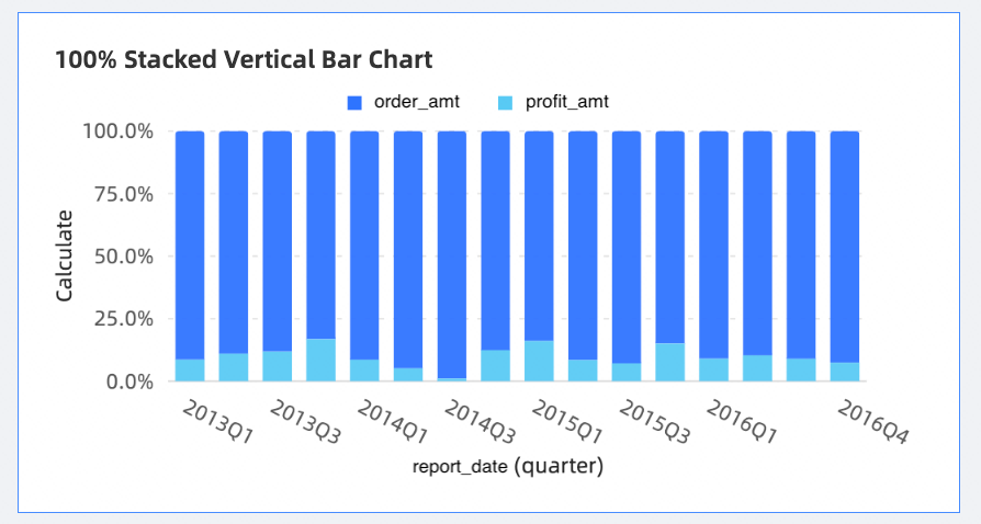
Each layer height of the 100% stacked column chart indicates the percentage of the category data to the total data of the group. Each bar represents a whole, and the segments in the bar represent different parts or categories of that whole.
Category Axis
Value Axis
Color legend
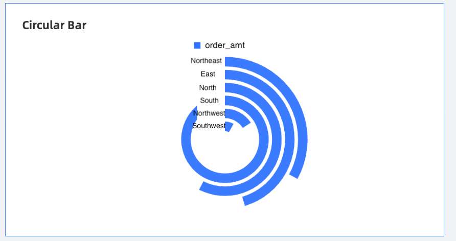
A circular bar chart shows the differences between data of different categories and the overall trend of data.
Category Axis
Value Axis
Color legend
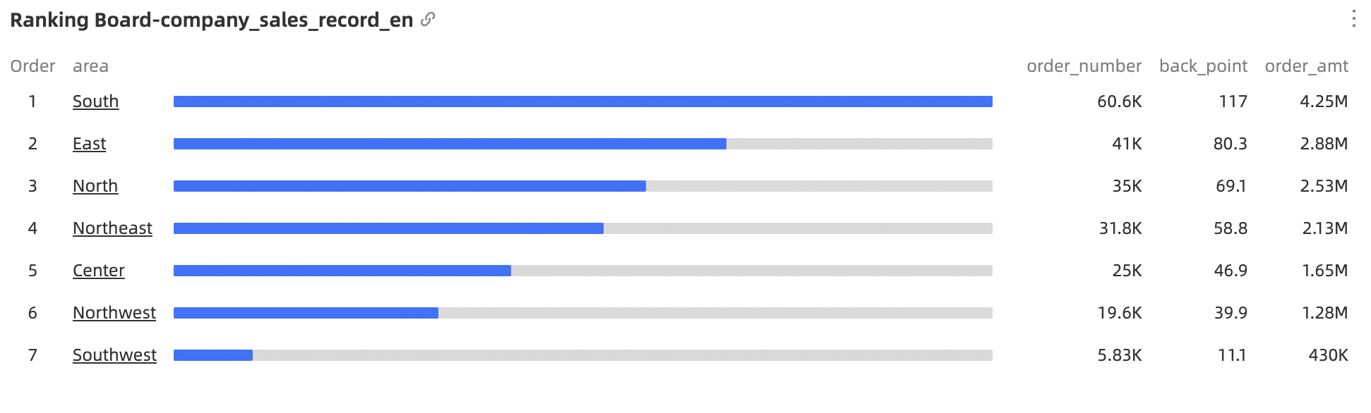
A ranking board shows the top N data.
Perspective
Metrics
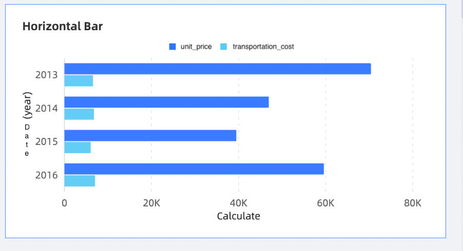
Similar to column chart, bar charts use a horizontal display to compare the size of data and the gaps between items.
Category Axis
Value Axis
Color legend
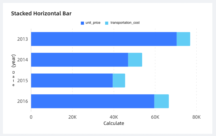
A stacked horizontal bar chart splits each data entry and shows the size of each entry of the same type. In the stacked horizontal bar chart, each bar represents a whole, and segments in the bar represent different parts or categories of that whole.
Category Axis
Value Axis
Color legend
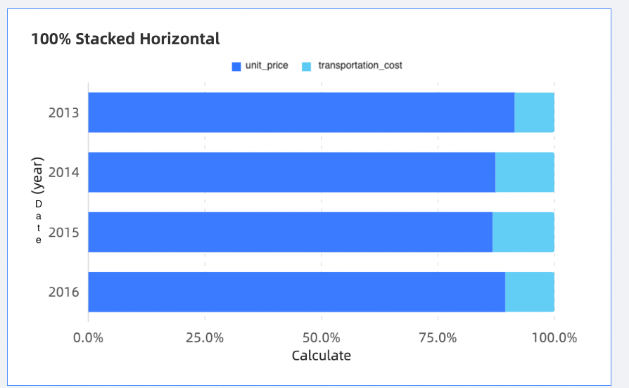
Each layer width of the 100% stacked bar chart represents the percentage of the category data to the total data of the group. Each bar represents a whole, and the segments in the bar represent different parts or categories of that whole.
Category Axis
Value Axis
Color legend
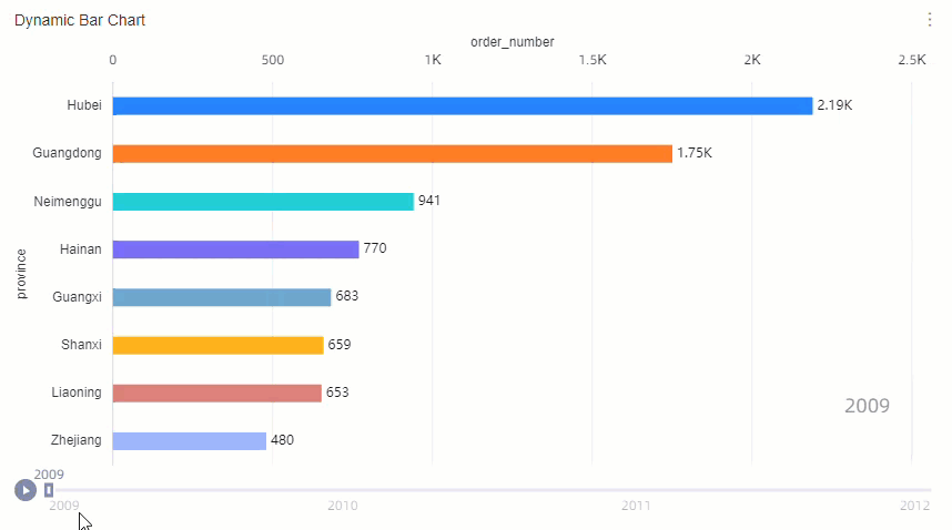
A dynamic bar chart can dynamically display the changes of metrics.
Value Axis
Category Axis
Playback Axis
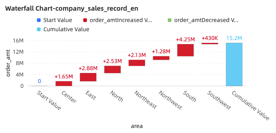
Waterfall charts use a combination of starting and relative values to visually reflect the results of data at different times or under the influence of different factors, and are often used in business and financial analysis.
Category Axis
Value Axis
Pie /Ring Class
Chart name
Example
Scenario
Data Elements
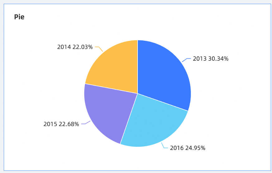
A pie chart is often used to show the ratio of the size of each item in the data to the sum of the items.
Sector Label
Central angle
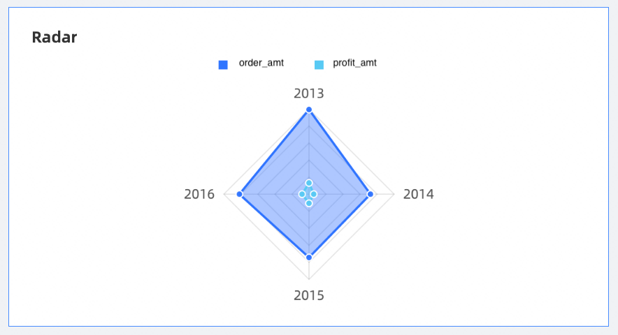
A radar chart is used to display the numbers or ratios obtained from analysis. It is mostly used to display the distribution of dimension values.
Branch label
Branch length
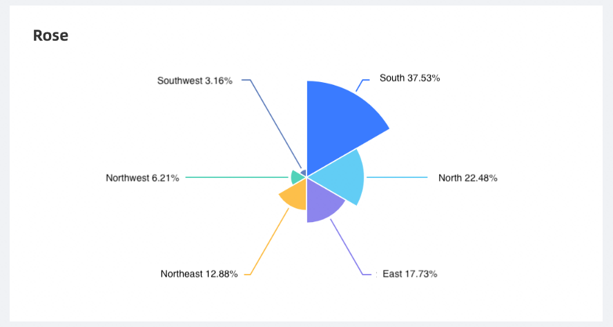
polar area chart shows the comparison between various data items. It is mostly applicable to enumerated data.
Sector Label
Sector length
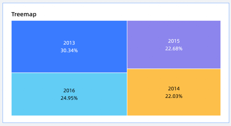
The rectangle hierarchy chart describes the relative proportion of data metrics among the objects to be examined. It is mostly used to view the distribution of dimension values.
Color block size
Color Block Label
Bubble /Scatter
Chart name
Example
Scenario
Data Elements
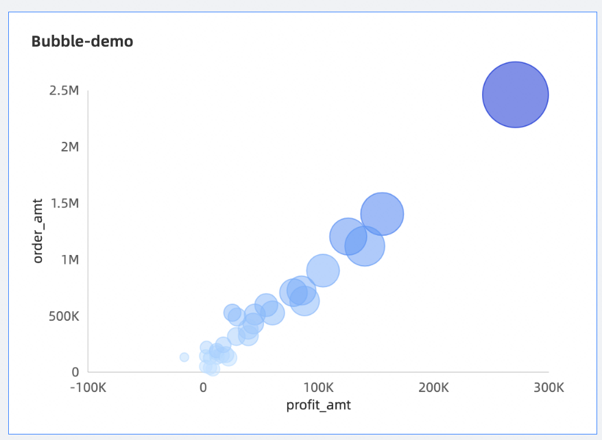
A bubble chart visualizes the distribution and aggregation of data based on bubble locations and sizes.
Y-axis
X-axis
Category
The color.
Size
Playback Axis
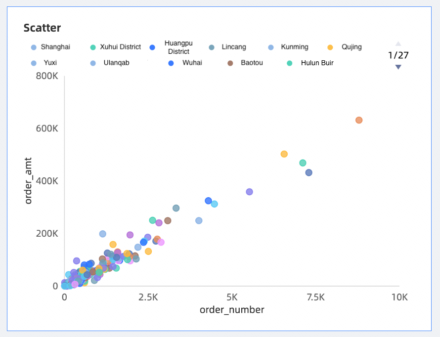
Scatter charts show the correlation and distribution of data.
Y-axis
X-axis
Category
The color.
Playback Axis
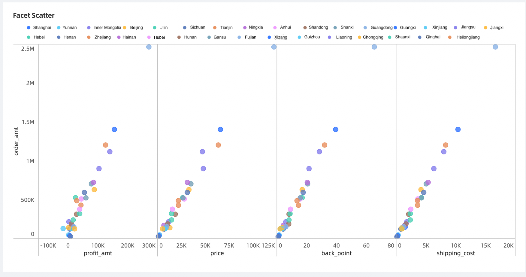
A facet scatter chart shows data correlation and distribution.
Y-axis
X-axis
The color.
Funnel /Transformation Relationship Class
Chart name
Example
Scenario
Data Elements
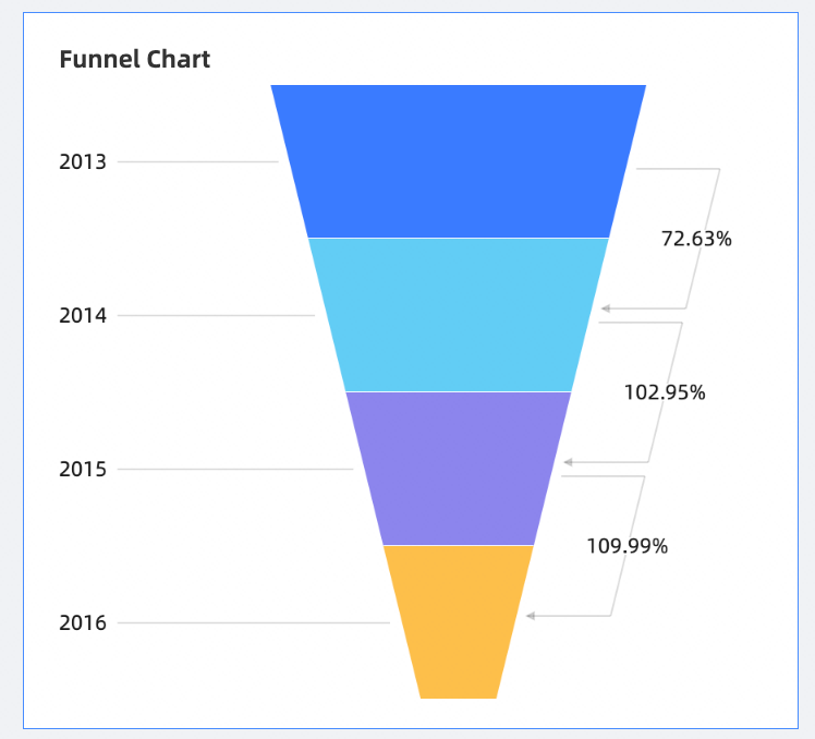
A funnel chart shows the progression of conversions in various aspects of the business. For example, a funnel chart can clearly show the final conversion rate of users from entering the website to realizing purchases.
Funnel Layer Label
Funnel layer width

The comparison funnel chart can compare the data of two types of things under different indicators, such as the proportion of floating population, employment rate and commercial housing transaction volume in Beijing and Shanghai.
Funnel width
Item
A source and destination chart can show the source, process, destination, and proportion of a set of data. It is mostly used to analyze and show the operation data of traffic flow.
Central POP
Node type
Name
Node metrics
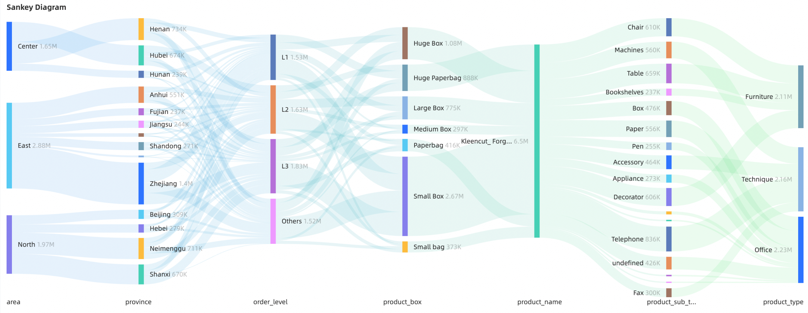
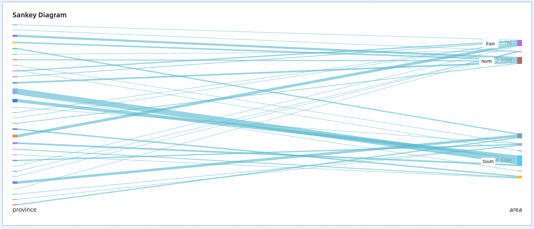
A Sankey diagram is a specific type of flow diagram that is commonly used to show traffic distribution and structural comparison.
Node category
Node height
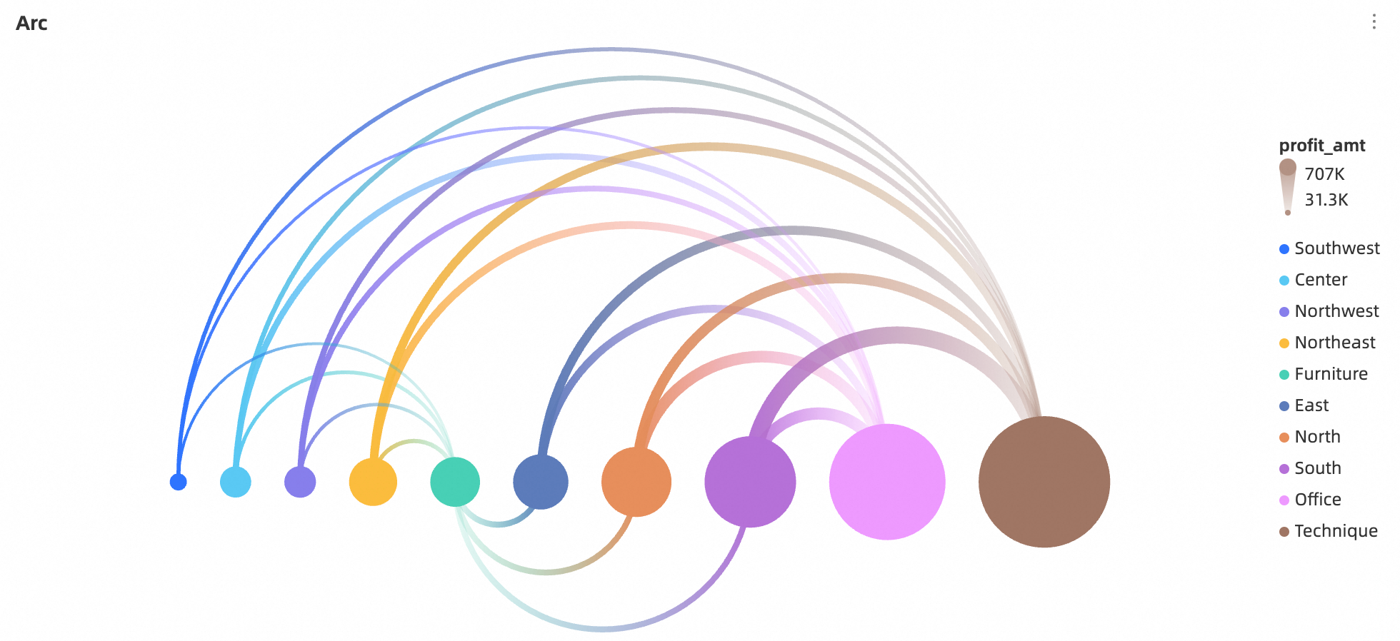
Arc charts are suitable for displaying and analyzing complex relationship network. They can be used to reveal patterns, trends, and relationships to help solve problems.
Source
Destination
Line value
Geography
Chart name
Example
Scenario
Data Elements
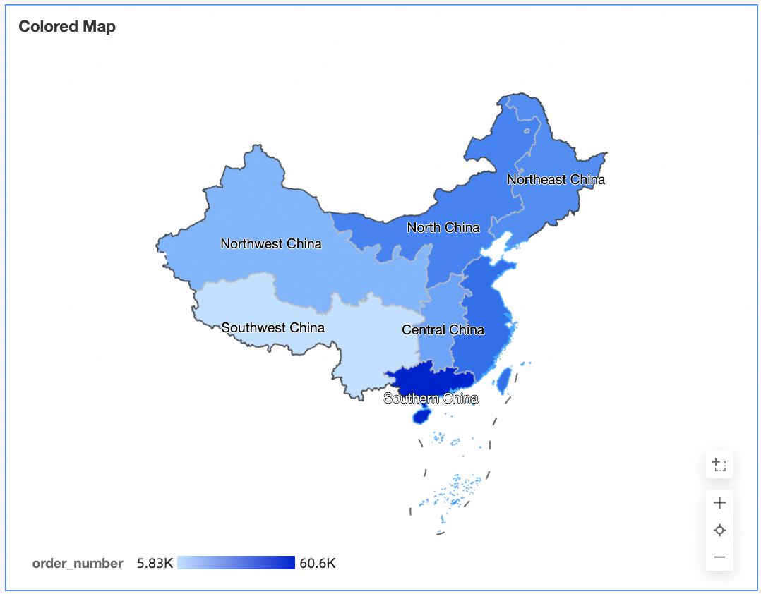
A filled map displays data in hues with different saturation levels to show distribution of data across areas.
Geographic region
color saturation
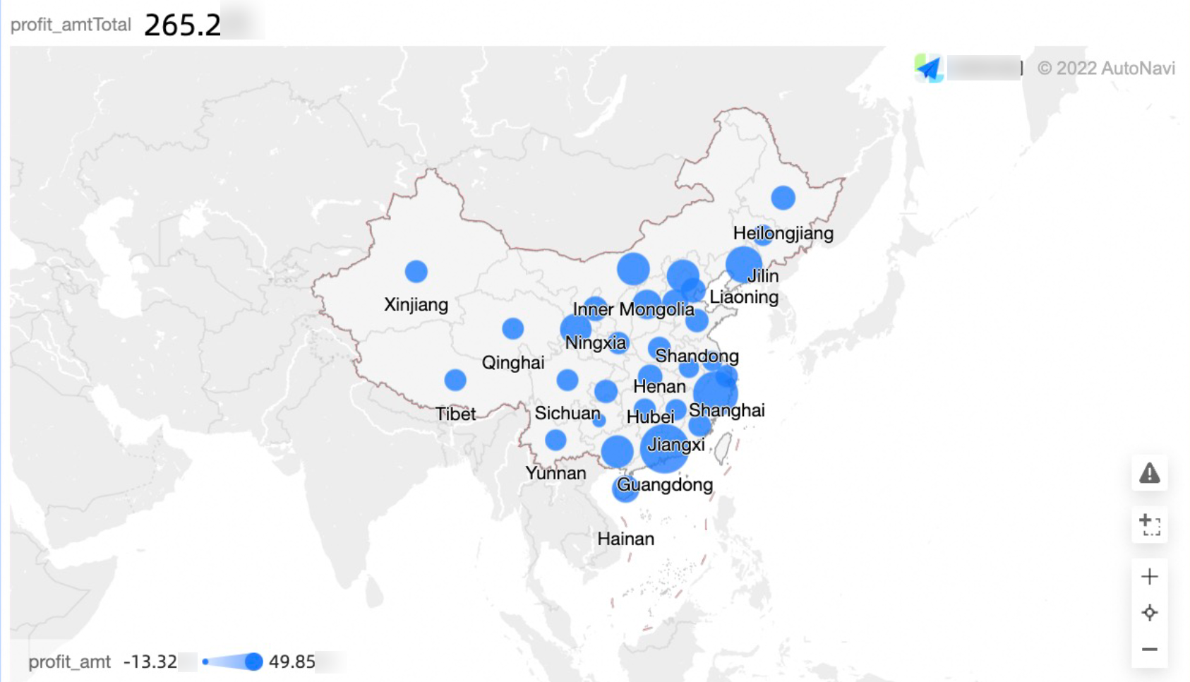
geo bubble chart visualize the size and distribution range of relevant data indicators for a country or region
Geographic region
Bubble size
Bubble Color
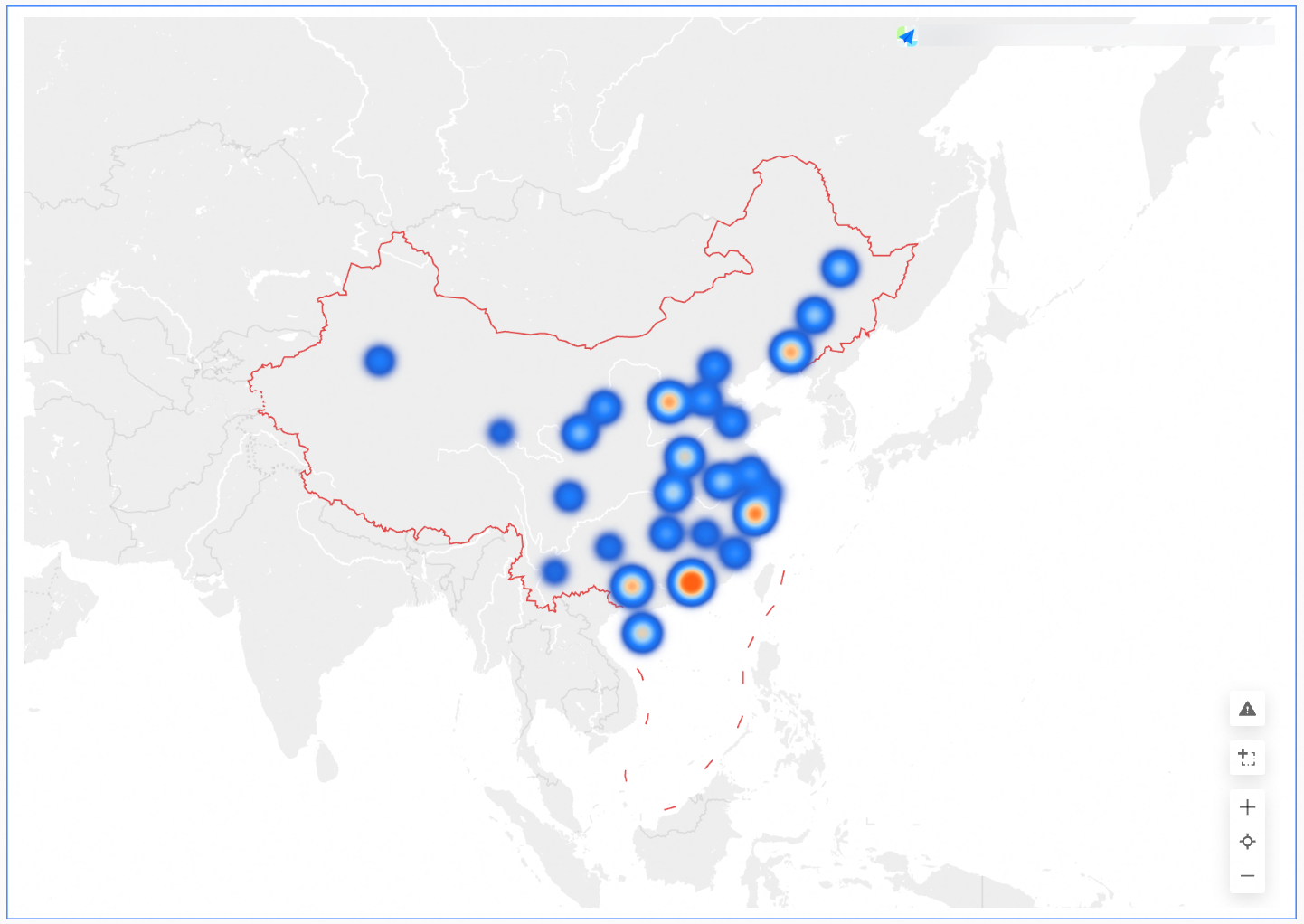
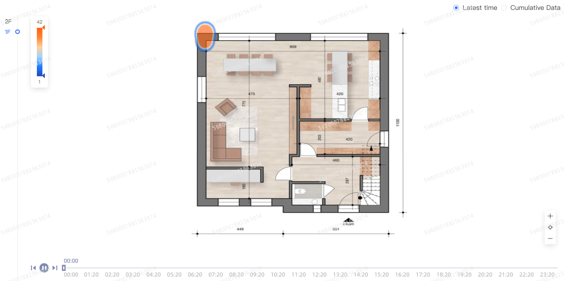
The heat map uses the depth of heat to show the size and distribution range of data.
Geographic region
Thermal depth
Statistics on the flow of people in offline venues, guide venue design, booth and commodity layout, and statistics on the flow of people in multi-user large exhibition halls, exhibitions, parks and large-scale supermarkets.
Coordinate data
Thermal depth
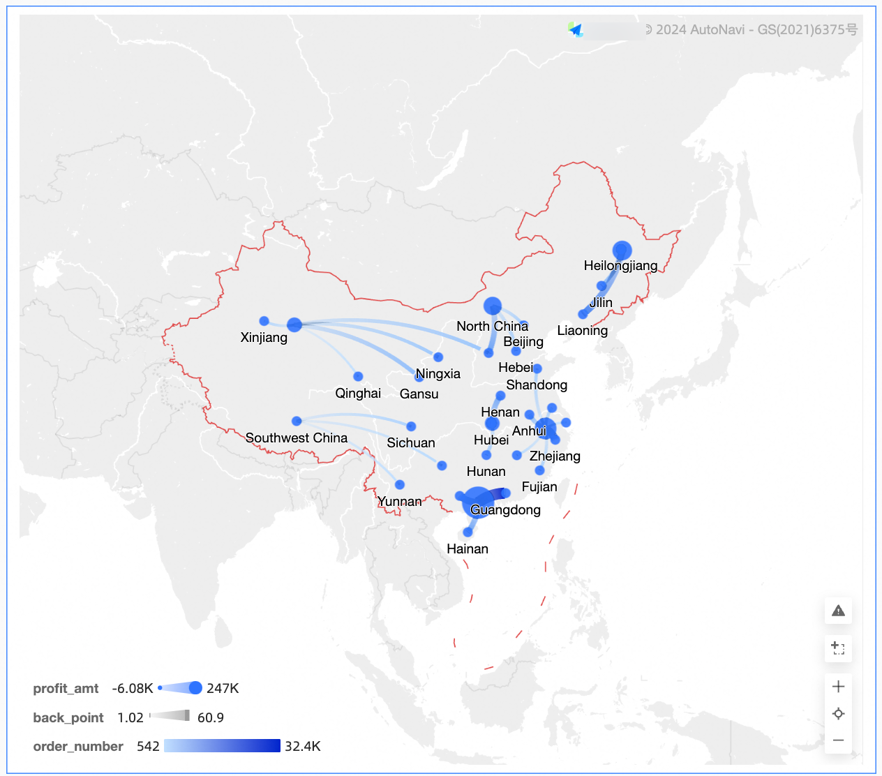
A flying line map uses a map outline as the background and dynamic flying lines to reflect the size of data between two or more places.
Flying Route Metrics
Geographic area (from)
Geographic area (to)
Other Classes
Chart name
Example
Scenario
Data Elements
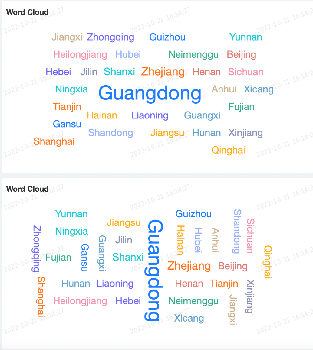
A word cloud is commonly used to create user portraits and user tags.
Word size
Word tag
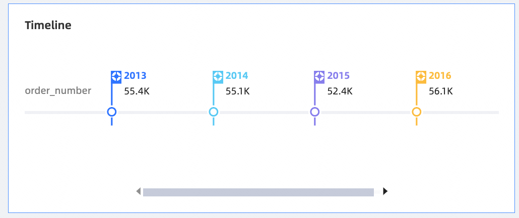
The timeline can dynamically display changes in behavior and status.
Timeline /Time Dimension
node tag /Dimension
node tag /Metrics
Operation entry of the chart
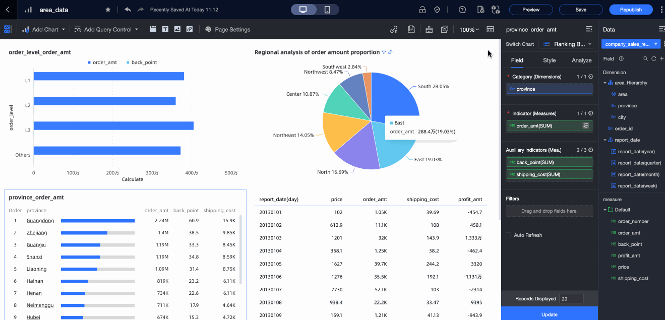
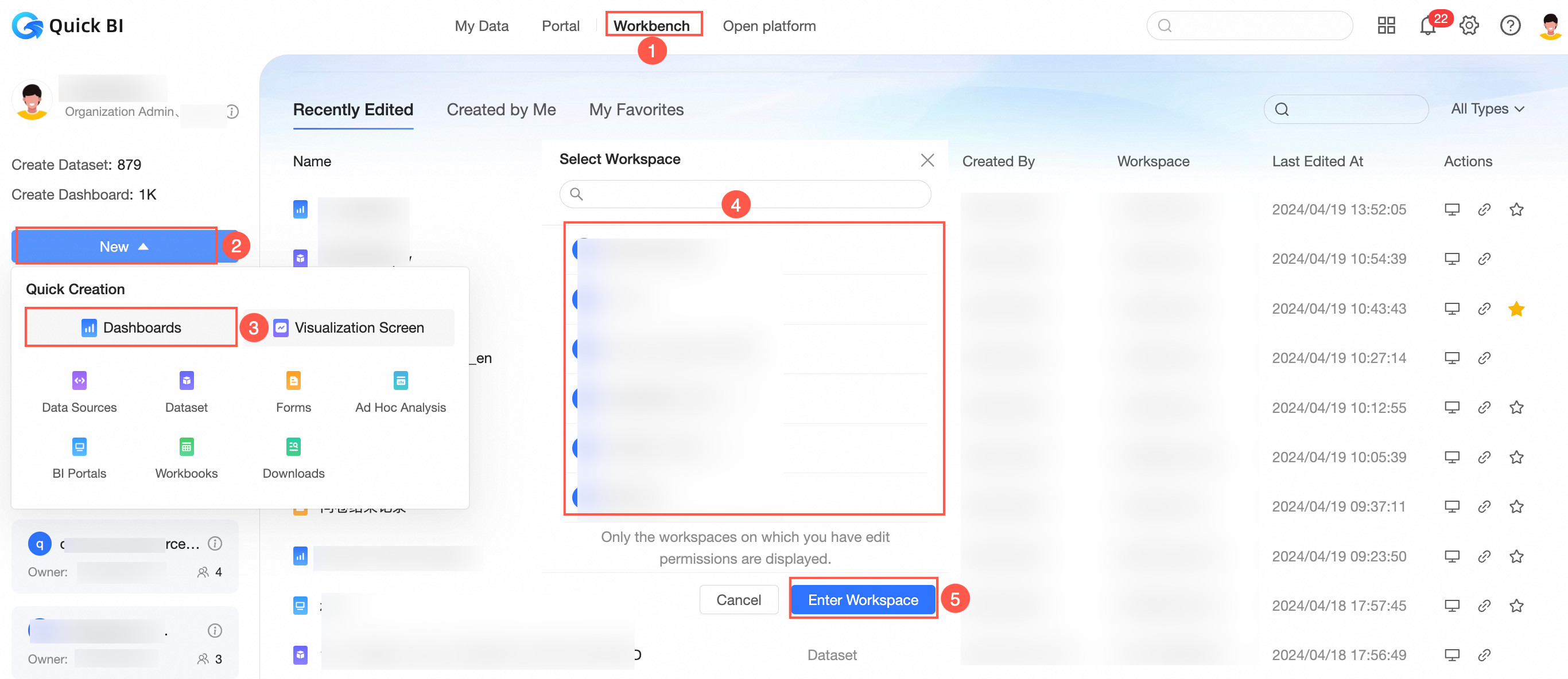
Log on to the Quick BI console , and go to the Create Chart page as shown in the following figure.
Method 1: Create an ad hoc query from Quick Start on the Workbench tab out of a workspace
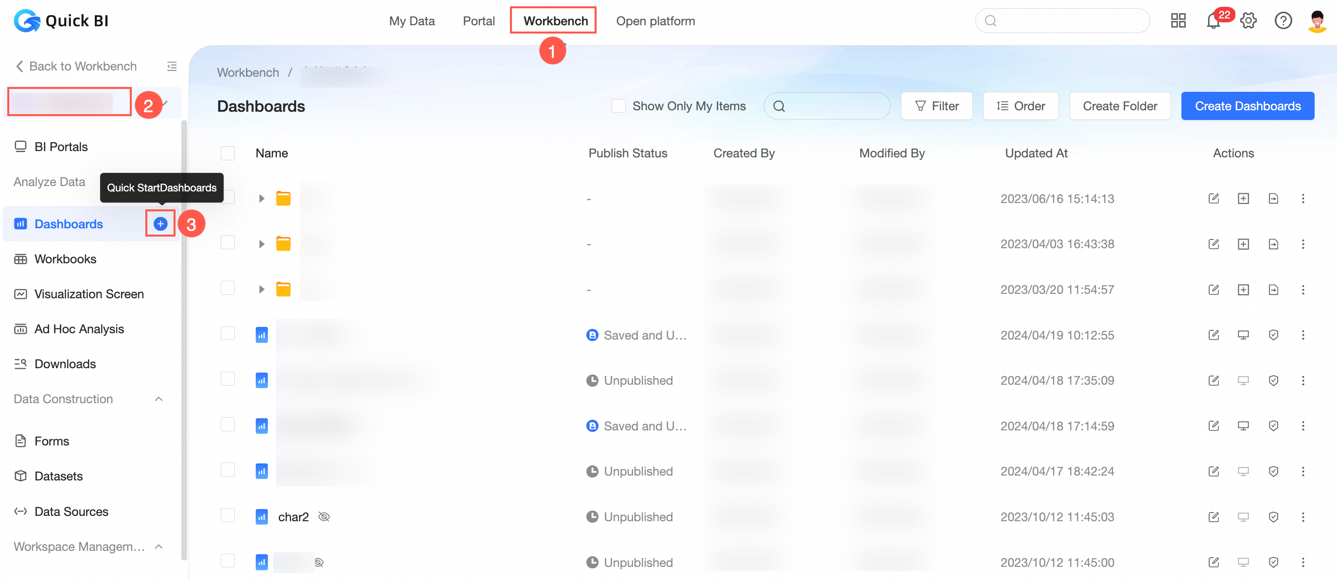
Method 2: Create an ad hoc query in the left-side navigation pane of the Workbench tab in a workspace
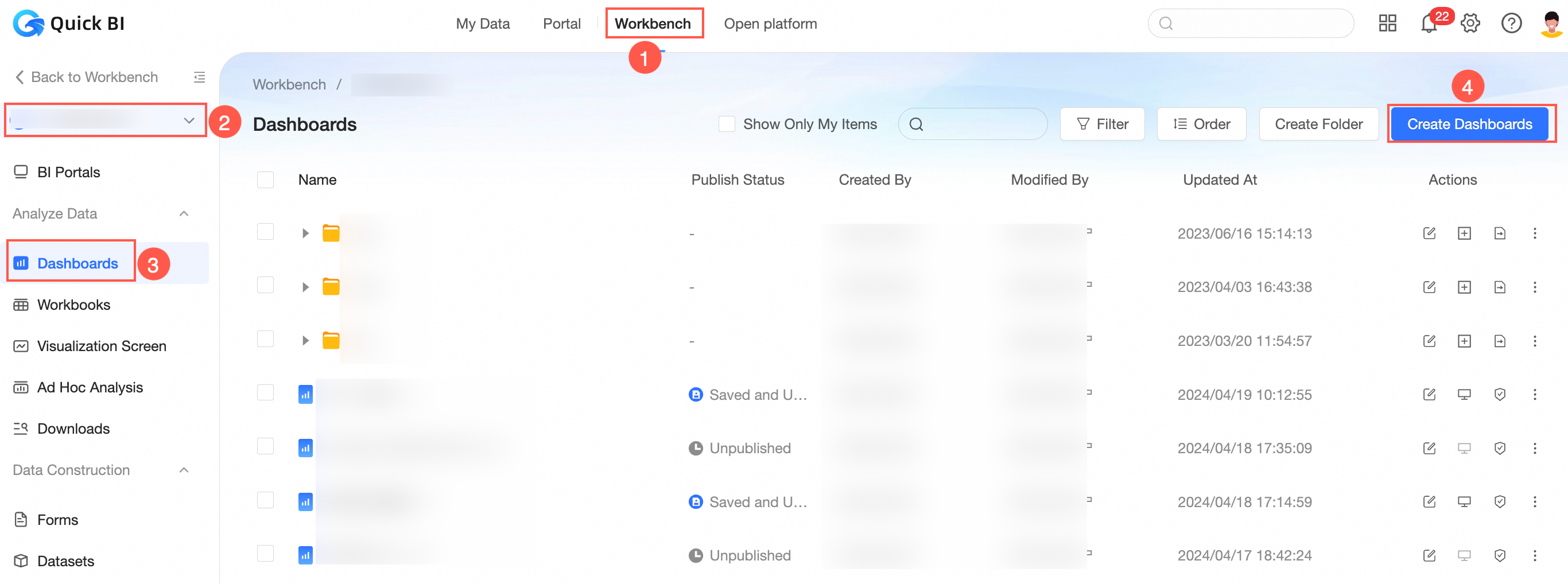
Entry 3: Create from the dashboard module in the space
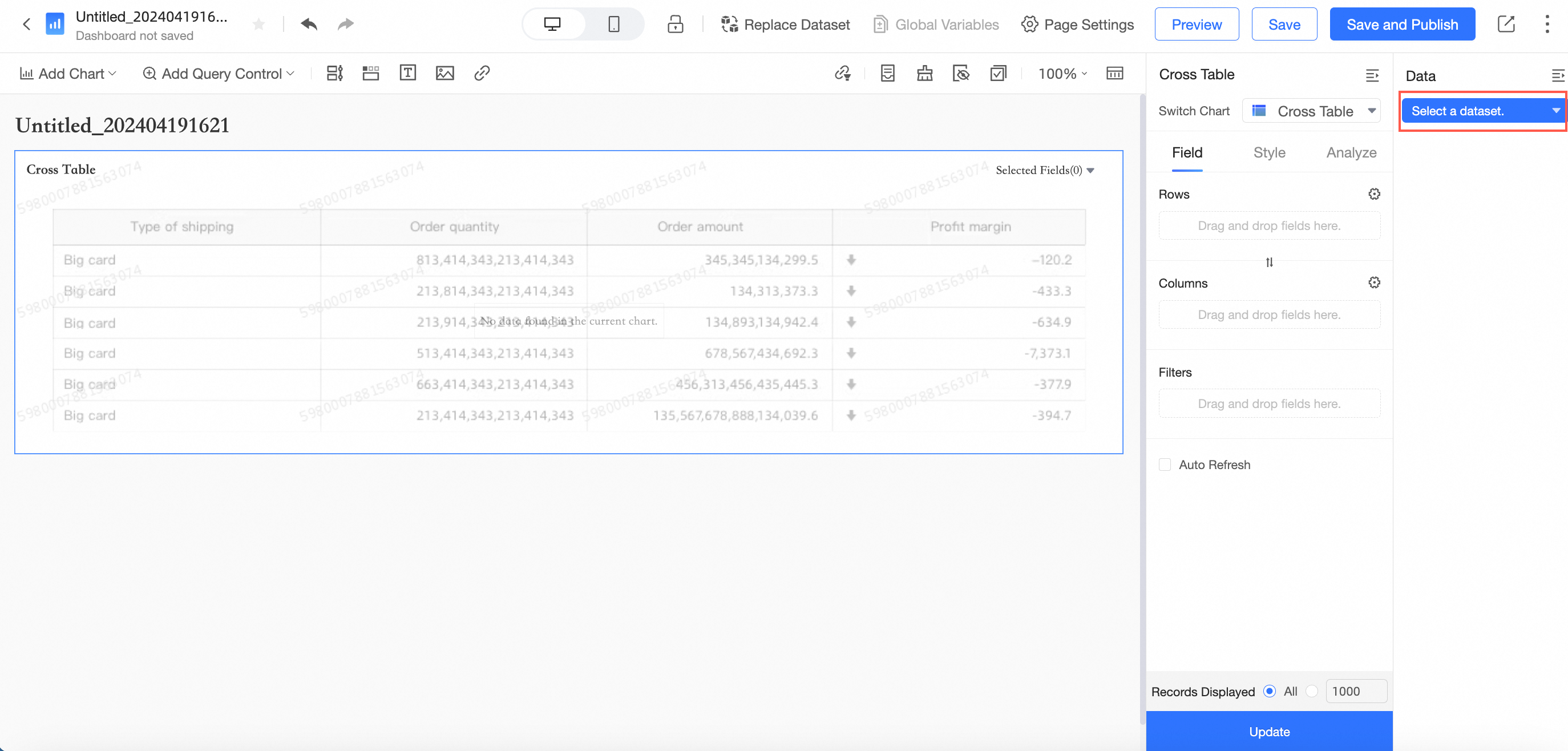
When you create a dashboard in the preceding three entries, the dataset is not selected by default. You need to select a dataset on the edit page.
Method 4: Create a workbook on the Datasets page.
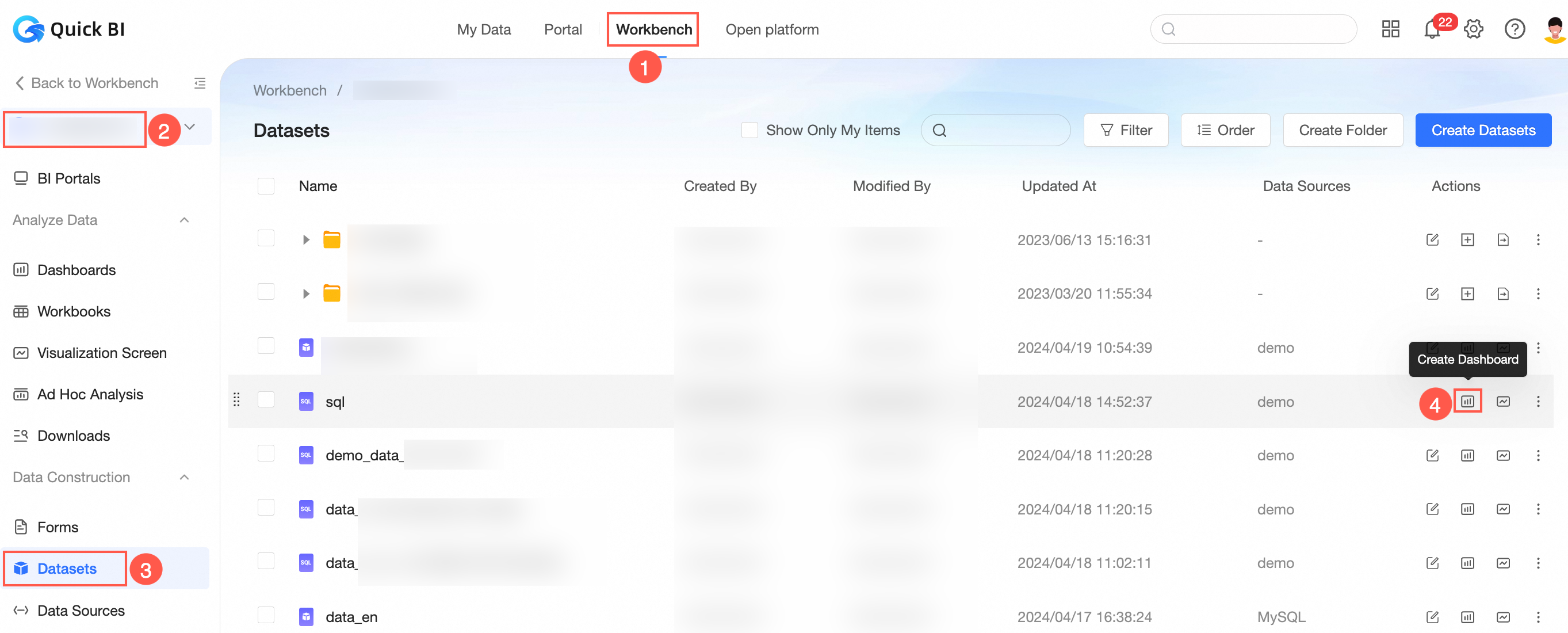
Method 5: Create a workbook on the editing page of a dataset.
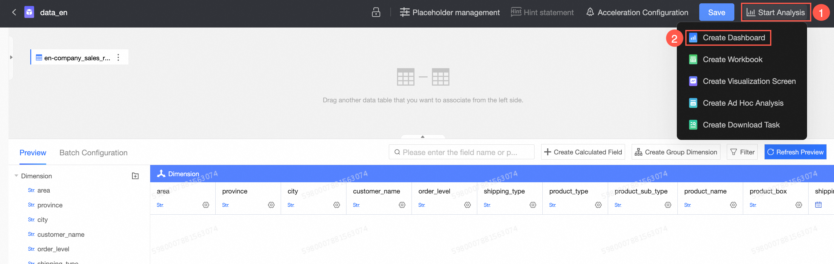
After you create a dashboard for entry 4 and entry 5 from an existing dataset, the data panel on the right directly loads the corresponding dimensions and measures based on this dataset and drag them to the Fields area.
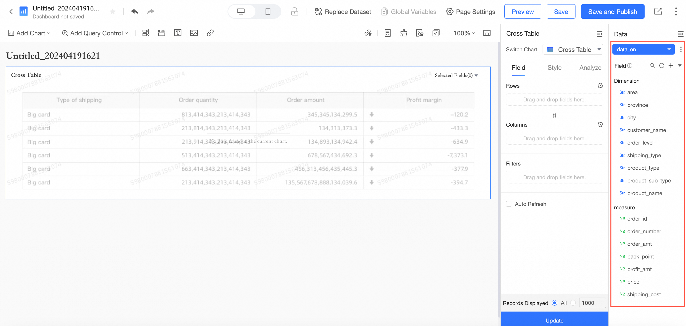
For more information about common operations on charts, see Configure a chart data area.
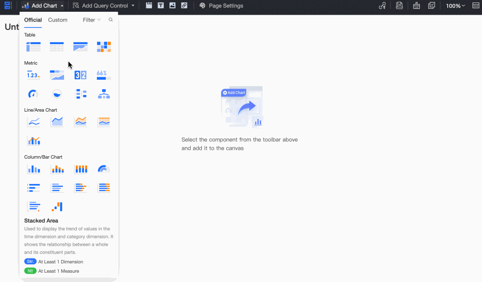
Add a chart
Click Add Chart. In the Chart List dialog box that appears, add a chart.
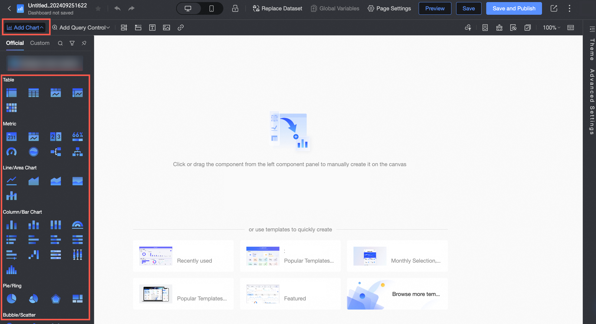
You can quickly lock a chart based on the chart type. When you move the pointer over a chart, Introduction and Dimensions /Measures are displayed below the floating window. You can click or drag the chart to add a chart.
In the upper-right corner of the page that appears, click Filter to filter charts by Analyze Intent. The default value is Unlimited. You can select Trend, Comparison, Distribution, Relationship, Geography, or Time Series.
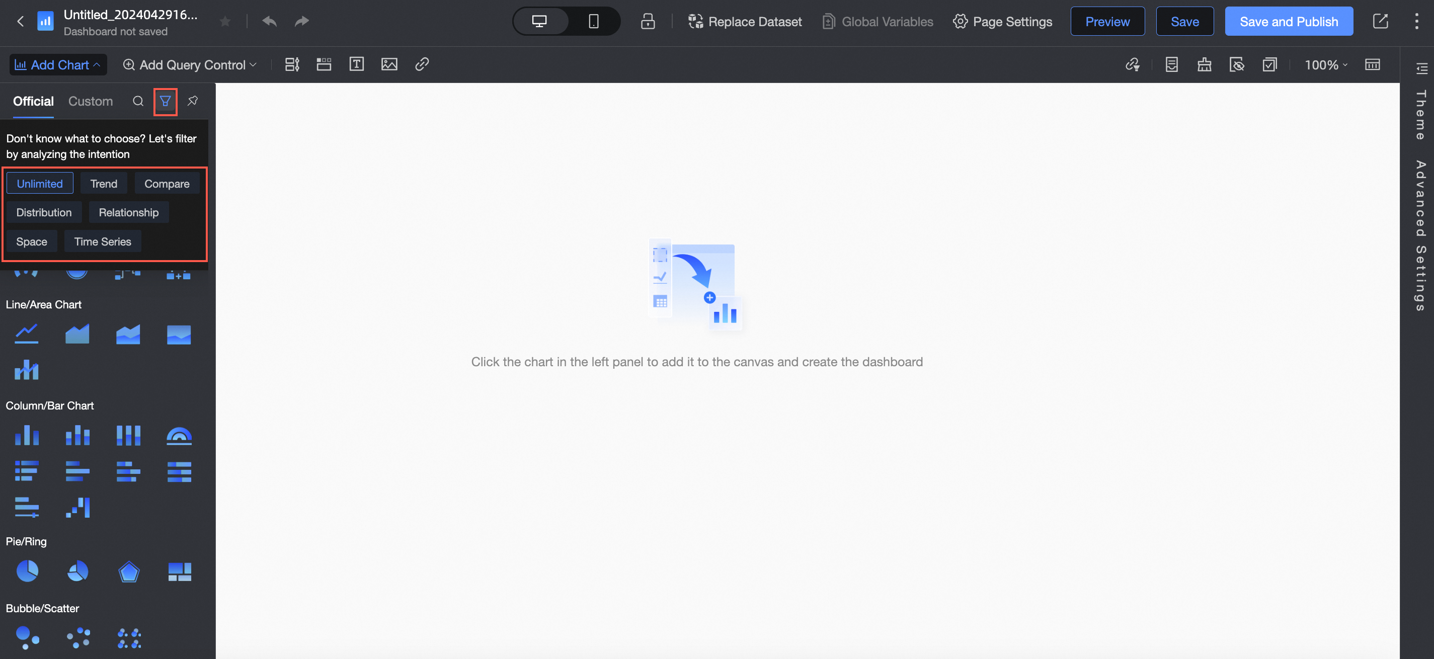
If you want to search for a chart name, you can click the icon in the upper-right corner
 to enter a keyword to search for the chart.
Manage charts
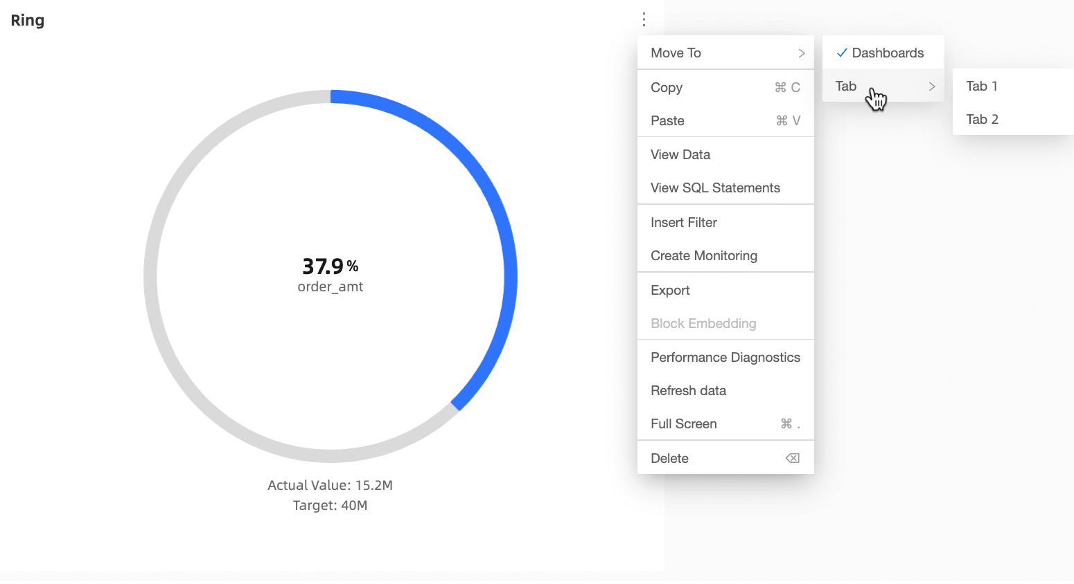
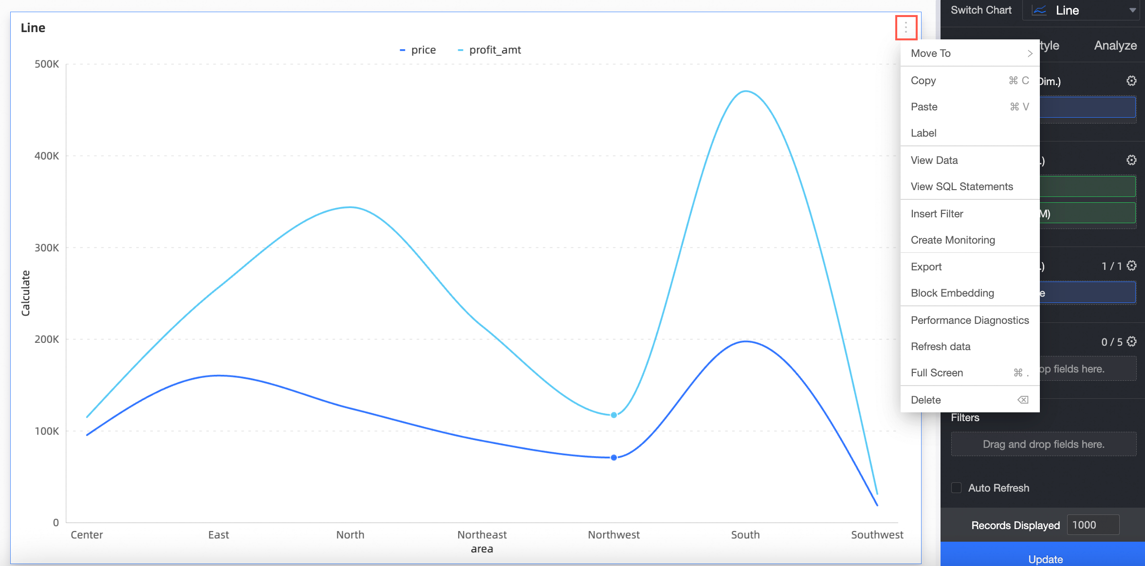
You can click the icon in the upper-left corner of a chart to move, copy, label, view data, view SQL statements, insert query conditions, create monitoring, export, embed block, perform performance diagnostics, refresh data, display in full screen, delete, and fetch data.
Category | Usage note |
Move To | Move the chart to the Tab container. |
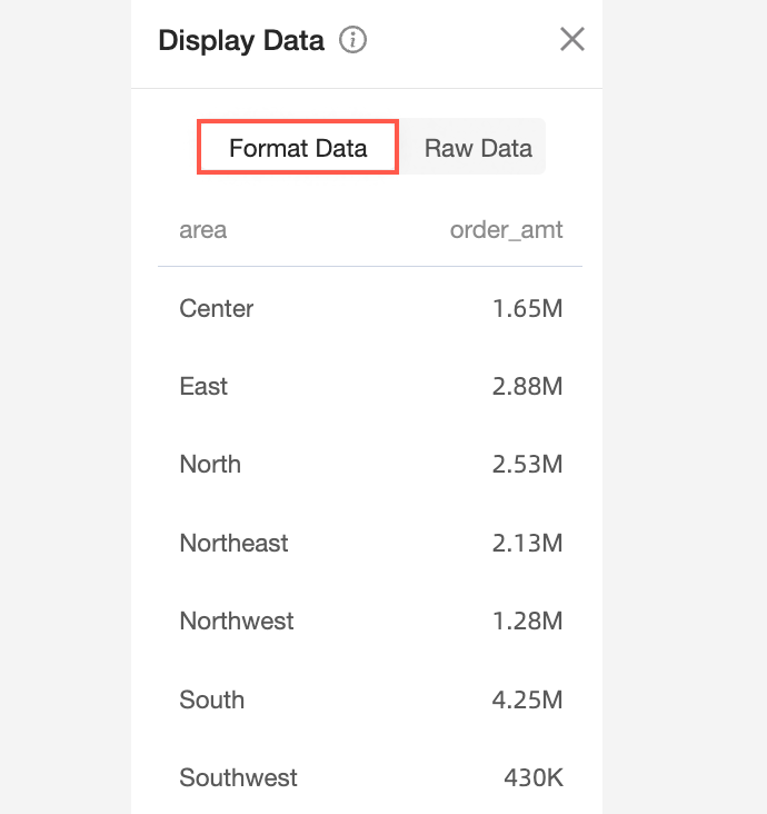
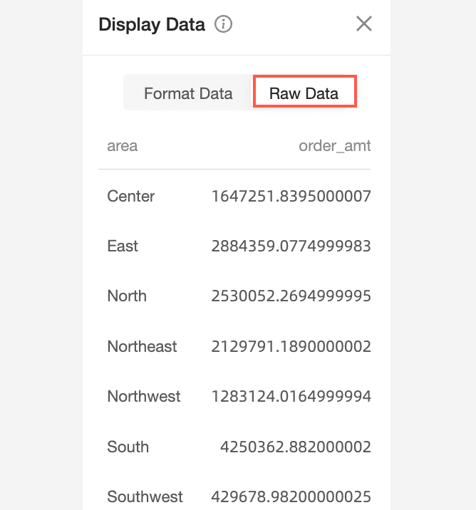
View the profiling data | View the chart data. Formatted data and raw data are available for viewing data format.
|
Copy | Copy the chart. |
Paste | Paste the copied chart to the current dashboard. |
Tag the data | Use icons, background colors, and dimension color highlights to mark specific parts of the chart. For more information, see Labeling. |
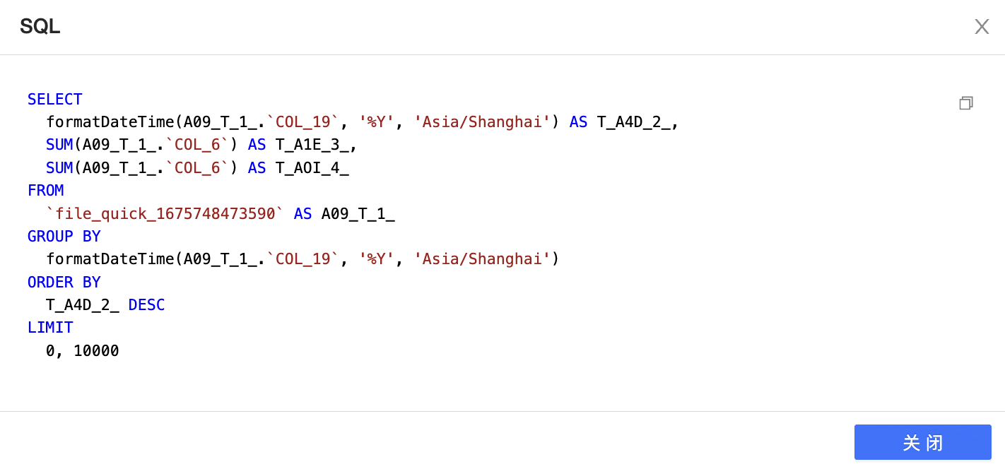
View SQL Statements | View the SQL query statement of the chart. |
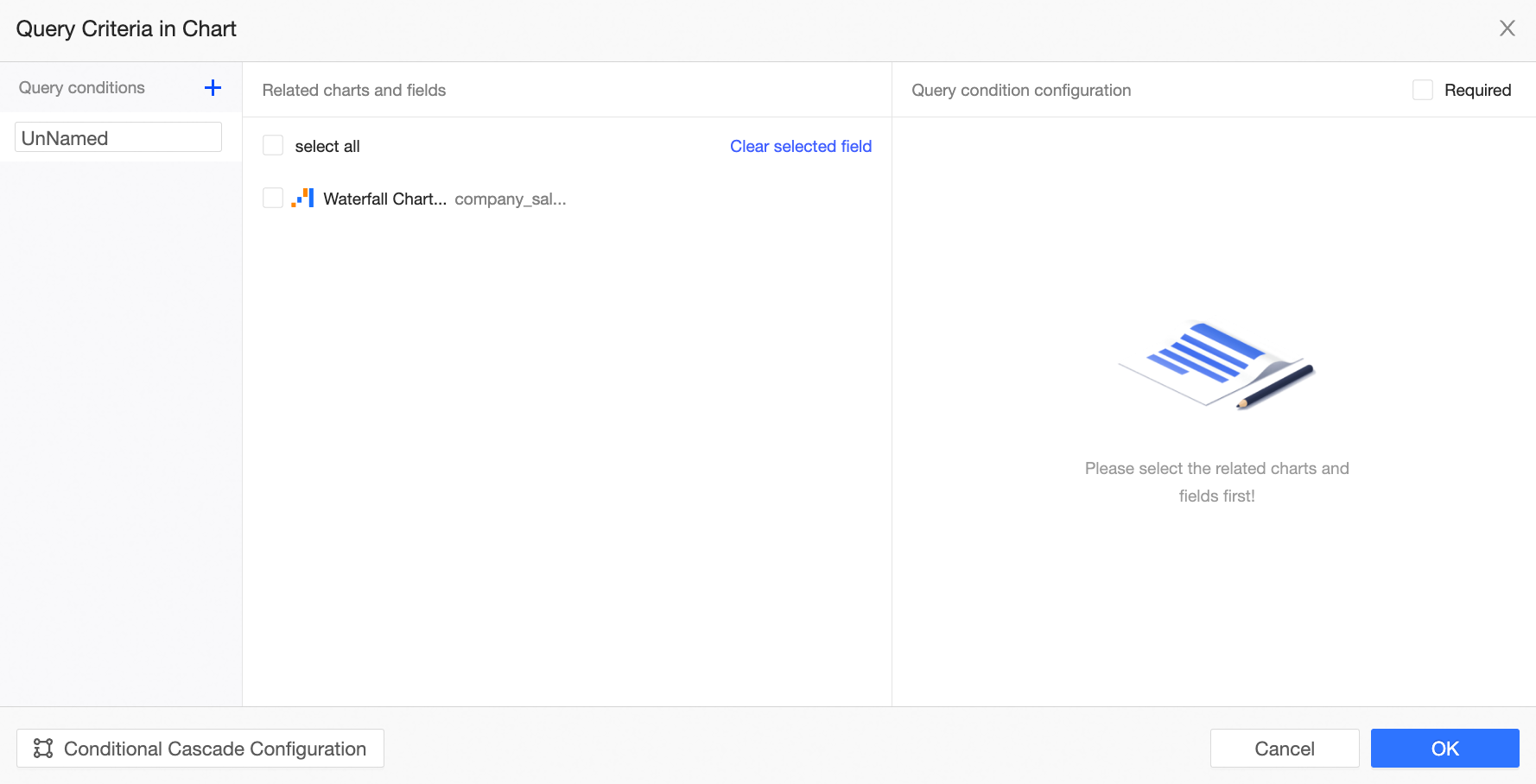
Insert query conditions | Add query conditions for the current chart. For more information, see Add and configure a filter bar for a chart. |
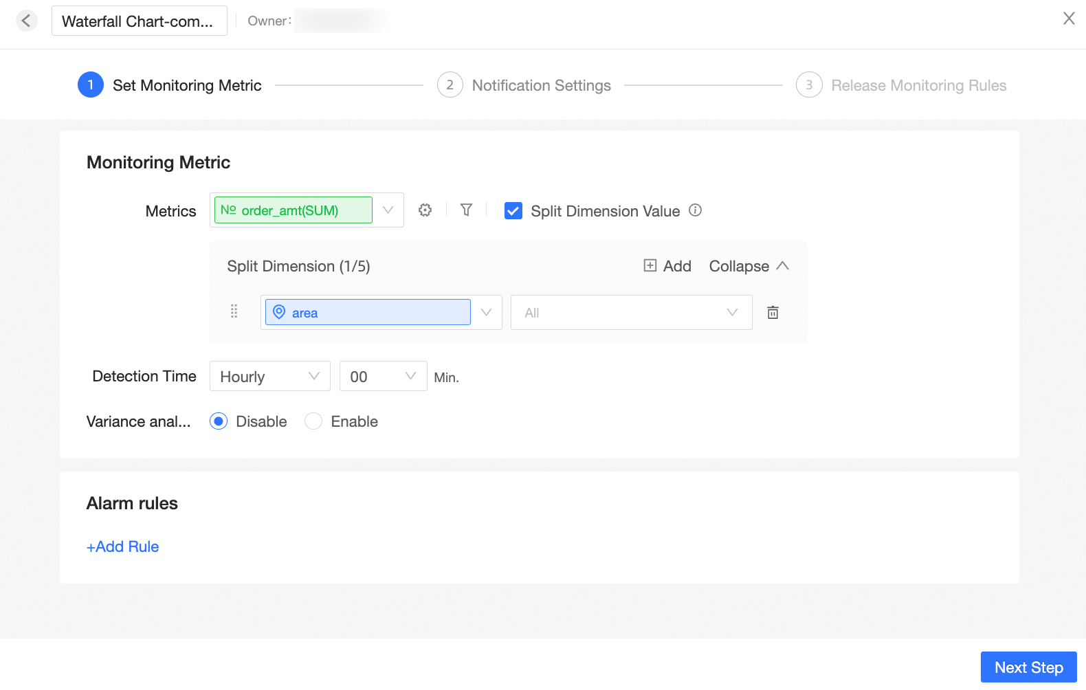
Create a monitor | The alert information of the monitoring chart metric. For more information, see Configure monitoring and alerting. |
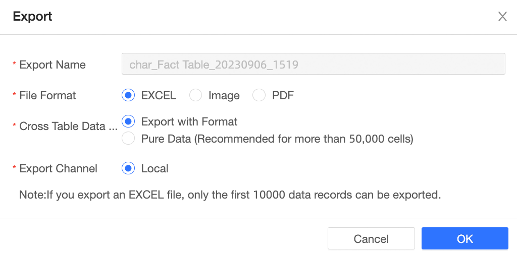
Export data | Export chart data in the PNG format, PDF format, or Excel format, and store it on a local or OSS server. |
Block embedding | After embedding, you can only see the embedded chart. |
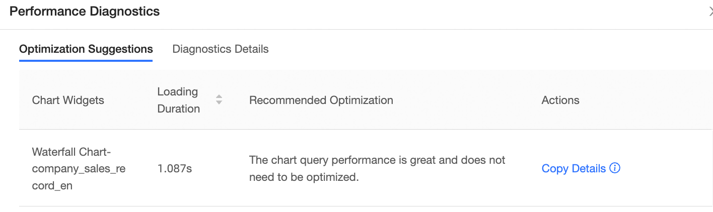
Performance diagnosis | Diagnoses the query performance of the current chart and provides diagnosis details and optimization suggestions. |
Refresh data | Refreshes the current chart data. |
Full Screen | Show the chart in full-screen mode. You can click the Exit Full Screen button to exit the full screen mode. |
Delete | Delete the chart. |
Downloads | Create a self-service data retrieval for the current chart. Note Only cross tables, new cross tables, and part tables support this feature. For more information, see Create and Manage Download Tasks. |