A word cloud chart displays large volumes of text data as a colorful, cloud-like graphic composed of words. For example, you can use it to build user profiles, cluster users, and enable fine-grained marketing.
Prerequisites
You have created a dashboard. For more information, see Create a dashboard.
Overview
-
Scenarios
Visualize keywords (tags) on websites or free-form text, and compare the relative importance of words.
-
Benefits
-
Visualization: Choose from rectangle, triangle, heart, or ellipse shapes for your word cloud.
-
Annotations and interactivity: Add comments or endnotes to metrics, and configure hyperlinks to external systems.
-
-
Example
Configure Chart Data
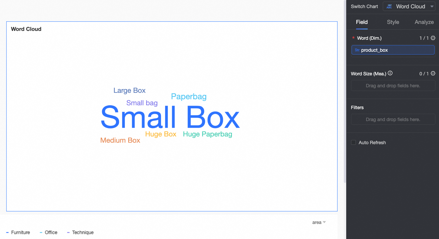
A word cloud chart consists of Word/Dimension and Word Size/Measure.
On the Fields tab, select the required dimension and measure fields to add data to the word cloud chart.
-
Method 1: Word size reflects the value of a measure. Add both a dimension and a measure as follows.
-
On the Fields tab on the right side of the chart, select the required dimension and measure fields.
-
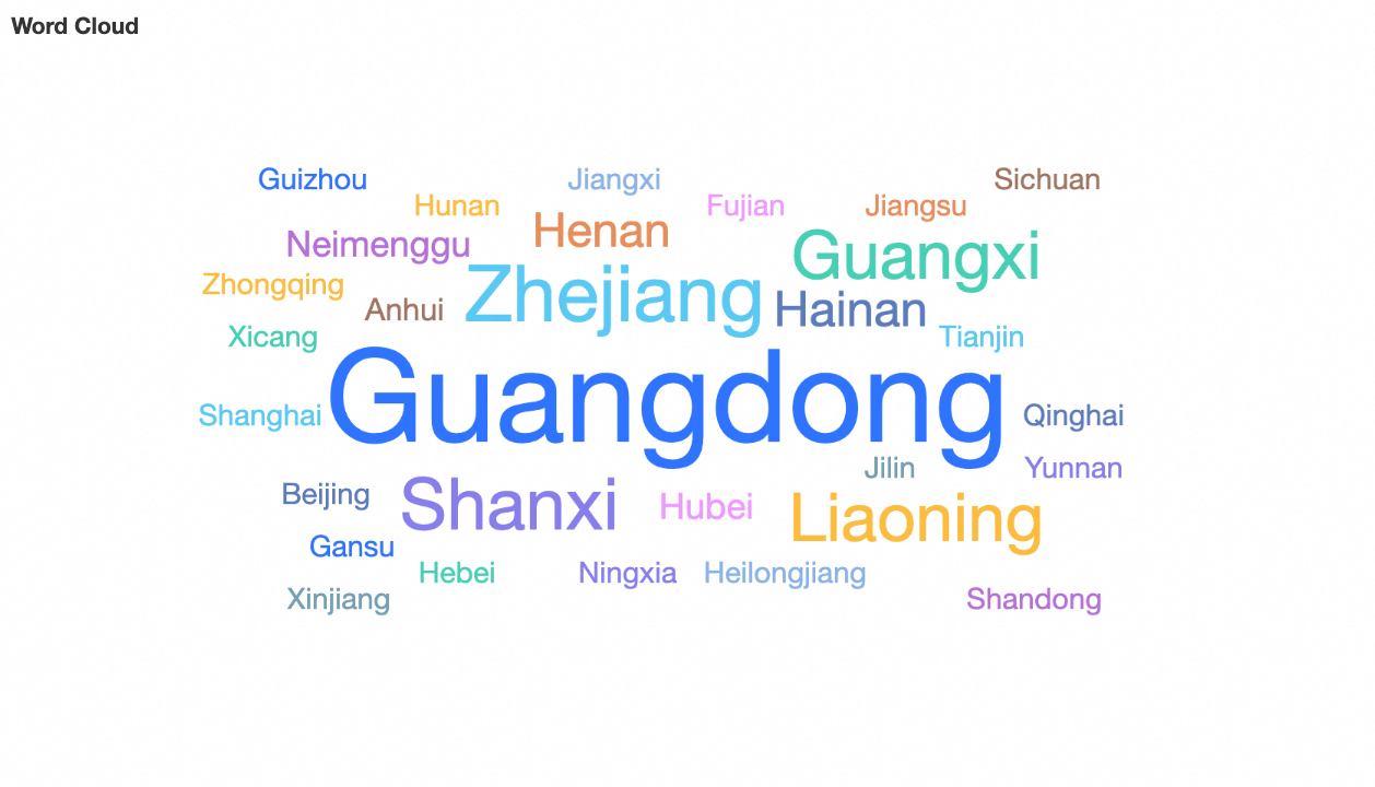
In the Dimensions list, find Province and double-click it or drag it to the Word/Dimension area.
-
In the Measures list, find Amount and double-click it or drag it to the Word Size/Measure area.
-
-
Click Update. The system updates the chart automatically.
The updated chart appears as follows.
-
-
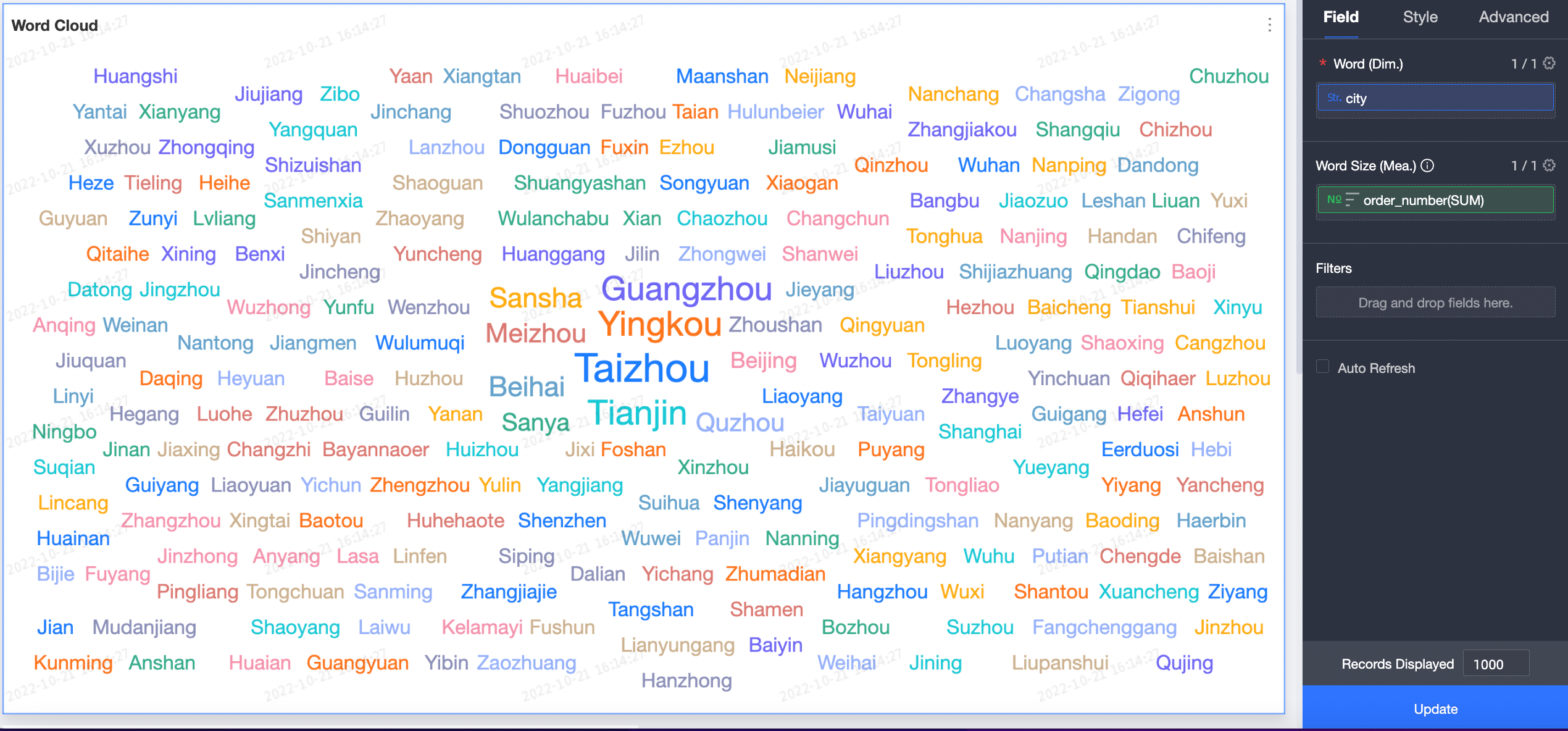
Method 2: Word size reflects word frequency. Add only a dimension as follows.
-
On the Fields tab on the right side of the chart, select the required dimension field.
-
In the Dimensions list, find Product Package and double-click it or drag it to the Word/Dimension area.
-
-
Click Update. The system updates the chart automatically.
The updated chart appears as follows.
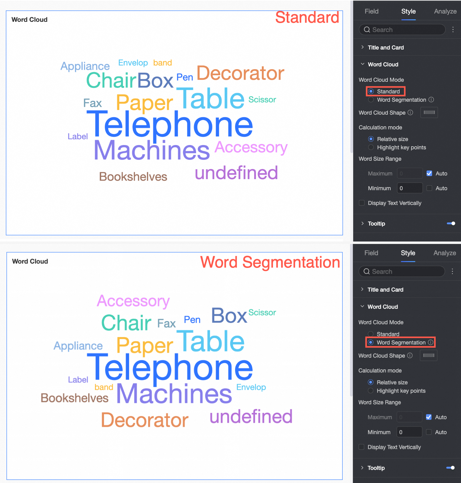
 If sentences are too long to quickly identify keywords, use word segmentation mode to highlight key terms. For more information, see Word Segmentation Mode.
-
Word Segmentation Mode
Word segmentation mode intelligently breaks down sample sentences:
-
If you add only a dimension field, word size reflects the frequency of each segmented word.
-
If you add dimension and measure fields, in tokenization mode, the system intelligently splits example sentences and displays token sizes.
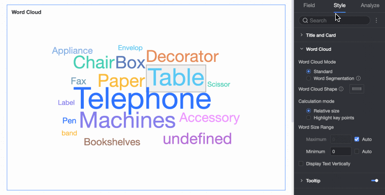
Configure Chart Styles
Configure styles for the word cloud chart appearance. For instructions on chart titles and card styles, see Configure the chart title.
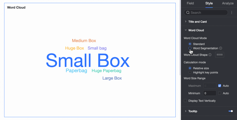
In the Style tab under the Chart Style area, configure the chart’s appearance.
|
Configuration Item |
Configuration Item Example |
|
Word Cloud Mode |
Supports Standard Mode and Word Segmentation Mode.
|
|
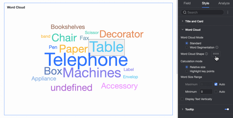
Word Cloud Shape |
Supports four shapes: square, circle, triangle, and heart.
|
|
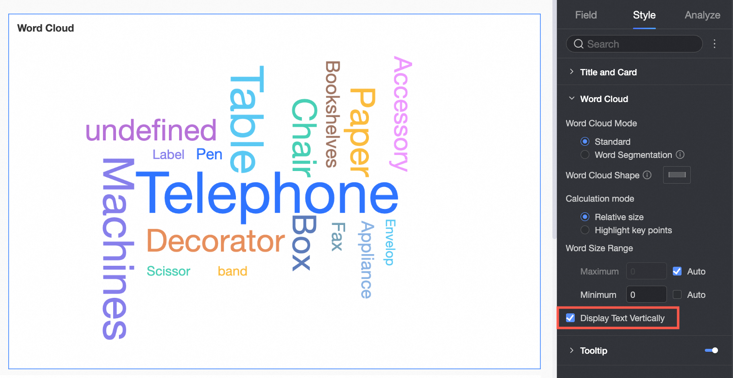
Vertical Text |
Displays text in portrait orientation.
|
|
Word Size Range |
Customize font sizes to make differences between words more distinct.
|
|
Tooltip |
Click the Note
Tooltip settings for PC and mobile are independent. Switch to the mobile editing view using the PC/Mobile toggle button ( |
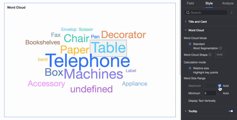
 icon to enable tooltips and configure their style.
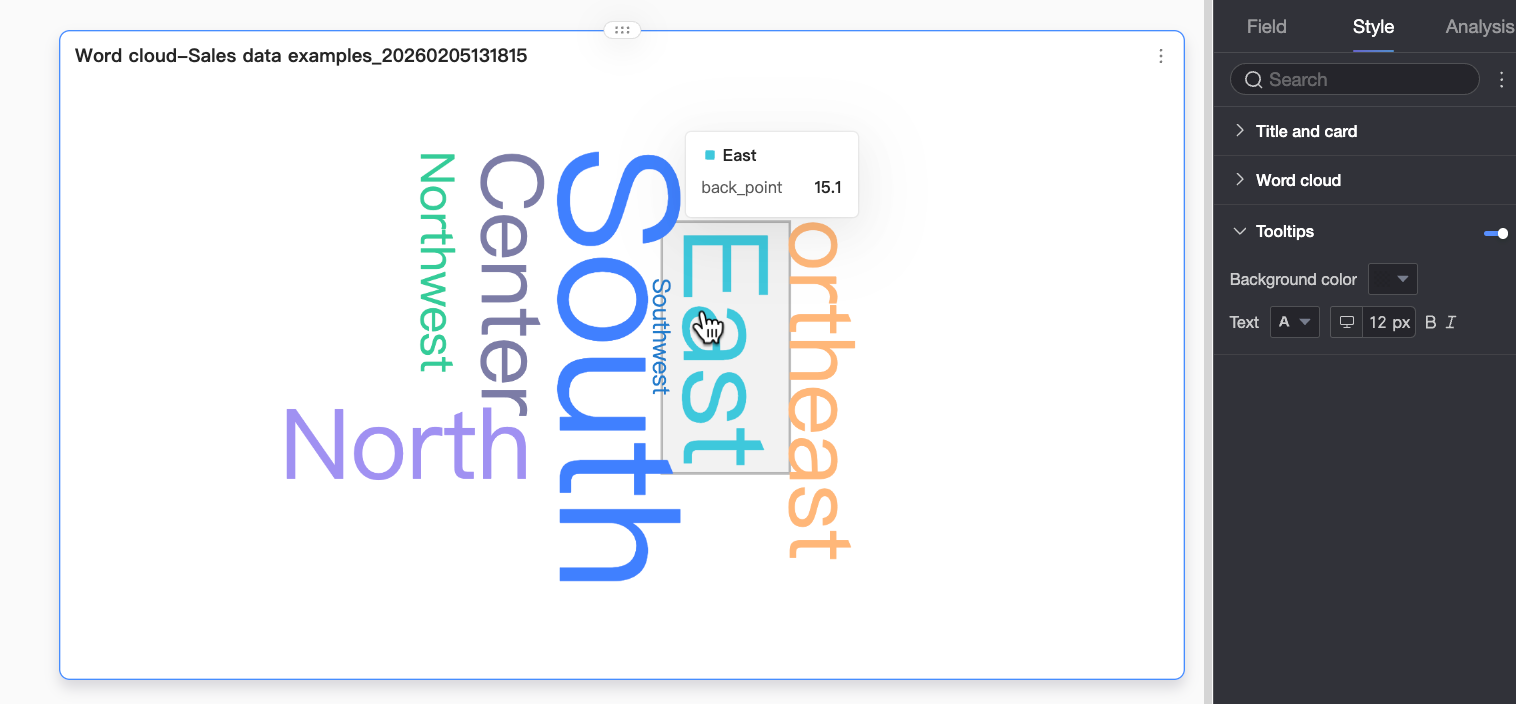
 ) at the top of the dashboard editor to configure mobile tooltips. Font size can be set separately for PC and mobile; all other tooltip styles apply universally.
Configure Chart Analytics
|
Name |
Description |
|
Filter Interaction |
When your data spans multiple charts, link them through filter interaction to analyze data collectively. For setup instructions, see Filter interaction. |
|
Navigation |
When your data spans multiple dashboards, connect them via navigation for unified analysis. Navigation supports parameter-based navigation and external links. For setup instructions, see Navigation. |
|
Annotation |
Highlight abnormal or critical data points using color, icons, comments, or markers to help identify issues and take action. For setup instructions, see Annotation. |
Limits
Note the following limits when adding data to a word cloud chart:
-
Word Size/Measure is based on measure data. Select either one measure or none.
-
Word/Dimension is based on dimension data. Select exactly one dimension.
What to do next
-
To allow others to view your dashboard, share it with specific users. For more information, see Share a dashboard.
-
To build a complex, navigation menu–enabled portal for thematic analysis, integrate your dashboard into a BI portal. For more information, see Create a PC BI portal.