A scorecard displays key metrics as prominent cards for at-a-glance, real-time KPI monitoring. Use scorecards when you need precise values for one or more measures within a single dimension.
Overview
Scenarios
Displays one or more measures under a single dimension, especially when precise metric readings are required.
Benefits
-
Calculations: Configure year-over-year and period-over-period calculations with a single click.
-
Visualization: Add logos or icons, and set custom backgrounds, font sizes, and colors.
-
Annotations: Add custom text, metric notes, and external links to other systems.
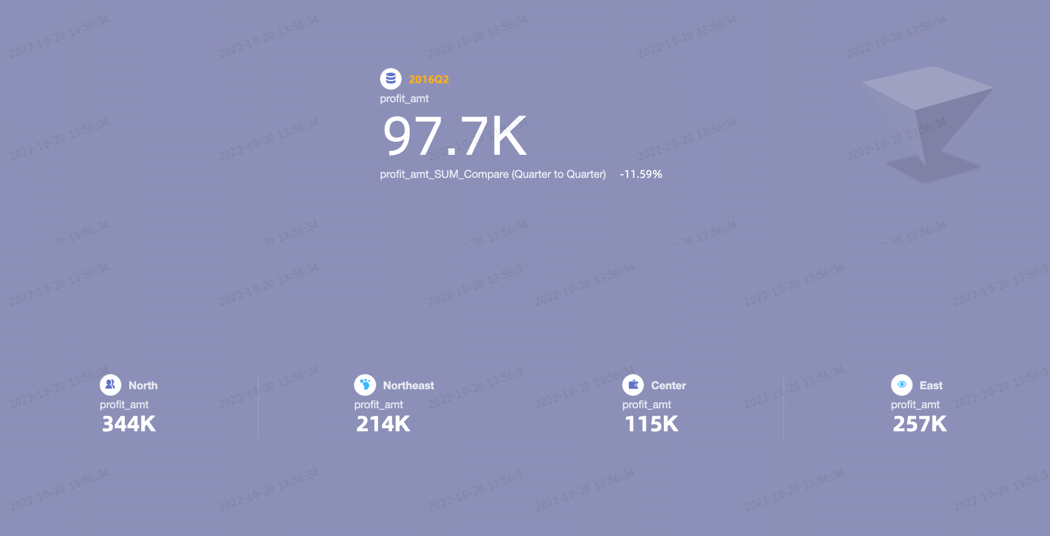
Example Rendering
Limits
-
Prerequisites
-
Data modeling: Complete data modeling first. Your dataset must include a date-type dimension field with daily granularity, such as Order Date (day).
-
Dashboard creation: You have created a dashboard.
-
-
Field configuration limits
A scorecard has two parts: Labels (Dim.) and Metrics (Mea.).
-
You can select only one dimension for Labels (Dim.), such as region.
-
You can select 1 to 20 measures for Metrics (Mea.), such as order quantity and order amount.
-
Chart Data Configuration
-
On the Field tab, select a dimension and one or more measures:
-
In the Dimension list, find the Province dimension. Double-click it or drag it to the Labels (Dim.) section.
-
In the Measure list, find the Order amount, Shipping cost, and Profit amount measures. Double-click them or drag them to the Metrics (Mea.) section in the desired order.
NoteThe first measure in the Metrics (Mea.) section is the primary measure. To change the primary measure, you can reorder the measures in the Metrics (Mea.) section.
-
-
Click Update. The system automatically updates the chart.
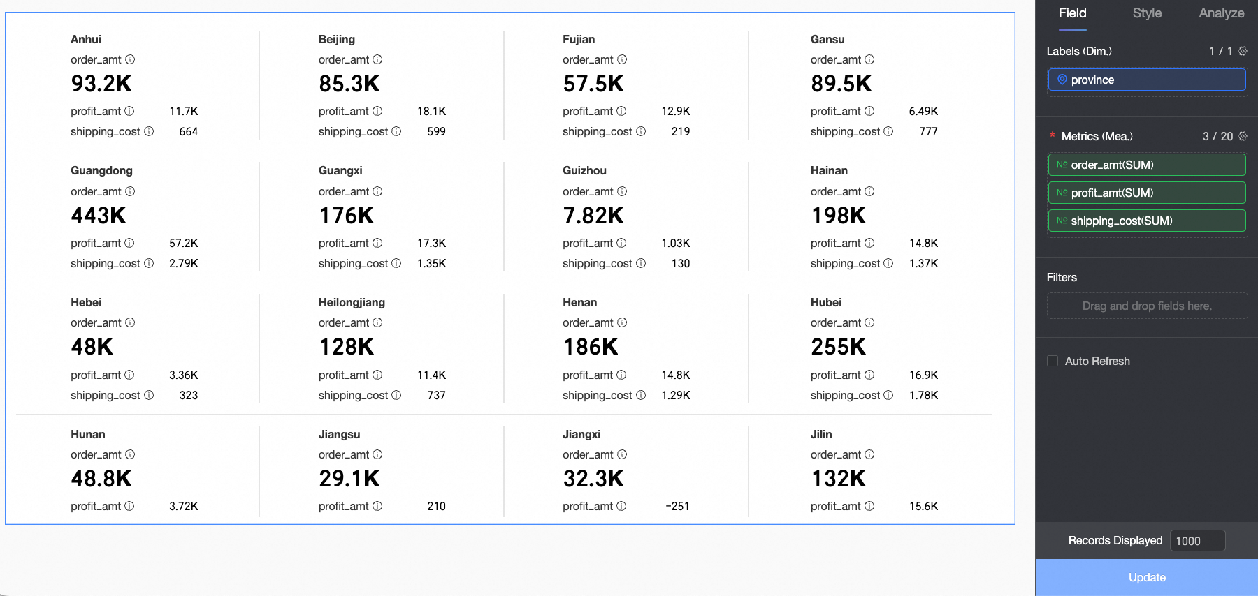
Chart Style Configuration
Common chart style settings are covered in Configure the chart title.

Quick Layout
Select a layout template. The first template is selected by default. Click the reset icon ( ) to restore the original layout without affecting content settings such as text or color.
|
Layout templates |
Preview |
|
|
Master/Sub Templates Highlights one primary metric over the others. |
Primary and secondary 1 |
Note
The first measure in the Metrics (Mea.) section is the primary measure. All others are secondary measures. |
|
Primary and secondary 2 |
|
|
|
Primary and secondary 3 |
|
|
|
Primary and secondary 4 |
|
|
|
Primary and secondary 5 |
|
|
|
Primary and secondary 6 |
|
|
|
Parallel Template Shows all metrics with equal prominence. |
Parataxis 1 |
|
|
Parallel 1 |
|
|


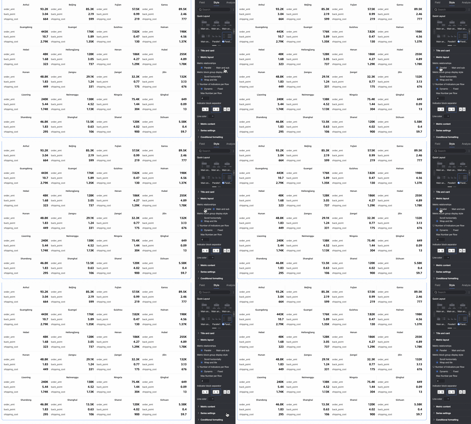
Metric Layout
Set the layout style for metric blocks.

|
Setting |
Description |
|
Metric relationship |
Choose Parataxis or Primary and secondary.
|
|
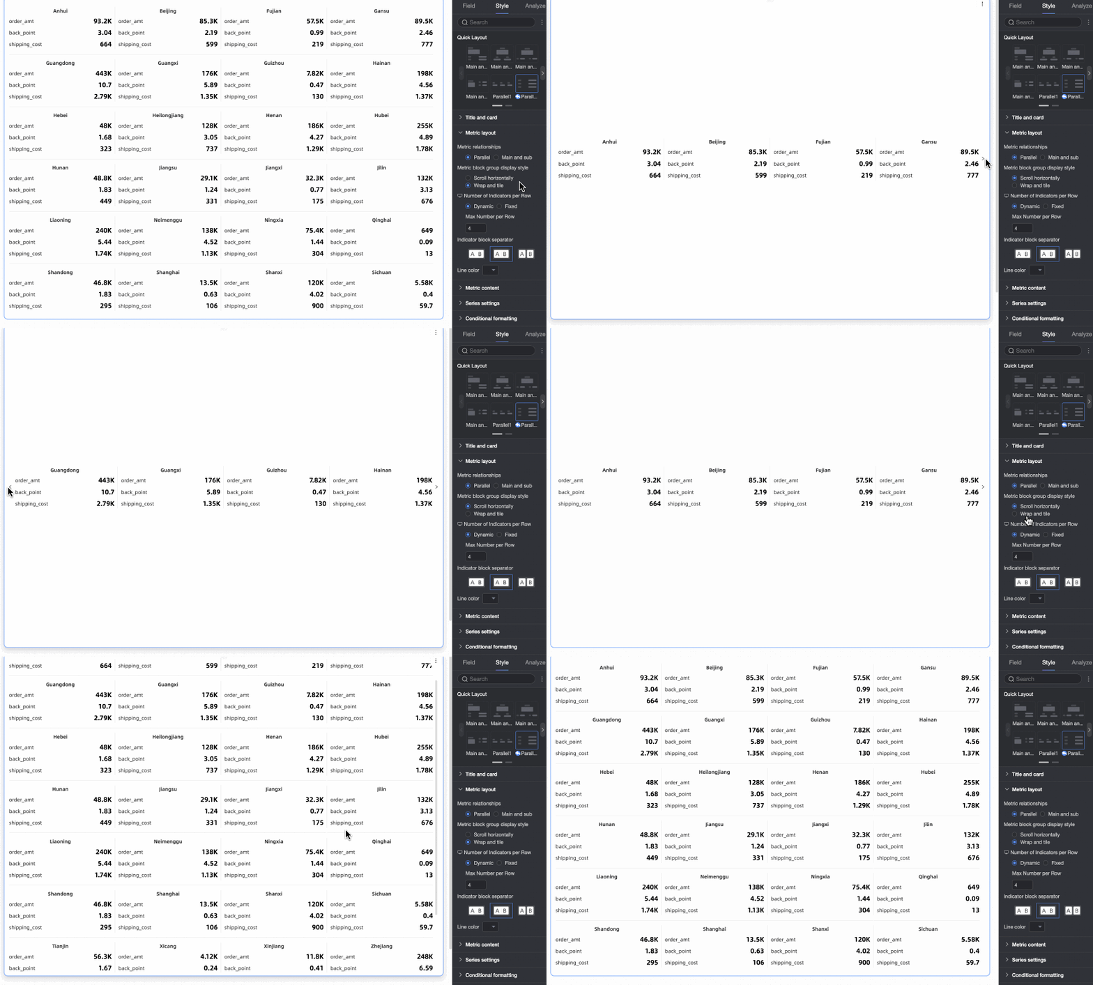
Metric block group layout |
Choose Horizontal scroll or Wrap.
|
|
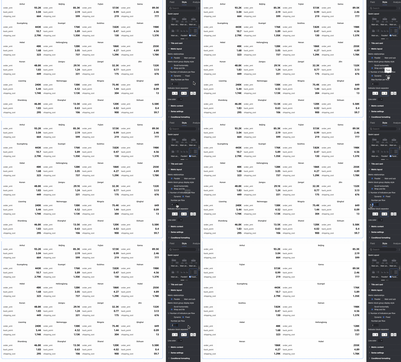
Metric block groups per row |
Set how many metric block groups appear per row, separately for mobile and desktop. Choose Auto or Fixed count.
|
|
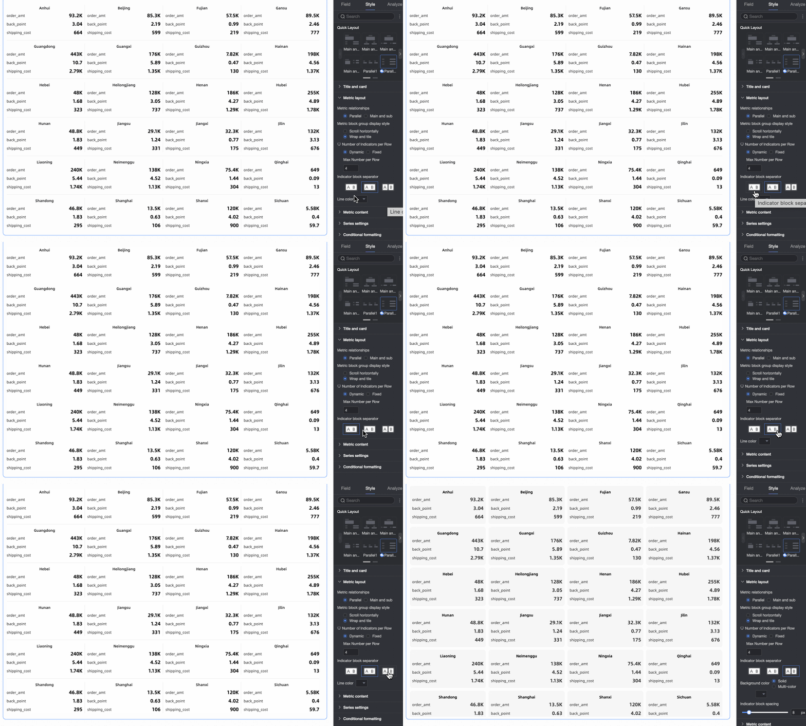
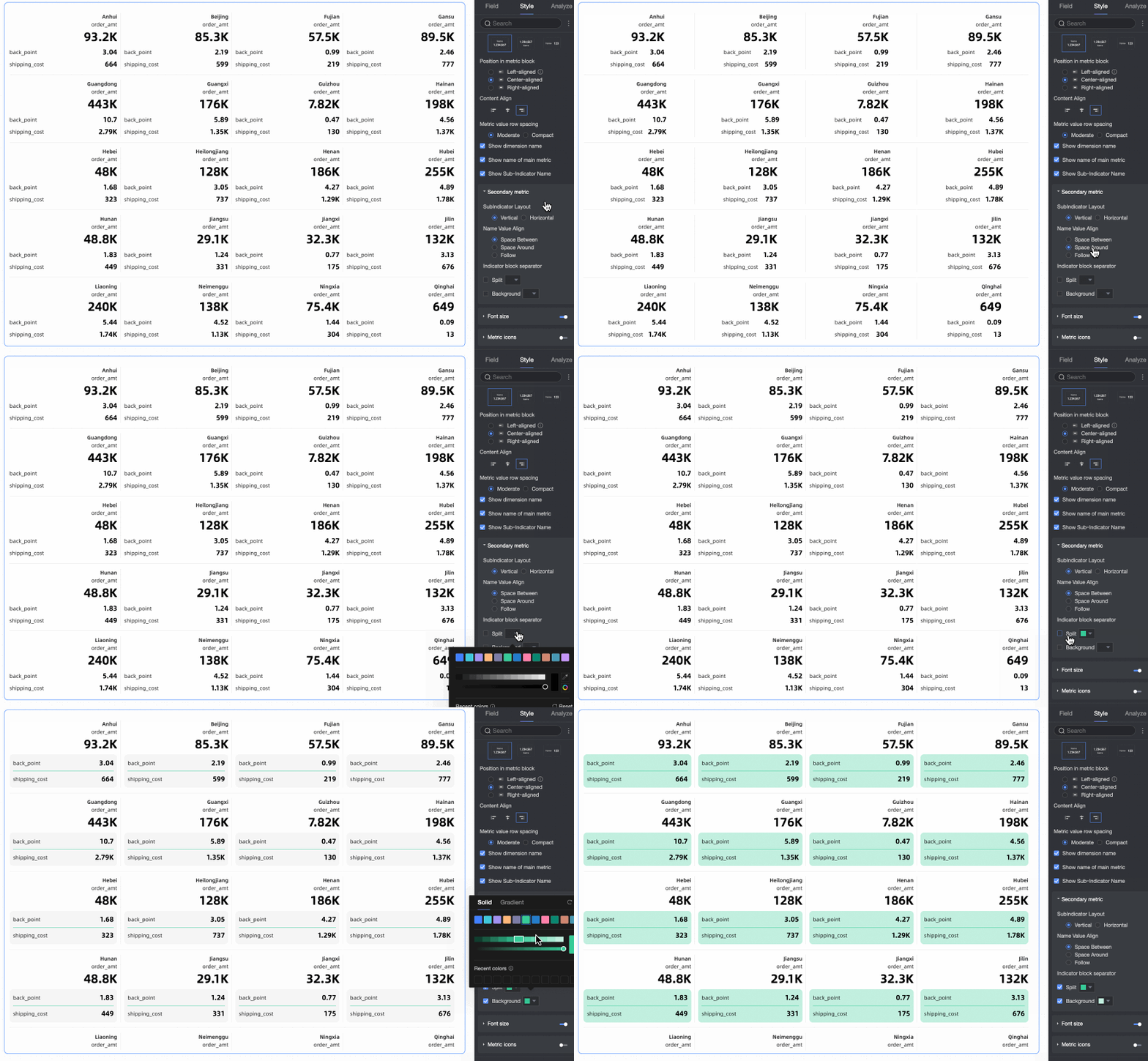
Metric block splitting |
Choose None, Line separator, or Fill background. With Line separator, set the line color. With Fill background, set the background color and padding.
|
Metric Content
Set the position, display mode, font size, and trend chart style for content inside metric blocks.

|
Setting |
Description |
|
Metric layout |
Settings vary by layout template.
|
|
Name and value position |
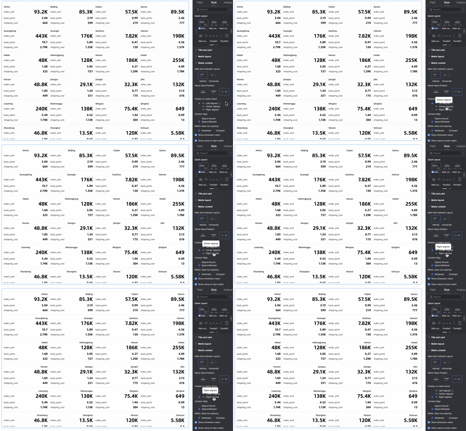
When Metric layout is Vertical, set the position of dimension names and values. |
|
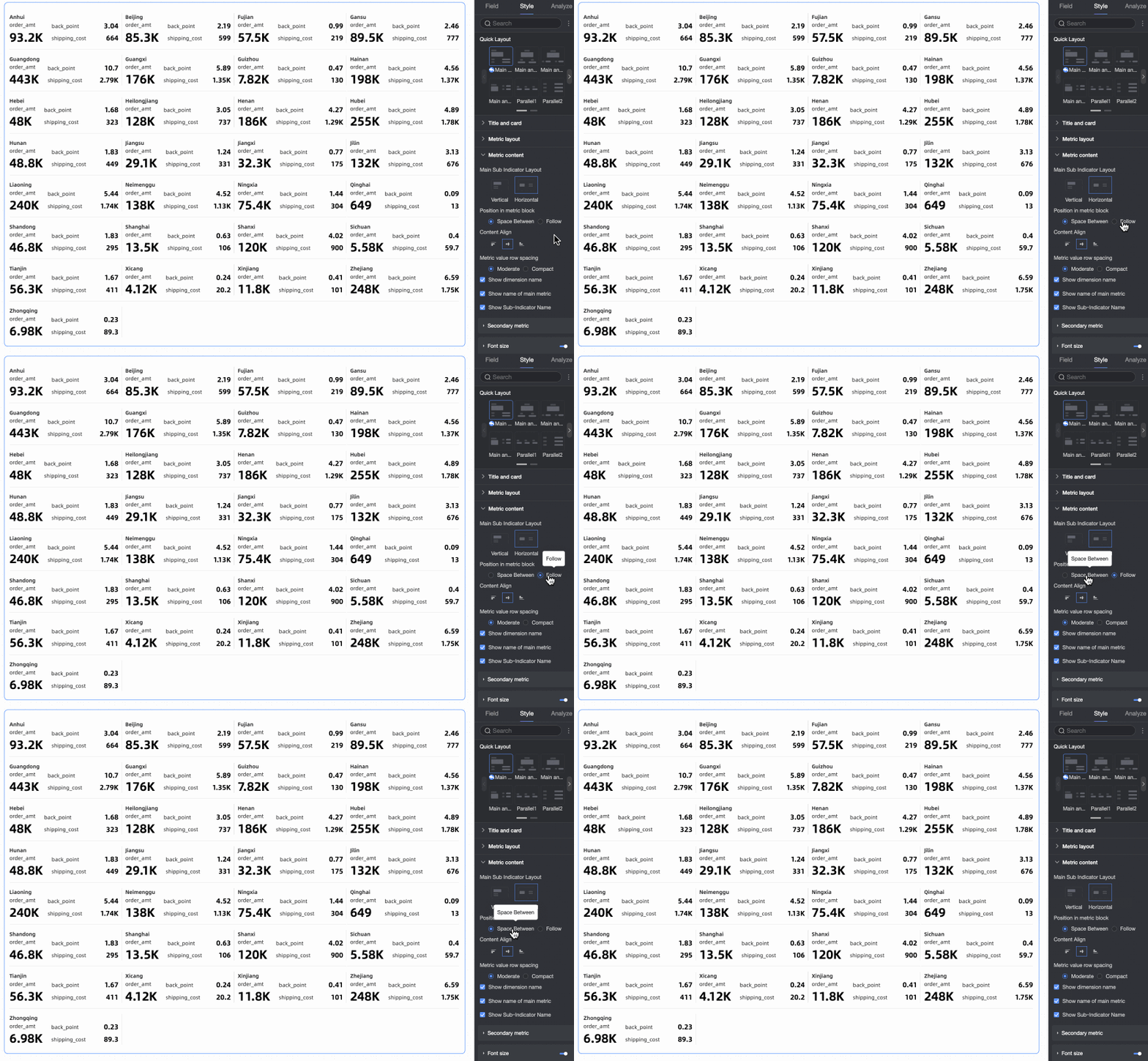
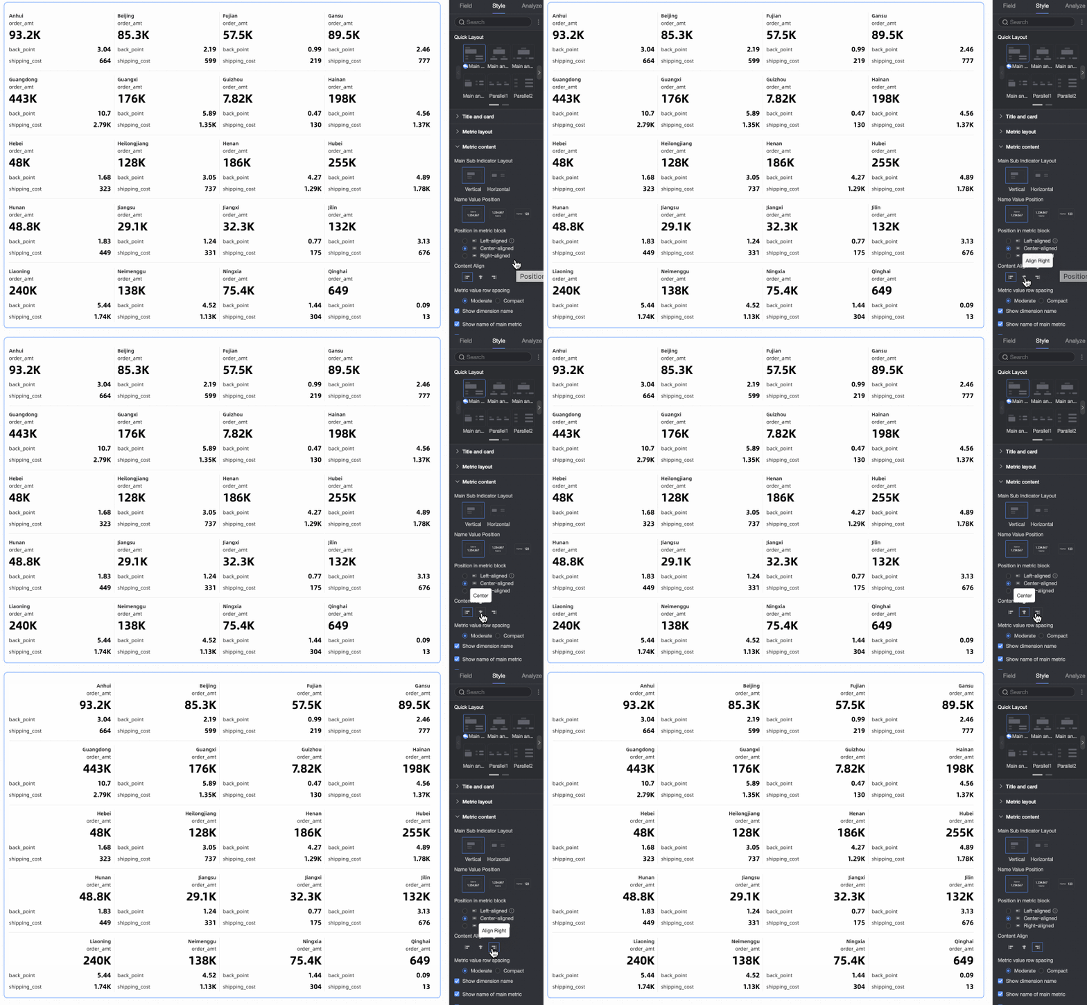
Content position in metric block |
Set where content appears inside the metric block:
|
|
Text alignment |
Set text alignment inside the metric block: Top-aligned, Center-aligned, or Bottom-aligned. |
|
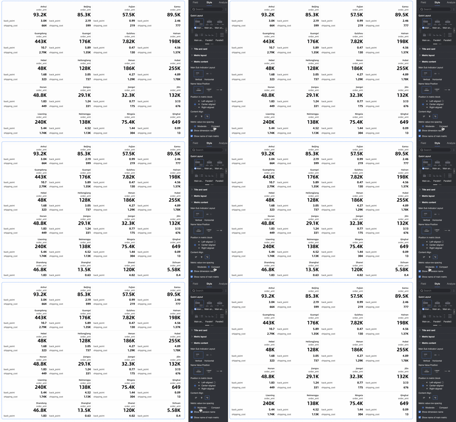
Line spacing for metric values |
Choose Medium or Compact. |
|
Show dimension name |
Show or hide the dimension name on the scorecard. |
|
Show primary metric name |
Show or hide the primary metric name. Applies only to Primary and secondary templates. |
|
Show secondary metric name |
Show or hide secondary metric names. Applies only to Primary and secondary templates. |
|
Secondary metric |
When using a Primary and secondary template, set the layout style for secondary metrics inside the metric block. |
|
Font size |
Turn font size settings on or off. When on, set font styles for dimensions and metrics. |
|
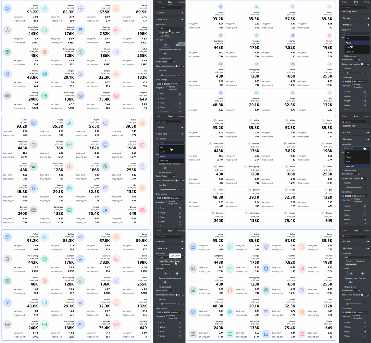
Customized Metric Graph |
Enable the metric modifier graph to configure its position, color scheme, type, and graph style.
|


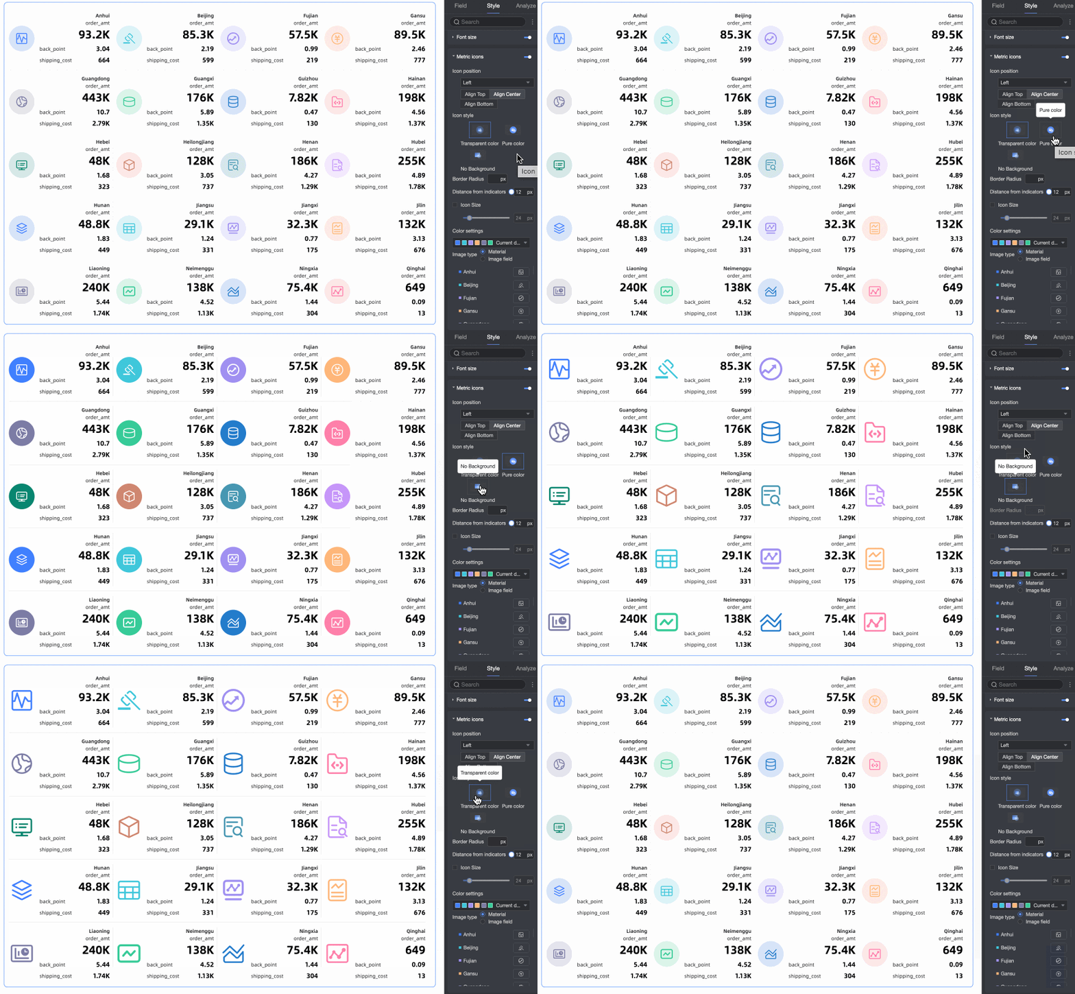
 ).
).
Series Settings
Set the series and add a prefix or suffix for metric values.
|
Setting |
Description |
|
Select field |
Select a measure added to the Metrics (Mea.) section. |
|
Prefix and suffix for metric value |
Set the prefix and suffix for metric values.
|

Conditional Formatting
In Conditional formatting, set conditional formats for measures.
|
Setting |
Description |
|
Select field |
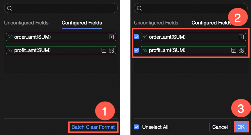
Select a measure from the Metrics (Mea.) section to apply conditional formatting. To clear unwanted formats, click Clear formats in the lower-right corner of the field panel, select the formats to remove, and click OK. |
|
Quick style |
Apply a preset style to set marker icons or font colors for the current measure.
|
|
Custom style |
Define custom styles beyond the preset options.
|
|
Synchronize style to |
Apply the current conditional formatting to other measures. |
|
Icon position |
When you use an icon-based style, set the icon position: Right or Left. |
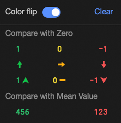

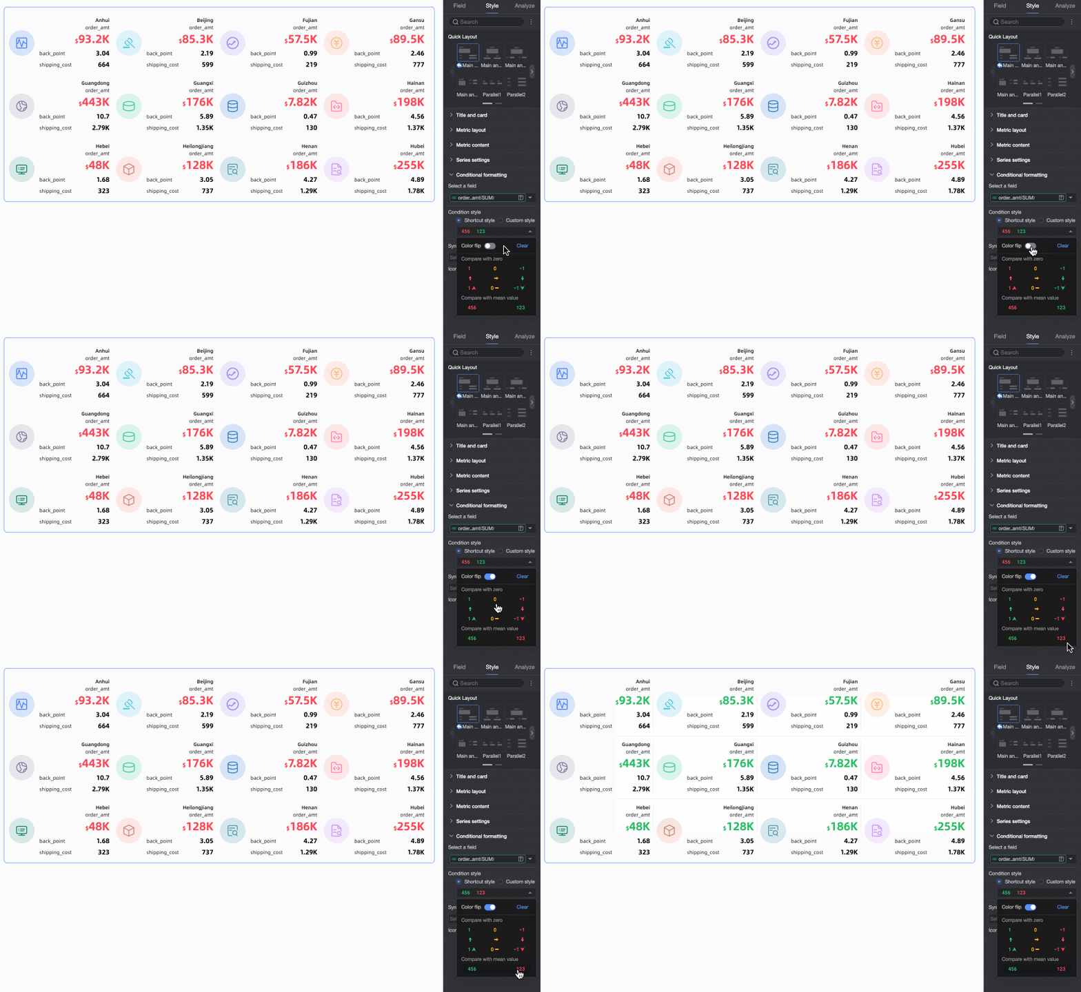

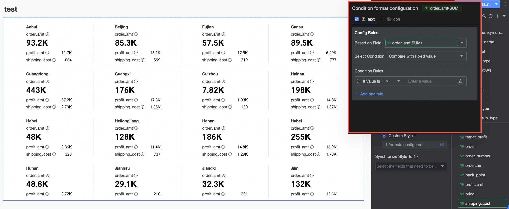 Configure these items:
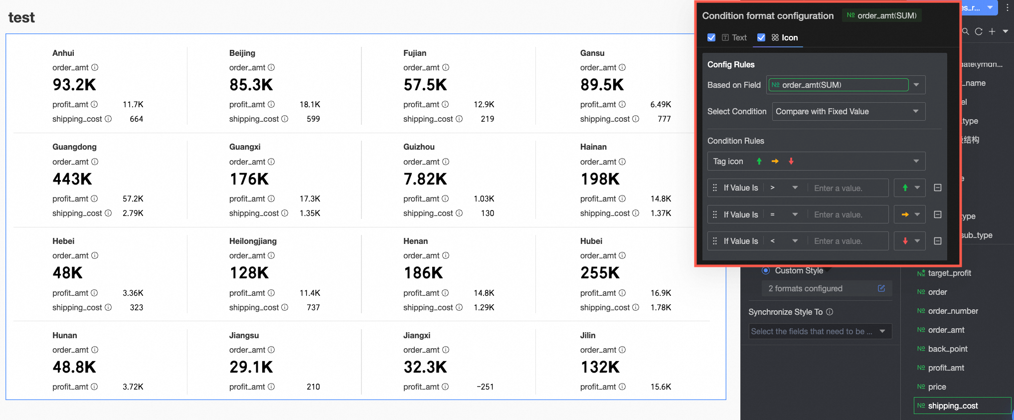 Configure these items: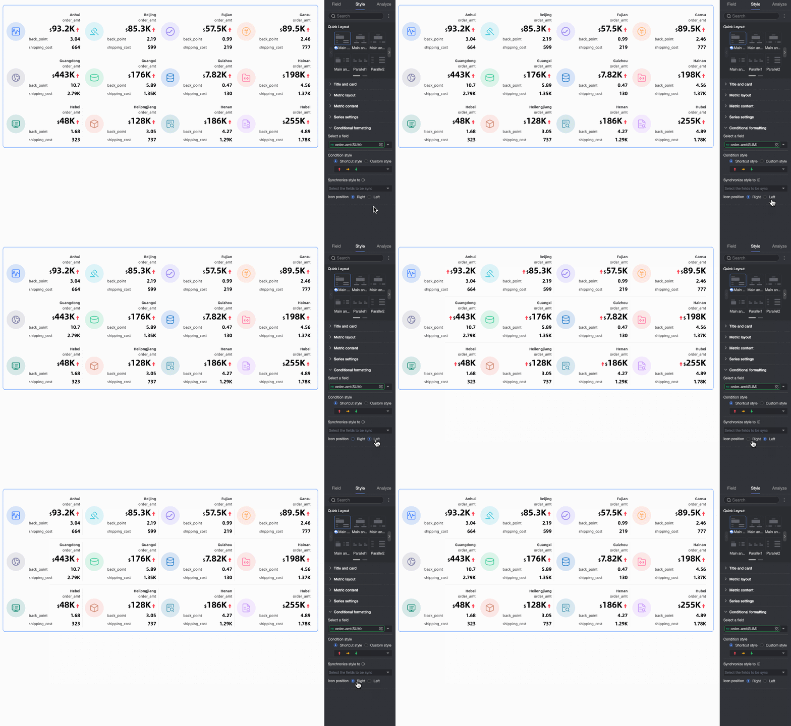
Chart Analysis Configuration
|
Configuration item |
Name |
Description |
|
Data interaction |
Filter interaction |
Link multiple charts for unified analysis with filter interaction. |
|
Go To |
Link dashboards with hyperlinks for unified analysis. Choose Parameter or External link. For more information, see Redirection. |
What to do next
-
Share the dashboard with others. For more information, see Share a dashboard.
-
Build a topic-specific analysis dashboard with navigation menus and integrate it into the BI portal.
FAQ
1. When should I use a scorecard?
Answer: Use a scorecard for a quick overview of core business metrics (total sales, user count, profit margin) at the top of a dashboard, or to show multiple key metrics across a single dimension such as region or product line.
2. How do I make the Sales metric stand out in the card?
Answer: On the Field tab, drag Sales to the first position in Metrics (Mea.) to make it the primary metric. Then on the Style tab, under Quick layout, select a Primary and secondary template, which uses larger fonts or more prominent placement for the primary metric.
3. How do I show an upward arrow (if the metric increases) or downward arrow (if it decreases) next to the metric value?
Answer: Use Conditional formatting. On the Style tab, in Conditional formatting, select your metric. Under Custom style > Icon, add rules — for example, a green upward arrow when [metric] > 0 and a red downward arrow when [metric] < 0. Use built-in icons or upload your own.
4. What does Labels (Dim.) do in a scorecard?
Answer: Labels (Dim.) sets the grouping dimension. For example, adding the Region dimension displays one set of metric cards per region or lists regions within a single card. Without a dimension, the scorecard shows aggregated metrics for all data.
5. How do I add units like “ten thousand USD” or “%” to metric values?
Answer: On the Style tab, go to Series settings. Select your metric from Select field, then enter your unit (such as “ten thousand USD” or “%”) in the Suffix box under Prefix and suffix for metric value.