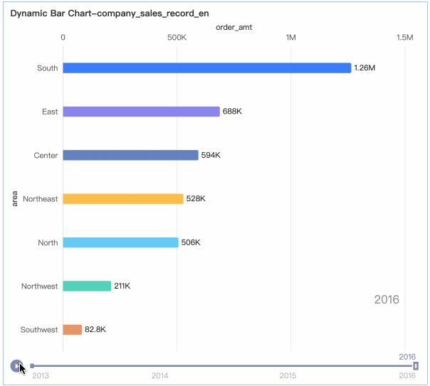
Dynamic bar charts animate top-ranked bars over time. Add data and configure styles to visualize ranking changes across time periods.
Prerequisites
A dashboard is created. Create a Dashboard.
Chart Overview
Scenarios
Visualize ranked data changes over time with animated playback. Example: track top sales ranking shifts over a period.
Benefits
-
Visualization: Animate data playback along a timeline.
-
Annotation: Add metric annotations, endnotes, and jump links to external systems.
Example
Limits
A dynamic bar chart consists of Value Axis/Measure, Category/Dimension, and Playback Axis/Time Dimension:
-
Value axis: one measure maximum (e.g., order amount).
-
Category: one dimension maximum (e.g., province or product type).
-
Playback axis: exactly one dimension with date information (e.g., order date).
-
Maximum 20 data entries.
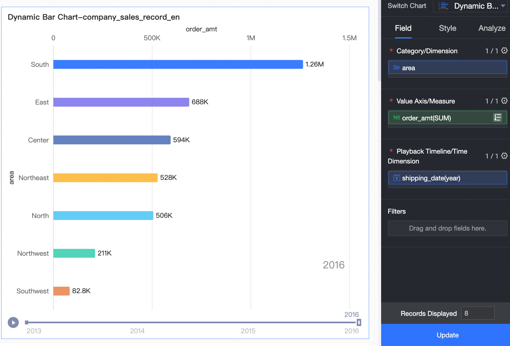
Configure Chart Data
-
Select the required dimension and measure fields.
-
In the Measures list, find Order amount. Double-click or drag it to the Value Axis/Measure area.
-
In the Dimensions list, find Region. Double-click or drag it to the Category/Dimension area.
-
In the Dimensions list, find Order date (year). Double-click or drag it to the Playback Axis/Time Dimension area.
-
-
Click Update to refresh the chart.
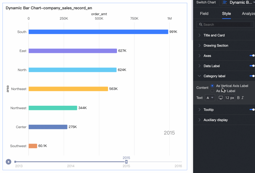
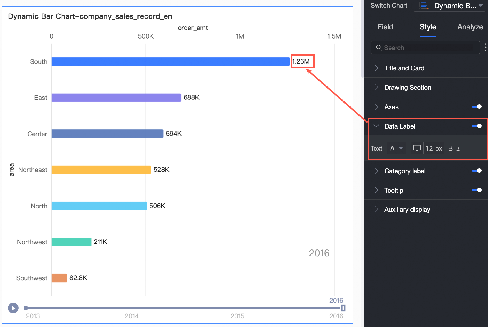
Configure Chart Style
-
Configure styling for dynamic bar charts below. For chart title and card styling, see Configure the chart title.
On the Style tab, go to Style Configuration to configure the chart style.
Chart Configuration Item
Parameter descriptions
Category Label
Set Category Label position: Vertical Axis Label or On Bar. Adjust text style.
Show Data Labels
Toggle Show Data Labels and configure label text style.
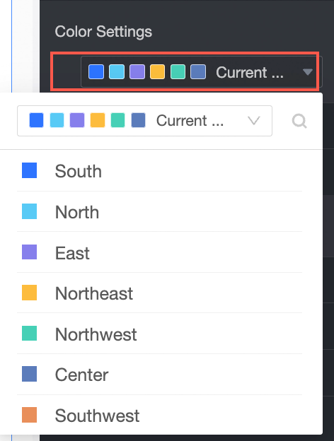
Data Color Scheme
Set the chart color scheme. Customize colors for each field.
-
In Feature Configuration, set Playback Axis.
Name
Configuration Item
Playback Settings
-
Autoplay when page loads: The chart plays automatically when the dashboard loads.
-
Loop playback: The chart replays continuously.
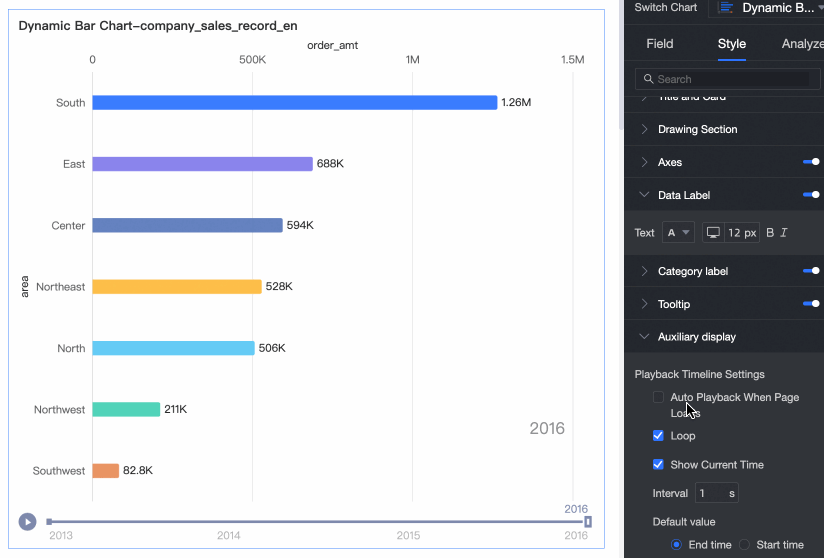
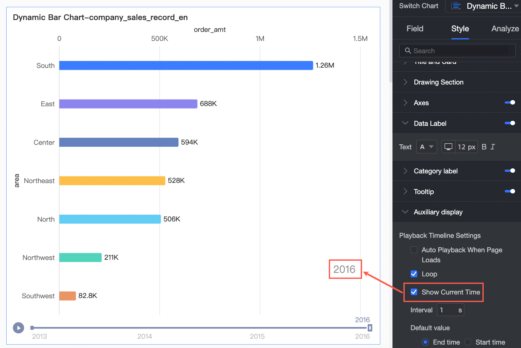
Show Current Time Value
Displays data for the current year on the chart.
-
-
In Axis, set the axis style.
Name
Configuration Item
Description
Bottom X-axis
Axis Title
Set the title for the X-Axis.
Unit
Set the unit for the X-Axis.
Minimum and Maximum
Display the minimum and maximum values for the X-Axis.
NoteSelect Auto for intelligent axis range. Clear Auto to set values manually.
Auto Magnify Value Differences
Automatically magnify value differences on the X-Axis.
NoteIf you select this option, the Minimum and Maximum values on the axis use actual values.
Show Title and Unit
Show or hide the Axis Title and Unit on the horizontal axis.
Y-Axis
Axis Title
Set the title for the Y-Axis.
Unit
Set the unit for the Y-Axis.
Show Title and Unit
Show or hide the Axis Title and Unit on the Y-axis.
Configure Chart Analysis
|
Configuration Item |
Name |
Description |
|
Data Interaction |
Filter Interaction |
Associate multiple charts for cross-chart data analysis. Filter interaction. |
|
Analysis Alert |
Auxiliary Line |
Shows the difference between a measure value and a reference value (fixed, average, maximum, minimum, or median). Auxiliary Lines. |
Next steps
-
Share the dashboard with specific people. Share a Dashboard.
-
Integrate dashboards into a BI portal for navigation-based thematic analysis. Create a BI portal for PC.