A cross table groups data into rows and columns. Each intersection cell displays an aggregate value such as SUM, AVG, COUNT, MAX, or MIN. Learn how to add data and configure styles for a cross table.
Overview
-
Use Cases
-
Multidimensional analysis: Analyze relationships between dimensions such as province, product type, and profit.
-
Decision support: Compare measures such as order amount and shipping cost to support business decisions.
-
Complex calculations: For scenarios requiring quick access to period-over-period comparisons, cumulative calculations, or percentage rankings.
-
-
Benefits
-
Calculation capabilities: One-click advanced calculations including period-over-period comparison, cumulative calculation, percentage, ranking, Top N, percentile, and grand total/subtotal.
-
Visual customization: Customize table theme, tree display, freezing, auto line wrap, and column width.
-
Remarks: Add custom remarks and endnotes using text or measures, and define external links for data interaction with other systems.
-
Events: Use events for data feedback and submission.
-
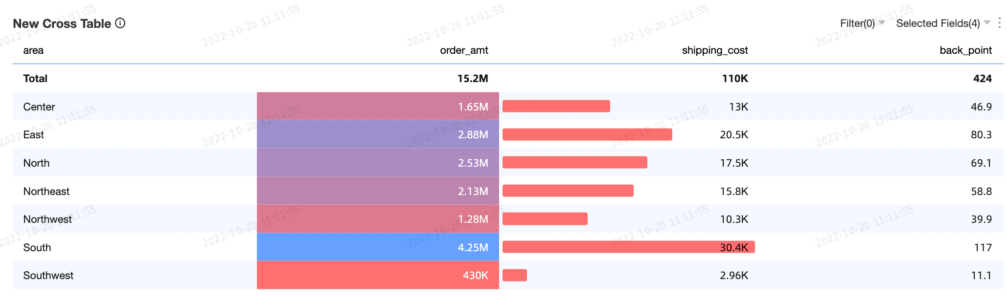
Conditional formatting: Improve data readability with formats such as font colors, background colors, icons, color scales, and data bars.
-
Interactive operations: Perform tasks such as dimension/measure filtering and in-table filtering.
-
-
Example
Limitations
-
Prerequisites: You have created a dashboard. Create a dashboard.
-
A cross table consists of Rows and Columns:
-
Rows are determined by data dimensions, such as province and product type.
-
Columns are determined by data measures, such as order quantity and profit amount.
NoteA cross table can have an unlimited number of dimensions and measures.
You can export up to 10,000 rows from a cross table. Export time depends on your computer configuration and data volume. Exporting Data.
-
Configure Chart Data
Add dimension and measure fields to the rows and columns of a cross table.
-
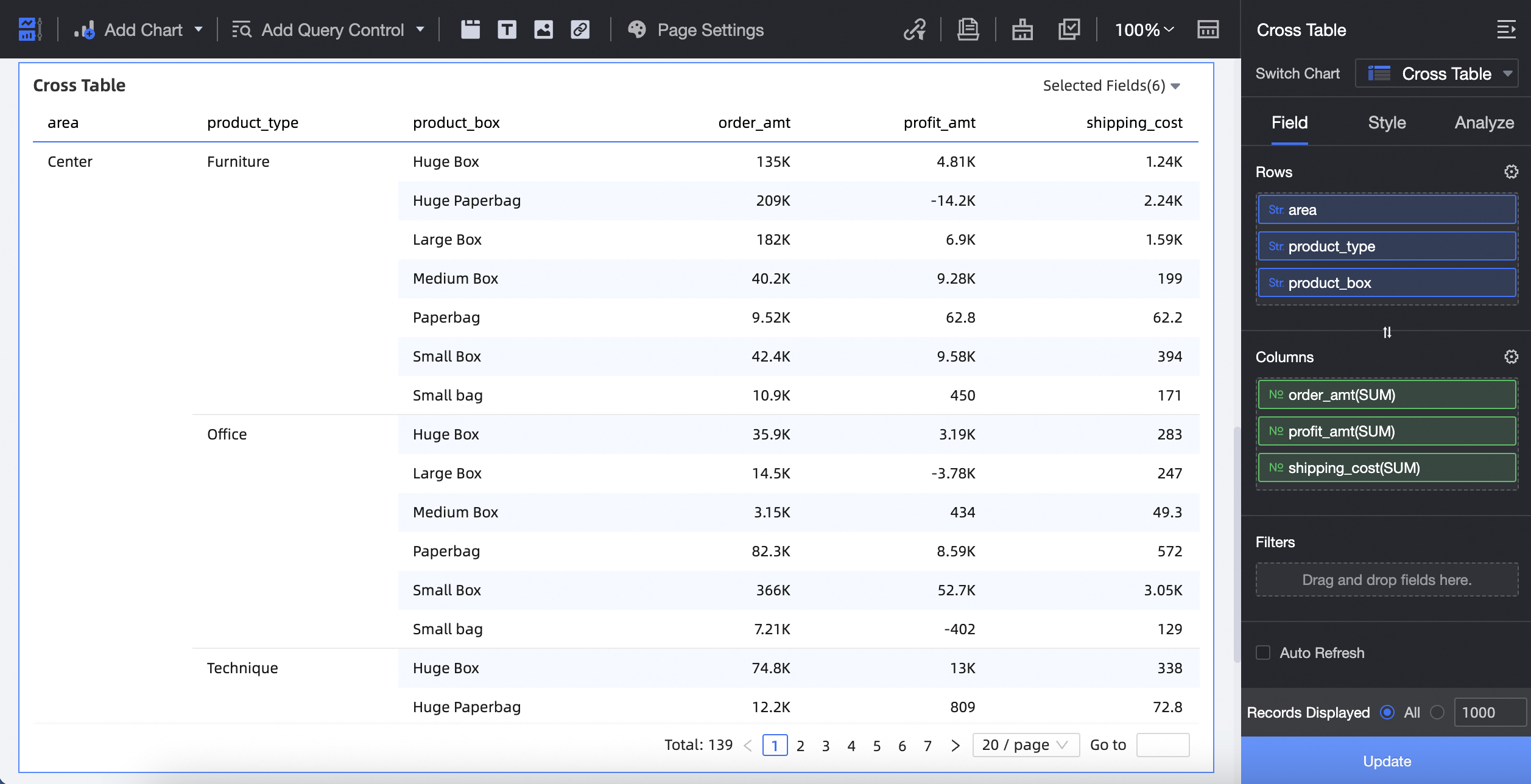
To add dimension fields to Rows and measure fields to Columns:
-
On the Data tab, select the dimension and measure fields:
-
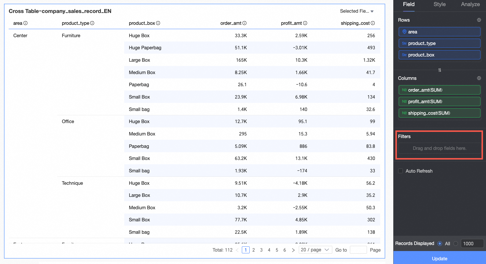
In the Dimensions list, double-click or drag area, product_type, and product_box to the Rows area.
-
In the Measures list, double-click or drag order amount, shipping cost, and profit amount to the Columns area.
-
-
Click Update. The chart updates automatically.
-
-
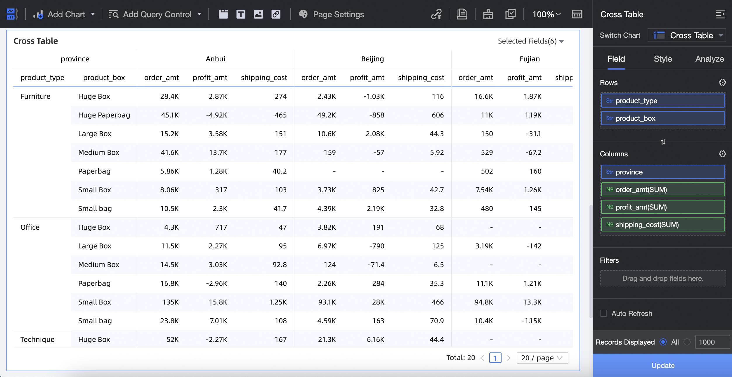
To add dimension fields to Rows and add both measure and dimension fields to Columns:
-
On the Data tab, select the dimension and measure fields:
-
In the Dimensions list, double-click or drag product_type and product_box to the Rows area.
-
In the Dimensions list, drag province to the Columns area.
-
In the Measures list, double-click or drag order amount, shipping cost, and profit amount to the Columns area.
-
-
Click Update. The chart updates automatically.
-
-
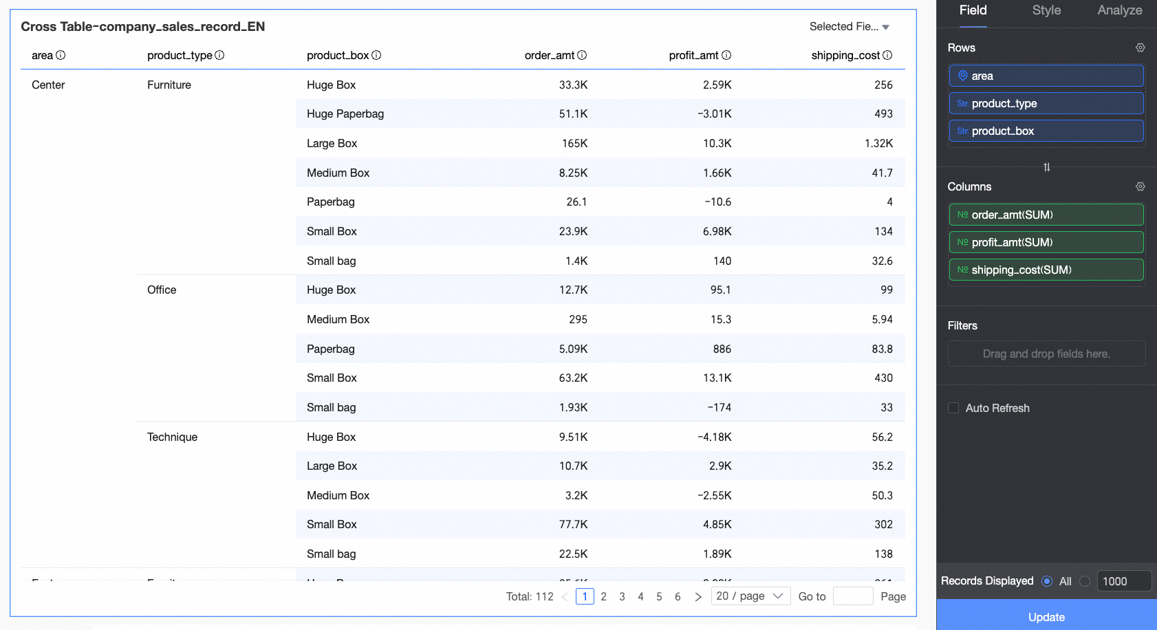
To add measure fields to Rows and dimension fields to Columns:
-
On the Data tab, select the dimension and measure fields:
-
In the Dimensions list, drag area, province, and product_type to the Columns area.
-
In the Measures list, drag order amount, shipping cost, and profit amount to the Rows area.
-
-
Click Update. The chart updates automatically.
-
-
You can add an unlimited number of dimension and measure fields to the rows and columns of a cross table.
-
You can export up to 10,000 rows of data from a cross table. Export time depends on your PC configuration and the amount of data. For more information, see Export Data.
-
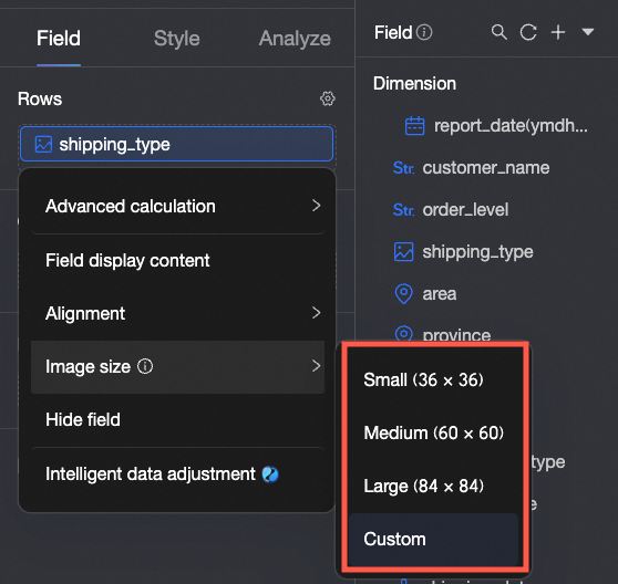
When a field is configured as an image, you can set the display size of the image. On a mobile client, the image width and height default to half the size set on the PC.
-
Set filters in the Filter section. Field Filter.
Data Tab
On the Data tab, you can do the following:
-
Add multiple fields
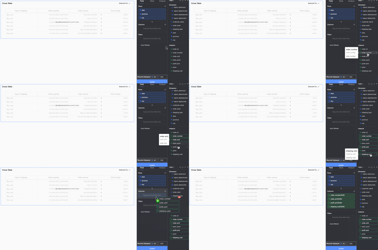
Hold Shift/Command and click the fields you want to add.
-
Hide fields
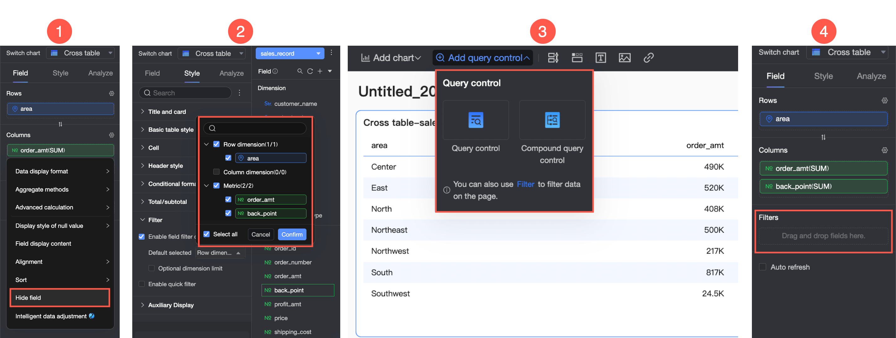
Hide fields in the Rows and Columns sections using one of four methods: ① Hide the measure on the editing page. ② Enable content filtering in the Filter section of the Style panel. ③ Add a query control. ④ Add a filter for the field.
Details:
-
If you hide a measure in the Rows section, it is not displayed in the chart but is still used for grouping and calculations.
-
If you hide a measure in the Columns section, it is not displayed in the chart but is still used to calculate grand totals.
-
-
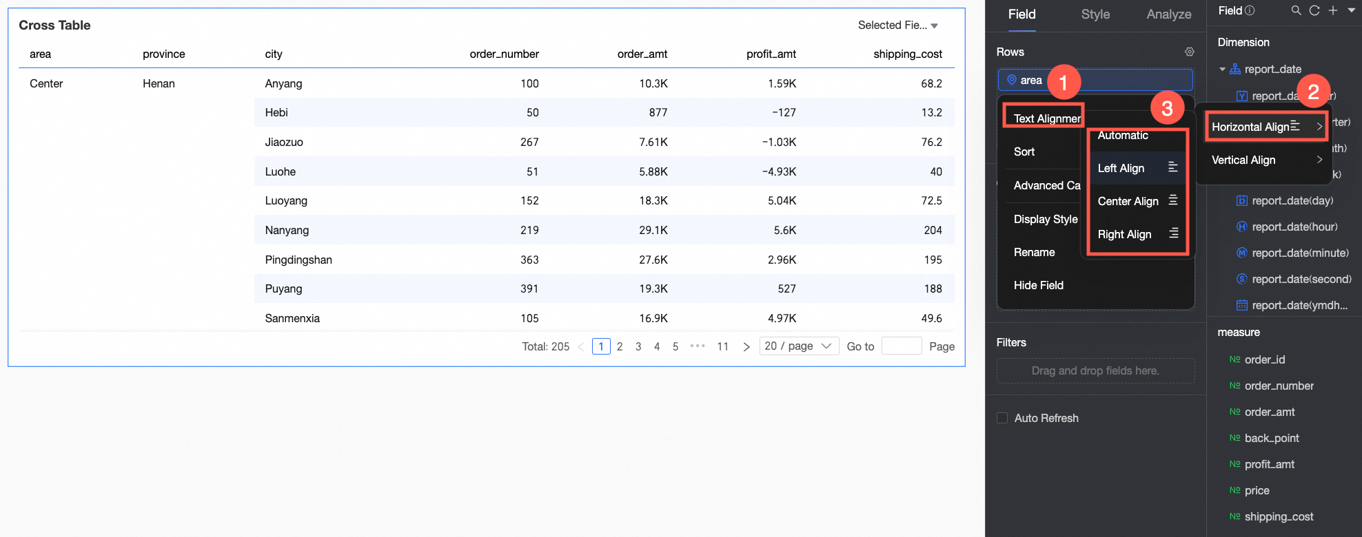
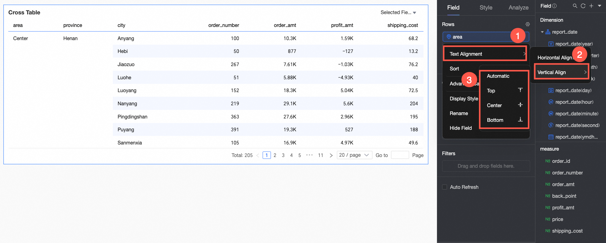
Alignment
-
For horizontal alignment, you can select left, center, right, or auto.
-
For vertical alignment, you can select top, middle, bottom, or auto.
-
To align multiple fields at once, click the
 icon in the field panel. In the field configuration dialog box that appears, select the desired fields and choose an alignment.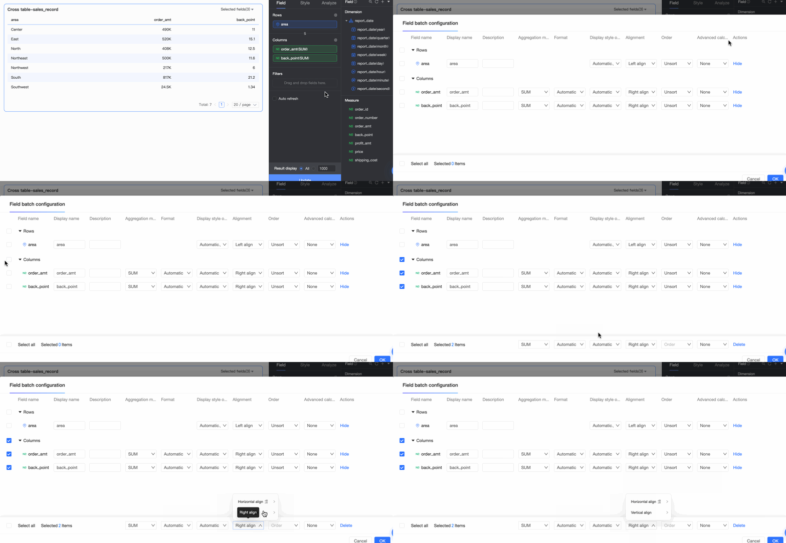
-
-
Sorting
-
Sorting options include No Sort, ascending, descending, ascending in the group, descending in the group, custom order, Sort by Field, and Advanced Sorting. Data Sorting.
-
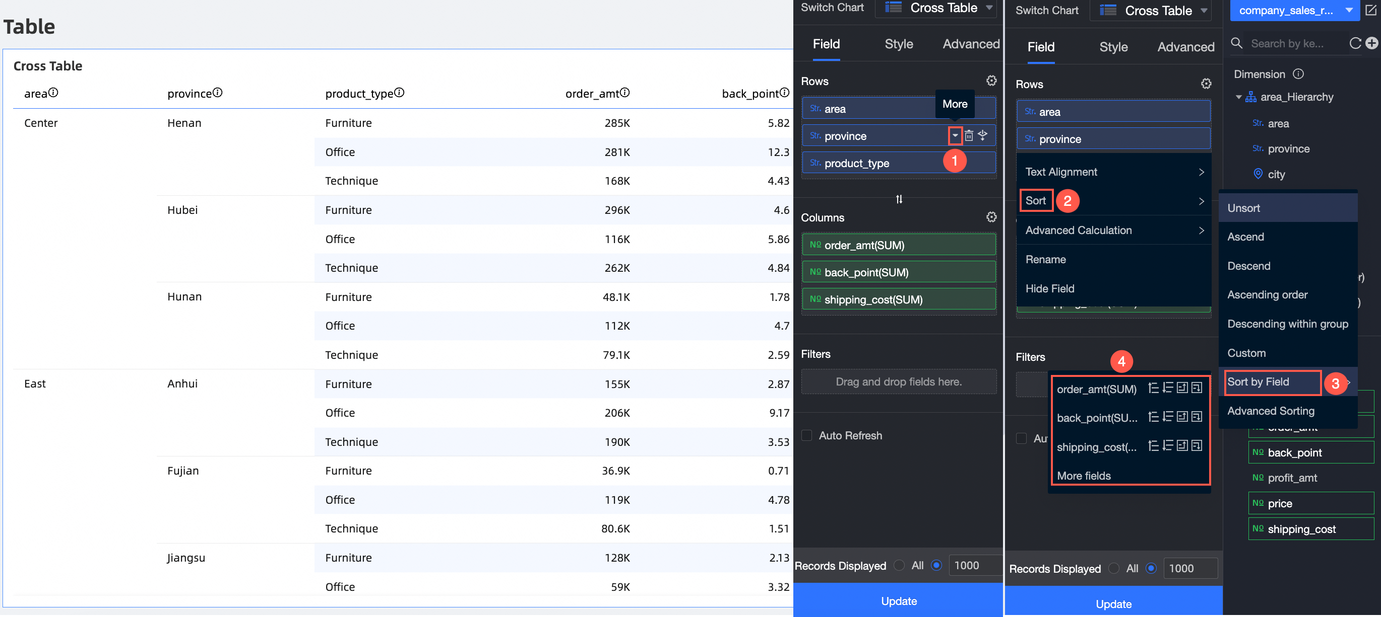
Sort by Field: You can sort a dimension in the Rows section by a measure or another dimension.
-
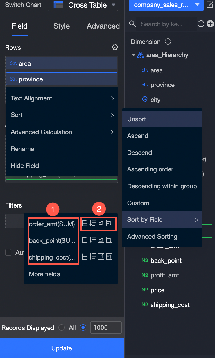
You can sort by a measure that is already on the Data tab.
① Select an added measure.
② Select a sorting method. The options, from left to right, are: ascending, descending, ascending in the group, and descending in the group.
-
You can sort by a measure or dimension from the dataset.
As shown in the following figure, you can sort by profit_amt.
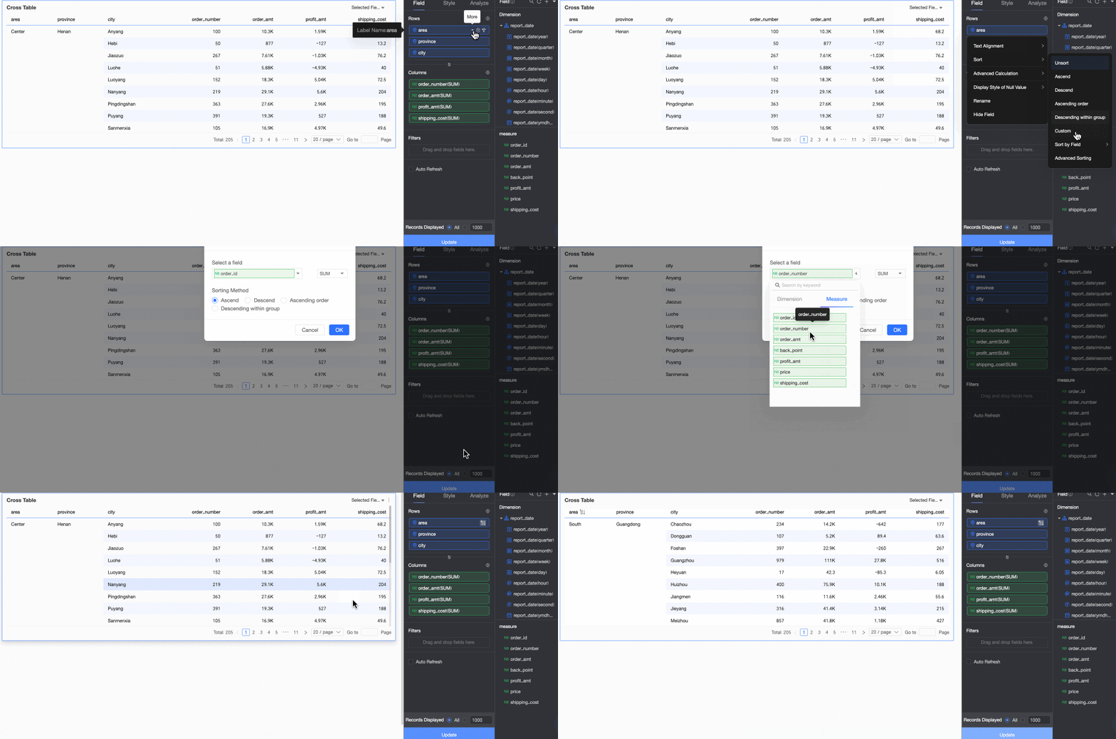
NoteThe Sort by Field option is available only for dimension fields.
-
-
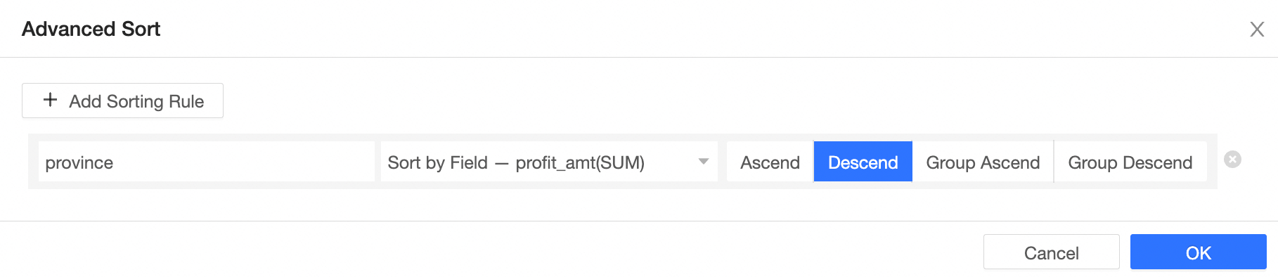
Advanced Sorting: This feature is typically used for aggregate tables and detail tables.
Advanced Sorting is supported for measures in both the Rows and Columns sections.
-
-
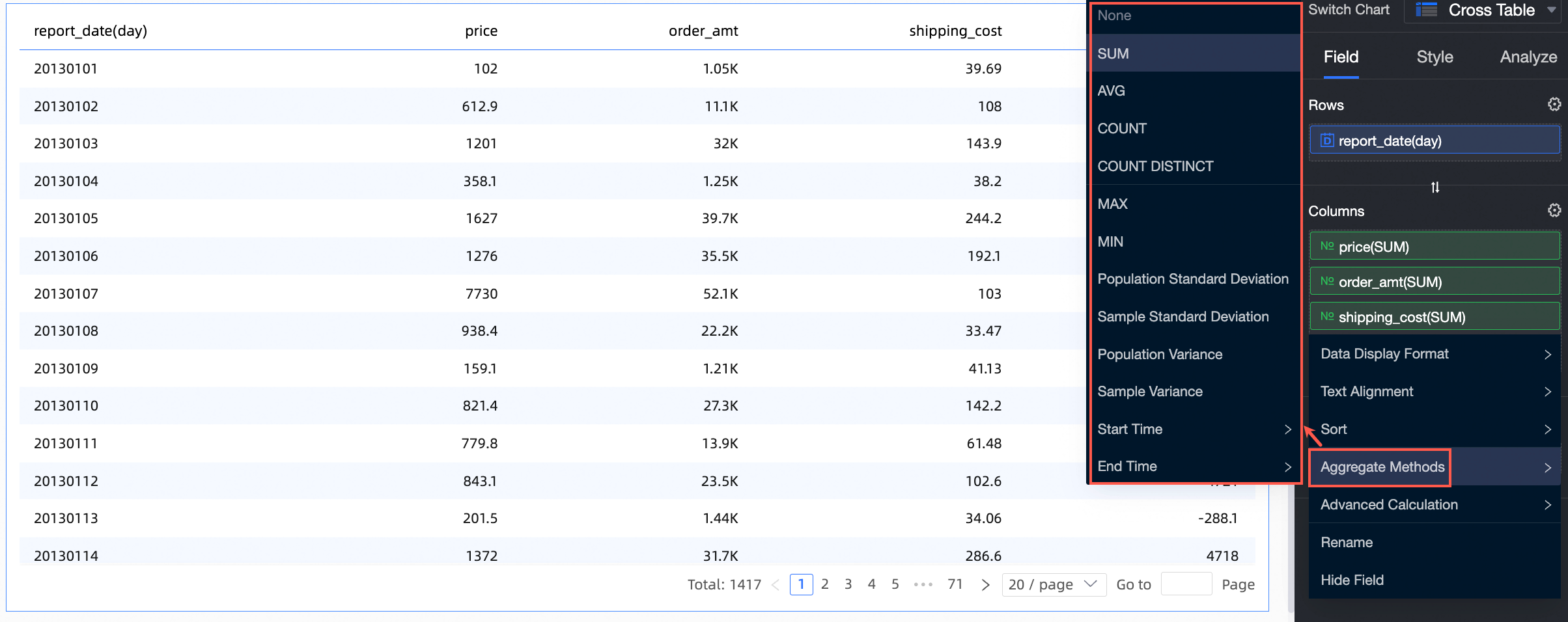
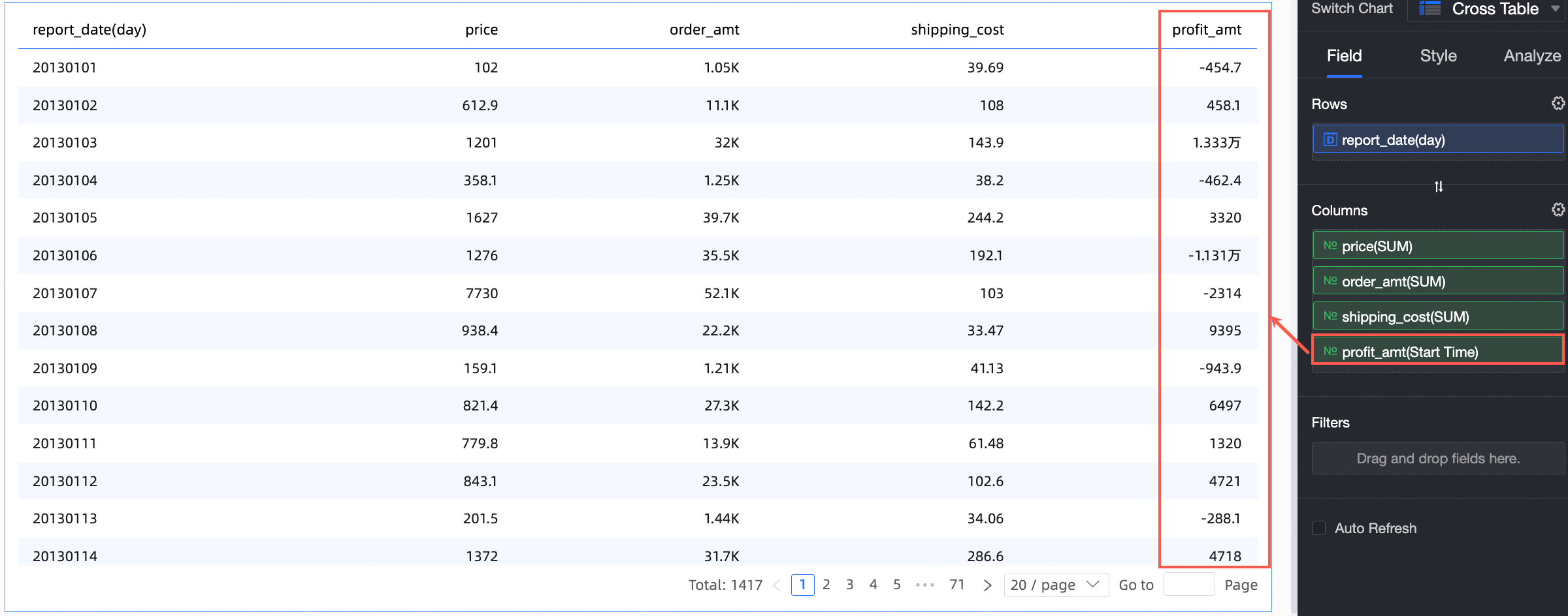
Aggregation: Supported functions include sum, average, count, distinct count, maximum, minimum, population standard deviation, sample standard deviation, population variance, sample variance, start time, and end time.
-
Start time: You can set the aggregation method for a column field to Start time and select a corresponding date field. After configuration, the field displays data corresponding to the start time in the aggregate table.
-
-
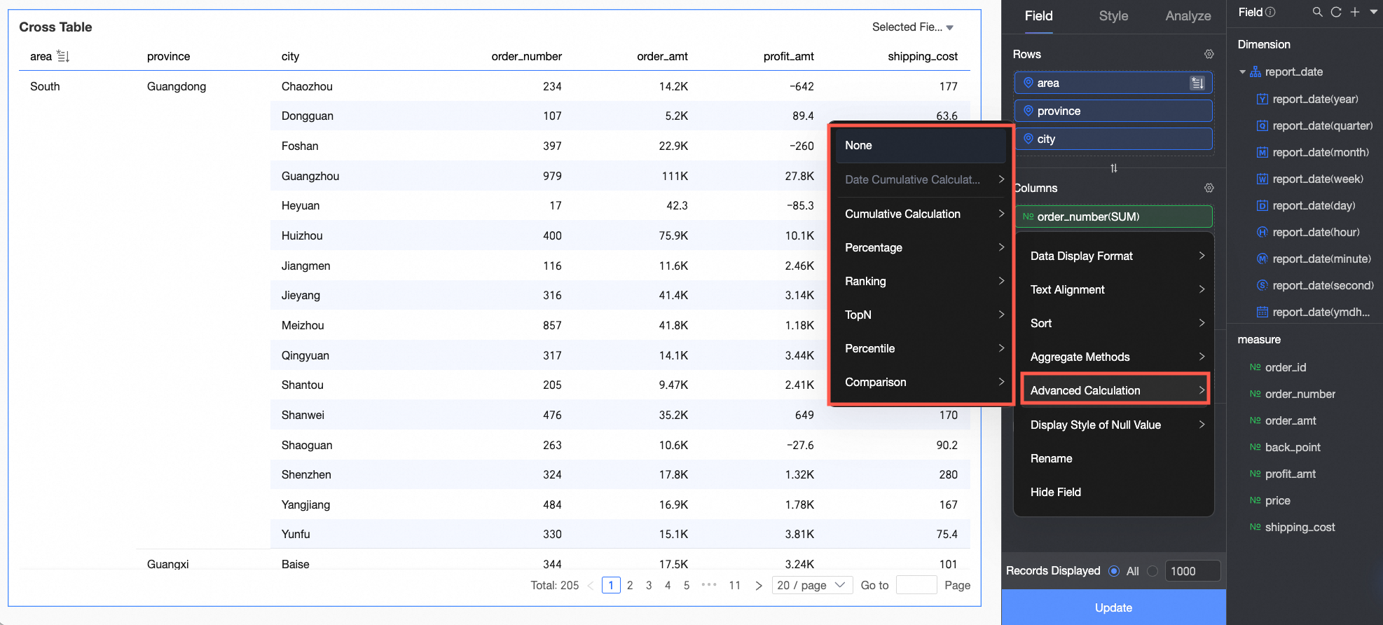
Advanced Calculation: Supported functions include date accumulation, cumulative calculation, percentage, ranking, TopN, percentile, and YoY and MoM comparisons.
-
Date accumulation calculates the running sum from a start date to the current date. Date accumulation.
-
Cumulative calculation computes a running total. Cumulative calculation.
-
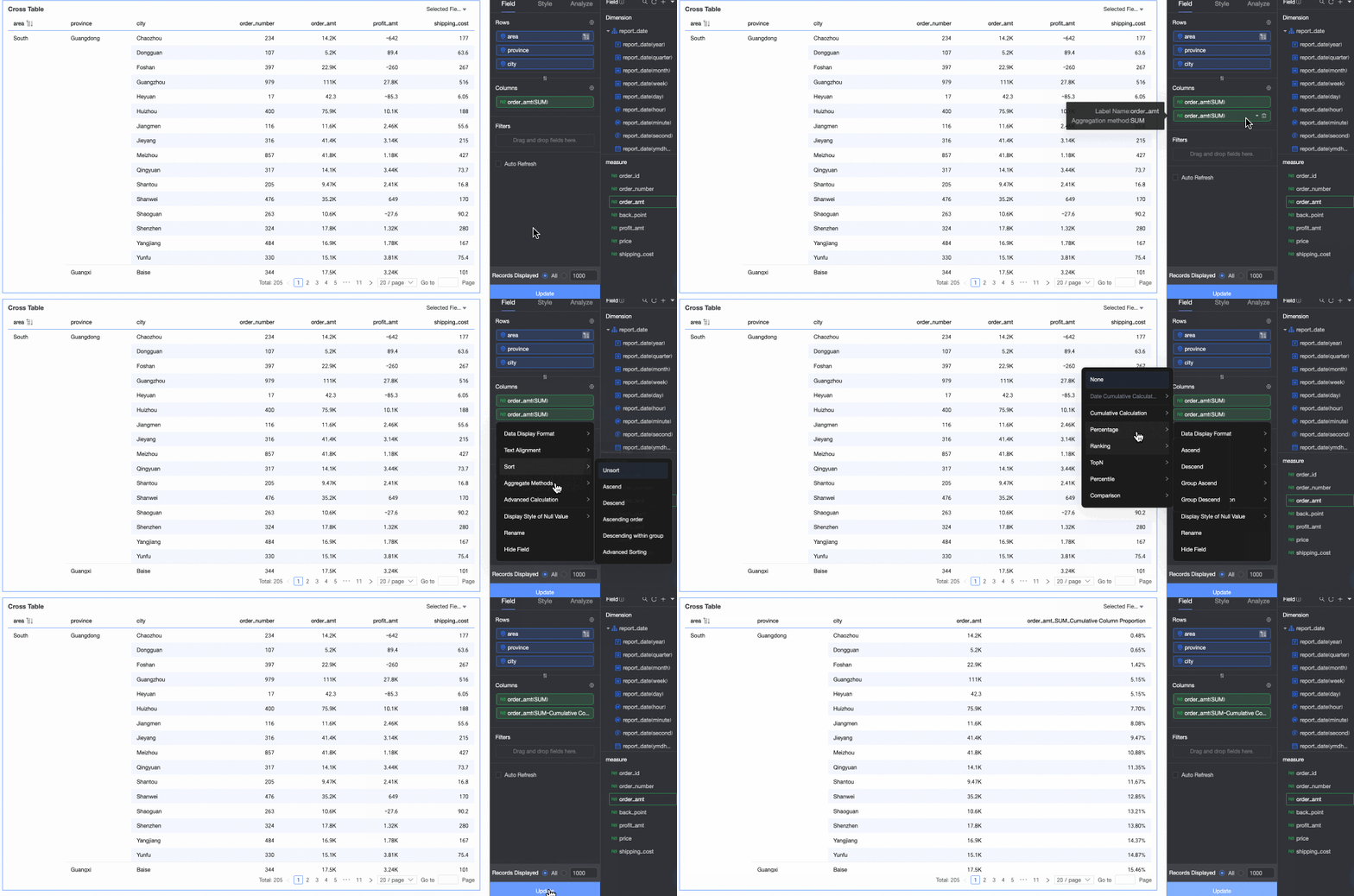
Percentage: You can configure data percentages to view the proportion of each data item.
In this example, the aggregate table shows the percentage of order amounts for each province. The following figure shows the result:
-
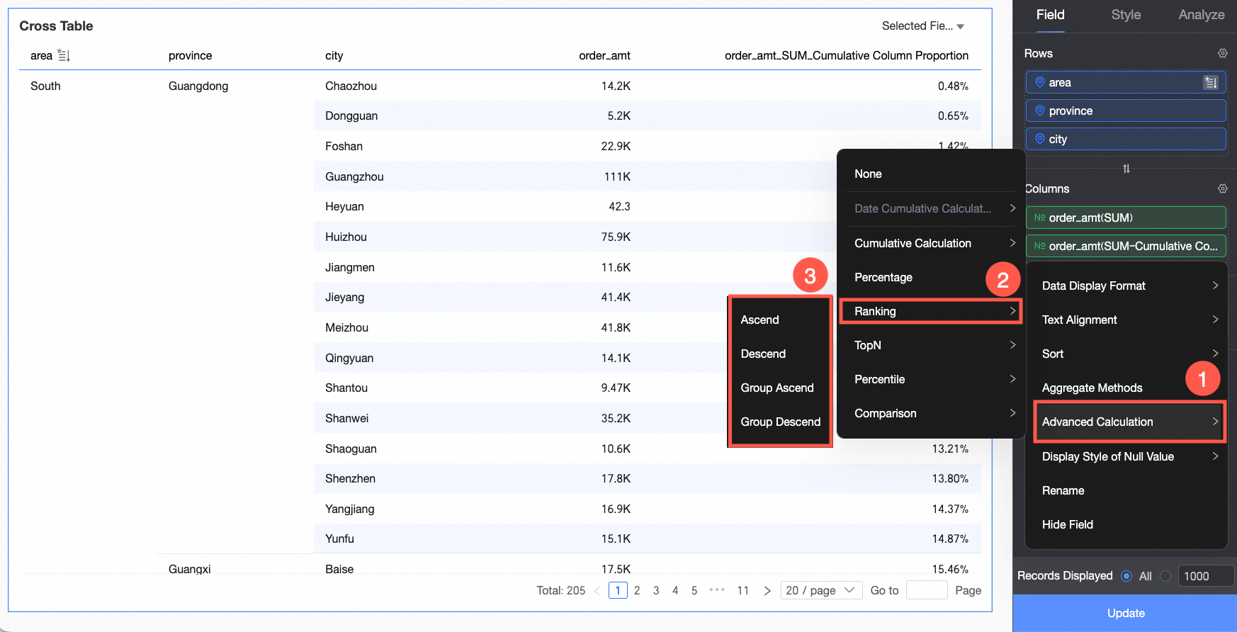
Data ranking: Ranks measures within groups based on their numerical values, to help you compare data.
-
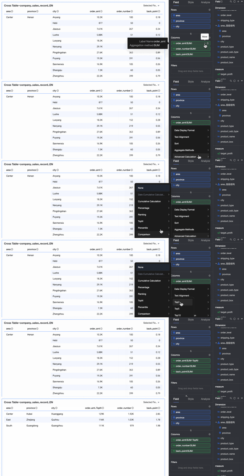
TopN: Displays the top N data entries. For example, selecting Top 5 displays the top 5 data entries. You can also customize the ranking method and the value of N. For more information, see TopN.
-
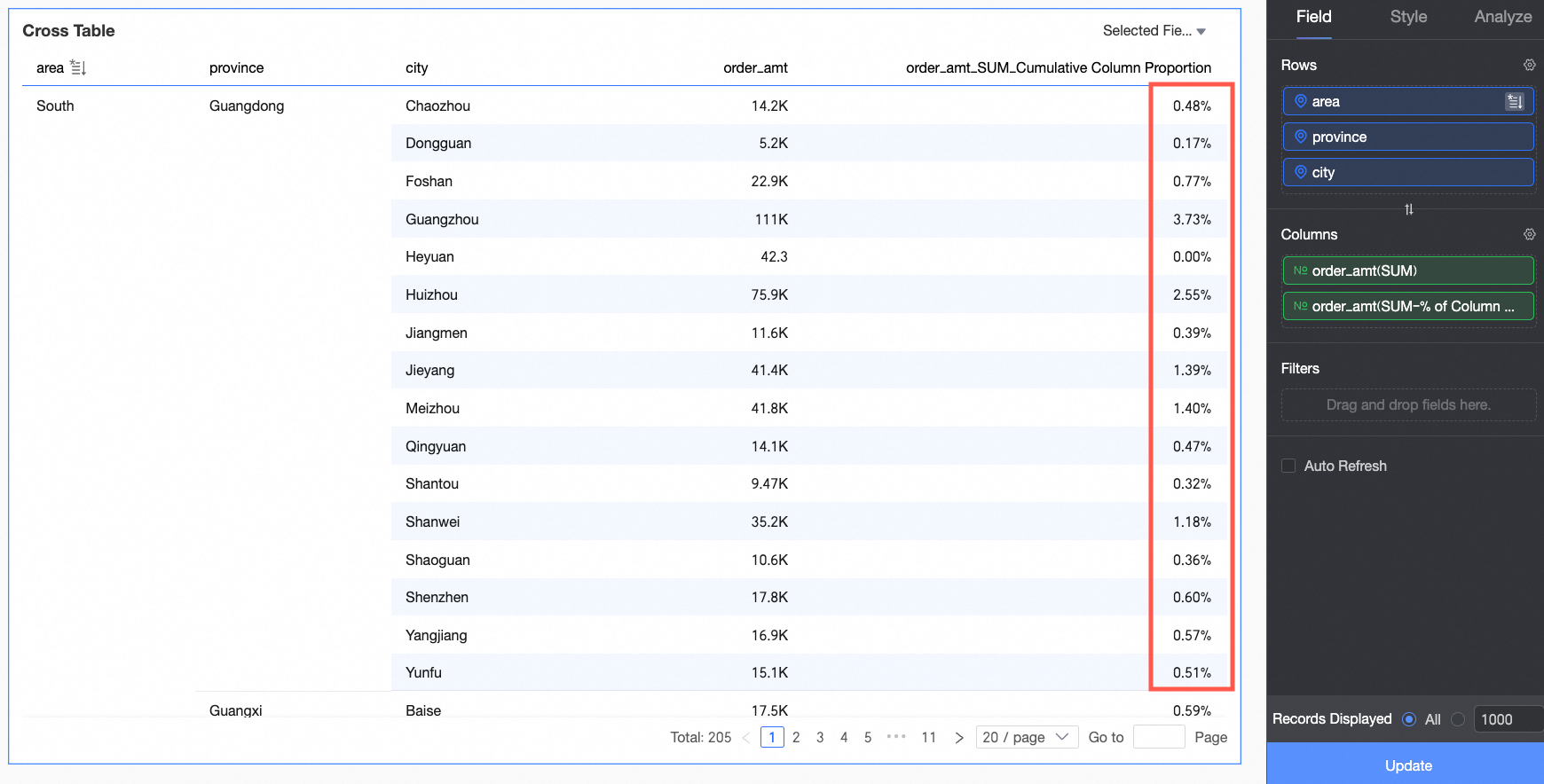
Percentile: Calculates the percentile rank for each data point, showing its position relative to the entire dataset. For more information, see Percentile.
-
YoY and MoM: Configure Year-over-Year (YoY) and Month-over-Month (MoM) comparisons for a measure. YoY and MoM.
NoteWhen you create a calculated field in a dataset, you cannot base it directly on the result of an Advanced Calculation (such as percentage). Instead, you must first write a custom SQL query to produce the desired result, and then create a new field in the dataset that references it.
-
Chart Styles
Configure cross table styles below. General chart style settings are covered in Configure the chart title area.
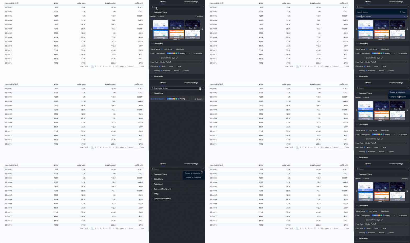
Enter keywords in the search box to find a parameter. Click the  icon on the right to expand or collapse all categories.
-
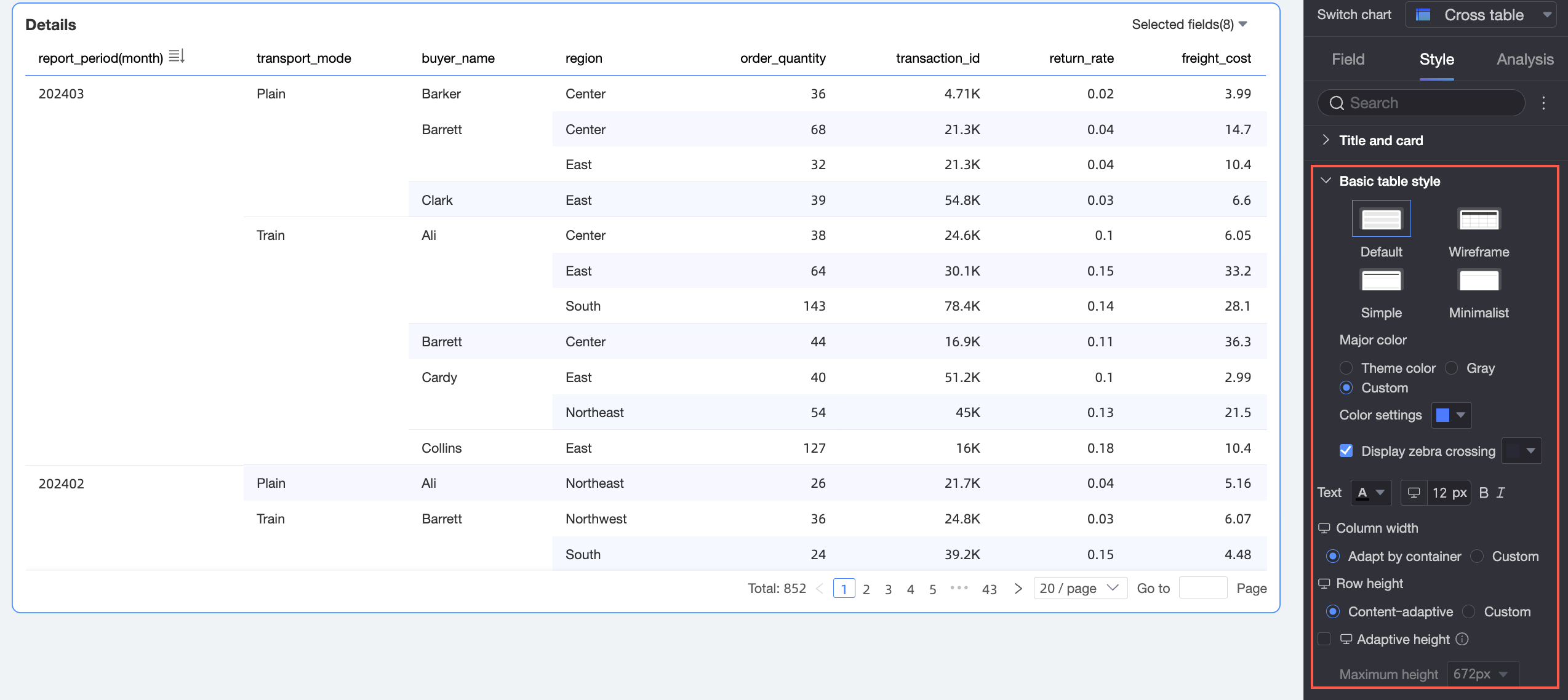
In the Basic table style section, configure the styles for the crosstab.
Parameter
Description
Custom table theme
Set the appearance of the crosstab.
-
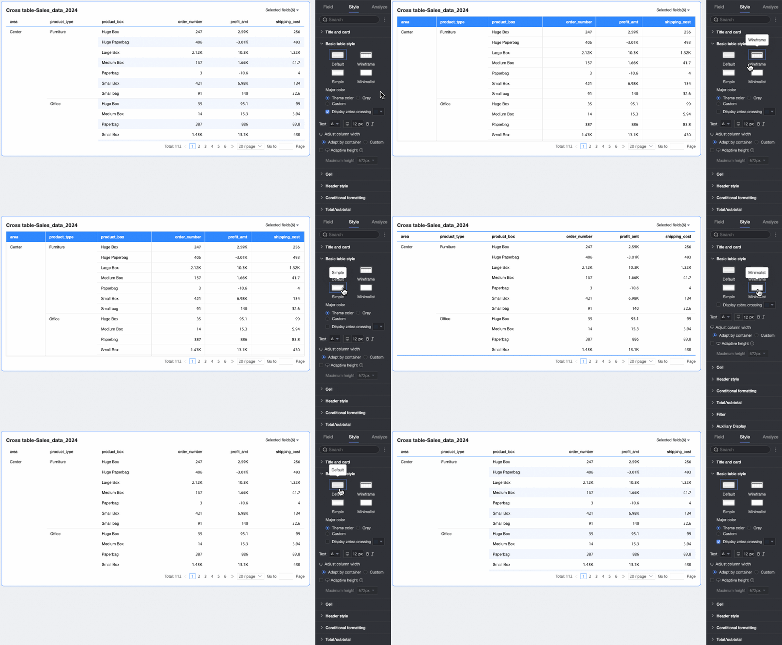
Theme style: Select from four types: Default, Wireframe, Simple, or Minimal.
-
Primary color: When the theme style is set to Default, Wireframe, or Simple, you can select a primary color scheme for the crosstab. The color can be the theme color, gray, or a custom color.

-
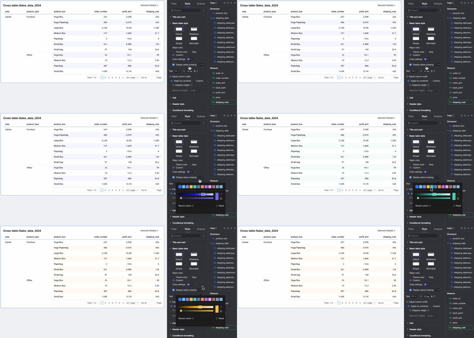
Show zebra stripes: Select whether to show zebra stripes in the crosstab and specify the color of the stripes.
Text
Configure the text style for the crosstab.
Column width, row height
Set the column width and row height for the crosstab. You can choose the adaptive or custom method.
-
Adaptive: Automatically adjusts column width to fit the container and row height to fit cell content. Use this option to adapt the table to different devices and layouts.
-
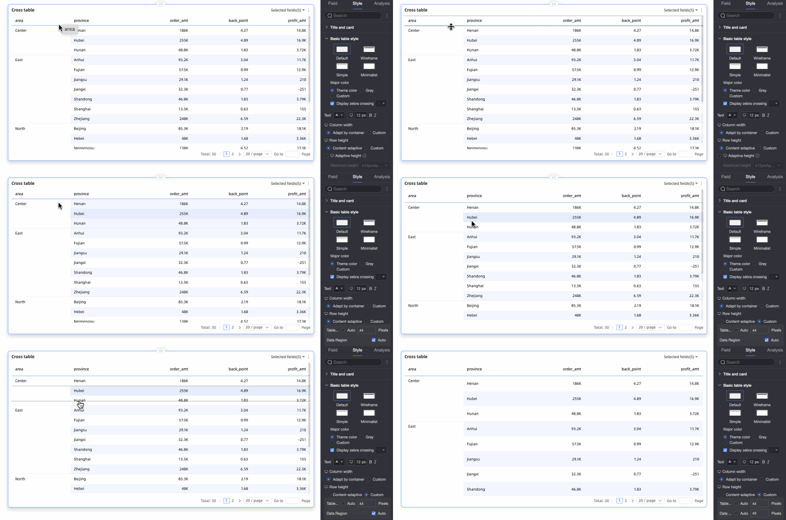
Custom: Specify exact column width and row height values. In custom mode, both default to Auto. Clear Auto to enter pixel values.
To find the right row height, drag a row border to adjust it visually.
Drag borders for header row or data area rows. All rows in that area adjust uniformly, and the height updates in the settings automatically.
 Note
NoteThe column width and row height settings for PC and mobile are independent. You can configure them separately.
Dynamic adaptive table height and maximum height
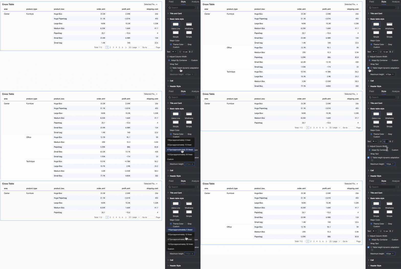
You can set the table height to a fixed height or an adaptive height.
-
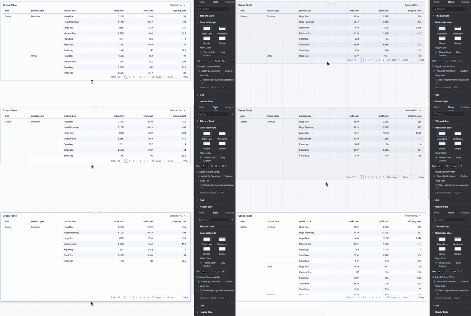
Fixed height: By default, the table height is fixed. You can manually set the height of the table container by dragging its border.
-
Adaptive height: Resizes the container based on content. Set a maximum height to cap the adaptive expansion.
The available maximum height options include: 192px (approx. 5 rows), 352px (approx. 10 rows), 672px (approx. 20 rows), 1632px (approx. 50 rows), and Custom.
Note-
When using Custom row height, you must also set a custom value for Dynamic adaptive table height and specify a maximum height.
-
Click the
 icon at the top of the page to switch between PC and mobile views and configure the adaptive height settings for each.
 -
On mobile devices, dynamic adaptive table height is enabled by default. You can only adjust the maximum height value.
-
This feature may affect the overall layout of the report. Use it with caution.
-
-
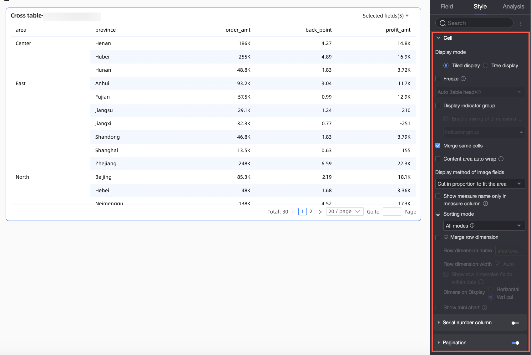
In the Cell section, configure cell display and sorting.
Parameter
Description
Display mode
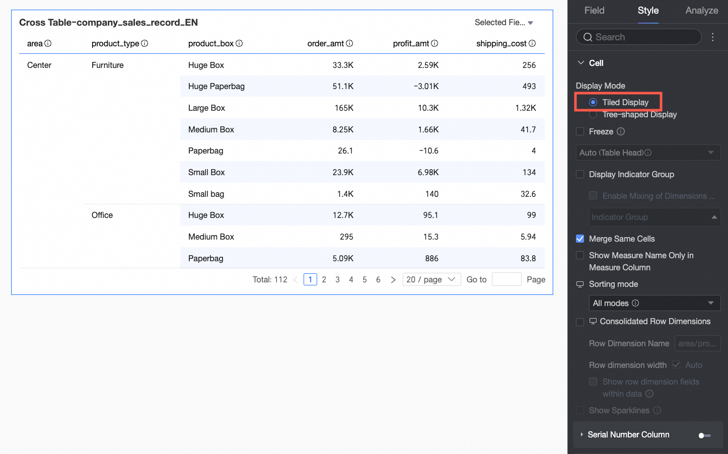
You can select tiled display or tree view.
-
If you select tiled display, the crosstab is displayed in a standard, flat format.
-
If you select tree view, dimension fields are displayed hierarchically.
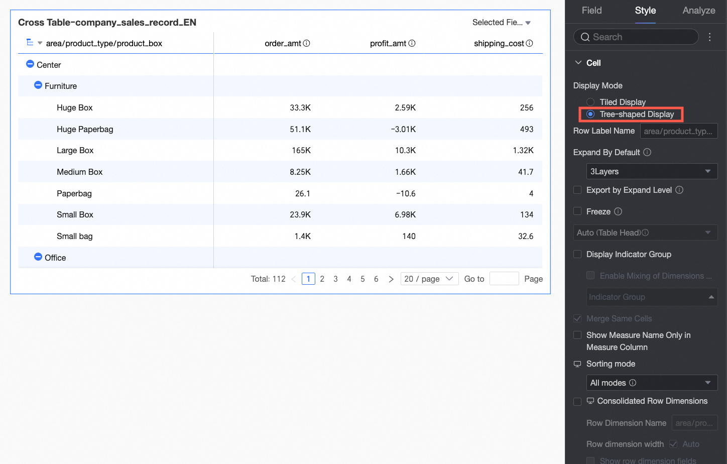
-
You can customize the row label name and display levels.
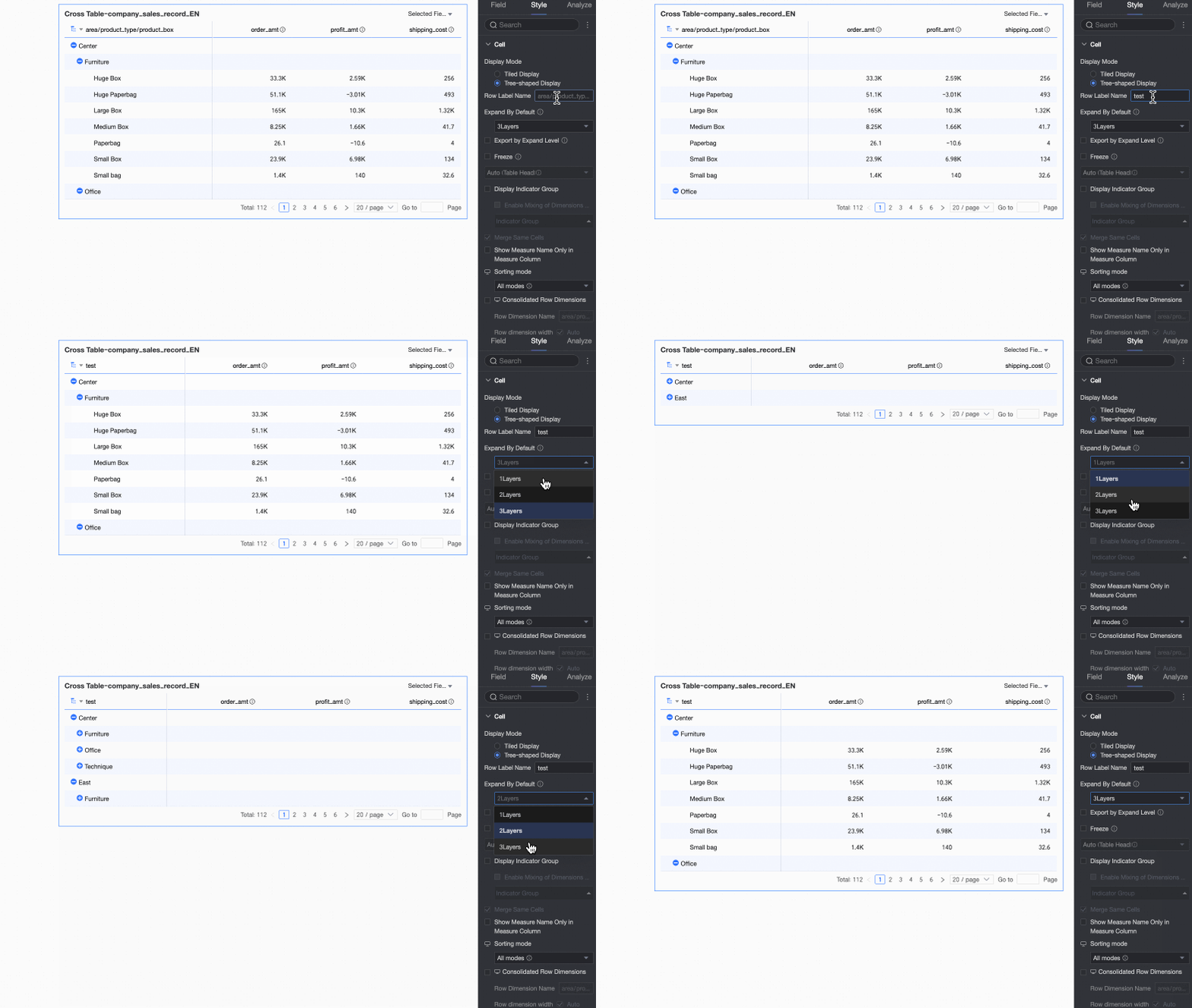
-
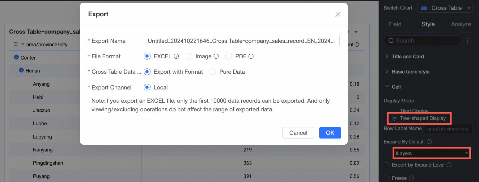
Export by expanded level
If you select this option, the formatted Excel export will match the current expanded/collapsed state of the tree view on the page.
For example, if the display level is set to 3, only data within those three levels is exported.
 Note
Note-
If pagination is enabled for the crosstab, you can only export the current page. To export all data, disable pagination or increase the number of rows displayed per page.
-
If a subtotal is not configured, parent levels may not display data in the exported file.
-
Freeze
Set whether to freeze the header or a column.
NoteWhen you freeze a column, ensure its width is less than 60% of the total table width.
Measure display grouping
You can set up measure grouping. After you enable mixed dimension/measure display, dimension fields can also be grouped. You can also set field descriptions for the groups.
Merge identical cells
You can choose whether to merge identical adjacent cells.
Wrap text in content area
Wrapping text in the content area helps keep the table compact, especially when content is much longer than headers.
Select Wrap text in content area to automatically wrap long text in the content area.
Note-
The crosstab recognizes newline characters in fields. You can also use them to create custom line breaks.
-
This option only controls text wrapping in the content area. To adjust text wrapping in the header area, see Header settings.
Image field display mode
If your chart contains an image field, you can set its display mode. Options include Scale to fit (keep aspect ratio), Crop to fill, and Stretch to fill.
NoteYou can use the Image Field only if the dataset contains an image field and the field type is the image type (
 ).
).Display measure name for single-measure column
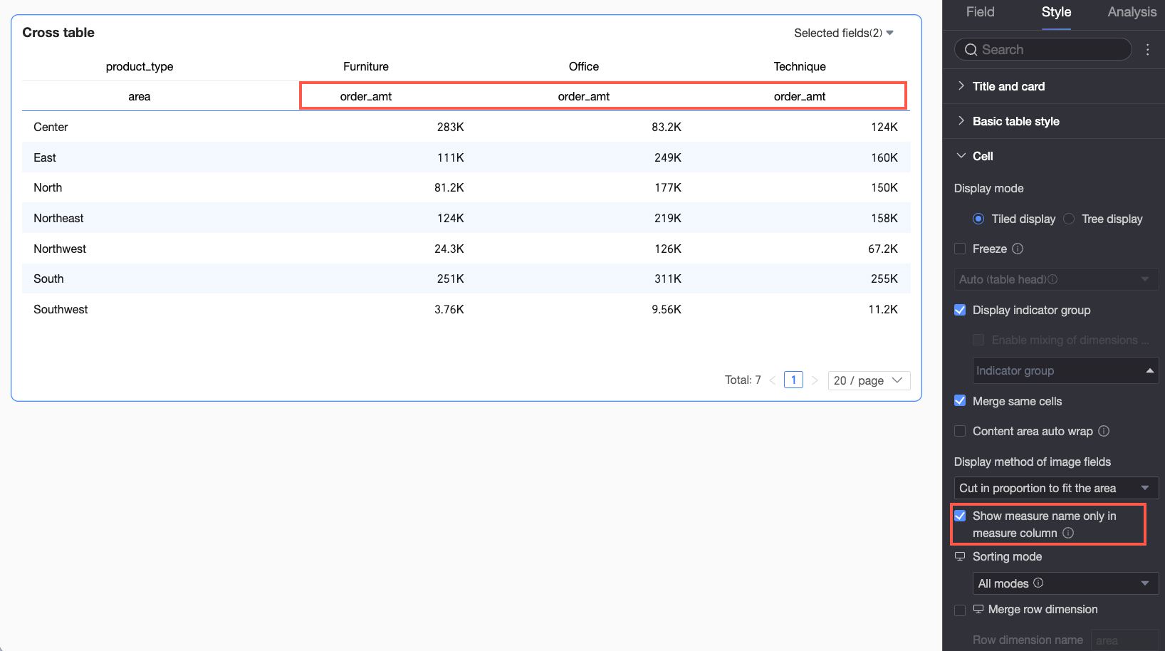
When the columns area has a dimension field and only one measure, select Display measure name for single-measure column to show the measure name in the column header.
If disabled, values in the content area are not labeled, so viewers must infer meaning from context.
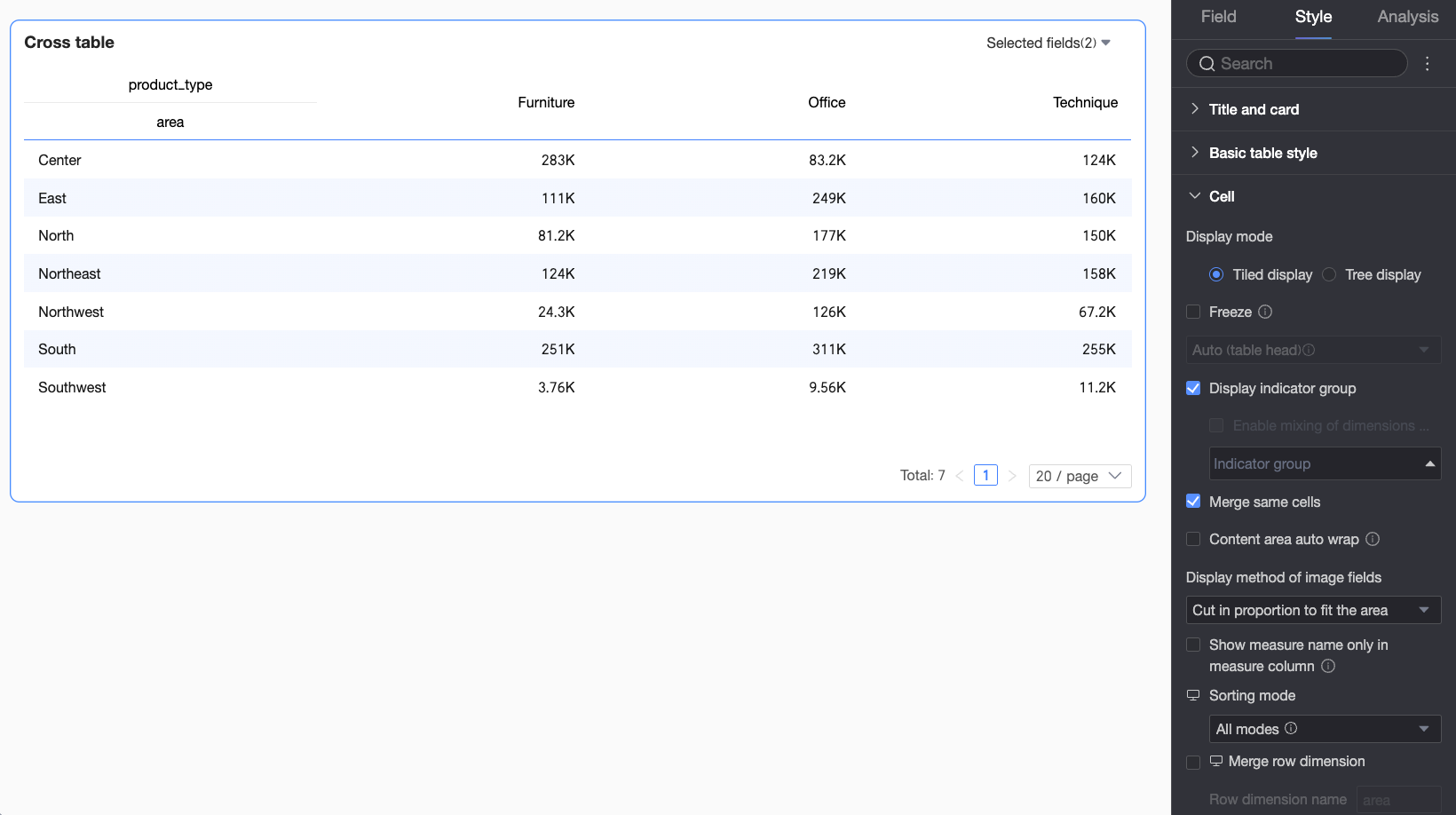
After you enable this option, the measure field name appears in the column header, so viewers can immediately identify the measure.
Sort mode
PC:
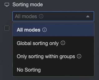
Set the sort mode for the crosstab.
-
All methods: Displays all sorting methods in a drop-down list. The list shows the currently set sorting method, and you can switch to another method.
-
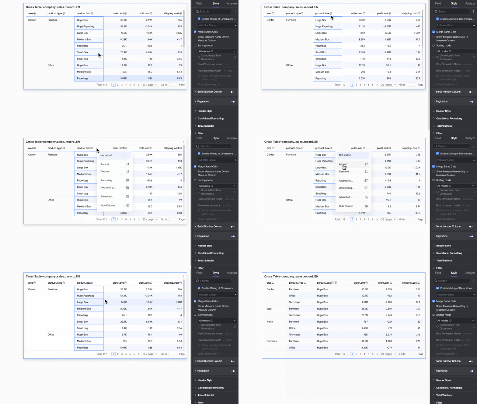
Global sort only: If your business logic only requires global sorting, you can set the mode to "Global sort only" to simplify the process. Report viewers can then click the up/down arrows
 to easily switch between global ascending, global descending, and no sort.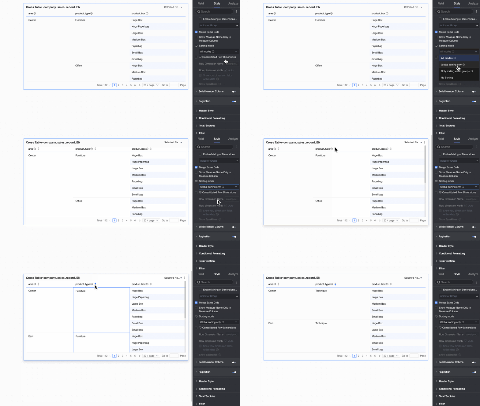
-
In-group sort only: If your business logic only requires in-group sorting, you can set the mode to "In-group sort only". Report viewers can then click the up/down arrows
 to switch between in-group ascending, in-group descending, and no sort.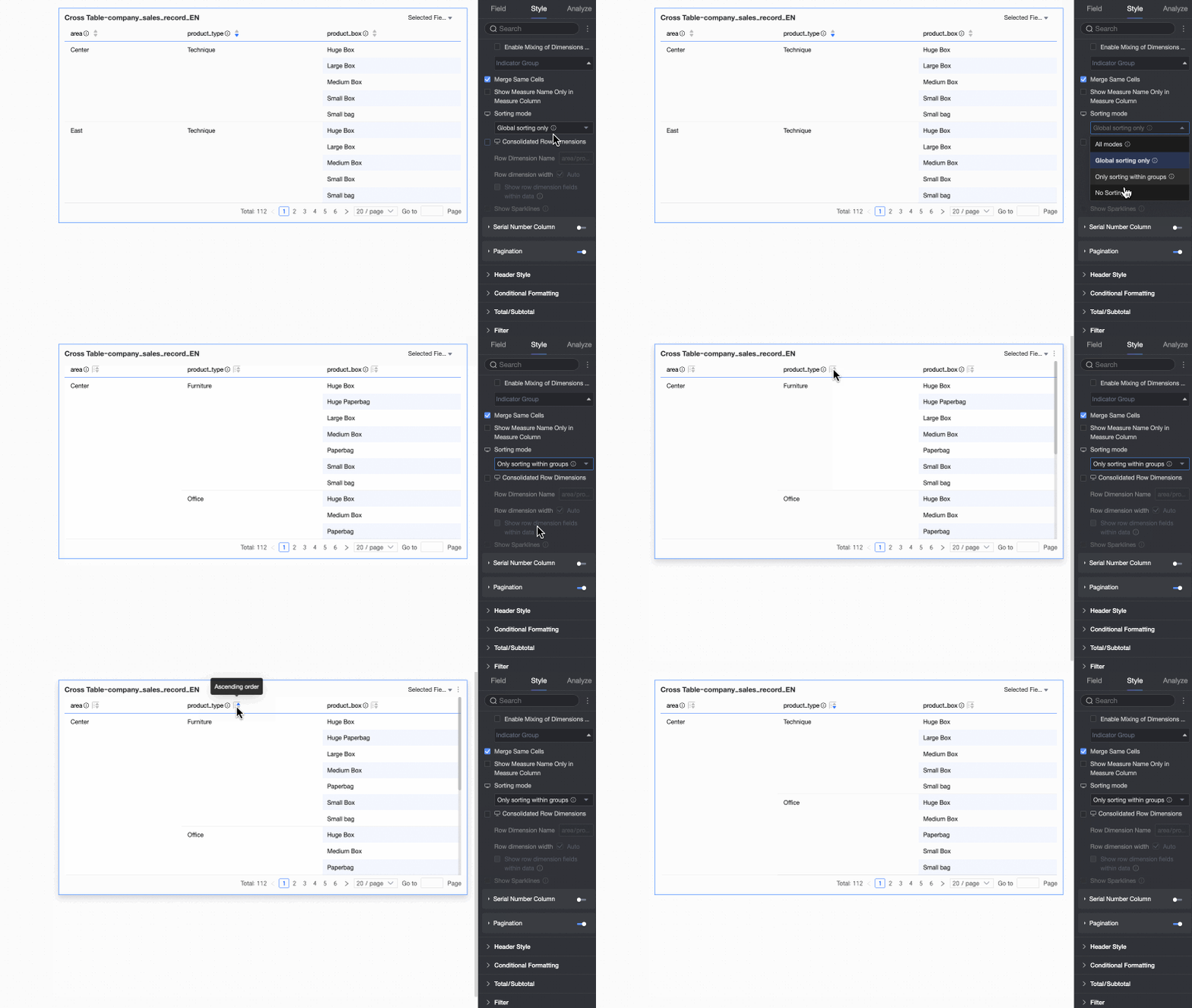
-
No sort: If you select this mode, no sorting is applied.
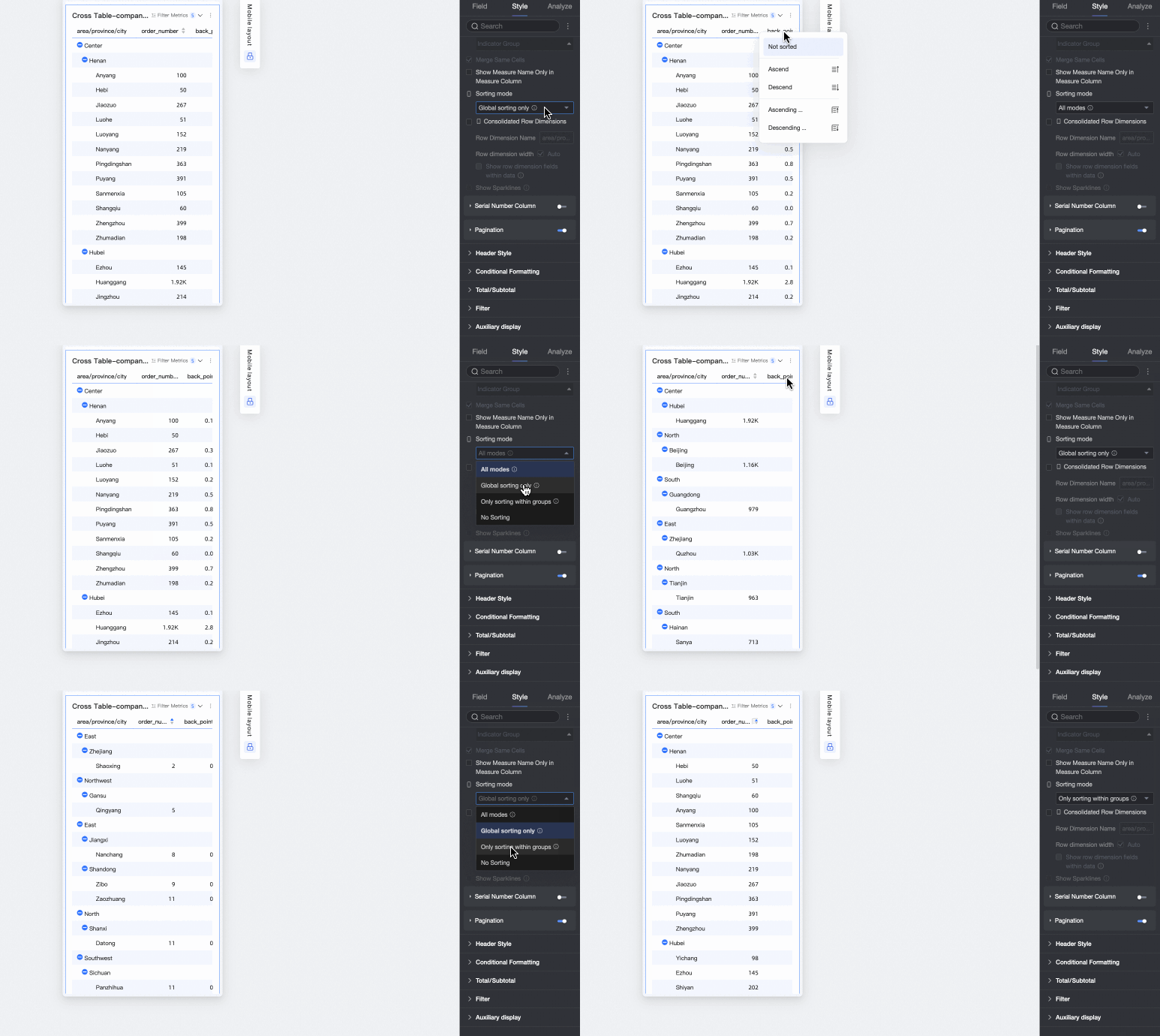
Mobile:
Supports All methods, Global sort only, In-group sort only, and No sort. The sorting logic is the same as on PC.
Merge row dimensions
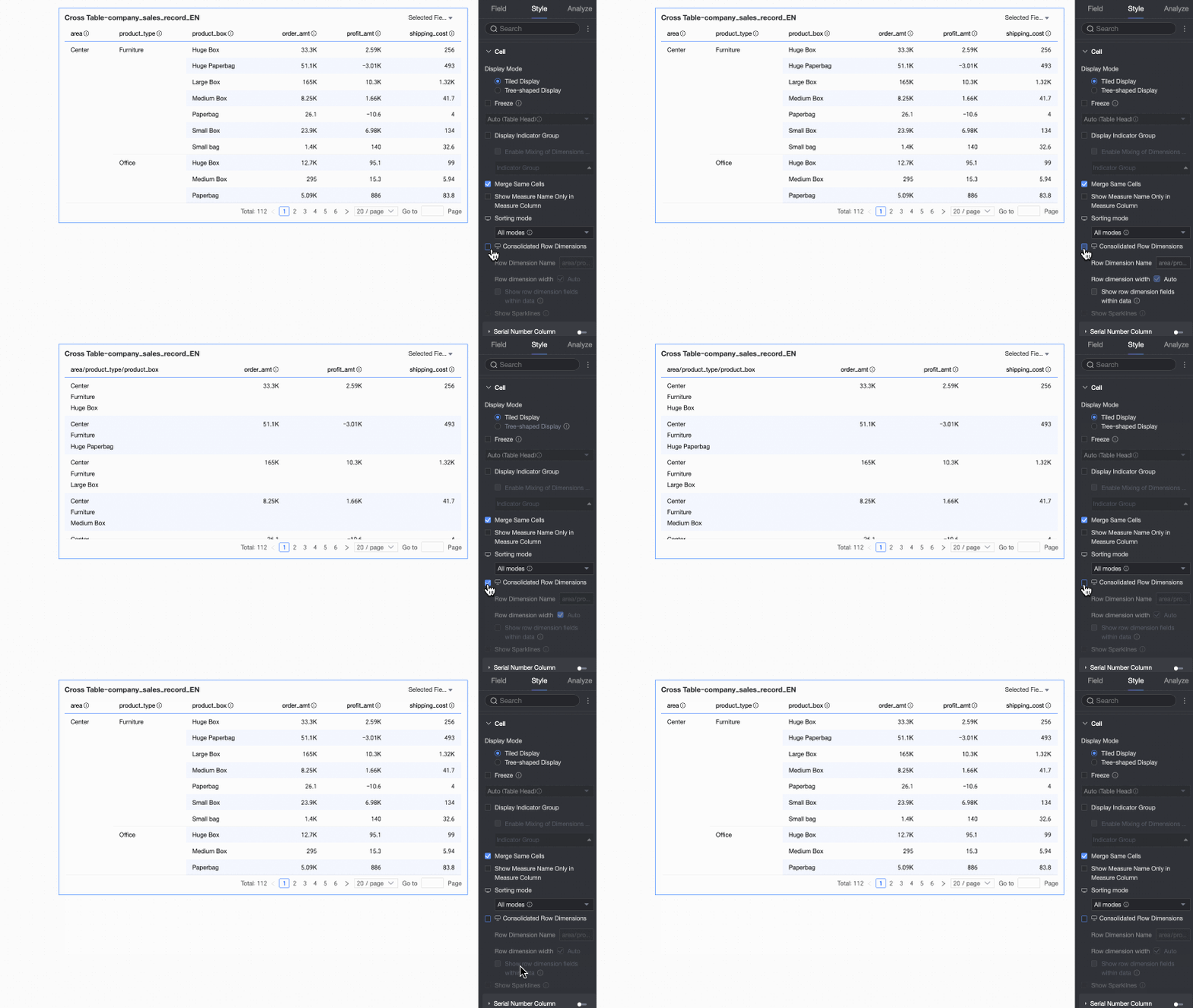
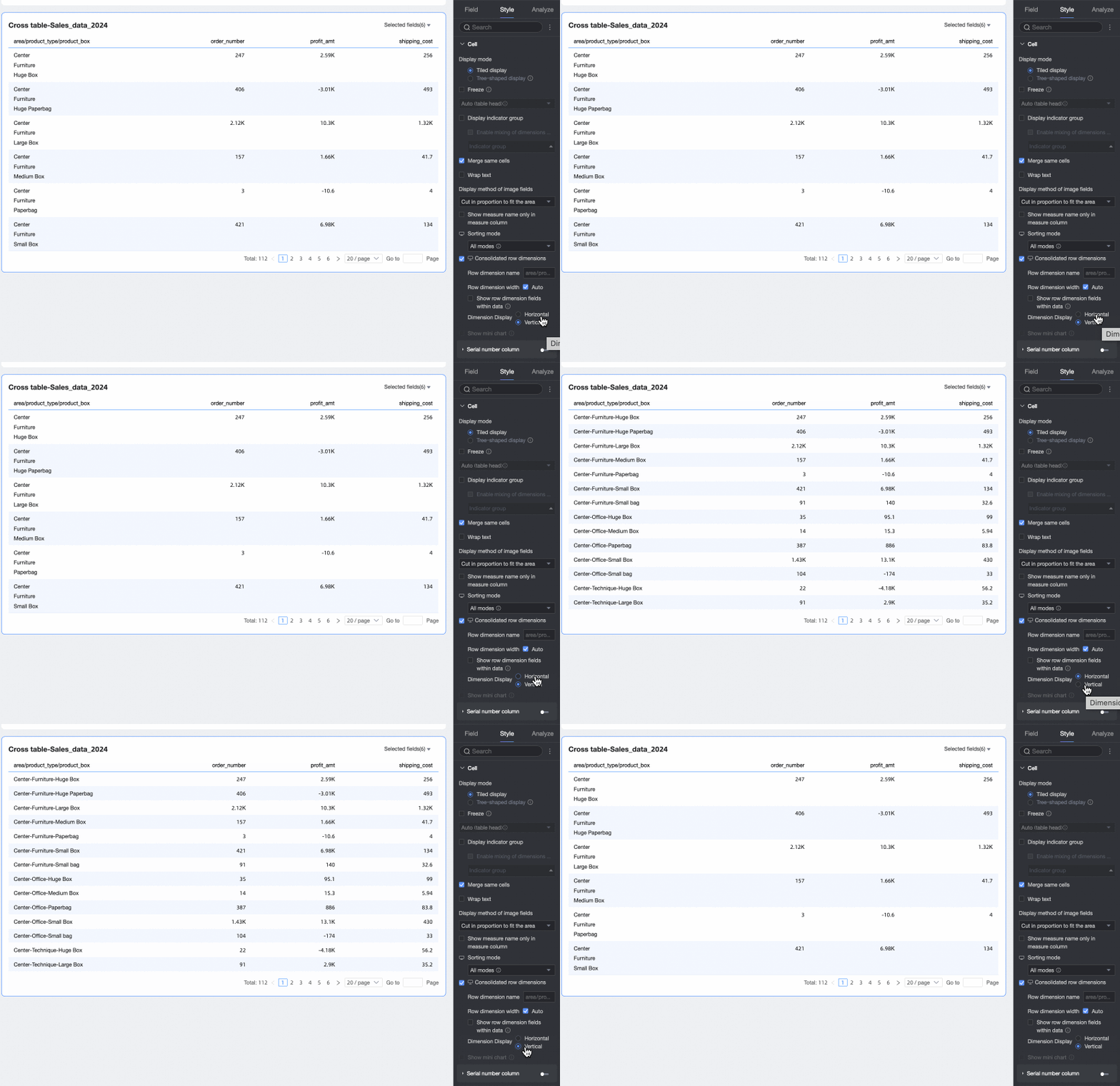
Merges dimension information into a single column, displayed row by row. Configure the following:
-
Row dimension name: Enter a name for the merged row dimension.
-
Row dimension width: Set the width of the row dimension column. You can choose to have it adjust automatically based on the UI, or enter a fixed custom width.
-
Display row dimension field in data: Select to display the names of the row dimension fields.
-
Dimension arrangement: Set the arrangement of the merged row dimension text. You can choose horizontal or vertical.
NoteYou can configure merged row dimension settings separately for PC and mobile by clicking the
 icon at the top of the page to switch views.
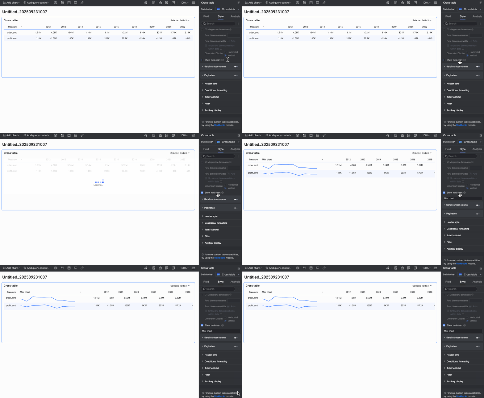
Show sparkline
When the Columns area of the crosstab contains a date field and the Rows area contains a measure, you can choose to enable a sparkline. Once enabled, you can customize the sparkline name.
Row number column
If you select this option, a row number column appears in the report.
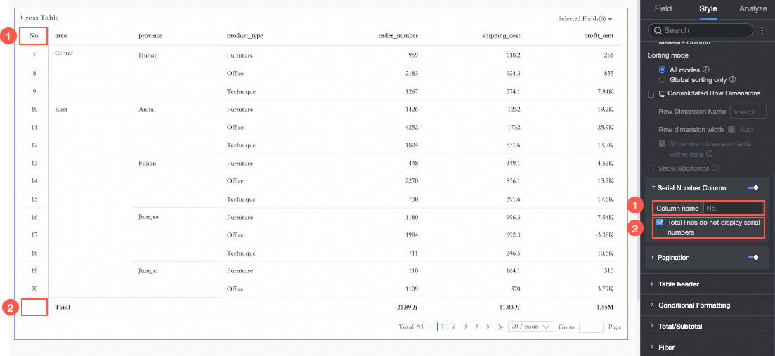
① You can set a name for the row number column.
② You can select Do not show number for grand total row.
NoteThis option is available only when column grand totals are enabled for the crosstab.
Pagination
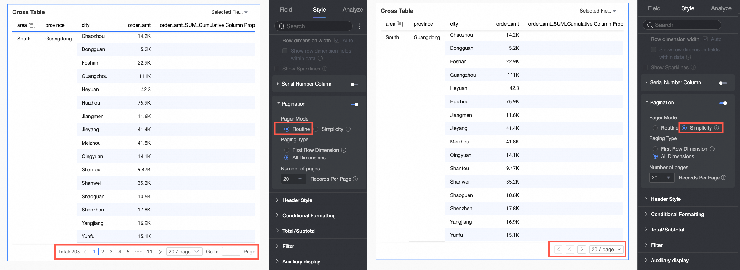
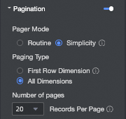
Click the pagination icon to open the pagination settings page.
-
The pagination mode is Normal by default. For large datasets, select Simple mode, which skips calculating total data entries.
-
For pagination type, you can select First row dimension or All dimensions.
NoteWhen you perform a global sort, first-row pagination is automatically disabled.
-
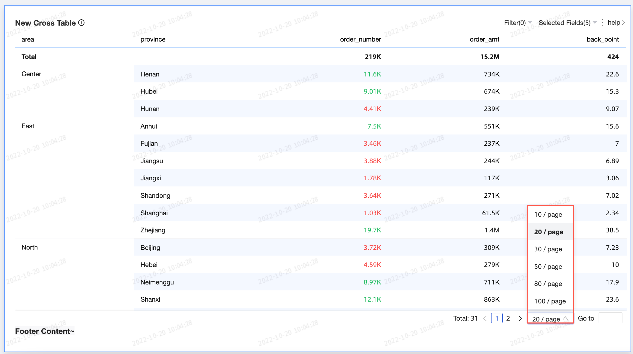
The available page sizes are 10, 20, 30, 50, 80, 100, 200, and 500 rows per page. The default is 20 rows per page.
-
-
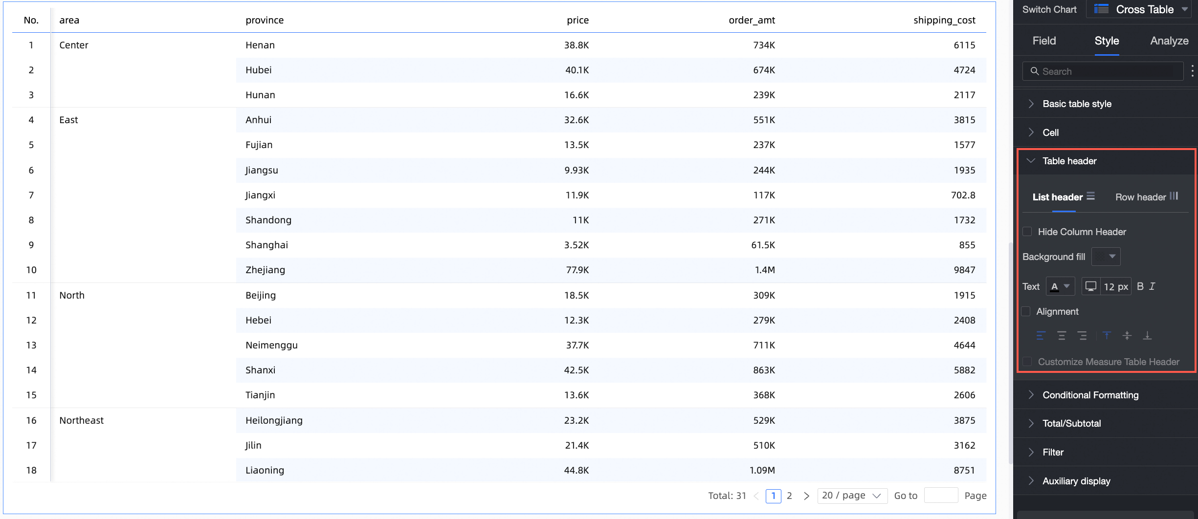
In the Header section, configure the styles for the crosstab's row and column headers.
Parameter
Setting
Description
Column header
Hide column header
If selected, hides the content of the column header.
Background fill
Set the background fill color for the column header.
Text
Configure the text style for the column header.
Alignment
Set the alignment for the column header. Options are left, center, and right.
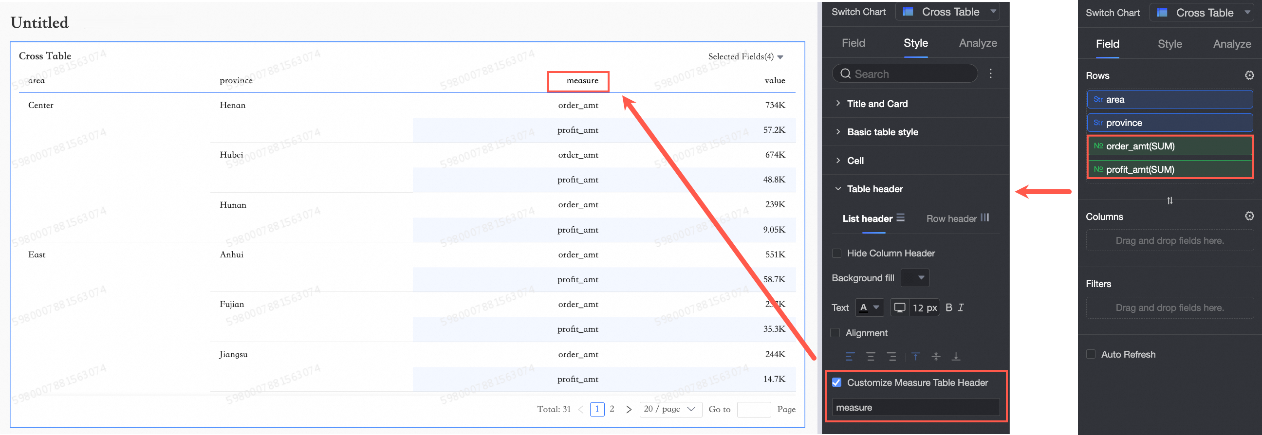
Custom measure header name
When a measure field is present in the row dimension, you can configure a custom measure header name.
Row header
Background fill
Set the background fill color for the row header.
Text
Configure the text style for the row header.
Alignment
If selected, you can set the alignment for the row header.
This overrides the field-level alignment. For example, if profit amount is left-aligned in its field configuration but center-aligned here, the row header shows center alignment.
Wrap text in row header
If selected, long text in the row header area will wrap automatically.
-
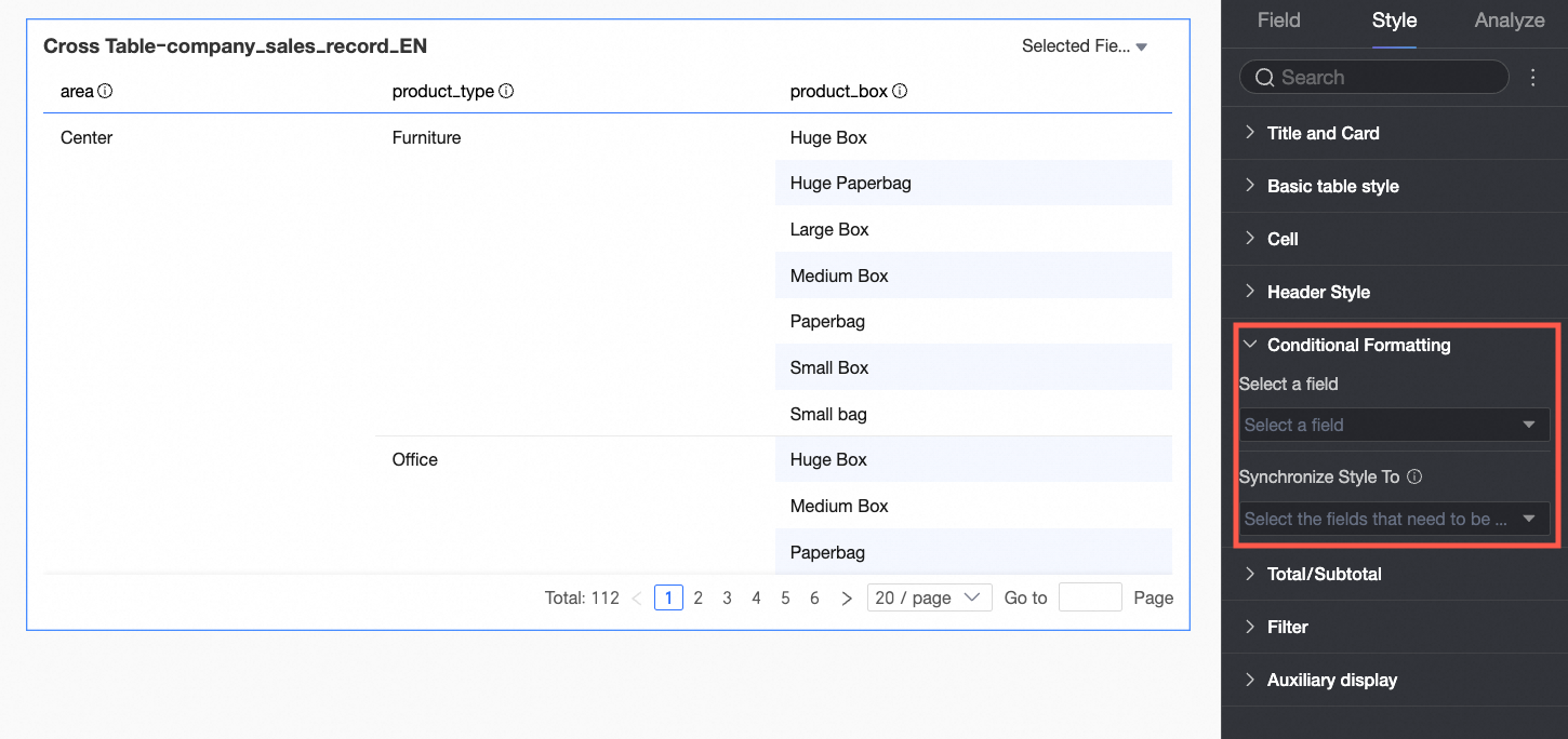
In the Conditional formatting section, set conditional formats for your data.
Parameter
Description
Select field
Select a field from the data panel to which you want to apply conditional formatting.
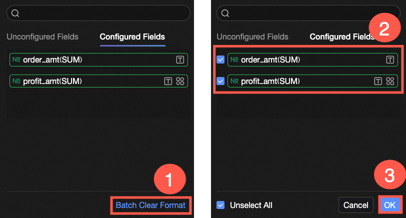
If you no longer need certain conditional formats, you can click Clear Formats in Bulk in the lower-right corner of the field panel. In the list that appears, select the formats you want to remove and click OK to clear them.
Quick styles
Use system-provided styles to set marker icons or font colors for the current field. Quick styles can only be configured for measure fields, not dimension fields.
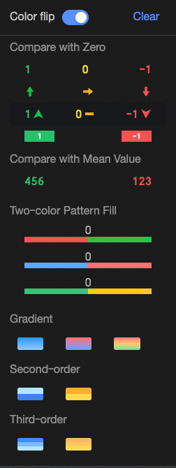
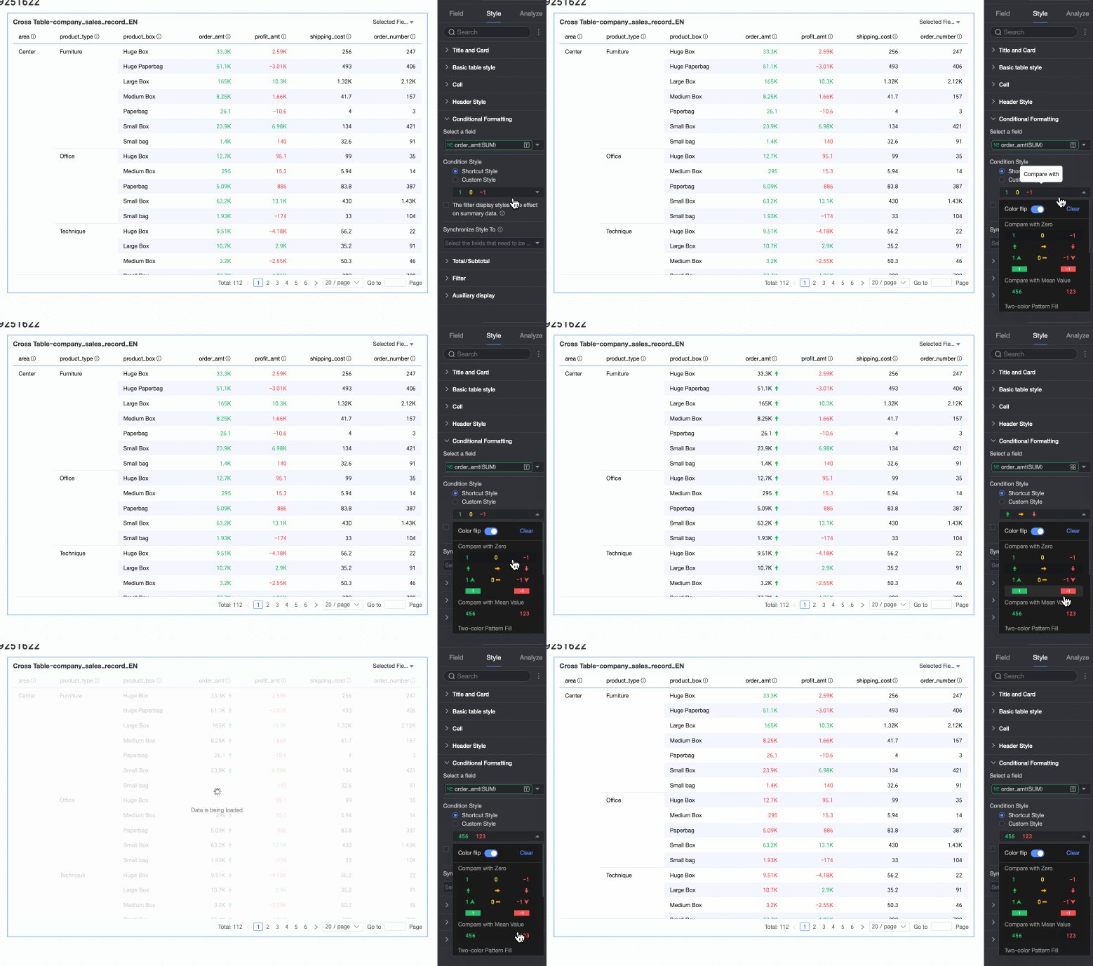
-
Comparison: You can choose to Compare with 0 or Compare with average.
-
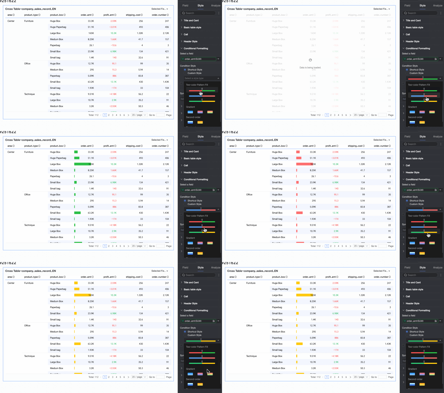
Two-color fill: You can select the color of the data bar.
 Note
NoteThe length of the data bar is calculated as follows: If the field contains both positive and negative values, the scale is based on the value with the largest absolute magnitude. If all values are positive or all are negative, the scale is based on the difference between the minimum and maximum values.
-
Color scale: You can choose Gradient, Two-tier, or Three-tier.
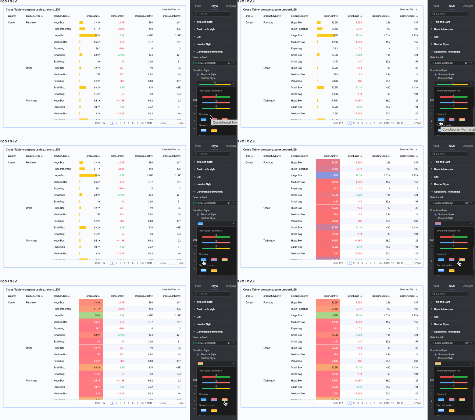
-
Invert colors
For example, with the Comparison quick style, values less than 0 are red and values greater than 0 are green by default. Inverting the colors makes values less than 0 green and values greater than 0 red.
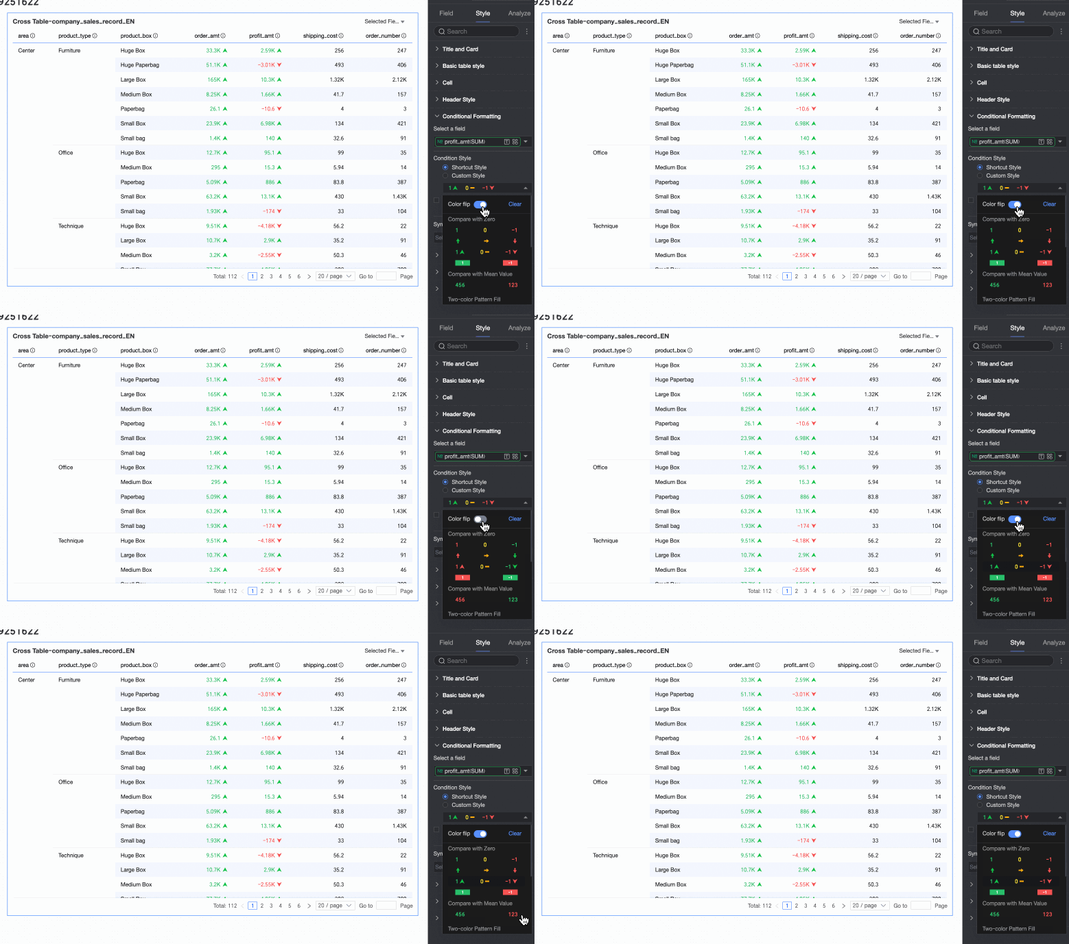
-
Clear: To remove a quick style, click Clear.
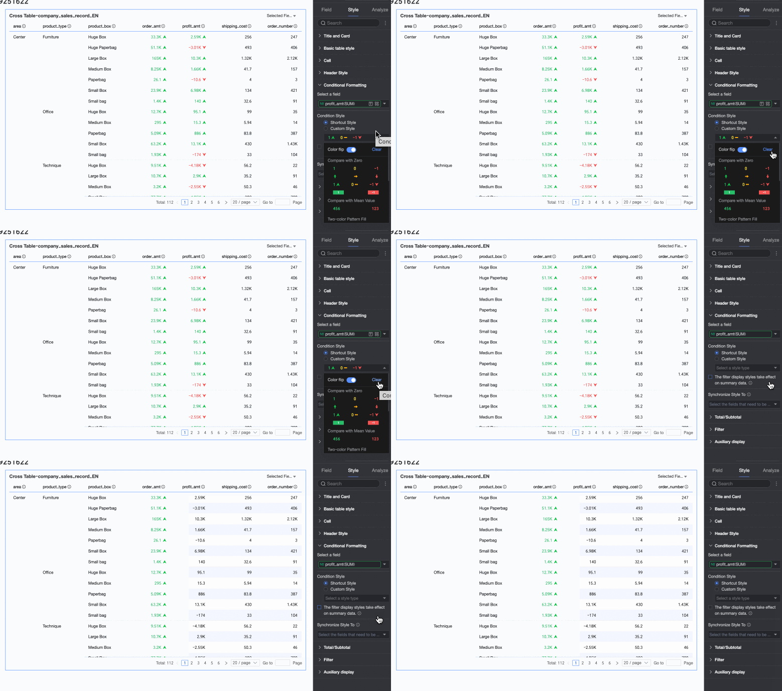
Custom style
In addition to quick styles, you can configure custom styles. Both measure and dimension fields support custom styles, but the available options differ.
-
Measure fields: Support Highlight text/background, Icon, color scale, and data bar.
-
Highlight text/background: Configure rules to highlight the text or background color of field values to visually emphasize key data in the table.
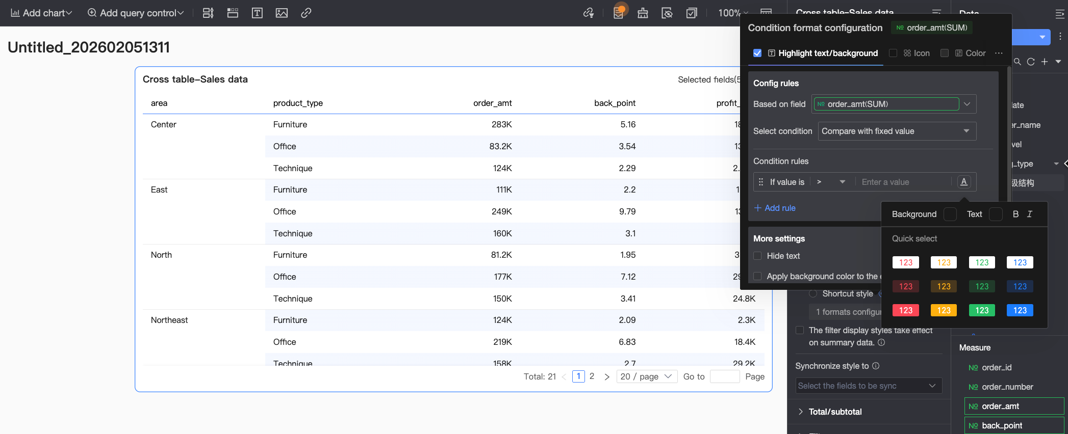 You need to configure the following settings:
-
Based on field: Set the data field to which the rule applies. By default, this is the field selected under Select field. You can also choose other fields to create more complex rules based on their values.
-
Condition type: Set the comparison basis for the rule. You can choose to Compare with fixed value, Divide by percentage range, or Compare with dynamic field.
-
Rule: Set the specific logic for the rule and the display style (text color, bold, italics, background color) for cells that meet the condition.
-
Add rule: Click to add a new rule.
-
More settings: Set whether to hide the text of the current field and whether to apply the background color to the entire row.
-
-
Icon: Display specific icons in cells based on a comparison result to clearly show the relationship between the current data and a target value.
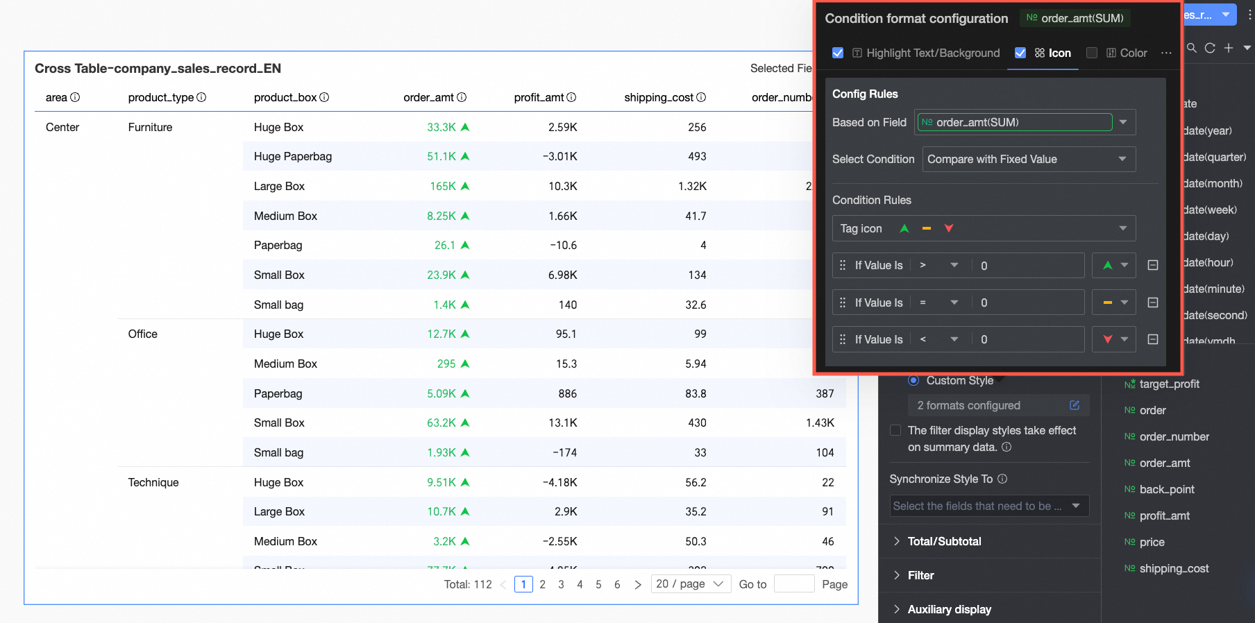 You need to configure the following settings:
-
Based on field: Set the data field to which the rule applies. By default, this is the field selected under Select field. You can also choose other fields to create more complex rules based on their values.
-
Condition type: Set the comparison basis for the rule. You can choose to Compare with fixed value, Divide by percentage range, or Compare with dynamic field.
-
Rule: Click the Marker icon selection box, choose a suitable icon set from the system-provided styles, and set the logic for the data condition. You can also select a unique icon for each comparison rule.
-
Add rule: Click to add a new rule.
-
More settings: Set whether to hide the text of the current field.
-
-
color scale: Applies a color to the cell background based on its numerical value, which helps visualize data distribution and trends.
NoteColor scales can only be configured if Highlight text/background, Icon, and Data bar are not selected.
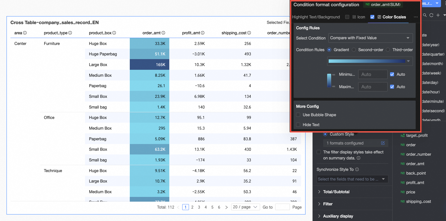 You need to configure the following settings:
-
Condition type: Set the comparison basis for the rule. You can choose to Compare with fixed value or Divide by percentage range.
-
Rule: Set the color scale style (gradient, one-tier, two-tier) and specify the minimum, maximum, and boundary values, along with the corresponding colors for each range.
-
In More settings, you can set the shape of the color scale and whether to hide the text of the current field.
-
-
data bar: Represents numerical values as visual bars, providing an intuitive way to compare relative sizes.
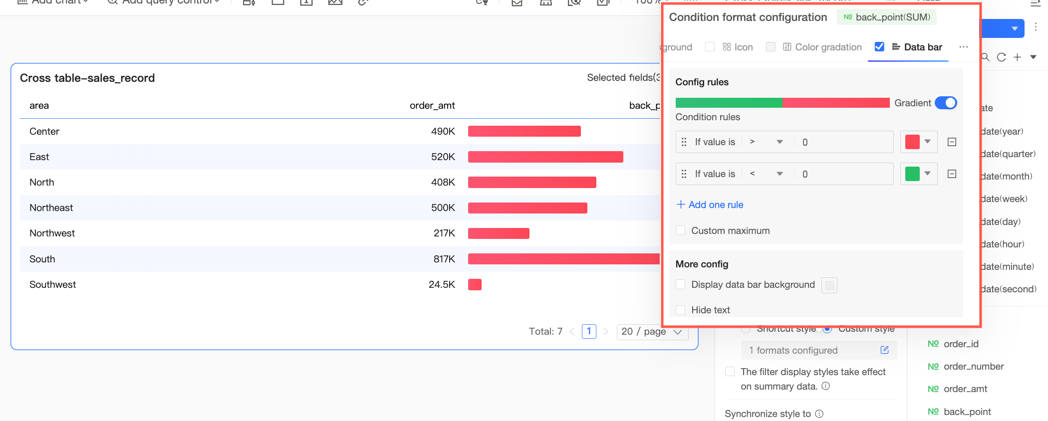 You need to configure the following settings:
-
Rule: Set the display rule for the data bar of the current measure field. You can specify a different color for each rule.
-
Add rule: Click to add a new rule.
-
Custom min/max: If selected, you can set custom maximum and minimum values. In automatic mode, the maximum and minimum are based on the highest and lowest values in the current field.
-
More settings: Set whether to show the data bar background and customize its color. You can also set whether to hide the text of the current field.
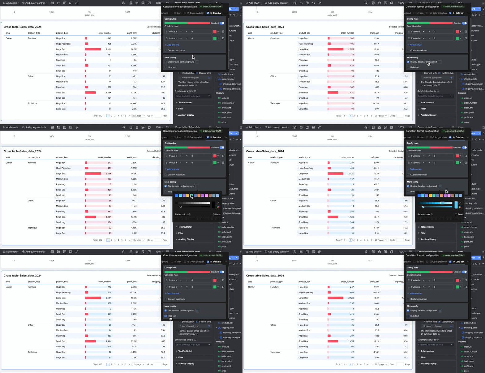
-
-
-
Dimension fields: Support Highlight text/background and Icon.
-
Highlight text/background
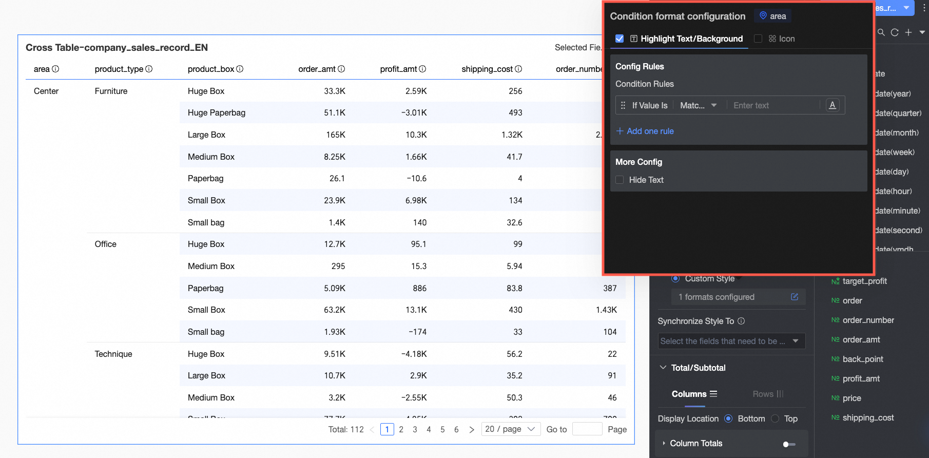
-
In Rule Definition, set the rule for highlighting the text of the current dimension field. The condition is based on the dimension's value, so you can only enter text in the condition value input box.
-
In More settings, set whether to hide the text of the current field.
-
-
Icon
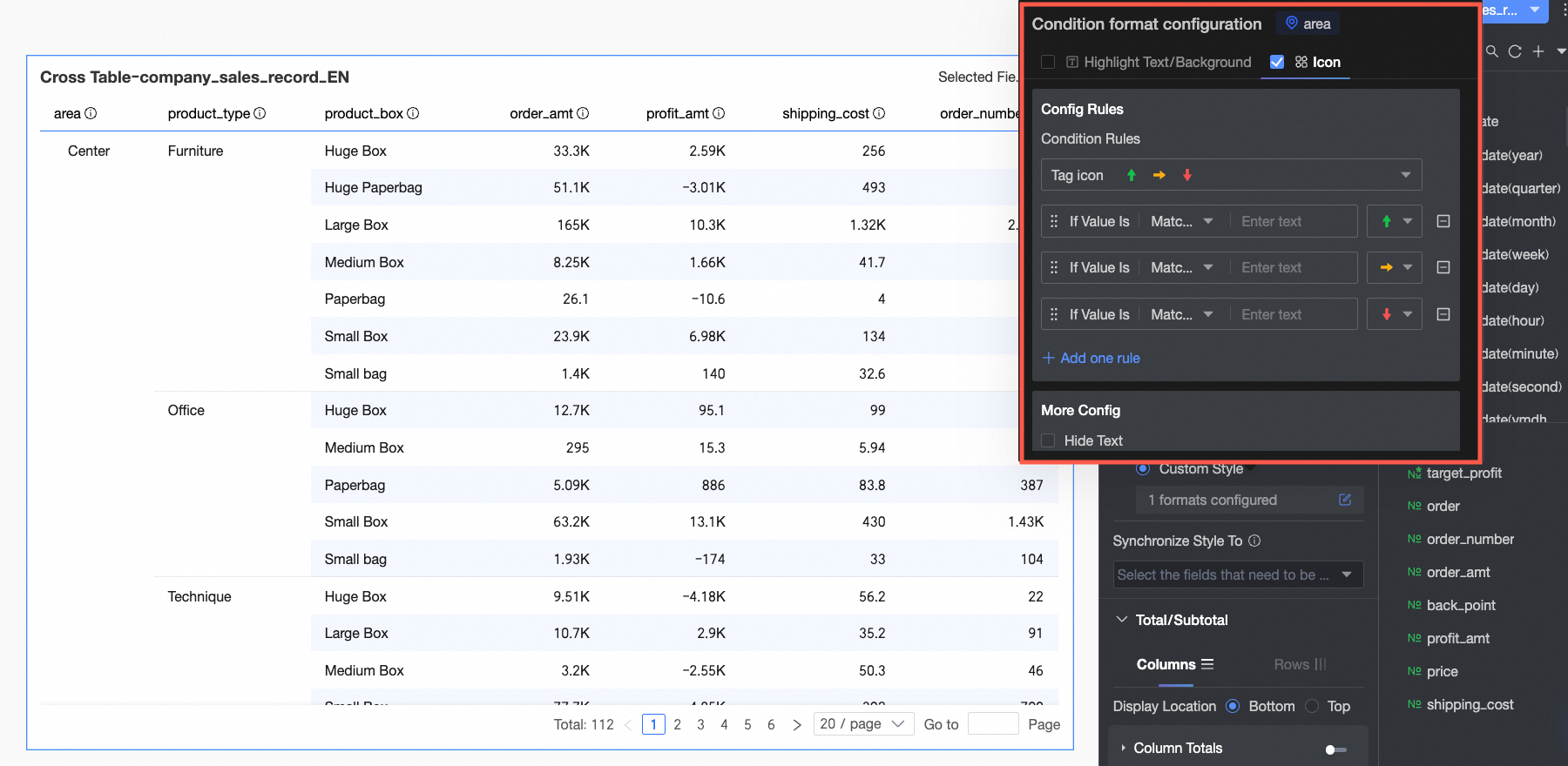
-
In Rule Definition, set the icon marking rule for the current dimension field. The condition is based on the dimension's value, so you can only enter text in the condition value input box.
-
In More settings, set whether to hide the text of the current field.
-
-
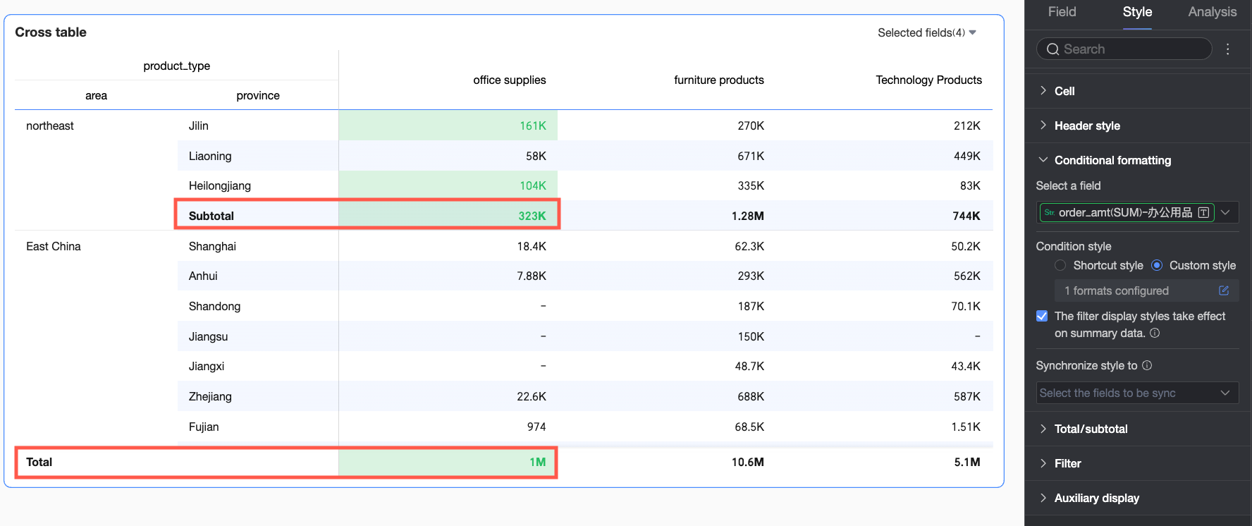
Apply conditional style to summary data
Choose whether to apply the configured conditional styles to summary data as well. If selected, calculations for max, min, and percentage in the conditional rule will include subtotal data but not grand total data.
Sync style to
Copies the current conditional formatting rule to other fields.
-
-
In the Grand total/subtotal section, configure column summary and row summary for the required dimensions.
-
column summary: Calculates summary data by column. This option is unavailable if the crosstab has no measures or no row dimensions.
-
row summary: Calculates summary data by row. This option is unavailable if the crosstab has no measures or no column dimensions.

Parameter
Description
Column summary
Display position
Set the display position for column grand total/subtotal data. You can choose to place it at the bottom or top of the summarized data.

Overall summary (column grand total)
Click the
 switch to enable or disable column grand totals. When enabled, this feature calculates a grand total for each column. You can also configure the following settings:
-
Grand total alias: Set a custom display name for the grand total, such as "Total sales for all regions".
-
Calculation method: Select a uniform grand total aggregation method for all fields. If a field is a calculated field, the selected aggregation method does not apply; the original method is used.
If you need to set a different aggregation method for each field, select Custom from the drop-down list and configure the logic for each field in the Custom Calculation module.
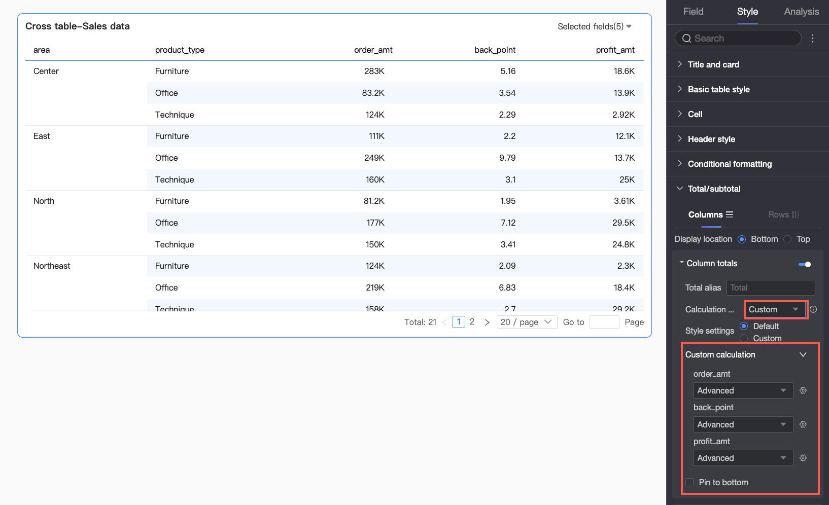
-
Style configuration: Configure the text style for the grand total data. You can either follow the system default or customize the font color, background color, and weight.
-
Pin to bottom: Set whether to pin the column grand total to the bottom.
NoteWhen column summaries are pinned to the top or bottom, you cannot copy the summary data.
Category summary (column subtotal)
Click the
switch to enable or disable column subtotals. When enabled, this feature calculates subtotals for categories within a column, based on a selected dimension. You can also configure the following settings:
-
Subtotal alias: You can set a display name for the subtotal data based on your business context, such as "Subtotal for Northeast sales".
-
Summary dimension: Set the dimension for categorizing subtotals, for example, to subtotal sales for each product type.
-
Subtotal function: Select a uniform subtotal aggregation method for all fields. If a field is a calculated field, the original aggregation method is used.
-
Add subtotal: If you need to view subtotals for multiple dimensions simultaneously (for example, sales by product type and by region), click Add subtotal to add another summary dimension.
-
Style configuration: Configure the text style for the subtotal data. You can either follow the system default or customize the font color, background color, and weight.
Row summary
Display position
Set the display position for row grand total/subtotal data. You can choose to place it to the left or right of the summarized data.
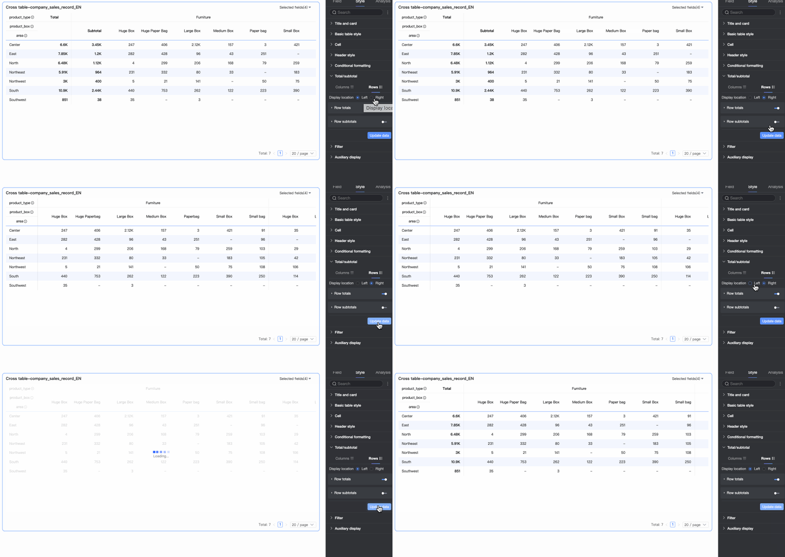
Overall summary (row grand total)
Click the
switch to enable or disable row grand totals. When enabled, this feature calculates a grand total for each row. You can also configure the following settings:
-
Grand total alias: Set a custom display name for the grand total, such as "Total sales for all products".
-
Calculation method: Select a uniform grand total aggregation method for all fields. If a field is a calculated field, the original aggregation method is used.
-
Style configuration: Configure the text style for the grand total data. You can either follow the system default or customize the font color, background color, and weight.
Category summary (row subtotal)
Click the
switch to enable or disable row subtotals. When enabled, data in a row is subtotaled for each category based on a selected dimension. You can also configure the following settings:
-
Subtotal alias: You can set a display name for the subtotal data based on your business context, such as "Subtotal for Northeast sales".
-
Summary dimension: Set the dimension for categorizing subtotals, for example, to subtotal sales for each product type.
-
Subtotal function: Select a uniform subtotal aggregation method for all fields. If a field is a calculated field, the original aggregation method is used.
-
Add subtotal: If you need to view subtotals for multiple dimensions simultaneously (for example, sales by product type and by region), click Add subtotal to add another summary dimension.
-
Style configuration: Configure the text style for the subtotal data. You can either follow the system default or customize the font color, background color, and weight.
NoteFor frequently asked questions about configuring totals, see FAQ.
-
-
In the Filter section:
-
If you enable Field Content Filter, you can use the Selected Fields drop-down list in preview mode to choose which fields to display.
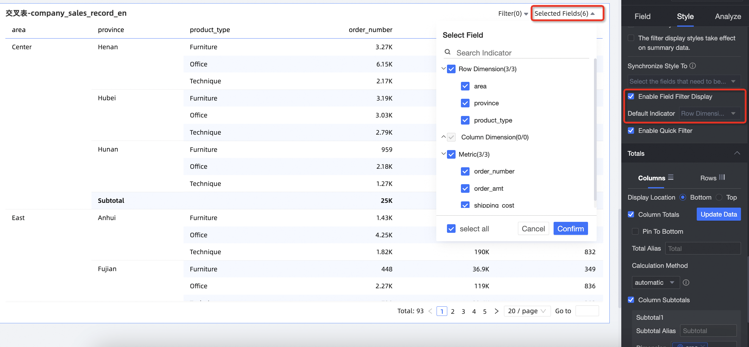
If a form submission event is configured and you deselect a field that is bound to the form, the submission will fail. For more information, see Field Relationship Mapping.
-
You can set default selected dimensions.
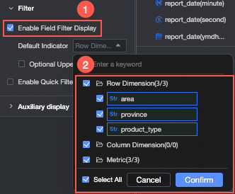
-
You can set a maximum number of selectable dimensions.
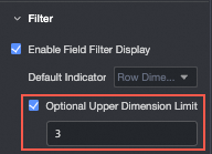
For example, if the maximum is set to 6, you can select at most 6 dimensions to display.
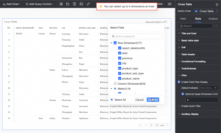
-
-
If you select Enable quick filter, you can click the Filter drop-down list on the crosstab in preview mode to filter fields.
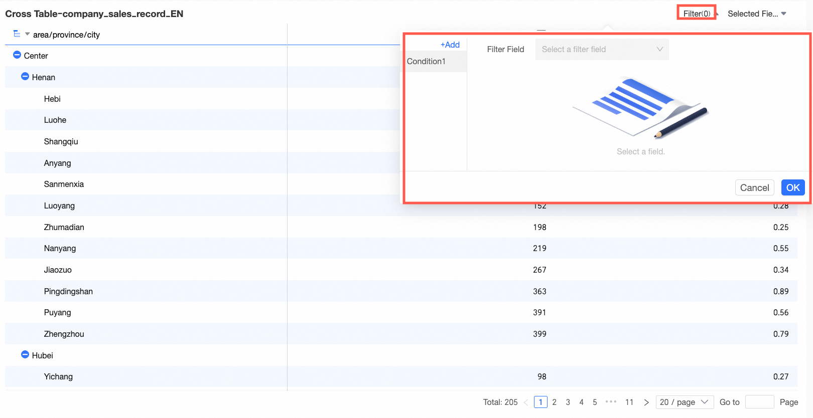
To filter multiple fields simultaneously, you can add multiple conditions in the dialog box that appears.
Example: Analyze city distribution in the South China region where shipping cost is
> 300and the discount rate is> 0.5.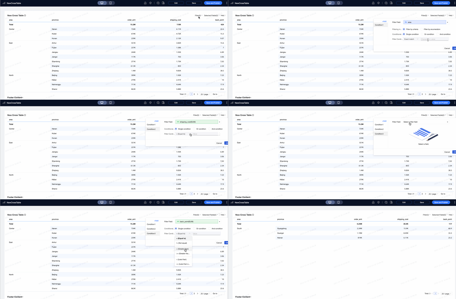 Note
NoteFilters applied in preview mode are not saved by default. When you close and reopen the page, you must reapply the filter conditions.
-
-
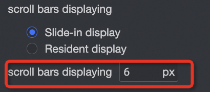
In the Auxiliary display section, you can configure the scroll bar display mode and scroll bar thickness.
-
If you set the display mode to Show on hover, the scroll bar appears only when you hover over the table.
-
If you want the scroll bar to be always visible, select Always show.
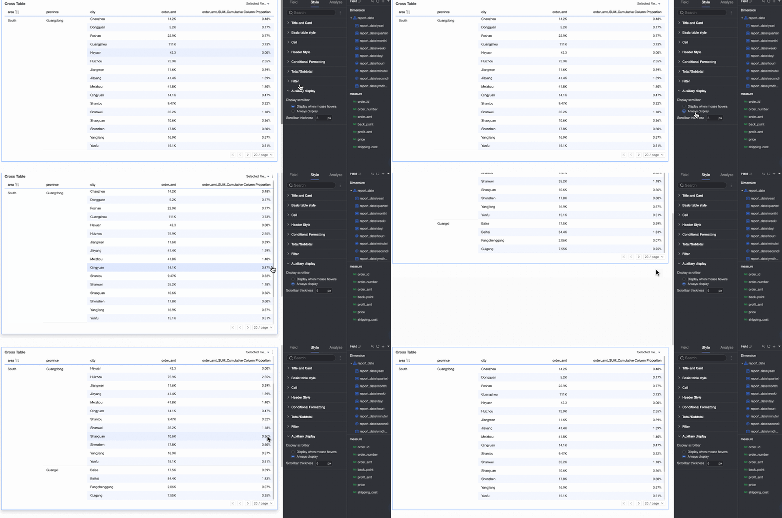
-
To make the scroll bar more prominent, you can adjust its thickness.
-
Adjusting the Cross Table
Besides using the Style panel, you can adjust the cross table directly in the following ways:
-
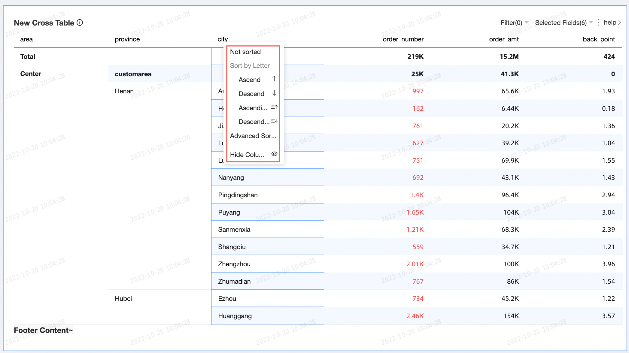
Click a column to open a drop-down list of configuration options.
-
Adjust the items per page.
-
Drag a column border to adjust the column width.
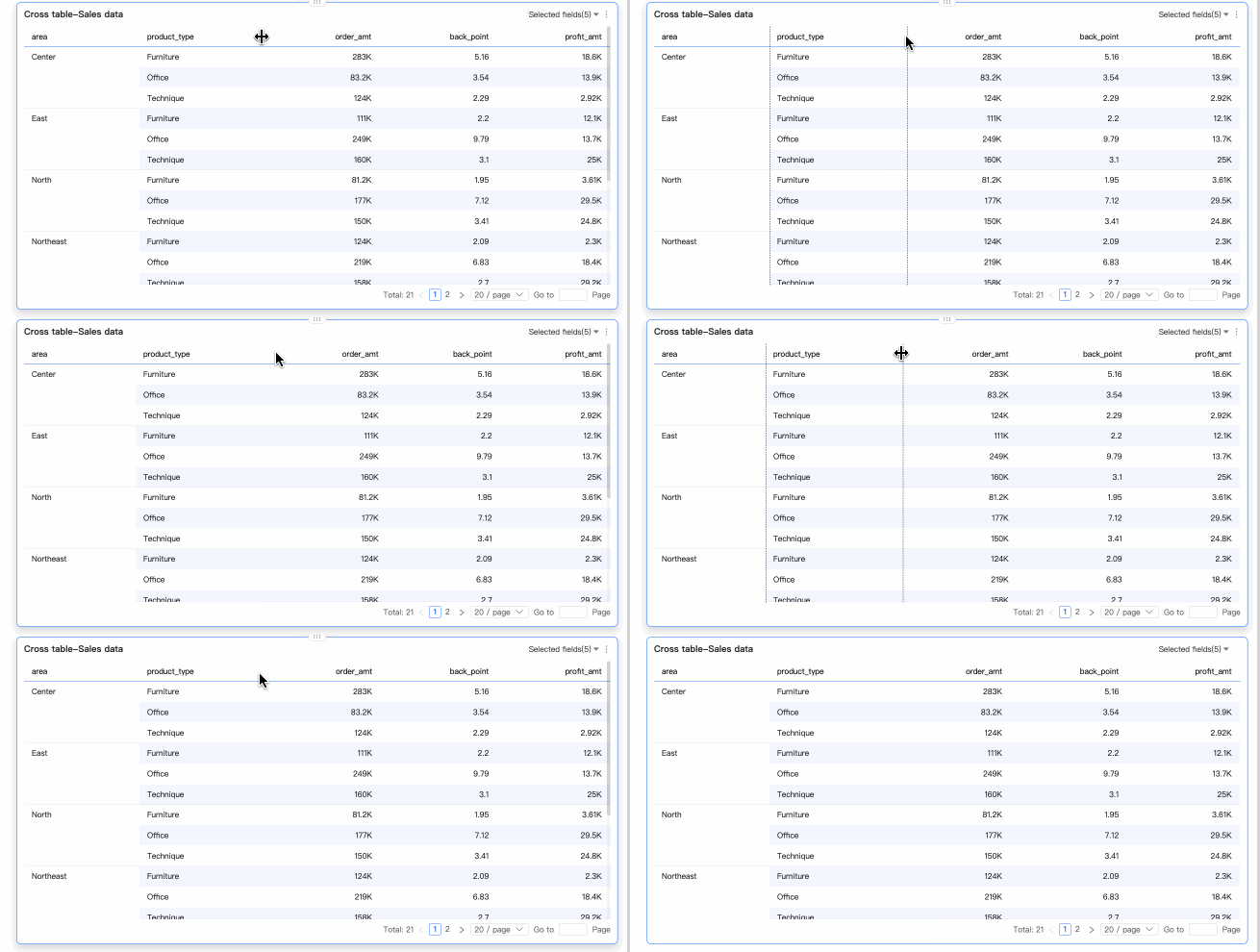
Chart Analysis Settings
|
Category |
Parameter |
Description |
|
Data interaction |
Drill-down |
When you configure drill-down for a chart, you can customize the style of drill-down rows. Drill-down. |
|
Linkage |
Linkage connects multiple charts, allowing you to analyze data that is spread across them. For more information, see Linkage. |
|
|
Hyperlink |
Use hyperlinks to connect multiple dashboards when your analysis data is spread across them. Two types are available: parameter and external link. Hyperlink. |
|
|
Advanced settings |
Event |
Enables data entry in a cross table. If the cross table has column dimensions, you can only configure events by adding row dimensions. Event. |
|
Display secondary indicator |
Select this option to configure the secondary indicator format. Display Secondary Indicator. |
Export Data
The export feature must be enabled to export data. For more information, see Export Control.
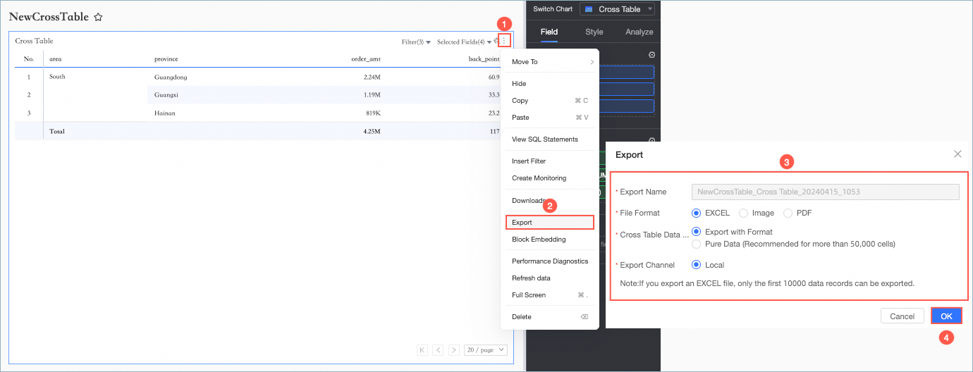
|
Parameter |
Description |
|
Export name |
Specify a custom name for the exported attachment. |
|
File format |
You can export files in Image, PDF, or EXCEL format. Note
When exporting a cross table in EXCEL format, you can choose between export with format and pure data.
An organization administrator can configure the data export formats. For more information, see Export Control. |
|
Watermark |
This option is available only for the EXCEL format. You can choose whether to add a watermark. |
|
Export channel |
You can export data to a local device or to Object Storage Service (OSS). |
Enable Secondary Indicators
After you configure measures, you can enable and configure secondary indicators.
After you select Display secondary indicator, you can select any measure from the comparison indicator drop-down list.
-
Comparison date: Requires a date field.
Note-
If the chart already contains a date field, you can only use the date field with the finest granularity in the chart as the comparison date.
-
If the chart does not contain a date field, you can use any date field from the dataset as the comparison date.
-
-
Comparison Method: The available comparison options depend on the granularity of the date field. A maximum of four comparison fields are displayed. For example, if you select daily granularity for Comparison Date, the Comparison Content section displays day-over-day comparison, week-over-week comparison, month-on-month comparison, and year-over-year comparison. If you select monthly granularity for Comparison Date, the Comparison Content section displays options such as month-over-month comparison and year-over-year comparison.
-
Comparison indicator selection: Choose the measure for the comparison.
-
Display content: By default, percent variance is selected. You can also select difference or original value.
-
Difference: The data is displayed in the same format as the primary measure.
When the difference option is selected, you can also select Calculate difference in percentage points (pt). This option is deselected by default. If this option is selected for a measure in percentage format, the difference is automatically displayed in percentage points (pt). For example: 5.2% - 4.1% = 1.1pt. You can then choose to keep 0, 1, or 2 decimal places.
-
Percent variance: You can choose to display the value with 0, 1, or 2 decimal places.
-
-
Same-period comparison: This setting only applies when the query filter has a daily granularity. If configured, the filter condition is also applied to the comparison period. For example, if you set a filter for 2022-01-02, a year-over-year comparison will also apply a 2021-01-02 filter to the previous year's data. Day-over-day comparison automatically supports same-period comparison; dynamic period-over-period comparison does not.
-
When previous period data is negative: Choose the formula to calculate the percent variance when the previous period's value is negative. You can set it as follows:
-
(Current Period Data / Previous Period Data - 1) * 100%: This is the default setting.
-
1 - (Current Period Data / Previous Period Data) * 100%
-
Display as -
-
-
Synchronize comparison indicators: You can apply the comparison settings from the current measure to multiple other measures.
-
Display location: The default is right side of indicator. Other options include on the right (separate) and below indicator.
-
Right side of indicator: Adds a new column for the secondary indicator to the right of the primary measure. The column header is named after the selected comparison method, such as year-over-year comparison or day-over-day comparison.
If measures are arranged in columns, their corresponding secondary indicators appear sequentially to their right.

-
On the right (separate): The secondary indicator appears in a separate column to the right of the current measure.
-
If measures are arranged in columns, the last column dimension is split to display the comparison types. As shown in the following figure, a dimension value of All is split into All, All (day-over-day), and All (week-over-week). Both measures are then displayed under each split dimension value.

-
If measures are arranged in rows, the last row dimension is split in a similar way to display the comparison results below the primary measure instead of to its right.
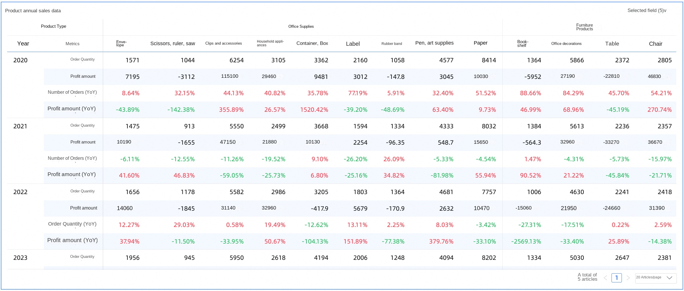
-
-
Below indicator: Adds new rows for the comparison indicators below the primary measure. The alignment matches that of the primary measure: text is left-aligned, and numerical values are right-aligned.
The secondary indicators appear in new rows under the primary measure's header, named after the selected comparison type, such as day-over-day comparison, week-over-week comparison, month-on-month comparison, or year-over-year comparison.

-
-
Display style: Choose the display colors for positive and negative numbers in the table. You can follow the Global semantic color settings (defined in Page Settings > Global Style > Semantic Color), or choose Red for positive values, green for negative values or Green for positive values, red for negative values.
FAQ
1. Totals FAQ
Total calculation
-
If your primary measure is GMV (SUM) and the calculation method for totals and subtotals is set to the default, automatic, totals and subtotals are calculated using GMV (SUM). If you change the calculation method to custom and select AVG as the aggregate method, the total is calculated using GMV (AVG).
-
If your primary measure is id (COUNT (DISTINCT)) and the calculation method for totals and subtotals is set to the default, automatic, totals and subtotals are calculated using id (COUNT (DISTINCT)). If you change the calculation method to custom and select COUNT as the aggregate method, the total is calculated using id (COUNT).
Calculating rates
-
Define the rate.
For this example, define the rate as (Metric A / Metric B).
-
In your dataset, create a new calculated field and define the expression as: rate=sum(A)/sum(B).
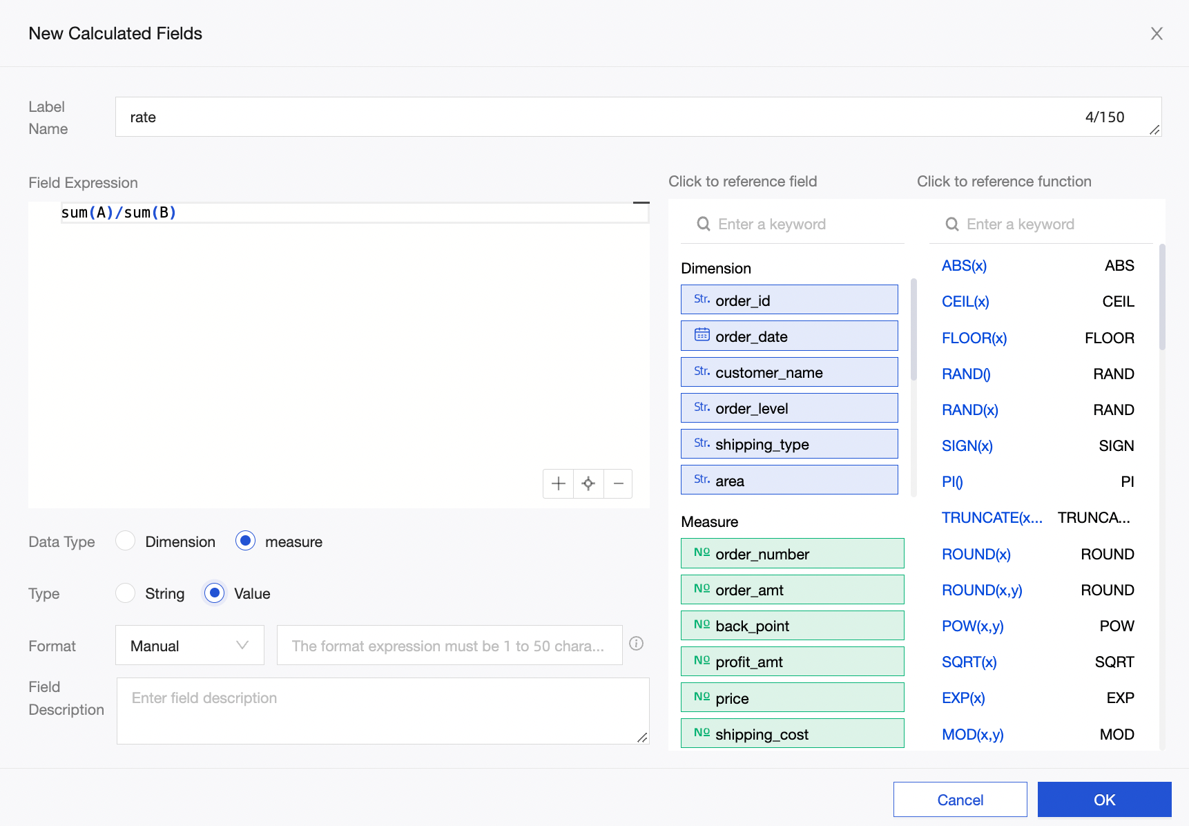
-
On the Data tab of your dashboard, select the rate (SUM) metric and enable totals and subtotals. The calculation method defaults to automatic, which uses rate (SUM). Therefore, both totals and subtotals are calculated using the expression sum(A)/sum(B).
NoteIf you write the expression as rate=A/B in the dataset and then enable automatic totals and subtotals, the calculation becomes A/B (SUM). This can lead to incorrect results, such as a rate greater than 100%.
2. Summary configuration
For percentage summaries on parent columns to work correctly, the following two conditions must be met:
-
Place the measure field in the Rows area and the dimension field in the Columns area.
-
There must be two or more dimension fields.
3. Creating a calendar in a crosstab
To create a calendar-like effect, apply conditional formatting. Set a rule on the week number field to hide its text, and a second rule on the date field to assign different colors to different values.