A facet scatter chart visualizes the correlation and distribution of your data. You can add data to and configure a facet scatter chart to reveal patterns across multiple variables.
Prerequisites
You have created a dashboard. For more information, see Create a dashboard.
Overview
-
Use Cases
A facet scatter chart plots points from two sets of data on a coordinate system, helping you identify correlations between variables or understand distribution patterns.
Key insights include:
-
The quantitative correlation between variables.
-
The nature of the correlation (linear or curved).
-
Outliers that deviate significantly from other data points, allowing you to analyze their potential impact on your model.
-
-
Benefits
Automatically calculates conversion rates.
-
Example
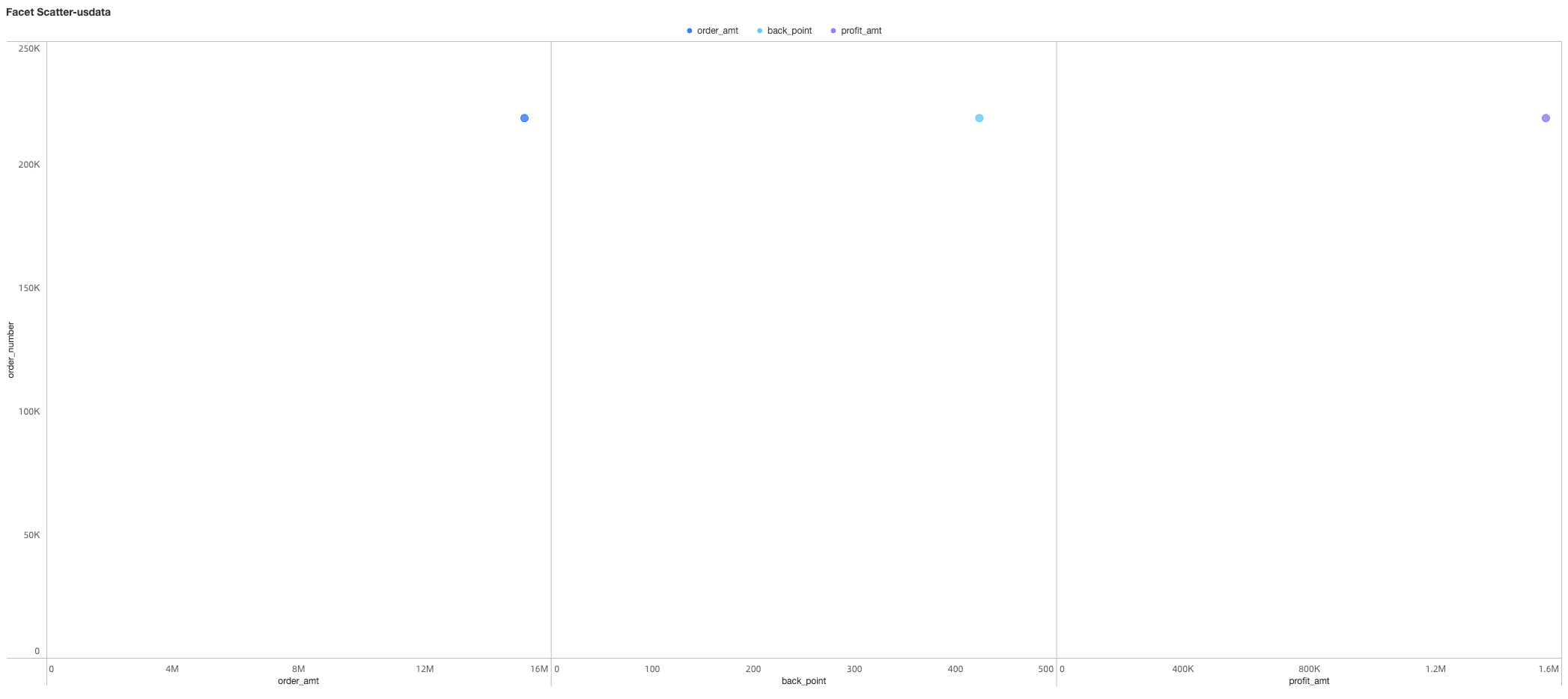
Limitations
A facet scatter chart is configured using the Y-axis/measure, X-axis/measure, and color legend/dimension fields:
-
The Y-axis is determined by a measure. You can select a maximum of one measure.
-
The X-axis is determined by measures. You must select between 1 and 3 measures.
-
The color legend is determined by a data dimension. You can select a maximum of one dimension, and the maximum value for that dimension is 1000.
For example, when you select Product Type for the color legend, a maximum of 1000 product types can be displayed.
Configure Chart Fields
-
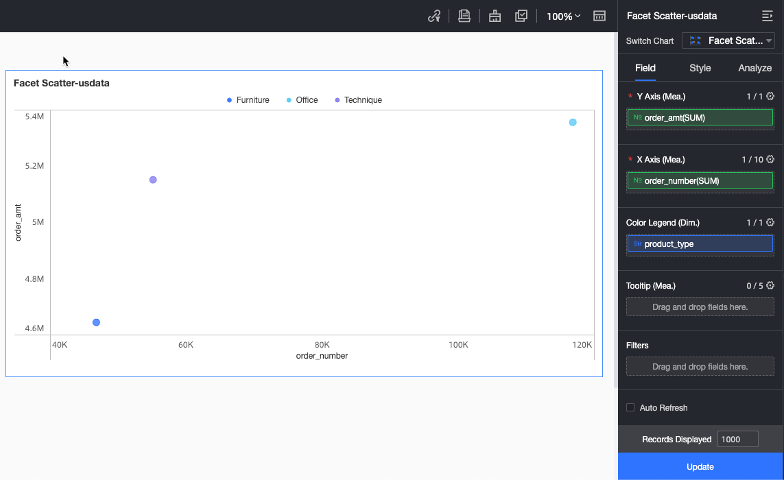
On the Data tab, select the required dimension and measure fields:
-
From the Measures list, find
order amountand double-click it or drag it to the Y-axis/measure field. -
From the Measures list, find
order quantityand double-click it or drag it to the X-axis/measure field. -
From the Dimensions list, find
product typeand double-click it or drag it to the color legend/dimension field.
-
-
Click Update to refresh the chart.
-
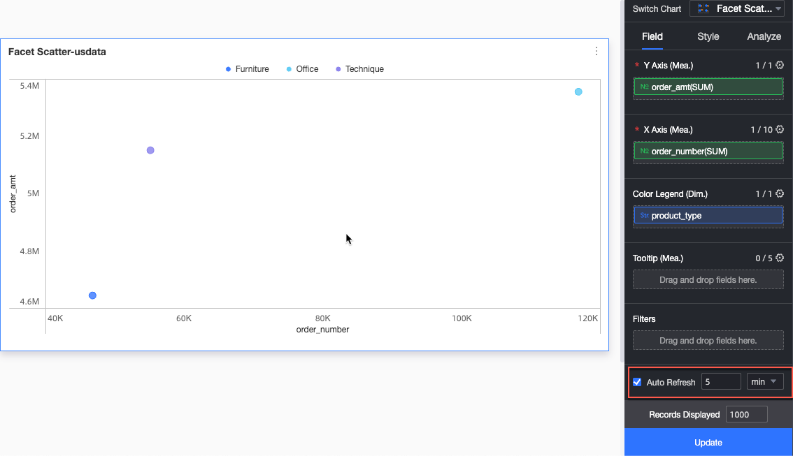
(Optional) Configure auto refresh.
Automatically refreshes the chart data at a set interval. For example, a 5-minute interval refreshes the data every 5 minutes.
Configure Chart Styles
The following style settings are specific to this chart type. For general style settings, see Configure the chart title area.
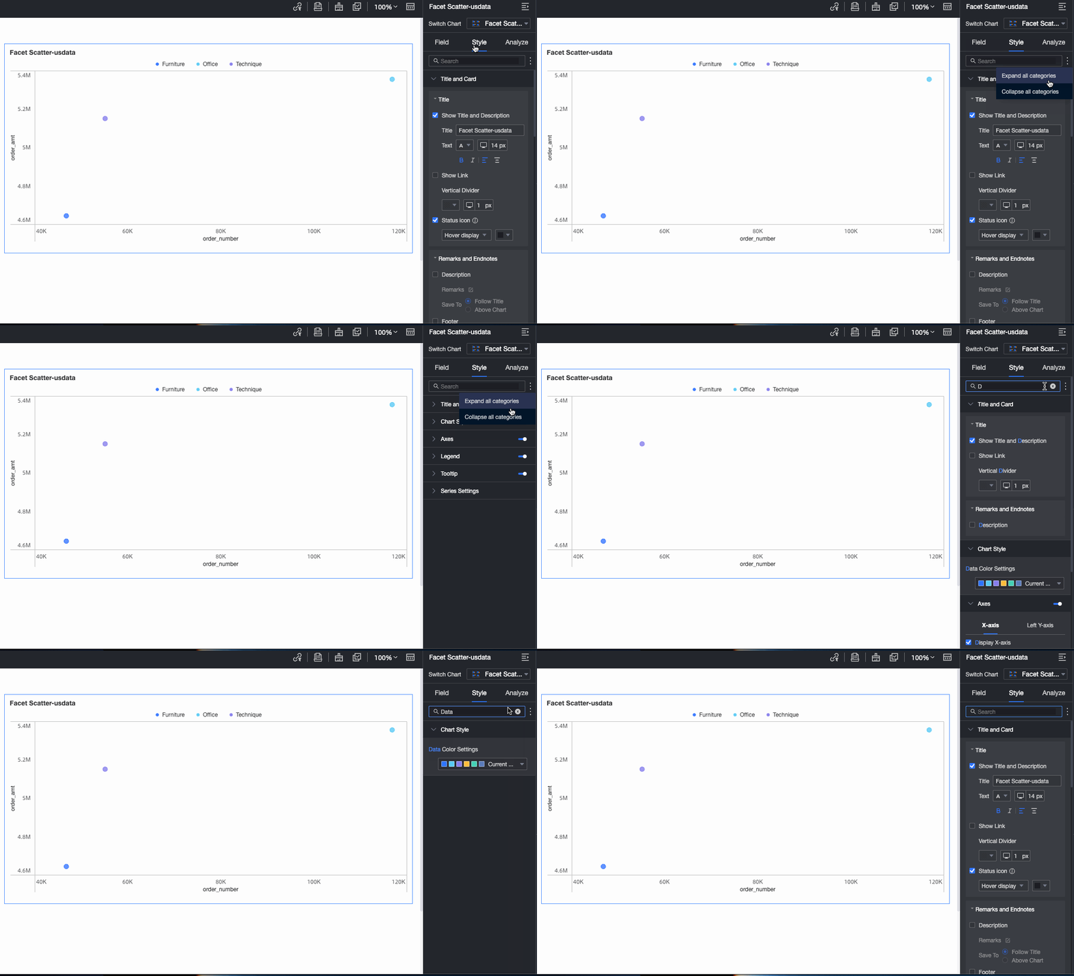
Enter a keyword in the Search box at the top of the configuration pane to find a configuration item. Click the  icon to Expand all or Collapse all categories.
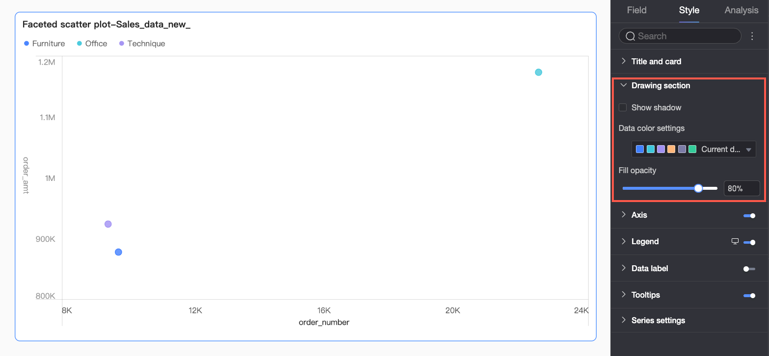
Plot Area
In the Plot area section, you can configure Data colors.
Axes
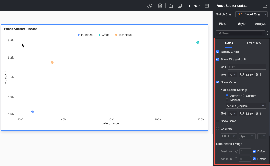
In the Axes section, configure the axis styles.
|
Parameter |
Parameter |
Description |
|
X-axis |
Show X-axis |
Shows or hides the X-axis. |
|
Show title and unit |
Shows or hides the axis title and unit for the X-axis. You can also configure their names, positions, and text styles. |
|
|
Show axis labels |
Shows or hides labels on the X-axis. If enabled, you can configure the Axis label display format and Text style. The display format has two modes: Auto and Custom.
|
|
|
Show tick marks |
Shows or hides tick marks on the X-axis. |
|
|
Show gridlines |
Shows or hides gridlines for the X-axis, and configures their line style, width, and color. |
|
|
Axis value range and interval |
|
|
|
Left Y-axis |
Show left Y-axis |
Shows or hides the left Y-axis. |
|
Show title and unit |
Shows or hides the axis title and unit for the left Y-axis. You can also configure their names, positions, and text styles. |
|
|
Show axis labels |
Shows or hides labels on the left Y-axis. If enabled, you can configure the Axis label display format and Text style. The display format has two modes: Auto and Custom.
|
|
|
Show tick marks |
Shows or hides tick marks on the left Y-axis. |
|
|
Show gridlines |
Shows or hides gridlines for the left Y-axis, and configures their line style, width, and color. |
|
|
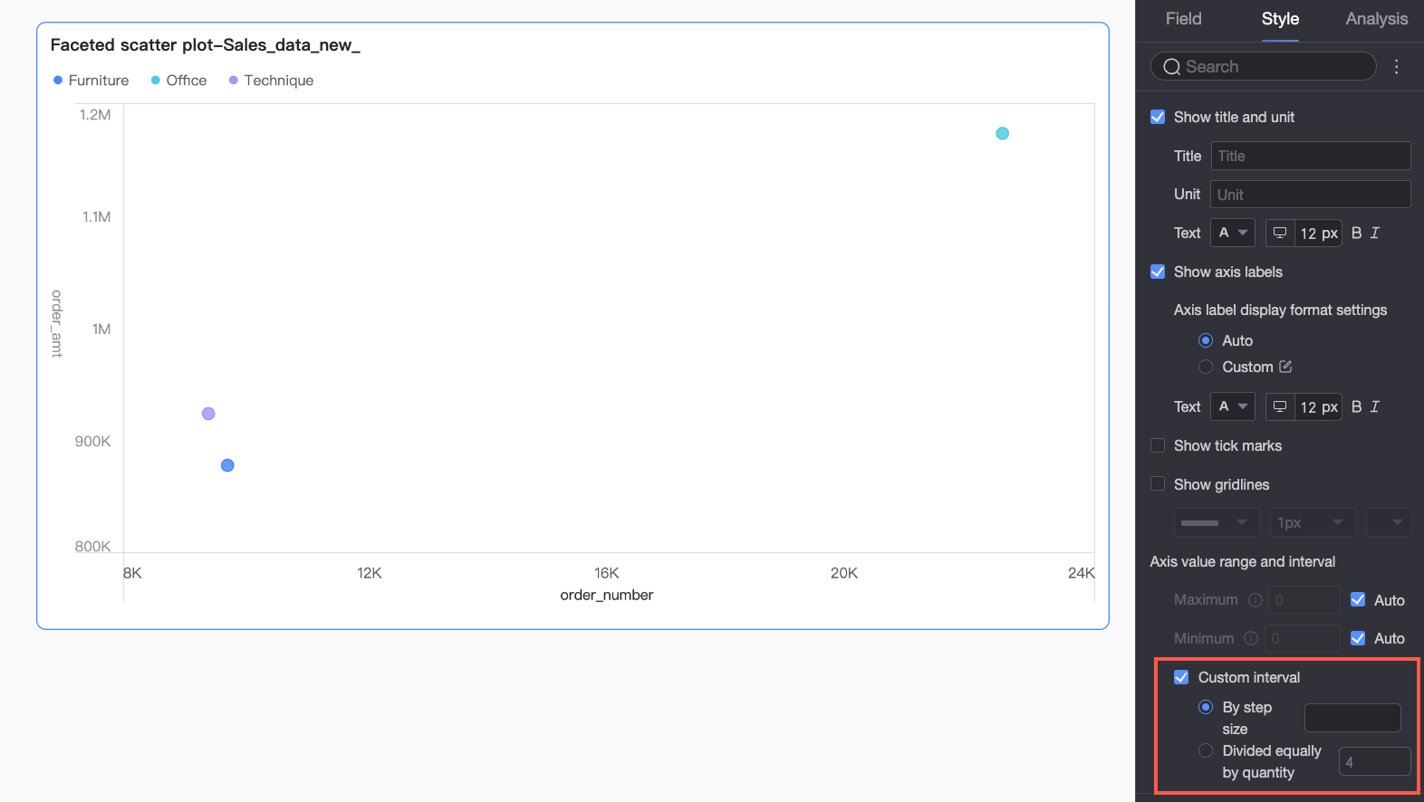
Axis value range and interval |
|
 icon to open the Data Display Format Settings dialog box and configure the data format. For more information about the configuration items in the dialog box, see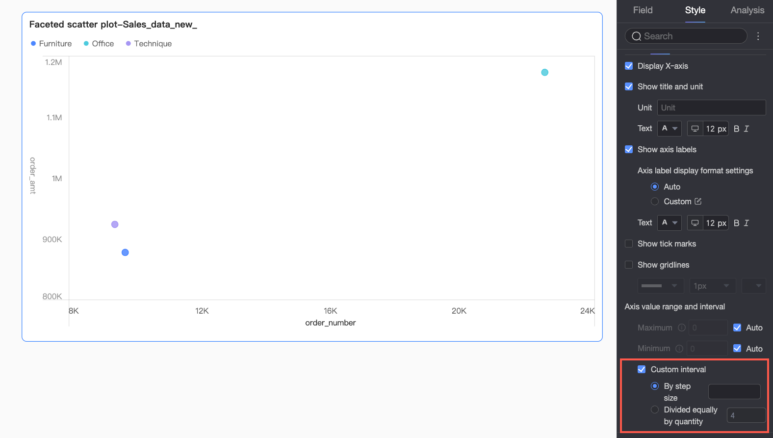
Legend
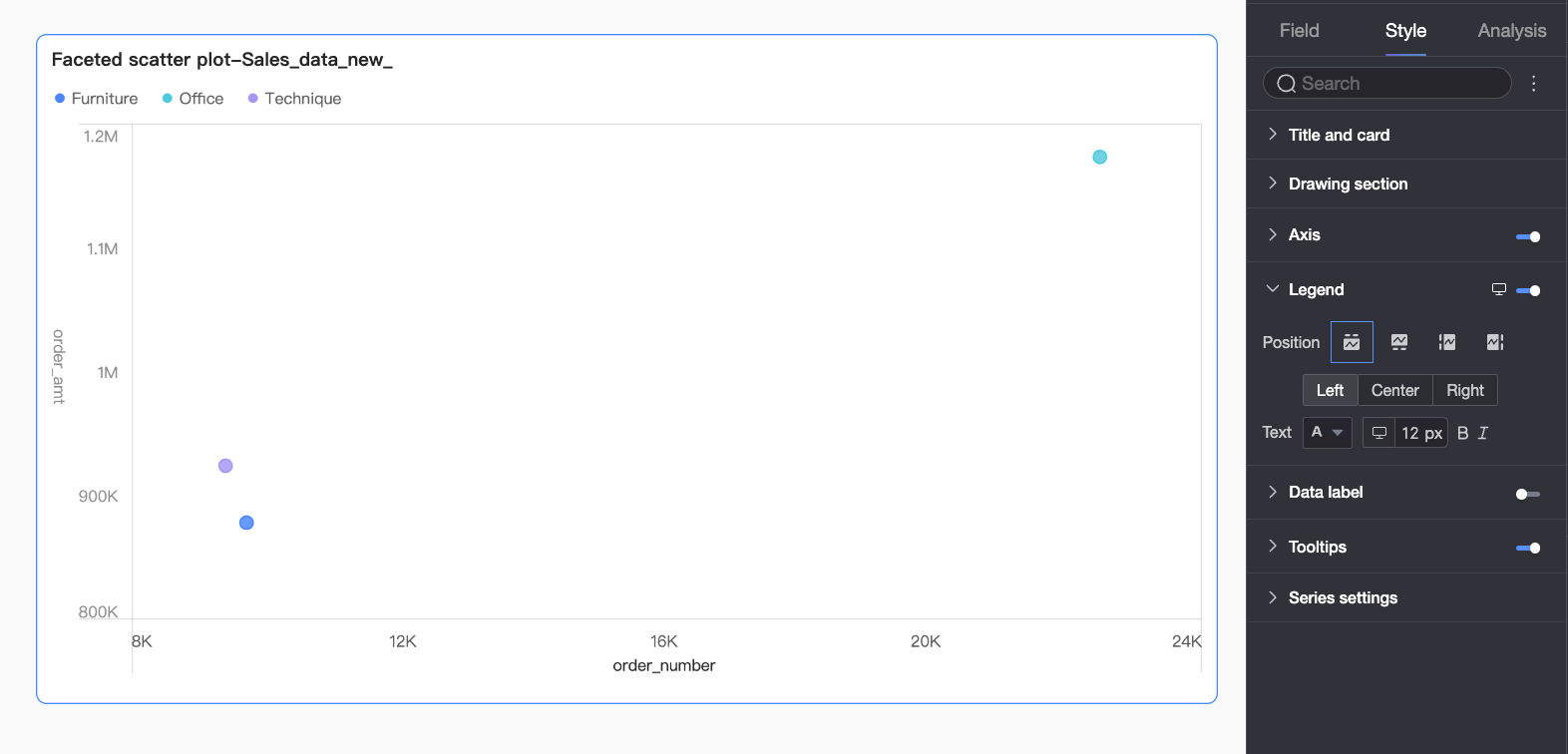
In the Legend section, click the  icon to enable the chart legend and configure its style.
|
Parameter |
Description |
|
Position |
Sets the display position and alignment of the legend on desktop.
|
|
Text |
Sets the text style of the legend, including font color, size, weight, and italic. |
|
Mobile legend |
The legend settings for PC and mobile are independent. You can switch to the mobile editing view by using the PC/Mobile toggle ( |
 ) at the top of the dashboard editing page to configure a separate legend for mobile devices, including its position and text style.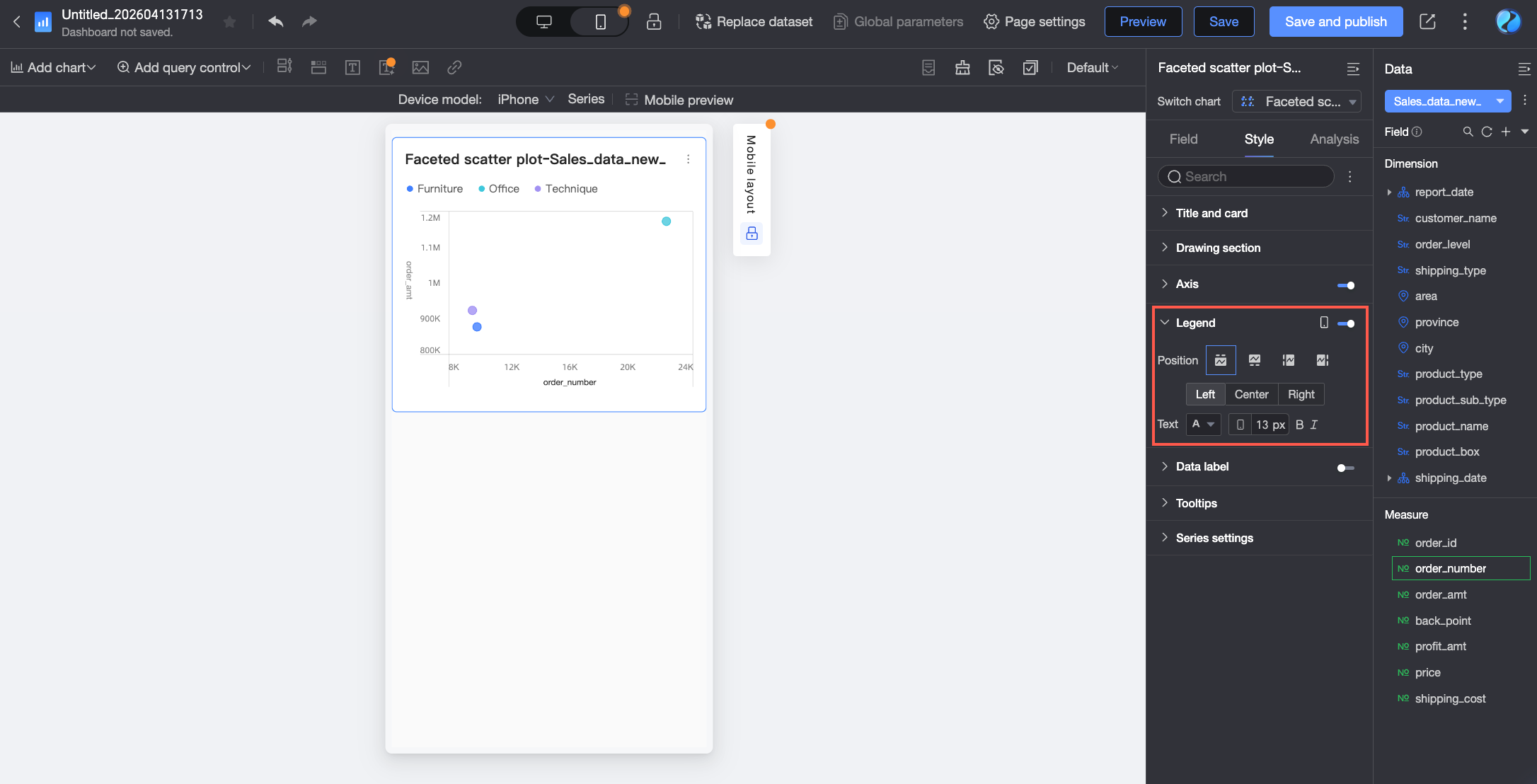
Data Labels
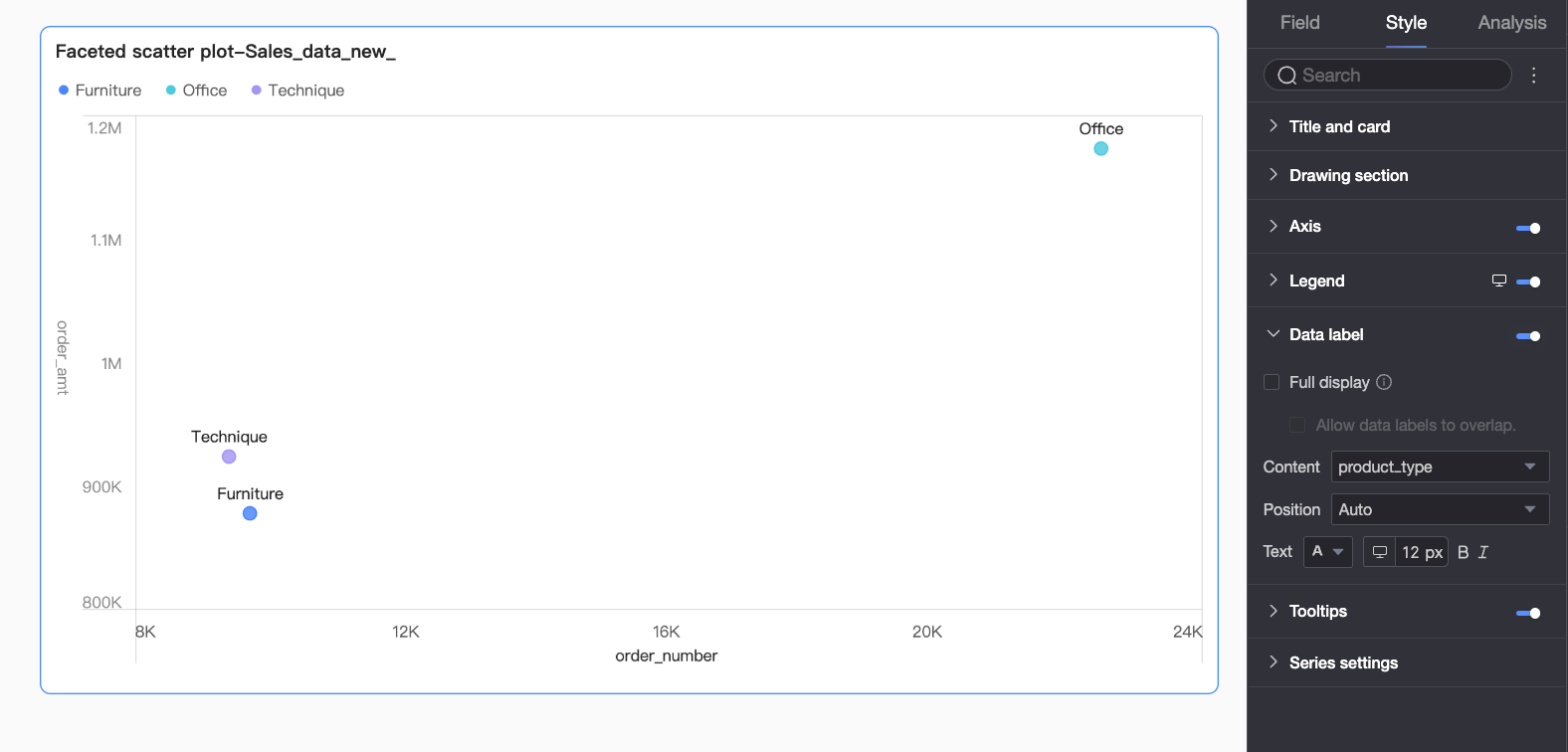
In the Data labels section, you can show or hide data labels and configure their styles.
|
Parameter |
Description |
|
Show all labels |
When enabled, the system repositions labels to prevent overlap. If there are too many labels, some may be hidden if they fall outside the axis area. To show all labels regardless of overlap, select Allow data labels to overlap. |
|
Content |
Select the content to display in the labels. |
|
Position |
Sets the display position of the labels. |
|
Text |
Sets the text style of the labels. |
Tooltip
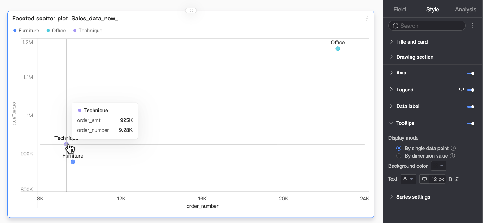
In the Tooltip section, click the icon to enable tooltips and configure their style.
|
Parameter |
Description |
|
Display mode |
Sets the tooltip display mode: by single data point or dimension value. |
|
Background color |
Sets the background fill color of the tooltip. |
|
Text |
Sets the text style within the tooltip, including font color, size, weight, and italic. |
|
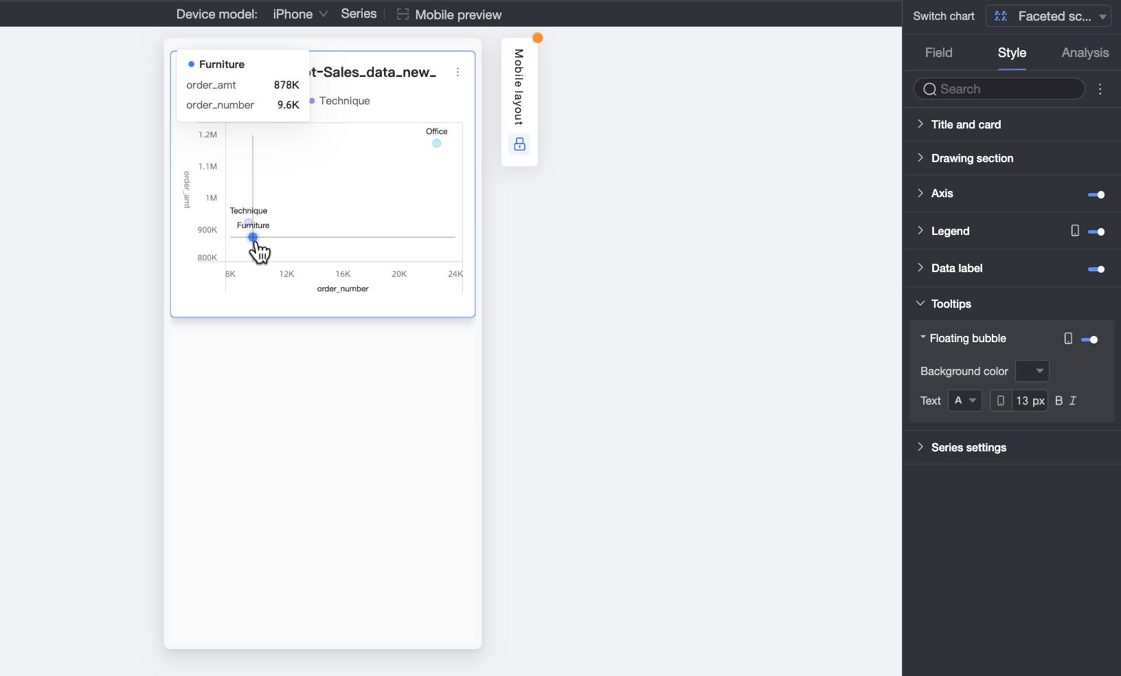
Mobile tooltip |
Tooltip settings for PC and mobile are independent. Use the PC/Mobile toggle ( |
Series Settings
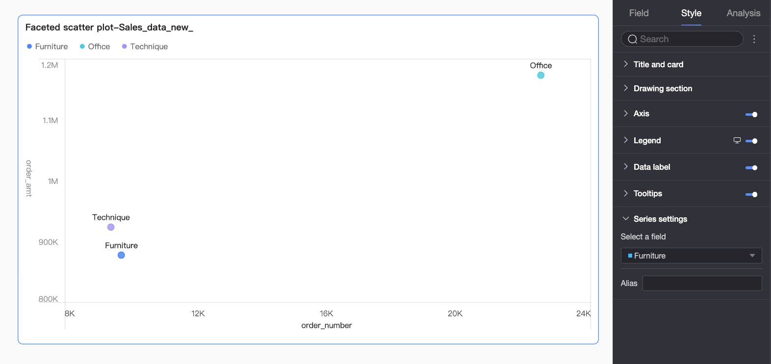
In the Series settings section, configure the series styles.
|
Parameter |
Description |
|
Select series |
Select a series to configure its settings. |
|
Display name |
Sets the display name for the selected series. |
Configure Chart Interactions
|
Parameter |
Parameter |
Description |
|
Data interaction |
Interaction |
When your analysis spans multiple charts, enable chart interactions to link them. For detailed instructions, see Configure and view interactions. |
|
Hyperlink |
When your analysis spans multiple dashboards, use hyperlinks to connect them. You can create a hyperlink using a parameter or an external link. For detailed instructions, see Configure and view hyperlinks. |
Next Steps
-
To let others view your dashboard, share it with specific users. For more information, see Share a dashboard.
-
To create a menu-driven portal for thematic analysis, integrate your dashboard into a BI portal. For more information, see Create a PC BI portal.