A polar area chart visualizes how data changes over time or compares values across categories. It is ideal for enumerated data.
Prerequisites
You have created a dashboard. For more information, see Create a Dashboard.
Example
Limitations
When you add data to a polar area chart, the following limitations apply:
-
Sector Angle/Measure: You must add one to ten measures.
-
Sector Label/Dimension: You can add only one dimension.
Configure Chart Data
-
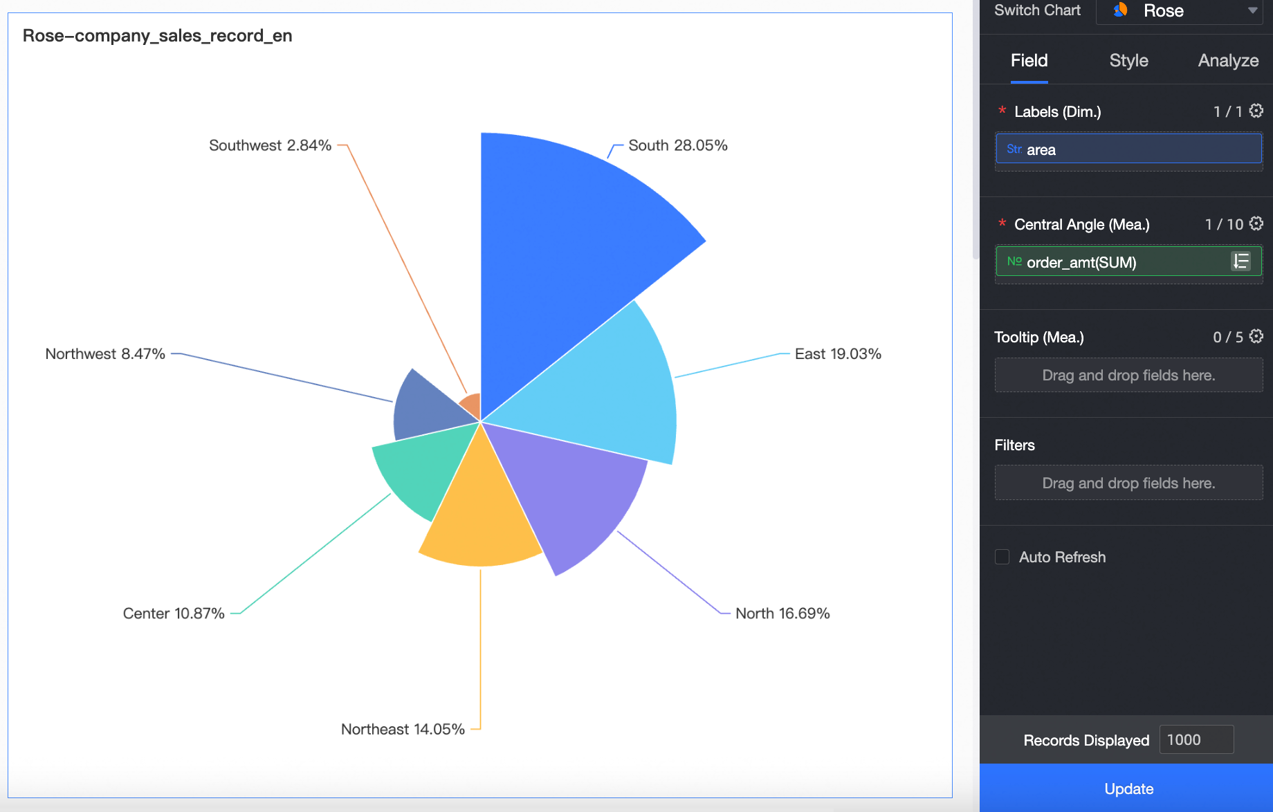
On the Fields tab, select the required dimension and measure fields:
-
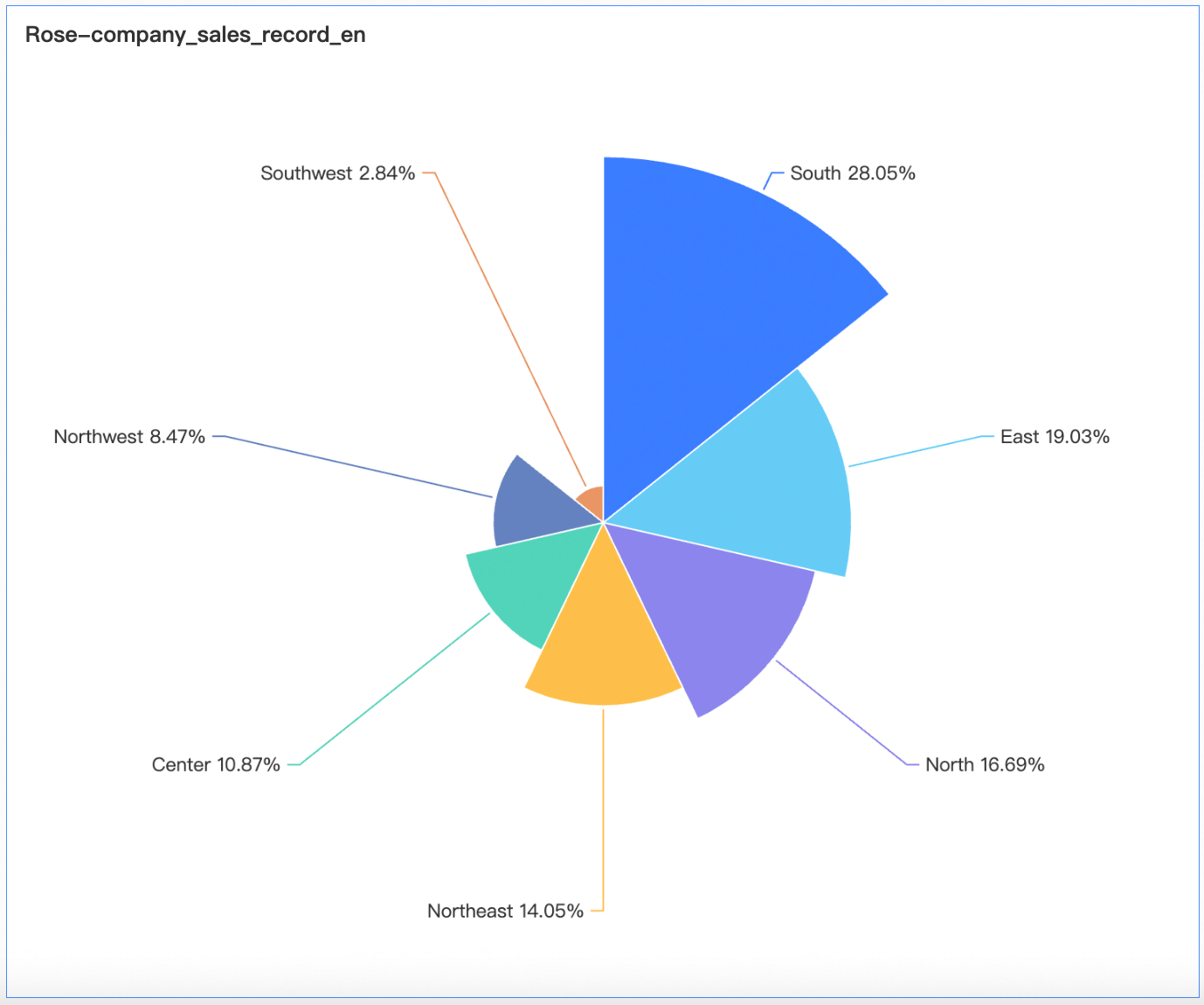
In the Dimensions list, find Region, and then double-click or drag it to the Sector Label/Dimension field.
-
In the Measures list, find Order Amount, and then double-click or drag it to the Sector Angle/Measure field.
NoteAfter you add a measure, the sectors are sorted clockwise in descending order by default, starting from the top.
-
-
Click Update to refresh the chart.
Configure Chart Styles
For information about chart title and card styles, see Configure the chart title area.
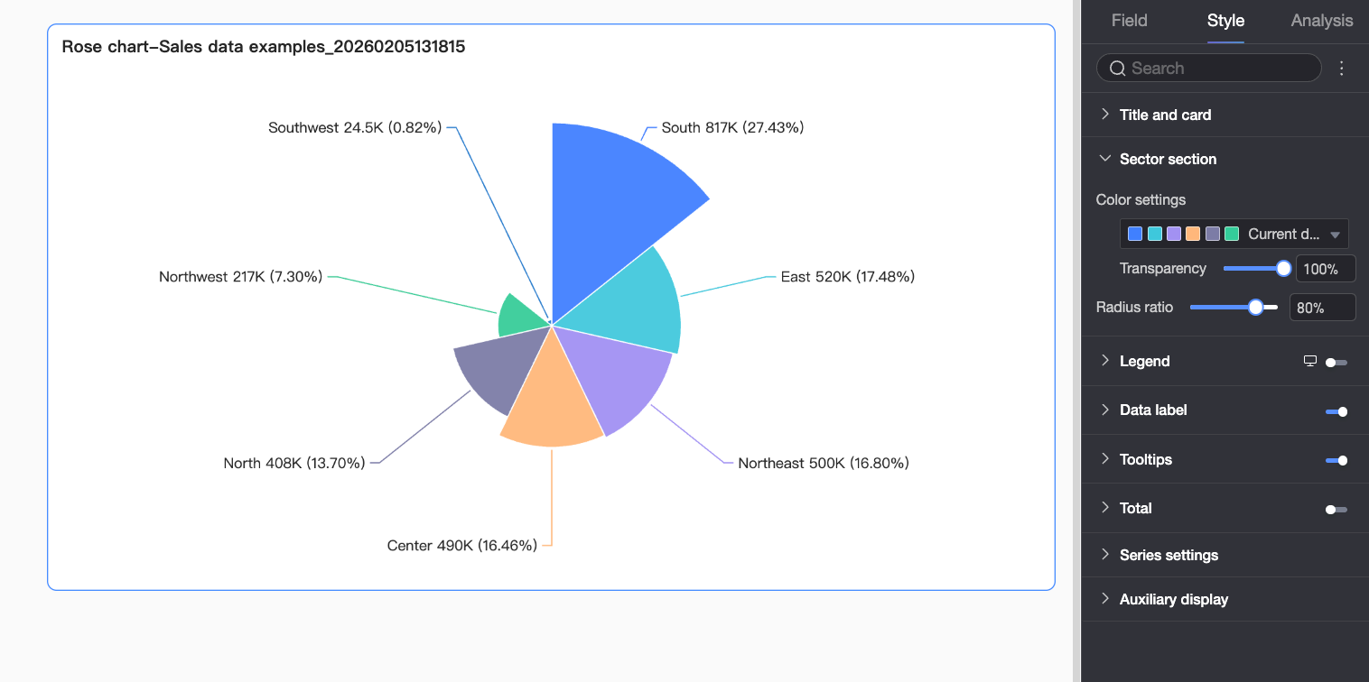
Sector
|
Parameter |
Description |
|
Color scheme |
Sets the chart color scheme. You can choose a predefined palette or customize colors for specific dimension values. |
|
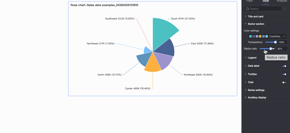
Radius ratio |
Sets the chart radius as a percentage of the component size. |
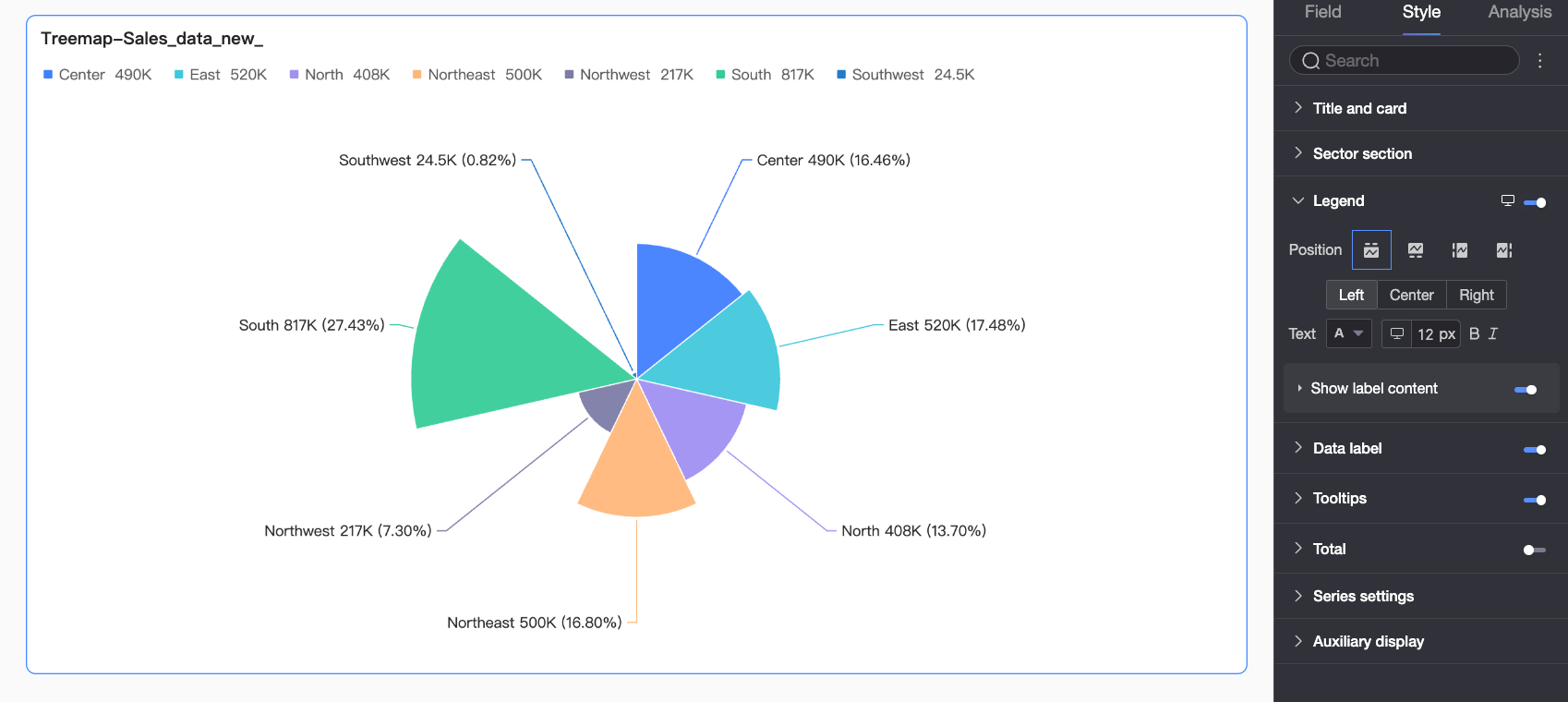
Legend
Show the chart legend and configure its style.
-
PC configuration
Parameter
Description
Position
Sets the legend position and alignment on a PC.
-
If the position is set to Top or Bottom, you can align the legend to the left, center, or right.
-
If the position is set to Left or Right, you can align the legend to the top, middle, or bottom. You can also set the legend's distance from the chart.
Text
Sets the legend text style on a PC, including font color, size, weight, and style (italic).
Display label content
Click the
 icon to enable label content.
Content
Specifies the data to display in the legend label. You can choose to display the
measureorpercentage.-
Measure: The aggregated value of all measures for the corresponding dimension value. For example, the total sales for a specific region.
-
Percentage: The sector's value as a percentage of the total value of all sectors. If you choose to display the percentage, you can also set the number of decimal places to 0, 1, or 2.
Spacing from main legend
Sets the distance between the data content and the main legend.
Text style
Sets the text style of the data content.
If you select Measure in the Content field, you can configure the text style for the measure data. If you select Percentage, you can configure the text style for the percentage data.
-
-
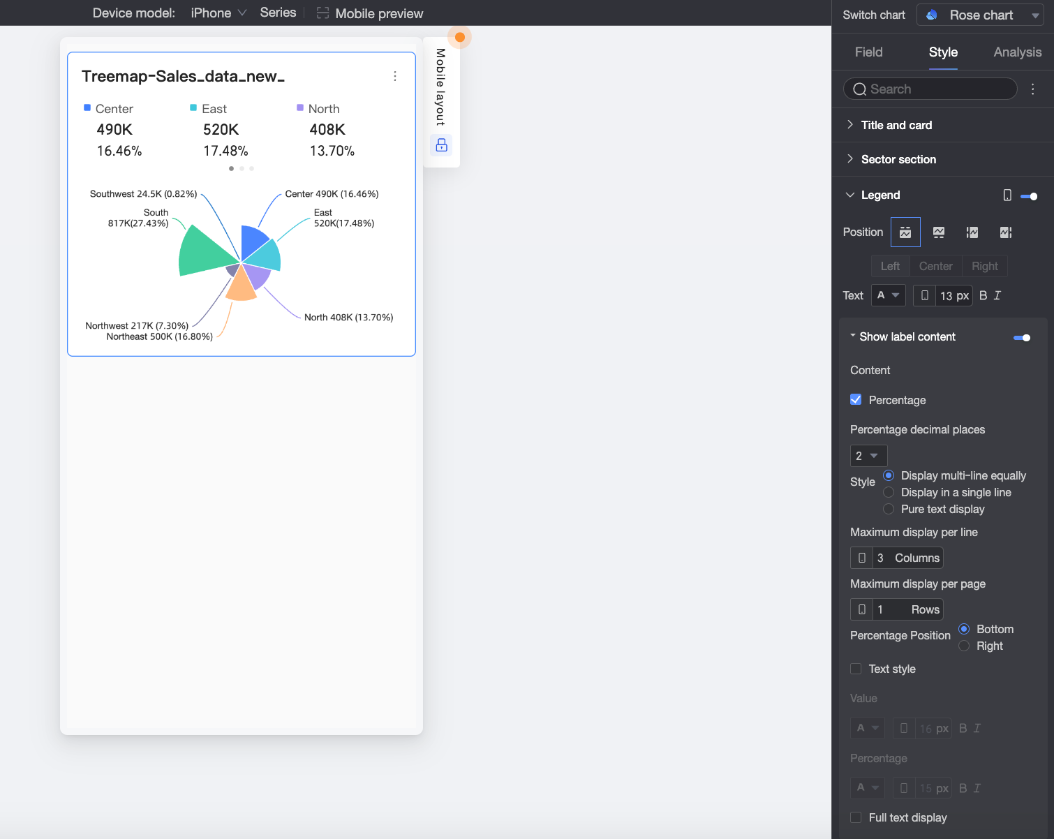
Mobile configuration
Parameter
Description
Position
Sets the legend position and alignment on a mobile device.
-
If the position is set to Top or Bottom, you can align the legend to the left, center, or right.
-
If the position is set to Left or Right, you can align the legend to the top, middle, or bottom. You can also set the distance between the legend and the chart.
NoteWhen the position is set to Top, you can enable labels under the legend.
Text
Sets the legend text style on a mobile device, including font color, size, weight, and style (italic).
Display label content
When Position is set to Top, click the
icon to enable legend sub-labels.Content
Specifies whether to display percentage data in the legend sub-labels. If enabled, you can also set the number of decimal places to 0, 1, or 2.
Style
Sets the layout style for the legend sub-labels:
-
Grid: Arranges the labels in an evenly spaced grid based on the number of columns set in Max per row and the number of rows set in Max per page.
-
Single line: Displays all label content in a single line.
-
Plain text: Displays only text content without icons.
Percentage position
If you choose to display Percentage data in the Content field, and the Style is set to Grid or Single line, you can position the percentage value Below or to the Right of the value label.
Text style
When the Style is set to Grid or Single line, you can configure the text style of the value.
If you choose to display Percentage data, you can apply a separate text style to it to visually distinguish it from the value label.
Show full text
When the Style is set to Grid or Single line, long measure names might be truncated. To display the full measure name, select Show Full Text.
-
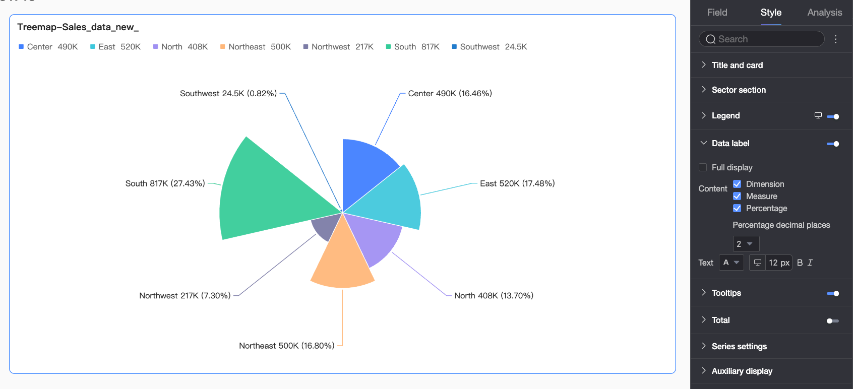
Data Label
|
Parameter |
Description |
|
Show all labels |
Displays all data labels, even if they overlap. |
|
Content |
Specifies the content to display in data labels. You can choose to display the dimension, measure, or percentage. If you choose to display the percentage, you can also set the number of decimal places to 0, 1, or 2. |
|
Text |
Sets the style for the label text. |
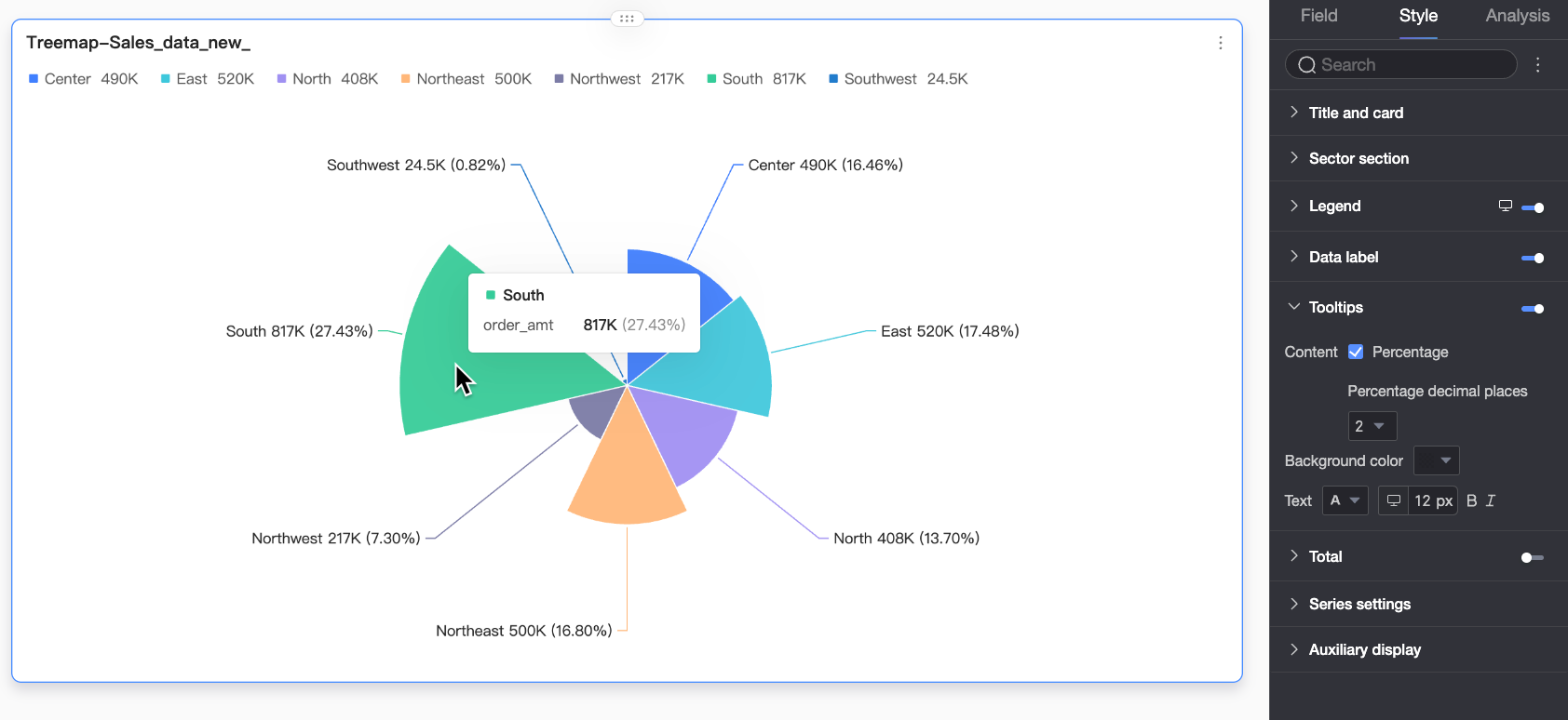
Tooltip
In the Tooltip section, click the  icon to enable the tooltip and configure its style.
|
Parameter |
Description |
|
Content |
Specifies the tooltip content. You can choose whether to display percentage information. |
|
Background color |
Sets the background color of the tooltip. |
|
Text |
Sets the text style in the tooltip, including font color, size, weight, and style (italic). |
|
Mobile tooltip |
Tooltips for PC and mobile are configured independently. To configure the mobile tooltip, switch to the mobile editing view by using the PC/Mobile toggle button (
|
 ) at the top of the dashboard edit page. Font size can be set separately for each view, while other styles apply globally.
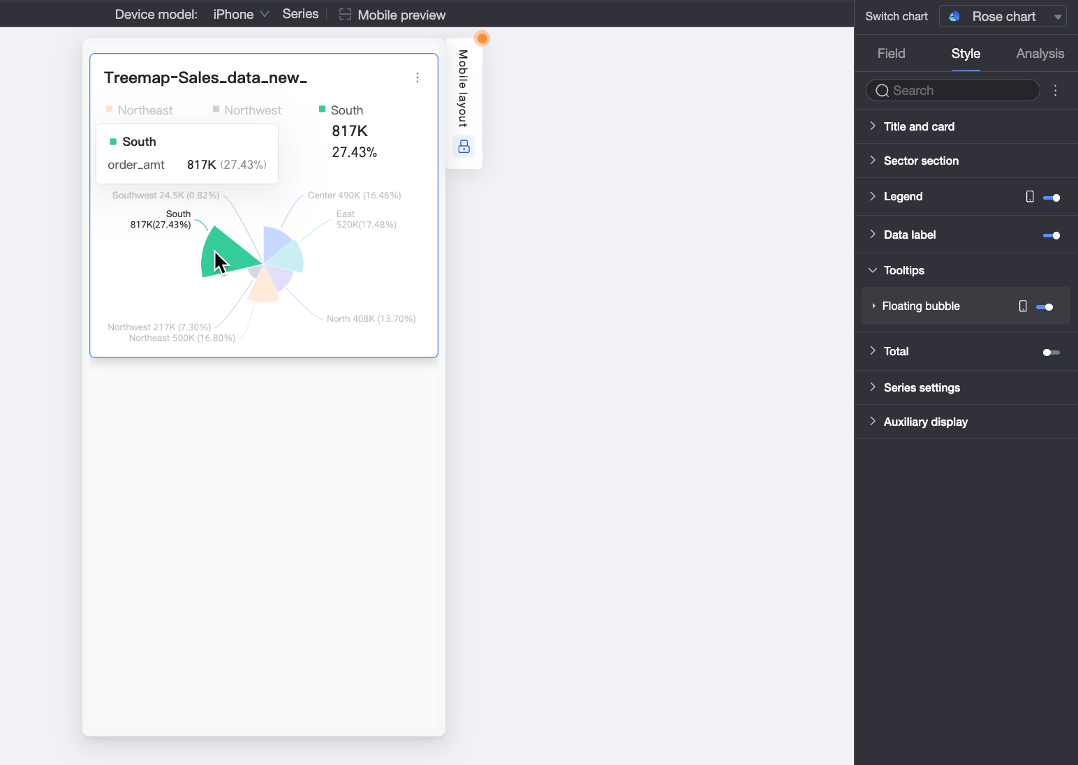
Total
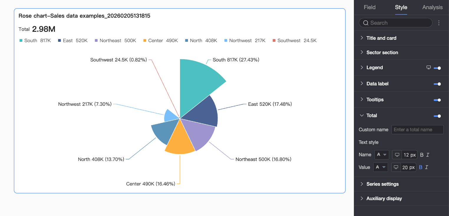
|
Parameter |
Description |
|
Custom name |
Sets a custom name for the total. |
|
Text Style |
Sets the text styles for the name and the value. |
Series
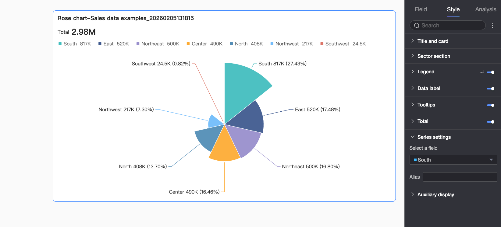
|
Parameter |
Description |
|
Select series |
Select a dimension based on your business scenario. |
|
Alias |
Sets an alias for the series name. |
Auxiliary Display
In the Auxiliary Display section, you can configure a metric filter.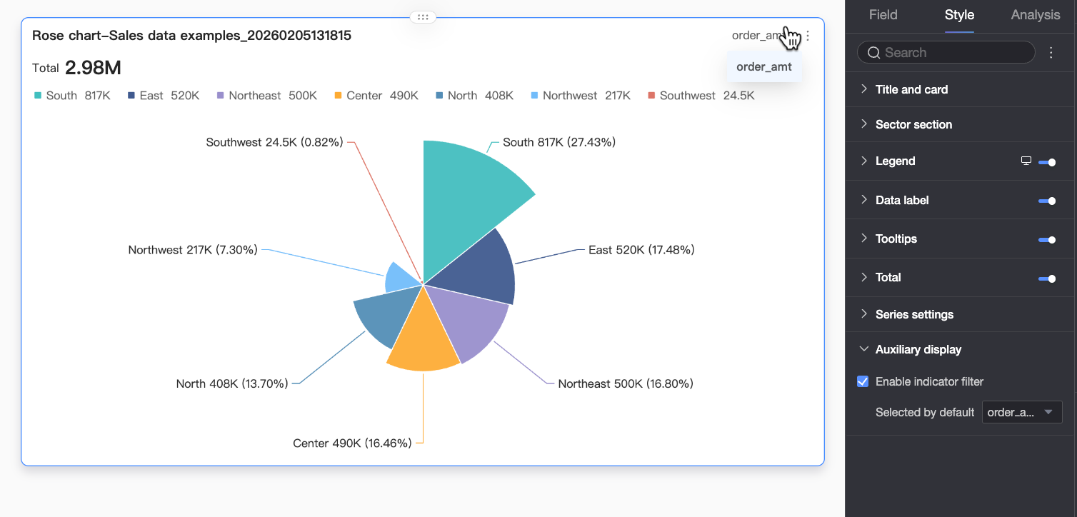
|
Parameter |
Description |
|
Enable metric filter |
Specifies whether to enable the in-chart metric filter. When enabled, you can switch between measures configured in Sector Angle/Measure within the same chart. |
Chart Analysis
|
Feature |
Description |
|
Interaction |
When data spans multiple charts, use chart interaction to link them for analysis. For more information, see Interaction. |
|
Hyperlink |
When data spans multiple dashboards, use hyperlinks to link them for analysis. Hyperlinks include Parameter Hyperlink and External Link. For more information, see Hyperlink. |
|
Annotation |
When chart data is anomalous or requires attention, add annotations such as color highlights, icons, or comments. For more information, see Annotation. |
Next Steps
-
Share your dashboard with others. For more information, see Share a Dashboard.
-
Integrate your dashboard into a data portal for topic-based analysis with navigation menus. For more information, see Create a PC Data Portal.