A heat map uses color intensity to represent the magnitude and geographic distribution of data. You can create heat maps only in workspaces of Quick BI Enterprise Standard Edition and Quick BI Pro Edition.
Prerequisites
-
You have created a dashboard. For more information, see Create a new dashboard.
-
Ensure that the geographic area fields have been converted into geographic information. For more information, see Configure fields.
NoteFor example, if you add the area field to the chart, it is recognized as geographic information only when the
 icon appears next to it. For a mapping table of detailed information by region, see public-area-info.xlsx. This file is for geographic area matching purposes only and does not represent the political stance of Quick BI.
Limitations
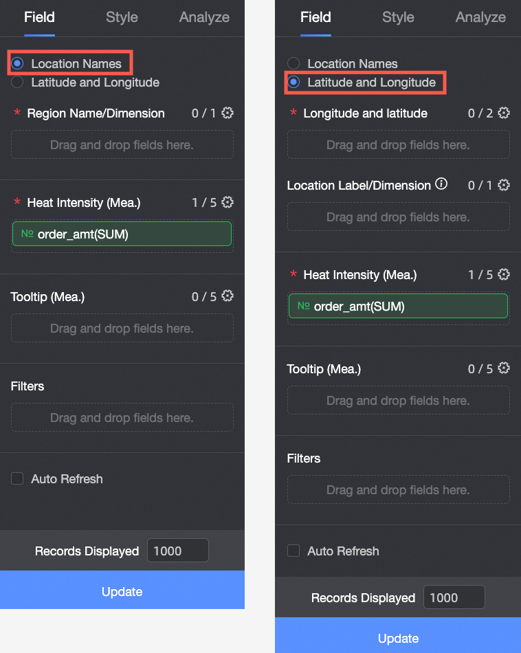
If you create a heat map in Area Name mode, the map consists of Area Name/Dimension and Heat Intensity/Measure:
-
Area Name is a data dimension. You can select a maximum of one dimension, which must be a geographic field. For example, province.
-
Heat Intensity/Measure consists of data measures. You must select at least one measure and can select up to five measures. For example, order amount and profit amount.
If you create a heat map in Longitude and Latitude mode, the map consists of Longitude and Latitude/Dimension, Location Tag/Dimension, and Heat Intensity/Measure:
-
Longitude and Latitude consists of data dimensions. You can select a maximum of one longitude field and one latitude field.
-
Location Tag is a data dimension. This is an optional field that supports string and geographic dimensions.
-
Heat Intensity/Measure consists of data measures. You must select at least one measure and can select up to five measures. For example, order amount and profit amount.
Overview
Use cases
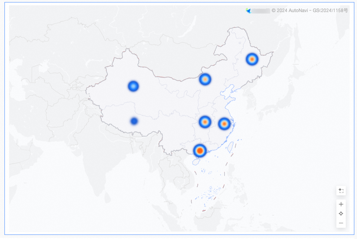
Heat maps display the spatial distribution of data across administrative regions, prefecture-level cities, streets, or longitude and latitude coordinates.
Benefits
-
Visualization: Renders data density through customizable heat map styling.
-
Interaction: Lets you lasso-select to zoom in on the map, switch metrics, and filter data within the component.
Example
Configure chart fields
-
On the Fields tab, select the required dimension and measure fields:
-
You can create a heat map based on Geographic Information in two ways: by Area Name or by Longitude and Latitude.
 Note
NoteIf you create a heat map in Area Name mode, the map consists of Area Name/Dimension and Heat Intensity/Measure:
-
Area Name is a data dimension. You can select a maximum of one dimension, which must be a geographic field. For example, province.
-
Heat Intensity/Measure consists of data measures. You must select at least one measure and can select up to five measures. For example, order amount and profit amount.
If you create a heat map in Longitude and Latitude mode, the map consists of Longitude and Latitude/Dimension, Location Tag/Dimension, and Heat Intensity/Measure:
-
Longitude and Latitude consists of data dimensions. You can select a maximum of one longitude field and one latitude field.
-
Location Tag is a data dimension. This is an optional field that supports string and geographic dimensions.
-
Heat Intensity/Measure consists of data measures. You must select at least one measure and can select up to five measures. For example, order amount and profit amount.
-
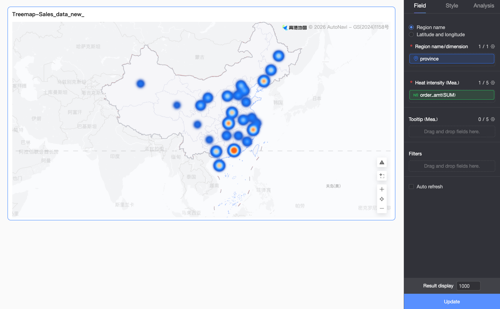
If you select Area Name, double-click or drag province to Area Name/Dimension.
-
If you select Longitude and Latitude, double-click or drag the longitude and latitude fields to Longitude and Latitude/Dimension. The Location Tag/Dimension field is optional.
-
-
In the Measures list, double-click or drag order_amount to the Heat Intensity/Measure area.
-
-
Click Update to automatically update the chart.
 Note
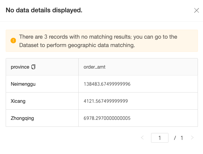
NoteIf an area value in your data does not match a standard geographic name, a notification icon appears in the lower-right corner of the chart. Click the icon to view the unmapped data, which helps you troubleshoot and correct data issues.
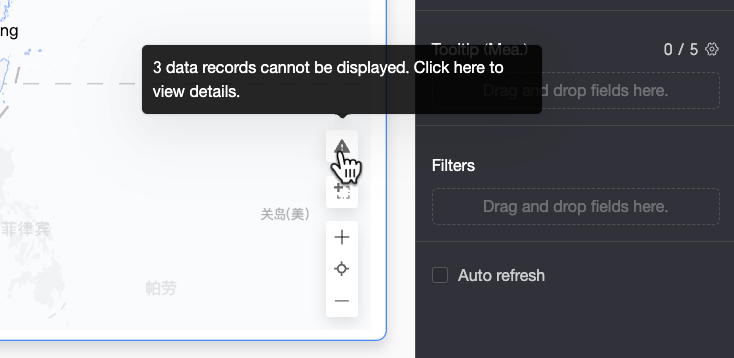
-
On the Unmapped Data Details page, you can view the details of data that could not be matched and copy it with a single click. You can then paste this data on the dataset's field configuration page to perform batch corrections efficiently.
-
After you complete the configuration, the map displays the data correctly.
-
Configure chart styles
For common style settings, see Configure the chart title and header.
Geographic area
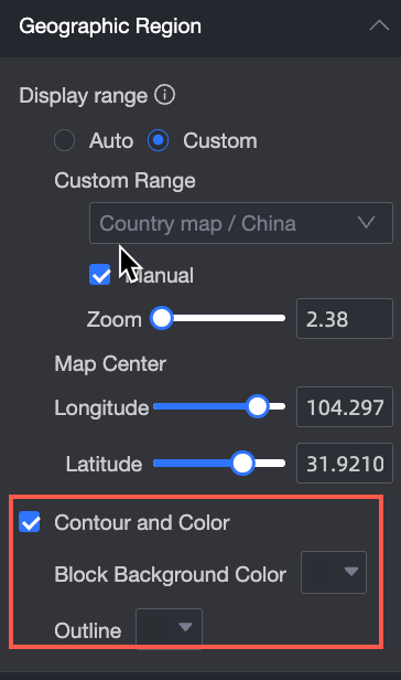
In the Map Area, set the Display Range and Outline and Fill.
-
For Display Range, you can select Auto or Custom. In this example, China is selected.
Note-
Auto automatically adjusts the display based on the data range, while Custom allows you to set the range manually. In interactive analysis scenarios, the display always adjusts automatically to the data range.
-
The custom display range currently supports only global continents and countries, as well as regions, provinces, and cities in China.

Enable Manual Adjustment to automatically generate the current center point and zoom level, which you can then modify.

-
-
In the Outline and Fill section, you can configure the colors for Area Background and Outline.
NoteOutlines are not supported in some regions.
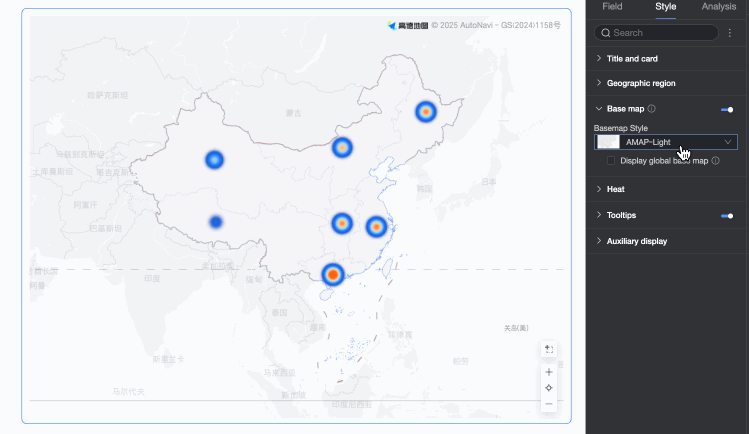
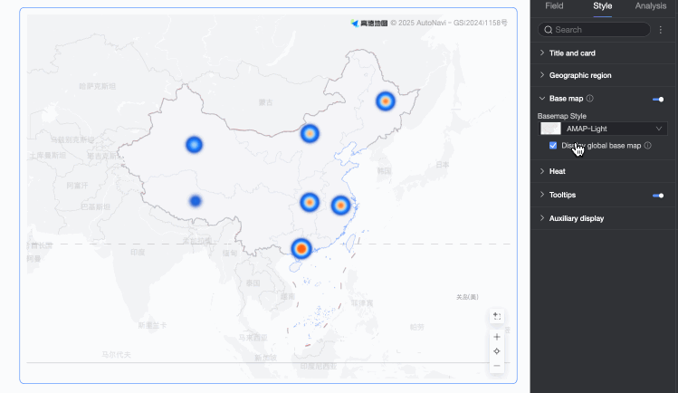
Basemap
In the Basemap section, configure Show Basemap, Basemap Style, and Show Global Basemap.
-
Show Basemap: Click the toggle
 to show or hide the basemap.
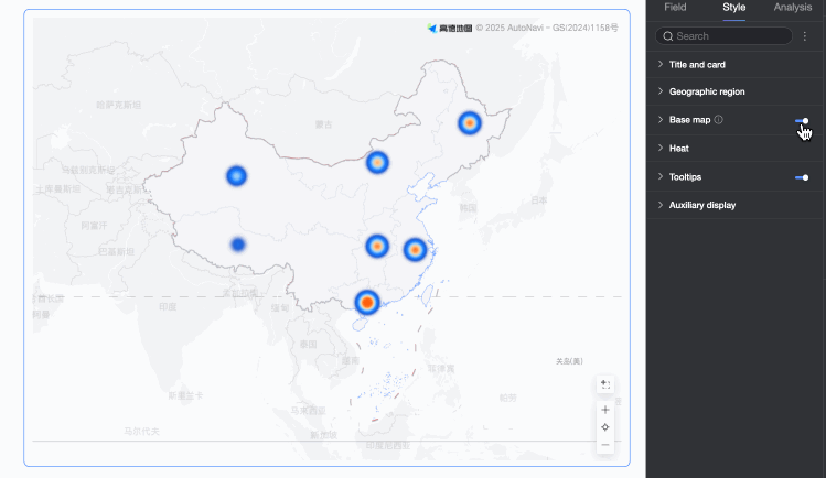
-
Basemap Style: Supports various styles for the Amap basemap.
-
Show Global Basemap: Select this option to display global information, such as cities, on the basemap.
 Note
NoteGlobal basemap usage limit: Each Quick BI organization can preview map charts containing overseas basemap information 1,000 times per month, calculated based on the number of basemap initializations. If this limit is exceeded, only domestic basemap information is displayed in map charts.
Heat
In the Heat section, configure the heat map's Style, Color Scheme, and Heat Radius.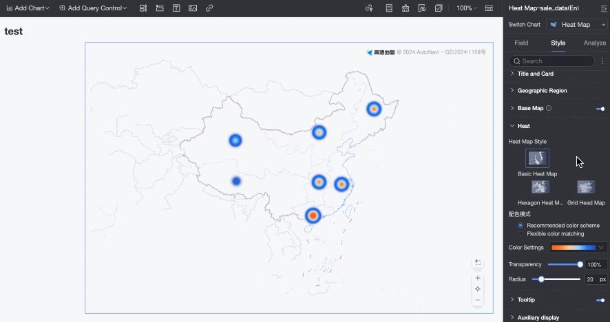
Tooltip
In the Tooltip section, click the  icon to enable tooltips and configure their style.
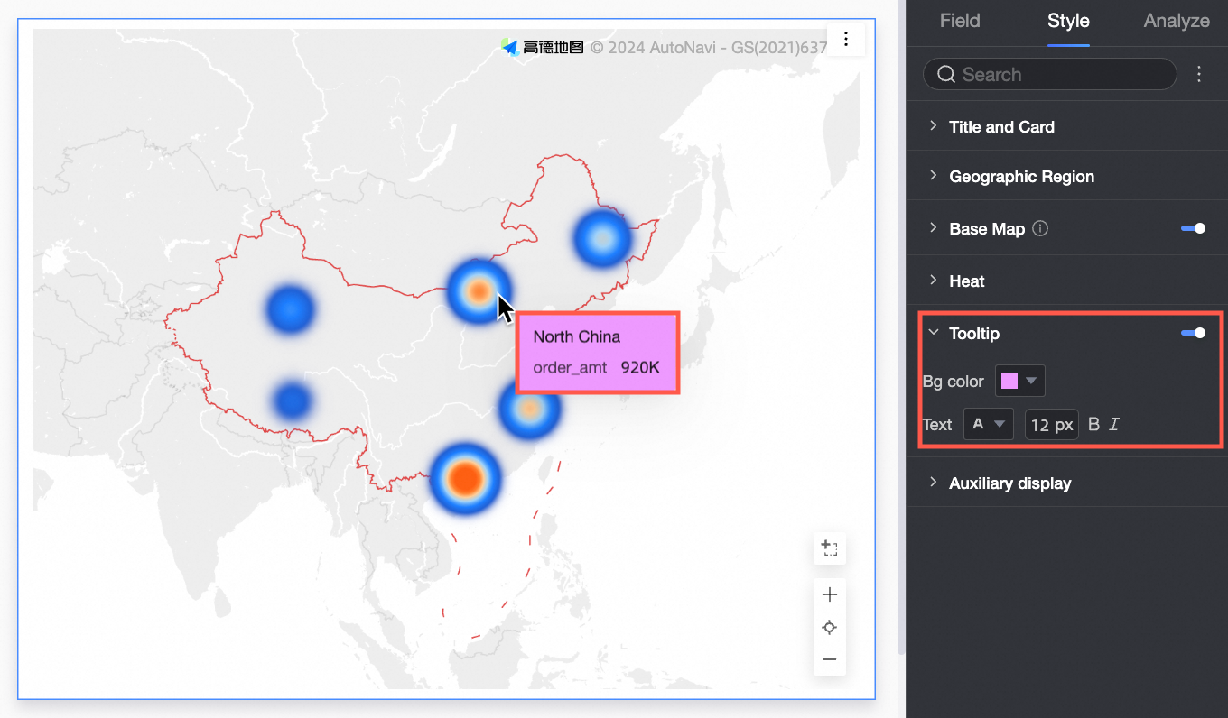
|
Parameter |
Description |
|
Background Color |
The background fill color of the tooltip. |
|
Text |
The font color, size, weight, and style (italic) of tooltip text. |
|
Mobile Tooltip |
Tooltip settings for PC and mobile are independent. To edit the mobile tooltip, click the PC/Mobile switch button ( |
 ) at the top of the dashboard editing page to switch to the mobile editing view. Font size can be set separately for PC and mobile. All other styles are shared.
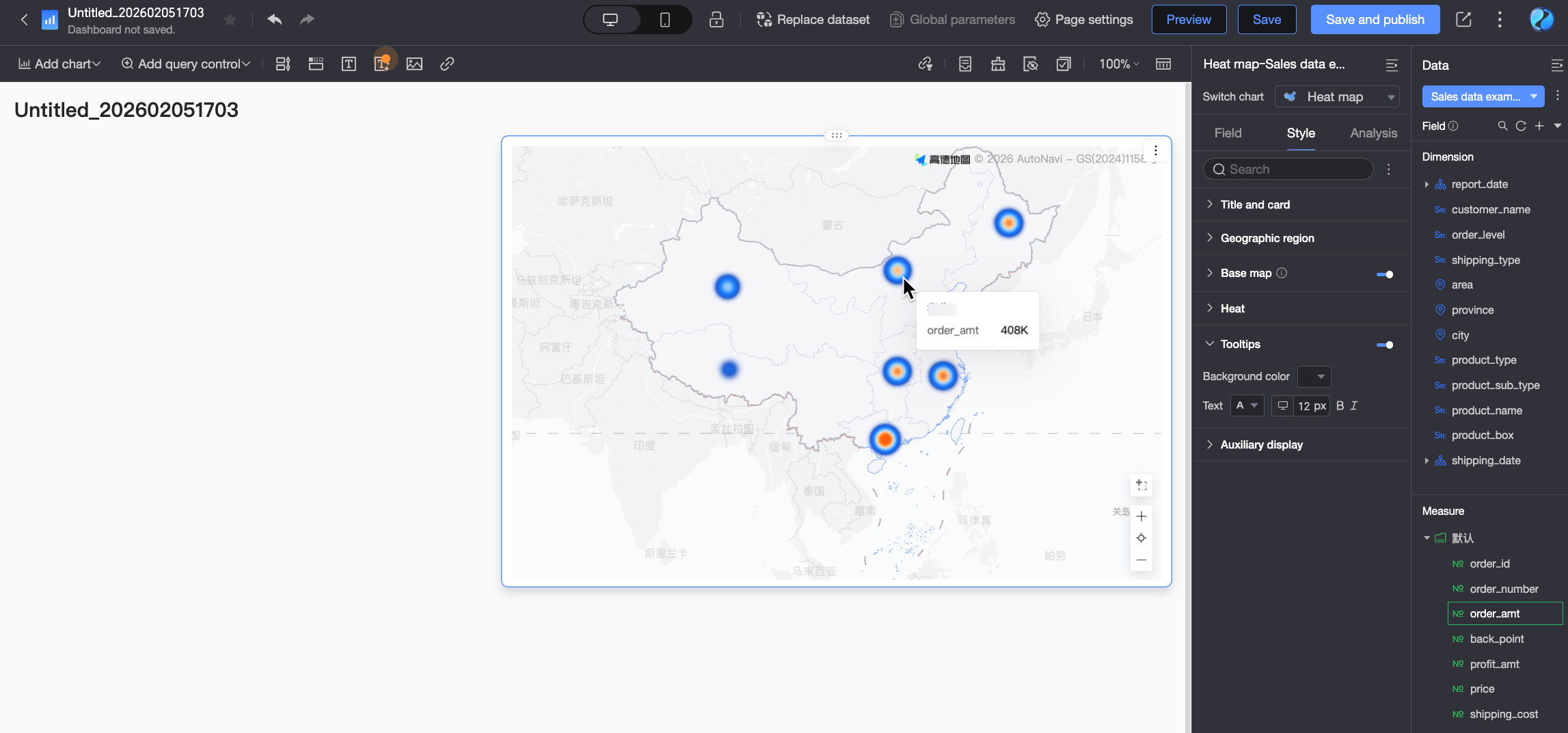
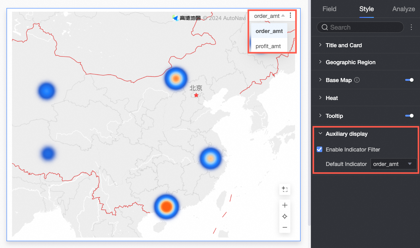
Auxiliary display
In the Auxiliary Display section, enable and configure the metric filter to specify which metric items to display.