A horizontal bar chart shows data distribution across a two-dimensional dataset. One axis represents categories, the other represents values — for example, product sales by month.
Overview
-
Use Cases
Compares values across groups. Bar length represents value, making differences easy to identify at a glance.
-
Benefits
-
Computational capabilities: One-click period-over-period comparisons, cumulative calculations, intelligent reference lines, and trendlines.
-
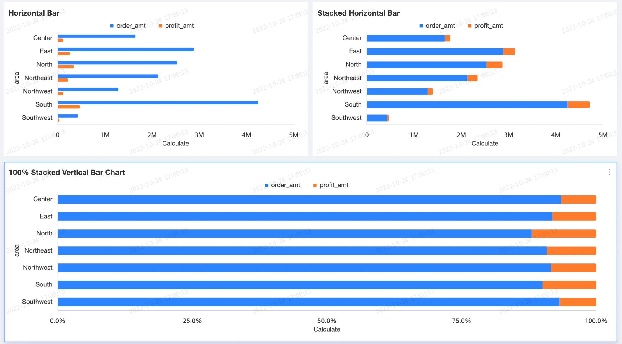
Visualization effects: Supports horizontal bar, stacked, and 100% stacked chart types. Configurable data labels, legends, and overview axis.
-
-
Example
Limitations
-
Prerequisites: You have created a dashboard.
-
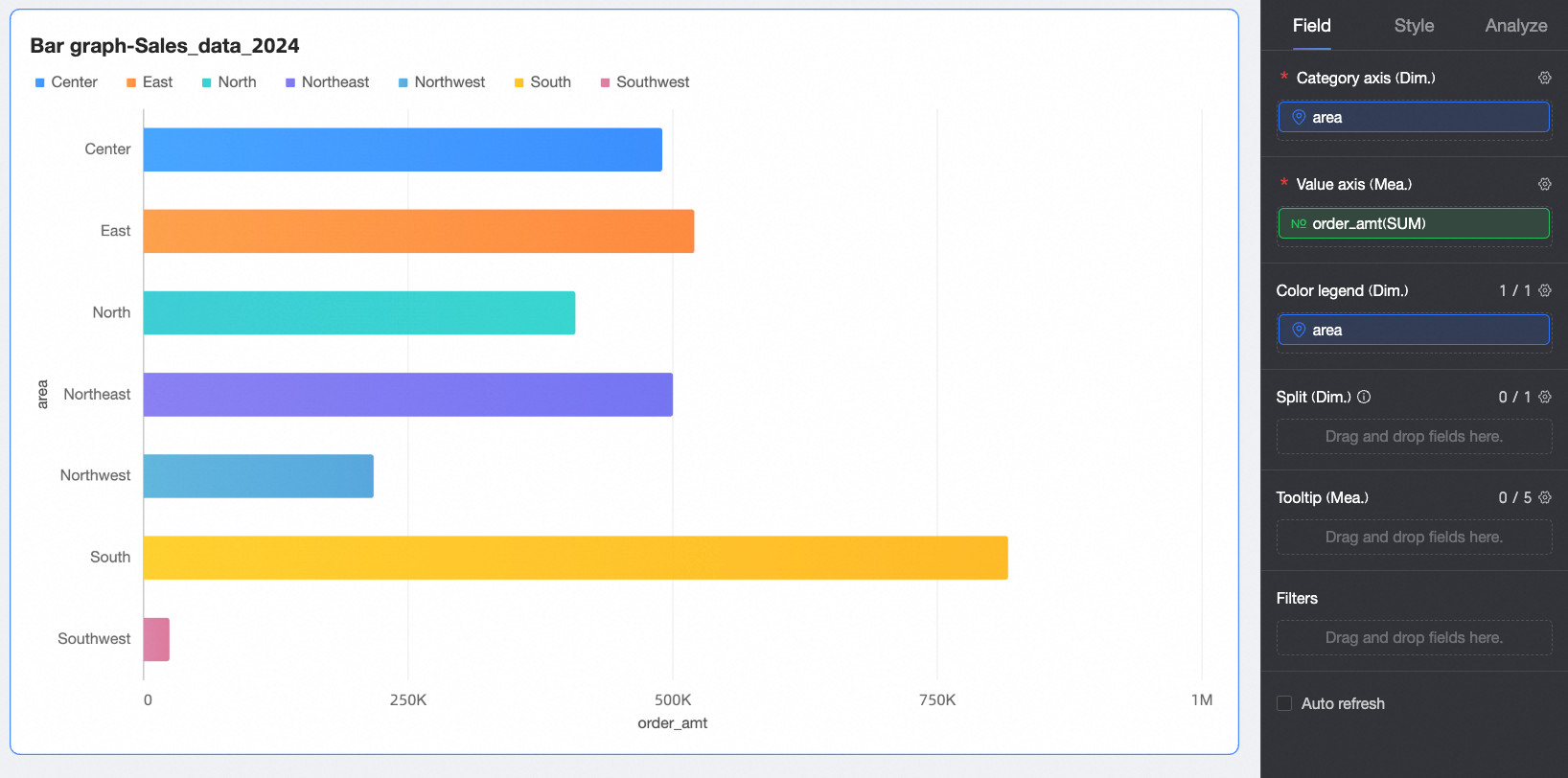
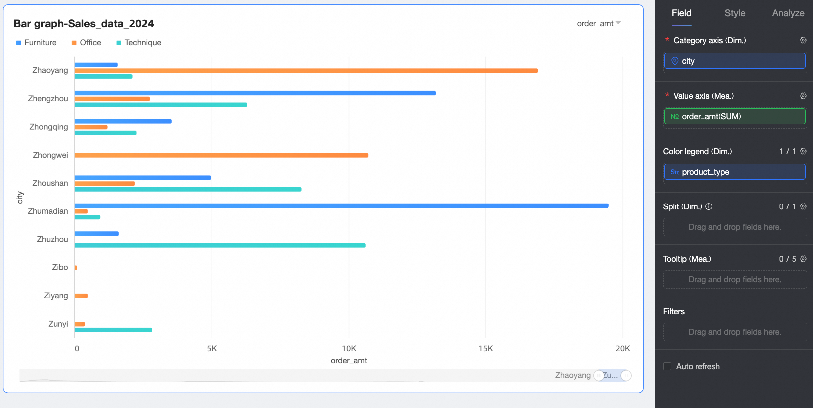
A horizontal bar chart consists of the value axis/measure, category axis/dimension, and color legend fields:
-
The value axis corresponds to the measures in your data. You must add at least one measure, such as order quantity or profit amount.
-
The category axis corresponds to the dimensions in your data. You must add at least one dimension, such as province or product type.
-
The color legend corresponds to a dimension in your data. You can add a maximum of one dimension, such as shipping method.
NoteYou can use the color legend only when one measure field is added to the value axis.
-
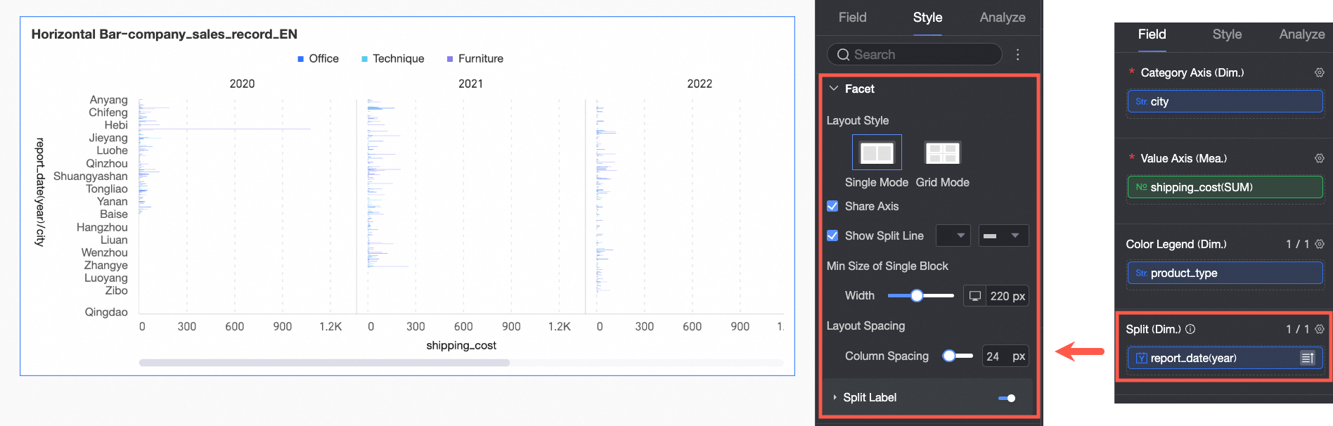
The split corresponds to a dimension in your data. You can add a maximum of one dimension, such as product type.
-
Configure Chart Data
-
On the Data tab, select the dimension and measure fields that you need.
-
From the Dimensions list, find
cityand add it to the category axis/dimension field. -
From the Dimensions list, find
product_typeand add it to the color legend/dimension field. -
From the Measures list, find
shipping_costand add it to the value axis/measure field.NoteYou can drag the same field into both the category axis and color legend fields to assign a unique color to each dimension value. The chart rendering varies depending on the configuration:
-
If the category axis and value axis each contain only one field, the number of bars equals the number of unique values in the category axis dimension.
-
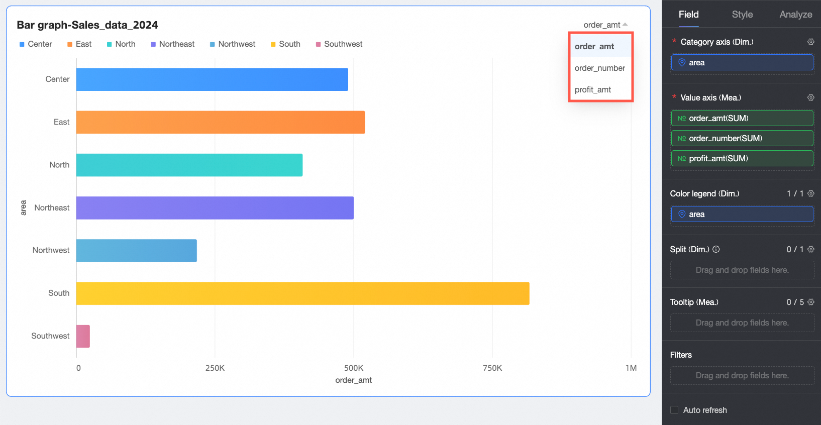
If the value axis contains multiple measure fields, the chart displays the first measure by default. You must open the field filter panel to switch to other measures.
-
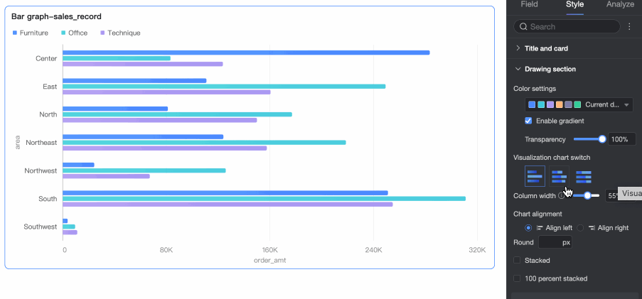
If the category axis contains multiple dimension fields, the number of bars is the product of the number of unique values in each dimension. For example, in the following figure, the number of bars equals the number of
regionsmultiplied by the number oforder_levels.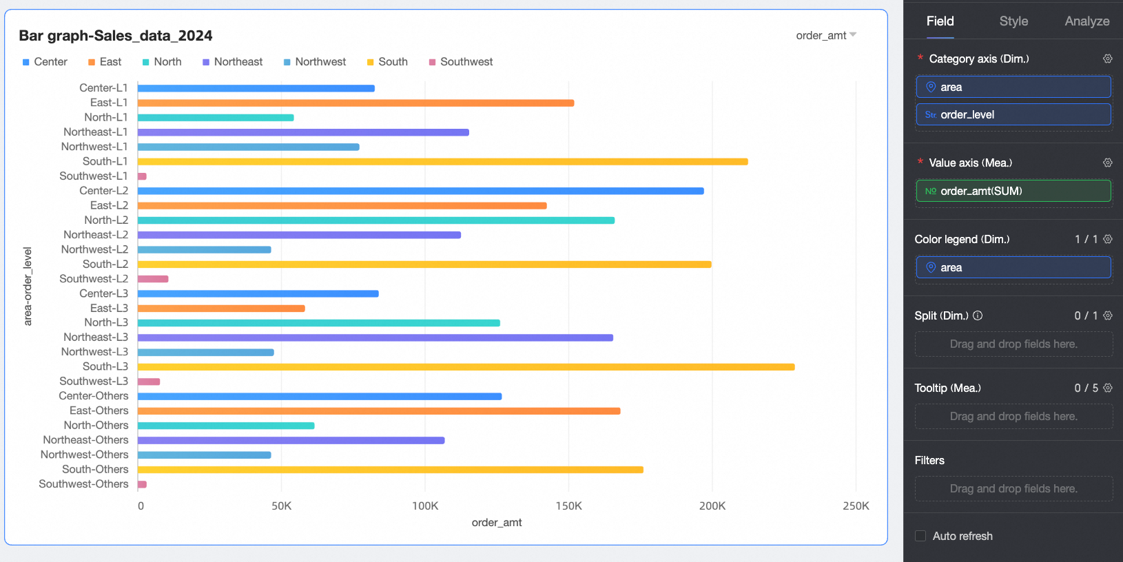
-
-
-
Click Update. The system automatically updates the chart.
-
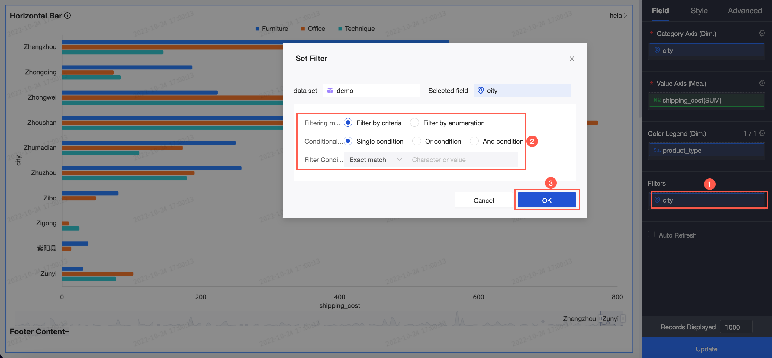
(Optional) To view data for only certain cities in the city field, set a filter.
-
(Optional) Auto refresh
Automatically refreshes chart data at the interval you specify (for example, every 5 minutes).
-
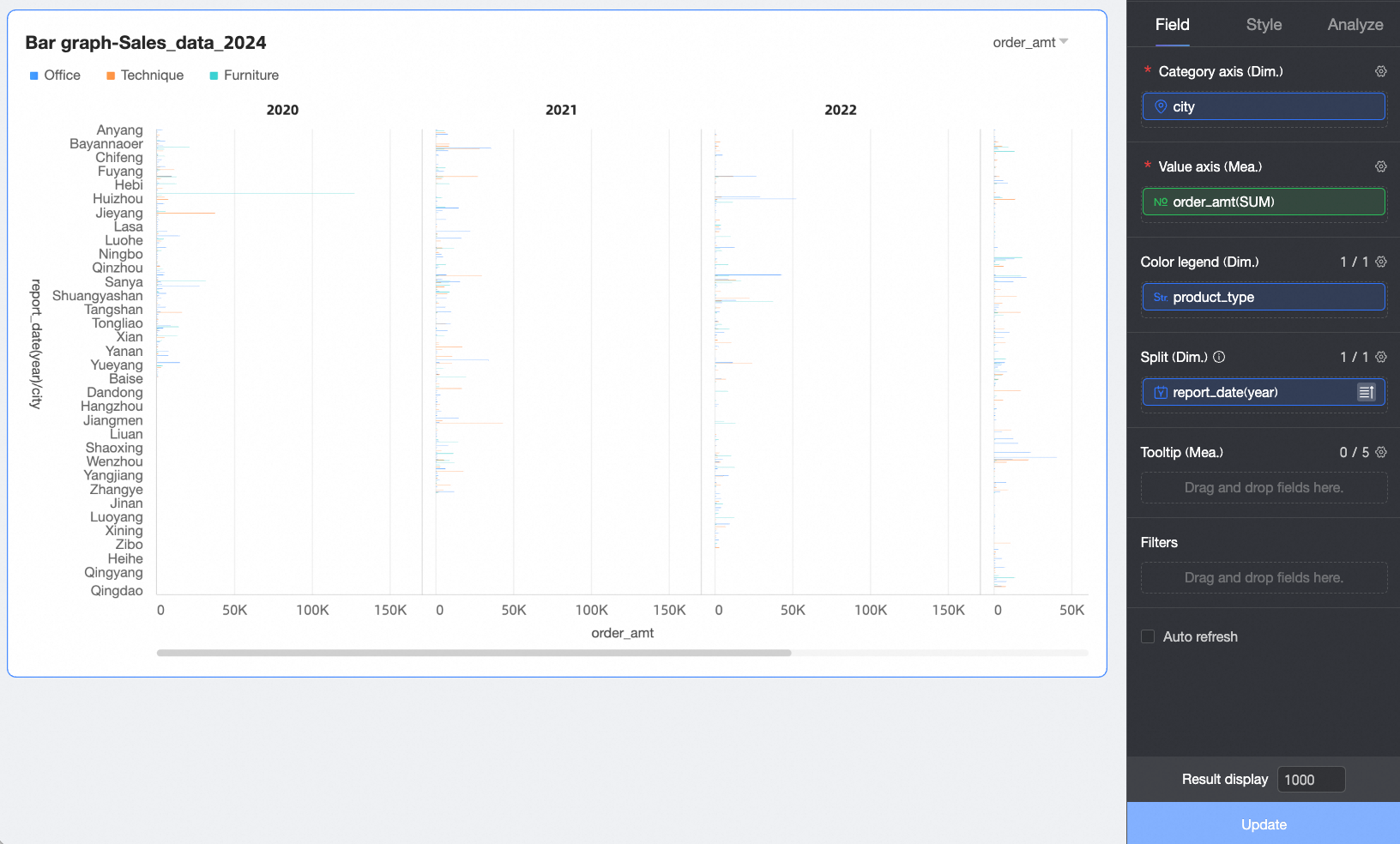
(Optional) To better visualize data trends across different dimension values, add a dimension to the split/dimension field to create facets.
Note-
You can add only one dimension field for splitting. Facet mode has the following limitations:
-
Fields: For the field in split/dimension, the advanced calculation feature only supports
Top NandNone. -
Style: The axes do not support a dual Y-axis. The overview axis is not supported in the auxiliary display settings.
-
Analysis: Only data interaction is supported. Advanced settings, analysis alerts, annotations, and smart insights are not supported.
-
-
Using many facets can cause the page to lag. For optimal performance, limit the number of facets to 500 or fewer.
-
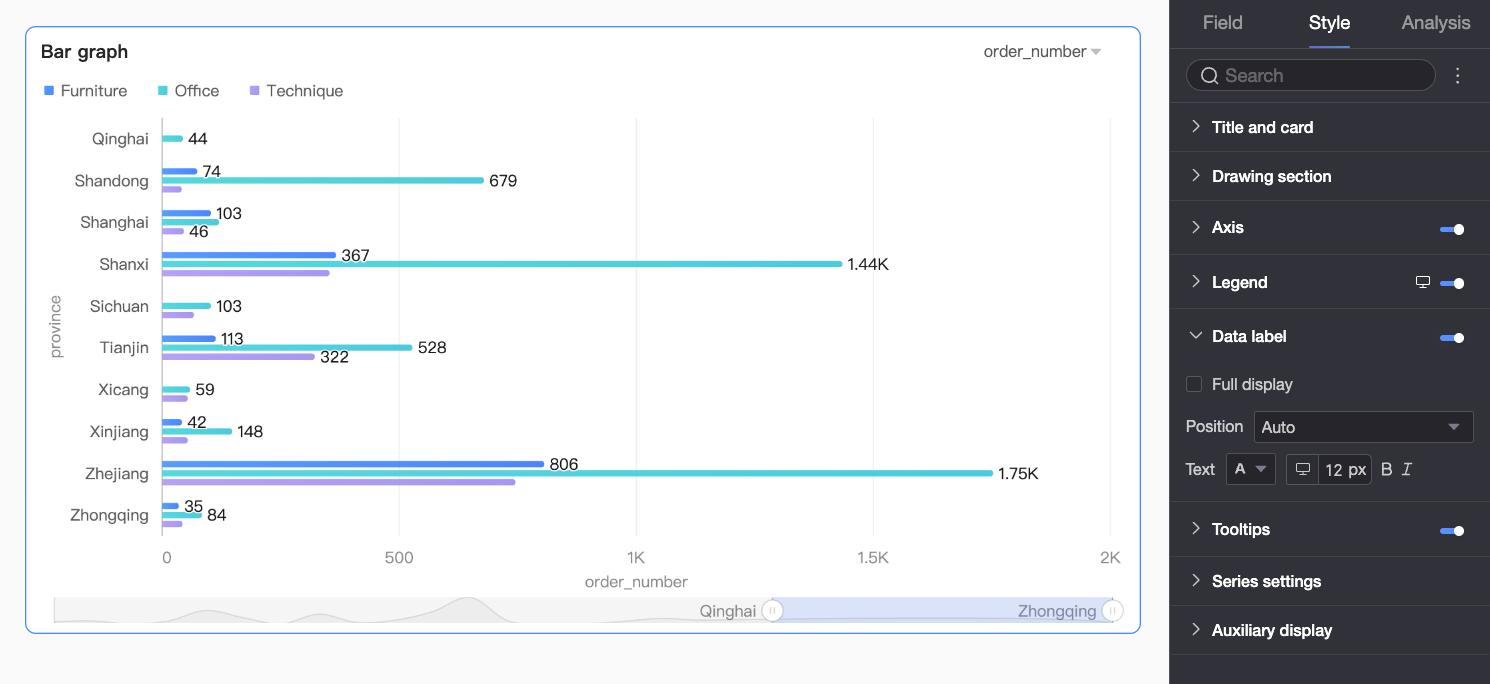
Configure Styles
Configure the chart appearance. Common style settings are covered in Configure the chart title area.
Enter a keyword in the Search box to find a setting, or click the  icon to Expand/Collapse All Categories.
Chart Style
Configure the horizontal bar chart appearance.
|
Parameter |
Description |
|
Color scheme |
Sets the chart color scheme. |
|
Chart type |
Supported types: horizontal bar chart, stacked horizontal bar chart, and 100% stacked horizontal bar chart. |
|
Bar width |
Sets bar width. |
|
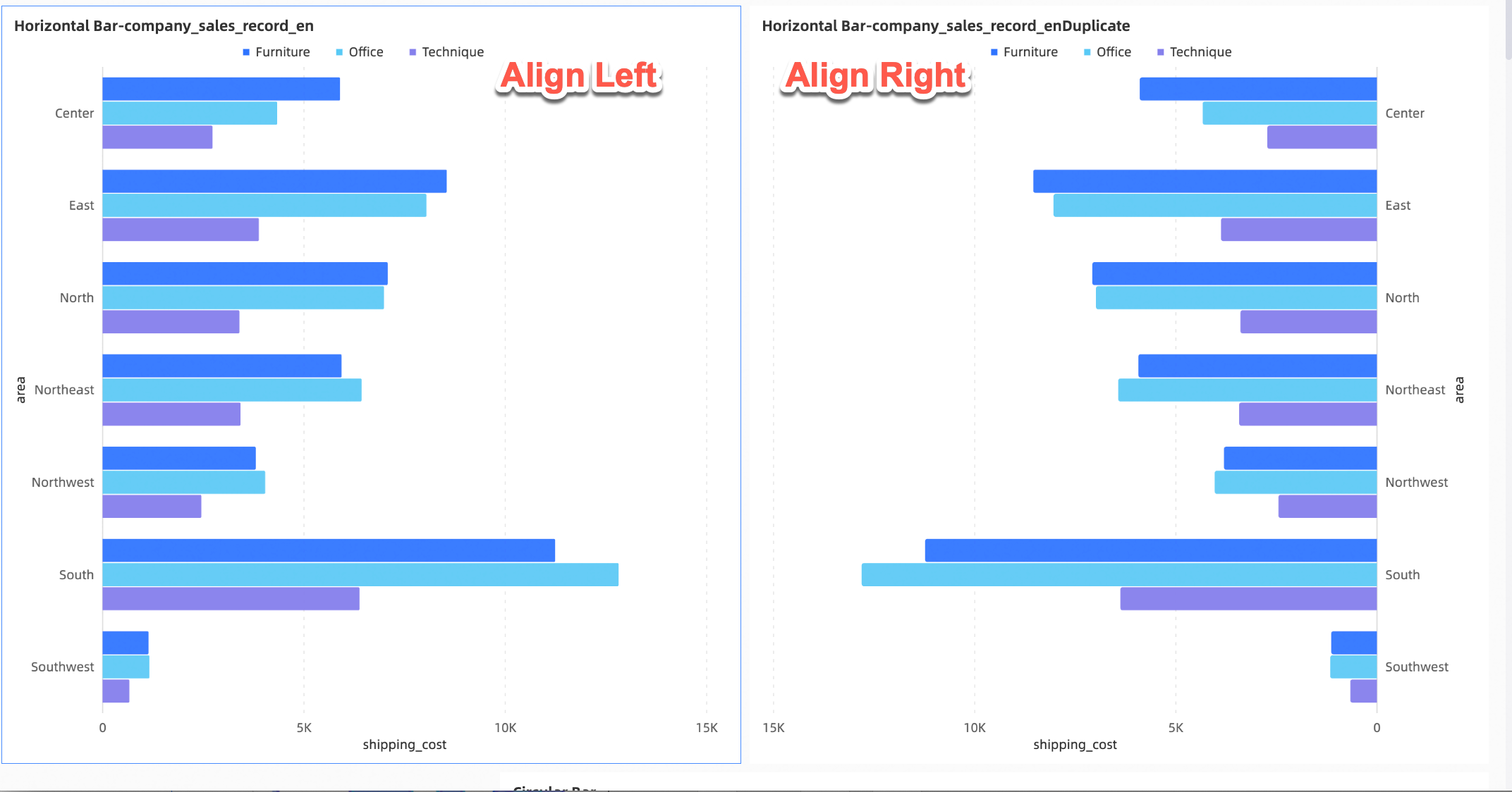
Alignment |
Sets chart alignment: Left or Right.
|
|
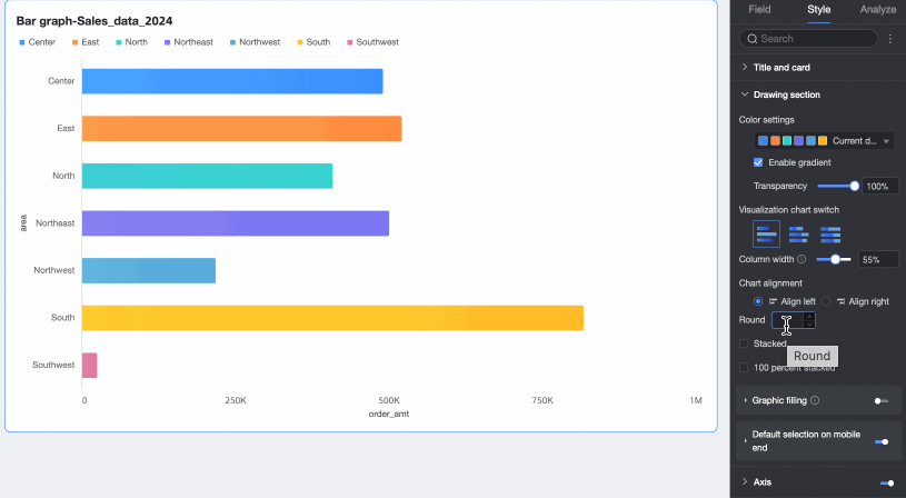
Corner radius |
Sets bar corner radius. |
|
Stacked, 100% stacked |
Switches between horizontal bar, stacked, and 100% stacked chart types.
|
|
Shape fill |
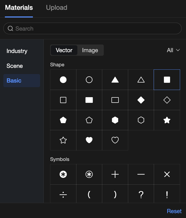
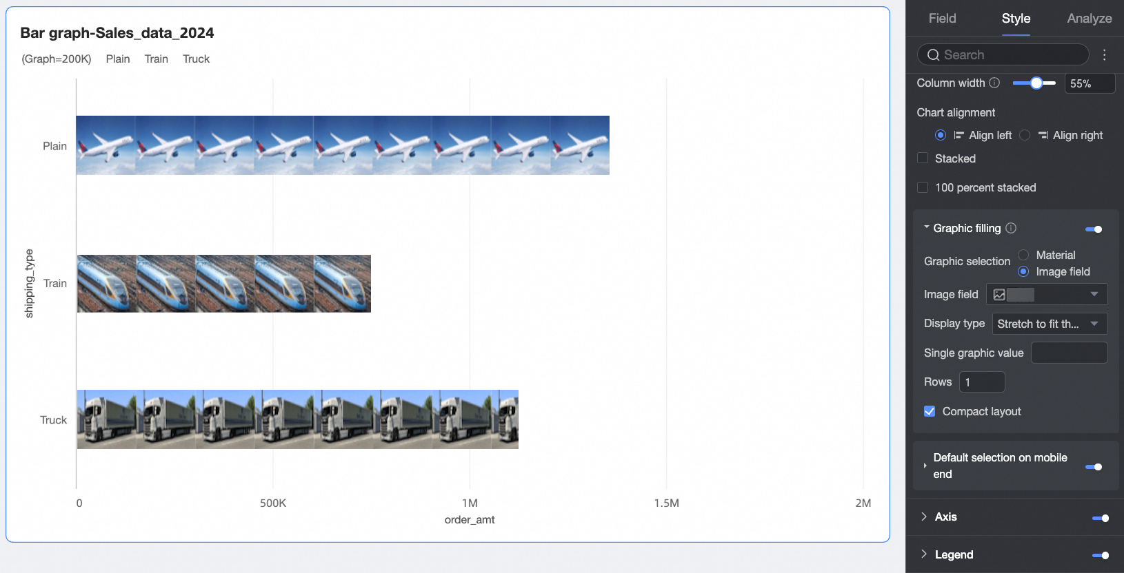
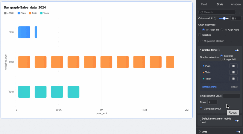
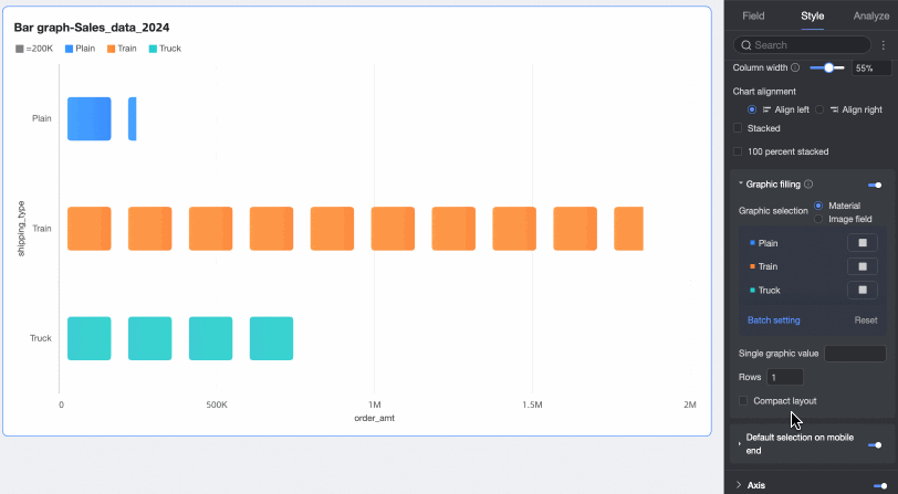
When Chart type is set to horizontal bar chart, you can fill bars with icons representing numerical values. Consider disabling the measure axis in this case. Fill options: Assets or Image Field.
You can also set the Value per shape, Number of rows, and whether to Compress layout.
|
|
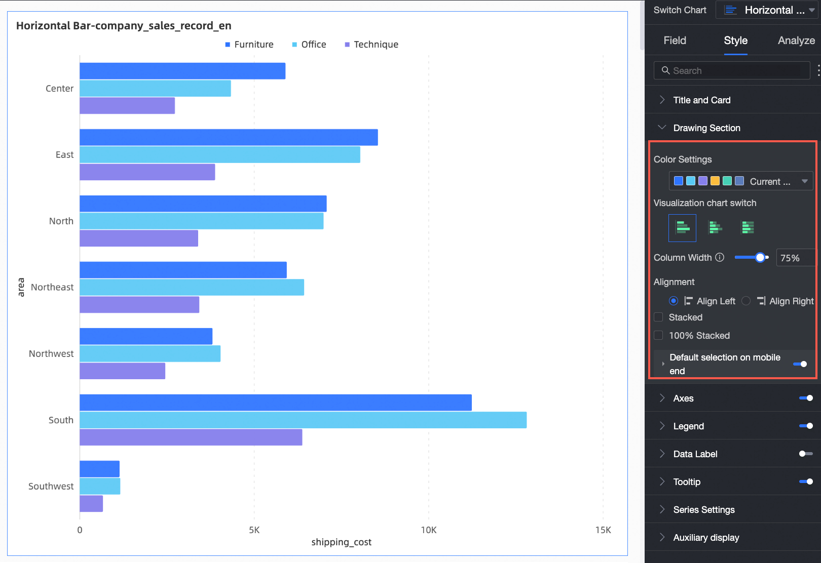
Default selection on mobile |
After enabling, set the Default selection to Last global dimension value or Last dimension value of specified series. |
 ).
).
Facet
In facet mode, configure the layout and style of chart arrangement.
Facet mode is available only when a field is configured in the split/dimension field.
|
Parameter |
Description |
|
|
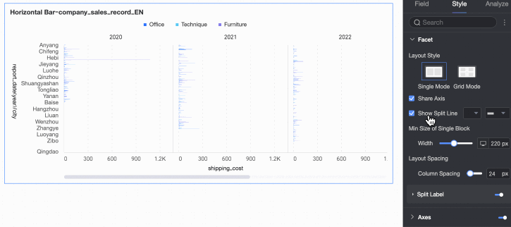
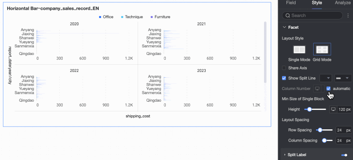
Layout style |
Sets the chart layout: Single-column Comparison or Grid Distribution. |
|
|
Shared axis |
Controls whether charts share an axis.
|
|
|
Show separator |
Shows or hides a separator line between charts. When enabled, configure the separator color and style. |
|
|
Columns |
When Layout is set to Default is Auto. You can also set a custom column count. Note
|
|
|
Min facet size |
Sets the minimum width and height for each chart. Options vary by layout style.
|
|
|
Spacing |
Sets row and column spacing between charts. Options vary by layout style.
|
|
|
Split label |
Position |
Sets the dimension value label position: Above chart or Below chart. |
|
Text |
Sets the font color and style of the dimension value label. |
|
|
Alignment |
Sets the dimension value label alignment. |
|

 icon at the top of the page.
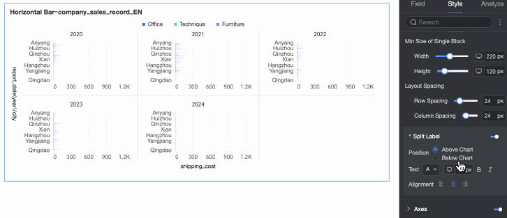
Axes
Configure axis display. Axes are shown by default.
Select Show dual Y-axis to add an Upper X-axis option in the Axis area. Dual Y-axis takes effect only with two or more measures.
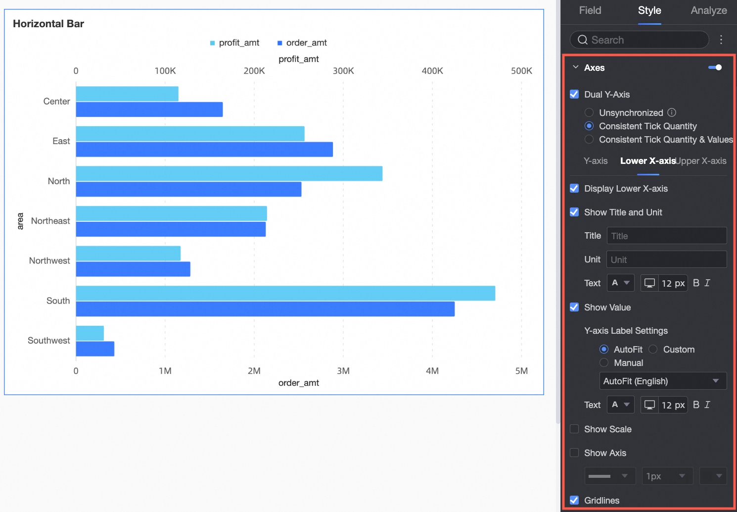
|
Axis |
Parameter |
Description |
|
Y-axis |
Show Y-axis |
Shows or hides the Y-axis. |
|
Show title and unit |
Shows or hides the axis title and unit on the Y-axis. |
|
|
Show axis label |
Shows or hides labels on the Y-axis. You can also configure the axis label display rule and text style. |
|
|
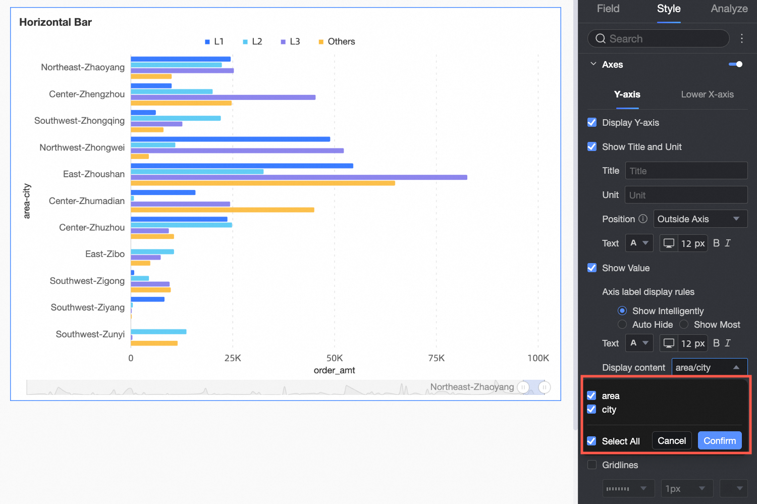
Display content |
Set the displayed content to some or all dimensions.
|
|
|
Show tick marks |
Shows or hides tick marks on the Y-axis. |
|
|
Show axis line |
Shows or hides the Y-axis line. You can also configure its line type, line width, and color. |
|
|
Show gridlines |
Shows or hides gridlines for the Y-axis. You can also configure their line type, line width, and color. |
|
|
Lower X-axis |
Show lower X-axis |
Shows or hides the lower X-axis. |
|
Show title and unit |
Shows or hides the axis title and unit. |
|
|
Show axis label |
Shows or hides labels on the lower X-axis. Configure the axis label display format and text style. Format options:
|
|
|
Show tick marks |
Shows or hides tick marks on the lower X-axis. |
|
|
Show axis line |
Shows or hides the lower X-axis line. You can also configure its line type, line width, and color. |
|
|
Show gridlines |
Shows or hides gridlines for the lower X-axis. You can also configure their line type, line width, and color. |
|
|
Axis value range and interval |
|
 icon to configure the data format in the
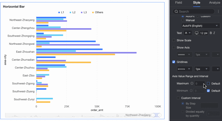
Configure the Upper X-axis only when Show Dual Y-axis is selected. Parameters are the same as the Lower X-axis.
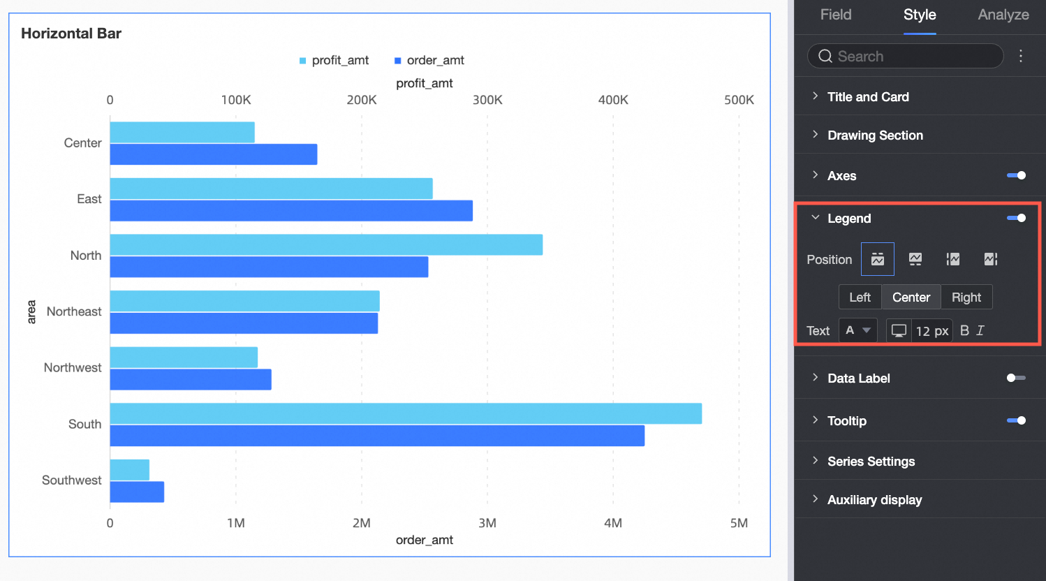
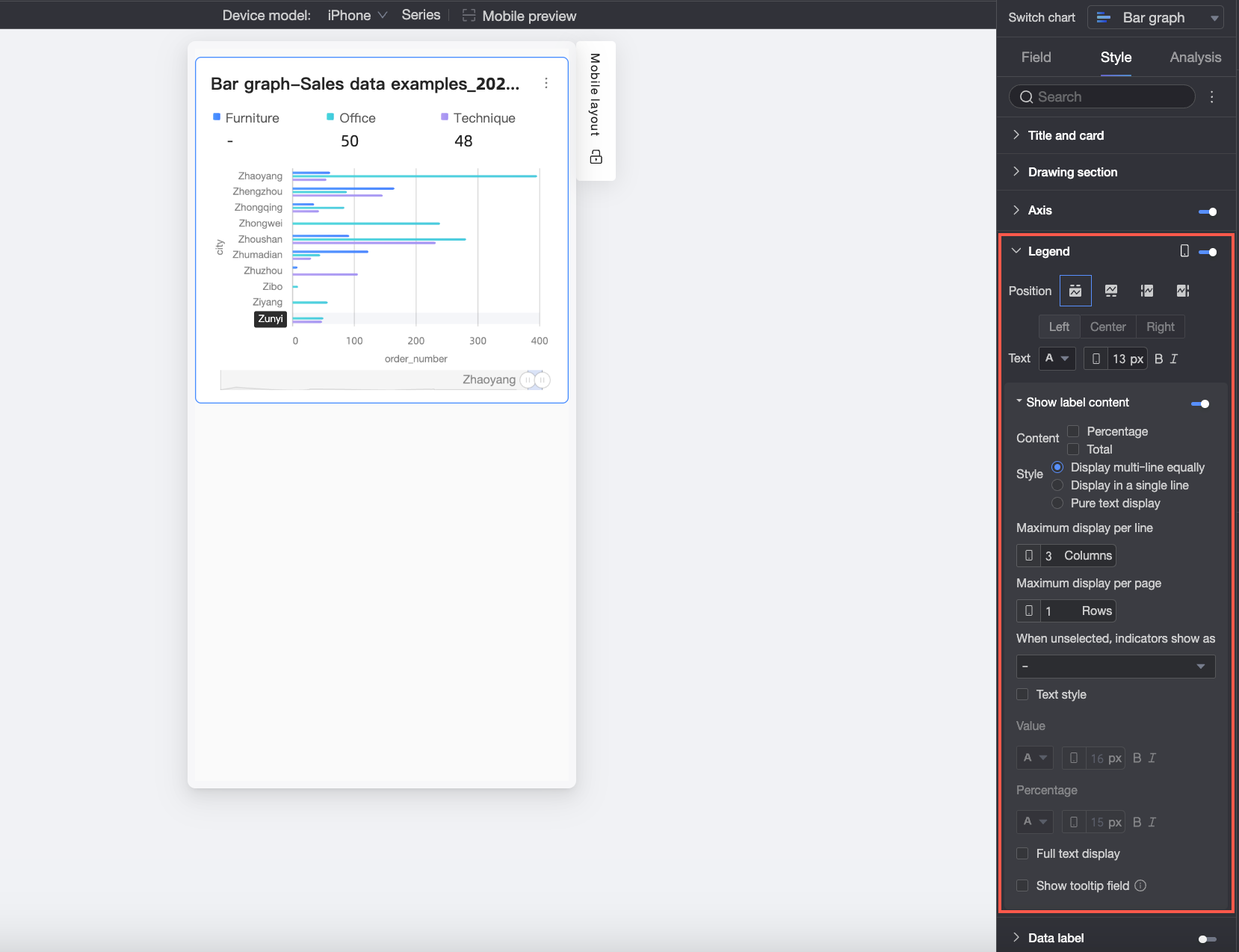
Legend
Click the  icon to enable the chart legend and configure its style.
-
PC configuration
Parameter
Description
Content
When the category axis and color legend fields use the same dimension and
Shape fillis enabled in the Chart style section, the chart displays multiple legends. You can then select which content to show in the legend.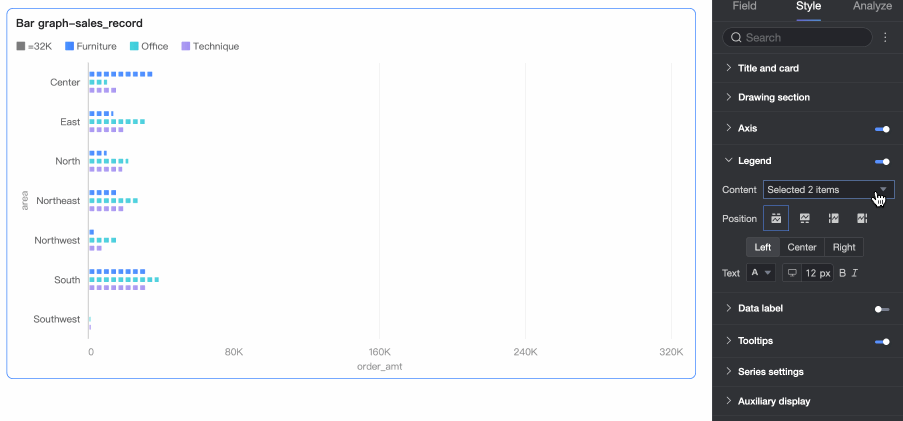
Position
Sets legend position and alignment on PC.
-
When the display position is set to Top or Bottom: you can choose left, center, or right alignment.
-
When the display position is set to Left or Right: you can choose top, center, or bottom alignment. You can also set the distance between the legend and the chart content.
Text
Sets legend text style on PC: font color, size, weight, and italic.
-
-
Mobile configuration
Parameter
Description
Position
Sets legend position and alignment on mobile devices.
-
When the display position is set to Top or Bottom: you can choose left, center, or right alignment.
-
When the display position is set to Left or Right: you can choose top, center, or bottom alignment. You can also set the distance between the legend and the chart content.
NoteWhen the position is set to Top, you can enable labels under the legend. After enabling, custom alignment is not supported.
Text
Sets legend text style on mobile: font color, size, weight, and italic.
Display Label Content
When Position is set to Top, click the
 icon to enable labels under the legend.
Content
Set the data content to be displayed in the labels under the legend. You can choose Percentage and Total.
-
Percentage: The percentage of a specific data point out of the total within the current dimension. For example, the percentage of profit amount from office supplies out of the total revenue. When you choose to display percentage data, you can also set the number of decimal places for the percentage to 0, 1, or 2 in Percentage Decimal Places.
-
Total: The sum of all measures within the current dimension. For example, the total sales amount for all regions in 2025.
Style
Set the layout of the labels under the legend. You can choose from the following styles:
-
Multi-line Evenly Divided: Labels are automatically arranged in an evenly divided grid based on the number of columns entered in Max columns per row and the number of rows entered in Max rows per page.
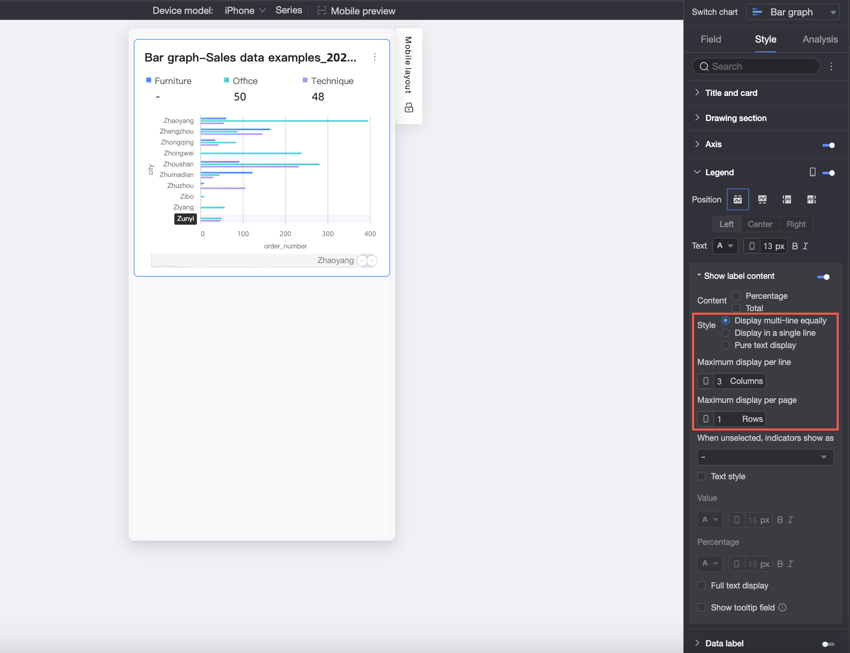
-
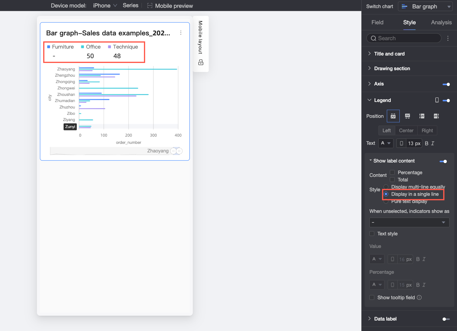
Single-line Tiled: All label content is displayed in a single line.
-
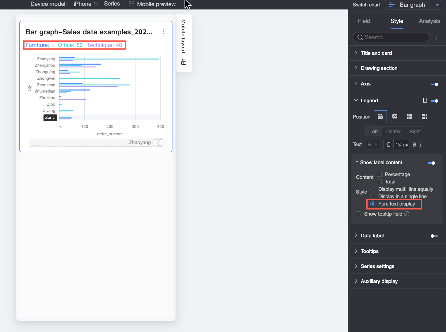
Plain Text: No icons, only text content is displayed. The text color will match the color of the corresponding measure's line in the chart.
Indicator display when not selected
When
Styleis set toMulti-line Evenly DividedorSingle-line Tiled, you can configure how the indicator appears when no legend item is selected. You can choose to display it as "-" or asEmpty.Percentage Position
When
Percentagedata is selected inContent, andStyleis set toMulti-line Evenly DividedorSingle-line Tiled, you can further set the display position of the percentage data. You can choose to place itBelowor to theRightof the value label.Text Style
When
Styleis set toMulti-line Evenly DividedorSingle-line Tiled, you can further set the style of the Value text.If Percentage data is selected in the content, you can set a different format for the percentage text to distinguish it from the
Valuelabel content, enhancing the visual difference between data types.Show Full Text
When
Styleis set toMulti-line Evenly Divided, long measure names may be truncated. If you need to display the full measure name, you can selectShow Full Text.Show Tooltip Field
After you select this option, the field added to the Tooltip/Measure setting will be displayed in the legend area.
NoteDisplaying tooltip fields is not supported when splitting by dimension value (that is, when the color legend is a dimension).
-
Data Labels
Specify whether to show data labels and configure their style.
|
Parameter |
Description |
|
Full Display |
Intelligently adjusts label positions to prevent overlap. Labels exceeding the axis area may be hidden. You can also select |
|
Position |
Set the display position of the labels. When |
|
Text |
Set the style of the label text. |
Tooltip
Click the icon to enable tooltips and configure their display.
-
PC configuration
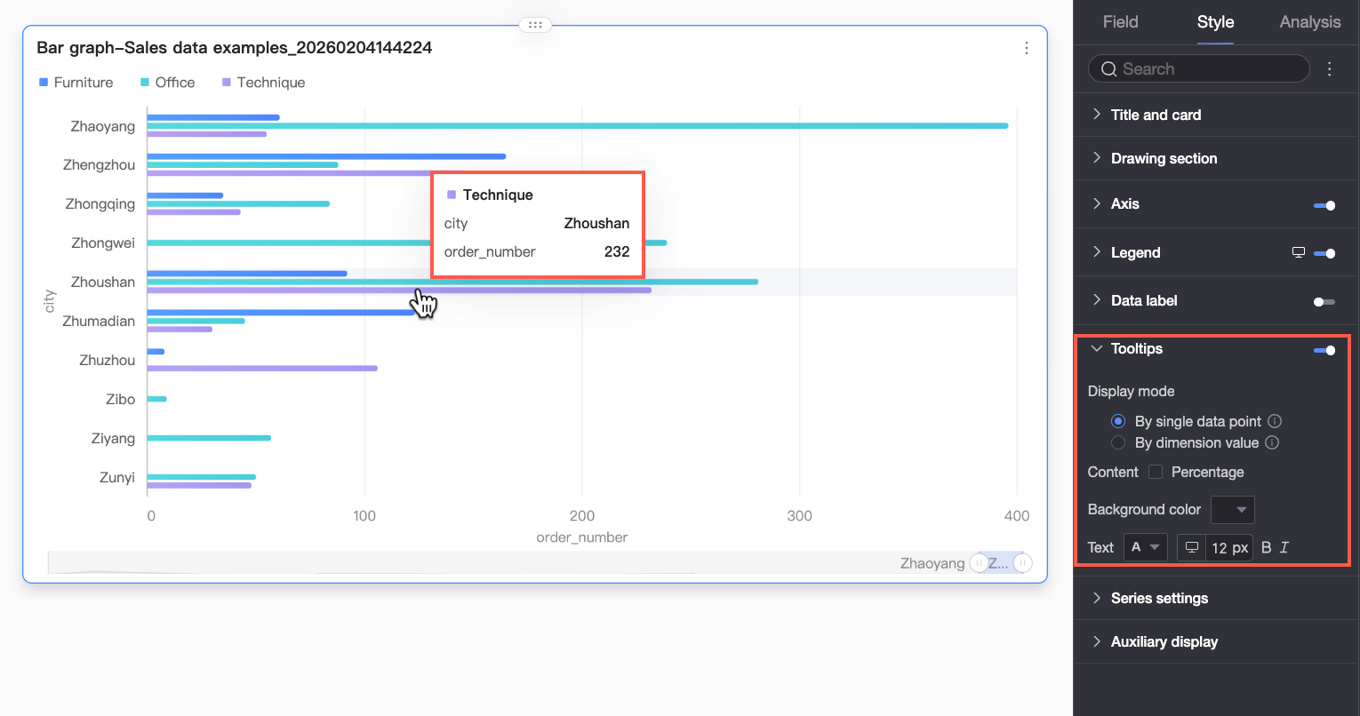
Parameter
Description
Display Mode
Set how the tooltip information is displayed. You can choose
By single data pointorBy dimension value.Content
Select the data content to display in the tooltip. The available options vary based on the display mode:
When the display mode is
By single data point, Percentage is supported. When the display mode isBy dimension value, Total and Percentage are supported.-
Percentage: The percentage of a specific data point out of the total within the current dimension. For example, the percentage of profit amount from office supplies out of the total revenue. When you choose to display percentage data, you can also set the number of decimal places for the percentage to 0, 1, or 2 in Percentage Decimal Places.
-
Total: The sum of all measures within the current dimension. For example, the total sales amount for all regions in 2025.
Background Color
Set the background fill color of the tooltip box.
Text
Set the style of the text in the tooltip box, including font color, size, weight, and whether it is italicized.
-
-
Mobile configuration
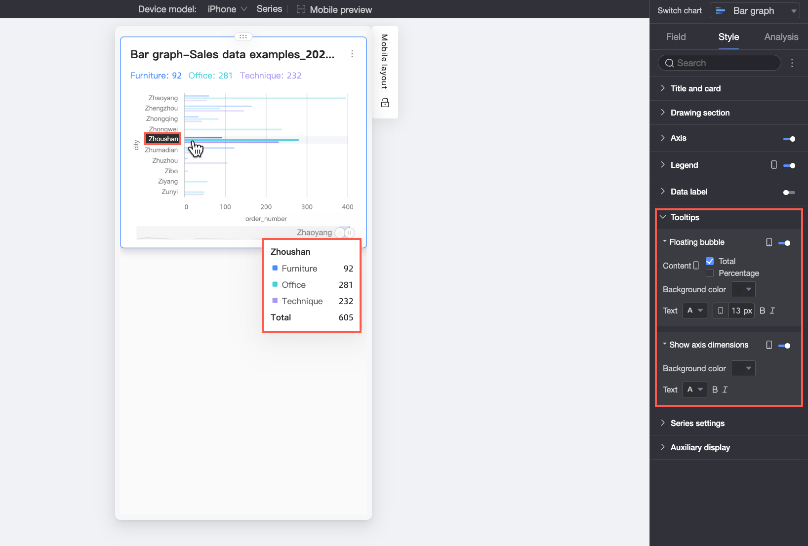
Parameter
Description
Floating BubbleClick the
icon to enable the floating bubble display (①).Content
Set the data content to display in the floating bubble. You can choose Percentage or Total.
-
Percentage: The percentage of a specific data point out of the total within the current dimension. For example, the percentage of profit amount from office supplies out of the total revenue. When you choose to display percentage data, you can also set the number of decimal places for the percentage to 0, 1, or 2 in Percentage Decimal Places.
-
Total: The sum of all measures within the current dimension. For example, the total sales amount for all regions in 2025.
Background Color
Set the background fill color of the floating bubble.
Text
Set the style of the text in the floating bubble, including font color, size, weight, and whether it is italicized.
Show Axis DimensionClick the
icon to enable the axis dimension display (②).Background Color
Set the background fill color of the axis dimension label.
Text
Set the style of the axis dimension label text, including font color, weight, and whether it is italicized.
-
Series Settings
Configure series display style.
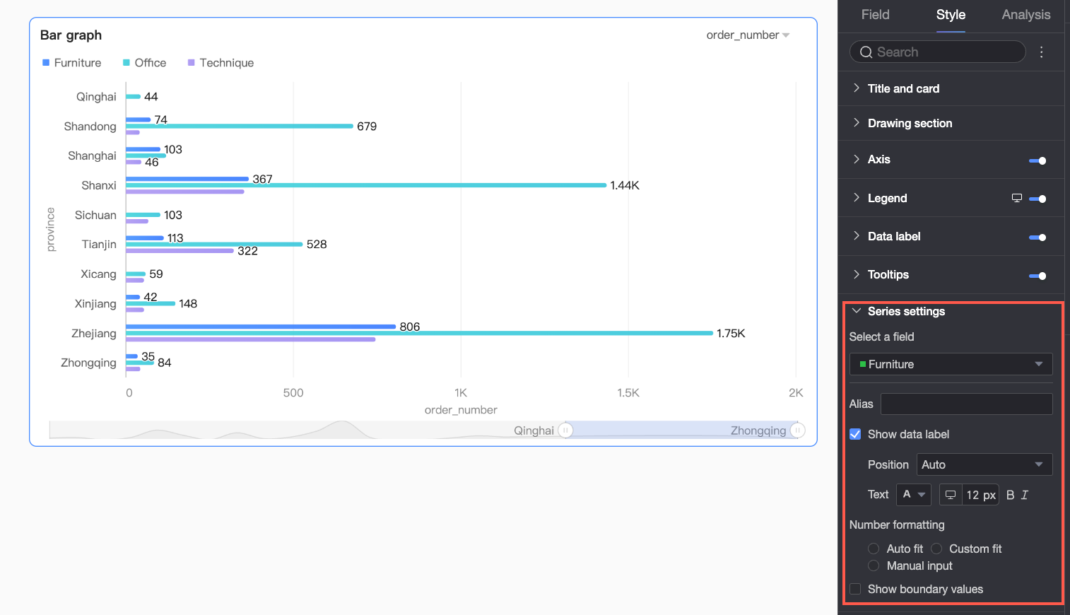
You only need to set the alias and numeric display format in Series Settings if Color Legend/Dimension is enabled in the Field configuration panel.
|
Parameter |
Description |
|
Select series |
Select a dimension or measure item based on your business scenario. |
|
Alias |
Set a field name that aligns with your business scenario. This item can be configured only when |
|
Show data labels |
Choose whether to display data labels and set their position and text format. |
|
Series number formatting |
Configure the display format for series values. You can select
This item can be configured only when |
|
Show extrema |
Specifies whether to show labels for the extreme values in the chart. After you select this option, you can set the Note
This feature is not supported for stacked and 100% stacked charts. |
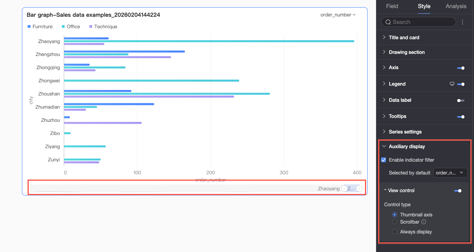
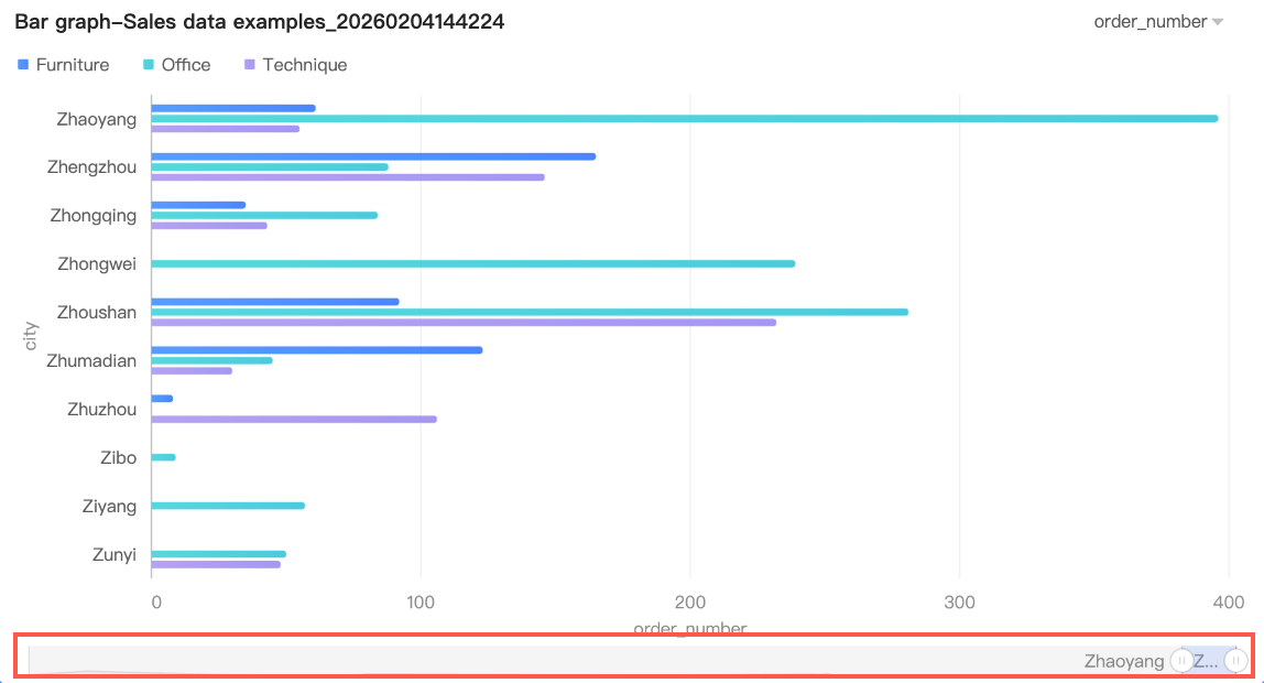
Auxiliary Display
Configure the metric filter and view controls.
|
Parameter |
Description |
|
Enable metric filter |
Enables the in-chart metric filter. Set the default selected metric field after enabling. |
|
View control |
If the data on a chart axis is too dense to fit in the container, click the You can use the following two control types to manage the visible range on the chart axis:
Note
|
 By default, the overview axis is displayed only when the amount of data exceeds the display width of the chart container. If you want the overview axis to be always visible, you can select
 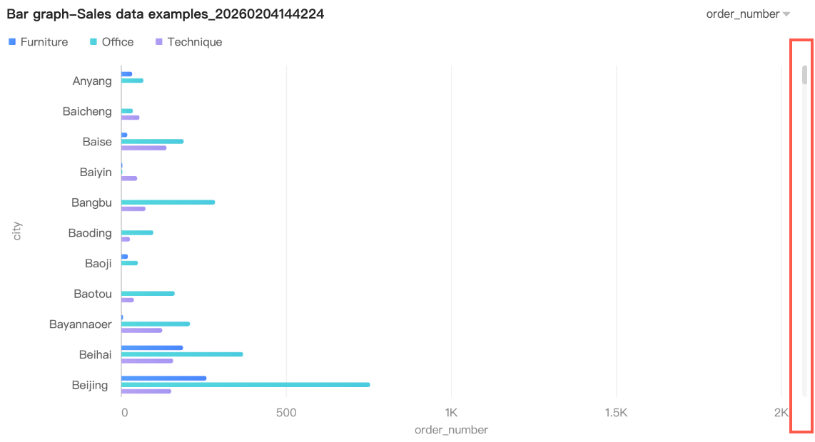 You can further set the minimum category width for the scroll bar to limit the amount of data in the current chart window. This ensures that the chart content is clearly displayed in the visible area and avoids visual clutter from overlapping data labels or overly dense data points. The default minimum category width is 32px, with a value range of 16-100px.
Analysis Configuration
|
Section |
Parameter |
Description |
|
Data interaction |
Drill-down |
If you have configured drill-down fields, you can set the display style for drill-down levels. |
|
Linkage |
Use chart linkage to associate multiple charts for cross-chart data analysis. Configure and display linkage. |
|
|
Hyperlink |
Link multiple dashboards for cross-dashboard data analysis. Two types: Parameter Hyperlink and External Link. Hyperlink Configuration and Display. |
|
|
Analysis alerts |
Reference line |
Compare current measure values against a fixed or calculated value (average, maximum, minimum, or median). Reference lines. |
|
Trendline |
Shows the overall trend of current data. Types: Intelligent Recommendation, Linear, Logarithmic, Exponential, Polynomial, and Power Function. Trendlines. |
|
|
Annotation |
- |
Highlight abnormal or noteworthy data points using color, icons, comments, or data point markers. Annotations. |
Next Steps
-
To let others view your dashboard, share it with specific users. For more information, see Share a dashboard.
-
Integrate your dashboard into a PC data portal to build a complex navigation menu for related topics.