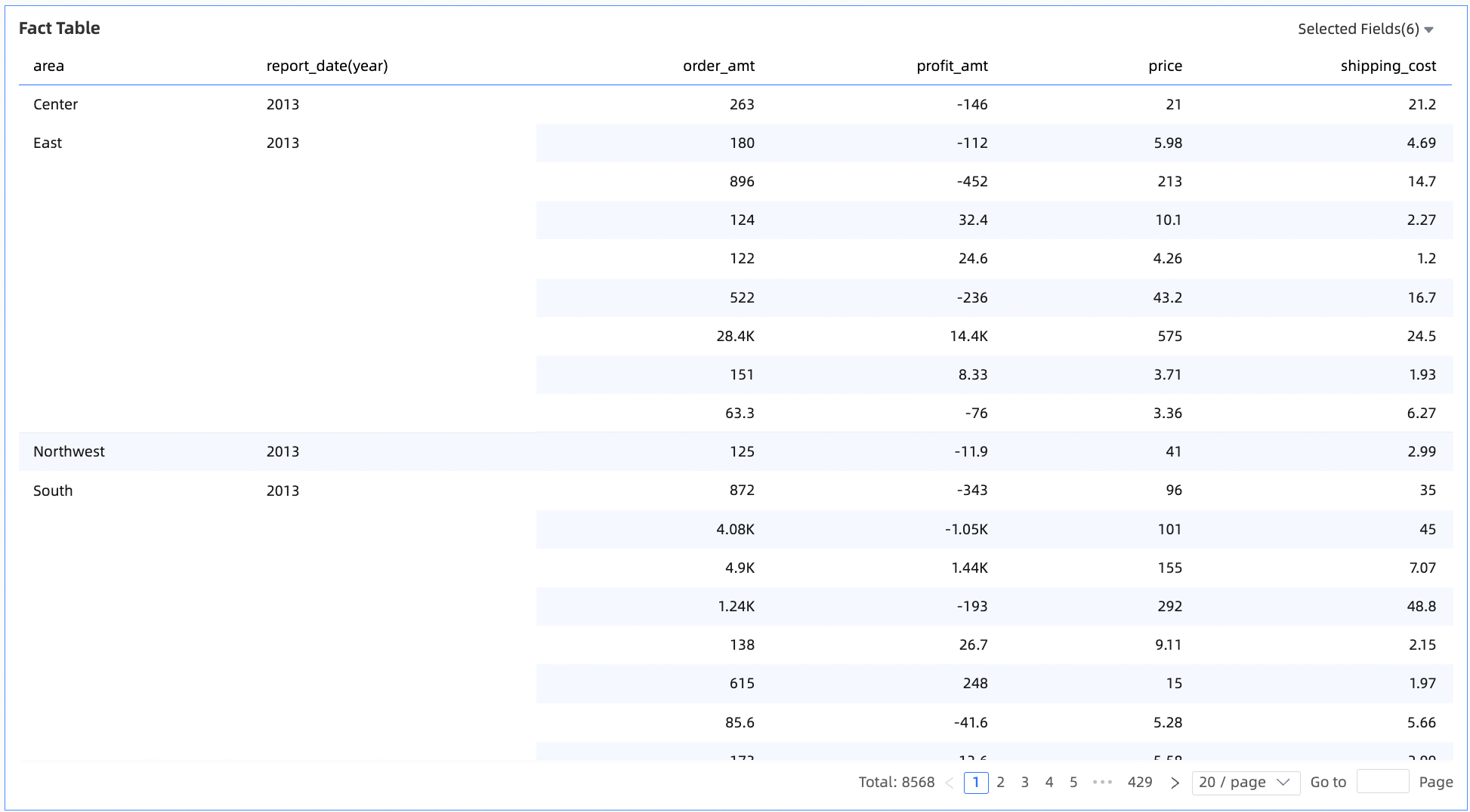
A details table is a core component in Quick BI used to display the detailed distribution and ranking of indicators across dimensions. Its visual configuration enables in-depth data analysis, decision support, and complex interactive features.
Overview
Use cases
Use a details table to analyze how indicators are distributed and ranked across dimensions. This helps you make data-driven decisions.
Benefits
Calculation capabilities: Easily configure advanced calculations such as period-over-period comparisons, cumulative calculations, totals, and subtotals.
Visualization effects: Apply table themes, freeze panes, wrap text, and adjust column widths.
Annotation capabilities: Customize text, indicators, notes, and footnotes. You can also customize external link paths to enable interaction between your data and other systems.
Example
Limitations
Prerequisites: You have created a dashboard. For more information, see Create a dashboard.
To correctly configure and render a details table, note the following limitations on fields and data volume:
A details table accepts only dimension and measure fields in its data configuration area.
Chart Data
A details table has a single data configuration area: Value Columns/Dimensions or Measures. You can add both dimension and measure fields to this area.
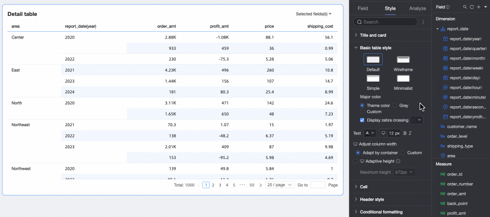
On the Data tab, select the required dimension and measure fields:
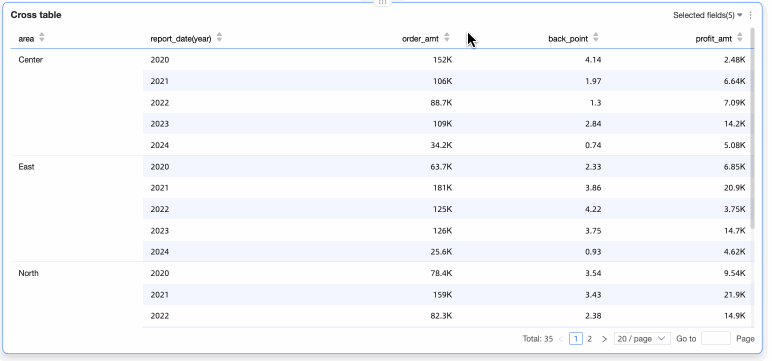
From the Dimensions list, double-click or drag Region and Order Date (year) to the Value Columns/Dimensions or Measures area.
From the Measures list, double-click or drag Order Amount, Unit Price, Shipping Cost, and Profit Amount to the Value Columns/Dimensions or Measures area.
NoteIf a configured field is an image, you can set its display size. On mobile devices, the image width and height default to half the size set for PCs.

Click Update to automatically update the chart.
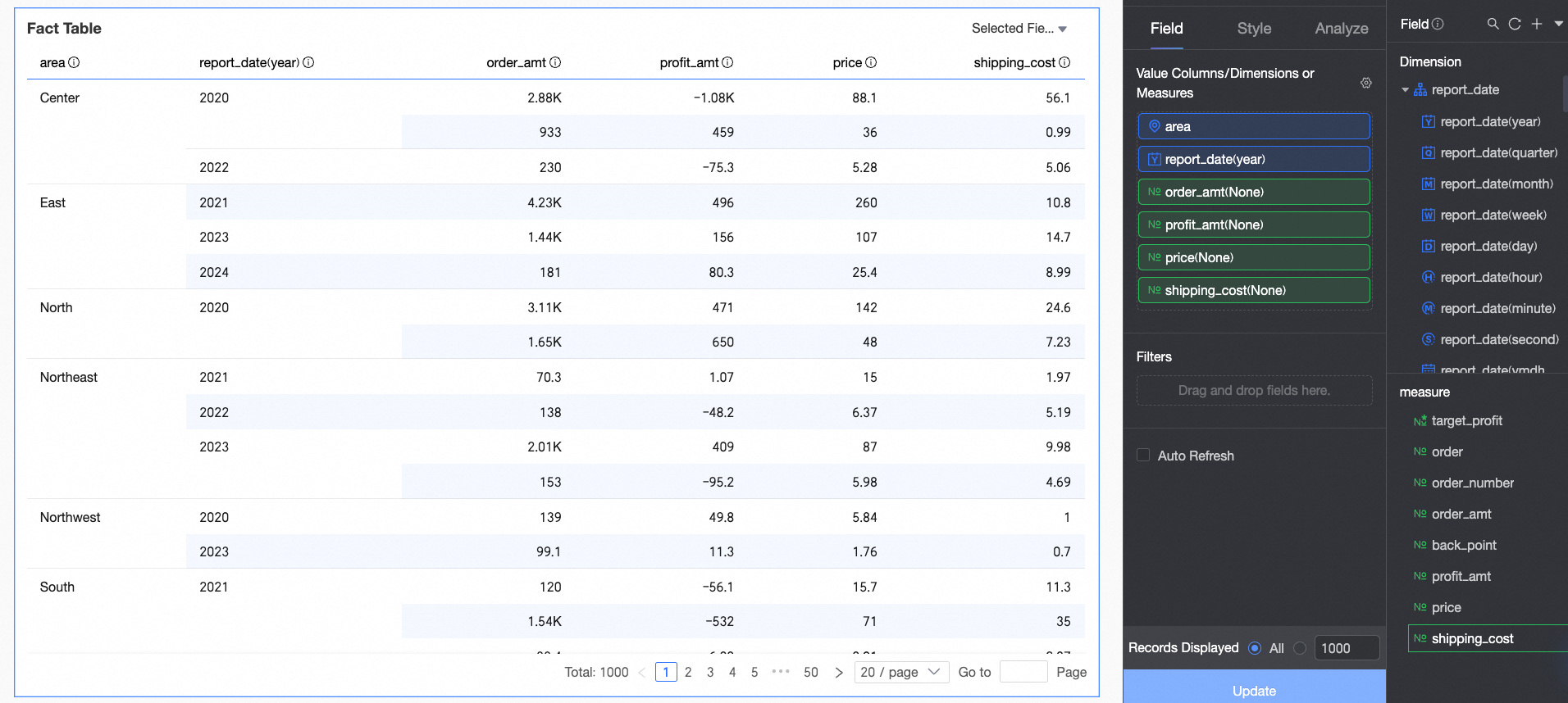
Chart Styles
This section describes how to configure the styles for a details table. For general chart style settings, see Configure the chart title area.
You can enter keywords in the search box at the top of the configuration pane to quickly find a setting. You can also click the  icon to Expand/Collapse All Categories, and switch between the new and legacy details table versions.
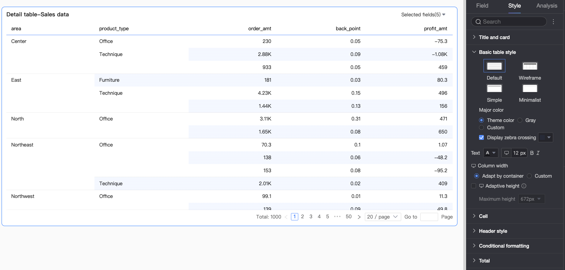
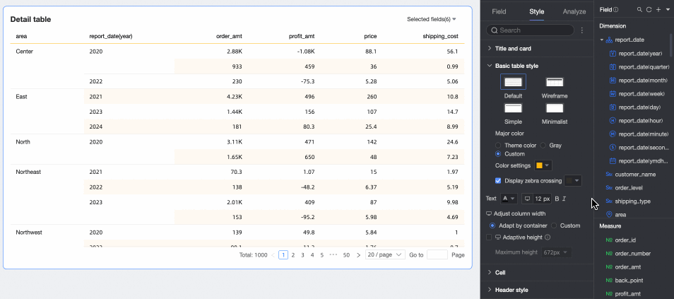
In the Basic Table Styles section, set the style for the details table.
Parameter
Description
Custom Table Theme
Sets the visual style of the details table.
Theme Style: You can choose from four styles: Default, Wireframe, Simplified, and Minimal.
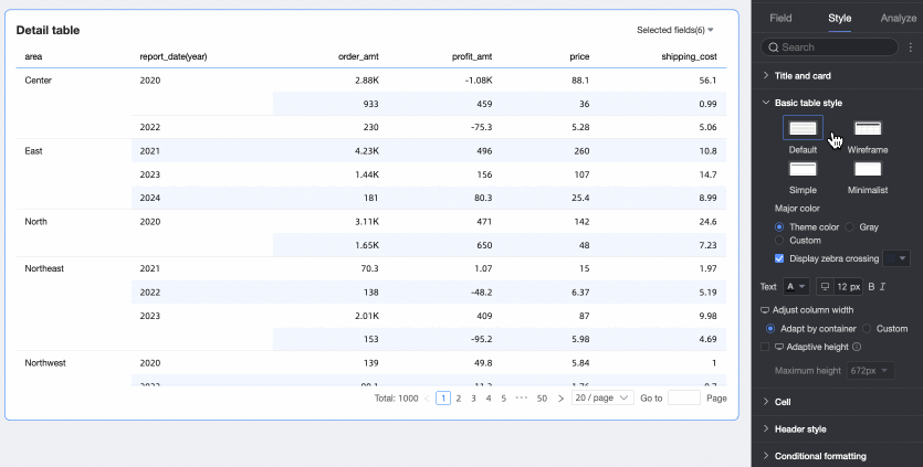
Primary Color Scheme: For the Default, Wireframe, and Simplified themes, you can select a primary color scheme. Options include the theme color, gray, or a custom color.
Show zebra stripes: Select whether to show alternating row colors (zebra stripes) in the details table, and specify the stripe color.
Text
Sets the text style for the table.
Column Width, Row Height
Sets the column width and row height for the table. You can choose between Fit to Content and Custom.
Fit to Content: The system automatically adjusts column widths based on the available space and row heights based on the content. This method makes efficient use of space, ensures all content is visible, and is ideal for responsive tables that require an automatic layout.
Custom: Enter custom values for column width and row height to precisely control the table layout. This method is suitable for scenarios that require high precision in table formatting. After you select Custom mode, row and column height default to auto-sizing. You can disable auto-sizing to set specific pixel values.
If you are unsure of the specific row height to set and want to visually adjust it first, you can manually drag the row height to preview and find the optimal display effect.
You can adjust the Header Row Height and Data Area Row Height by dragging them separately. Dragging adjusts the height of all rows in an area uniformly, and the new pixel value is automatically entered into the corresponding setting field.
NoteColumn width and row height settings for PC and mobile are independent. You can configure them separately based on your requirements.
Wrap text
Selecting this option automatically wraps table content.
Notedetails tables can recognize line break characters in fields. You can also use line break characters to customize the wrapping effect.
Dynamic Table Height Adaptation, Maximum Height
You can set the table height using two methods: fixed height and adaptive height.
Fixed height: By default, the table height is fixed. You can manually set the table container height by dragging it.
Adaptive height: This setting allows the table container to automatically adjust its height based on the data content. You can also set a maximum height for the table, which applies to the combined height of the header and data rows. When a maximum height is set, the table's adaptive height will not exceed this value.
The available maximum height options include 192px (approx. 5 rows), 352px (approx. 10 rows), 672px (approx. 20 rows), 1632px (approx. 50 rows), and Custom.
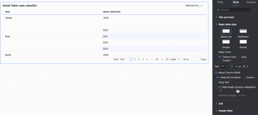
NoteWhen row height is set to Custom mode, Dynamic Table Height Adaptation only supports the Custom option. Please set a custom maximum table height based on your desired effect.
You can click the
 icon at the top of the page to configure height adaptation settings for PC and mobile devices separately.
Dynamic table height adaptation is enabled by default on mobile devices, and you can only adjust the maximum table height value.
This feature may affect the overall report layout, so enable it based on your needs.
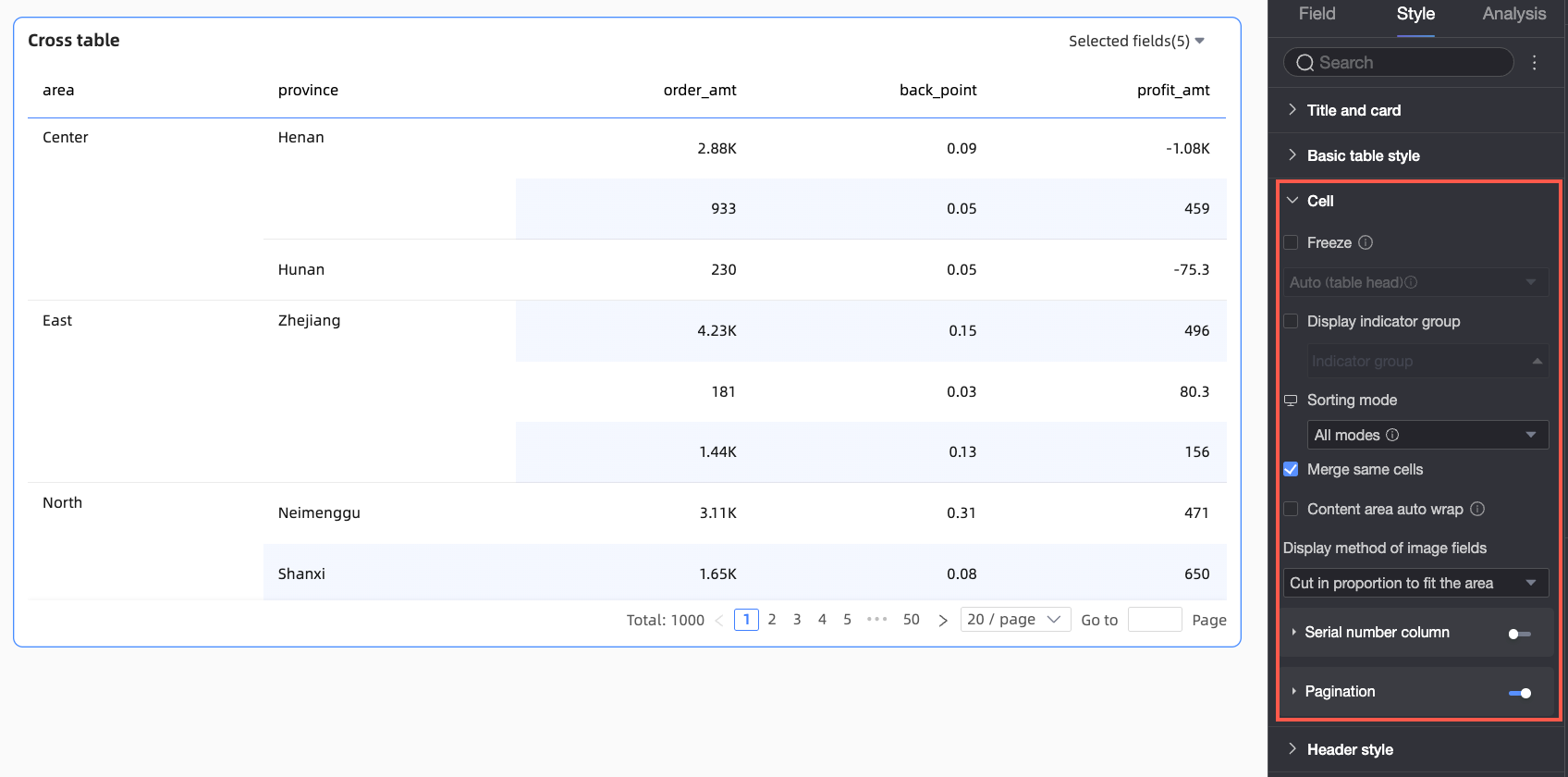
In the Cell section, configure cell display, sorting, and other options.
Parameter
Description
Freeze
Specifies whether to freeze the header or columns.
Indicator Display Grouping
Lets you set up grouped indicator displays. If you enable Mixed Dimension/Measure Layout, dimension fields can also be grouped. You can also set field descriptions for the groups.
Sort Mode
Sets the sort mode for the details table.

All methods: Displays all sorting methods in a drop-down list. You can manually select and switch the sorting method for a column from this list.

Global sort only: Select this option if you want to perform a global sort on a field by clicking its column header. Once selected, you can click the icon
 to the right of the column header to choose ascending or descending order. Global sort can be applied to a single column or to multiple columns.
When you select Apply to Multiple Columns, you can perform a global sort based on multiple columns simultaneously. The system will first sort by the first selected column. If there are identical values, it will then sort by the second selected column, and so on.

When you select Apply to Single Column, the chart will be sorted based on a single column's data, and all rows will be reordered accordingly. This means only one column will have active sort logic at any time. For example, if you sort column A and then sort column B, the sorting on column A will be automatically cleared.
No sort: This option prevents report viewers from sorting any of the chart's columns.
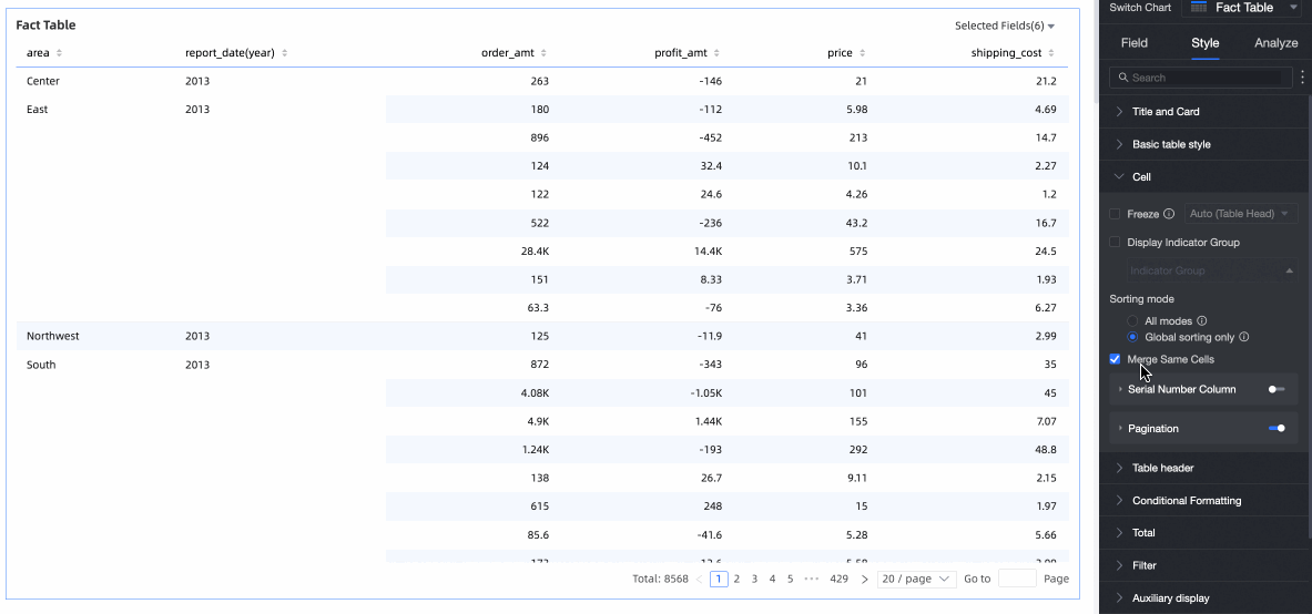
Merge Identical Cells
You can choose whether to merge identical cells.
Wrap Text in Content Area
This option lets you wrap text in the content area independently from the header. This is useful when content in the data rows is longer than the header text, helping to maintain a compact and visually appealing table.
Select Wrap Text in Content Area to automatically wrap long text in the content area.
Notedetails tables can recognize line break characters in fields. You can also use line break characters to customize the wrapping effect.
This option only controls whether text wraps automatically in the table's content area. To adjust text wrapping for the header, see Header settings.
Image Field Display Mode
If the chart contains image fields, you can set how the images are displayed. Options include scaling to fit while maintaining the aspect ratio, cropping to fit the area while maintaining the aspect ratio, or stretching to fit the area.
NoteYou can use image fields only if the dataset contains an image field and the field type is image (
 ).
).Index Column
When this option is enabled, an index column with serial numbers is displayed in the table.
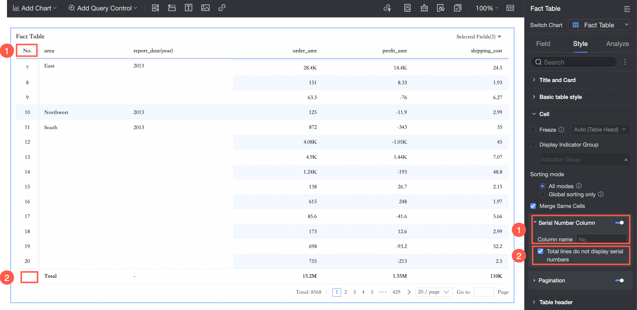
① You can set the name of the index column.
② You can select Do not show index for total row.
NoteYou can select Do not show index for total row only when column totals are enabled for the details table.
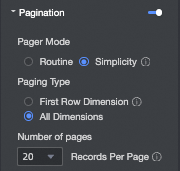
Paginator
Displays a paginator, which is useful for tables with large amounts of data. A paginator improves readability and loading performance by splitting data across multiple pages. Click the paginator toggle icon (
 ) to enable it.
Once enabled, you can configure the following settings for the paginator.
The default paginator mode is Standard. For large data volumes, select Simple mode, which does not calculate the total number of data entries.
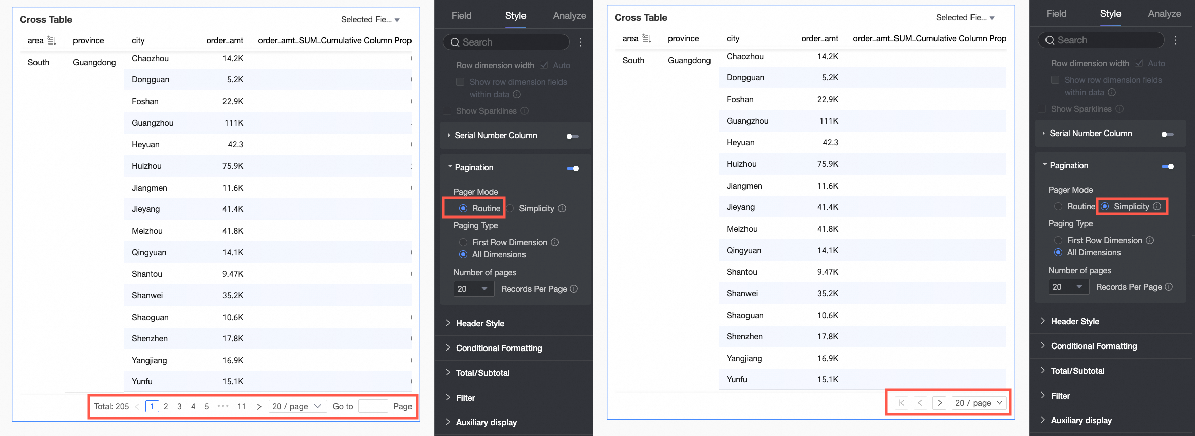
Supported page sizes are 10, 20, 30, 50, 80, 100, 200, and 500 rows per page.
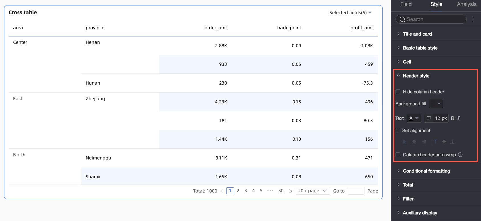
In the Header section, configure the styles for the row and column headers of the details table.
Parameter
Description
Hide Column Header
If this option is selected, the column header content is not displayed.
Background Fill
Sets the background fill color for the column header.
Text
Sets the text style for the column header.
Set Alignment
If this option is selected, you can set the alignment for the column header.
This setting overrides the alignment setting in the field configuration. For example, if the Profit Amount field is set to left-align in the field configuration, but here it is set to center-align, the field name in the column header will ultimately be center-aligned.
Wrap Text in Column Header
If this option is selected, long text in the column header area will automatically wrap.
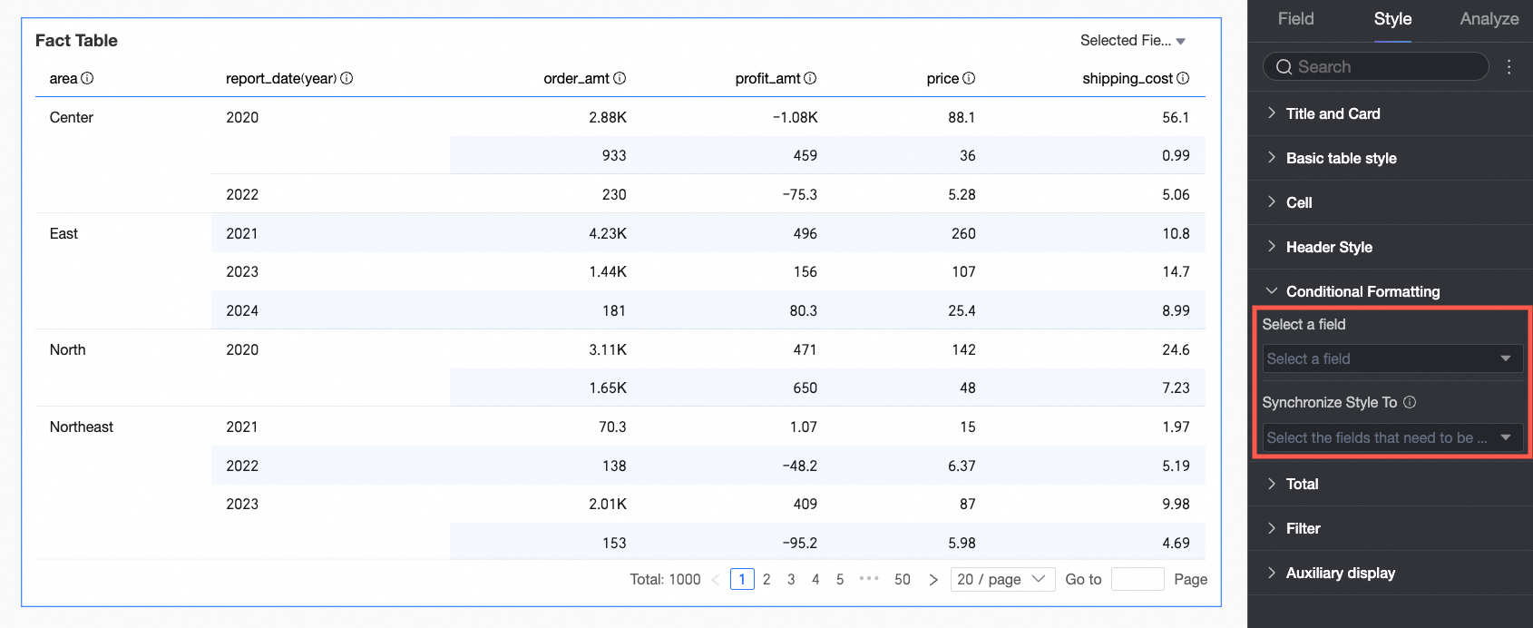
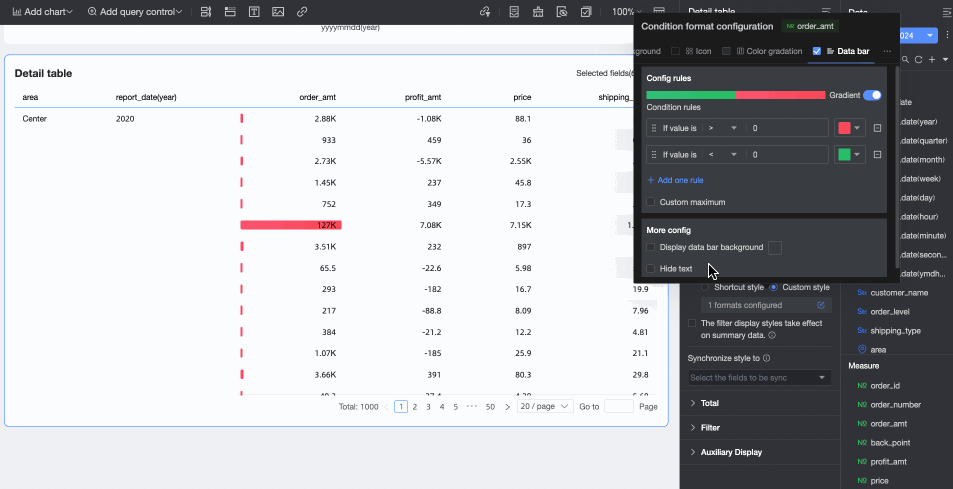
In the Conditional Formatting section, set the conditional formatting for your data.
Parameter
Description
Select Field
Select a field to apply conditional formatting to. You can select any field that has been added to the data panel.
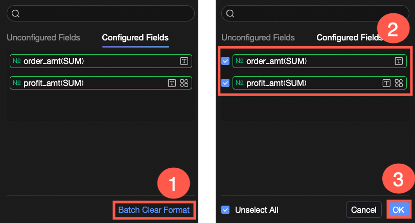
After configuring the styles, if you no longer need some of the conditional formats, you can click Clear Formatting in Batch in the lower-right corner of the field panel. In the selection list, choose the formats to clear and click OK.
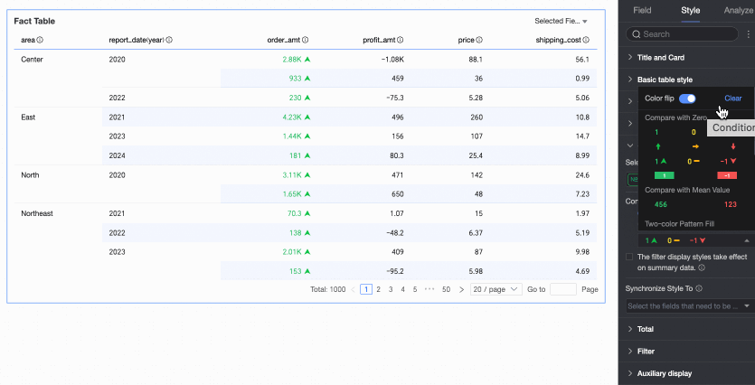
Quick Styles
Set the marker icon or font color for the current field from a list of system-provided styles. Quick styles can only be configured for measure fields, not dimension fields.
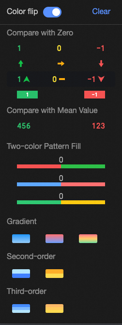
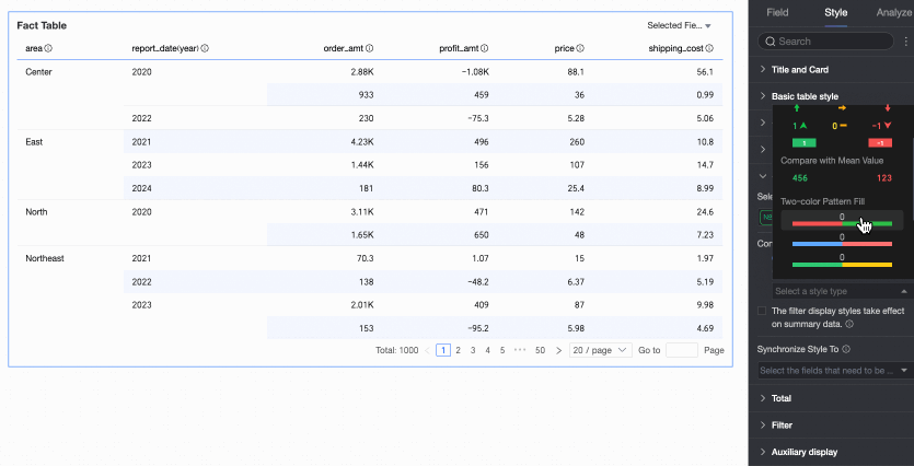
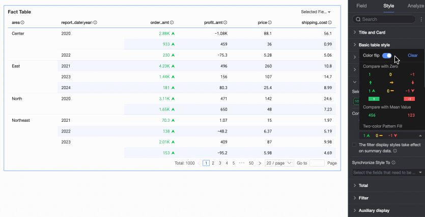
Comparison: Options include Compare with 0 and Compare with average.
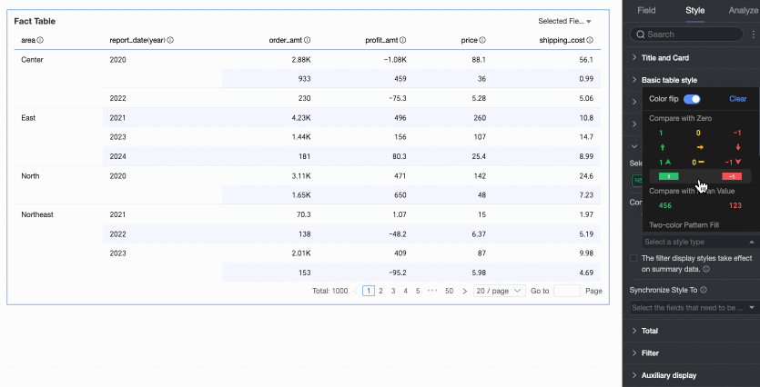
Two-color fill: Allows you to select the color of the data bar.
 Note
NoteThe data bar length is calculated as follows: If the range of values includes both positive and negative numbers, the denominator is the greater of the absolute values of the maximum and minimum. If all values are positive or all are negative, the denominator is the difference between the maximum and minimum absolute values.
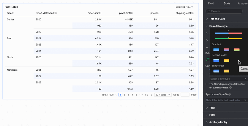
Color scale: Options include Gradient, Two-step, and Three-step.
Invert Colors
For example, with the Comparison style, values less than 0 are red and values greater than 0 are green. After inverting, values less than 0 become green, and values greater than 0 become red.
Clear: If you no longer need a quick style, click Clear to remove it.
Custom Styles
In addition to the system's quick styles, you can configure custom styles as needed. Both measure and dimension fields support custom styles, but the available options differ.
For measure fields: You can configure Highlight Text/Background, Icons, Color Scale, and Data Bar.
Highlight Text/Background: Configure rules to highlight the text or background color of field values to visually emphasize key data in the table.
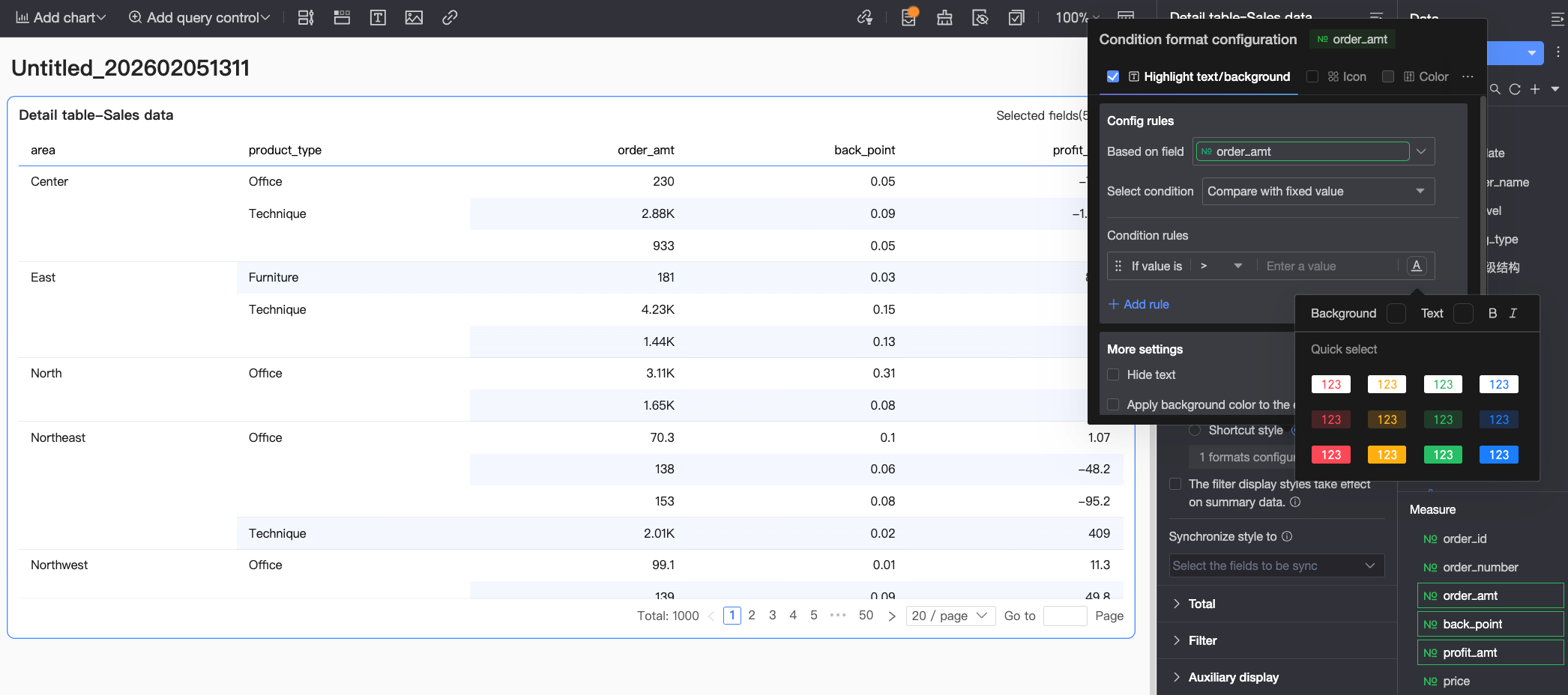 Configure the following settings:
Base Field: Sets the data field to which the rule applies. This defaults to the field selected in Select Field. You can also choose another field from the chart to create more complex rules based on its values.
Condition Selection: Sets the comparison baseline for the rule. Options include Compare with fixed value, By Percentage Range, and Compare with dynamic field.
Condition Rule: Defines the specific logic for the condition and the display style for the cell text/background when the rule is met. You can set the text color, bold, italics, and background fill color.
Add Rule: Click to add a new calculation rule.
More Settings: Sets whether to hide the text of the current field and whether to apply the background color to the entire row.
Icons: Display specific marker icons in cells based on numerical comparisons to clearly show the relationship between the current data and a target value.
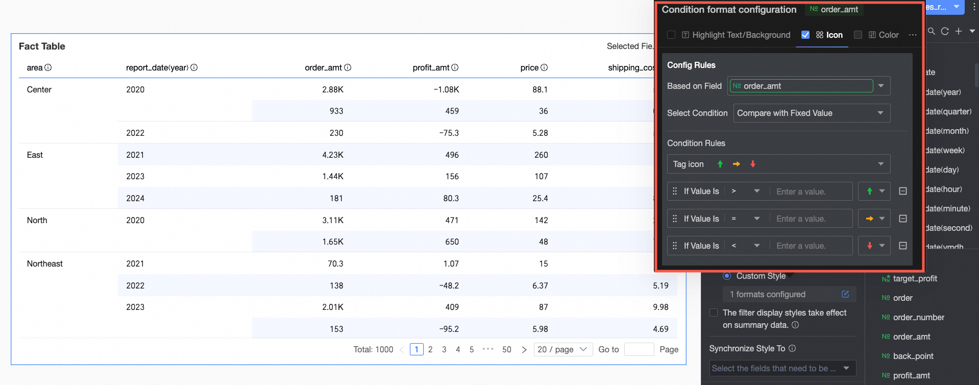 Configure the following settings:
Base Field: Sets the data field to which the rule applies. This defaults to the field selected in Select Field. You can also choose another field from the chart to create more complex rules based on its values.
Condition Selection: Sets the comparison baseline for the rule. Options include Compare with fixed value, By Percentage Range, and Compare with dynamic field.
Condition Rule: Click the marker icon selection box to choose a suitable icon type from the system-provided icon sets. Then, define the logic for the data condition that corresponds to each icon. You can also select a unique marker icon for each comparison rule.
Add Rule: Click to add a new calculation rule.
More Settings: Sets whether to hide the text of the current field.
Color scale: Applies different background colors from a specified color scale based on numerical values to clearly show data distribution and trends.
NoteYou can configure a color scale only when Highlight Text/Background, Icons, and Data Bar are not selected.
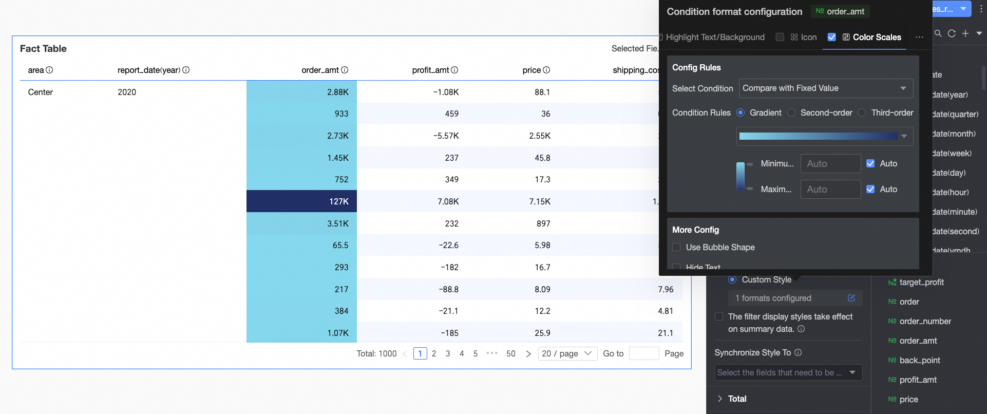 Configure the following settings:
Condition Selection: Sets the comparison baseline for the rule. Options include Compare with fixed value and By Percentage Range.
Condition Rule: Sets the color scale style (Gradient, One-step, Two-step) and specifies the maximum/minimum values, thresholds, and corresponding colors for each value range.
In More Settings, you can set the shape of the color scale bar and whether to hide the text of the current field.
Data bar: Represents cell values with visual bars of varying length and color to more intuitively show the relative size or comparison of data.
 Configure the following settings:
Condition Rule: Sets the display rules for the data bar of the current measure field. You can specify a different display color for each rule.
Add Rule: Click to add a new calculation rule.
Custom Min/Max: If selected, you can set specific values for the maximum and minimum. In automatic mode, the maximum value defaults to the highest value in the current field, and the minimum value defaults to the lowest.
More Settings: Sets whether to display the data bar background and allows you to customize its color. Also sets whether to hide the text of the current field.
For dimension fields: You can configure Highlight Text/Background and Icons.
Highlight Text/Background
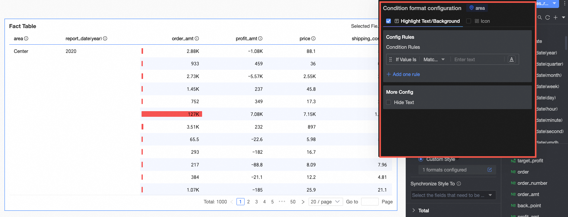
In Rule Definition, set the condition rule for highlighting the text of the current dimension field. Since the condition is evaluated on dimension values, the condition value input box only supports text.
In More Settings, set whether to hide the text of the current field.
Icons
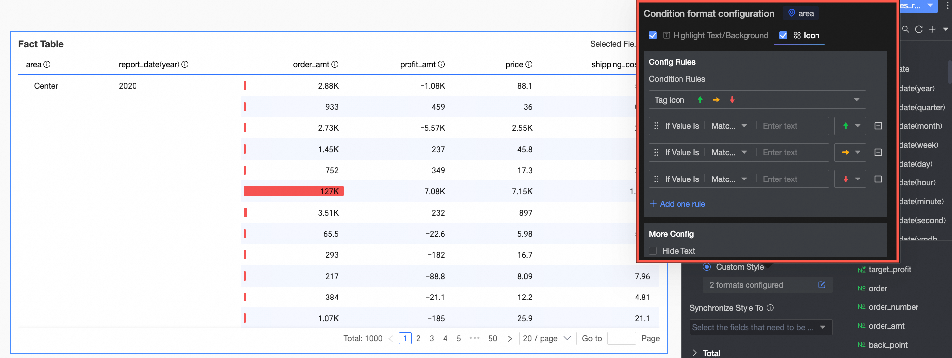
In Rule Definition, set the icon marking rule for the current dimension field. Since the condition is evaluated on dimension values, the condition value input box only supports text.
In More Settings, set whether to hide the text of the current field.
Apply Conditional Styles to Summary Data
If this option is selected, the configured conditional styles will also apply to summary data.
Sync Styles To
Syncs the current conditional formatting to other fields.
In the Total/Subtotal section, click the toggle
 to enable column totals. When enabled, this performs a summary operation on all numerical values in a column.
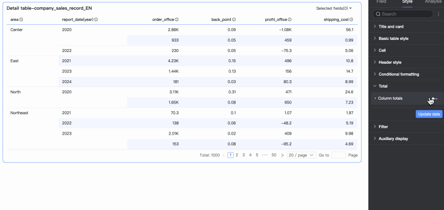
Parameter
Description
Overall Summary (Column Total)
Total Alias
Sets the display name for the total data based on its business meaning, for example, "Total Sales by Region".
Calculation Method
Select a single aggregation method for all fields' totals. If a field is a calculated field, the selected aggregation method here does not apply; the original aggregation method will be used instead.
If you need to set different aggregation methods for each field, select Custom from the drop-down list and configure the aggregation logic for each field in the Custom Calculation module.
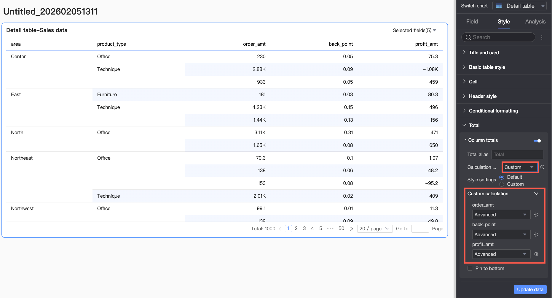
Style Configuration
Sets the text style for the current total data. You can follow the system default or customize the text's font color, background color, weight, and more.
Pin to Bottom
Sets whether to pin the column total data to the bottom of the table.
NoteFor frequently asked questions about total configuration, see Total Configuration FAQ.
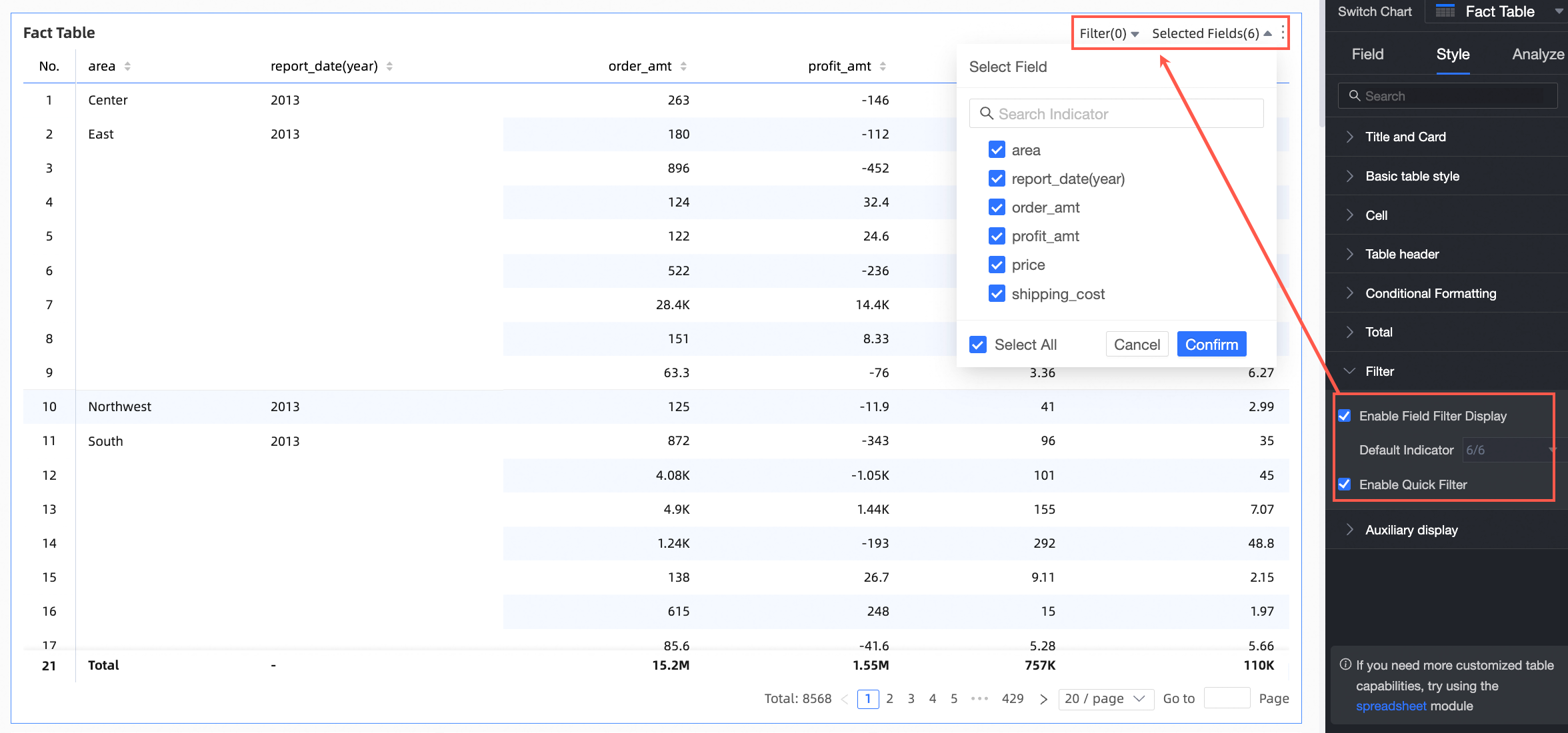
In the Filter section:
After you enable Filter Display by Field Content, you can click the Selected Fields drop-down list on the details table in preview mode to filter or sort fields.
After you enable Quick Filter, you can click the Filter drop-down list on the details table in preview mode to filter fields.
In the Auxiliary Display section, you can set the Scrollbar Display Mode and Scrollbar Thickness.
When you set the display mode to Show on hover, the scrollbar will only appear when your cursor is over the table.
If you want the scrollbar to be always visible, select Always Show.
If you need the scrollbar to be more prominent, you can adjust the thickness.
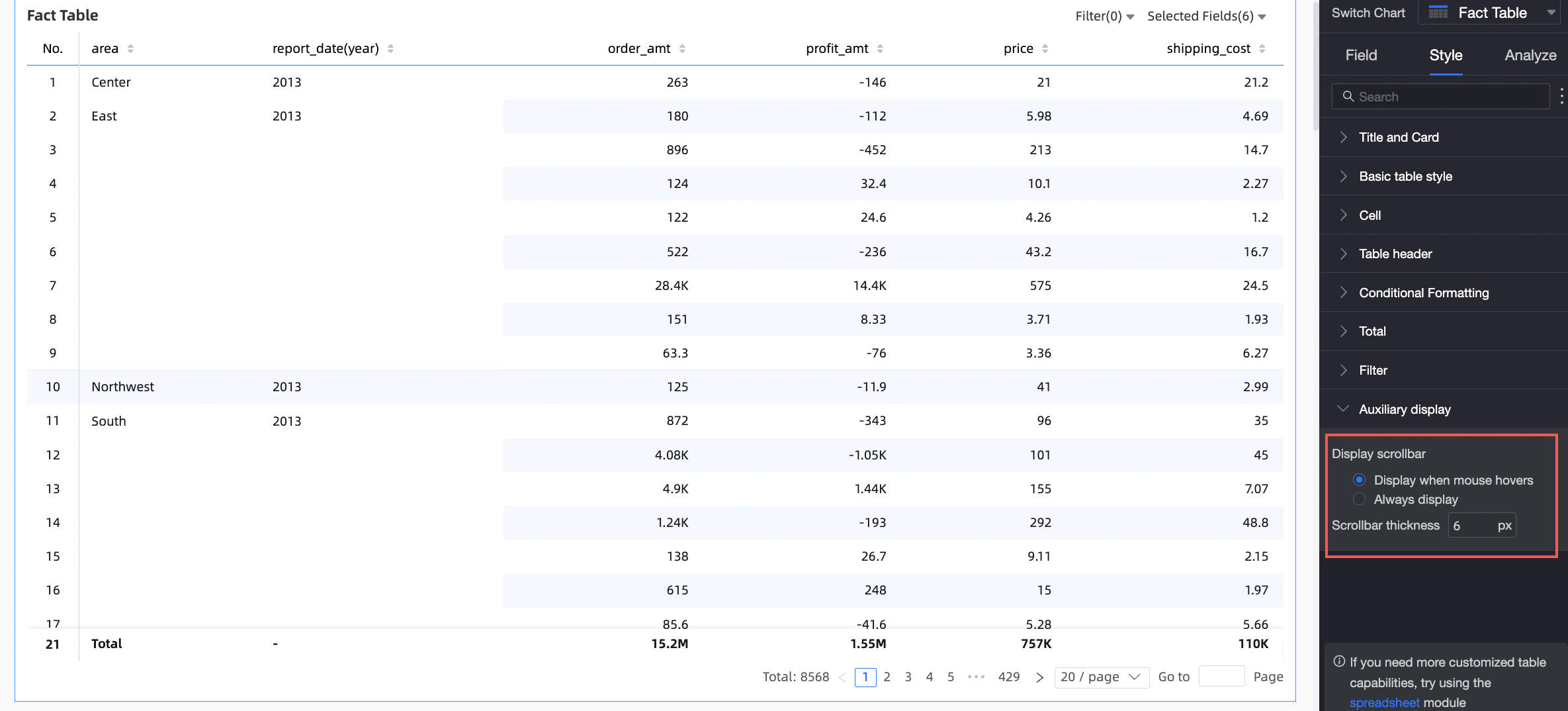
Chart Analysis
Category | Parameter | Description |
Data Interaction | Drill-down | When you configure the drill-down feature for a chart, you can also set the display style of the drill-down hierarchy rows. For more information, see Drill-down. |
Linkage | When the data you need to analyze resides in different charts, you can use chart linkage to connect multiple charts for data analysis. For more information, see Linkage. | |
Jump | When the data you need to analyze is spread across multiple dashboards, you can use dashboard jump to connect them for analysis. Jump supports two methods: parameter jump and external link. For more information, see Jump. | |
Advanced Settings | Events | After selecting this option, you can perform data entry in the details table. When column dimensions are present, you can only add row dimensions to configure events. For more information, see Events. |
Enable Secondary Indicator Display | Select this option to set the display format for secondary indicators. For more information, see Enable secondary indicator display. |
Secondary Indicator Display
After you configure measure indicators, you can enable and configure secondary indicators.

After selecting Enable Secondary Indicator Display, the comparison indicator drop-down list allows you to select any measure indicator.
Comparison Date Selection: You must select a date field from the dataset.
NoteIf the chart contains date fields, the secondary indicator's comparison date can only be the date field with the finest granularity in the chart.
If the chart does not contain any date fields, the secondary indicator's comparison date can be any date field from the dataset.
Comparison Method: The available comparison options, up to a maximum of four, depend on the granularity of the date field. For example, if the Comparison Date has daily granularity, the Comparison Content Selection will show day-over-day, week-over-week, month-over-month, and year-over-year. If the Comparison Date has monthly granularity, the Comparison Content Selection will show month-over-month, year-over-year, etc.
Display Content: Difference Percentage is selected by default. You can also select Difference or Raw Value.
Difference: The data display format matches that of the indicator.
When Difference is selected, you can also select Calculate percentage point difference for percentage indicators. This is not selected by default. If this option is selected and the indicator is a percentage, the difference is displayed in percentage points (pt), for example, 5.2% - 4.1% = 1.1pt. You can choose to retain 0, 1, or 2 decimal places.
Difference Percentage: You can choose to retain 0, 1, or 2 decimal places.
Compare with same period (effective only when query filter is bound to daily granularity): If a filter condition is configured, the same-period comparison is also filtered. For example, if you filter for the date
2022-01-02, the year-over-year calculation will compare it to data from2021-01-02. Day-over-day comparison automatically supports same-period comparison; dynamic sequential comparison does not.When the previous period's data is negative: Select the formula for calculating the difference percentage when the previous period's value is negative. The selected formula applies only to data items where the previous period's value is less than 0. You can set it to:
(Current Period Data / Previous Period Data - 1) * 100%: Default value
1 - (Current Period Data / Previous Period Data) * 100%
Display as -
Sync Comparison Indicators: You can sync the configuration of the current indicator to multiple other indicators.
Display Position: The default is To the right of indicator. Other options include Separate on right and Below indicator.
To the right of indicator: Adds a new indicator column to the right of the current one. The column name will be the selected comparison method, such as year-over-year, day-over-day, etc.
If multiple indicators are arranged as columns, secondary indicators are displayed sequentially to their right.

Separate on right: The last column dimension is split to display the selected comparison methods (day-over-day, week-over-week, etc.) separately to the right of the current indicator.

Below indicator: Adds multiple rows for comparison indicators below the current indicator. The alignment matches the primary indicator's alignment: text is left-aligned, and numerical values are right-aligned.
The comparison indicators share a cell with the current indicator. A new row for the selected comparison method (day-over-day, week-over-week, etc.) is added below the current indicator's header.

Display Style: Select the display colors for positive and negative numbers. Options include Follow global semantic color settings (which follows the settings in Page Settings > Global Styles > Semantic Colors), Positive numbers red, negative numbers green, or Positive numbers green, negative numbers red.
Total Configuration FAQ
How totals are calculated
If your original data is GMV (Sum), and the calculation method for totals and subtotals is set to Auto (default), then the calculation logic for totals and subtotals will be GMV (Sum). If you change the total calculation to Custom and select Average as the aggregation method, the total will be calculated as GMV (Average).
If your original data is id (Distinct Count), and the calculation method for totals and subtotals is set to Auto (default), then the calculation logic will be id (Distinct Count). If you change the total calculation to Custom and select Count as the aggregation method, the total will be calculated as id (Count).
How do I calculate a ratio?
Define the ratio.
In this example, assume the ratio is defined as (Indicator A / Indicator B).
In the dataset, create a new calculated field with the expression:
rate=sum(A)/sum(B).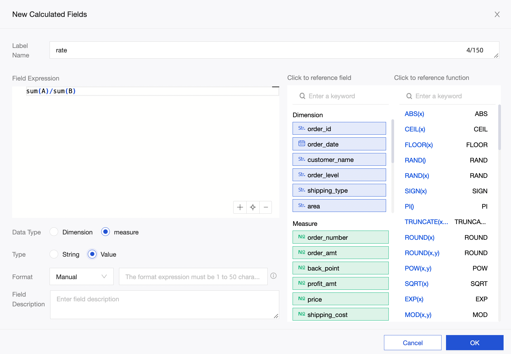
In the dashboard's data panel, select the rate (Sum) indicator and enable totals and subtotals. The calculation logic defaults to rate (Sum), so the total and subtotal logic will be sum(A)/sum(B).
NoteIf you write the expression as
rate=A/Bin the dataset and use the default A/B (Sum) logic for totals, the result will be incorrect (for example, a ratio greater than 100%).