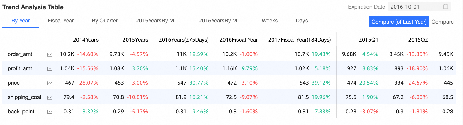
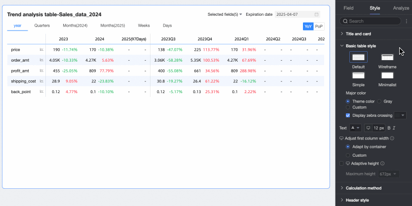
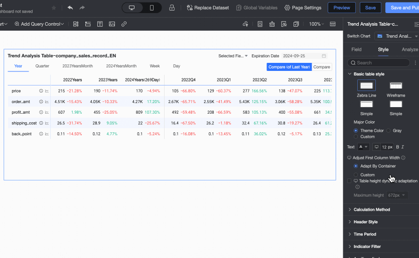
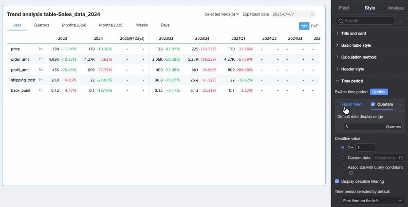
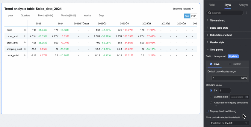
A trend analysis table combines tabular data with trend charts to show how key measures perform across time granularities such as year, quarter, and month. Use it to compare historical data and track progress toward goals.
Overview
Use Cases
Ideal for analyzing high-level metrics by year, quarter, month, week, fiscal year, or the last seven days. You can further analyze individual measures through comparisons, trend visualization, mean values, and normalization.
Example
Key Advantages
-
Multi-dimensional analysis: Compare data across time granularities such as day, week, month, and year, including year-on-year and month-on-month comparisons.
-
Goal management: Enter target values and analyze completion rates with built-in tools.
-
Enhanced interaction: Click a measure to open a pop-up trend chart for deeper analysis.
Limitations
-
Prerequisites
-
You have created a dataset. The dataset must contain a date field with day-granularity, such as Order Date (day). For more information, see Create a dataset.
-
You have created a dashboard. For more information, see Create a dashboard.
-
-
When you add data to a trend analysis table, the dataset must include a date field with day-granularity, such as Order Date (day). The following limitations also apply:
-
The number of columns in a trend analysis table is determined by the date field and the number of time periods. You can select only one dimension field with day-granularity, and the number of time periods cannot exceed 1,000.
-
The number of rows in a trend analysis table is determined by the number of measures. You must select at least one measure and no more than 300 measures.
-
Configure Chart Data
-
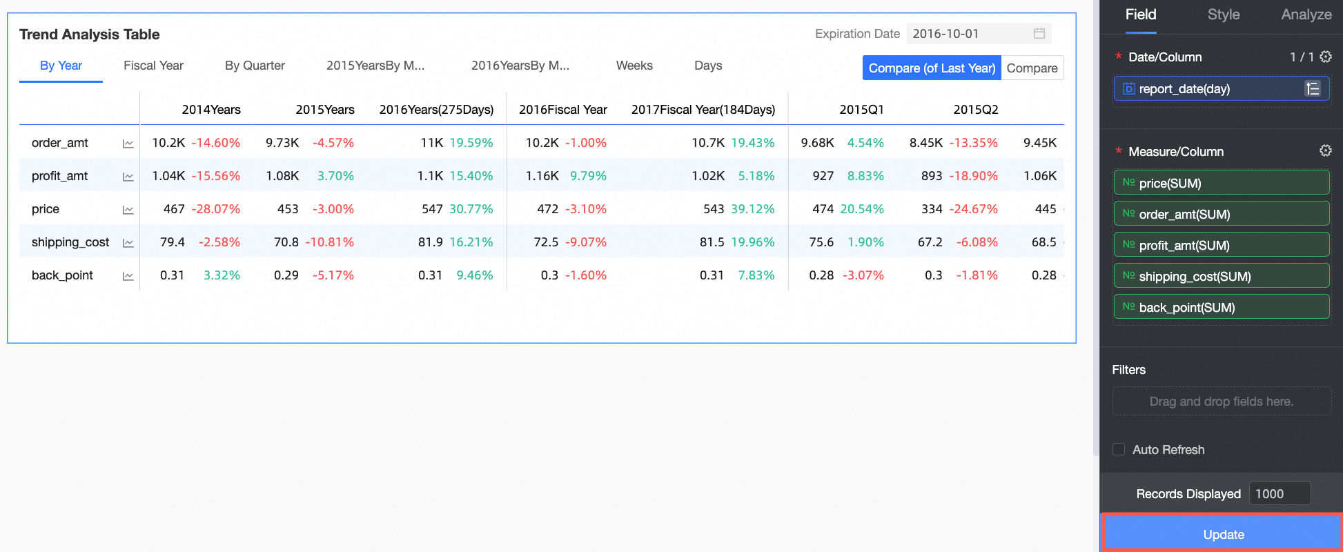
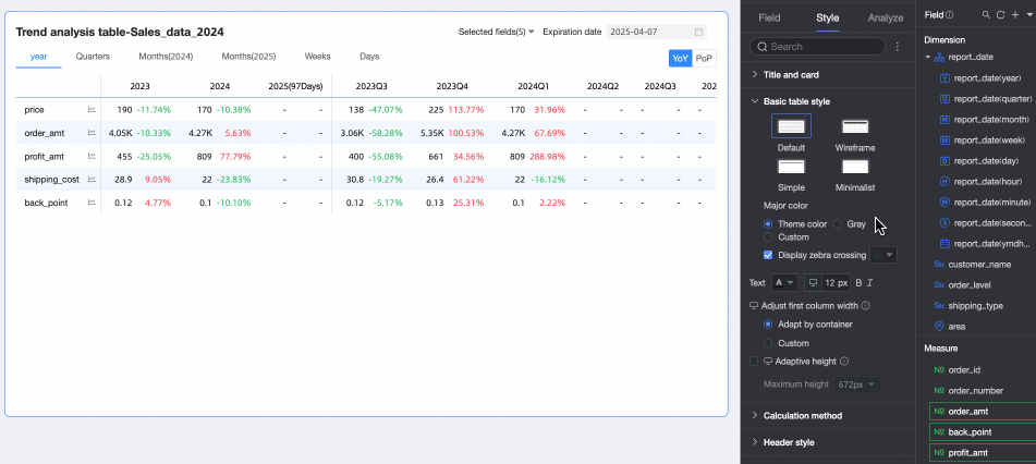
On the Chart Design panel, go to the Data tab and select the required dimension and measure fields.
-
From the Measures list, find Order Amount, Profit Amount, Shipping Cost, Unit Price, and Discount. Double-click or drag them to the Measures / Row area.
-
From the Dimensions list, find Order Date (day). Double-click or drag it to the Date / Column area.
NoteOnly one date field with day-granularity can be added to the Date / Column area.
-
-
Click Update. The chart automatically updates.
Configure Chart Styles
-
On the Fields tab, click the Settings icon
 next to Measure / Column and follow the instructions in the figure to configure the tree structure of the trend analysis table.
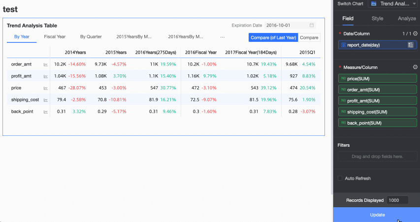
-
On the Style tab, configure the style of the trend analysis table. For general style settings, see Configure the chart title area.
You can enter a keyword in the search box at the top of the configuration panel to quickly find a configuration item. You can also click the
 icon to Expand/Collapse all categories.
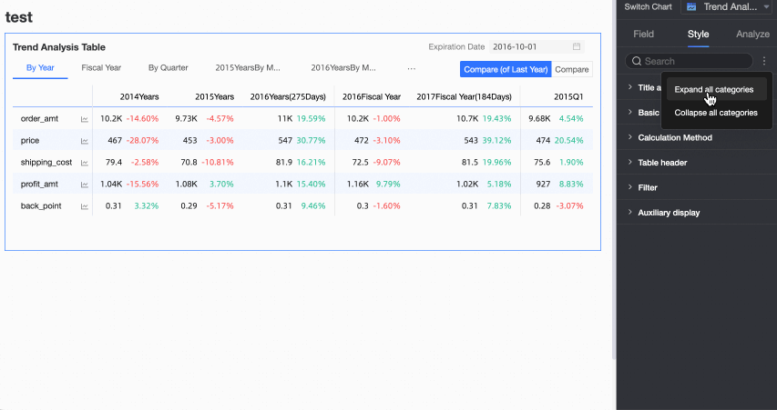
-
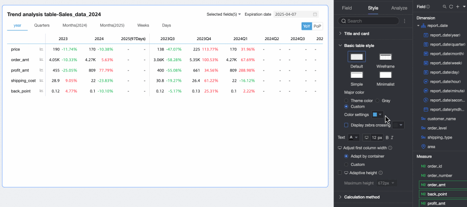
In the Basic table style section, configure the basic style of the table.

Parameter
Description
Custom table theme
Configures the appearance of the trend analysis table.
-
Theme: The supported types are Default, Wireframe, Simple, and Minimal.
-
Primary color: When the theme style is set to Default, Wireframe, or Simple, you can set the primary color scheme of the table. Options include Follow Theme Color, Gray, or Custom.
-
Show zebra stripes: Choose whether to display alternating row colors (zebra stripes) in the table and specify the stripe color.
Adjust first column width
Configures the width of the first column. You can switch the preview mode
 at the top of the page to set different widths for PC and mobile views. The following options are available:
-
Fit to Container: Automatically adjusts the column width to fit the content.
-
Custom: Lets you set a specific column width in pixels. The default is 160.
Dynamic table height adaptation
Controls whether the table height automatically adjusts based on its content.
You can click the
 icon at the top of the page to configure height adaptation for PC and mobile views separately. When enabled, the table container height adjusts to fit the data, which may affect the overall dashboard layout. Use this feature as needed.
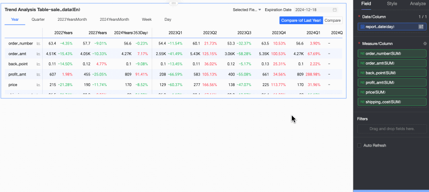
Max height
When dynamic height adaptation is enabled, you can set a maximum height. If the content height exceeds this value, the table is capped at the maximum height. Otherwise, it adjusts to the content height.
You can click the
icon at the top of the page to set the max height for PC and mobile views separately. Options include 192px (about 5 rows), 352px (about 10 rows), 672px (about 20 rows), 1632px (about 50 rows), and Custom.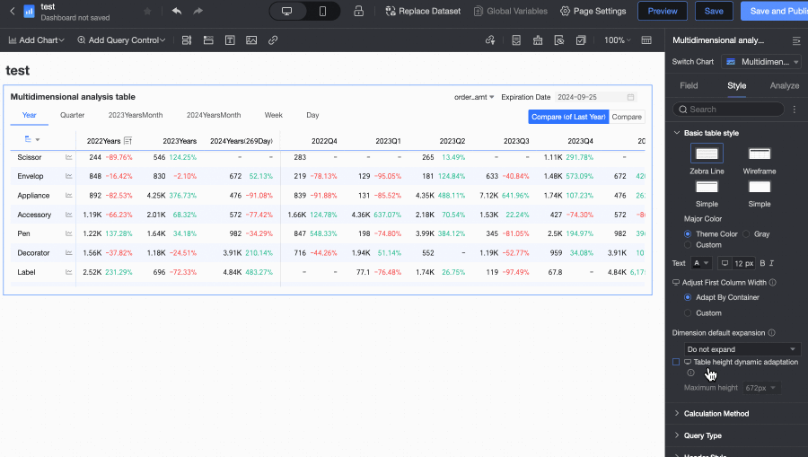
-
-
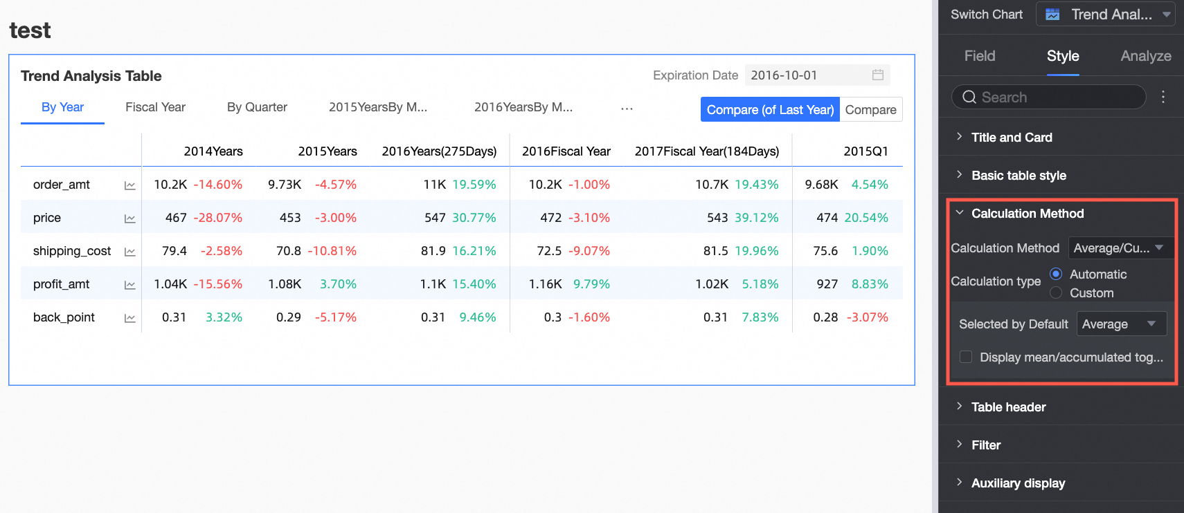
In the Calculation method section, configure the calculation method for the table.
Parameter
Description
Calculation method
Configures the calculation method for the trend analysis table.
-
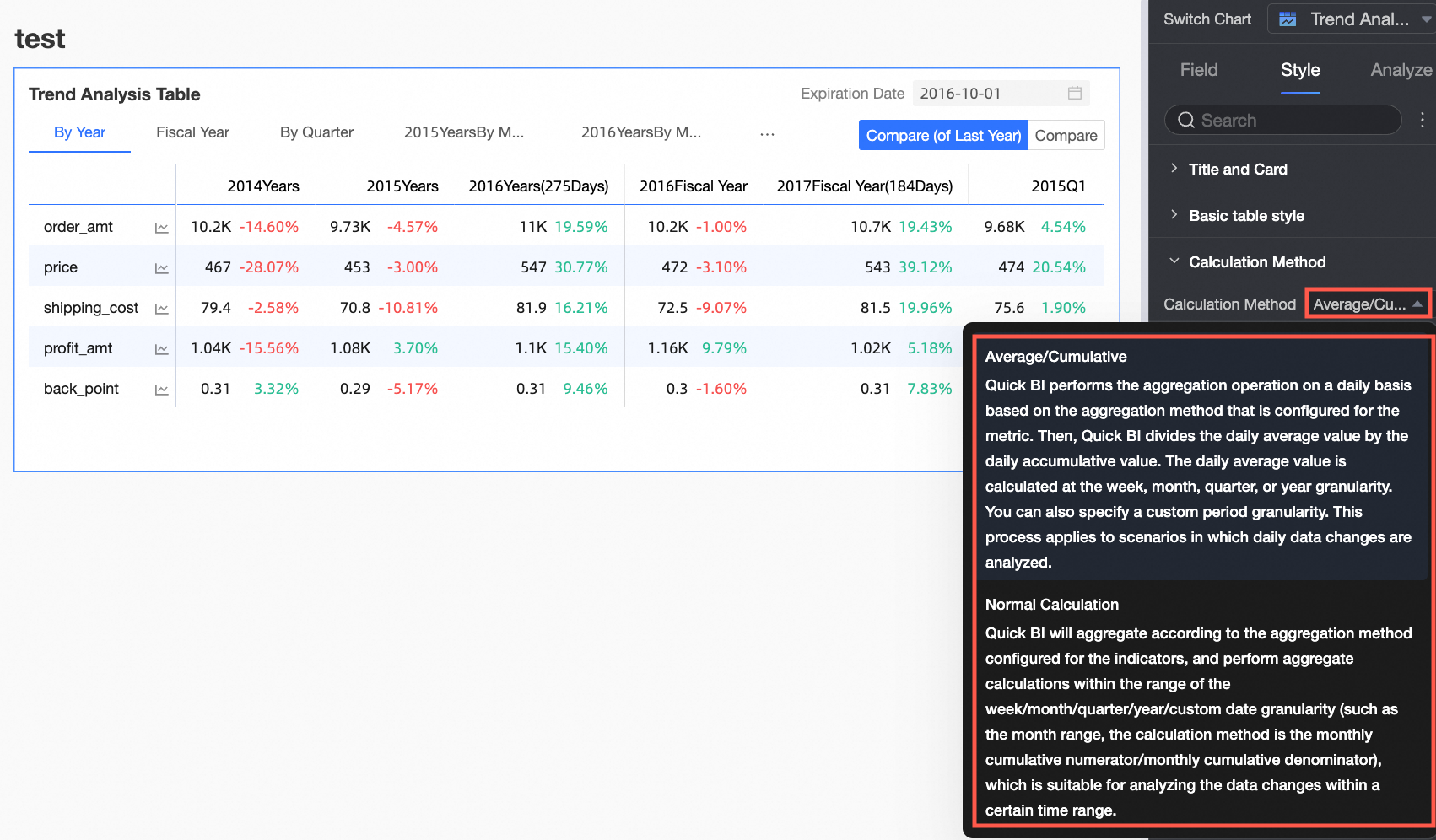
You can choose between Mean/Grand total or Standard Calculation. The default is Mean/Grand total.
NoteFor a list of data sources that support Standard Calculation and Mean/Grand total, see Data source feature list.
-
Mean/Grand total requires further configuration. Standard Calculation does not.
NoteStandard Calculation: Quick BI performs aggregation based on the configured aggregation method for the measure within the specified date range (week, month, quarter, year, or custom). For example, within a monthly range, the calculation might be monthly cumulative numerator/monthly cumulative denominator. This is suitable for analyzing data changes over a specific period.
-
Enabling Enable Mean/Grand Total Toggle displays Mean and Grand total toggle buttons in the upper-right corner of the chart. The button color will match the table's Primary Color setting.
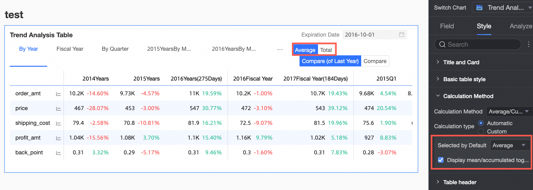
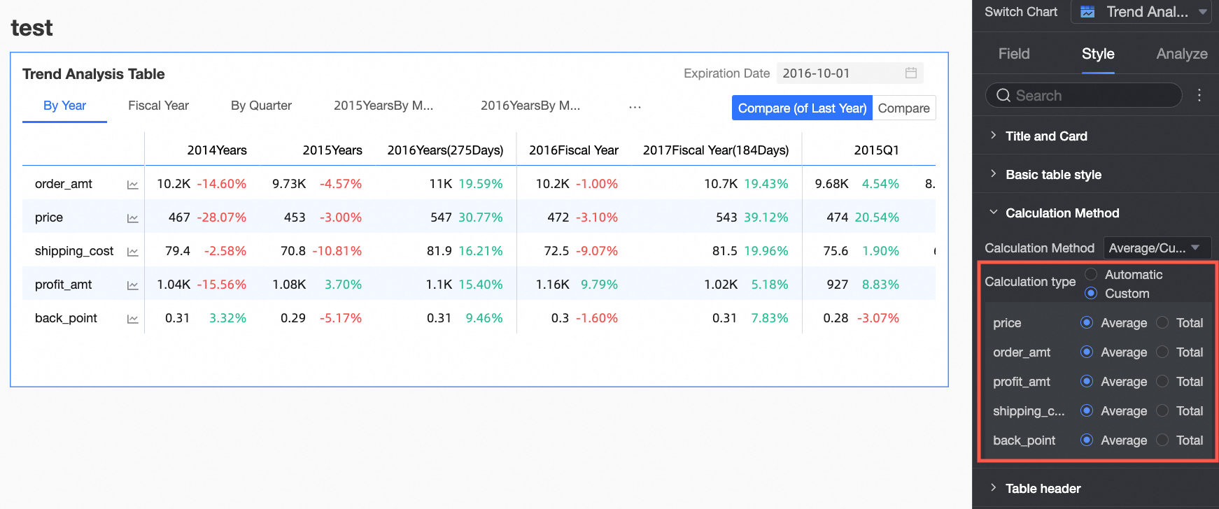
Select the Customize Mean/Grand Total Toggle checkbox to manually set the Mean/Grand total calculation method for each measure.
-
-
In the Header style section, configure the style for the row and column headers.

Parameter
Setting
Description
Column header
Background Fill
Sets the background fill color of the column header.
Text
Sets the text style of the column header.
Row header
Background Fill
Sets the background fill color of the row header.
Text
Sets the text style of the row header.
-
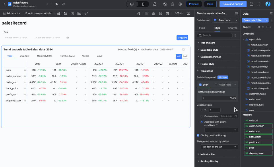
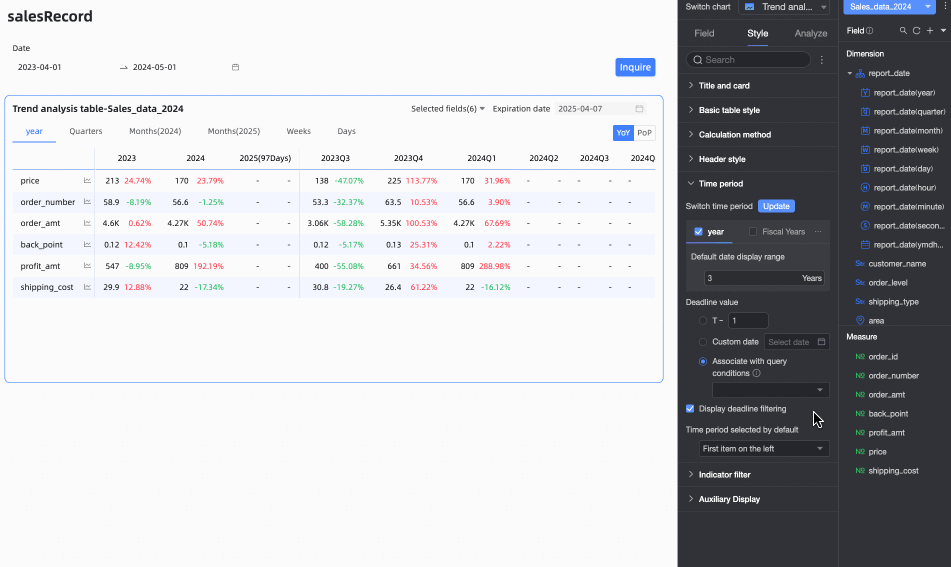
In the Time period section, configure the time period switcher and the default end date.

Parameter
Description
Time period switcher
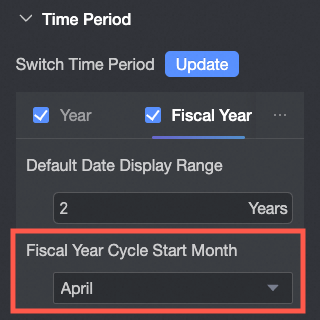
Lets you switch between Year, Fiscal Year, Quarter, Fiscal Quarter, Month, Week, Day, and Custom Time periods.
-
For all time periods except custom, you can set the Default Date Display Range.
-
For Fiscal Year, you can configure the Fiscal Year Start Month, with options from 1 to 12. April is selected by default.
 Note
NoteThe fiscal year start month setting in the trend analysis table is independent of the fiscal year configuration in the dataset's date properties.
-
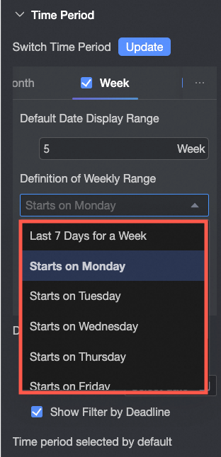
Week Range Definition: When the calculation method is Standard Calculation, you need to download and run a function script on your data source to define a custom week range.
After running the script, you can select the week range.
 Note
NoteFor a list of data sources that support custom week start times, see Data source feature list.
-
The Fiscal Quarter's start month is determined by the Fiscal Year Start Month setting.
Default end date value
Set Show Date Filter and specify a default value. Selecting the Show Date Filter checkbox adds the End Date text to the upper-right corner of the chart.
The End Date Value can be set to T-X, Custom Date, or Associate with Query Condition.
-
T-X: The end date is set to X days before the current date (Today). X must be a positive integer. For example, if X is 1 and the current date is January 16, 2024, the end date is January 15, 2024.
-
Custom Date: Manually set a custom end date.
-
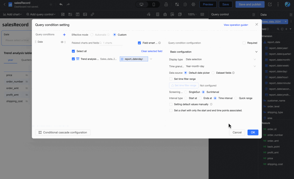
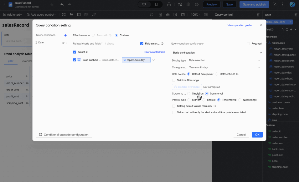
Associate with Query Condition: The end date is linked to a time-based query condition in the dashboard. In preview mode, the table uses the selected query condition's value as its end date. This improves analysis efficiency, especially when a single query control manages multiple trend or multidimensional analysis tables.
-
When adding a standard query control to the dashboard, you must select the associated chart and its date field under Associated Charts and Fields. The query control's Display Type must be Date Selection.

-
If the query condition's Filter Mode is Range, the Range Type cannot be Starts with. When a range is selected, its end date is used as the table's end date. For example, if the range is 2023-10-19 to 2023-11-30, the end date is 2023-11-30.
-
If the query condition's Filter Mode is Single Day, the selected day becomes the end date. For example, if January 1, 2024 is selected, the end date is January 1, 2024.
-
If you select Associate with Query Condition but do not select a specific query condition from the dropdown list, the end date defaults to T-1. For example, if the current date is December 17, 2024, the end date is December 16, 2024.
-
Default selected time period
You can set the Default Time Period. By default, it is the first option on the left.
-
-
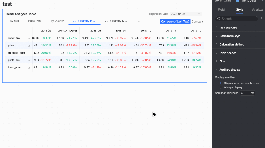
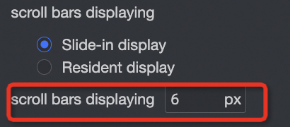
In the Auxiliary display section, you can set the Scrollbar Display Mode and Scrollbar Thickness.
-
If you set the display mode to Show on Hover, the scrollbar appears only when you hover the cursor over the table.
-
To keep the scrollbar always visible, select Always Show.
-
To make the scrollbar more prominent, you can adjust its thickness.
-
-
-
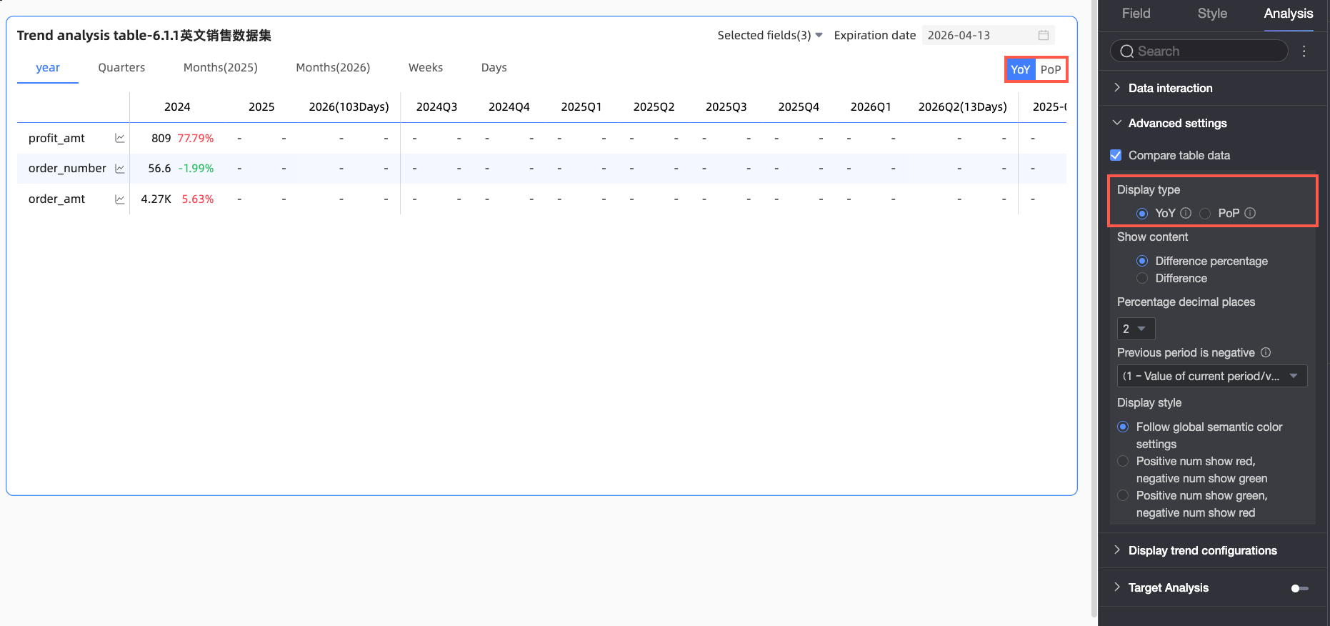
On the Chart Design panel, go to the Analysis tab and expand the Advanced settings section to configure data comparison.
Select the Enable Table Data Comparison checkbox. Year-on-year and Month-on-month options appear in the upper-right corner of the chart.
-
Display type: Supports year-on-year and month-on-month comparisons.
NoteBecause the date field has day-granularity, the chart supports year-on-year and month-on-month comparisons for daily, weekly, monthly, quarterly, yearly, and custom intervals. You can select the desired comparison type.
-
Show: Supports percent variance and variance.
-
variance = Current Period Data - Previous Period Data.
-
percent variance = [(Current Period Data - Previous Period Data) / Previous Period Data] * 100%
NoteWhen you select percent variance, or select variance and check Calculate variance for percentage measures (pt), you can configure the number of decimal places for the percentage to 0, 1, or 2.
The following example compares order data for the previous period (week 2015-09) and the current period (week 2015-10) to show variance and percent variance.
-
For example, if the current period's data is 6,113 and the previous period's data is 6,577. The variance is -464 (
-464 = 6113 - 6577).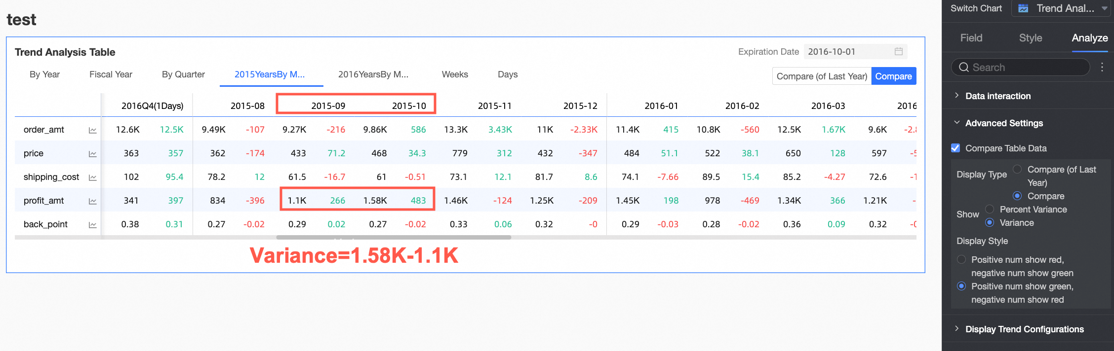
-
For example, if the current period's data is 6,113 and the previous period's data is 6,577. The percent variance is
-7.06%(-7.06% = [(6113 - 6577) / 6577] * 100%).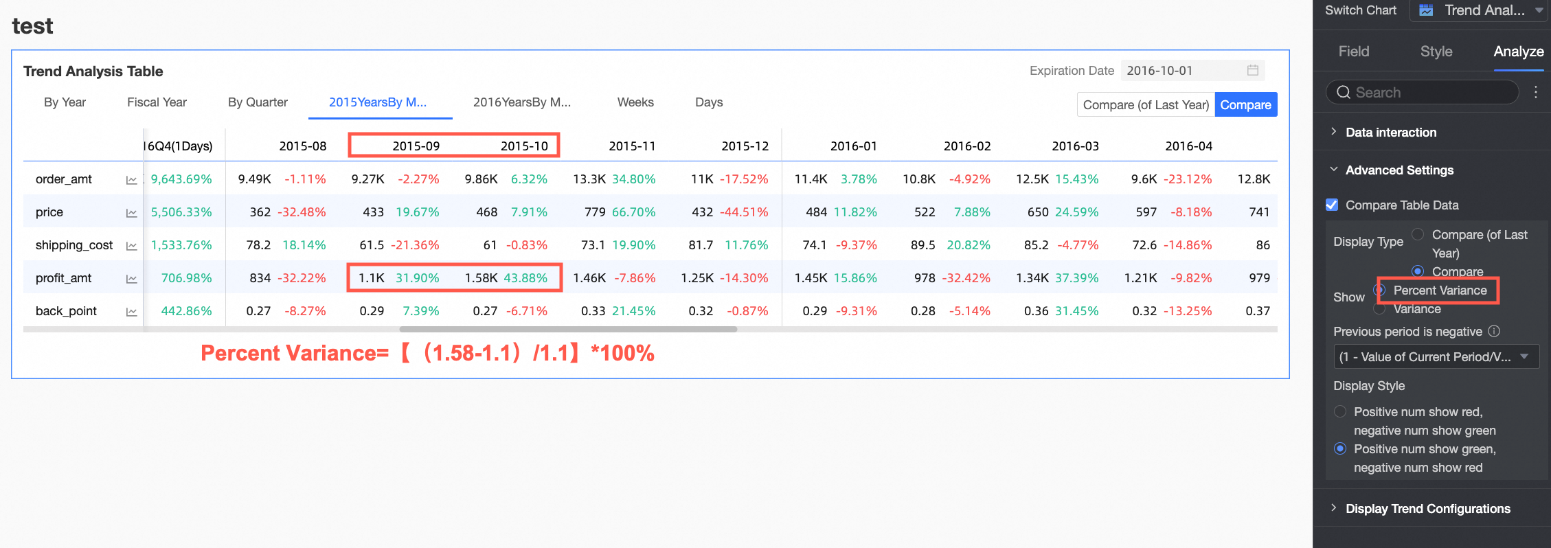
-
-
Display style: Configure the display colors for positive and negative numbers. You can choose to Follow global semantic color settings (which follows the settings in Page Settings > Global Style > Semantic Colors).

-
Configure Goal Analysis
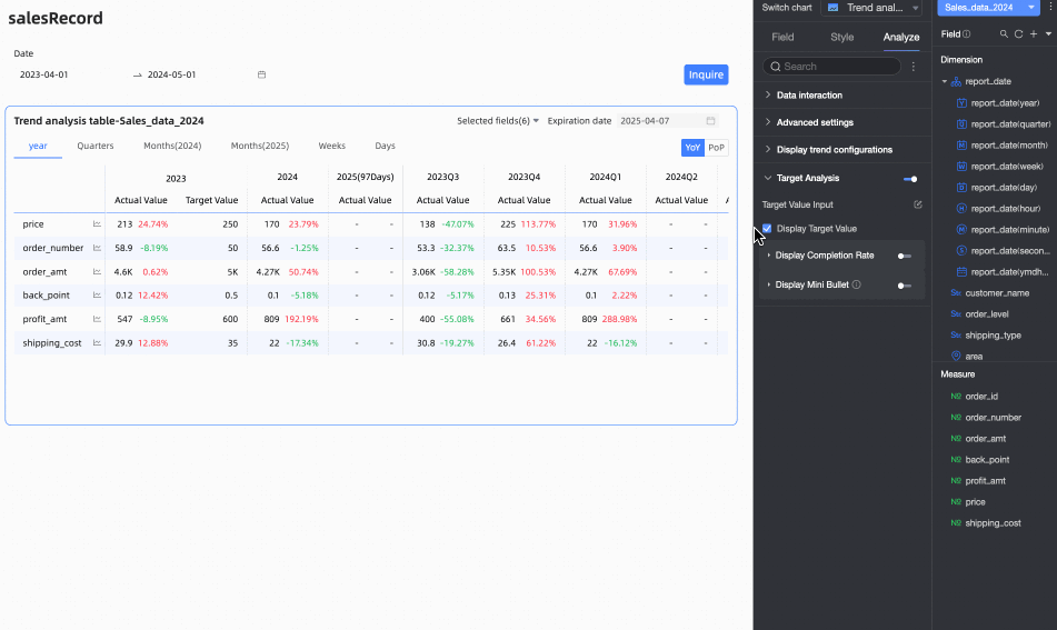
Many business scenarios require setting target values for key performance indicators over specific time periods, such as quarterly sales targets or annual profit goals. The goal analysis feature displays actual values alongside target values in the same chart, helping you compare performance against goals, analyze completion rates, and adjust strategies accordingly.
After configuring the fields for the trend analysis table, you can enable and configure the Goal Analysis feature in the Analysis panel.

|
Parameter |
Setting |
Description |
|
Enter target values Click the |
Fill in target values |
In the Target Value Entry Table, enter the target values for each measure in the corresponding time period. Click OK when finished. Note
|
|
Export entry table |
Click Export Entry Table to download the current table as an Excel file. You can then send this file to colleagues to collect target data. |
|
|
Import target values |
Click Import Target Values to upload a file containing target value data. The system automatically recognizes the file content and populates the entry table. Note
|
|
|
Update |
To preserve entered data, the entry table structure does not automatically update after its initial generation. If you change the field or time period configuration of the trend analysis table, you can click Update to synchronize the entry table with the trend analysis table's current structure. |
|
|
Clear |
To clear all entered target values at once, click Clear. |
|
|
Show target value |
Choose whether to Show Target Value in the trend analysis table. This is enabled by default when Goal Analysis is turned on. |
|
|
Show completion rate Enable the |
Configure completion rate calculation |
Click the
|
|
Custom header name |
Select this option to enter a custom name for the completion rate column header. |
|
|
Custom completion rate font color |
Select this option to set font colors for different completion rate ranges to visually indicate performance. |
|
|
Completion rate decimal places |
Set the number of decimal places for the completion rate to 0, 1, or 2. |
|
|
Show mini bullet chart Enable the |
Custom header name |
Select this option to enter a custom name for the bullet chart column header. |
|
Bar color |
Set a custom color for the bullet chart's bar. |
|
|
Target line color |
Set the color of the target line in the bullet chart. |
|
|
Background color |
Set the background color of the bullet chart bar.
|
|
 icon to open the entry window

 toggle to show completion rate
 icon to open the Configure Completion Rate Calculation dialog box. Configure the calculation method for each measure. The following three methods are available:


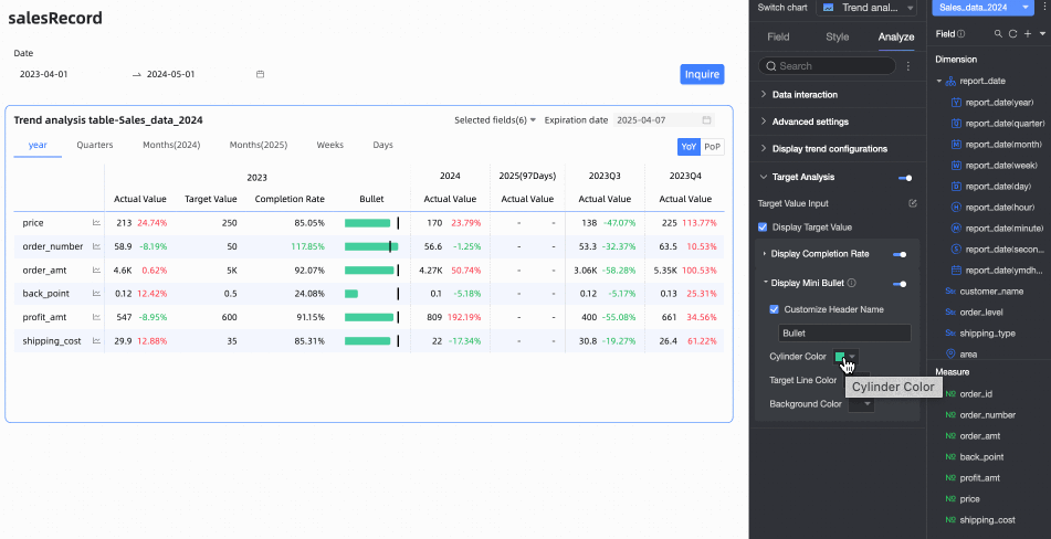
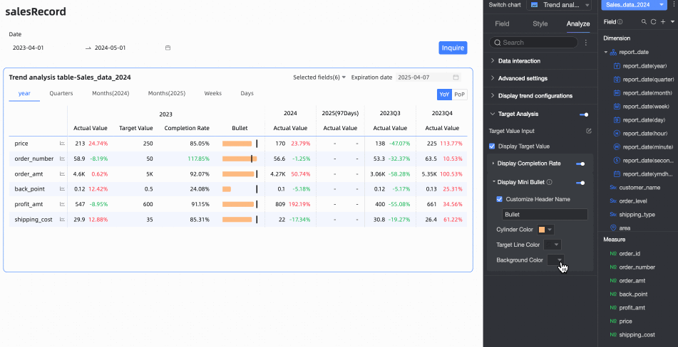
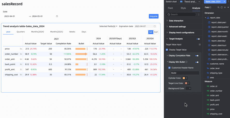
Chart Preview
In the preview page, you can adjust the display to improve data analysis efficiency and user experience.
Trend Analysis Chart
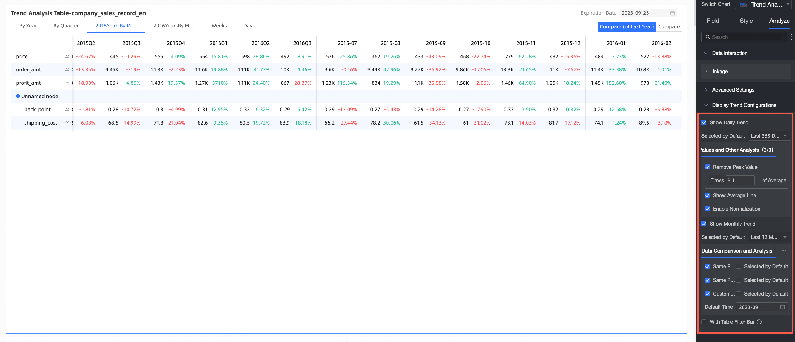
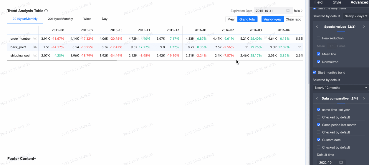
Click a measure's trend icon to open its pop-up trend chart.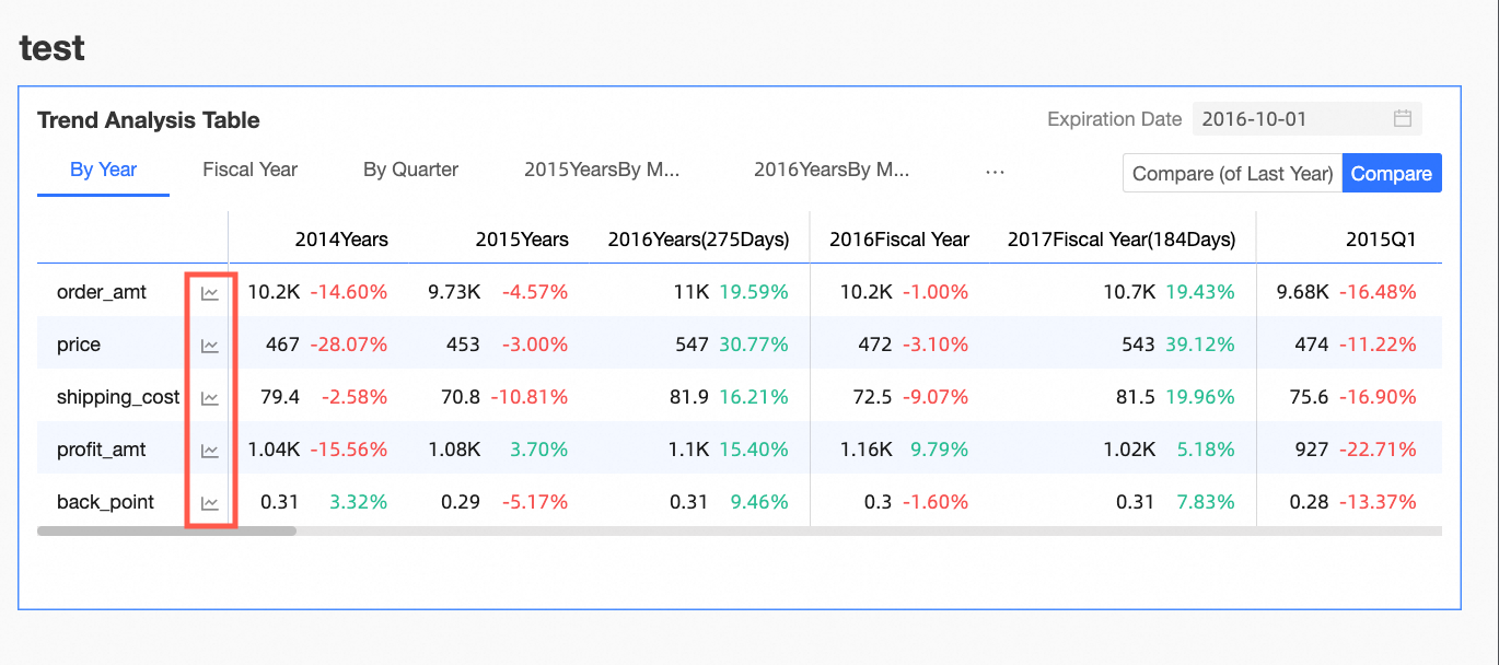
Configure the trend analysis chart in the Pop-up Trend Settings section on the Analysis tab of the Chart Design panel.
|
Parameter |
Description |
|
Enable Daily Trend and Enable Monthly Trend |
When enabled, you can view the daily and monthly trends of the measure in the trend analysis chart. |
|
Data comparison |
Includes Same Period Last Year, Same Period Last Month, Same Period Last Week, Previous Day, and Custom Date.
|
|
Special value and other analyses |
Includes Exclude Peaks, Mean Line, and Normalization. Analyze data and support decision-making by handling special values. |
|
Comparison measures |
Select multiple measures to analyze and compare simultaneously. |
Hide Empty Columns
Time filtering can create empty columns (columns with no data for the selected time range), which you can quickly hide. Options include Hide Single Column and Hide All Empty Columns.
-
Hide all empty columns: Click any column header and select Hide all empty columns from the dropdown list. This automatically hides all columns that contain only empty cells (displays as '-').
You can click the
 icon to unhide specific columns, or click a column header again and select Show all hidden columns to unhide all empty columns.
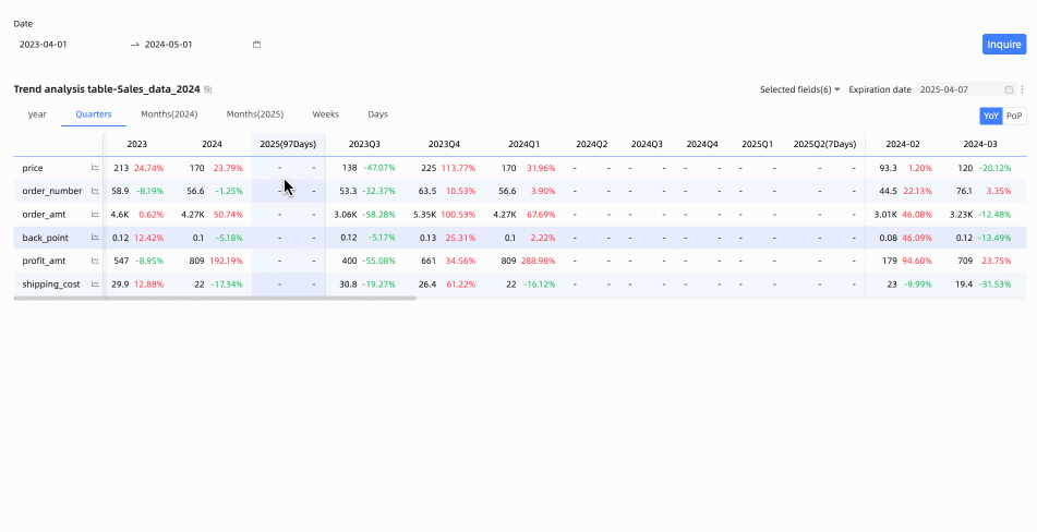
-
Hide single column: When editing or previewing the table, you can hide specific columns. Click the header of the target column and select Hide column from the dropdown list.
Click the
icon to unhide the column.
Restore Default Filters
Use the field filter panel to select which measures to display. To revert to the default selection, click the  icon in the upper-right corner of the table or click Restore Default in the field filter panel.
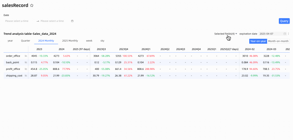
FAQ
1. Difference between trend analysis and multidimensional analysis tables
A: The main difference lies in column configuration. A trend analysis table allows only a single time dimension with day-granularity in its columns, focusing on how measures change over time. A multidimensional analysis table supports multiple business dimensions (such as region or product category) in rows or columns for more complex cross-analysis.
2. View YoY and MoM growth rates
A: In the chart editing view, go to the Analysis tab, find Advanced settings, and select Enable Table Data Comparison. Then, in the Show field, select percent variance. Choose the Display Type as either year-on-year or month-on-month as needed. After saving, toggle buttons for year-on-year/month-on-month will appear in the chart preview, and the table will display the corresponding percentage data.
3. Date field rejected for Date / Column
A: The trend analysis table requires a date field with day-granularity in the Date / Column area. Ensure your selected field meets this requirement (for example, the field name might be similar to Order Date(day)). Date fields with other granularities, such as year, month, or week, cannot be used in this area.
4. Remove empty date columns
A: In preview mode, hover over any column header, click the dropdown arrow that appears, and select Hide all empty columns from the menu. This automatically hides all columns that contain only empty cells, making the table more compact.