Funnel charts analyze standardized, multi-step business processes by comparing data across stages to pinpoint drop-offs. Each step displays its conversion rate, making it easy to track progression — for example, from website visitors to paying customers.
Prerequisites
The dashboard has been created. For more information, see Create a Dashboard.
Limits
A funnel chart has two parts: Funnel layering/dimension and Funnel width/measure.
-
For Funnel layering/dimension, you can select up to one dimension, or no dimension. For example, region.
-
For Funnel width/measure, you can select from 1 to 10 measures. For example, order amount.
You can configure a funnel chart in two ways:
-
Select one dimension for Funnel layering/dimension and one measure for Funnel width/measure. This configuration is used to analyze data for a single stage and identify issues quickly.
-
Select no dimension for Funnel layering/dimension and 1 to 10 measures for Funnel width/measure. This configuration is used to compare data across multiple stages.
Chart Overview
Scenarios
-
Analyze standardized, multi-step workflows in a single direction. Compare data across stages to find where problems occur and take action.
-
A funnel chart uses the area of a trapezoid to show the difference in volume between one stage and the previous stage.
-
The top-to-bottom flow represents logical progression, showing how well business goals are met at each stage.
Benefits
-
Calculation: Automatically computes conversion rates.
-
Visualization: Offers trapezoid and rectangle styles, plus custom label displays.
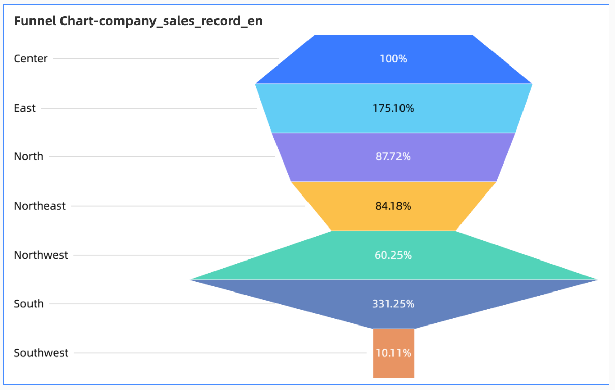
Example Rendered Output
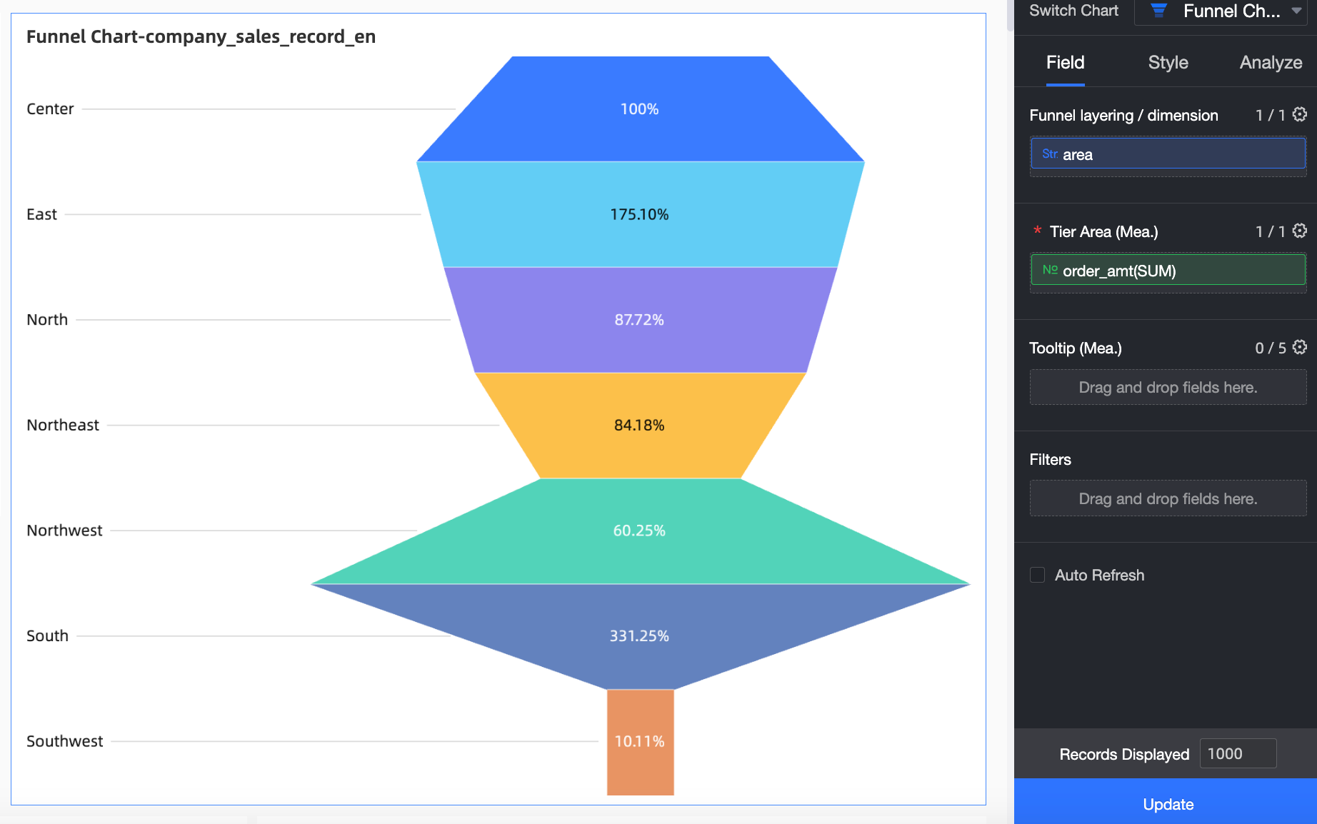
Configure Chart Data
-
On the Data tab, select dimensions and measures.
-
To compare order amounts by region, add the following fields:
-
From the Dimensions list, double-click or drag Region to the Funnel layering/dimension area.
-
In the Measures list, locate Order amount. You can double-click it or drag it to the Funnel width/measure area.
-
-
-
Click Update. The system automatically updates the chart.
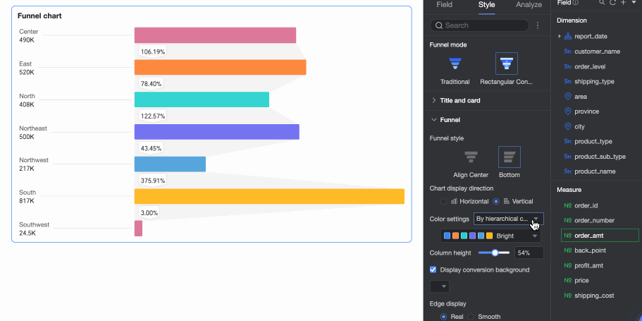
Configure Chart Style
Configure the chart style below. For general chart style settings, see Configure the chart title. You can set the funnel mode to Classic funnel or Rectangle conversion. 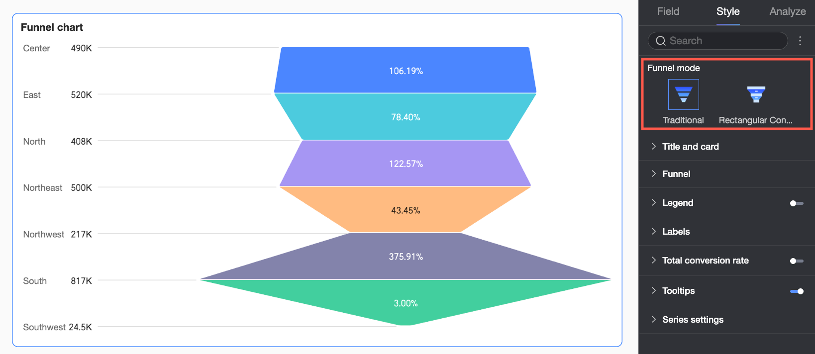
Funnel
You can set the funnel mode to Classic funnel or Rectangle conversion:
-
In Classic funnel mode, conversion rates are calculated as a percentage of the layer above or the first layer. The slope of each trapezoid visually represents the change. Use this mode to view the full workflow as a single unit.
-
When Funnel pattern is set to Conversion analysis, the conversion rate is calculated as the percentage of each layer compared to the previous layer. This pattern highlights gaps between levels and specific conversion values, making it suitable for comparing conversion efficiency between adjacent stages.
Each mode supports different settings, described in the following sections.
-
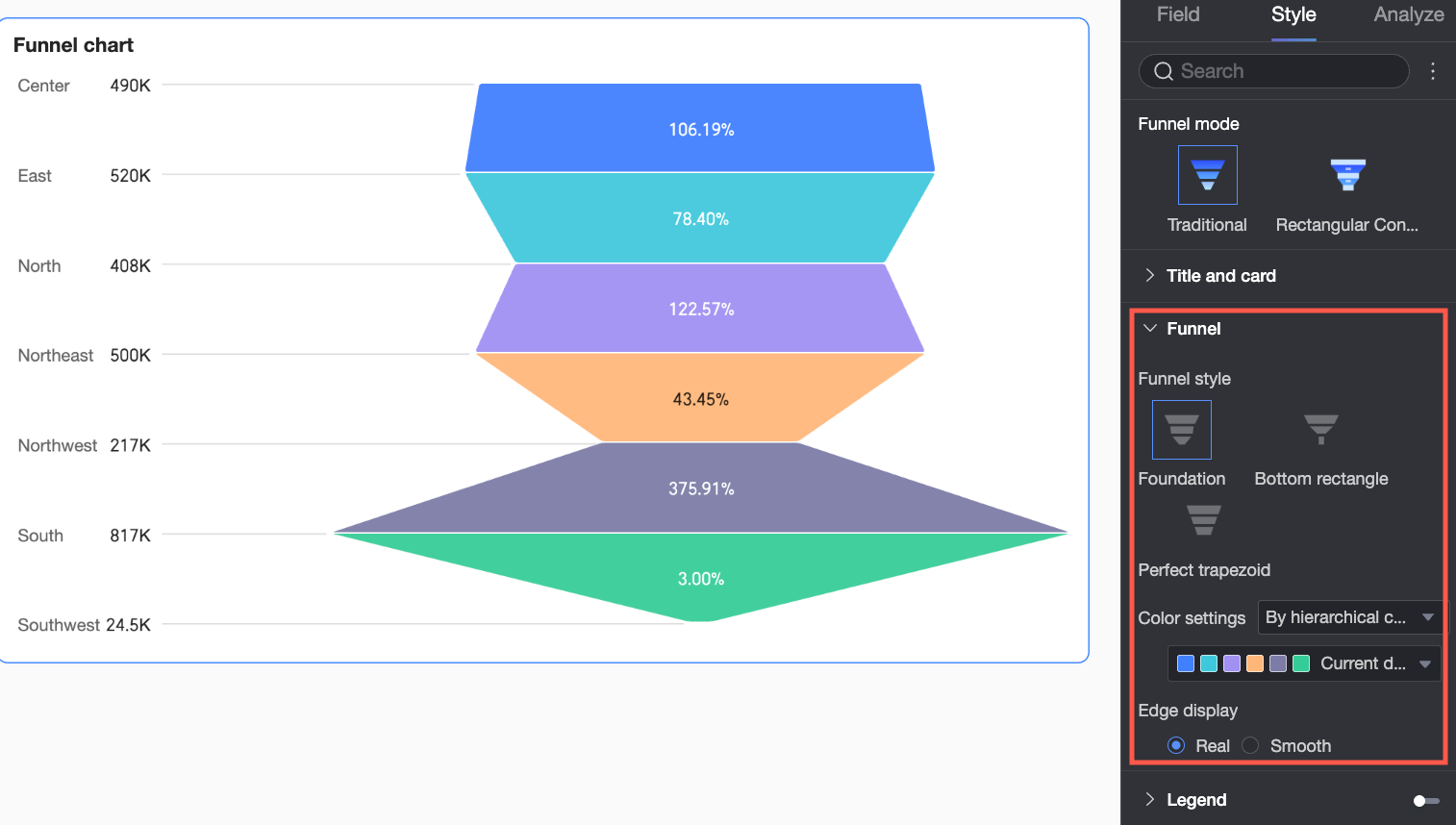
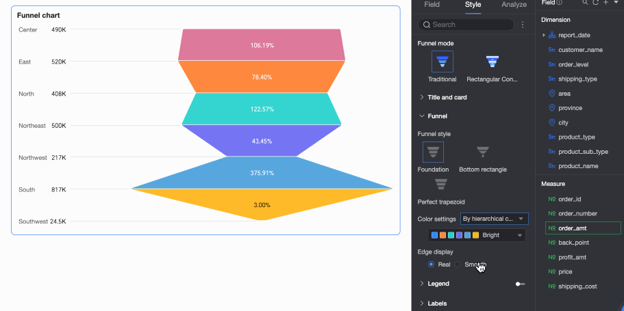
If Funnel mode is set to Classic funnel, you can set Funnel style to Basic, Bottom rectangle, or Perfect trapezoid.
Configuration Item Name
Description
Basic
Color scheme
Set Funnel color. Choose from By layer category, Gradient by layer, or Monochrome. You can also pick custom colors.
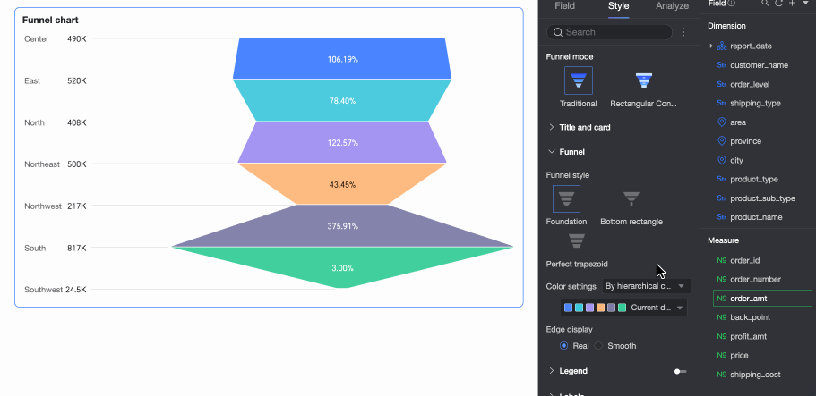
Edge display
Set funnel edges to Real or Smooth.
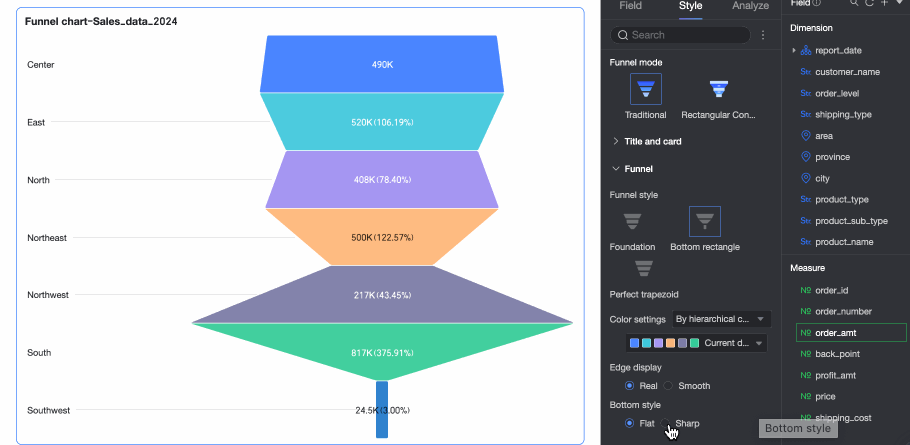
Bottom rectangle
Color scheme
Set Funnel color. Choose from By layer category, Gradient by layer, or Monochrome. You can also pick custom colors.
Edge display
Set funnel edges to Real or Smooth.
Bottom style
Set the funnel bottom to Flat or Tapered.
Perfect trapezoid
Color scheme
Set Funnel color. Choose from By layer category, Gradient by layer, or Monochrome. You can also pick custom colors.
-
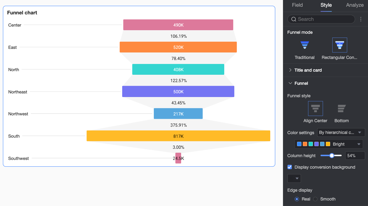
If Funnel mode is set to Rectangle conversion, you can set Funnel style to Align center or Align bottom.
Configuration Item Name
Description
Chart direction
When Funnel style is Align bottom, set chart direction to Horizontal or Vertical.

Color scheme
Set Funnel color. Choose from By layer category, Gradient by layer, or Monochrome. You can also pick custom colors.
Cylinder Height
Set the width of bars in the chart.
Show conversion background
Turn on or off the conversion background. Set a custom background color.
Edge display
Set funnel edges to Real or Smooth.
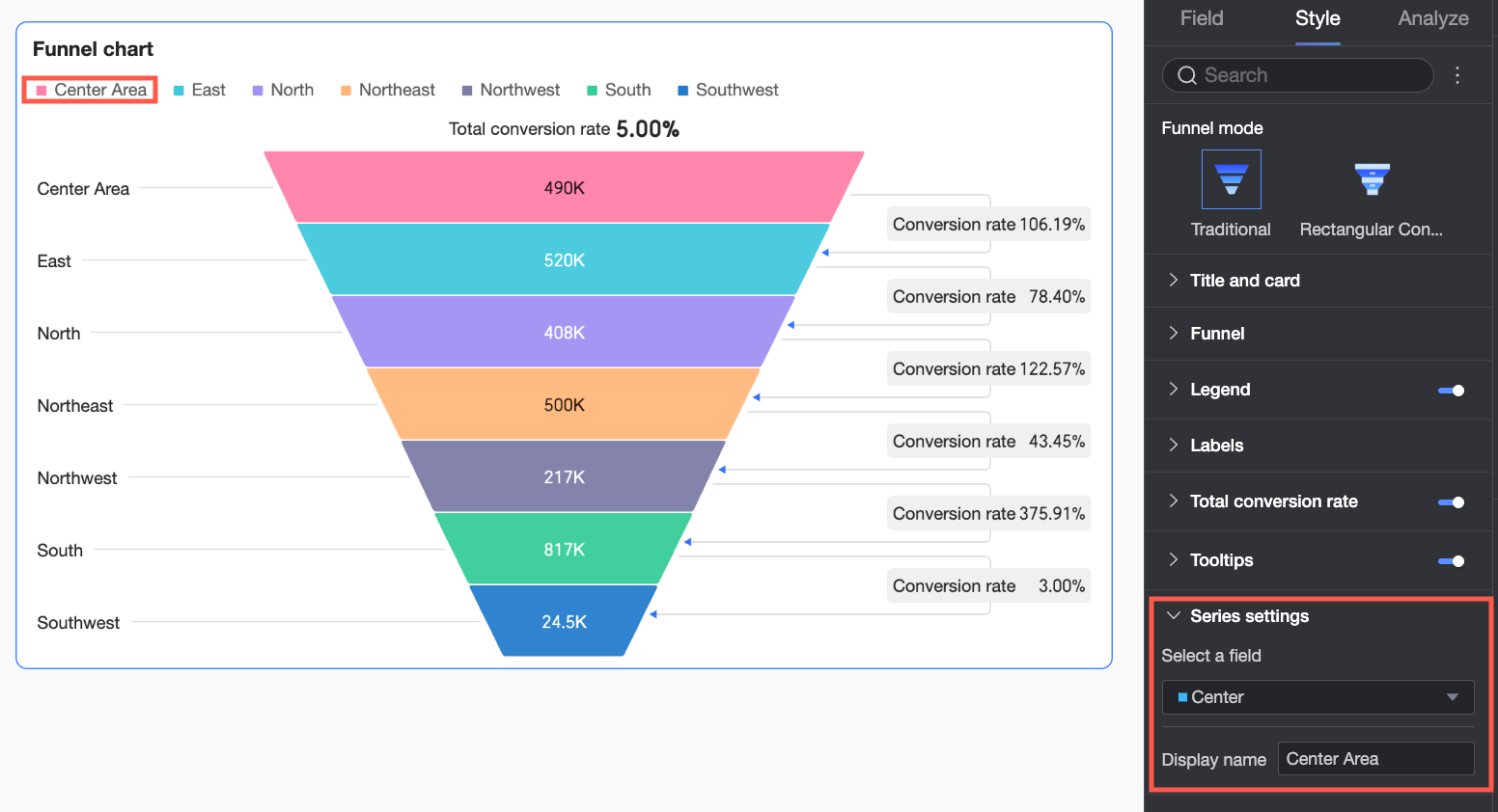
Legend
In the Legend section, turn on Show legend  and set the Legend style.
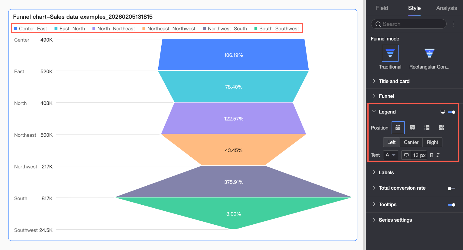
|
Chart configuration items |
Description |
|
Position |
Set where to show the legend and how to align it.
|
|
Text |
Set legend text style. Choose font color, size, weight, and italic. |
|
Mobile legend |
PC and mobile legend settings are independent. Click the PC/Mobile toggle button |
 at the top of the dashboard editor to switch to mobile view, where you can set a mobile-optimized legend position and text style.
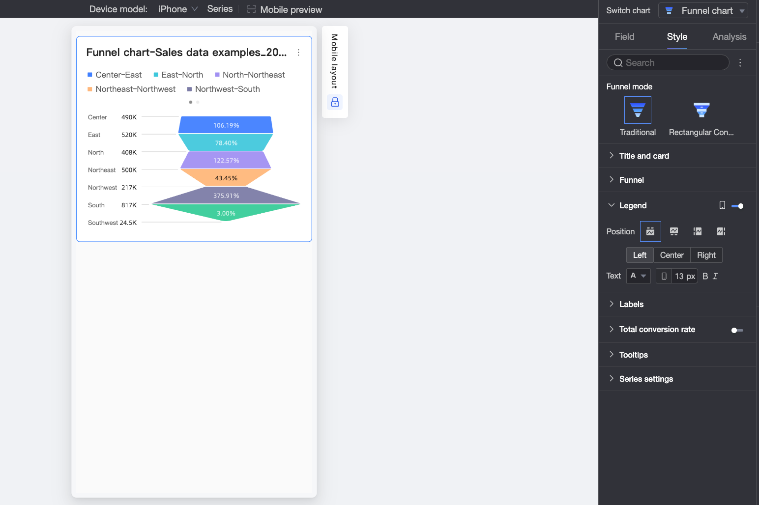
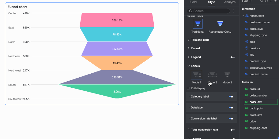
Labels
In the Labels section, you can configure which labels to show and their style. 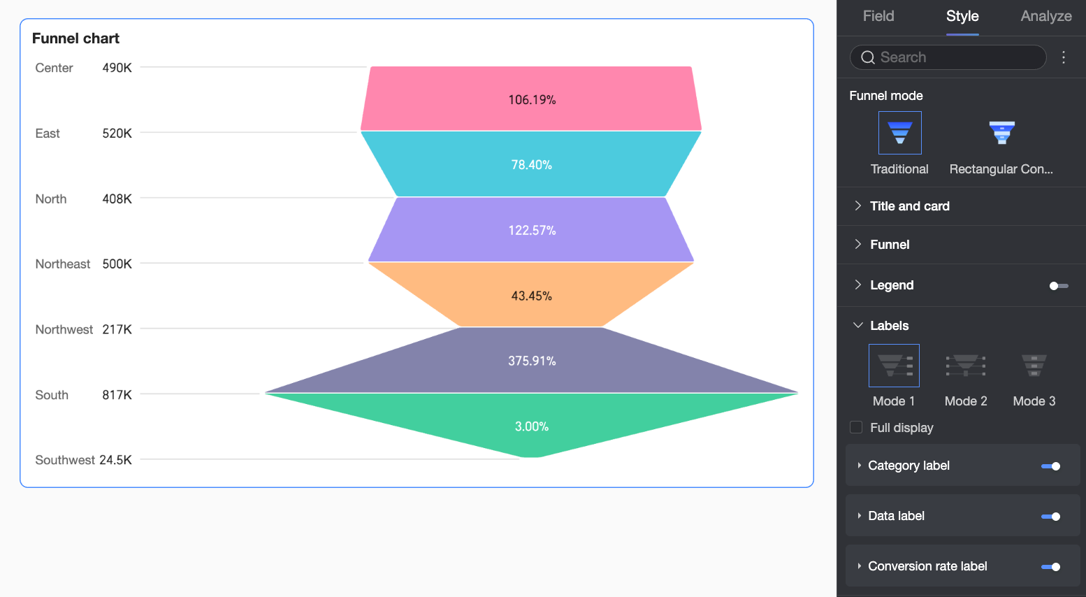
|
Configuration item |
Description |
|
|
Mode |
Set label display mode. When Funnel style is Basic or Bottom rectangle, choose Mode 1, Mode 2, or Mode 3. When Funnel style is Perfect trapezoid, choose Mode 1 or Mode 2. |
|
|
Show all |
Choose whether to show all labels. If your chart has many data points, clear this option. The system then shows only key labels to keep the chart clean. |
|
|
Category label |
Position |
Set where to show category labels. |
|
Text |
Set category label text style. |
|
|
Data label |
Position |
Set where to show data labels. |
|
Text |
Set data label text style. |
|
|
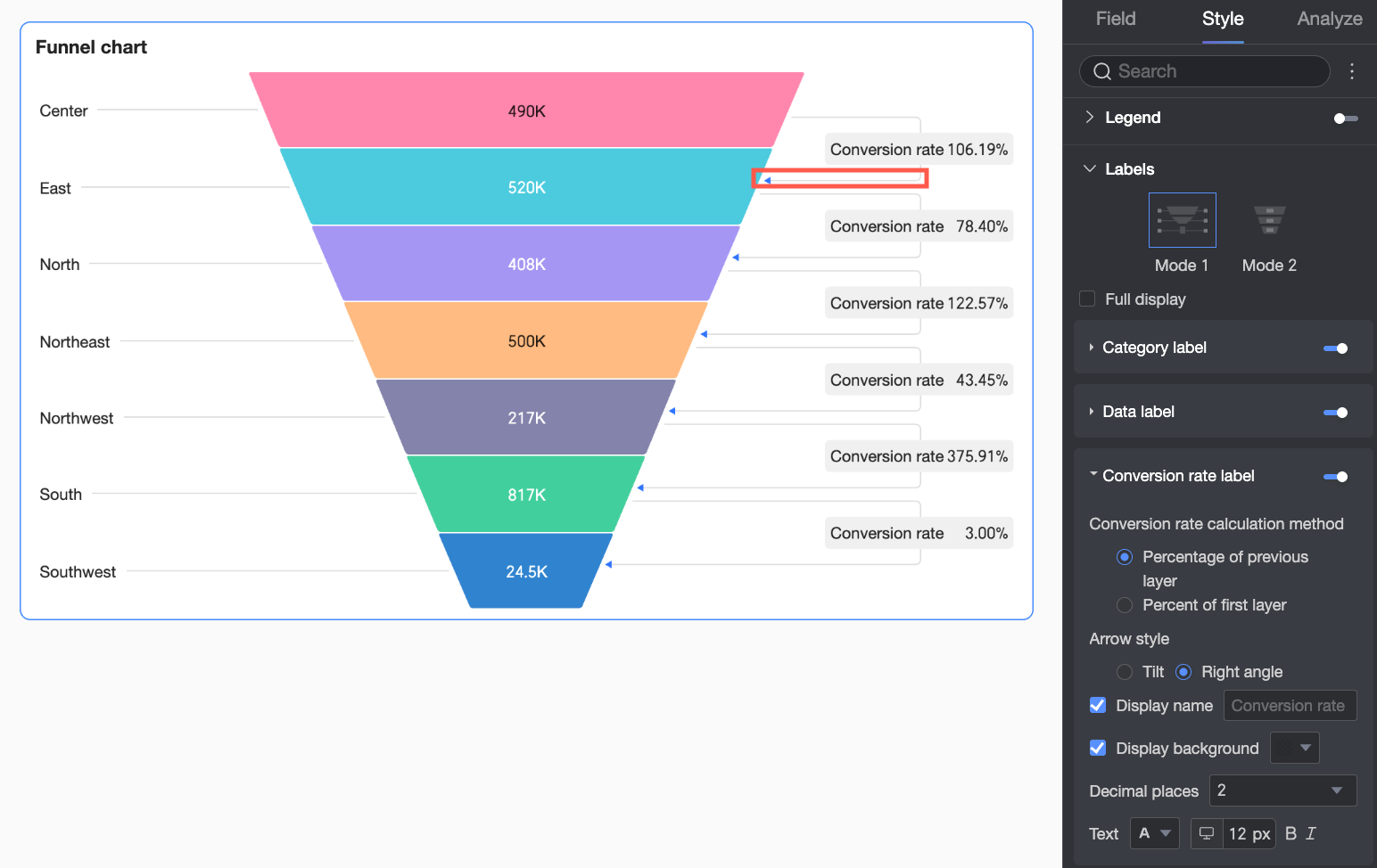
Conversion rate label |
Conversion rate calculation |
Set how to calculate conversion rates:
|
|
Arrow style |
When Funnel style is Perfect trapezoid, set arrow style for conversion rates. |
|
|
Display name |
When Funnel style is Perfect trapezoid, set a custom display name for the label. |
|
|
Show background |
When Funnel style is Perfect trapezoid, set a custom background color for the label. |
|
|
Decimal places |
Set decimal places for conversion rates. |
|
|
Text |
Set conversion rate label text style. |
|
Total Conversion Rate
In the Total conversion rate section, turn on Show total conversion rate and set its Position, Name, and Text style. 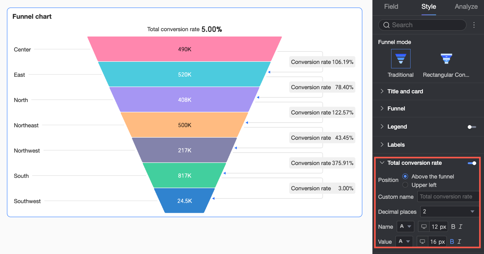
|
configuration item |
Description |
|
Position |
Set where to show the total conversion rate: Above or Upper left of the funnel. |
|
Custom name |
Set a custom name for the total conversion rate to match your business terminology. |
|
Decimal places |
Set decimal places for the total conversion rate. |
|
Name |
Set name text style. |
|
Value |
Set value text style. |
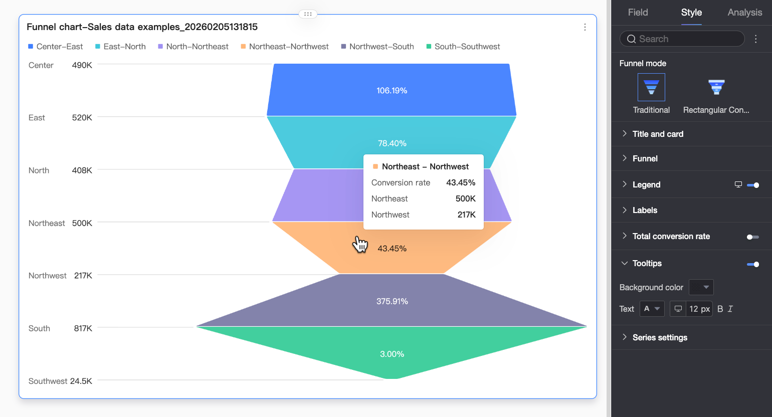
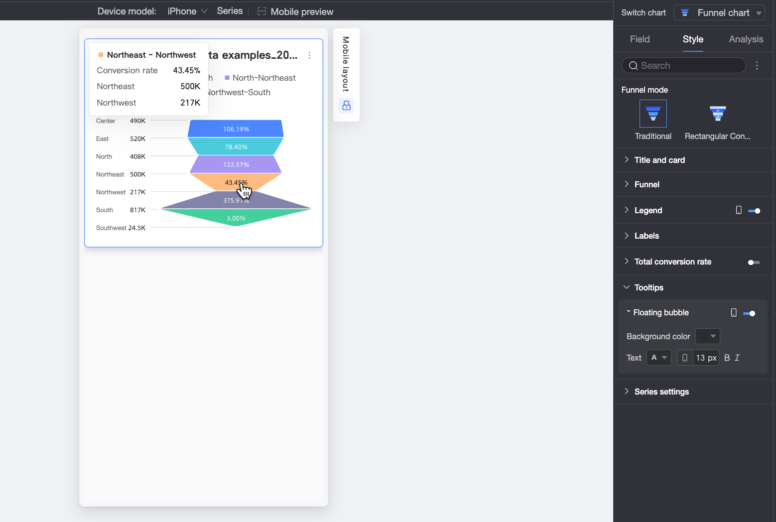
Tooltip
In the Tooltip section, click the  icon to turn on tooltips and configure their style.
|
Setting |
Description |
|
Content |
When Funnel mode is Rectangle conversion, choose whether to show Percent of layer above and Percent of first layer in tooltips. |
|
Background color |
Set tooltip background color. |
|
Text |
Set tooltip text style. Choose font color, size, weight, and italic. |
|
Mobile tooltip |
PC and mobile tooltip settings are independent. Click the PC/Mobile toggle button |
Series Settings
If you turn on Legend, you can use the Series settings to configure the display name for each series.
Configure Chart Analysis
|
Setting |
Name |
Description |
|
Data interaction |
Filter interaction |
Use filter interaction to link charts that hold related data. This lets you analyze data across multiple charts at once. For more information, see Filter interaction. |
|
Jump |
Use hyperlink to link dashboards that hold related data. This lets you analyze data across multiple dashboards. Choose from In-product navigation, Component in page, or External link. For more information, see Redirection. |