A sankey diagram visualizes data flow between stages or categories, with link width proportional to flow volume. Use it to analyze energy, material, or financial flows. Available in Quick BI Pro and Enterprise Standard workspaces only.
Prerequisites
A dashboard is created. Create a dashboard.
Overview
Key advantages
-
Visualize complex relationships: Illustrates connections between entities (nodes). Ideal for network-structured data.
-
Highlight key nodes and connections: Node size and link thickness reveal the most important nodes and paths.
-
Discover patterns and trends: Reveals flow directions, bottlenecks, and correlations such as community structures.
-
Intuitive and effective: Simplifies exploration of relational data.
Use cases
Ideal for analyzing relationships with clear sources and destinations:
-
Sales data analysis: Transfers and quantities across regions or products.
-
Financial market analysis: Fund and transaction flows between financial institutions.
-
Transportation network analysis: Passenger and cargo flows between cities or stations.
-
Network security analysis: Communication patterns and data traffic between IP addresses or servers.
-
Social network analysis: Showing interactions between users.
Example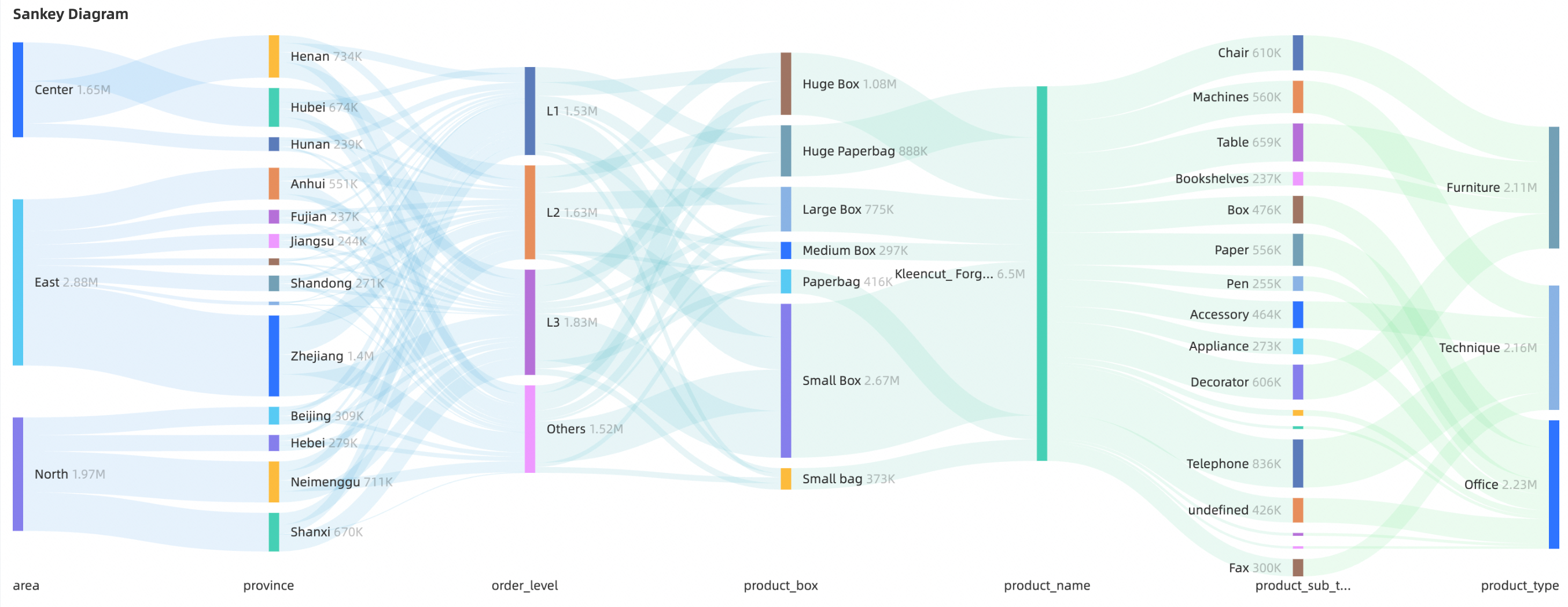
Limits
-
Dashboard: An existing dashboard is required. Create a dashboard.
-
Edition: Requires a Quick BI Pro or Quick BI Enterprise Standard workspace.
-
Field configuration
-
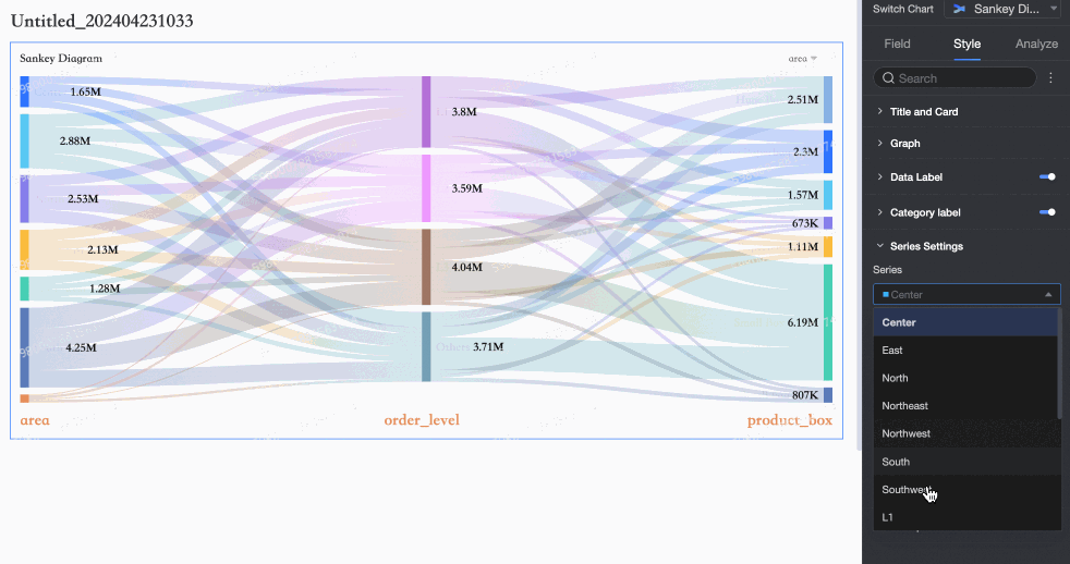
Node Type (Dimensions)
-
Requires at least 2 dimension fields.
-
Supports up to 20 dimension fields.
-
Nodes represent stages or categories in the flow, such as region, product type, or order level.
-
Supports dimension group fields. Display all dimensions in the group or a single one.
-
-
Node Height (Measures)
-
Supports a maximum of 1 measure field.
-
Optional. If omitted, flow is calculated from row counts or even distribution.
-
Determines flow size through each node and link, such as order amount or user count.
-
-
Configure chart fields
-
Select the required dimension and measure fields.
-
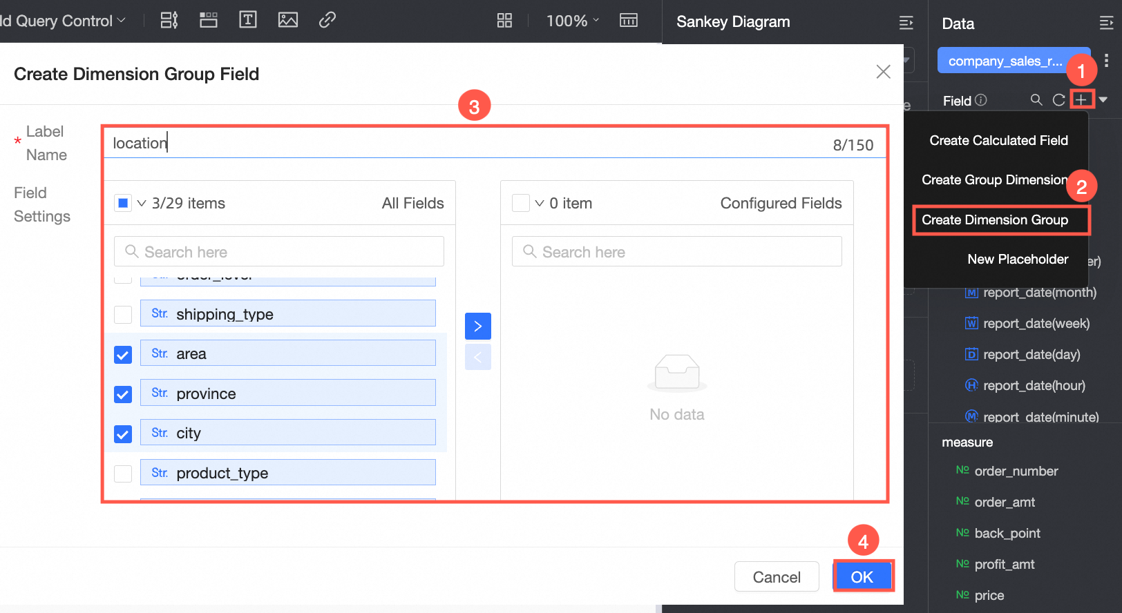
In the Dimensions list, add dimension fields or dimension group fields.
-
Create a dimension group field.
Name it Location Dimension. It contains the region, province, and city dimensions.
-
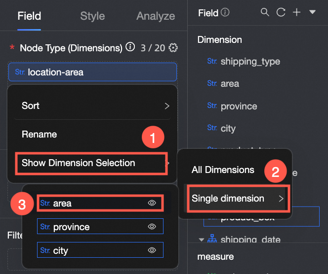
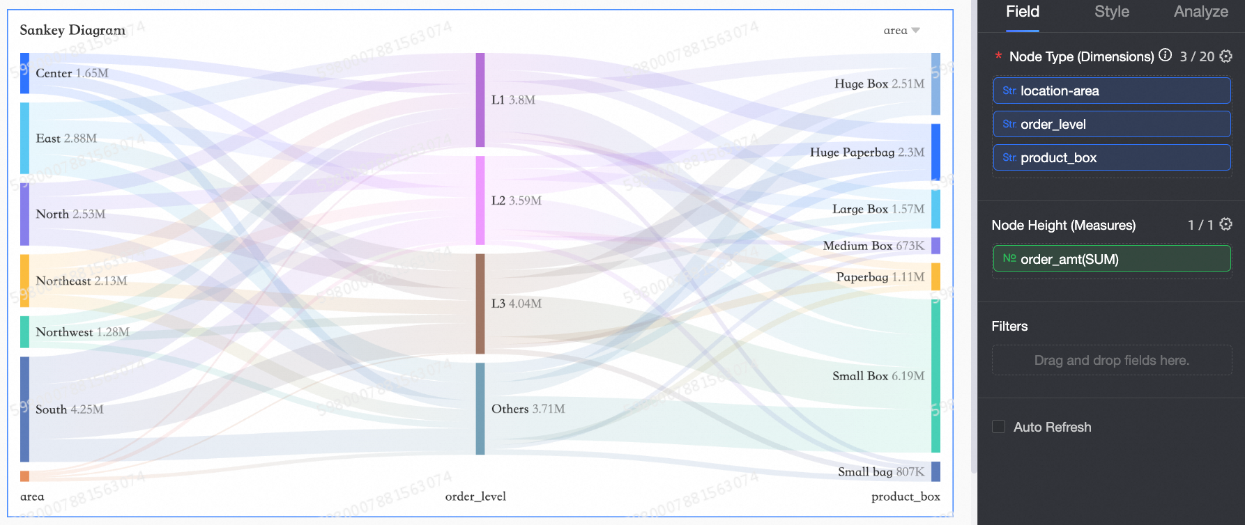
Double-click or drag the Location Dimension dimension group field and the order_level and product_box dimension fields to the Node Type (Dimensions) area.
For a dimension group, choose to display all dimensions or a single one. In this example, select Region.
-
-
In the Measures list, find order_number and double-click or drag it to the Node Height (Measures) area.
-
-
Click Update.
When a dimension group displays a single dimension, click the
 icon to switch between dimensions in the group.
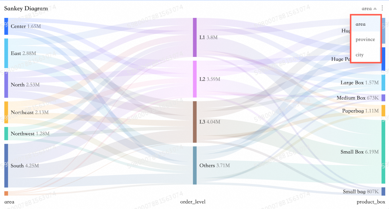
Configure chart style
General chart style settings are covered in Configure the chart title area.
-
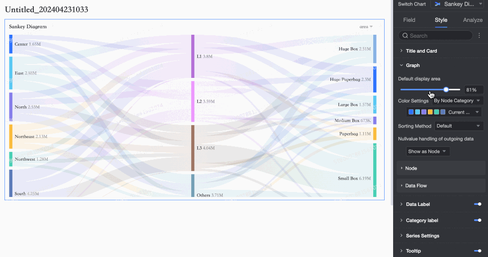
In the Chart Style section, configure settings such as Default Display Area, Color Settings, Sort By, and Null Value Handling for Outgoing Data.
Parameter
Description
Default Display Area
Default percentage of the chart area to display.
Color Settings
Color mode: By Node Type or Single Color.
Sort By
Node sort order. Default: unsorted. Options: By Node Height (Ascending) or By Node Height (Descending).
Null Value Handling for Outgoing Data
Handling of null values in outgoing data. Default: Show as Node. Options: Show as Churn Bar or Do Not Show Flow. Show as Churn Bar supports custom bar color.
Node
Node Width and Vertical Spacing.
Data Flow
Line Style, Line Color, and Opacity of data flows.
-
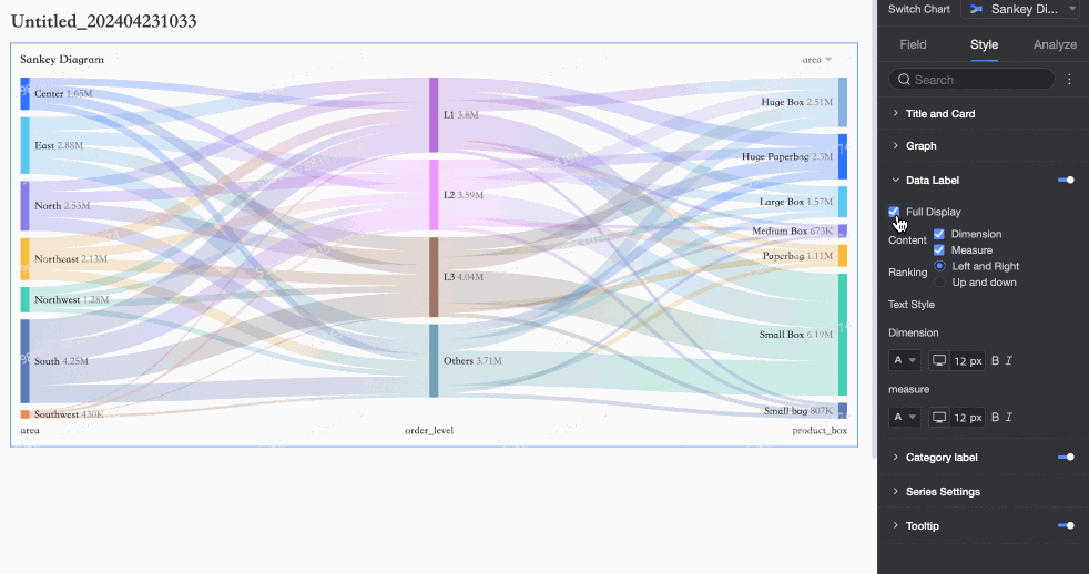
In the Data Labels section, configure Show All, Content, Arrangement, and Text Style.
-
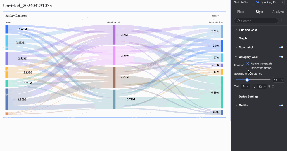
In the Category Labels section, configure Position, Spacing from Chart, and Text style.
-
In the Series Settings section, configure Node Style, Label Text, and other properties.
Parameter
Description
Node Style
Node display style: Bar or Card.
Background Color
Node background color. Applies when Node Style is Card.
Border
Node border width and color. Applies when Node Style is Card.
Label Text
Text style for dimension and measure labels on nodes.
-
In the Tooltip section, click the
 icon to enable tooltips and configure their style.
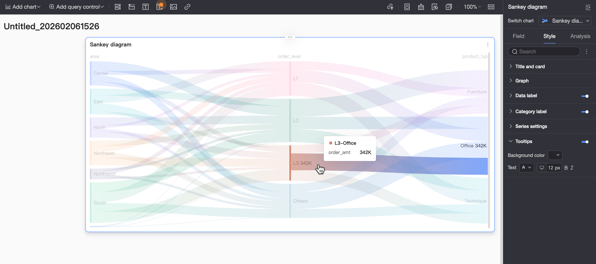
Parameter
Description
Background Color
Tooltip background color.
Text
Tooltip text style: font color, size, weight, and italic.
Mobile Tooltip
PC and mobile tooltips can be enabled independently. Switch to mobile editing via the PC/Mobile toggle (
 ) at the top of the dashboard editor. Font size is set separately for each; other styles are shared.
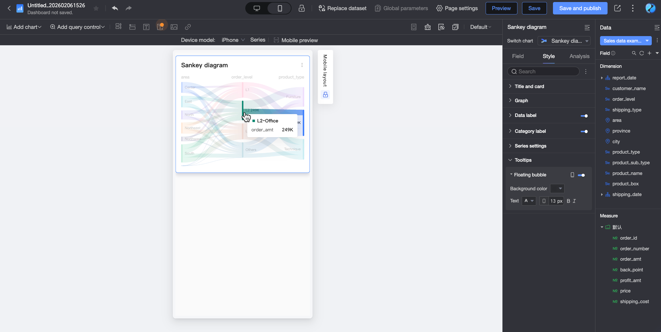
Next steps
-
Share the dashboard with specific people. Share a dashboard.
-
Integrate your dashboard into a data portal for complex analysis with navigation menus. Create a PC data portal.