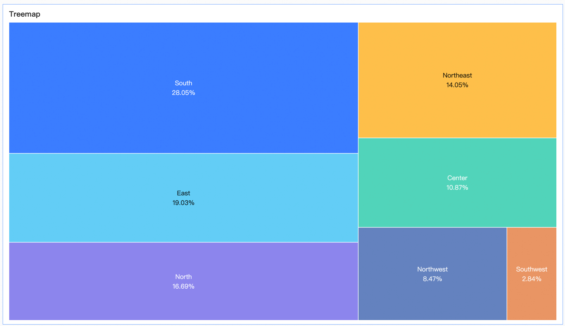
A treemap chart displays hierarchical data as nested rectangles, showing how a measure is proportionally distributed across categories.
Prerequisites
You have created a dashboard. Create a dashboard.
Chart Overview
Use Cases
Visualizes how dimension values distribute as a proportion of a measure, emphasizing relative category sizes.
Benefits
-
Visual effects: Customize rectangle styles and data labels.
-
Annotations: Highlight data points and configure jumps to reports or external links.
Example
Limitations
-
A treemap chart uses Labels (Dim.) and Size (Mea.):
-
Labels (Dim.): Up to two dimensions from your data.
-
Size (Mea.): One measure from your data (for example, shipping cost).
-
-
When a treemap chart uses multiple dimensions, drilling is not supported.
Configure Chart Data
-
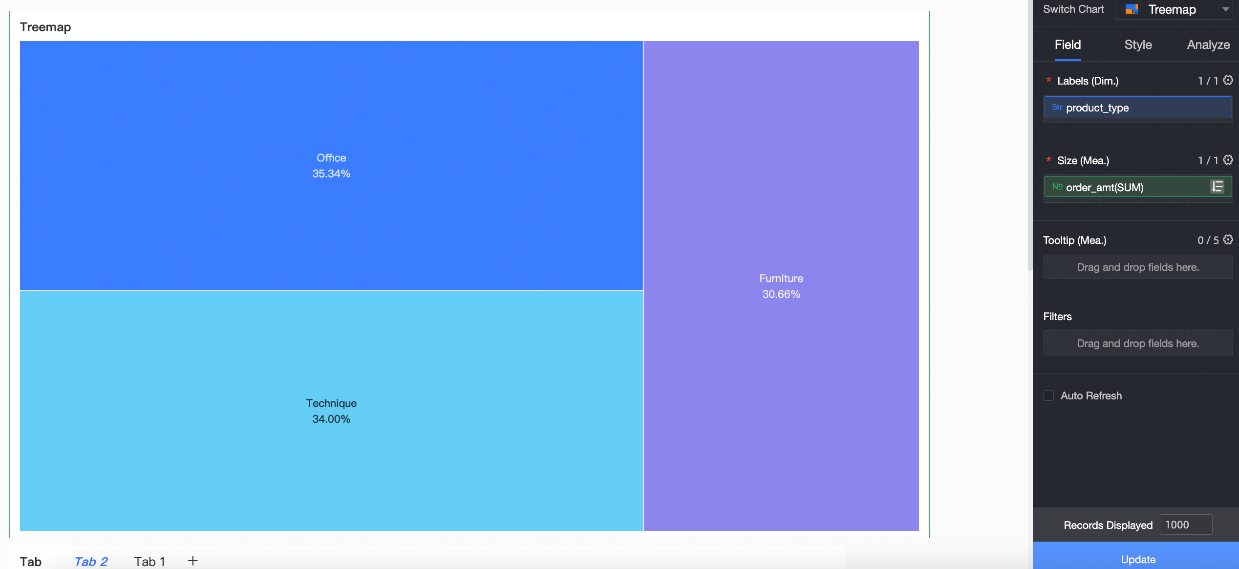
On the Fields tab, add a dimension and a measure to the chart:
-
From the Dimensions list, double-click or drag Product Type to the Labels (Dim.) field.
-
From the Measures list, double-click or drag Order Amount to the Size (Mea.) field.
-
-
Click Update. The chart updates automatically.
Configure Chart Style
These style settings are treemap-specific. Title and card settings are covered in Configure the chart title area.
Configure these settings in the Style Settings section on the Style tab.
|
Parameter |
Description |
|
Rectangle |
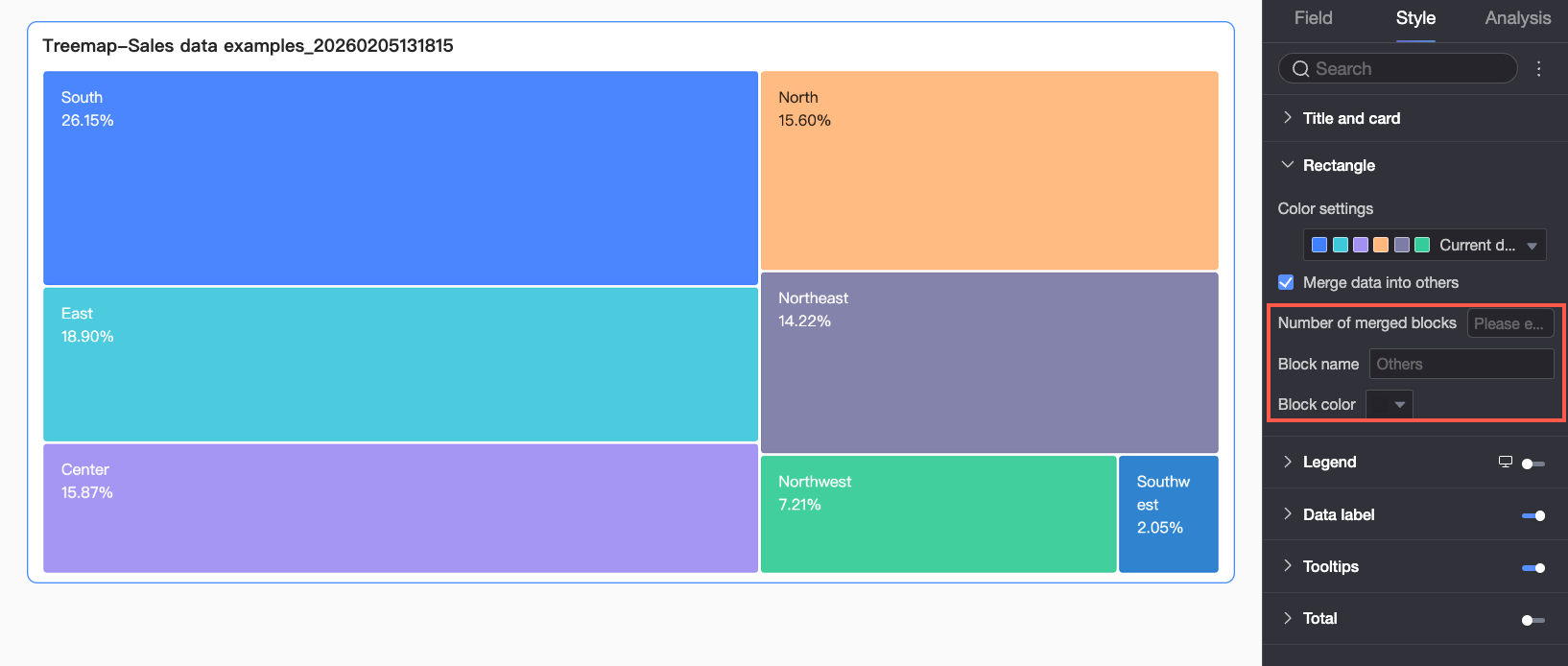
Configure color schemes and merge data into an 'Others' category.
|
|
Legend |
Toggle the Note
|
|
Data Label |
Set the visibility, content, and format of data labels.
|
|
Tooltip |
Set the content, background color, and text style of the tooltip. Note
|
|
Total |
Set the name and text style of the total.
|
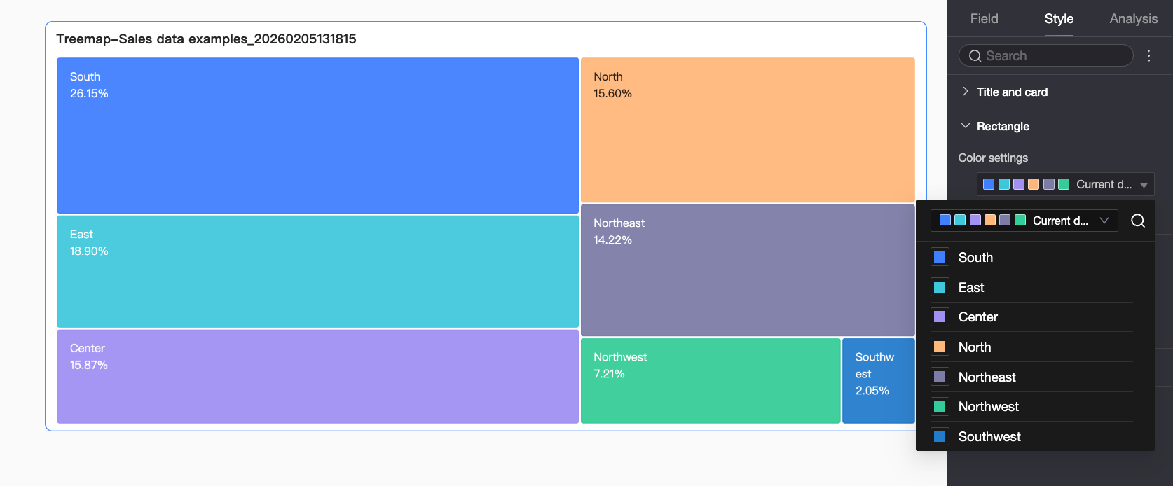
 icon to show the legend and configure its style.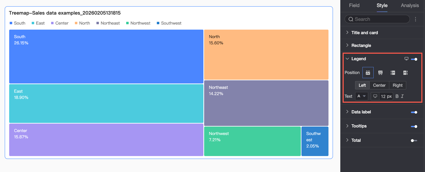
 ) to configure mobile-specific settings.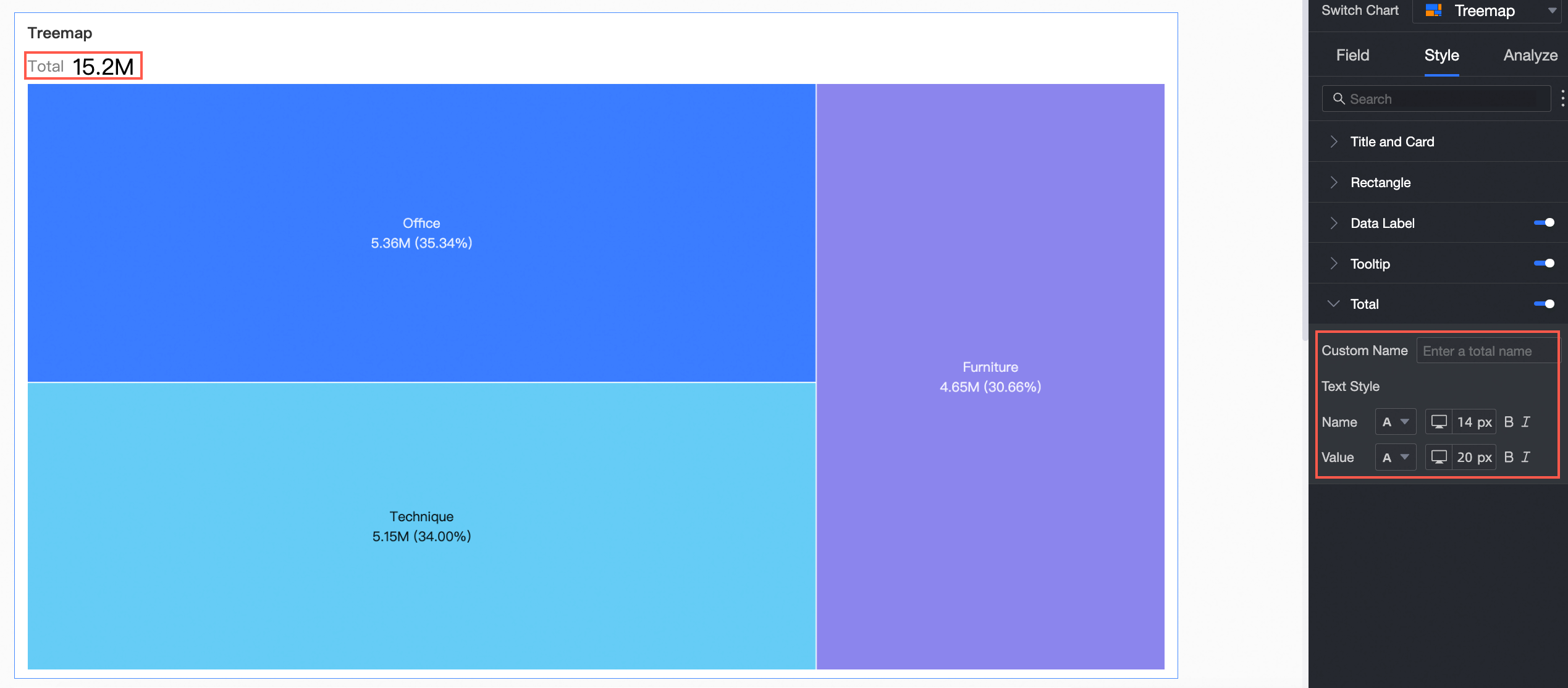
Configure Chart Analysis
|
Parameter |
Description |
|
Drilling |
Customize the appearance of a configured drill-down hierarchy. drilling. |
|
Interaction |
Link charts for coordinated analysis — filtering one chart updates the others automatically. interaction. |
|
Jump |
Link multiple dashboards for cross-dashboard analysis. Types: in-product jump, in-page component, and external link. jump. |
|
Annotation |
Highlight or explain data points (anomalies, trends) using highlights, icons, and comments. annotation. |
Delete a Chart
Delete a chart as shown below.
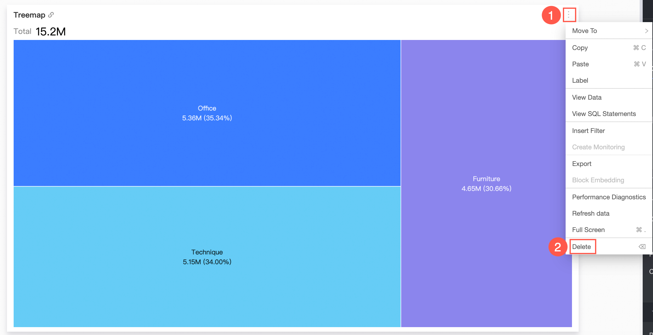
Next Steps
-
Share the dashboard with specific users. Share dashboards.
-
Integrate your dashboard into a data portal for topic-based analysis pages with navigation. Create a PC data portal.