Arc charts use arcs to represent relationships and distributions among data points, helping you understand complex relationship networks at a glance.
Prerequisites
You have created a dashboard. For more information, see Create a Dashboard.
Chart Overview
-
Scenarios
Arc charts are suitable for displaying and analyzing complex relationship networks. They reveal patterns, trends, and associations in domains such as sales data analysis, financial market analysis, traffic network analysis, and network security analysis.
-
Benefits
Arc charts visualize complex relationships, highlight key nodes, and surface patterns and trends for intuitive data exploration.
-
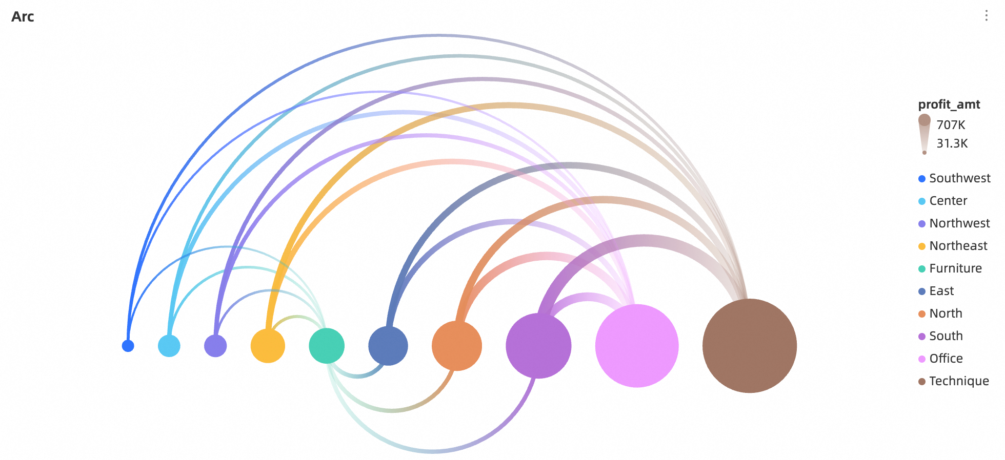
Sample image
Limits
An arc chart consists of Source/Dimension, Target/Dimension, and Connection Value/Measure.
-
Source/Dimension and Target/Dimension are determined by the data’s source dimension. Select only one dimension, such as region or product type.
-
The Limit Value/Measure is determined by a single data measure, such as Total Sales by Region.
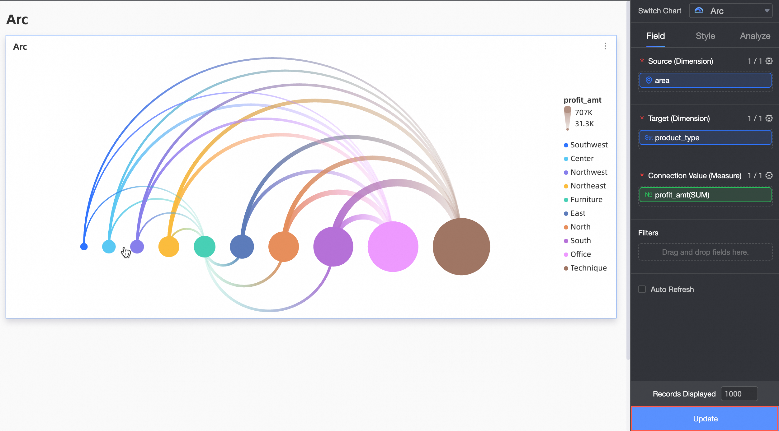
Chart Field Configuration
-
On the tab, select the required dimension and measure fields.
-
In the Source/Dimension column, select data by double-clicking or dragging.
-
In the Target/Dimension column, select the Target dimension data.
-
In the Connection Value/Measure column, select the measure data reflected in the connection value.
-
-
Click Update. The system automatically updates the chart.
-
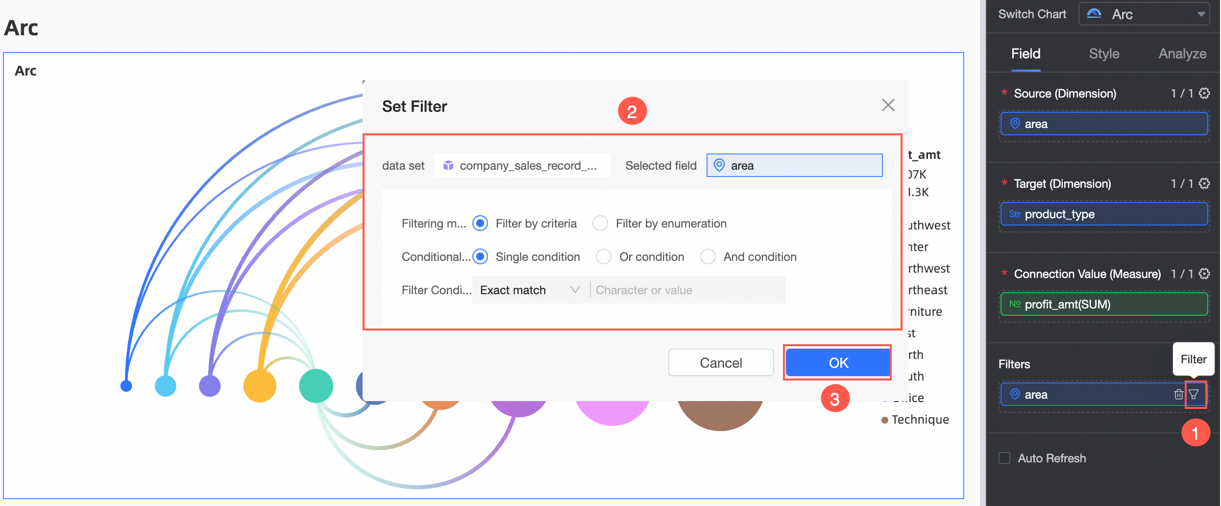
To view data for a specific region, set a filter to retrieve the required data.
-
Auto-refresh
After enabling this option, the system automatically refreshes the chart data. For example, select this option and set the duration to 5, with the unit set to minutes. The system then refreshes the chart data every 5 minutes.
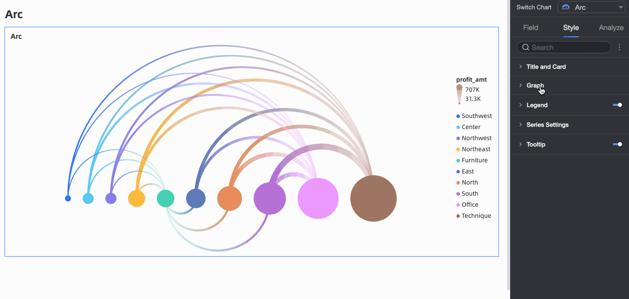
Chart Style Configuration
Configure styles specific to arc charts. For general chart style settings, see Configure the chart title.
In the search box at the top of the configuration area, enter a keyword to find a configuration item. Click the ![]() icon on the right to expand/collapse all categories.
icon on the right to expand/collapse all categories.

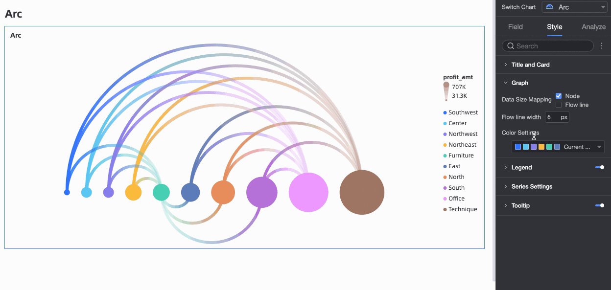
Graphics
Customize the appearance in the Graphics area.
Data size mapping supports two methods: multi-selecting nodes and flow lines. If you do not select the Flow Line option, customize the flow line width. The default value is 6 px, the peak value is 12 px, and the valley value is 2 px.
In Graphics, customize the color scheme as needed.
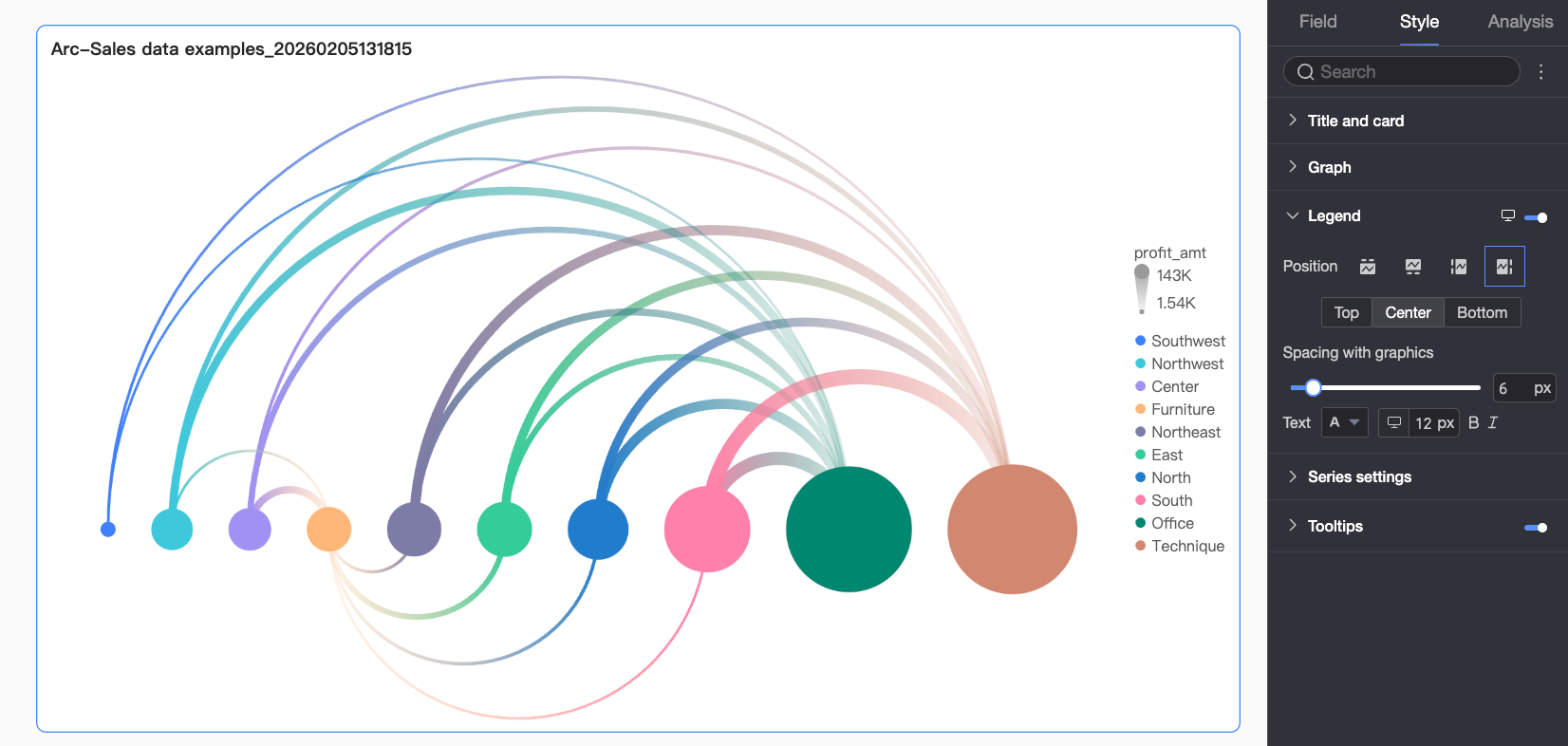
Legend
In Legend, click the  icon to enable the legend and configure its style.
|
Chart Configuration Item |
Configuration Item Description |
|
Position |
Set the display position and alignment of the legend.
|
|
Text |
Set the legend text style, including font color, size, weight, and italic. |
|
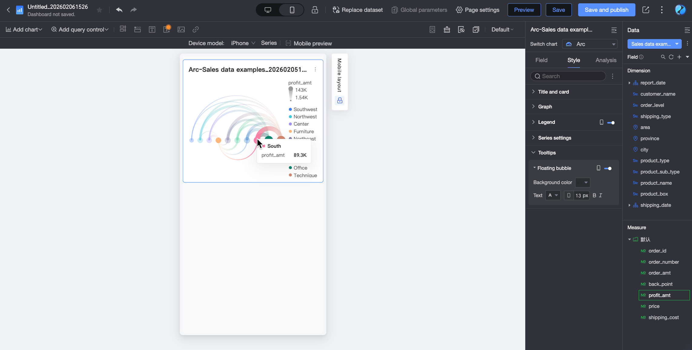
Mobile Legend |
Legend settings for PC and mobile are independent. Use the PC/Mobile switch button ( |
 ) at the top of the dashboard editing page to enter the mobile editing view and customize the mobile legend's position and text style.
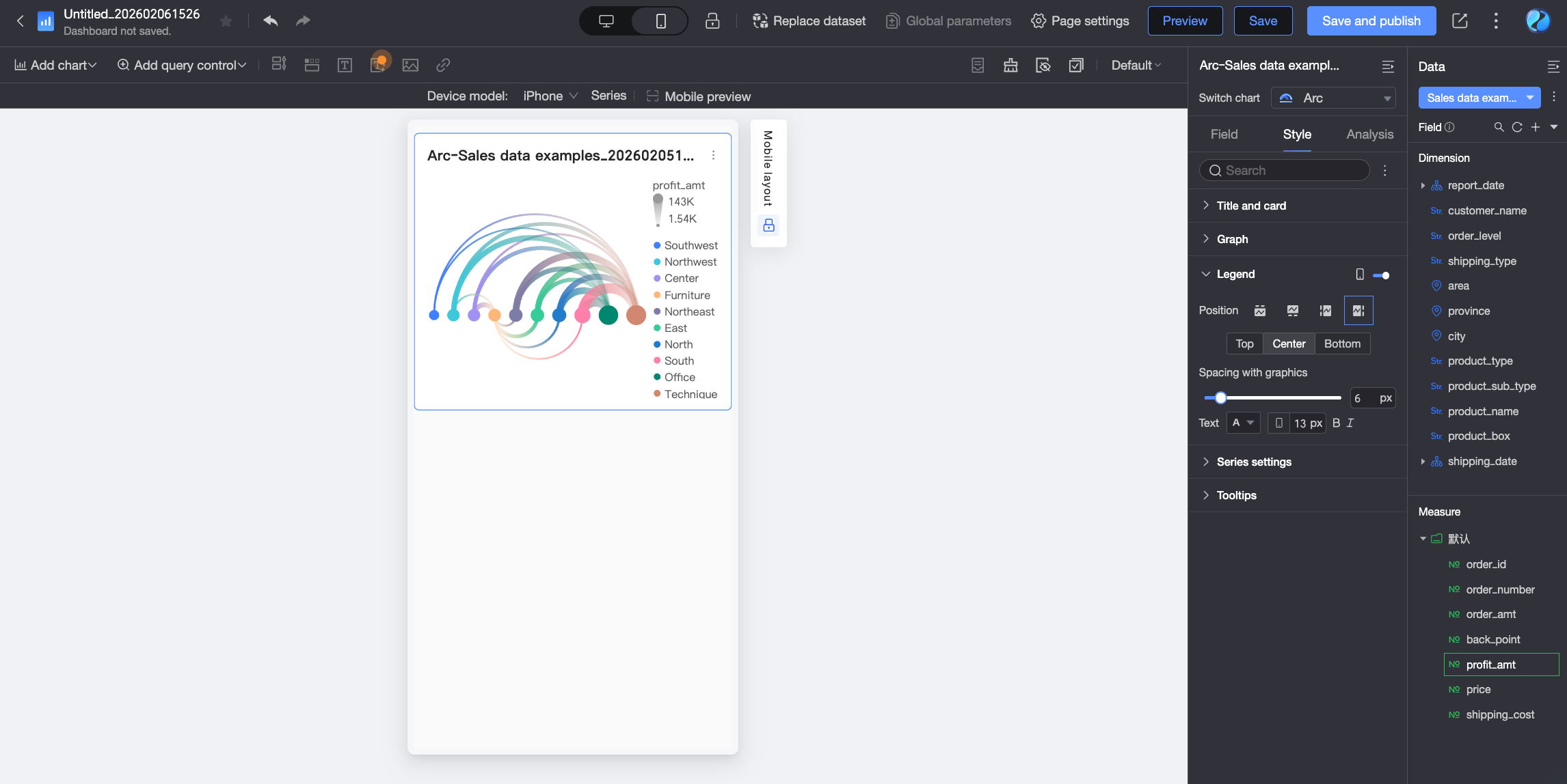
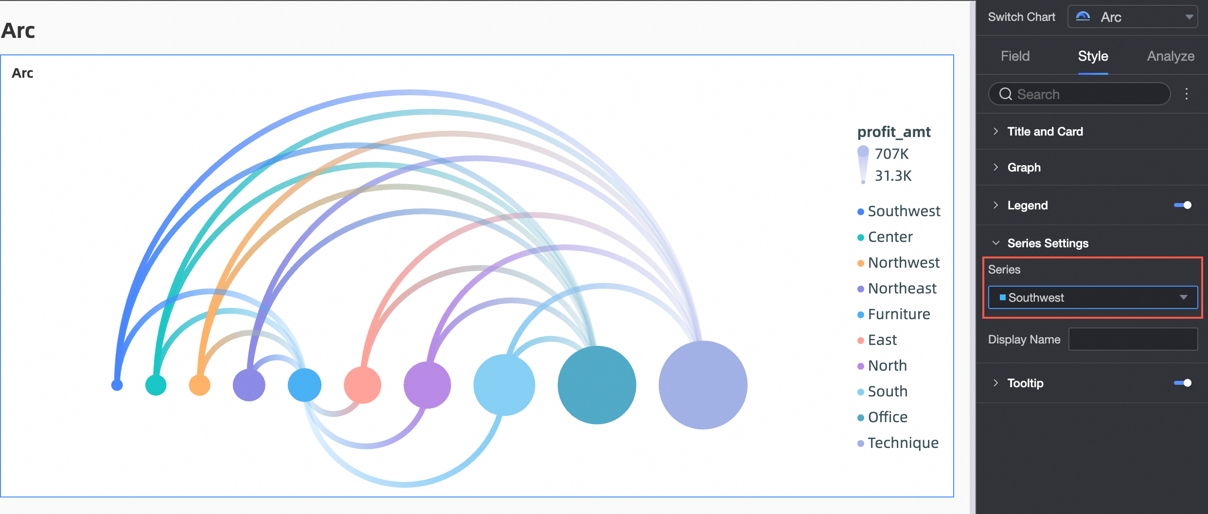
Series Settings
In Series Settings, set the series style.
|
Chart Configuration Item |
Description |
|
Select Series |
Select a dimension or measure item as needed. |
|
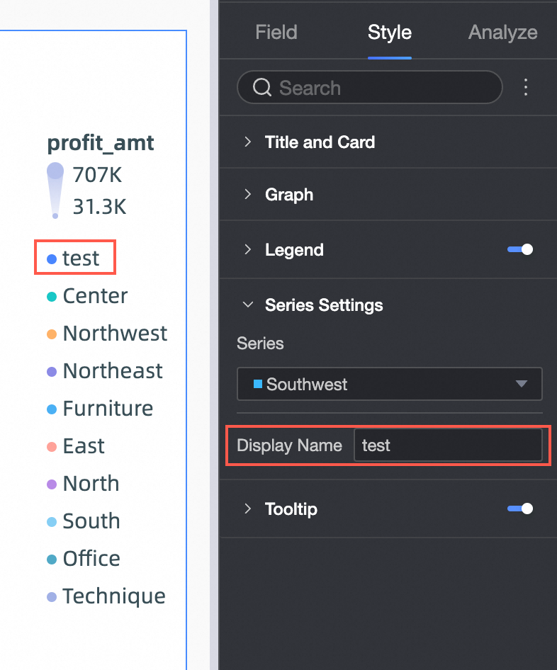
Alias |
Set an alias for the series name. For example:
|
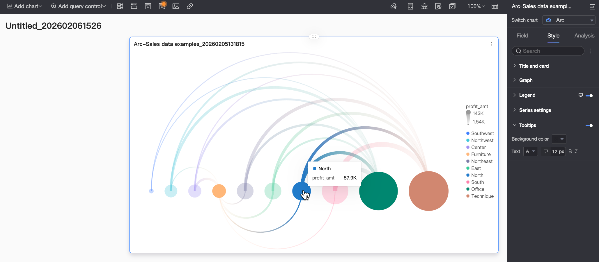
Tooltip
In Tooltip, click the icon to enable the tooltip and configure its style.
|
Chart Configuration Item |
Configuration Item Description |
|
Background Color |
Set the background fill color of the tooltip box. |
|
Text |
Set the tooltip text style, including font color, size, weight, and italic. |
|
Mobile Tooltip |
Tooltip settings for PC and mobile are independent. Use the PC/Mobile switch button ( |
What to do next
-
To let others view a dashboard, share it with specific people. For more information, see Share a Dashboard.
-
To create a complex, topic-based analysis with a navigation menu, integrate your dashboard into a BI portal. For more information, see Create a PC BI portal.