A building heatmap visualizes foot traffic density in physical locations, helping you optimize venue design, booth and product layouts, and traffic distribution analysis across exhibition halls, trade shows, business parks, and shopping malls.
In V6.1, the display logic for the basemap in the building heatmap was updated. The basemap display area now defaults to the dimensions of the uploaded image. You can no longer customize the geographical display range.
Prerequisites
-
You have created a custom image basemap and mapped it to a dataset. For more information, see custom image basemap.
-
You have created a dashboard. For more information, see Create a dashboard.
Overview
Use Cases
Analyze foot traffic density in physical venues to optimize venue design, booth and product layouts, and traffic distribution across exhibition halls, trade shows, business parks, and shopping malls.
Key Features
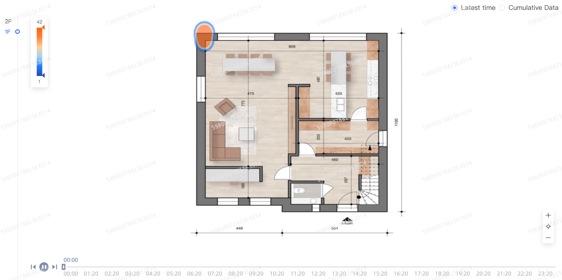
Visualize heat data across multiple floors or venues, switch between them, and toggle between point-in-time data and cumulative daily data.
Example
Create the Chart
-
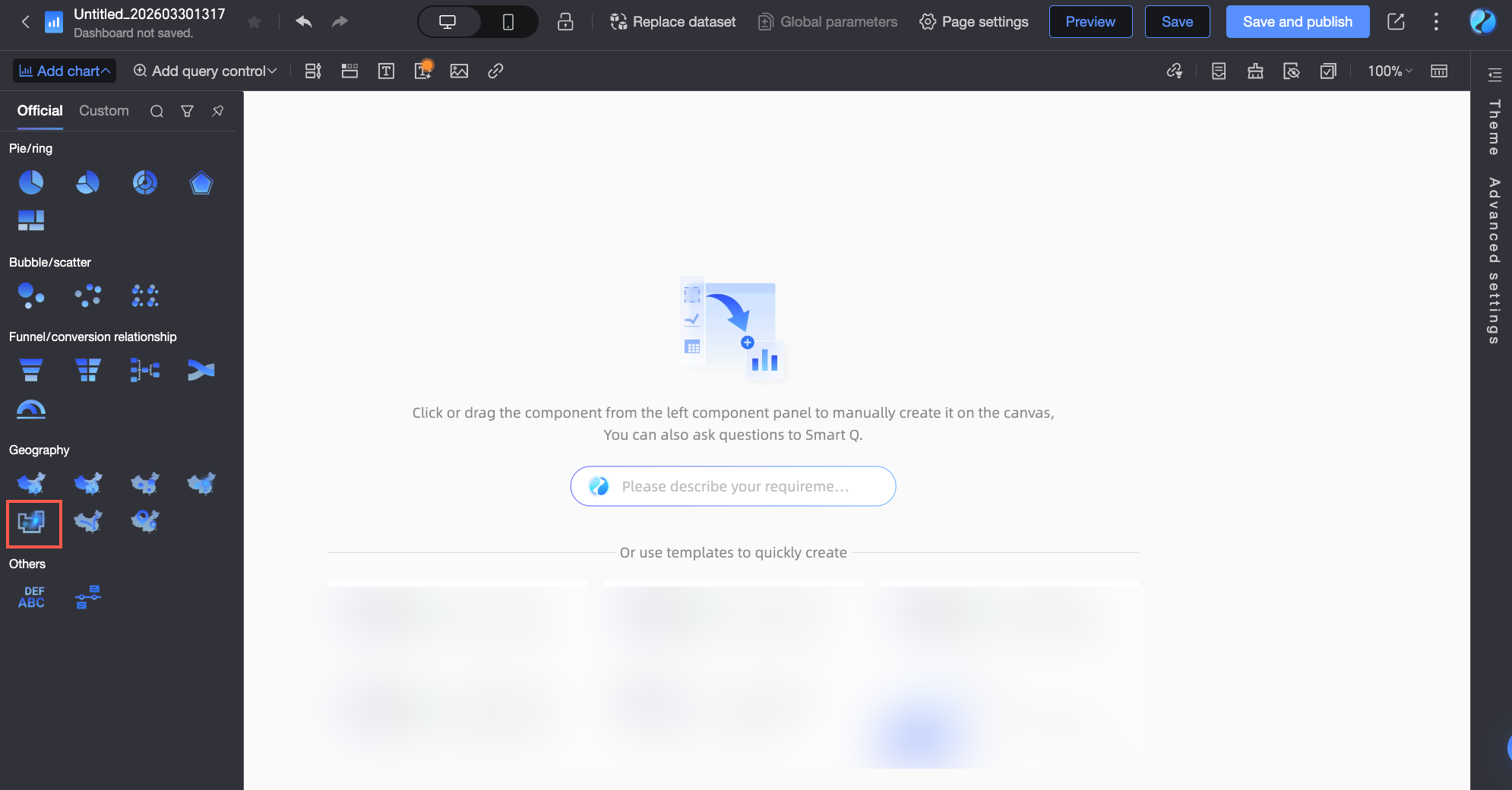
In the dashboard editor, select building heatmap.
-
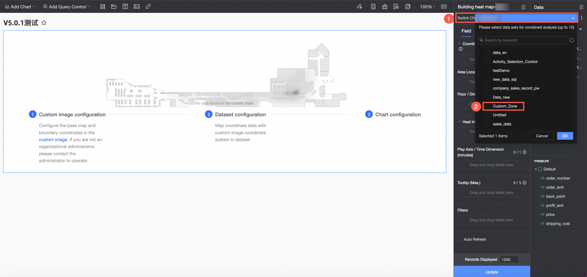
Select a dataset that is mapped to a custom image basemap. For more information about how to create a custom image, see custom image basemap.
Configure Chart Fields
-
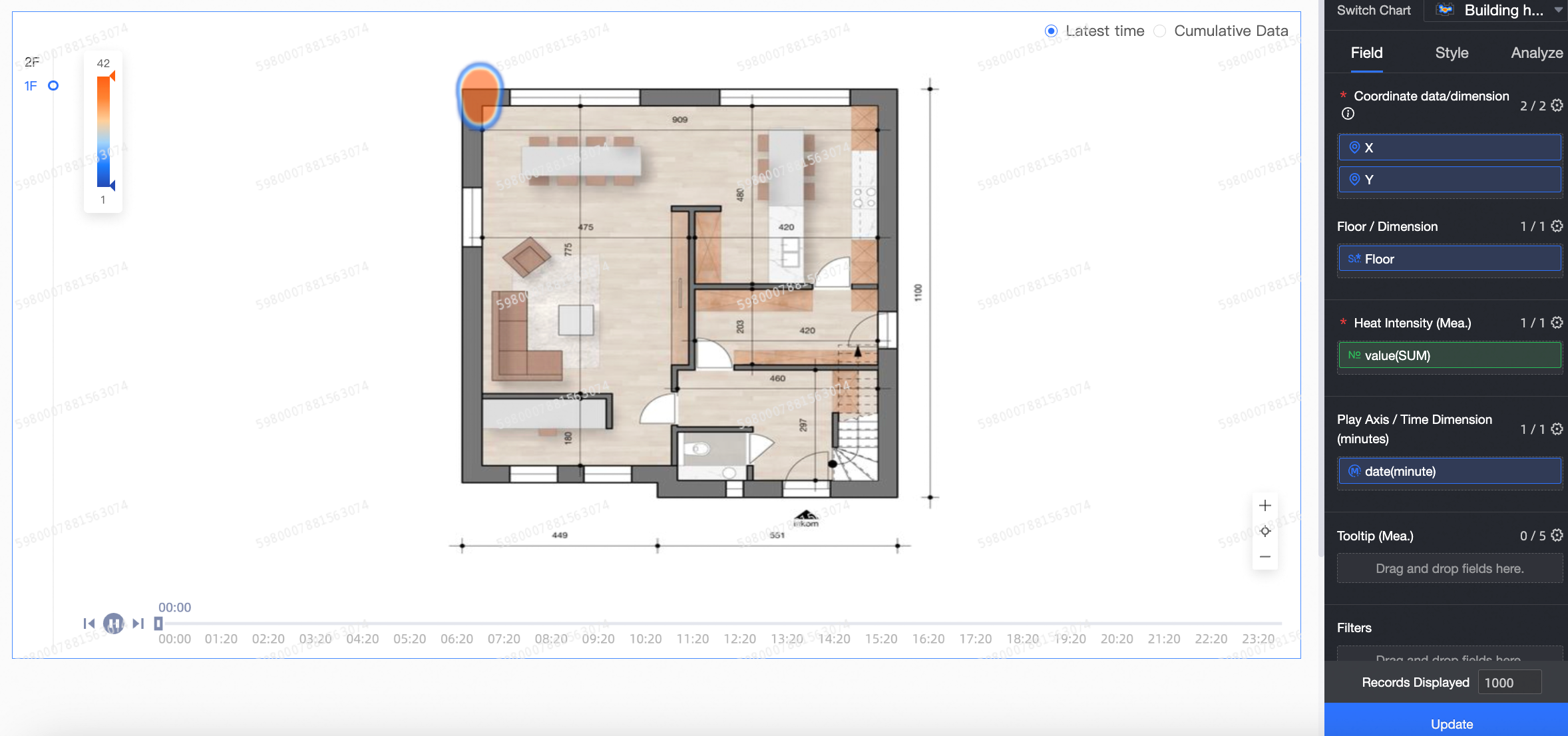
On the Fields tab to the right of the chart, select the required dimension and measure fields.
-
In the coordinate data/dimension list, find the x and y fields. Double-click or drag them to the coordinate data/dimension area.
NoteThis chart supports only geographic fields of the custom image type.
-
In the Dimensions list, find the floor field. Double-click or drag it to the floor/dimension area.
NoteEnsure that the floor names in your data exactly match the floor names in the custom image basemap. Otherwise, the chart will not render the data.
-
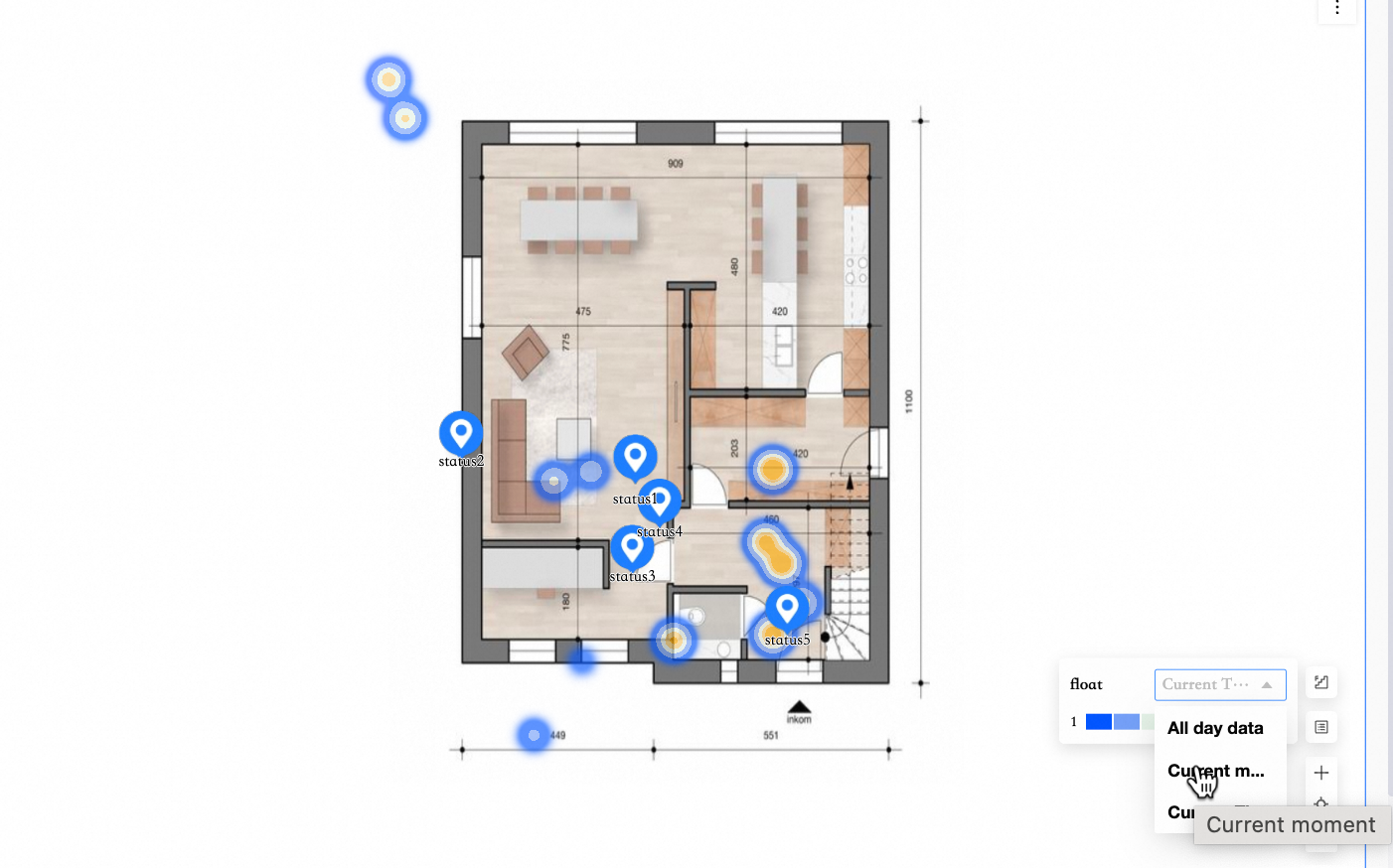
(Optional) You can drag a dimension field to the area location tag/dimension area to specify the location data for area nodes.
-
In the Measures list, find the foot traffic field. Double-click or drag it to the heat depth/measure area.
-
Find the time range (minute) field. Double-click or drag it to the time period/time area.
NoteThis field supports only date fields with minute-level granularity.
-
(Optional) To add a tooltip, drag the desired fields to the tooltip/measure area. You can add up to five fields.
-
-
(Optional) You can set a filter to display only the data you need.
-
Click Update. The system automatically updates the chart. The updated chart appears as follows.
Configure Chart Styles
Configure the style settings below. For general style settings, see Configure the chart title area.
-
In the Heat section, configure Data mapping, Color, Transparency, and heat radius.
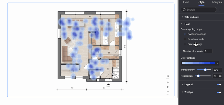
Parameter
Description
Data mapping
Supports continuous intervals, equal intervals, and custom intervals.
Color
Supports sequential gradient, diverging gradient, and custom color schemes.
Transparency
Range: 0% to 100%.
Heat radius
Range: 5px to 100px.
-
In the Tooltip section, select whether to Enable tooltip and configure its background color and text format.
NoteThe tooltip settings for PC and mobile views are independent. To configure the tooltip for the mobile view, switch to the mobile editor by clicking the PC/Mobile toggle button (
 ) at the top of the dashboard editor.
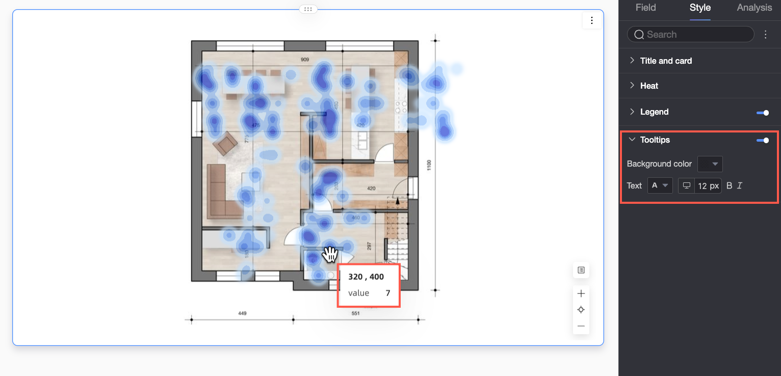
-
In the Feature configuration section, configure the following settings.
Parameter
Description
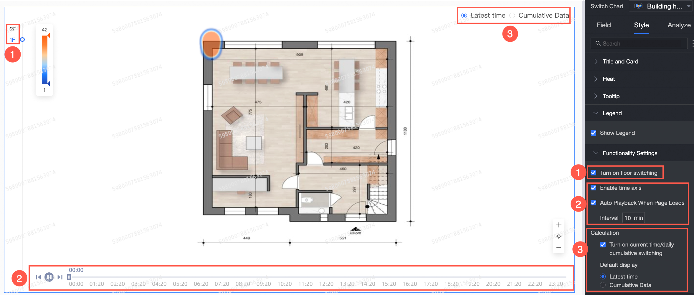
① Enable floor switch
Allows switching between floors.
-
You can set the Position to top left, bottom left, top right, or bottom right.
-
You can also choose whether to Expand by default.
② Enable timeline and Auto play on page load
-
Enable timeline: Shows the timeline on the chart.
NoteThis option appears after you configure a time field. It is enabled by default.
-
Auto play on page load: Configures the playback interval for autoplay.
Note-
You can configure this option only after you select Enable timeline.
-
The playback interval ranges from 1 to 60 minutes.
-
③ Calculation method
Select Enable current time/total today switch to display a toggle in the upper-right corner of the chart. You can choose which view to display by default.
-
Current time: Shows data from the latest point on the timeline.
-
Total today: Shows the aggregated data for the current day.
-
Analysis Configuration
|
Category |
Name |
Description |
|
Data interaction |
Linkage |
Connect multiple charts for interactive analysis using linkage. For more information, see Linkage. |
|
Jump |
Connect multiple dashboards for cross-dashboard analysis using the jump feature. For more information, see Jump. |