This topic describes how to add and configure a filter bar for a chart on a dashboard.
Prerequisites
A dashboard is created and charts are added to the dashboard.
Background information
If multiple charts are created in a dashboard, you can add a filter bar for one of the charts.
Create a filter bar
The following example describes how to create a query condition for a pie chart.
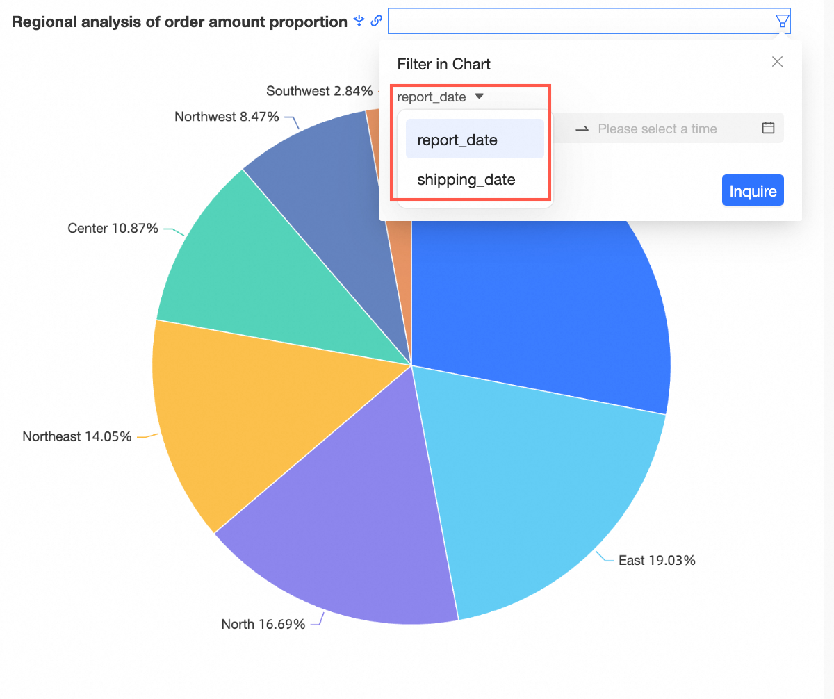
On the dashboard edit page, move the pointer over the upper-right corner of the chart, click the
 icon, and then select Insert Query Condition.
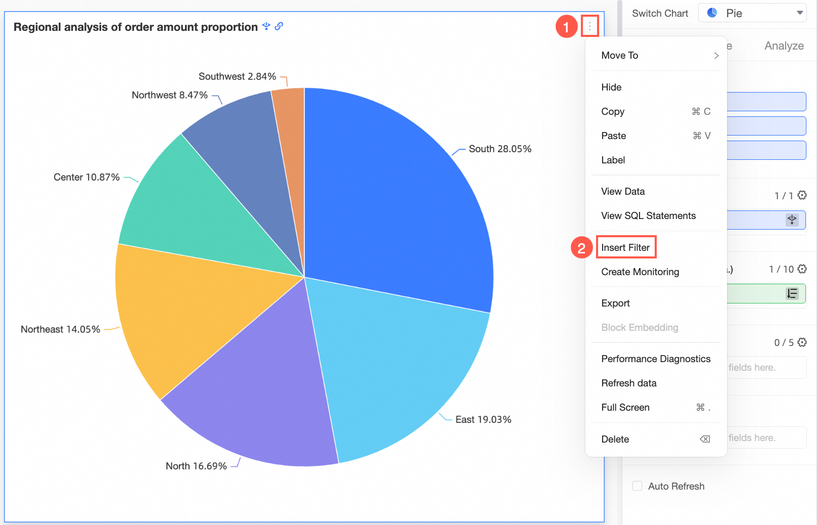
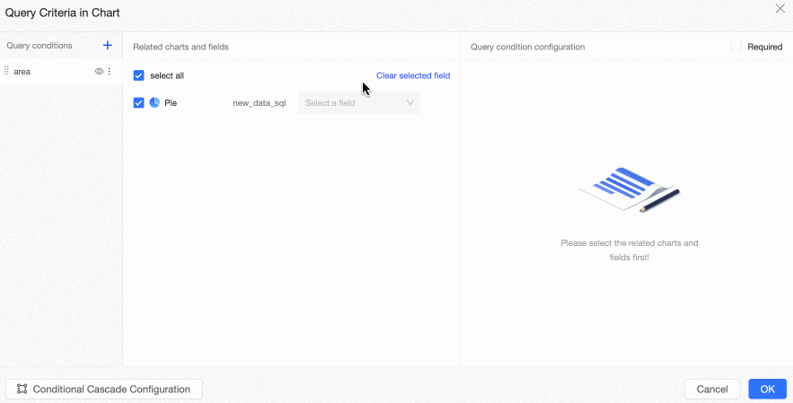
In the Query Criteria in Chart dialog box, configure the following parameters:
Condition
If you click the
 icon in the Query Condition section and add a query condition, the default name is Unnamed. You can enter a name for the query condition.
 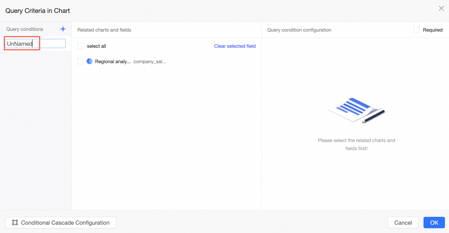 Note
NoteThe name takes effect immediately after you enter the name.
You can click the
 icon to hide a filter. After a filter is hidden, the filter is no longer displayed on the dashboard. However, the configuration is retained.
 You can click the
 icon to rename or delete a filter.
Related charts and fields
Select the associated fields for this chart.
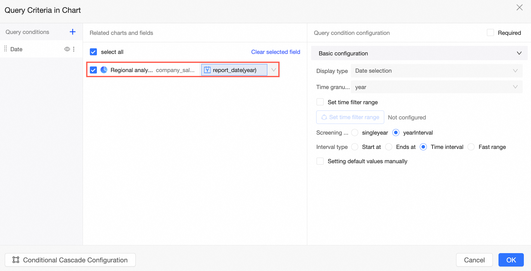
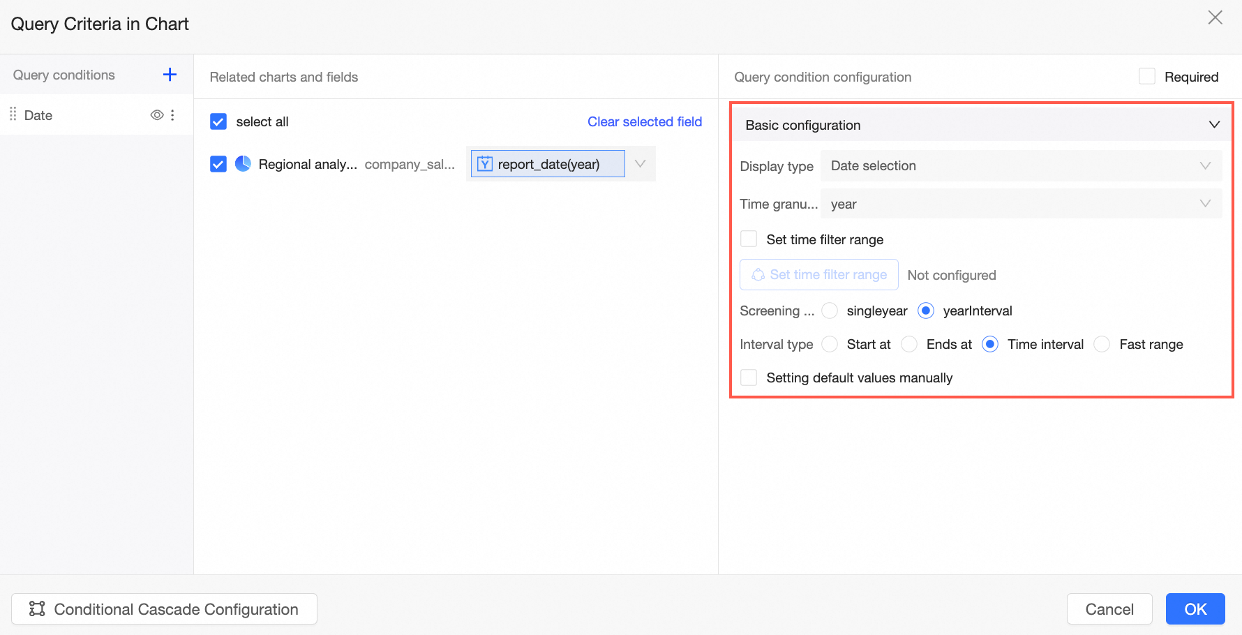
Query condition configuration
The configuration of query conditions varies based on the type of associated fields. For more information, see Query type configuration.
Conditional Cascade Configuration
After you configure conditional cascading, upper-level fields can control the display of lower-level fields. Conditions at the same level can affect each other. After you configure a global filter bar, tab-level filter bar, and chart-level filter bar, these filter bars are cascaded in the following descending order: global filter bar, tab-level filter bar, and chart-level filter bar. For more information, see Configure conditional cascade.
Configure a query condition group
If you have added multiple query controls of the same type, such as the Statistical Time and New Time controls of the Date type, you can configure a query condition group to associate the query controls with the controls. You can switch between the query conditions.
 For more information, see Configure a query condition group.
Configure the style
After you configure a filter bar, you can set the display style of the filter bar on the Style tab.
In the Template Settings section, you can select a defined template to configure the filter bar style.
Styles supported in Template Settings are Right-side Search Box, Drop-down List, and Tile.
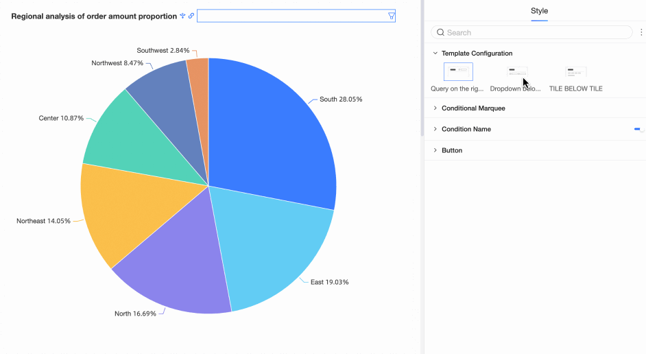
Template Settings allows you to change the style of a filter bar with one click. After you change the style of a filter bar, you can still configure the style in the Basic Settings, Control style, or Field style section.
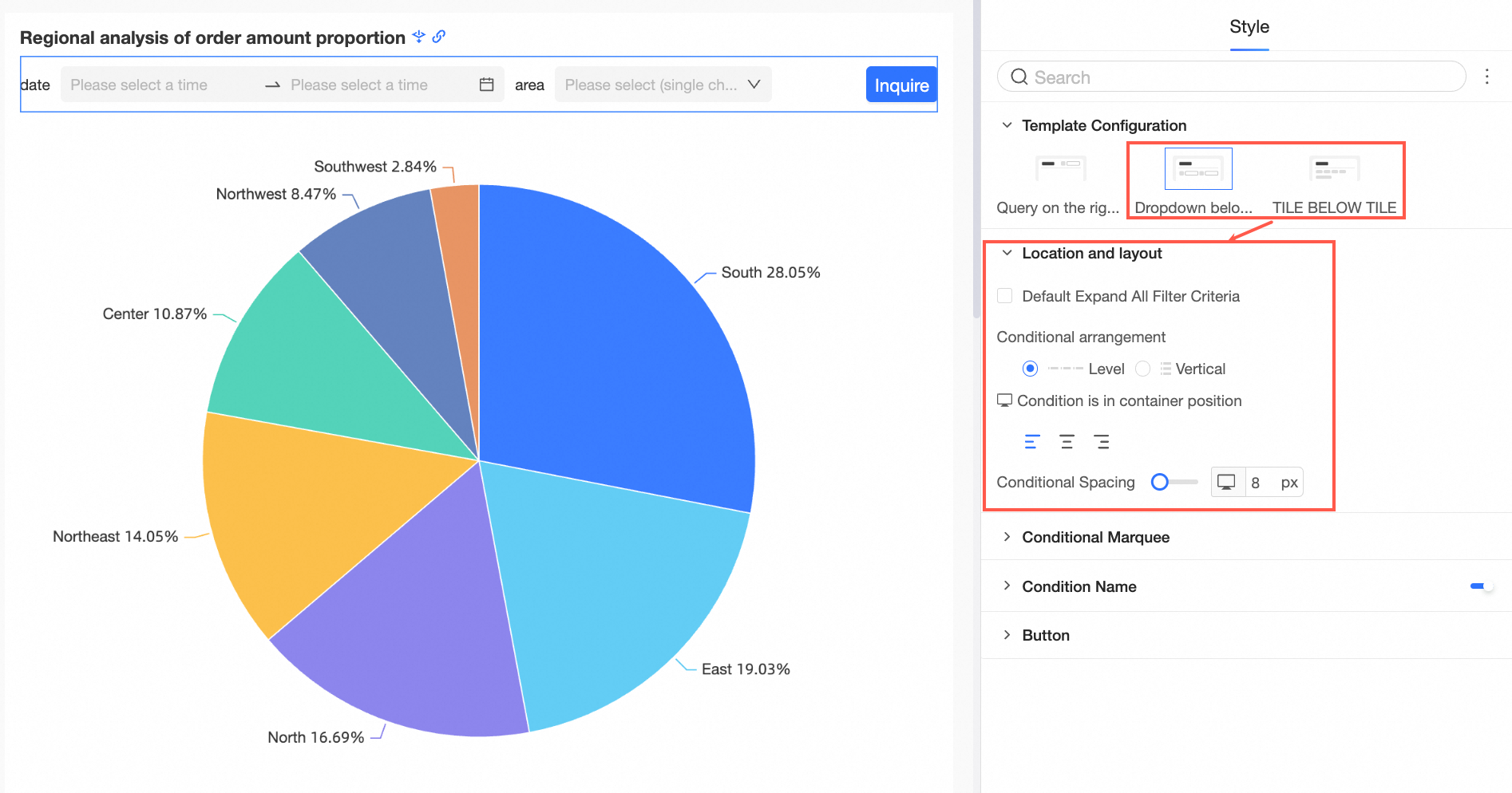
In the Location and Layout section, configure the following settings.
If you set Template Configuration to Title Drop-down or Title Tile, you can set the Default Expand All Filter Conditions, Condition Arrangement, Condition Position in Container, and Condition Spacing in the Position and Layout section.
In the Conditions section, configure the following settings:
Parameter/Option
Marquee Style
The marquee style supports Fill, Wireframe, and Simple.
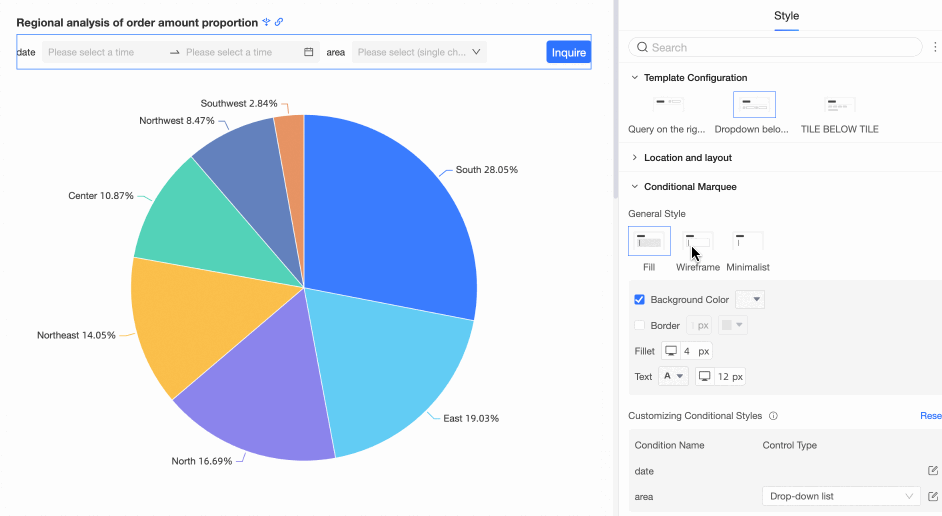
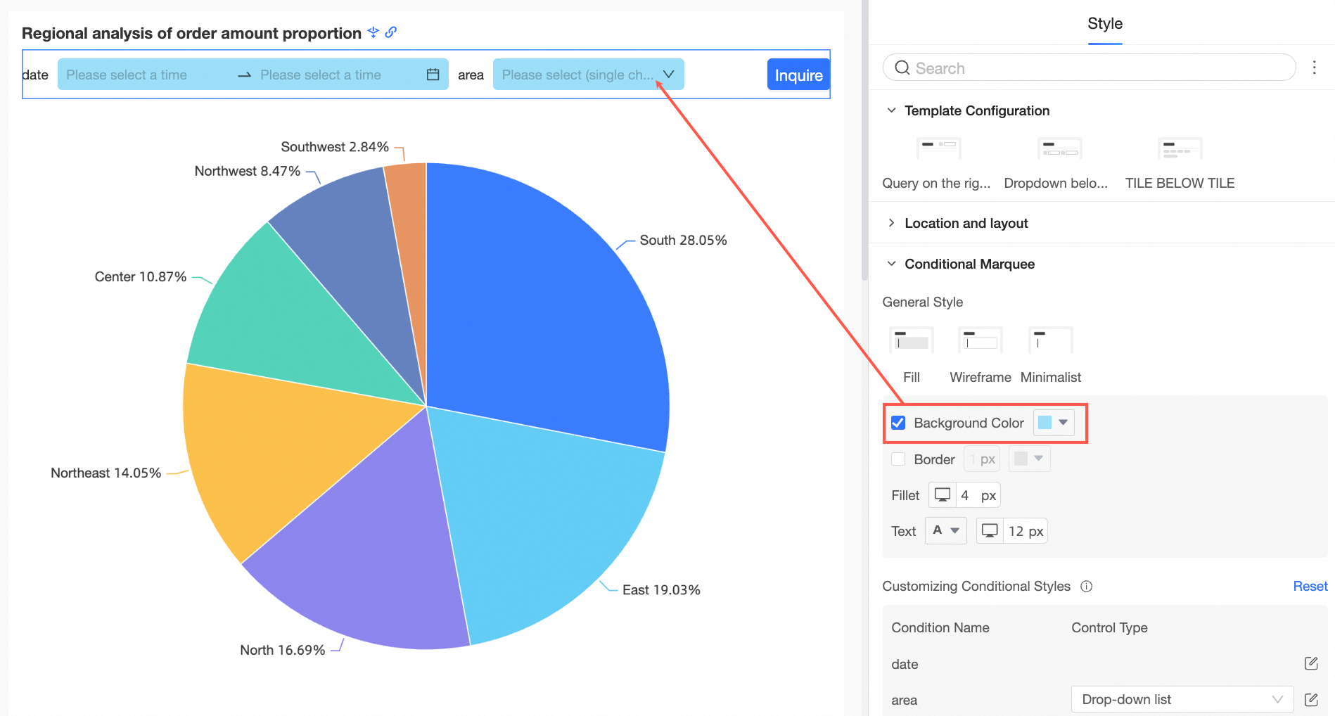
Background color
You can set the background color of the conditional marquee.
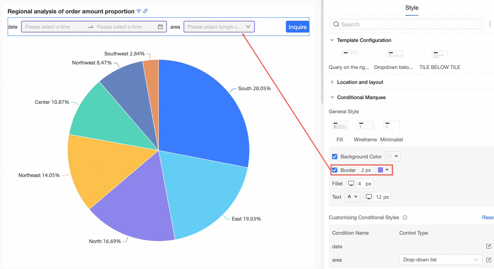
Borders
You can set the border thickness and color of the conditional marquee.
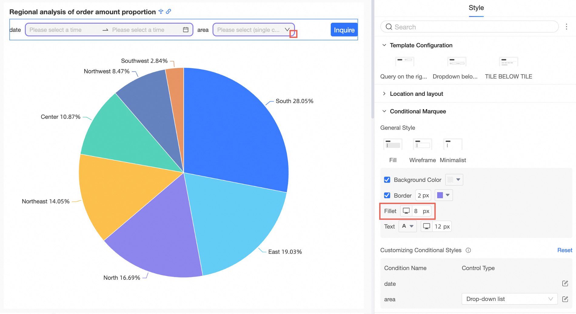
Fillet
You can set the size of rounded corners for conditional marquee.
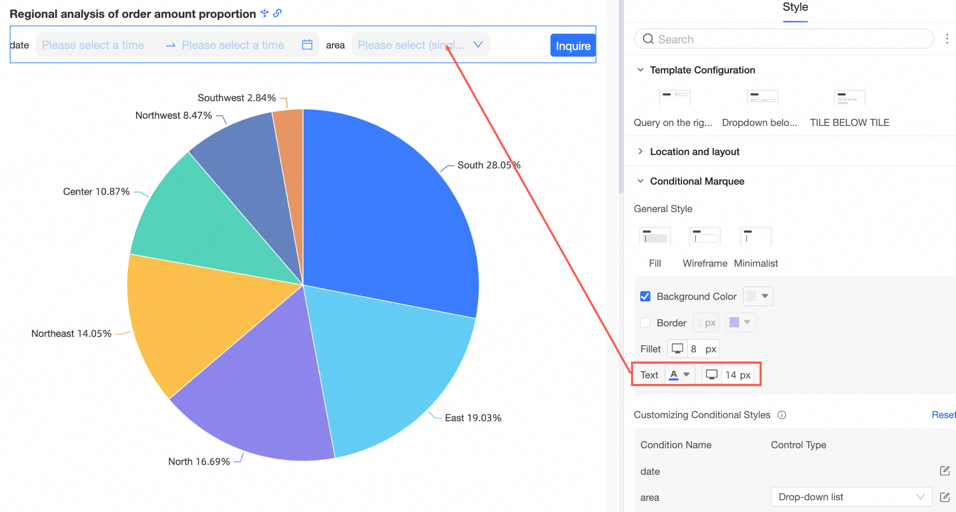
Text
You can set the text color and font size of the conditional marquee.
Custom Condition Style
You can customize the style of a single query condition based on the display type of the query condition.
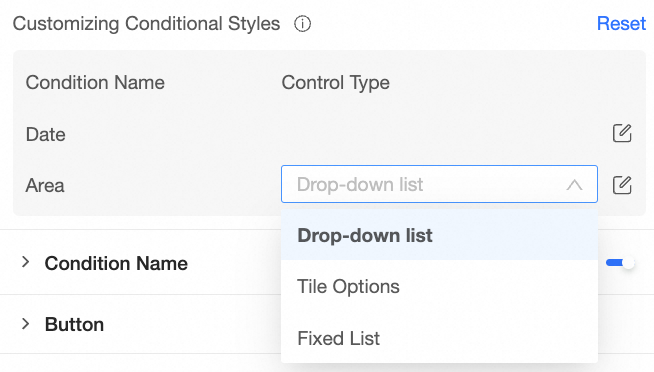
For more information, see Customize conditional styles.
NoteIf the object is duplicated, the custom style overwrites the common style above. You can choose Reset to restore the default.
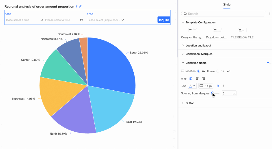
You can specify whether to display the Condition Name and configure the position, text, and spacing between the condition name and the marquee.
Parameter/Option
Position
If you select Title Drop-down or Title Tile for Template Configuration, you can set the condition name to the top or left position. If you set the value to Top, the supported alignment modes are Left Align, Center Align, and Right Align.
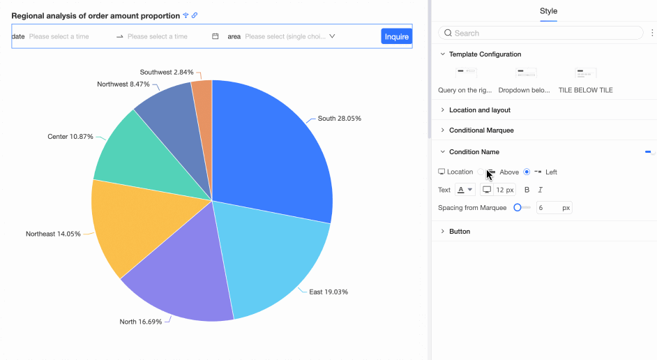
Text
Supports setting the text style of the condition name.
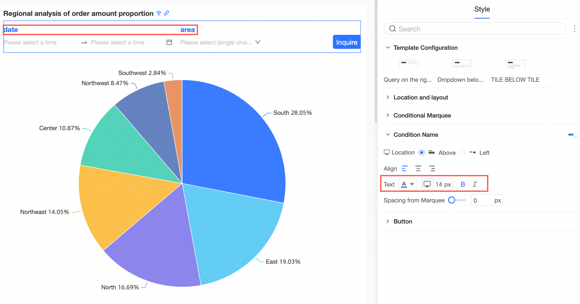
Distance from marquee
You can set the condition name and the marquee spacing.
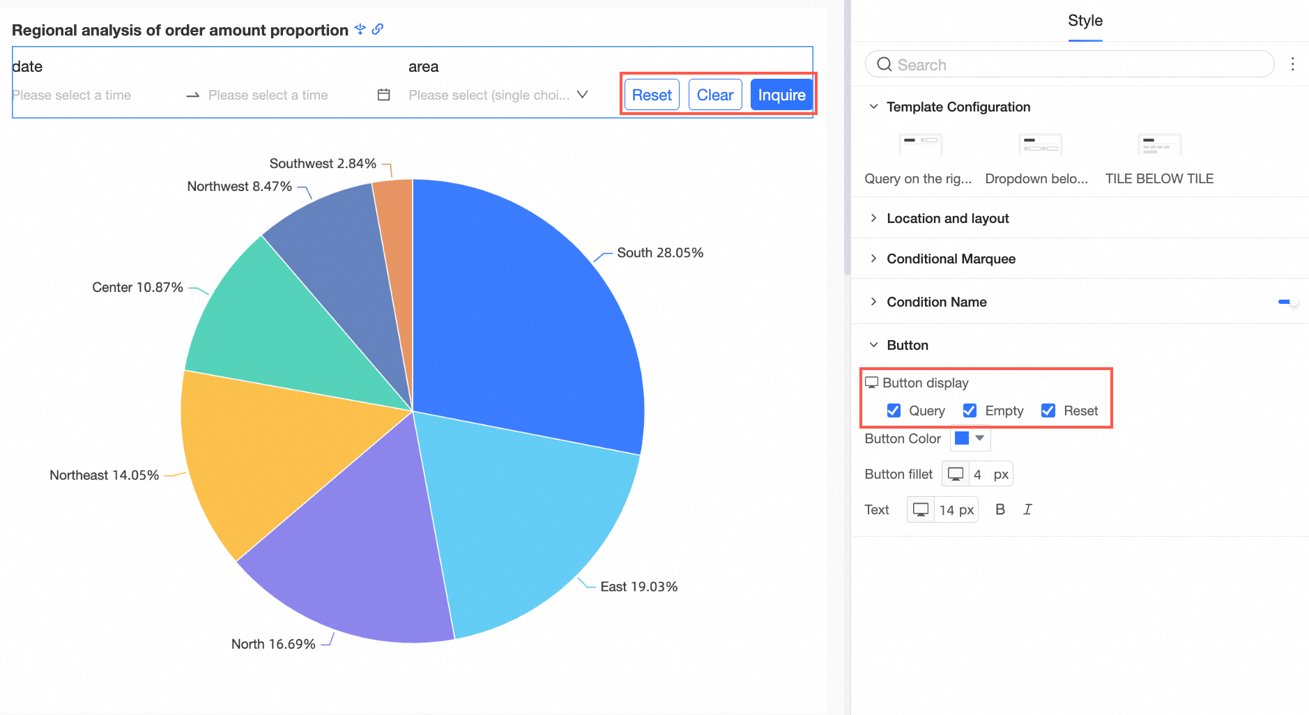
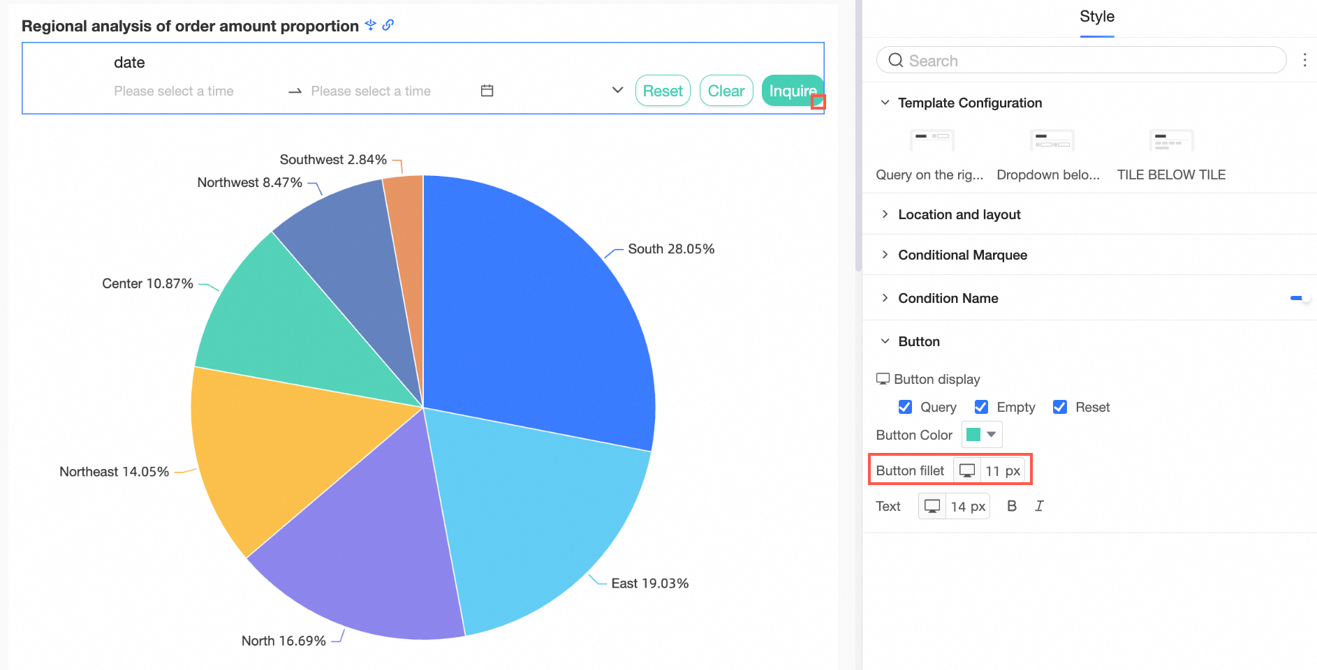
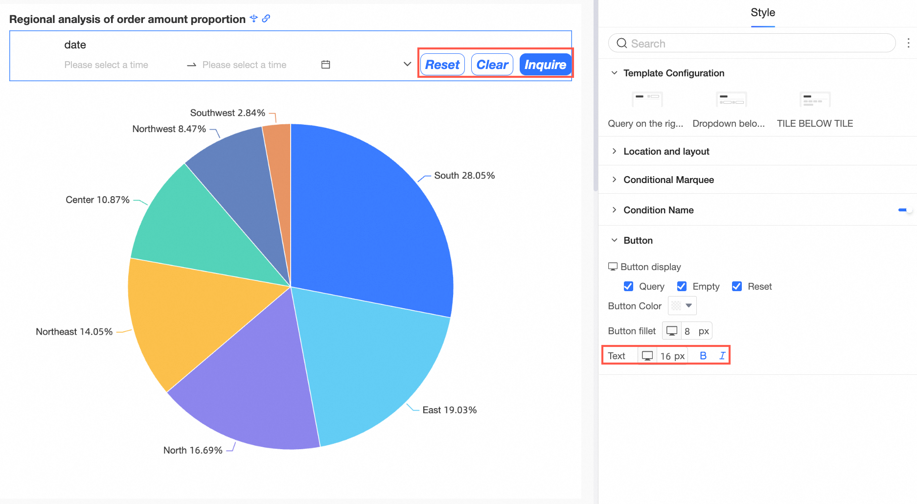
In the Button section, you can configure the Button Display, Button Position, Button Color, Button Round, and Text styles.
Parameter/Option
Button Display
 Note
NoteThe Reset and Clear buttons appear only when Clear and Show are selected configuration items the button display.
Reset: indicates that the filter is restored to the default settings.
Clear: indicates that the filter is cleared.
For example, if Filter Bar A is cascaded with Filter Bar B, Filter Bar A is the upper level of Filter Bar B. If Filter Bar A is reset or cleared, Filter Bar B is also reset or cleared. If Filter Bar B is reset or cleared, Filter Bar A does not change.
Button Color
You can set the Button Color.

Button Fillet
You can set Button Fillet.
Text
The text style of the button.
Configure the display type
Query controls can act on both placeholders and common fields of the same type.
The following content describes the settings of Display type.
Date selection
After you associate a date field with a filter bar, Display type is automatically set to Date selection, and the value of the Time granularity parameter varies based on the date field. The following types of granularities are supported: year, Year-quarter, years, Year-week, year month day, YYYYMMDD HH:MM:SS, time, Hour-minute, and Minutes and seconds.
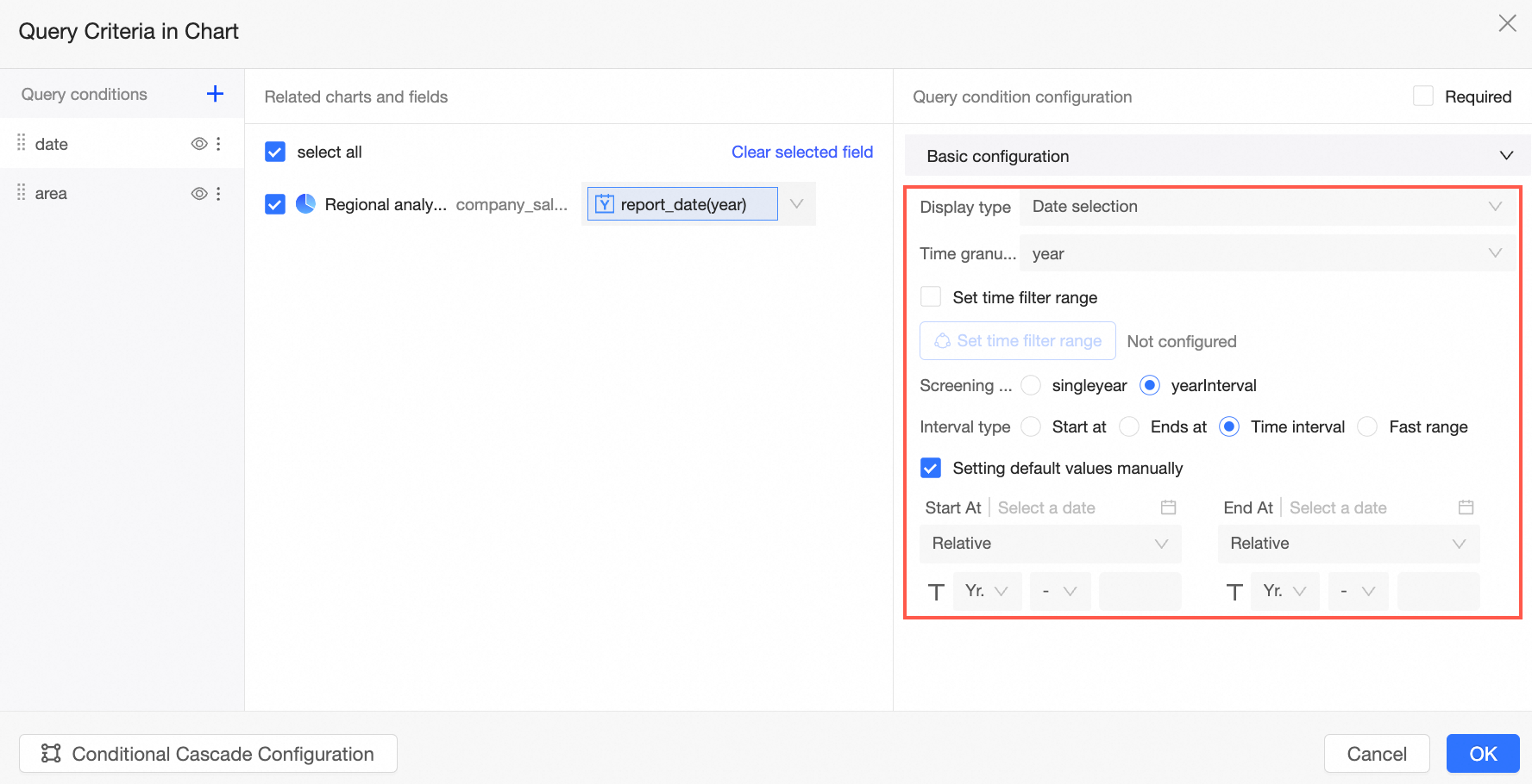
For more information about how to query data based on a date field, see Query data based on a date field.
Numeric Input Box
If the associated field is a measure, you can select No aggregation or another aggregation method from the Aggregation method drop-down list. The default value is Summation.
NoteIf an aggregation method is used in a filter bar, the filter bar cannot be used to query detailed data. You can set Conditional form to Single condition, Or condition, or And condition. If you want users to preview a report by using a fixed condition, such as the Equal to condition, select Lock the filter condition.
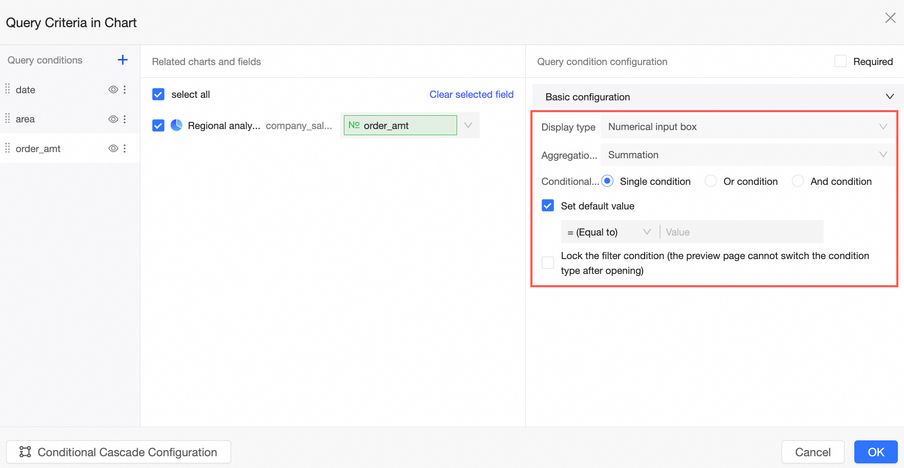
For more information about how to query data based on a numeric field, see Query data based on a numeric field.
Text input box (formerly conditional filter)
Similar to Numerical input box, you can set the Conditional form parameter to Single condition, Or condition, or And condition.
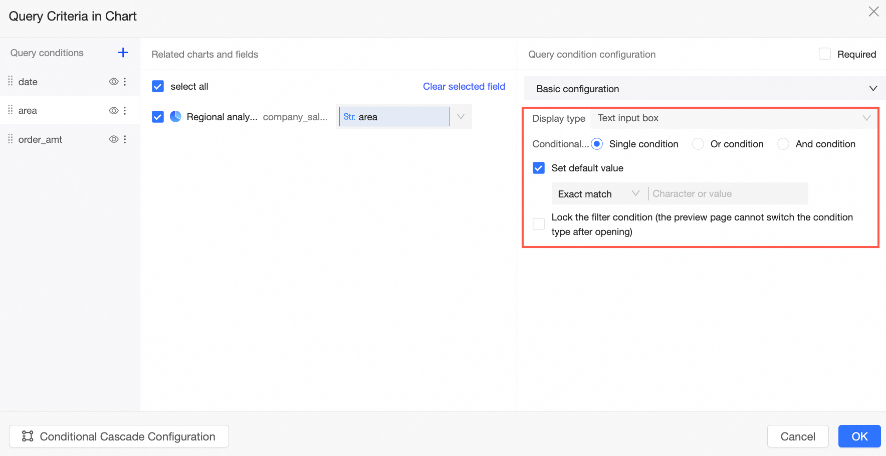
For more information about how to query data based on a text field, see Query data based on a text field.
Drop-down list
If the Display Type parameter is set to Drop-down List, the Option Source parameter is set to the filter values that can be selected from the filter conditions. You can select one of the following options: Automatic Parsing, Single Dataset, and Manual Input.
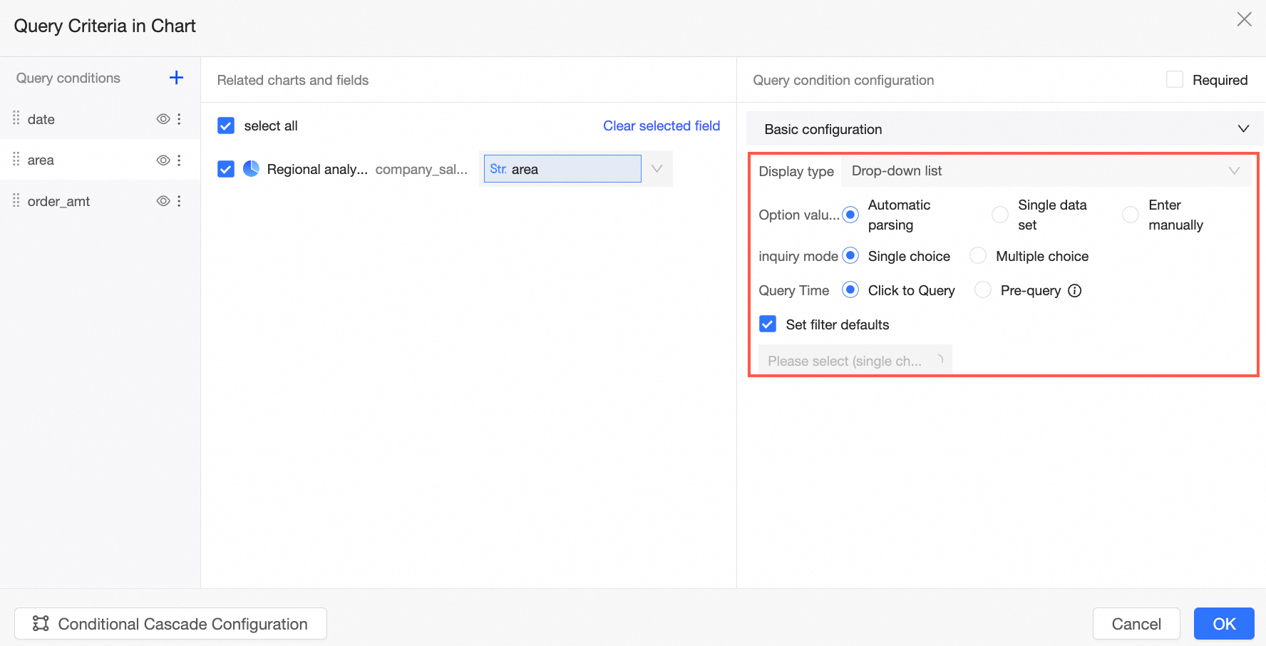
For more information, see Drop-down list.
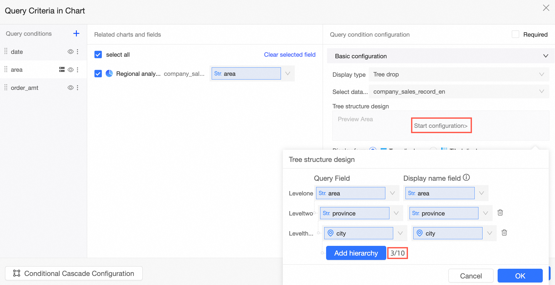
Tree Drop
If you select Tree drop from the Display type drop-down list, fields from both the current dataset and another dataset can be selected, Display form can be set to Tree display or Tiled display, inquiry mode can be set to Single choice or Multiple choice, and Query Time can be set to Click to Query or Pre-query.
NoteThe tree structure supports up to 10 layers.
For more information, see Tree drop-down.