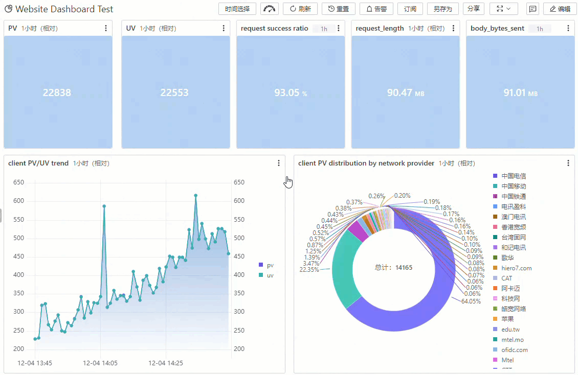
SLS dashboards transform raw log data into graphical representations for monitoring and analysis.
Overview
SLS dashboards support multiple chart types with flexible styling to meet diverse visualization needs.
View dashboards and playlists
In Simple Log Service, the  icon represents Dashboard, the
  icon represents Dashboards, and the
  icon represents Dashboard Playlists.
Dashboards
In the left-side navigation pane, choose to view all dashboards in the current Project.
Dashboard Playlists
In the left-side navigation pane, choose to view all dashboard playlists in the current Project.
Dashboard modes
Display mode
Dashboards open in display mode by default. In this mode, you can browse charts, refresh data, subscribe to updates, and share the dashboard.
In display mode, right-click a chart to access options such as View, Create Password-free Share, Preview Query Statement, Select a time range, Save as Alert, Download Chart, and Download Chart Data.
|
Section |
Operations |
|
Dashboard list section |
In the left-side navigation pane, choose to view all dashboards in the current Project. Click a dashboard to open it in display mode. |
|
Toolbar |
|
|
Filter section |
After you add a filter to the dashboard, the configured filter appears in this section. |
|
Chart area |
Click |
 on a chart to perform operations such as View, Create Password-free Share, Preview Query Statement, Select Time Range, Save as Alert, Download Chart as a PNG image, or Download Chart Data as a CSV file.
Edit mode
Click Edit on the dashboard page to enter edit mode. In this mode, you can modify the dashboard name, add new charts, adjust the layout, edit existing charts, and import charts.
In edit mode, click the three-dot icon in the upper-right corner of a chart to Edit, Copy, or Delete it.
|
Section |
Operations |
|
Dashboard list section |
In the left-side navigation pane, choose to view all dashboards in the current Project. Click a dashboard, and then click Edit in the upper-right corner to enter edit mode. |
|
Toolbar |
|
|
Chart area |
Click |
Use dashboards
Refresh a dashboard
You can refresh a dashboard either manually or automatically.
-
In the upper-right corner of the dashboard page, choose to refresh the dashboard immediately.
-
In the upper-right corner of the dashboard page, choose to refresh the dashboard at a specified interval. You can set the interval to 15 seconds, 60 seconds, 5 minutes, or 15 minutes.
Query data in a dashboard
Set a global time range for a dashboard. All charts update to display results for the selected period.
The selected time range is temporary and resets to the default when you reopen the dashboard.
-
Select a time range
At the top of the dashboard page, clickSelect Time Range to select a time range. After making a selection, you can hover over the displayed time to view the exact start and end times.
Time selection
Description
Relative time range
Queries log data from a time range relative to the present, such as the last 1 minute, 5 minutes, or 15 minutes. For example, if the current time is 19:20:31 and you select 1 Hour, the dashboard queries data from 18:20:31 to 19:20:31.
Aligned time frame
Queries log data from a time range aligned to the hour or minute, such as the last full hour or 15-minute block. For example, if the current time is 19:20:31 and you select 1 Hour, the dashboard queries data from 18:00:00 to 19:00:00.
Custom time range
Queries log data from a specific time range that you define.
-
View a dashboard with specific conditions
At the top of the dashboard page, click Select Time Range, select a time range, and then click the dashboard filter to add filter conditions. This allows you to query log data that matches the specified time and conditions. For example, if the current date is 2024-09-06, set the time to Yesterday (Relative) and add filter conditions where
methodisGETandstatusis200. This queries log data from 2024-09-05 00:00:00 to 2024-09-06 00:00:00 wheremethodisGETandstatusis200.
Share a dashboard
Share dashboards with DingTalk, WeCom, or Alibaba Cloud accounts, or embed them in DingTalk documents. Password-free sharing and dashboard integration.
Subscribe to a dashboard
Subscribe to a dashboard to periodically send an image of it to specified recipients through email, DingTalk, or other channels.
Dashboard subscription limits:
-
You can create only one subscription task for each dashboard.
-
Each email address can receive a maximum of 50 subscription emails per day.
-
The total number of subscription tasks and alert tasks in a Project cannot exceed 100. To request a quota increase, you can submit a ticket.
-
If a table is paginated, the subscription sends a screenshot of only the first page.
-
Subscriptions do not support cross-Project data. If a dashboard queries data from another Project, the subscription cannot retrieve that data.
Add a filter to a dashboard
Dashboard filters refine chart results based on specified conditions without modifying query statements. Add a filter.
Play dashboards
-
Create a dashboard playlist: If no dashboard playlists exist in the current Project, you can create one by clicking Create Now or the
 icon.
icon.In the Create Dashboard Playlist dialog box, configure the following parameters and click OK.
Parameter
Description
Playlist Name
The name of the playlist.
Play Interval
The rotation interval between dashboards.
Name of Dashboard to Play
Add the target dashboards. You can add dashboards from different Projects.
-
Play dashboards: Select the target playlist and click the Play button in the upper-right corner. The system automatically plays the added dashboards at the configured interval. You can also click Previous Page or Next page to play dashboards manually.
The toolbar also includes Time Range and Edit buttons.
Drill-down analysis
Use drill-down analysis to investigate anomalies — query Logstore data, perform trace analysis, or navigate to other dashboards to find the root cause. Use drill-down analysis to identify the root cause of an anomaly.
Supported chart types
Table (Pro)
A table consists of cells that are organized into rows and columns. The first row of a table is the header, which indicates the content and meaning of each column. For example, you can query the total size of the response body for each http_referer and display the body_bytes_sent in the table.
(*)| SELECT http_referer, array_agg(body_bytes_sent) as body_bytes_sent GROUP BY http_referer 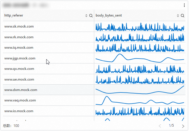
Use cases: A table can accurately display the specific value of each data item. Tables are suitable for scenarios such as data analysis, financial reporting, and scientific experiment recording.
Line chart (Pro)
A line chart is a type of trend analysis chart. It is typically used to show how a dataset changes over an ordered category, often a continuous time interval, to analyze data trends. For example, you can query the page view (PV) at each point in time and set an upper and lower fluctuation range for display.
(*)| select __time__ - __time__ % 60 as time, COUNT(*) as pv, COUNT(*) + 50 as pv2, COUNT(*) - 50 as pv3 GROUP BY time order by time 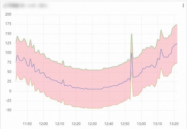
Use cases: A line chart is primarily used to show data trends over time or other continuous variables. It is suitable for analyzing time-series data, such as stock prices, temperature changes, and sales figures. A line chart clearly shows data changes over a period, including:
-
Increases or decreases
-
The rate of change
-
Patterns of change, such as cycles
-
Peaks and troughs
Column chart (Pro)
A column chart uses vertical bars to show numerical comparisons between categories. It is used to describe categorical data and count the number of values in each category. For example, you can display the top five hosts with the highest unique visitor (UV) count and their page views (PVs).
(*)| select host, COUNT(*) as pv, approx_distinct(remote_addr) as uv GROUP BY host ORDER BY uv desc LIMIT 5 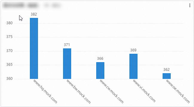
Use cases: A column chart is mainly used to compare the magnitude of data across different categories or time points. It is suitable for displaying categorical data, such as sales volumes of different products or population numbers in different regions.
Single value chart (Pro)
A single value chart highlights one or more key numerical values. For example, you can show the page view (PV) for the last 15 minutes.
(*)| select COUNT(*) as PV 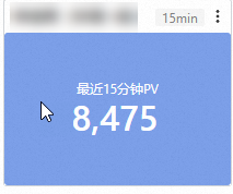
Use cases: A single value chart is mainly used to intuitively display the current value and trend of a single key metric. It is suitable for scenarios where you need to understand business status or monitor for anomalies.
Pie chart (Pro)
A pie chart divides a circle into multiple slices based on the proportion of each category. The entire circle represents the total amount of data, and each slice represents the proportion of that category to the whole. The sum of all slices is 100%. For example, you can count the number of occurrences for each request_method, such as GET or POST.
(*)| SELECT request_method, arbitrary(request_length) as len, COUNT(*) as c group by request_method 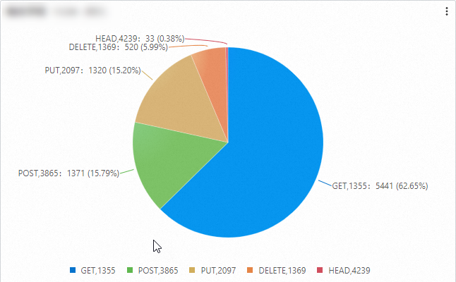
Use cases: A pie chart is mainly used to show the proportional relationship of data. It is suitable for displaying the proportion of different parts to a whole, such as the market share of different products or the budget allocation of various departments.
Map (Pro)
Other supported chart types: flow chart, bar gauge, histogram, radar chart, cross table, scatter chart, topology chart, flame graph, Markdown chart, timeline chart, word cloud, sankey diagram, trail map, treemap chart, state timeline chart, and funnel chart.
Related documentation
-
Quickly create a dashboard. Password-free sharing and dashboard integration.
-
Use a dashboard to quickly find abnormal metrics. Use drill-down analysis to identify the root cause of an anomaly.
-
Visualize query results as charts: Chart overview and Overview of charts (Pro).
-
Save query results as dashboard charts: Add a chart to a dashboard and Add a chart (Pro) to a dashboard.
-
Filter examples: Add a filter of the filter type and Add a filter of the variable type.