Line charts let you visualize results from multiple queries in a single chart and apply custom settings to specific fields. This topic describes how to configure a basic line chart.
Overview
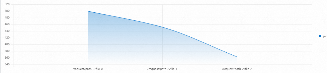
A line chart is a type of trend analysis chart. It shows how a dataset changes over a series of ordered categories, which are typically continuous time intervals. This helps you easily spot trends. With a line chart, you can clearly observe changes within a specific period, such as:
-
Increases or decreases
-
The rate of change
-
Patterns, such as cyclical changes
-
Peaks and troughs
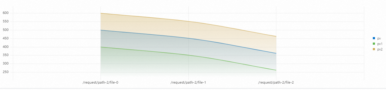
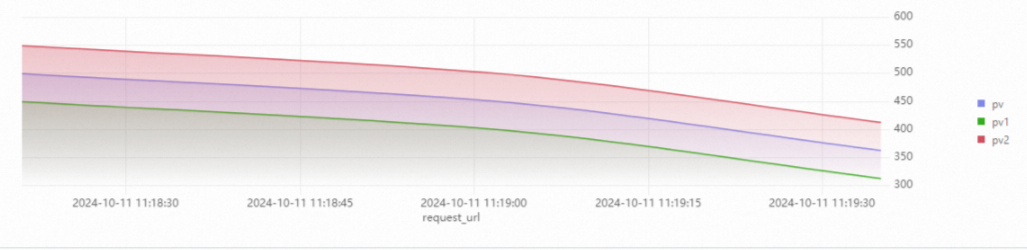
Line charts are ideal for analyzing data trends over time. You can also plot multiple lines on the same chart to compare different datasets over the same period. This helps you analyze how the datasets interact, such as whether they increase together, decrease together, or are inversely related.
To learn how to add a line chart, see Add a chart to a dashboard.
Examples
|
Line chart type |
Example |
Related link |
|
Basic line chart |
|
|
|
Multi-axis line chart |
|
|
|
Data Completion |
|
Configuration example
Basic line chart
Log on to the Simple Log Service console. In the Projects section, click the project you want.

-
In the left-side navigation pane, choose . In the Dashboard list, click the dashboard you want. In the upper-right corner of the dashboard page, click Edit. In edit mode, choose .
-
In the pane, under Chart Type, select the
 icon. Then, enter a query statement and click Last 15 Minutes to specify a time range.
For example, the query statement for Query A is:
* | select __time__,count(request_url) as pv group by __time__In the right-side Query and Analysis Configurations section, set x-axis Field to
__time__and selectpvfor y-axis Field.
Other configurations
|
Configuration |
Description |
Example |
|
Configure the x-axis and y-axis |
For more information, see Configure the x-axis and y-axis for a line chart. |
|
|
Configure aliases and colors for a multi-axis line chart |
On a multi-axis line chart, where multiple lines represent different data series, setting unique aliases and colors helps you distinguish between them. This is especially useful when a chart contains many data series. For more information, see Configure aliases and colors for a multi-axis line chart. |
|
|
Configure chart type settings for a multi-axis line chart (point, line, column) |
In a multi-axis line chart, you can use points, lines, and columns to represent different data:
For more information, see Configure chart type settings for a multi-axis line chart. |
|

General Configurations
The General Configurations tab provides global settings for the line chart.
-
Basic configurations
Parameter
Description
Title
The title of the line chart.
Display Title
When you enable the Display Title switch, the title is displayed in the line chart.
Display Border
After you turn on the Show Border switch, a border is displayed in the line chart.
Display Background
When you turn on the Show Background switch, the line chart displays a background color.
Display Time
After you turn on the Show Time switch, the query time will be displayed in the line chart.
Fixed Time
After you turn on the Fixed Time switch, the time range for the query analysis is fixed and is not affected by the dashboard's global time.
-
Standard configurations
Parameter
Description
Format
The display format for numeric values.
Unit
The unit for numeric values.
Decimal Places
The number of decimal places to display for numeric values.
Display Name
Changes the name of the legend.
If you set a display name, all legend items in the chart are renamed to this value. To modify the name of a specific legend item, use the Field Configuration tab.
Color Scheme
Select a color scheme for the chart background and legend.
-
Built-in: Uses the default color scheme.
-
Solid: Uses a single color that you select.
-
-
Query and analysis configurations
Parameter
Description
x-axis Field
Select a field for the x-axis.
By default, Simple Log Service automatically selects a field for the x-axis.
y-axis Field
Select one or more fields for the y-axis.
By default, Simple Log Service automatically selects fields for the y-axis.
-
Data configuration
Parameter
Description
Data Completion
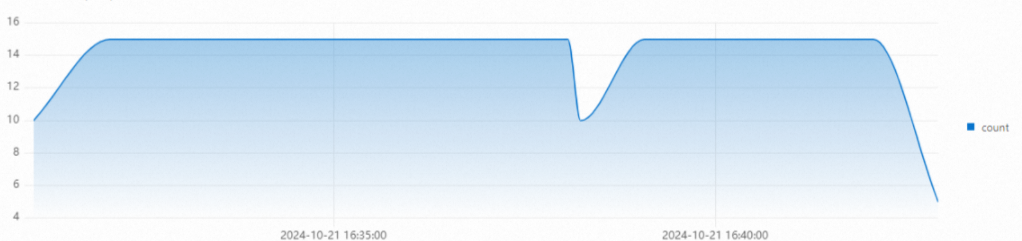
After you enable Data Completion, Simple Log Service starts data completion from the first piece of data according to the completion window.
Completion Window
The time window for filling in missing data. The minimum value is 10 seconds.
By default, Simple Log Service automatically determines the completion window.
Completion Value
The value to use for filling in missing data points. The default value is 0.
-
Legend configurations
Parameter
Description
Display Legend
After you turn on the Show Legend switch, the legend will be displayed in the line chart.
Legend Position
The position of the legend.
Actions
The behavior when a legend item is clicked.
-
Single: When you click a legend item, only that item's data is displayed.
-
Switch: Click a legend item to hide its data. Click it again to show it.
Maximum Width (Height)%
The maximum width and height of the legend.
-
-
Tooltip
Parameter
Description
Sort By
The sorting method for the data.
Display Mode
-
All
-
Single
Additional Information
Adds custom information to the tooltip. You can add one item for each query. Use the
${{field}}syntax to reference a value from the query results. -
-
x-axis
Parameter
Description
Display x-axis
After you turn on the Show x-axis switch, the x-axis is displayed in the line chart.
x-axis Title
The title of the x-axis.
x-axis Height
The height of the x-axis.
By default, Simple Log Service automatically sets the height of the x-axis.
Format
Select a format to apply to the time values on the x-axis.
Drag and Zoom
-
Global
-
Single
-
-
y-axis
Parameter
Description
Display y-axis
After you turn on the Show y-axis switch, the y-axis will be displayed in the line chart.
y-axis Title
The title of the y-axis.
y-axis Position
The position of the y-axis.
Stack
If you enable this option, the y-axis data is stacked.
y-axis Width
The width of the y-axis.
By default, Simple Log Service automatically sets the width of the y-axis.
Maximum Value
The maximum value for the y-axis.
By default, Simple Log Service automatically sets the maximum value of the y-axis.
Minimum Value
The minimum value for the y-axis.
By default, Simple Log Service automatically sets the minimum value of the y-axis.
Elastic Maximum Value
The elastic maximum value for the y-axis. This setting applies only if all y-axis values are less than this value.
By default, Simple Log Service automatically sets the elastic maximum value of the y-axis.
Elastic Minimum Value
The elastic minimum value for the y-axis. This setting applies only if all y-axis values are greater than this value.
By default, Simple Log Service automatically sets the elastic minimum value of the y-axis.
y-axis ID
The ID of the y-axis. This parameter is typically not needed in the General Configurations pane. If you want to define multiple y-axes, you must configure them on the Field Configuration tab. The y-axis ID can be any string. Using different IDs creates separate y-axes on the chart. For more information, see Add a line chart with multiple y-axes.
The y-axis ID setting has a higher priority than the Unit setting in the Standard Configurations section. For example, if two y-axes have the same unit, they are merged into one. However, if they have the same unit but different IDs, they are displayed as two separate y-axes.
-
Chart configurations
Parameter
Description
Chart Type
The type of the line chart.
Connection Mode
The connection style for the lines in the chart.
Line Width
The width of the lines.
Display Point
Specifies whether to display points on the lines.
Transparency
The transparency of the line chart.
Point Size
The size of the points on the chart.
Gradient Mode
The fill gradient style for the area under the line.
-
Transparency: The fill is based on the line color and is affected by the Transparency setting.
-
No Gradient: No gradient is used. The area is filled with the line color.
-
-
Thresholds
Parameter
Description
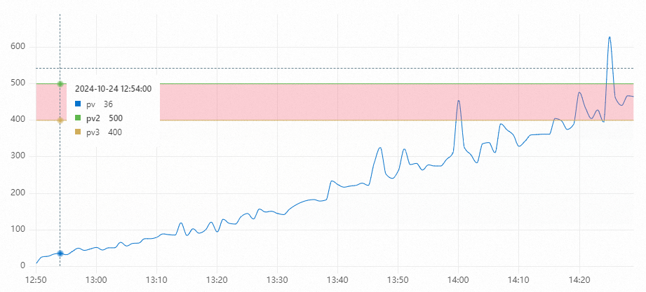
Upper Boundary
Select the upper boundary line.
Lower Boundary
Select the lower boundary line.
Boundary Fill Color
The fill color.
Boundary Fill Color Opacity
The opacity of the color.
-
Variable substitution
Parameter
Description
Variable substitution
Variable substitution adds a variable-type filter to the chart. After configuration in General configurations, a filter appears in the upper-left corner of the chart. When you select a value, Simple Log Service replaces the variable in the query statement and reruns the analysis. Example 2: Set variable substitution.
-
Documentation link
Parameter
Description
Add Documentation Link
Allows you to add a custom documentation link or description. The information is displayed in the upper-right corner of the line chart.
Field Configuration
The Field Configuration tab lets you apply custom visualization settings to the results of an entire query or to a single data series within the results. For descriptions of the configuration parameters, see General Configurations.
For example, A > pv allows you to configure settings for the pv field from Query A, while B allows you to configure settings for all results from Query B. In this case, the green line represents the pv field from Query A, and the blue line represents the results from Query B. You can set the width of the green line to 6 and the blue line to 2.
On the Field Configuration tab, you can also set the Axis ID (left or right axis), Axis Position, and Unit to create a chart with dual y-axes.
Interaction events
The Interaction Occurrences tab lets you configure drill-down actions for a specific data series or for the results of an entire query. Supported actions include Open Logstore, Open Saved Search, Open Dashboard, Open Trace Analysis, Open Trace Details, and Create Custom HTTP URL. For more information, see Add interactive events to a dashboard for drill-down analysis.
For example, selecting A > pv allows you to set up an interactive event for the pv field from Query A. If you set the event to Open Logstore for the pv field, clicking any point on the green line and then clicking Open Logstore takes you to the specified Logstore.
Example: line chart styles
For more information about how to configure field colors, see Field Configuration.
* | select __time__ - __time__ % 60 as time, COUNT(*) as line1, COUNT(*) -20 as line2, COUNT(*) - 40 as line3 GROUP BY time order by time limit 100In the right-side Query and Analysis Configurations section, set the x-axis Field to time and select line1, line2, and line3 for the y-axis Field.