A dashboard in Simple Log Service is a visualization tool that displays the results of log data queries and analysis in formats such as bar charts, line charts, and pie charts. You can use dashboards to monitor the operational status of your systems, applications, or services. This topic describes how to create a dashboard.
Quick start
This section uses CLB access logs as an example to create a dashboard to monitor the page view (PV) trends of different request methods and use a filter to view the trend for a specific method. A sample log is shown below:
{
    "body_bytes_sent": "1346",
    "client_ip": "118.*.*.125",
    "host": "www.*.*.com",
    "http_host": "www.*.*.com",
    "request_length": "15**",
    "request_method": "PUT",
    "request_time": "26",
    "scheme": "https",
    "slbid": "slb-02",
    "status": "200",
    "upstream_addr": "133.*.*.113",
    "upstream_response_time": "18",
    "upstream_status": "200",
    "vip_addr": "39.*.*.121",
    "__pack_meta__": "1|MTcyNDE*==|120|119",
    "__topic__": "slb_layer7",
    "__source__": "127.0.0.1",
    "__tag__:__receive_time__": "1725349464",
    "__tag__:__receive_time___0": "1725349464",
    "__time__": "1725349464"
}
You can create a dashboard in Simple Log Service in just three steps:
-
Add a dashboard: First, add a dashboard in the Simple Log Service console to contain your related charts.
-
Add a chart: Next, add a chart to the dashboard to visualize the query and analysis results.
-
Add a filter: Then, configure a filter for the chart to narrow down the data based on fields from your query statement.
1. Add a dashboard
Log on to the Simple Log Service console, select the target project, and navigate to the Dashboard > Dashboards page.
Click the + icon in the upper-right corner and select Add Dashboard from the drop-down menu.
2. Add a chart
-
Click Add Chart.
-
Configure and save the chart:
-
In the left pane, configure the time range, Logstore, and query statement.
-
In the right pane, set the chart type to Line Chart, the x-axis to t, the y-axis to pv, and the aggregation column to request_method. Click Apply at the top of the page to preview the chart, and then click OK to save it.
The query statement is as follows:
SELECT
    DATE_FORMAT(DATE_TRUNC('minute', __time__), '%m-%d %H:%i') AS t,
    request_method,
    COUNT(*) AS pv
GROUP BY
    t,
    request_method
ORDER BY
    t ASC
LIMIT 10000;
-
-
Drag the corner of the chart to resize it, and then click Save in the upper-right corner.
In the Save Dashboard dialog box that appears, enter a Name and Description for the dashboard, and then click OK to save.
3. Add a filter
The chart displays the PV for all request methods. To view the PV for only specific methods, add a filter and select the desired value from the drop-down list. This way, you do not need to modify the query statement.
-
On the dashboard page, click Edit in the upper-right corner to enter edit mode, and then click the button at the top of the page to create a filter.
This is the funnel-shaped Filter icon on the far left of the toolbar.
-
Configure the filter.
A filter works by searching for logs that contain a specific
Key:Valuepair within your original query results. To view the PV chart for thePOSTrequest method, you need to filter the results of the preceding query statement for logs containingrequest_method:POST.In the right pane, set the Key value to
request_methodas the filter condition. Then, enable the Add Dynamic List Item switch and enter the query statement*|select distinct request_methodto retrieve all values for therequest_methodfield. These values then populate the filter's drop-down list. -
Click Save in the upper-right corner of the dashboard page.
-
From the drop-down list, select
POST. The chart then displays the PV only for the selected request method.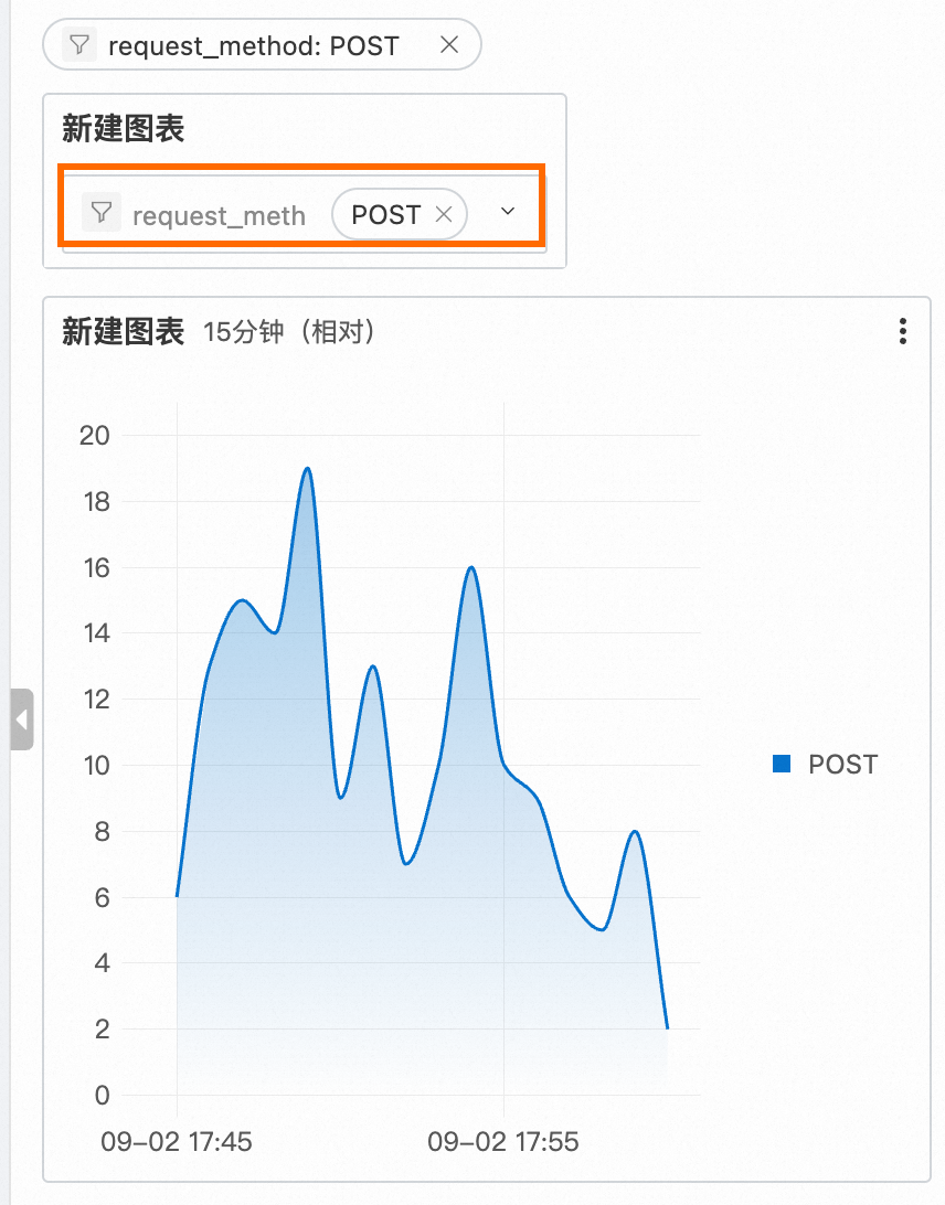
Related documents
-
This topic describes how to create a single chart. You can add multiple related charts to the same dashboard for centralized viewing. For more information about how to configure dashboards and other chart types, see Use dashboards.
-
After you create a dashboard, you can share it to a DingTalk account, a WeCom account, or an Alibaba Cloud account. You can also use a password-free link to access it directly in a browser. For more information, see Password-free sharing and dashboard integration.
-
When you find an anomaly on a dashboard and need to quickly perform further analysis, such as querying and analyzing data in the corresponding Logstore, opening the Trace Analysis page, or navigating to another dashboard, you can use the Interaction Occurrences feature. For the configuration steps, see Use drill-down analysis on a dashboard to identify the root cause of an anomaly.
-
To promptly identify metric anomalies on your dashboards, you can configure threshold highlighting and alerts for your charts. For more information, see Quickly identify metric anomalies on a dashboard.