A scatter chart plots data points on a Cartesian plane to reveal the relationship between two variables. Customize axes, legends, tooltips, and thresholds to suit your analysis.
Overview
Each point is defined by an x-axis value and a y-axis value. The position, distribution, and density of these points indicate the degree of correlation between the two variables.
Configuration example
Log on to the Simple Log Service console. In the Projects section, click the project you want.

-
In the left-side navigation pane, choose . In the Dashboard list, click the dashboard you want. In the upper-right corner of the dashboard page, click Edit. In edit mode, choose .
-
On the right side of the page, configure the Chart Type and Query and Analysis Configurations. On the left side, set the time range, Logstore, and query and analysis statement. Then, click Apply at the top of the page to view the chart.
Enable Time Series Mode, select scatter chart as the chart type, and select
charts-demofor Logstore. In the query and analysis configurations section, set x-axis field totime, y-axis field toduration, category column torequest_method, and point size column topv.The following query and analysis statement calculates the request count and the average request time for each request method within specific time intervals:
* | select __time__ - __time__ % 60 as time, COUNT(*) as pv, avg(request_time) as duration, request_method GROUP BY time, request_method order by time limit 1000The scatter chart shows how request counts and average request times are distributed across request methods over time.
-
Points of different colors represent different request methods.
-
The vertical position of a point on the y-axis indicates the average request time. A higher position means a longer average request time for that method during the time interval.
-
The size of a point indicates the request count. A larger point means more requests were made for that method during the time interval.
-
General configurations
Configure the global display settings for the scatter chart.
-
Basic configurations
Parameter
Description
Title
The chart title.
Display Title
Shows the chart title when enabled.
Display Border
Shows a border around the chart when enabled.
Display Background
Shows a background color for the chart when enabled.
Display Time
Shows the query time in the chart when enabled.
Fixed Time
Locks the query and analysis time range so that it is not affected by the dashboard's global time setting.
-
Standard configurations
Parameter
Description
Format
The display format for numbers.
Unit
The unit for numbers.
Number of Digits after Decimal Point
The number of decimal places for numbers.
Display Name
The display name for the field.
This name overrides all other field names in the chart. To rename a specific field, use field configuration.
Color Scheme
The color scheme for the chart.
-
Built-in: Uses the built-in colors.
-
Solid: Uses a single color.
-
Threshold: Colors the chart based on configured thresholds.
-
-
Query and analysis configurations
Parameter
Description
Axis X Field
Select a field for the x-axis.
By default, Log Service automatically selects an appropriate field for the x-axis.
Axis Y Field
Select a field for the y-axis.
By default, Log Service automatically selects an appropriate field for the y-axis.
Category Column
Select a field to categorize the data.
Point Size Column
Select a field whose values determine the size of the data points. Log Service dynamically adjusts the point size based on the values in this field.
-
Chart configurations
Parameter
Description
Line Width
The width of the lines in the scatter chart.
Transparency
The opacity of the scatter chart.
Point Size
The size of the data points in the scatter chart.
NoteIf you set the Point Size Column, this Point Size setting does not take effect.
Shape
The shape of the data points in the scatter chart. Valid values: Circle, Square, and Triangle.
Axis Y Grouping
You can enable y-axis grouping after you configure the category column.
-
X-axis
Parameter
Description
Display Axis X
If you turn on Display Axis X, the x-axis is displayed.
Axis X Title
The title of the x-axis.
Format
The format for the values on the x-axis.
Axis X Height
The height of the x-axis.
By default, Log Service automatically sets the height of the x-axis.
-
Y-axis
Parameter
Description
Display Axis Y
If you turn on Display Axis Y, the y-axis is displayed.
Axis Y Title
The title of the y-axis.
Axis Y Position
The position of the y-axis.
Axis Y Width
The width of the y-axis.
By default, Log Service automatically sets the width of the y-axis.
Maximum Value
The maximum value of the y-axis.
By default, Log Service automatically sets the maximum value of the y-axis.
Minimum Value
The minimum value of the y-axis.
By default, Log Service automatically sets the minimum value of the y-axis.
Elastic Maximum Value
The elastic maximum value for the y-axis. This value takes effect only when all values on the y-axis are less than the specified elastic maximum.
By default, Log Service automatically sets the elastic maximum value for the y-axis.
Elastic Minimum Value
The elastic minimum value for the y-axis. This value takes effect only when all values on the y-axis are greater than the specified elastic minimum.
By default, Log Service automatically sets the elastic minimum value for the y-axis.
Axis Y ID
The ID of the y-axis. This parameter is generally not configured in the General Configurations section. To define multiple y-axes, you must configure this parameter in the Field Configuration tab. The y-axis ID can be any string. Axes with different IDs are displayed as separate y-axes in the chart.
The y-axis ID takes precedence over the Standard Configurations setting in the Standard Configurations section. For example, two y-axes with the same unit are merged by default. However, if they have different IDs, they are displayed as two separate axes.
-
Legend configurations
Parameter
Description
Display Legend
If you turn on Display Legend, the legend is displayed.
Sorting Method
The sort order for the items in the legend.
Legend Position
The position of the legend.
Actions
The behavior when you click a legend item.
-
Single: Clicking a legend item shows only the data for that item.
-
Switch: Clicking a legend item hides its data. Click again to show it.
Maximum width (height)%
The maximum width or height of the legend, as a percentage of the total chart area.
-
-
Tooltip configurations
Parameter
Description
Additional Information
Additional information to display in a tooltip when you hover over a data point.
You can use variables. For example:
Method: ${{request_method}}\nQuantity: ${{pv}}. In this example,\ncreates a new line. -
Thresholds
Parameter
Description
Threshold
The thresholds for the data.
If you set Color Scheme to Threshold and define thresholds here, the data points in the scatter chart are colored based on these thresholds.
-
Variable replacement
Parameter
Description
Variable Replacement
Configures a variable-based filter for the chart. After you configure this setting in the General Configurations section, a filter control appears in the upper-left corner of the chart. When you select a value from the filter, Log Service automatically replaces the variable in the query and analysis statement with the selected value and re-runs the query. For a configuration example, see Example 2: Set variable replacement.
-
Documentation link
Parameter
Description
Add Documentation Link
Adds a custom link or description to the upper-right corner of the chart.
Field configuration
Field configuration lets you customize visualization settings for a specific query result or a single column within those results. For more information about the parameters, see General configurations.
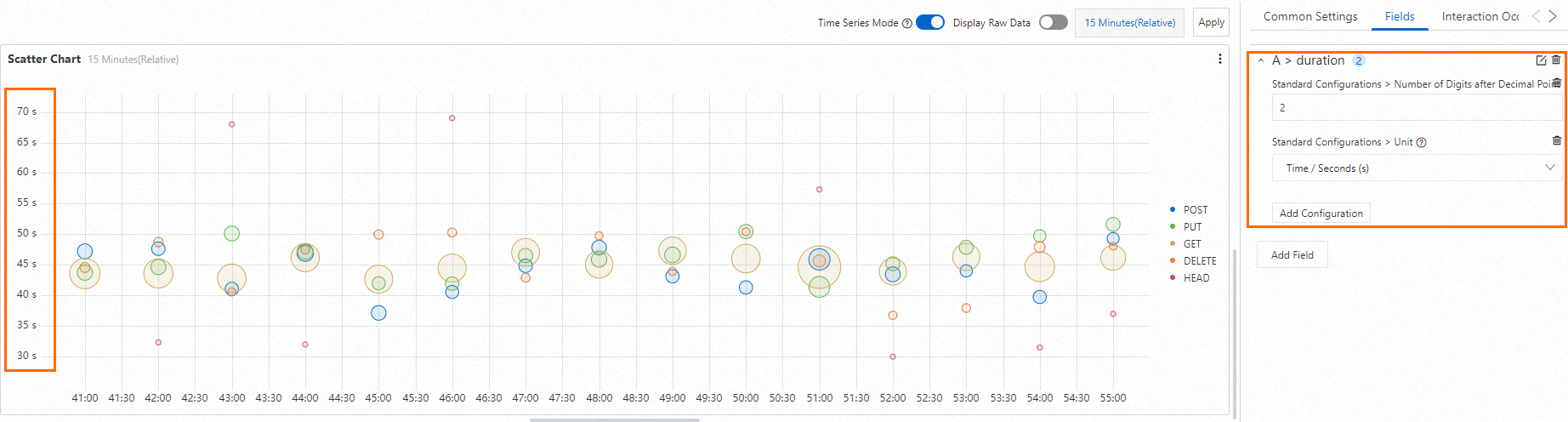
For example, in the scatter chart shown below, the y-axis field is duration. To add a unit to the y-axis, you can configure the unit setting for the query under A > duration.
Interaction events
Interaction events let you drill down into a specific field or query result. Supported events include open Logstore, open saved search, open dashboard, open Trace Analysis, open Trace Details, and custom HTTP URL. For more information, see Add interaction events to a dashboard for drill-down analysis.
For example, A > duration indicates that an interaction event is configured for the duration field from query A. If you set the interaction event for the duration field to Open Logstore, you can click any data point on the chart and then click Open Logstore in the tooltip to open the specified Logstore.