A pie chart displays data as slices of a circle, where each slice represents the proportion of a category. The size of a slice corresponds to its value, making it easy to compare parts of a whole. This topic describes the basic configurations of a pie chart.
Overview
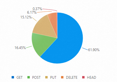
A pie chart is divided into slices to illustrate numerical proportion. The entire circle represents 100% of the data, and each slice's size shows its percentage of the total. Simple Log Service offers three types of pie charts: pie chart, donut chart, and polar area chart.
Donut chart: A donut chart is a pie chart with a hollow center. Compared to a standard pie chart, a donut chart offers the following advantages:
It provides more information by displaying a total value in the center.
It encourages viewers to compare the arc lengths of the slices rather than their central angles, which can make comparisons more intuitive.
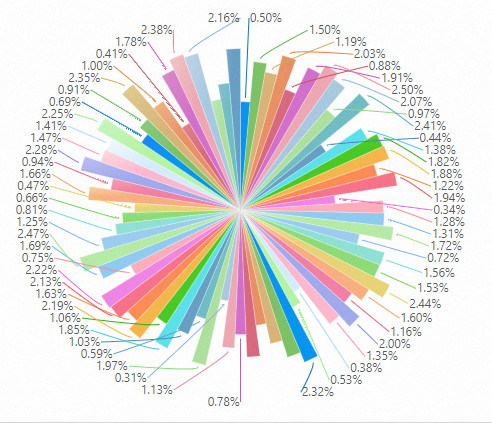
Polar area chart: This chart is a type of bar chart drawn in a polar coordinate system. Each category is given an equal segment of the circle, and the radius of each segment represents its data value. Compared to a pie chart, a polar area chart offers the following advantages:
Pie charts are best for datasets with fewer than 10 categories. Polar area charts are suitable for datasets with more categories (10 to 30).
Because the area of a slice is proportional to the square of its radius, a polar area chart amplifies the visual difference between values. This makes it ideal for comparing values that are close to each other.
A polar area chart is also well-suited for cyclical data, such as days of the week or months of the year, due to its circular layout.
For more information about how to add a chart, see Add a chart to a dashboard.
Examples
Type | Sample chart | References |
Basic pie chart |
| |
Donut chart |
| |
Polar area chart |
| |
Chart with multiple queries |
|


Configure a basic pie chart
Log on to the Simple Log Service console. In the Projects section, click the project you want.

In the left-side navigation pane, choose . In the Dashboard list, click the dashboard you want. In the upper-right corner of the dashboard page, click Edit. In edit mode, choose .
On the right side of the page, configure the settings in the Chart type and Query and analysis configuration panels. On the left side of the page, specify the time range, Logstore, and query statement. Then, click Apply at the top of the page to see the chart preview.
In the query and analysis configuration, set Category to
http_user_agentand Value Column topv.The following query statement calculates page views (PVs) by browser:
(*)| select count(1) as pv, case when http_user_agent like '%Chrome%' then 'Chrome' when http_user_agent like '%Firefox%' then 'Firefox' when http_user_agent like '%Safari%' then 'Safari' else 'unKnown' end as http_user_agent group by case when http_user_agent like '%Chrome%' then 'Chrome' when http_user_agent like '%Firefox%' then 'Firefox' when http_user_agent like '%Safari%' then 'Safari' else 'unKnown' end order by pv desc limit 10
General configurations
The General configurations panel contains global settings for the pie chart.
Basic configurations
Parameter
Description
Title
The title of the chart.
Display Title
After you turn on the Show Title switch, the title will be displayed in the pie chart.
Display Border
When you turn on the Show Border switch, a border is displayed in the pie chart.
Display Background
After you turn on the Show Background switch, a background color is displayed in the pie chart.
Display Time
After you turn on the Show Time switch, the query time will be displayed in the pie chart.
Fixed Time
Turning on the Fixed Time switch fixes the time for queries and analysis, so it is not affected by the dashboard's global time.
Standard configurations
Parameter
Description
Format
The display format for numeric values.
Unit
The unit for numeric values.
Decimal places
The number of decimal places to display for numeric values.
Display name
A custom display name for the chart.
Color scheme
The color scheme for the pie chart.
Built-in: Uses the built-in color palette.
Solid: Uses a single color that you select.
Query and analysis configuration
Parameter
Description
Category
The field used to categorize the data.
Value column
The field that provides the numeric values for the chart.
Pie chart configurations
Parameter
Description
Pie chart type
The type of pie chart. Valid values: Pie chart, donut chart, and polar area chart.
Label format
The format of the labels displayed on the chart's slices.
Percentage: The scale of the pie chart is displayed as a percentage, for example, 1.98%.
Category: Percentage: The labels in the pie chart are displayed as Category: Percentage, such as PUT: 1.98%.
Category: Value (Percentage): The labels in the pie chart are displayed in the Category: Value (Percentage) format, such as PUT: 120(1.98%).
Show labels
Select Yes to display labels on the chart slices.
Legend configurations
Parameter
Description
Display legend
After you turn on the Show Legend switch, the pie chart displays the legend.
Legend position
The position of the legend on the chart.
Action
The behavior when you click a legend item.
Single select: When you click a legend item, the chart displays only the data corresponding to that item.
Toggle: When you click a legend item, the data for that item is hidden. Click the item again to show the data.
Max width (height) %
The maximum width or height of the legend as a percentage of the chart area.
-
Variable substitution
Parameter
Description
Variable substitution
Variable substitution adds a variable-type filter to the chart. After configuration in General configurations, a filter appears in the upper-left corner of the chart. When you select a value, Simple Log Service replaces the variable in the query statement and reruns the analysis. Example 2: Set variable substitution.
Documentation link
Parameter
Description
Add documentation link
Adds a custom documentation link or description. The information is displayed in the upper-right corner of the chart.
Field configuration
The Field configuration panel lets you apply custom visualization settings to the results of a single query or to a specific column within those results. For more information about the available options, see General configurations.
For example, A > pv lets you configure the pv field from query A. You can set Standard configurations > Color scheme to solid to display the data in a single color.
Interaction occurrences
Interaction Occurrences let you perform drill-down analysis on a specific field or query. Supported interaction occurrences include Open Logstore, Open Saved Search, Open Dashboard, Open Trace Analysis, Open Trace Details, and Create Custom HTTP URL. For more information, see Configure drill-down analysis for a dashboard by using interaction occurrences.
For example, you can configure an interaction occurrence for the results of query A. If you set the action to Open Logstore, clicking any point on the pie chart and then clicking Open Logstore opens the specified Logstore.