A bar gauge in Simple Log Service displays multiple bars for different data or a single bar that acts as a progress bar to show percentages or data proportions.
Overview
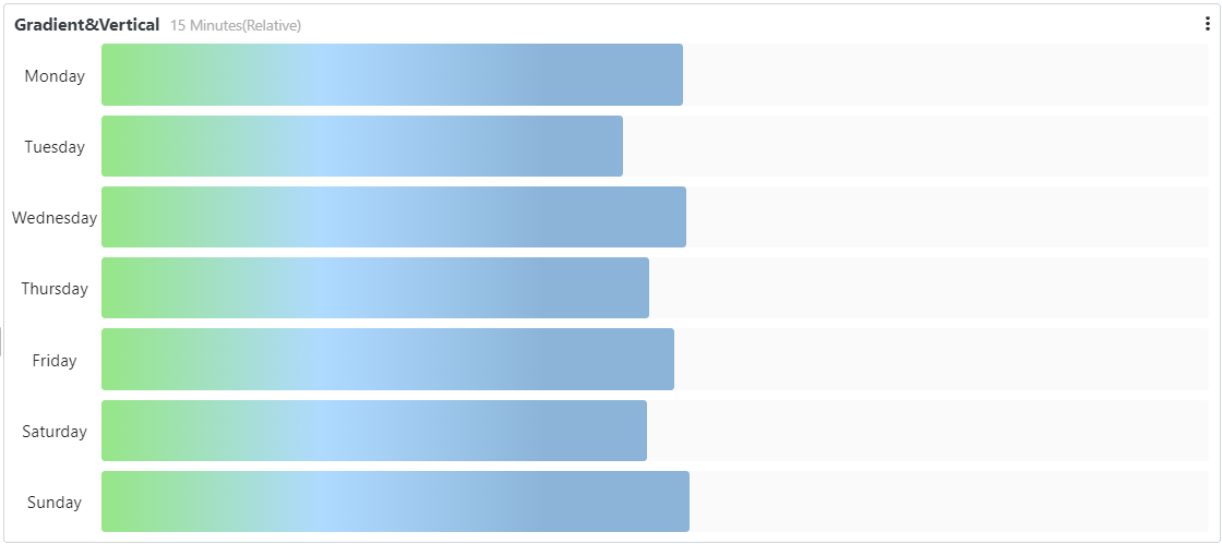
A bar gauge with multiple bars is typically used for top-N analysis.
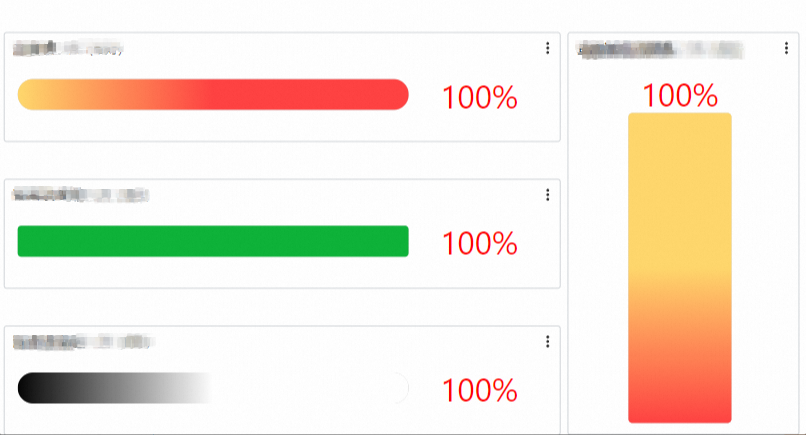
A bar gauge with a single bar is typically used as a progress bar to display percentages or data proportions.
To add a bar gauge to a dashboard, see Add a chart to a dashboard.
Bar gauge types
| Bar gauge type | Example | Related topics |
| Basic Metering Graph | 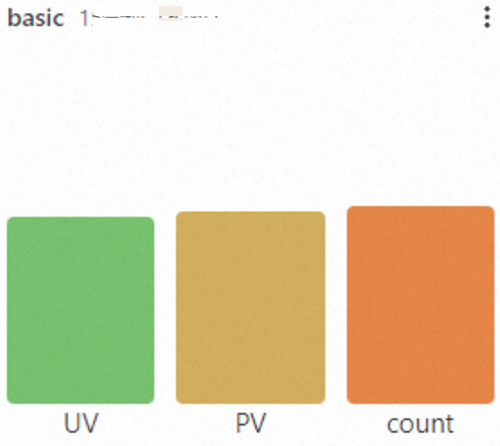 | Configure a basic bar gauge |
| Configuring the dial | 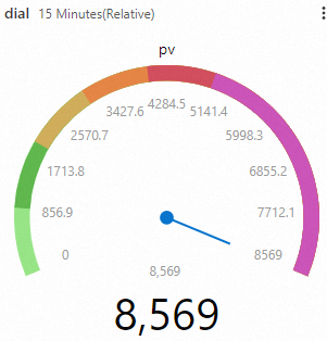 | Configure a dial |
| Multiple queries | 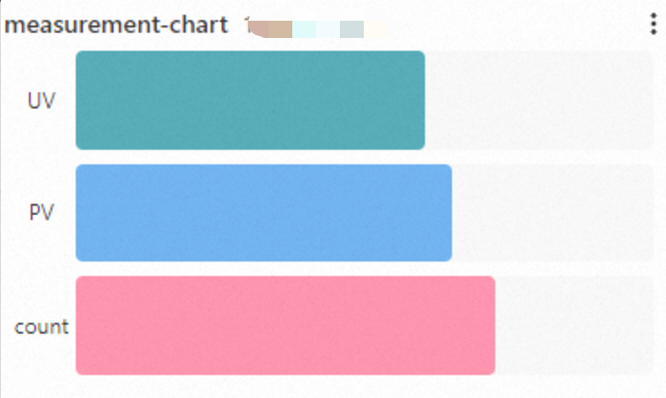 | Configure multiple queries |
Configure a basic bar gauge
Log on to the Simple Log Service console. In the Projects section, click the project you want.

In the left-side navigation pane, choose . Click the dashboard you want. In the upper-right corner of the page, click Edit. In edit mode, choose Add > Add Chart.
On the right side of the page, configure Chart Type and Style Settings. On the left side, configure the query time range, Logstore, and query statement. Then, click Apply at the top of the page to view the chart.
In this example, the Logstore is set to website_log, and the query time range is set to 15 Minutes (Relative).
The query statement to count the unique visitors (UVs) of a webpage:
status < 400 | SELECT approx_distinct(client_ip) AS UVThe query statement to count the page views (PVs) of a webpage:
status < 400 | SELECT count(*) AS PVThe query statement to count the number of log records:
* | SELECT count(*) AS count
General configurations
Configure global settings for the bar gauge.
Basic configurations
Parameter Description Title The title of the bar gauge. Display Title Turn on Display Title to show the title on the bar gauge. Display Border Turn on Display Border to show a border around the bar gauge. Display Background Turn on Display Background to show the background color of the bar gauge. Display Time Turn on Display Time to show the query time range on the bar gauge. Fixed Time Turn on Fixed Time to make the query time range independent of the global time range of the dashboard. Standard configurations
Parameter Description Format The display format for numbers. Unit The unit for numbers. Decimal places The number of decimal places for numbers. Display Name The row name. If you set a display name, all rows in the bar gauge use this name. To change a specific name, use the field configuration. Color Scheme The color scheme for the bar gauge. Built-in: Uses the built-in colors. Monochrome: Select a single color. Threshold: Displays colors based on threshold configurations. Data configuration
Parameter Description Display Mode The display mode for the bar gauge. Calculated value: Displays the value calculated by a function. All values: Displays all values of the target field from the query results. Calculation function If you set Display Mode to Calculated value, select a function to calculate the query results. For example, if you set Calculation function to Maximum, the bar gauge displays the maximum value from the results of each query. Layout The layout of the bar gauge. Horizontal: The bars are arranged from left to right. You can also use Minimum width to control the minimum width. Vertical: The bars are arranged from bottom to top. You can also use Minimum height to control the minimum height. Minimum width The minimum width of the bars. Show percentage Shows the percentage of each bar's value relative to the maximum value. Show Title Turn on Show Title to display the title in the bar gauge. Style settings
Parameter Description Display Mode Controls the appearance of the bar gauge. Gradient: A bar with a gradient based on thresholds. Retro LCD: A bar that looks like an LCD progress bar. Basic: A monochrome bar. Dial: A dial. Show empty area Turn this on to render the unfilled area of the bar in gray.
NoteThis does not apply to the Retro LCD mode.
Minimum range The minimum value to display. Maximum range The maximum value to display. Value font color The color of the displayed numbers. Value font size The font size of the numbers. Title font size The font size of the title. Edge shape The shape of the bar gauge edges. Thickness The thickness of the bar gauge. Base color The base color of the bar gauge. Query and analysis configuration
Parameter Description Displayed Fields The fields to display in the bar gauge. Use query result Turn on Use query result to select the Field with maximum value. Thresholds
Parameter Description Threshold mode The display mode for thresholds. Threshold The thresholds for the data. If you set Color Scheme to Threshold and set thresholds here, the system displays the bar gauge with the corresponding threshold colors. Value mappings
Parameter Description Value mapping Replace values in the bar gauge with words or icons. For example, set Value to 200, Mapping type to Text, and Mapping value to Success. The value 200 in the bar gauge is then replaced with Success. Variable substitution
Parameter Description Variable substitution Variable substitution adds a variable-type filter to the chart. After configuration in General configurations, a filter appears in the upper-left corner of the chart. When you select a value, Simple Log Service replaces the variable in the query statement and reruns the analysis. Document links
Parameter Description Add document link Add a custom document link or description. The information is displayed in the upper-right corner of the bar gauge.
Field configuration
Apply custom visualization settings to the results of a single query or a single data column. For descriptions of the configuration items, see General configurations.
For example, you can use a query statement to count the number of requests for each request method and display the results in a bar gauge. In the Field configuration section, you can set a different color for each bar.
configures the
POSTcolumn in query A and sets the corresponding bar to blue.configures the
PUTcolumn in query A and sets the corresponding bar to green.configures the
Dcolumn in query A and sets the corresponding bar to yellow. BecauseDELETEis a keyword in SQL syntax, it cannot be used directly in an analytic statement. You can set the display name toDELETE.configures the
GETcolumn in query A and sets the corresponding bar to red.configures the
HEADcolumn in query A and sets the corresponding bar to purple.
Interaction events
Configure interactions for the results of a single query or a single data column to enable deeper data analysis. Interaction events include opening a Logstore, opening a saved search, opening a dashboard, opening Trace Analysis, opening Trace Details, and using a custom HTTP link. For more information, see Add interaction events to a dashboard for drill-down analysis.
For example, you can use the A option to set an interaction event for the results of query A. If you set the event to Open Logstore, you can click any point on the bar for query A and then click Open Logstore to go to the specified Logstore.