Radar charts visualize multidimensional data, making it easy to compare multiple data series across the same set of dimensions.
Overview
A radar chart is ideal for comparing multiple data series across the same dimensions.
For example, a query returns four columns: request_method, total, avg_time, and avg_length, representing the total requests, average response time, and average response length for each HTTP method (HEAD, PUT, POST, GET, and DELETE). A radar chart can compare these metrics side by side.
The following chart shows how these metrics compare across request methods.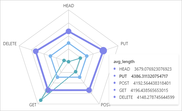
To add a chart to a dashboard, see Add a statistical chart to a dashboard.
Common settings
Configure global display properties for the radar chart.
-
Basic settings
Parameter
Description
Title
The title of the radar chart.
Display Title
Turn on this switch to display the title on the chart.
Display Border
Turn on this switch to display a border around the chart.
Display Background
Turn on this switch to apply a background color to the chart.
Display Time
Turn on this switch to display the query time on the chart.
Fixed Time
Turn on this switch to fix the query time range. When enabled, the time range is not affected by the global time setting of the dashboard.
-
Standard settings
Parameter
Description
Format
The display format of numeric values.
Unit
The unit of numeric values.
Number of Digits after Decimal Point
The number of decimal places for numeric values.
Display Name
A custom display name applied to all legend items.
To name a specific item, use the field settings.
Color Scheme
The color scheme for the radar chart.
-
Built-in: Use the built-in color palette.
-
Solid: Select a single color.
-
-
Query and analysis settings
Parameter
Description
Category
The field used to categorize data.
Value Column
The field that contains the numeric values for the chart.
-
Radar chart settings
Parameter
Description
Radar chart type
The shape of the radar chart. Valid values: Polygon and Circle.
-
Graphics settings
Parameter
Description
Point Size
The size of data points on the chart.
Line Width
The width of connectors on the chart.
-
Legend settings
Parameter
Description
Display Legend
Turn on this switch to display the legend on the chart.
Legend Position
The position of the legend.
Actions
The action triggered when a user clicks a legend item.
-
Single: Displays only the clicked data series.
-
Switch: Hides the clicked data series. Click the item again to show it.
Maximum width (height)%
The maximum width or height of the legend, expressed as a percentage of the chart area.
-
-
Variable substitution
Parameter
Description
Variable substitution
Variable substitution adds a variable-type filter to the chart. After configuration in General configurations, a filter appears in the upper-left corner of the chart. When you select a value, Simple Log Service replaces the variable in the query statement and reruns the analysis. Example 2: Set variable substitution.
-
Documentation link
Parameter
Description
Add Documentation Link
A custom documentation link or description that appears in the upper-right corner of the chart.
Field settings
Customize the visualization of a specific query result or column. For configuration item descriptions, see Common settings.
On the Field Configuration tab, you can set colors, widths, and other connector properties per column. The following examples show two field configurations.
-
A > avg_length: Configures the avg_length column from Query A. The connector color is pink, the connector width is 5, and the point size is 8.
-
A > avg_time: Configures the avg_time column from Query A. The connector width is 3, and the point size is 5.
Drill-down events
Drill-down events enable deeper analysis on a specific field or query. Available events include opening a Logstore, a saved search, a dashboard, a trace analysis, or trace details, and creating a custom HTTP link. For more information, see Add drill-down events to a dashboard.
For example, A > avg_length sets a drill-down event for the avg_length column from Query A. If you set this event to Open Logstore, clicking any point on the pink connector lets you select Open Logstore to navigate to the specified Logstore.