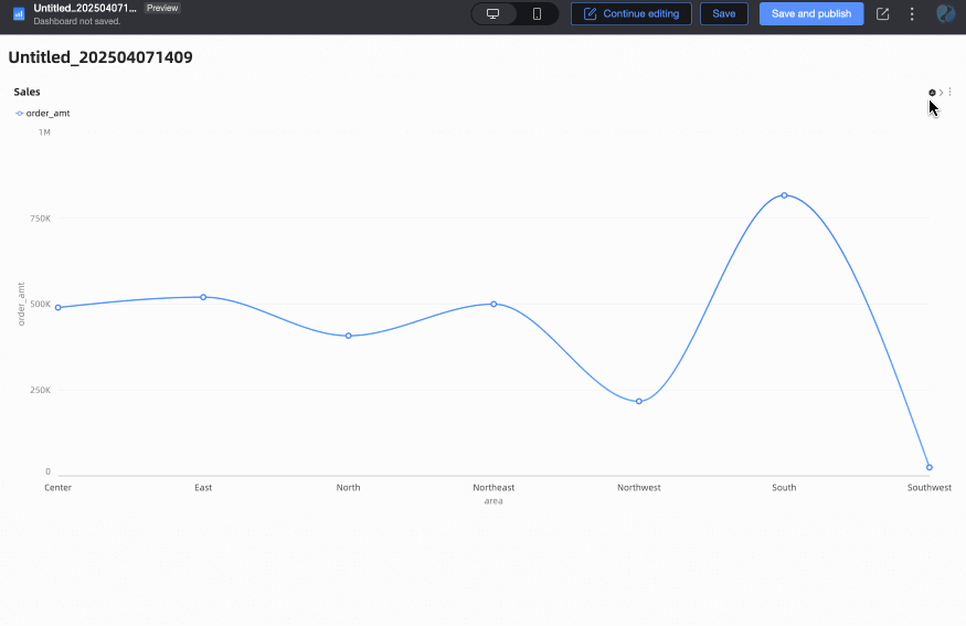
Configure the style of a chart's title and card area on the Style tab of the dashboard edit page. This topic uses a line chart as an example.
Configure title
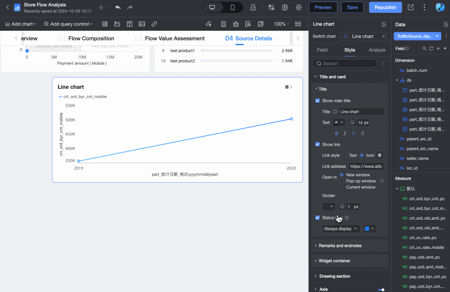
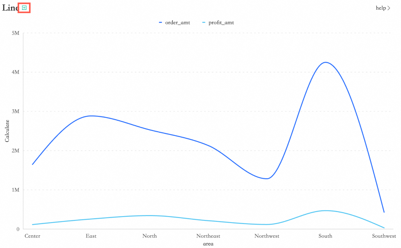
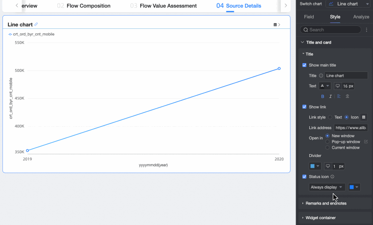
In the Title and Card section, customize the Main title content, Show Link, and status icon.

|
Parameter |
Setting |
Description |
|
① Title |
Main title content |
Enter a custom title for the chart. For example: Sales Data Analysis. |
|
text format |
Set the text style for the chart title. |
|
|
② Show Link |
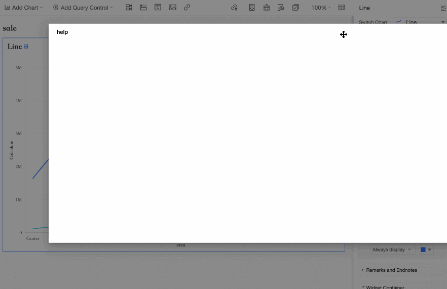
link style |
Set the link display style. Options: text or icon.
|
|
Link Address |
Enter the destination URL. |
|
|
Open with |
Set how the link opens. Options: New window, Pop-up, or Current window.
|
|
|
Divider |
Set the style of the divider. |
|
|
③ Status icon |
In the Status icon section, configure the display mode and color of the icons. After you enable this option, two display modes are available: Always show and Show on hover (default). Show on hover displays the icons only when you interact with the chart. Note
The status icon refers to five types of icons: linkage, jump, drill-down, filtered, and fluctuation analysis.
|
|


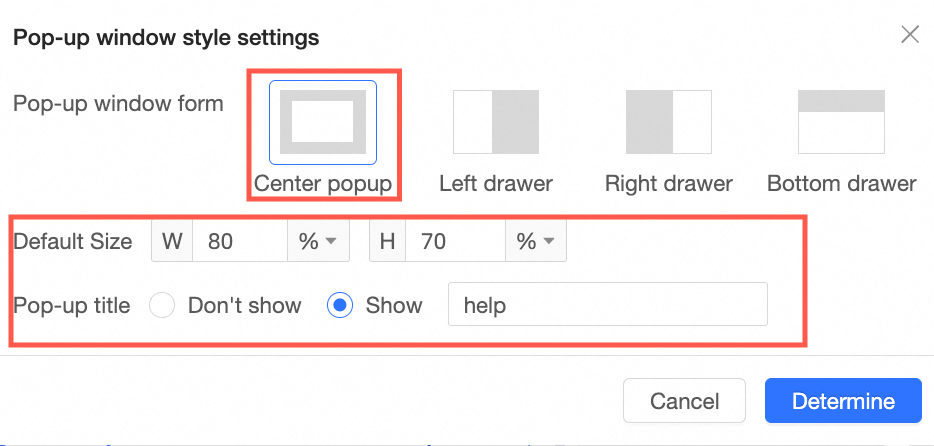
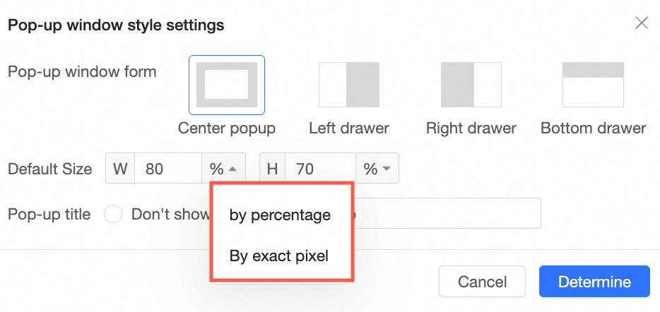
 icon next to Pop-up to configure the Pop-up type, Default size, Pop-up title, and page overlay.
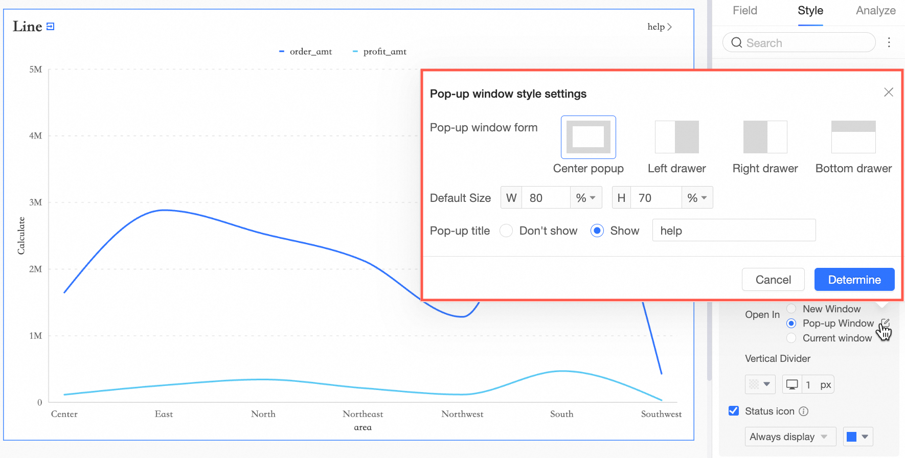


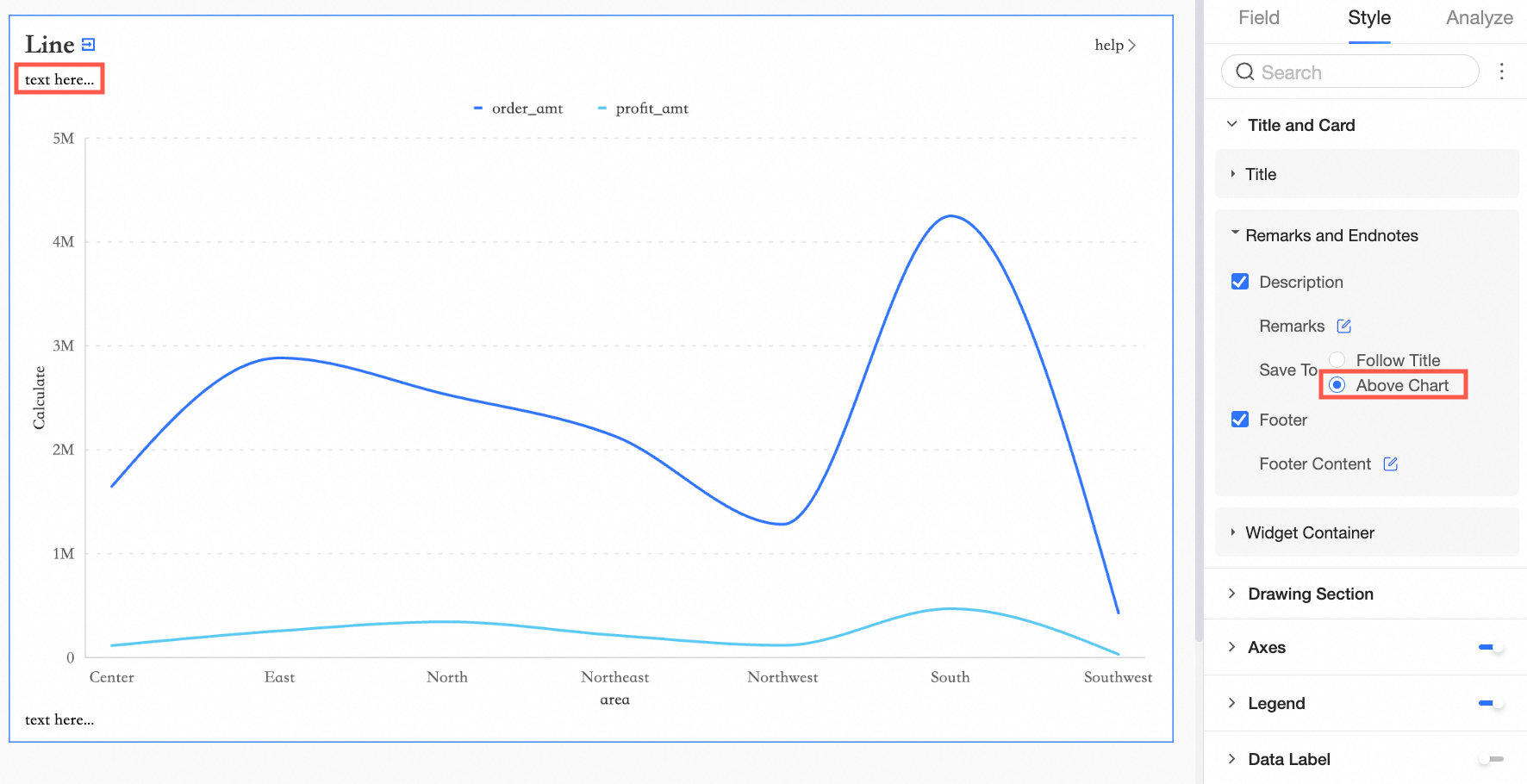
Notes and endnotes
In the Notes and Endnotes section, configure note and endnote content.
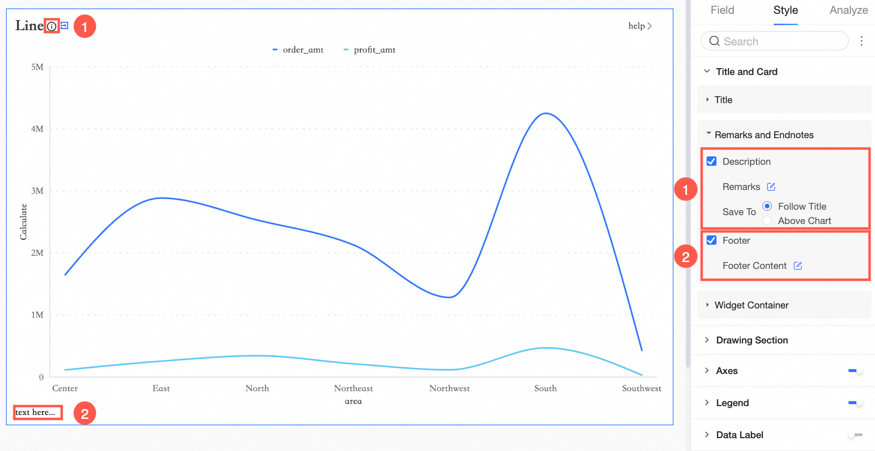
For note position, select below title or above chart.
-
Below title
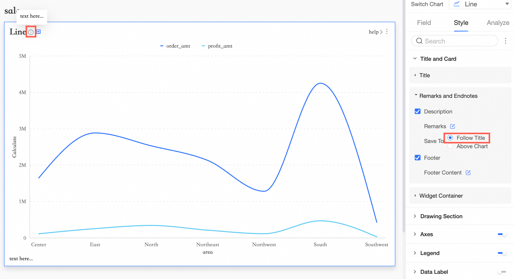
-
Above chart
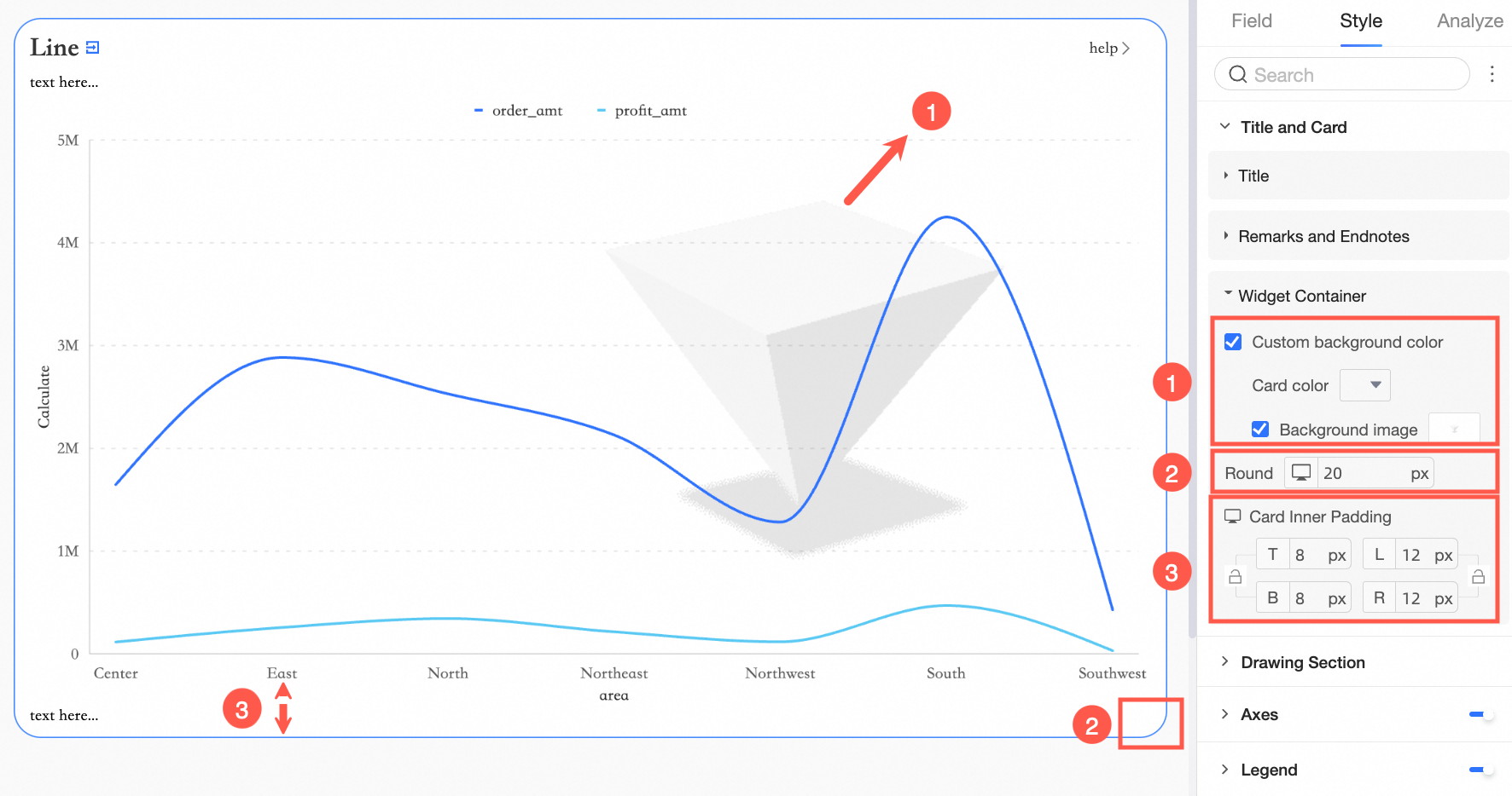
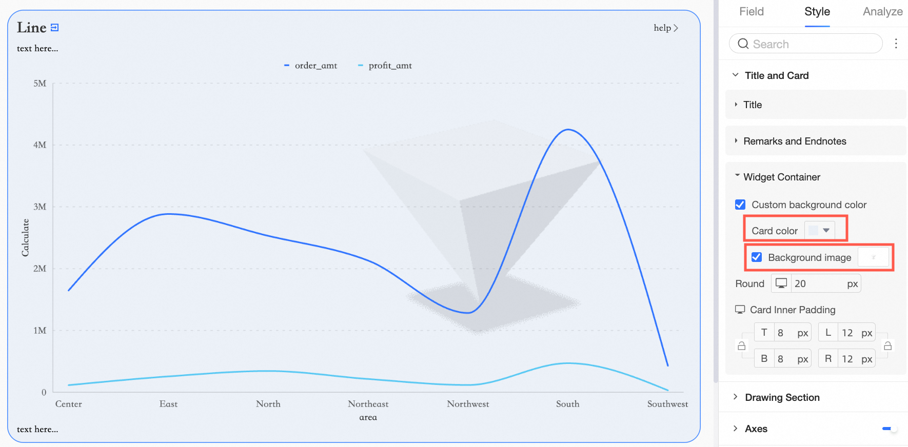
Configure the component container
In the component container section, configure the background fill (①), corner radius (②), and card padding (③).
-
① background fill: Select custom background fill to customize the background color and image of the component container. You can use a system-provided image or upload a custom one. For more information, see Custom Background Fill.
-
② corner radius: Set the roundness of the container's corners.
-
③ card padding: Set the space between the chart content and the container's border.
The supported configuration items vary by chart type. See the following table for details.
In the title and card area configuration,  indicates support, and
  indicates no support.
|
Component |
Custom title |
Notes |
Footer note |
Display link |
Card padding |
Custom background |
|
|
Controls |
tab |
|
|
|
|
|
|
|
rich text |
|
|
|
|
|
|
|
|
query control |
|
|
|
|
|
|
|
|
composite query control |
|
|
|
|
|
|
|
|
image |
|
|
|
|
|
|
|
|
embedded page |
|
|
|
|
|
|
|
|
Metrics |
metric board |
|
|
|
|
|
|
|
trend chart |
|
|
|
|
|
|
|
|
gauge |
|
|
|
|
|
|
|
|
progress bar |
|
|
|
|
|
|
|
|
liquid fill gauge |
|
|
|
|
|
|
|
|
digital flip counter |
|
|
|
|
|
|
|
|
decomposition tree |
|
|
|
|
|
|
|
|
metric relation graph |
|
|
|
|
|
|
|
|
Tables |
trend analysis table |
|
|
|
|
|
|
|
crosstab |
|
|
|
|
|
|
|
|
detail table |
|
|
|
|
|
|
|
|
heatmap |
|
|
|
|
|
|
|
|
Line and area charts |
line chart |
|
|
|
|
|
|
|
area chart |
|
|
|
|
|
|
|
|
stacked area chart |
|
|
|
|
|
|
|
|
percentage stacked area chart |
|
|
|
|
|
|
|
|
combo chart |
|
|
|
|
|
|
|
|
Column and bar charts |
column chart |
|
|
|
|
|
|
|
stacked column chart |
|
|
|
|
|
|
|
|
percentage stacked column chart |
|
|
|
|
|
|
|
|
bar chart |
|
|
|
|
|
|
|
|
stacked bar chart |
|
|
|
|
|
|
|
|
percentage stacked bar chart |
|
|
|
|
|
|
|
|
radial column chart |
|
|
|
|
|
|
|
|
leaderboard |
|
|
|
|
|
|
|
|
waterfall chart |
|
|
|
|
|
|
|
|
dynamic bar chart |
|
|
|
|
|
|
|
|
Pie and donut charts |
pie chart |
|
|
|
|
|
|
|
rose chart |
|
|
|
|
|
|
|
|
radar chart |
|
|
|
|
|
|
|
|
treemap |
|
|
|
|
|
|
|
|
Bubble and scatter plots |
bubble chart |
|
|
|
|
|
|
|
scatter plot |
|
|
|
|
|
|
|
|
faceted scatter plot |
|
|
|
|
|
|
|
|
Funnel and conversion charts |
funnel chart |
|
|
|
|
|
|
|
comparison funnel chart |
|
|
|
|
|
|
|
|
sankey diagram |
|
|
|
|
|
|
|
|
sankey diagram |
|
|
|
|
|
|
|
|
Maps |
bubble map |
|
|
|
|
|
|
|
choropleth map |
|
|
|
|
|
|
|
|
heat map |
|
|
|
|
|
|
|
|
flow map |
|
|
|
|
|
|
|
|
symbol map |
|
|
|
|
|
|
|
|
Others |
word cloud |
|
|
|
|
|
|
|
timeline chart |
|
|
|
|
|
|
|
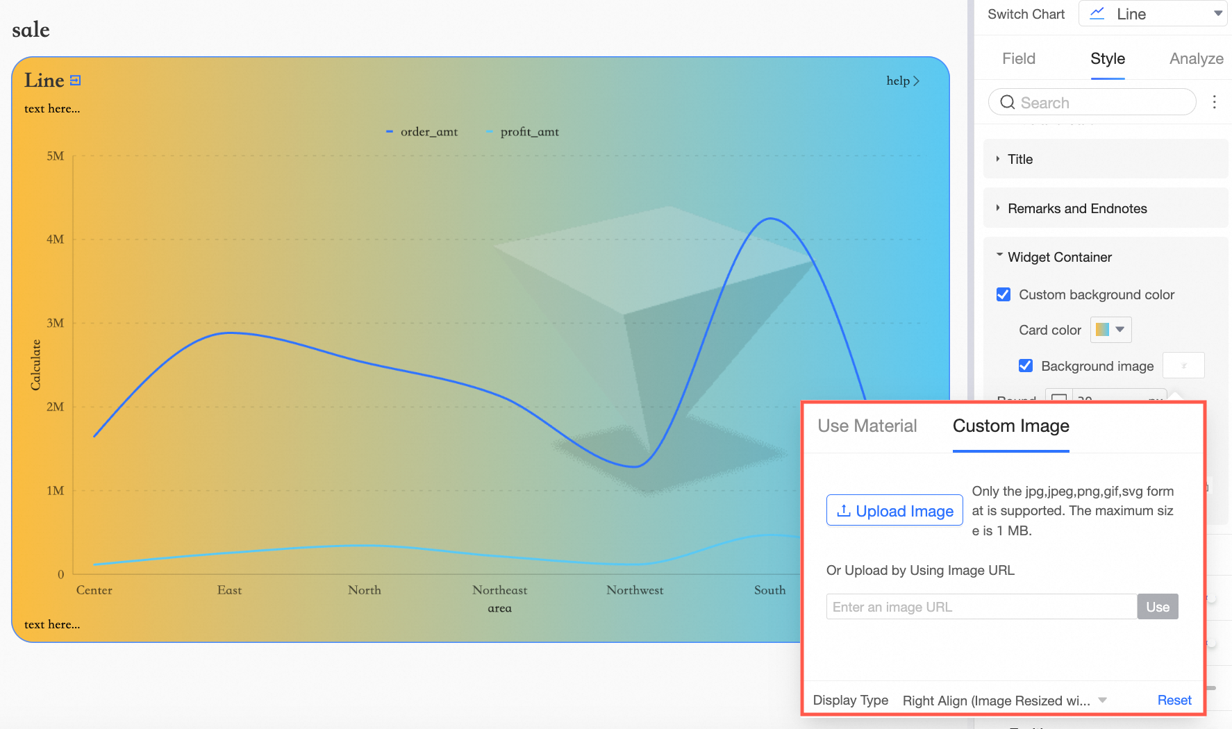
Custom background fill
Configure the custom background fill in the component container.
-
Set the card color to a solid color or gradient.
-
For the background image, use a built-in or custom image.
The following components support custom background fill.
-
Controls
tab, image
-
Metrics
dashboard, metric trend chart, progress bar, liquid fill gauge, digital flip counter
-
Trend
line chart, area chart, stacked area chart, 100% stacked area chart, combo chart
-
Comparison
column chart, stacked column chart, 100% stacked column chart, bar chart, stacked bar chart, 100% stacked bar chart, radial bar chart