A nested calculation applies two or more advanced calculations sequentially to a single measure, enabling complex, multi-step analyses on your data.
Prerequisites
-
You have created a dashboard. For more information, see Create a dashboard.
-
You have selected a target dataset and configured the chart fields. For more information, see Configure chart fields.
Limitations
The following chart types support nested calculations.
|
Chart type |
Chart name |
|
Tables |
crosstab, detail table, heatmap. |
|
KPIs |
scorecard, KPI trend chart. |
|
Line/Area charts |
line chart, area chart, stacked area chart, 100% stacked area chart, combo chart. |
|
Column/Bar charts |
column chart, stacked column chart, 100% stacked column chart, radial bar chart, leaderboard, bar chart, stacked bar chart, 100% stacked bar chart, waterfall chart, bullet chart, box plot. |
|
Pie/Donut charts |
pie chart, rose chart, sunburst chart, radar chart, treemap. |
|
Bubble/Scatter charts |
bubble chart, scatter plot, faceted scatter plot. |
|
Funnel/Conversion charts |
funnel chart, comparison funnel chart. |
|
Maps |
choropleth map, bubble map, heat map, building heat map, flow map, symbol map. |
|
Other |
word cloud. |
Configure a nested calculation
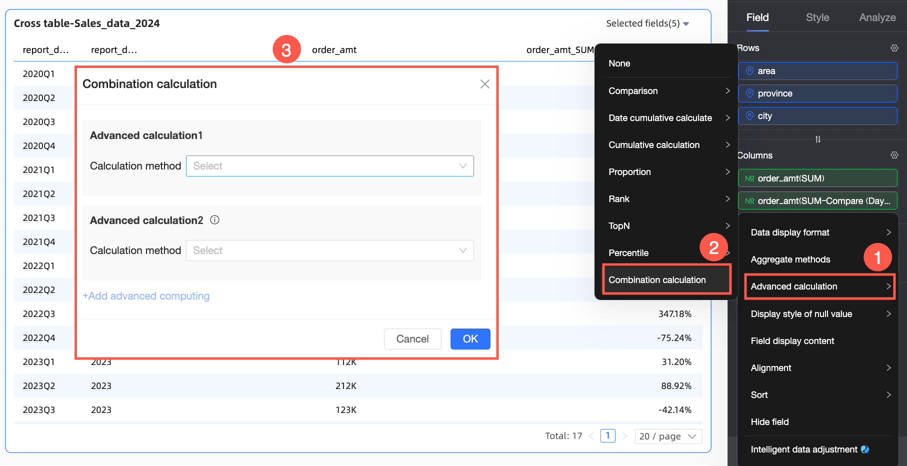
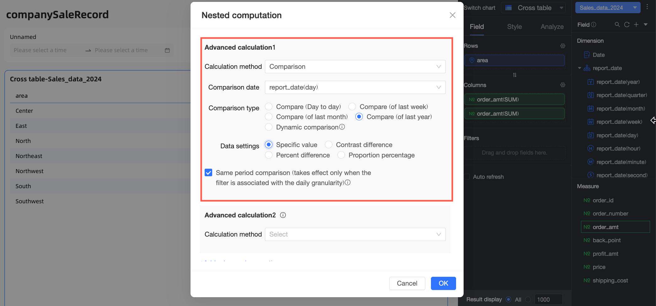
In the Fields panel of your chart, find the measure that you want to use. Click the  icon next to the measure and select Advanced Calculation > Nested Calculation. In the Nested Calculation dialog box, configure the logic for Advanced Calculation 1 and Advanced Calculation 2 based on your business requirements.
During execution, Advanced Calculation 2 processes the result of Advanced Calculation 1.
Use cases
The following examples use a crosstab to demonstrate nested calculations.
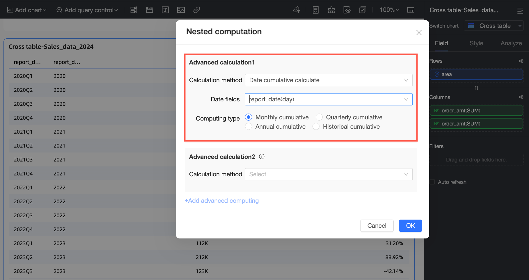
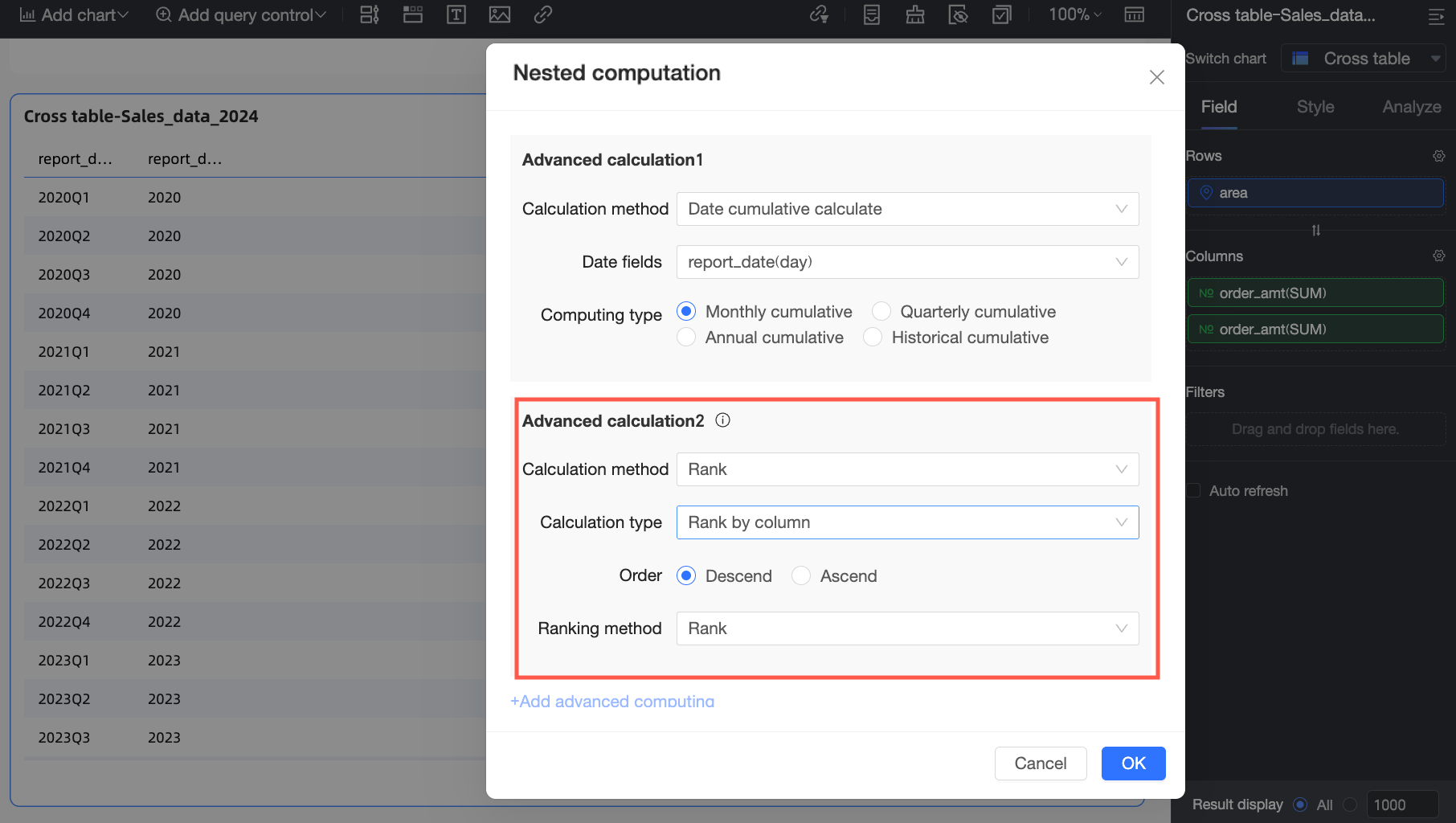
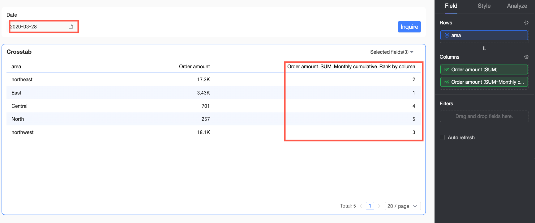
Example 1: Rank monthly cumulative sales
Use case: On July 16, 2016, you want to calculate the cumulative order amount for each region from the beginning of the month to the current date, and then rank the regions by this amount. This requires a running total calculation followed by a rank calculation.
-
In the Nested Calculation dialog box, select running total for Advanced Calculation 1.
A running total is the cumulative sum of data from a start date to the current date. For more information, see Running total.
-
For Advanced Calculation 2, select rank. After configuring the settings, click OK.
Ranking sorts data based on value. For more information, see Data ranking.
-
In the date filter, set the date to 2016-07-16 and click Query. The chart displays the rank of the cumulative order amount for each region from July 1 to July 16, 2016.
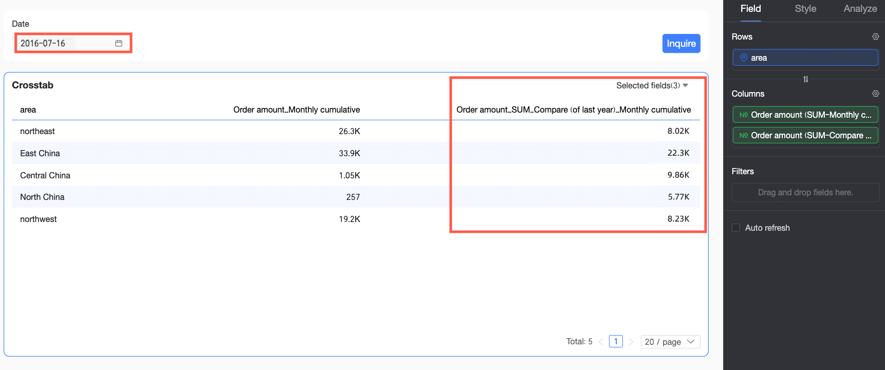
Example 2: Compare period-over-period cumulative sales
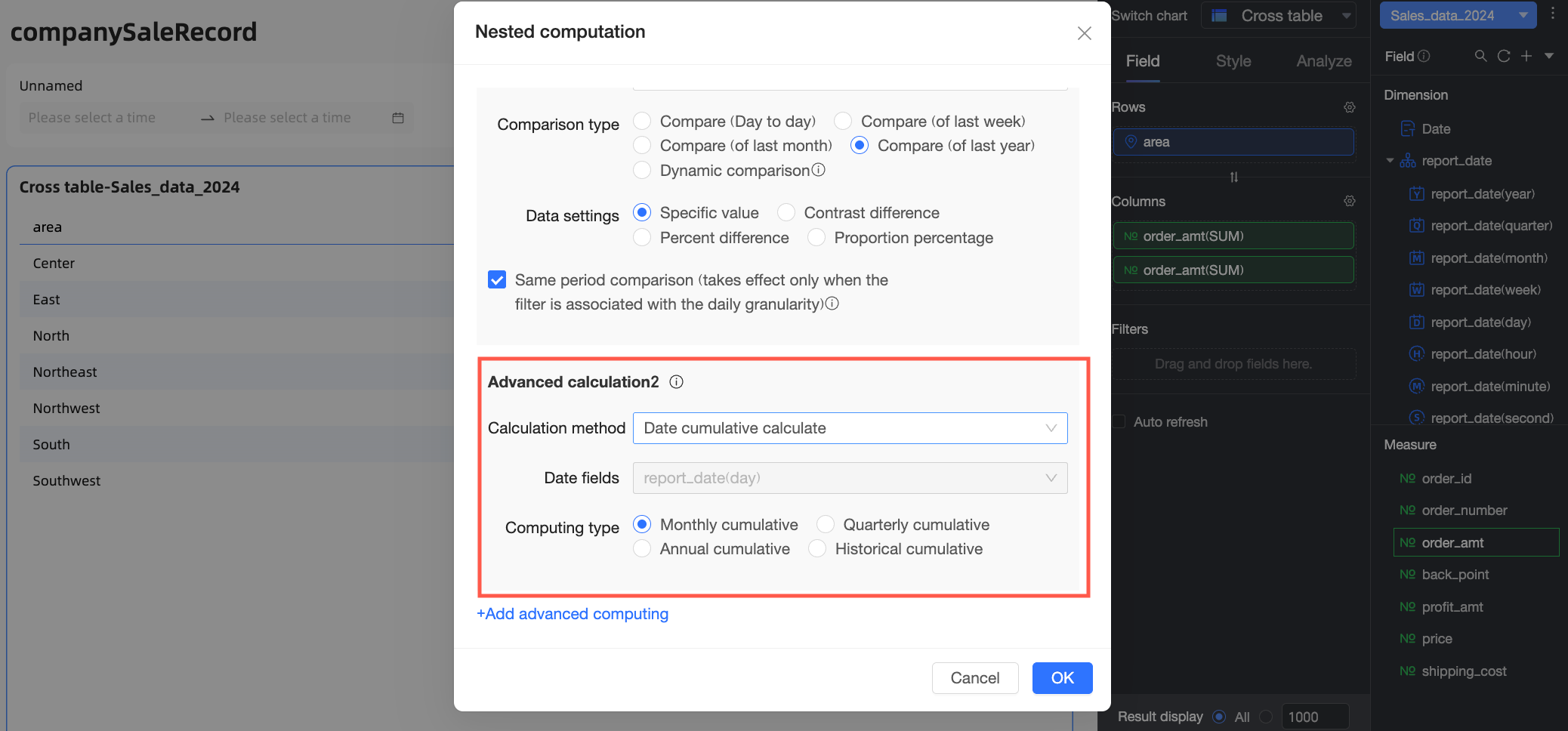
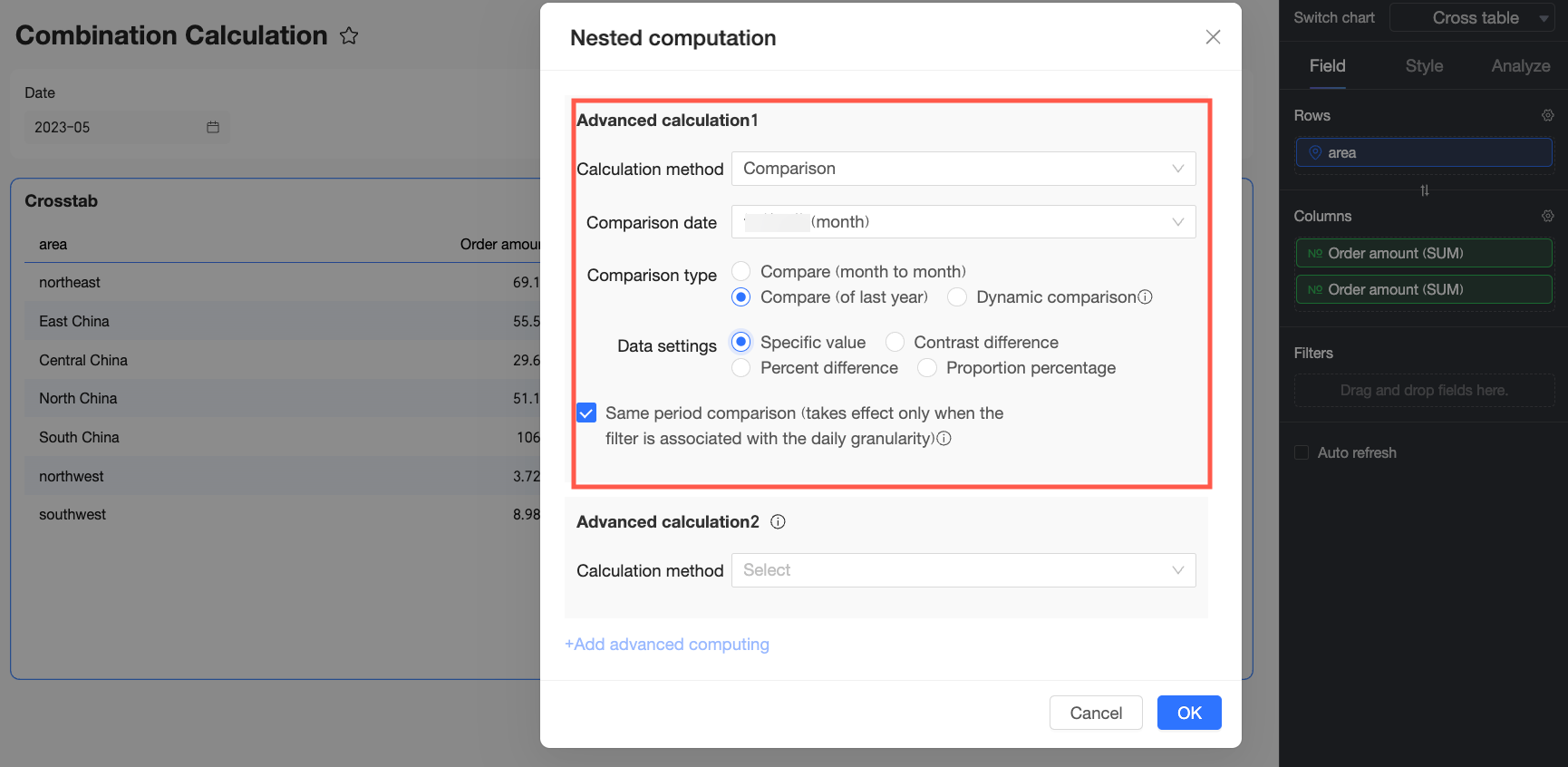
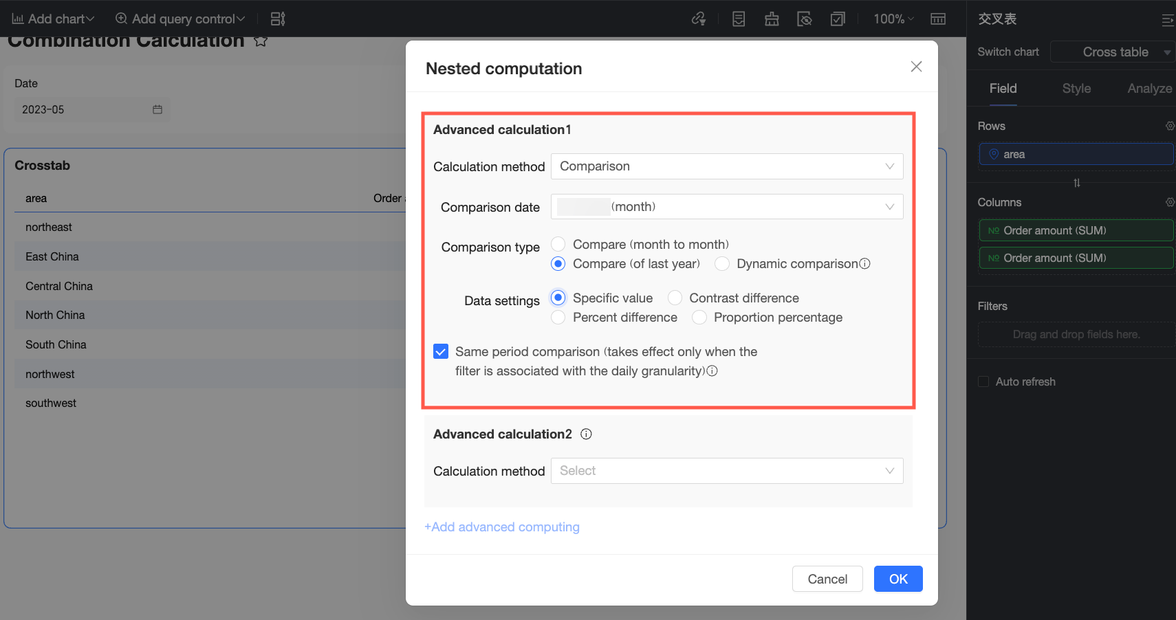
Use case: You want to compare the cumulative monthly order amount for each region from July 1-16, 2016, with the same period in the previous year (July 1-16, 2015). This requires a period-over-period comparison first to get the previous year's data, followed by a running total calculation.
-
In the Nested Calculation dialog box, select YoY and MoM for Advanced Calculation 1 and configure it based on your requirements.
A period-over-period comparison measures data changes over different time periods, such as year-over-year (YoY) and month-over-month (MoM). For more information, see Period-over-period comparison.
-
For Advanced Calculation 2, select running total. After configuring the settings, click OK.
A running total is the cumulative sum of data from a start date to the current date. For more information, see Running total.
-
In the date filter, set the date to 2016-07-16 and click Query. The chart displays the cumulative monthly order amount for each region from July 1 to July 16, 2015.
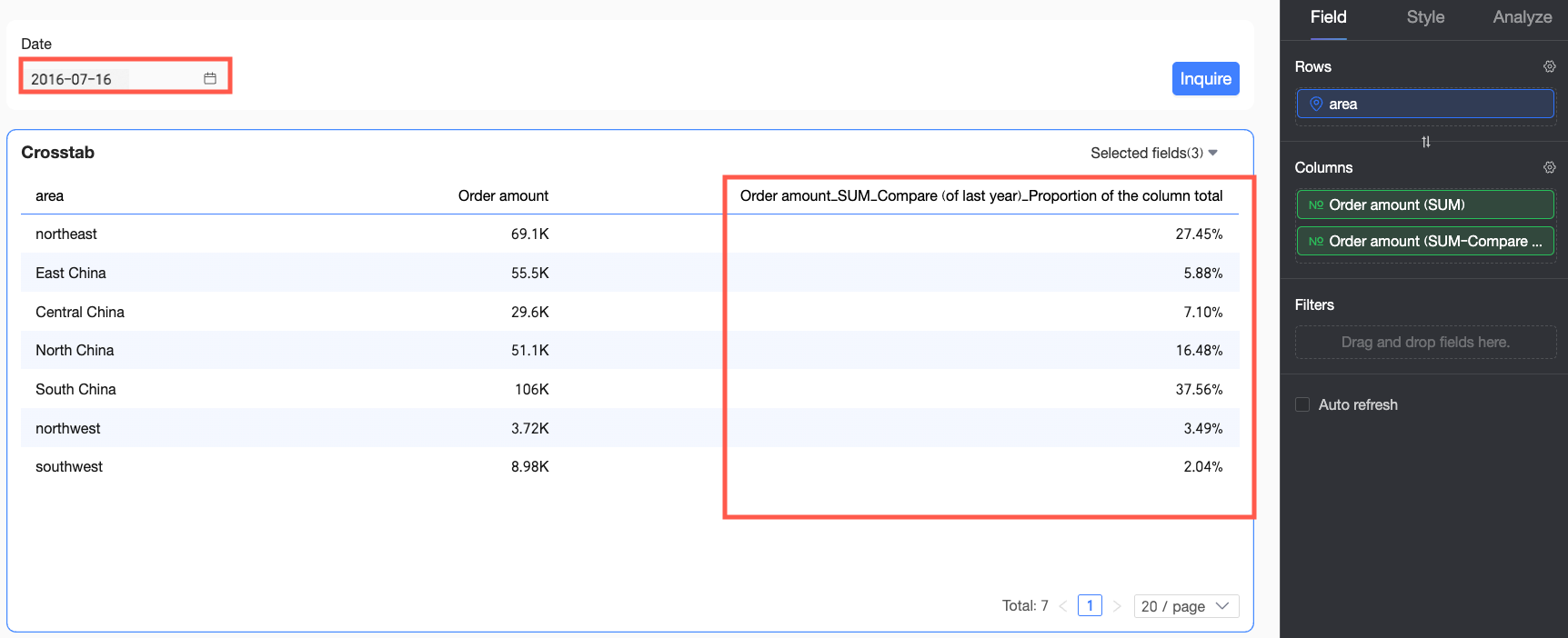
Example 3: Compare period-over-period percentage of total sales
Use case: You want to compare the percentage of total order amount for each region in July 2016 with the same period in the previous year (July 2015). This requires a period-over-period comparison first, followed by a percentage of total calculation.
-
In the Nested Calculation dialog box, select YoY and MoM for Advanced Calculation 1 and configure it based on your requirements.
A period-over-period comparison measures data changes over different time periods, such as year-over-year (YoY) and month-over-month (MoM). For more information, see Period-over-period comparison.
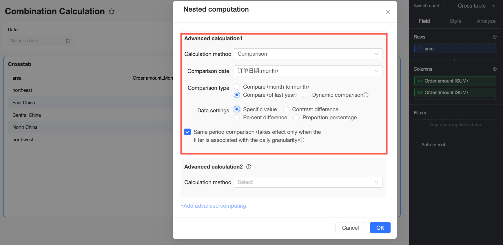
-
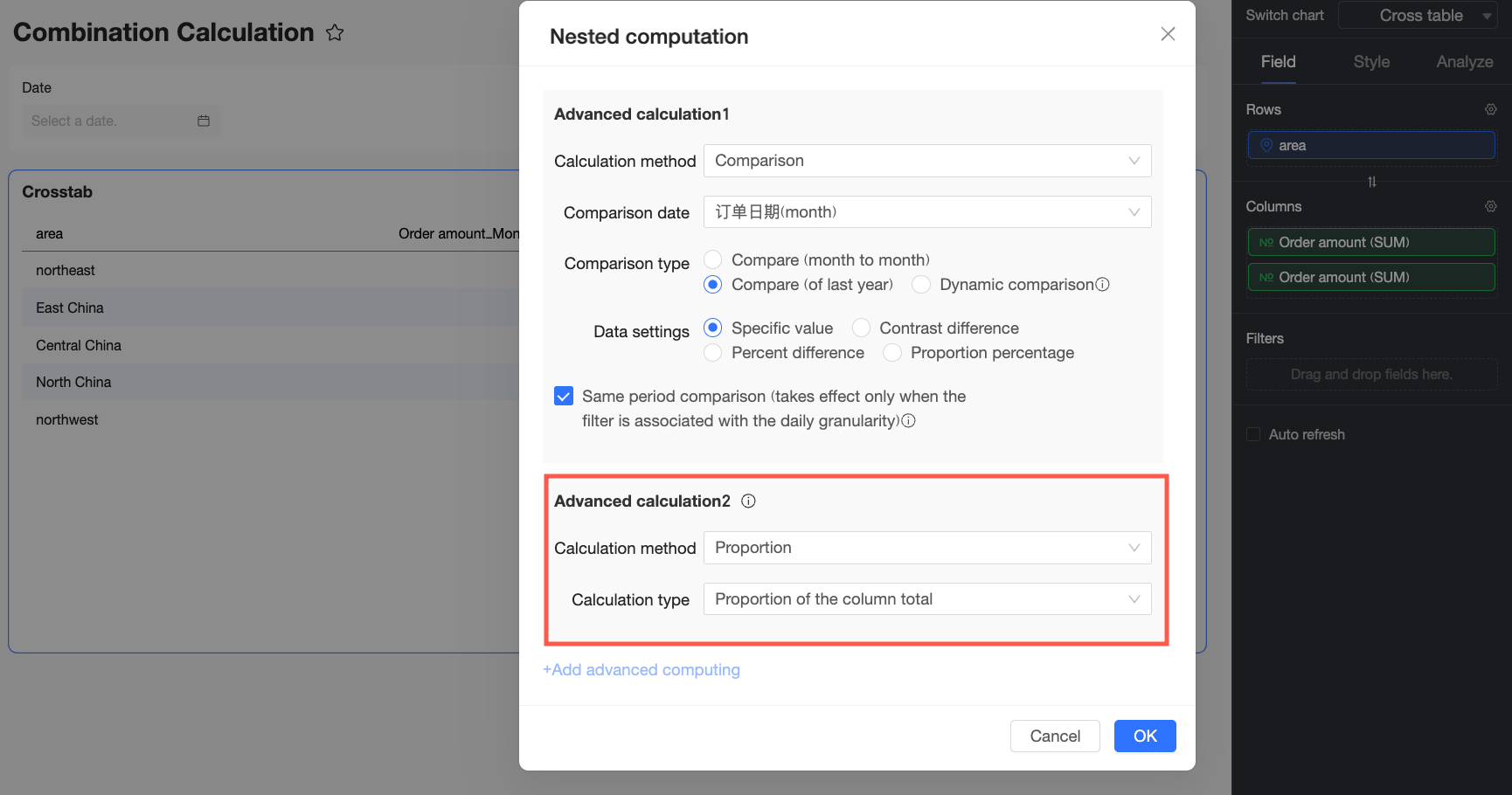
For Advanced Calculation 2, select percentage of total. After configuring the settings, click OK.
The percentage of total calculation computes the proportion of a value relative to the total. For more information, see Percentage of total calculation.
-
In the date filter, set the date to July 2016 and click Query. The chart displays the percentage of total order amount for each region in July 2015.
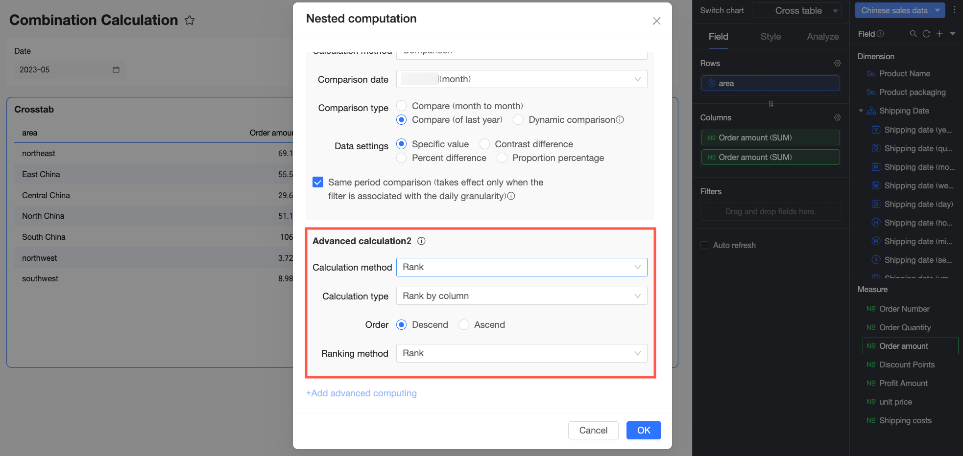
Example 4: Compare period-over-period sales rank
Use case: You want to compare the sales rank of each region in July 2016 with the rank from the same period in the previous year (July 2015). This requires a period-over-period comparison first, followed by a rank calculation.
-
In the Nested Calculation dialog box, select YoY and MoM for Advanced Calculation 1 and configure it based on your requirements.
A period-over-period comparison measures data changes over different time periods, such as year-over-year (YoY) and month-over-month (MoM). For more information, see Period-over-period comparison.
-
For Advanced Calculation 2, select rank. After configuring the settings, click OK.
Ranking sorts data based on value. For more information, see Data ranking.
-
In the date filter, set the date to July 2016 and click Query. The chart displays the sales rank for each region in July 2015.

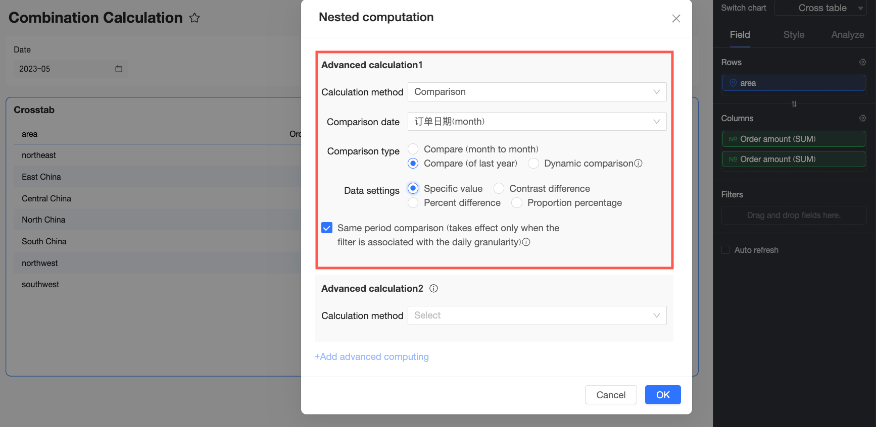
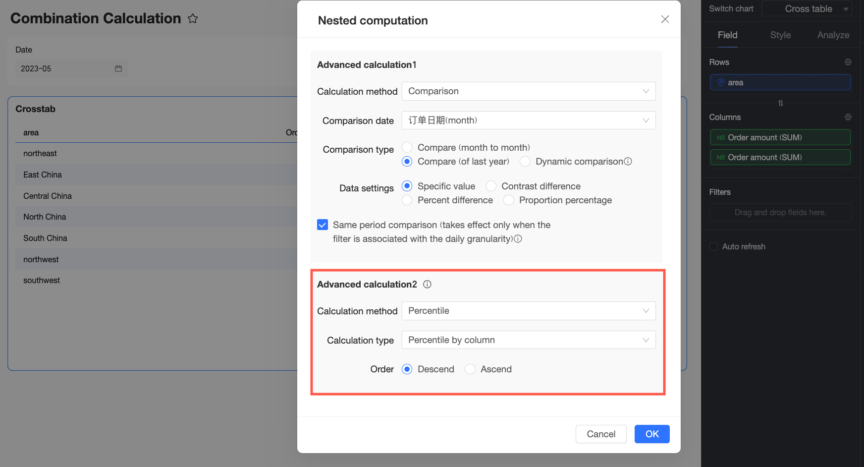
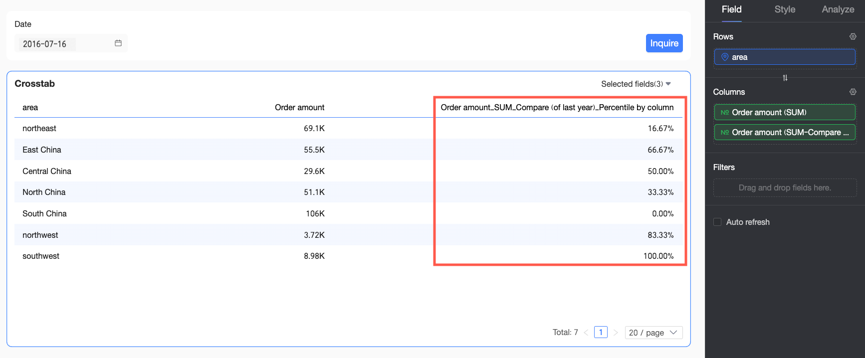
Example 5: Compare period-over-period sales percentile
Use case: You want to compare the sales percentile of each region in July 2016 with the percentile from the same period in the previous year (July 2015). This requires a period-over-period comparison first, followed by a percentile calculation.
-
In the Nested Calculation dialog box, select YoY and MoM for Advanced Calculation 1 and configure it based on your requirements.
A period-over-period comparison measures data changes over different time periods, such as year-over-year (YoY) and month-over-month (MoM). For more information, see Period-over-period comparison.
-
For Advanced Calculation 2, select percentile. After configuring the settings, click OK.
A percentile indicates the relative standing of a value within a dataset. For more information, see Percentile.
-
In the date filter, set the date to July 2016 and click Query. The chart displays the sales percentile for each region in July 2015.
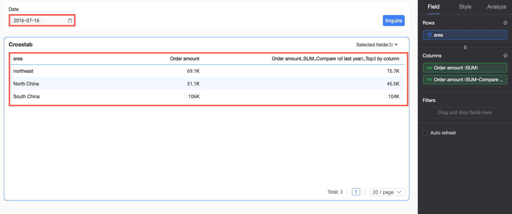
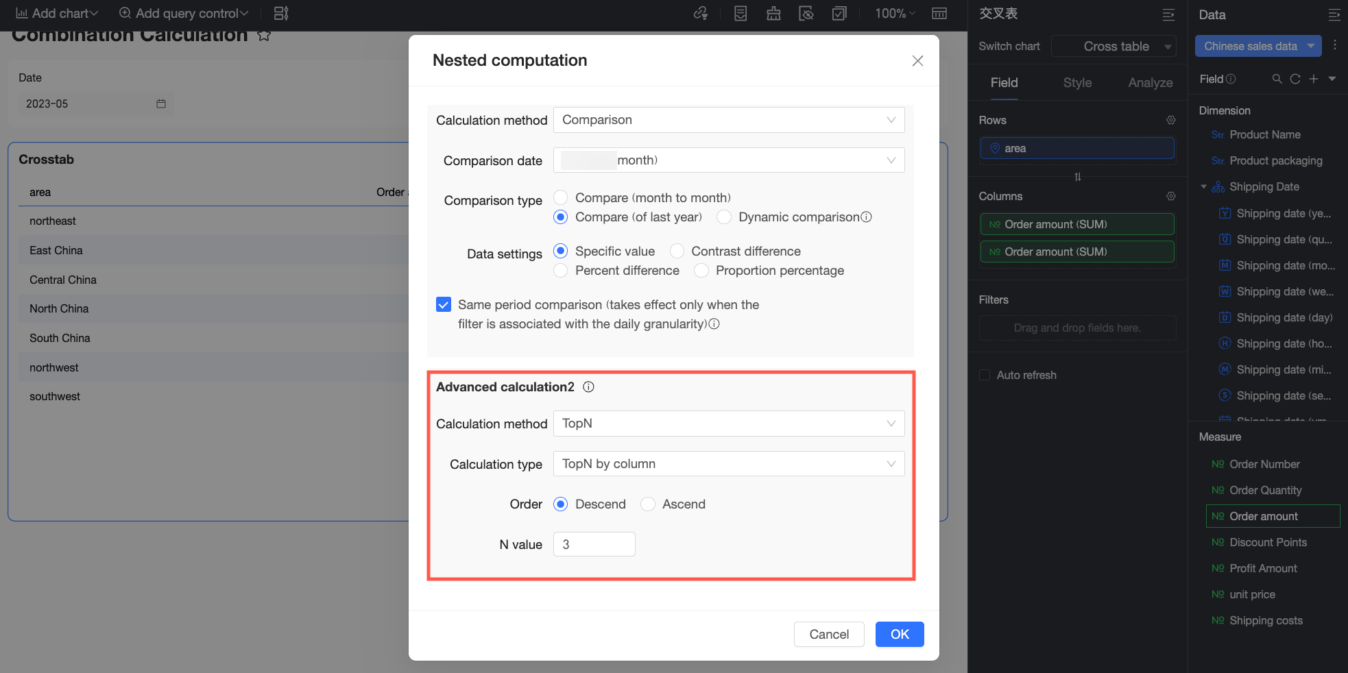
Example 6: Previous year's Top-3 regional sales
Use case: You want to filter for the top three regions by order amount from the same period in the previous year (July 2015, assuming the current month is July 2016). This requires a period-over-period comparison first, followed by a Top-N filter.
-
In the Nested Calculation dialog box, select YoY and MoM for Advanced Calculation 1 and configure it based on your requirements.
A period-over-period comparison measures data changes over different time periods, such as year-over-year (YoY) and month-over-month (MoM). For more information, see Period-over-period comparison.
-
For Advanced Calculation 2, select Top-N and configure it to show the top 3 results, and click OK.
The Top-N filter (quick filter) displays only the top items by value. For more information, see Top-N.
-
In the date filter, set the date to July 2016 and click Query. The chart displays the top three regions by order amount from July 2015.