A histogram displays the frequency distribution of continuous data. It reveals key characteristics of the data, such as central tendency, dispersion, skewness, and kurtosis. This topic describes how to add data to a histogram and configure its style.
Prerequisites
You have created a dashboard. For more information, see Create a Dashboard.
Chart Overview
A histogram divides a continuous data range into a series of adjacent, non-overlapping intervals. It displays the number of data points in each interval as rectangular bars. This visual representation highlights the data distribution and differences between data groups.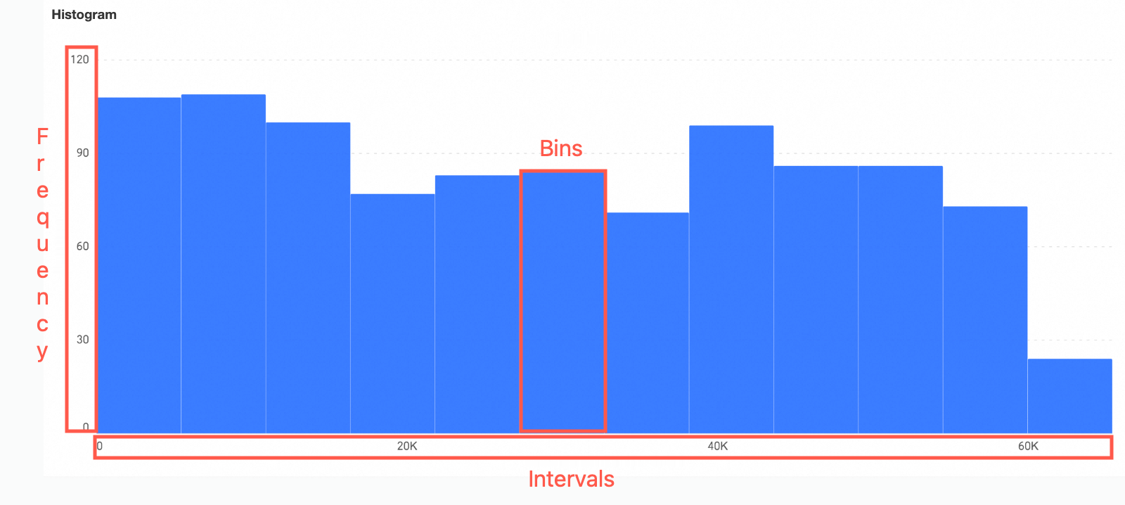
Intervals (also known as data bins): These are adjacent, non-overlapping intervals created by dividing the data range.
Frequency: The number of data points within each interval.
Rectangular bars: Each bar represents the count of data points in an interval. The width of the bar corresponds to the interval range. The height corresponds to the frequency of values in that interval.
Scenarios
Common use cases for histograms include the following:
Data center trend analysis, such as analyzing average customer satisfaction for products or services.
Analyze data distribution. For example, view the distribution of student scores to assess teaching effectiveness.
Analyze dispersion. For example, analyze temperature variation ranges across geographical areas to assess environmental temperature stability.
Analyze bias. For example, understand product preferences among consumers at different income levels.
Identify outliers. For example, monitor product quality stability and detect items outside the normal quality range.
Advantages
Visualization: Customize chart styles for intuitive display. Add auxiliary elements such as legends and tooltips.
Annotation capability: Add custom annotations and endnotes. Configure links to external systems to enable cross-system data interaction.
Interactive operations: Supports drilling, filter interaction, navigation (available only when a color legend is configured), dimension or measure filtering, and in-table filtering.
Preview Example
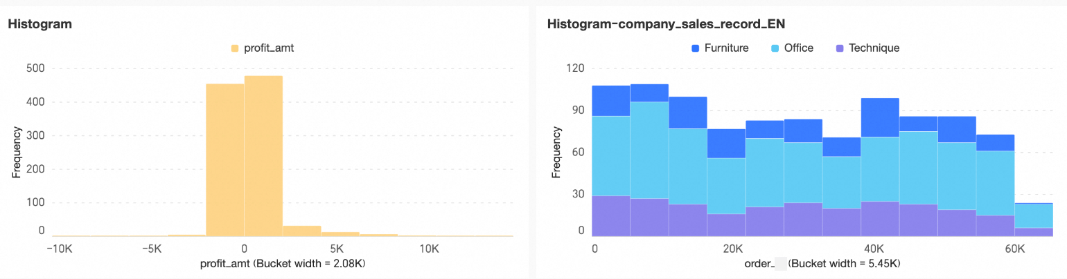
Analyze the histogram to obtain the following insights:
Skewness: An asymmetric overall shape visually indicates skewness in the dataset distribution.
If the long tail extends to the right, the distribution is right-skewed (positive skew). Most data points cluster on the left side of the histogram.
If the long tail extends to the left, the distribution is left-skewed (negative skew). Most data points cluster on the right side of the histogram.
Central tendency: Mean, median, and mode describe central tendency. Observe the overall shape of the histogram to estimate the relative positions of the mean, median, and mode, and assess the dataset’s central tendency.
If the histogram is symmetric, the mean, median, and mode are approximately equal and centered in the histogram.
If the long tail extends to the right, most data points cluster on the left and fewer appear on the right. In this case, the mean exceeds the median, and the mode lies on the left side of the histogram.
If the long tail extends to the left, most data points cluster on the right and fewer appear on the left. In this case, the mean is less than the median, and the mode lies on the right side of the histogram.
Dispersion: Assess dispersion by examining the overall width of the histogram and the height variation among the rectangular bars.
Outliers: One or more isolated rectangular bars indicate potential outliers in the dataset.
Kurtosis: The sharpness or flatness of the histogram reflects kurtosis. A sharp peak indicates a concentrated distribution, while a flatter peak suggests a more uniform distribution.
Configure Chart Fields
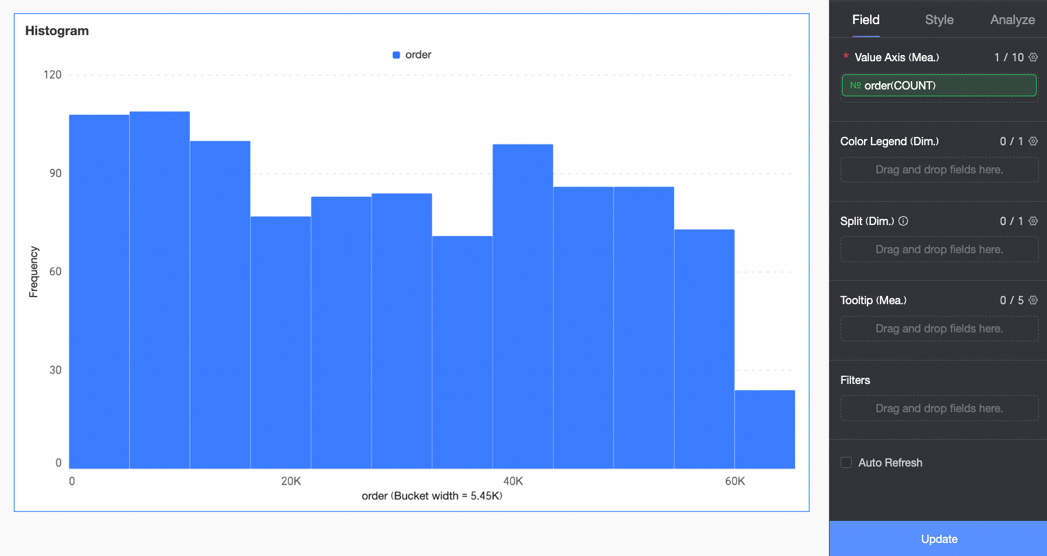
This section uses order quantity analysis across product types as an example to demonstrate field configuration.
In the Data pane, select the required fields. Then, double-click or drag them to the corresponding areas under the Fields tab.
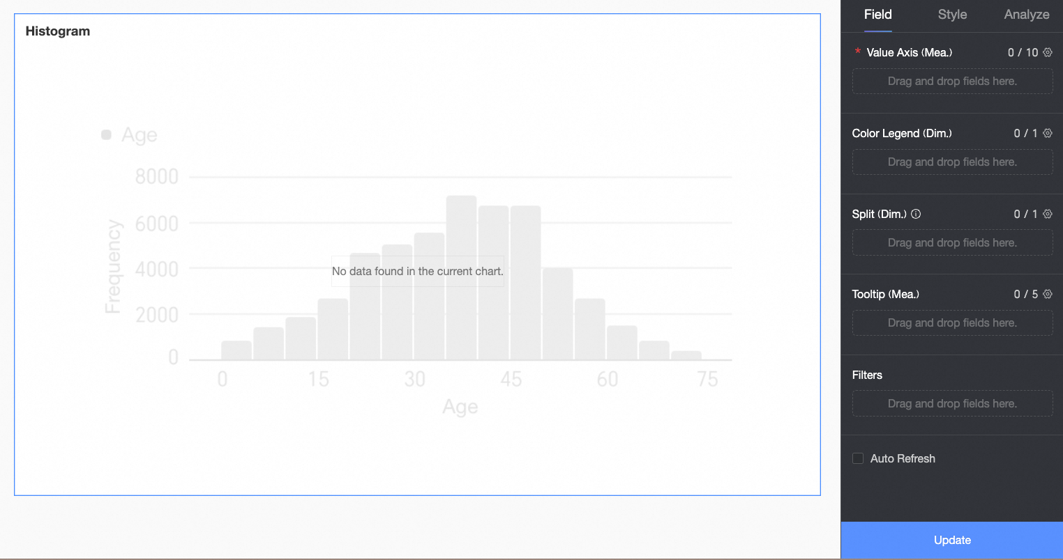
In the Value Axis/Measure area, configure the primary metric for the chart.
In this example, you drag the Order Quantity field into the primary metric area for further analysis.
Click Update. The system updates the chart automatically.
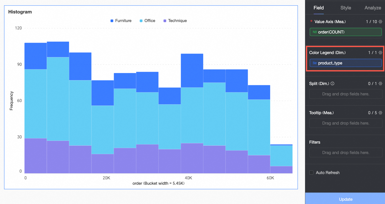
(Optional) To analyze by dimension, configure dimension fields in the Color Legend/Dimension area. After configuration, the chart segments the rectangular bars according to the number of distinct values in that dimension. For example, segment order quantity by product type.
In this example, drag the Product Type field to break down the order amount by product type.
(Optional) To perform multi-dimensional analysis, configure dimension fields in the Split/Dimension area. Use facet mode to compare data across different dimension values.
In this example, you can drag the report_date(year) field to view the order count by year.
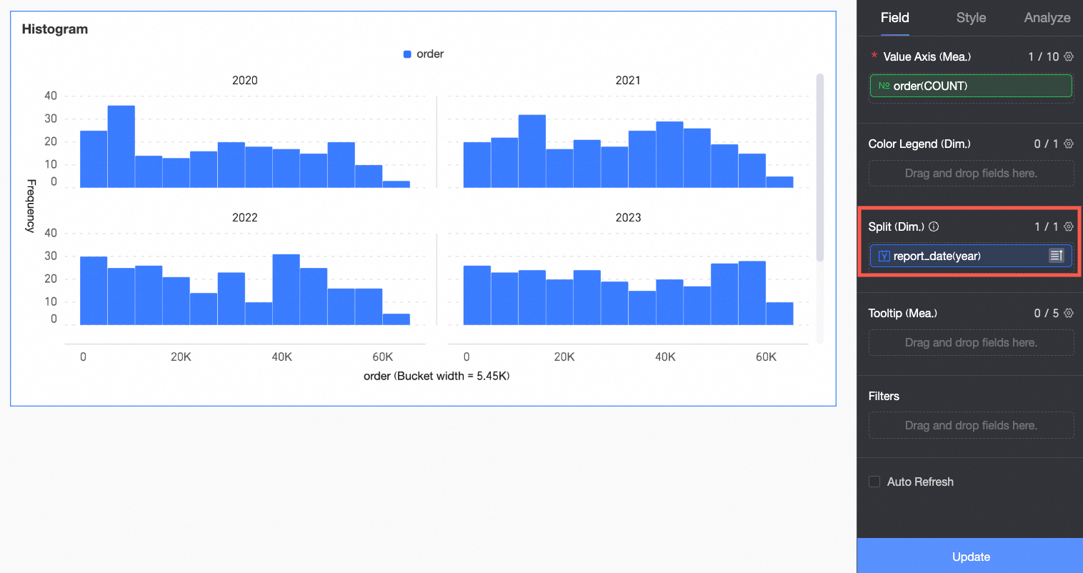 Note
NoteAdd only one split dimension field. Facet mode has the following limitations.
Style: Auxiliary display does not support thumbnail axis settings.
Analysis: Only supports data interaction settings. Advanced settings, analysis alerts, annotations, and smart insights are not supported.
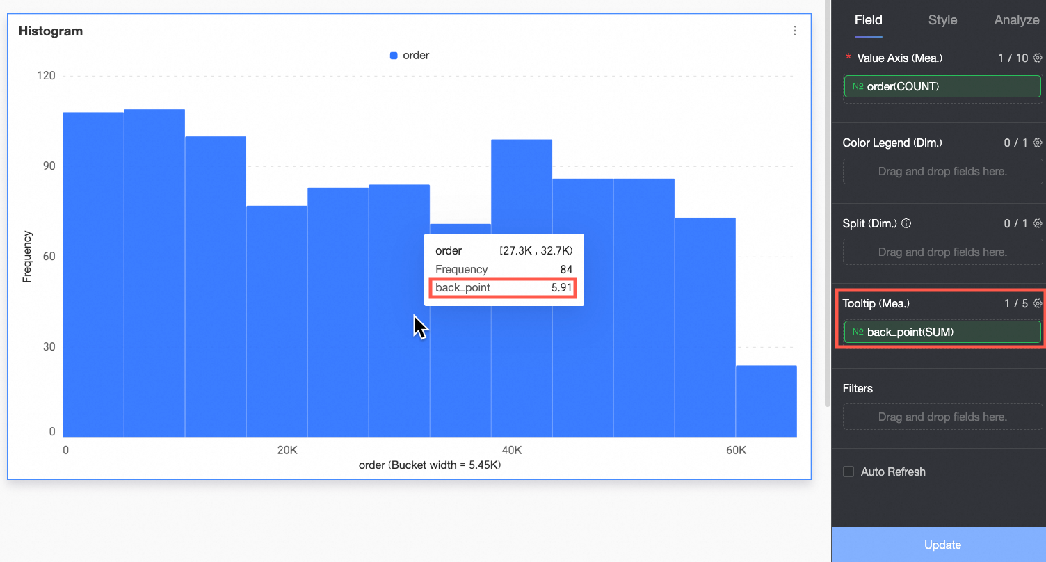
(Optional) To display a measure in the tooltip, add it to the Tooltip/Measure area.
(Optional) To filter displayed data, drag the field to be filtered into the Filter area. For example, to exclude data from specific regions, drag the Region field to the Filter area. Then, click the
 icon in the Set Filter window to specify the required filter conditions.
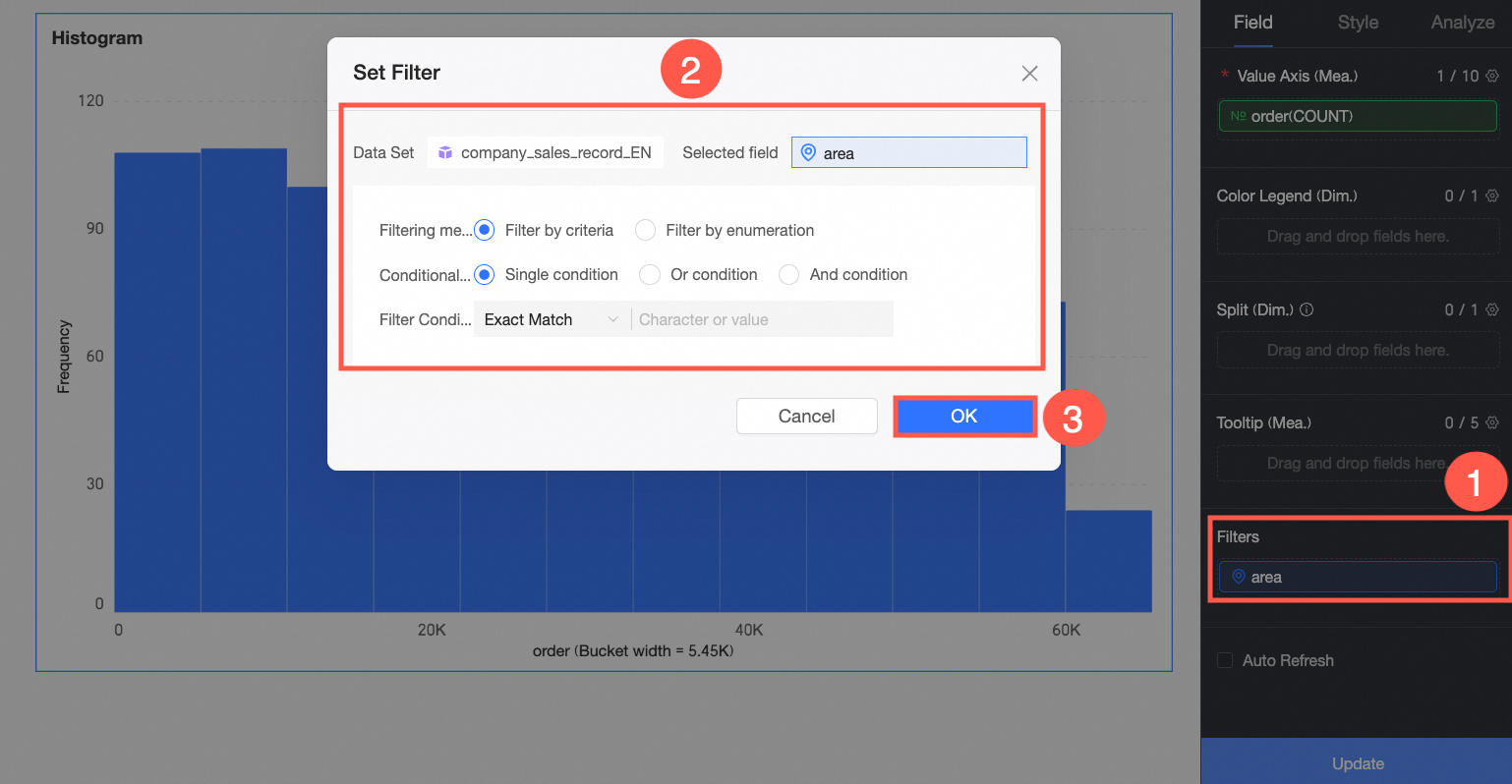
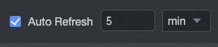
(Optional) Auto-refresh
Enable this option to automatically refresh the chart data. For example, select this option and set the duration to 5, with the unit set to minutes. The system then refreshes the chart data every 5 minutes.
Configure Chart Styles
This section describes how to configure chart styles. For general chart Title and Card configurations, see Configure the Chart Title.
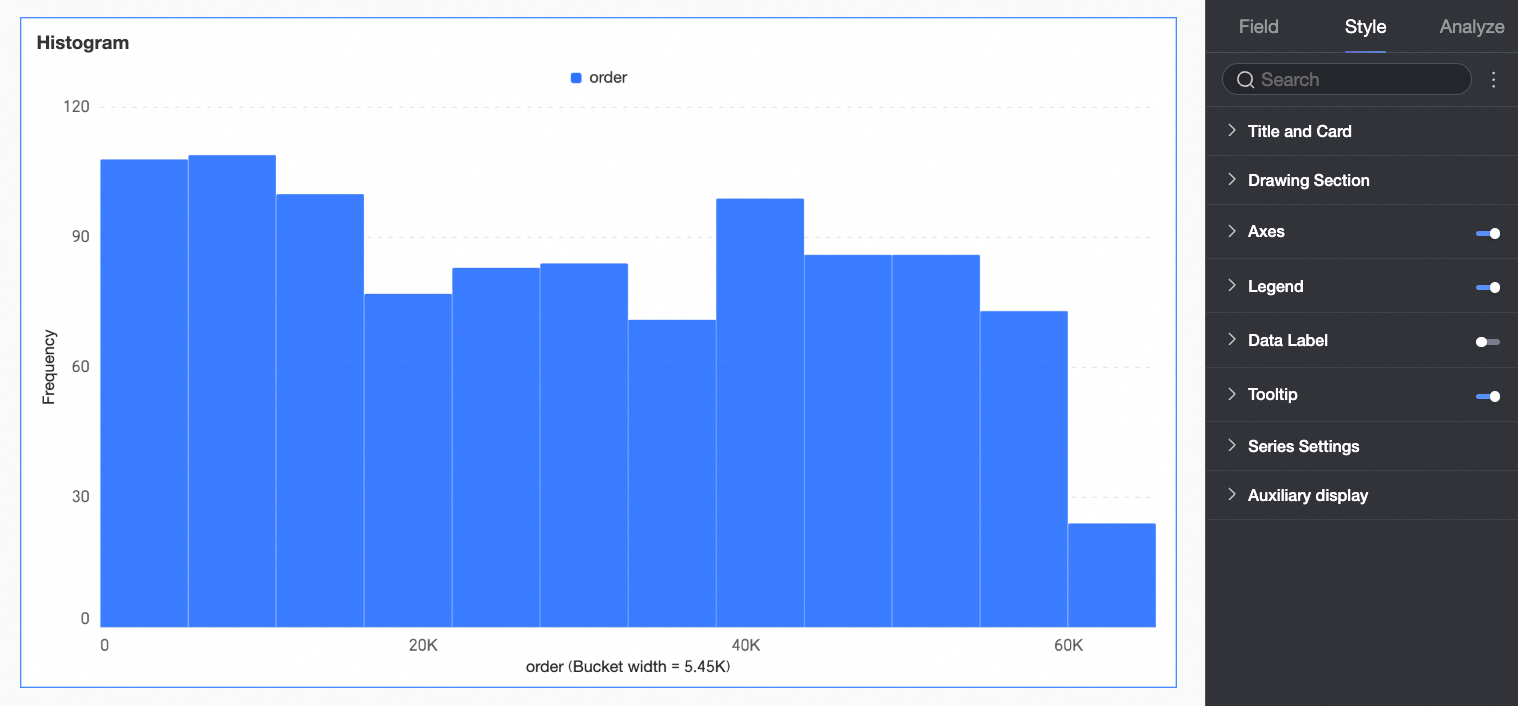
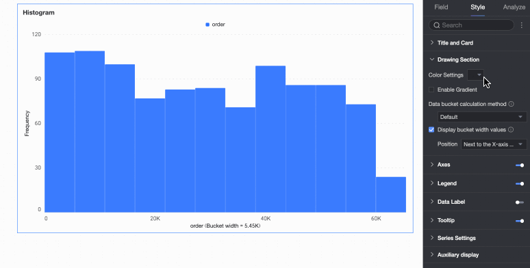
Drawing Area
Under the Style tab, in the Plot Area section, configure the appearance of the rectangular bars in the histogram.
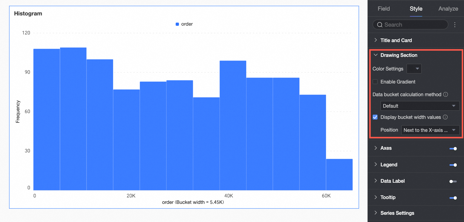
Chart configuration item | Description |
Bar color scheme | Set the color scheme for the rectangular bars. Enable gradient effects. |
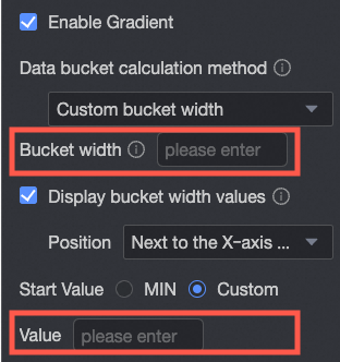
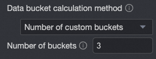
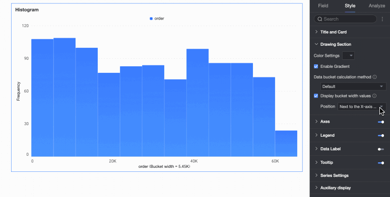
Data bin calculation method | Data bins are rectangular bars created by grouping data. The number of rectangular bars is the number of groups, and the width of each rectangle is the group interval. Set the data bin calculation method to Default, Custom Group Interval, or Custom Number of Groups.
|
Display group interval value | Set whether to display the group interval value and its display position, such as next to the X-axis title or above the chart. |
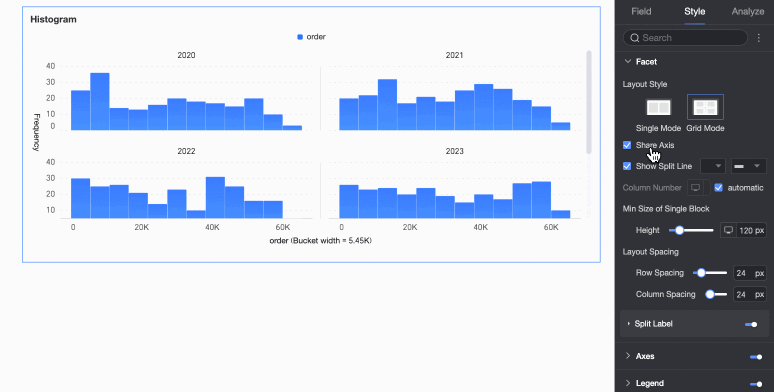
Faceting
In facet mode, configure the chart layout and style in the Faceting section.
Facet mode applies only when you configure a field in Split/Dimension.
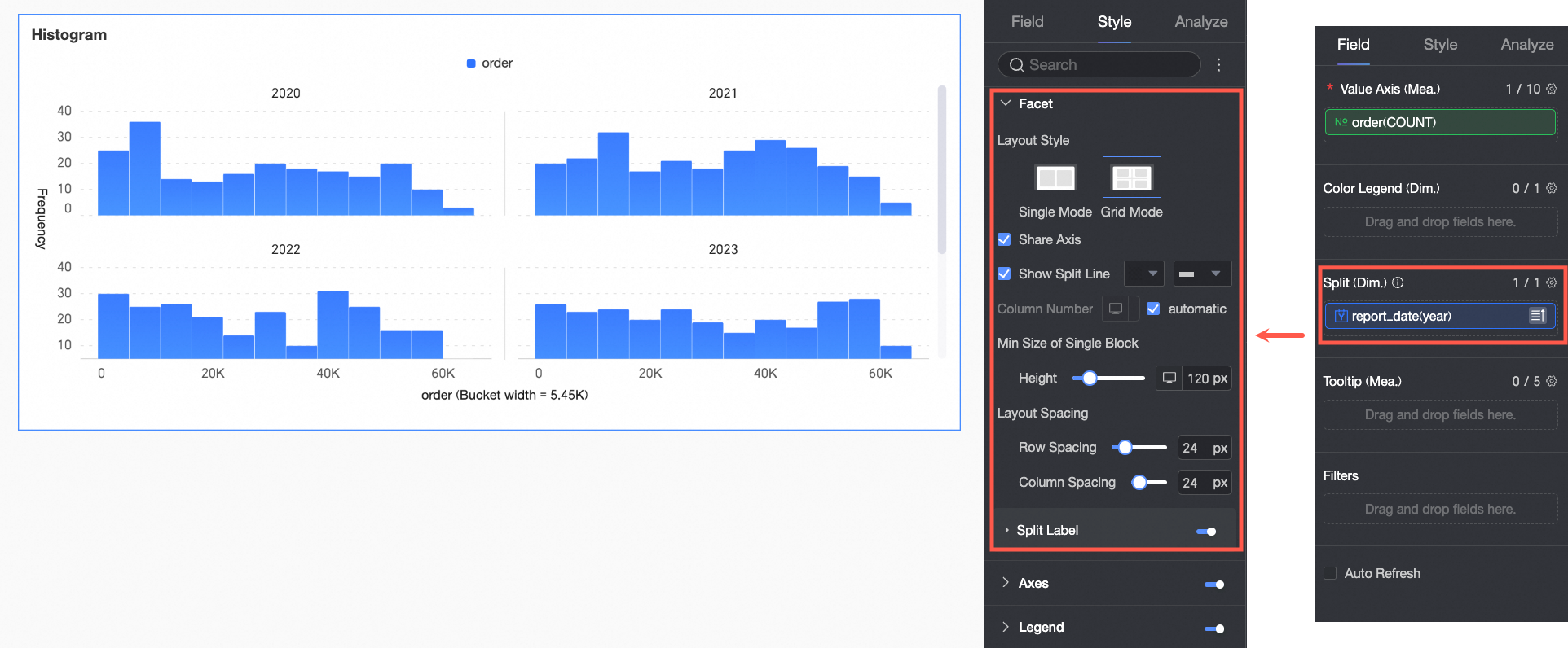
Chart configuration item | Description | |
Layout style | Set the chart arrangement layout. It supports two modes: Single Column Comparison and Grid Distribution. | |
Share axis | Set whether charts share the same axis.
| |
Display line separator | Set whether to display line separators between charts. If set to display, configure the color and style of the line separator. | |
Number of columns | When Grid Distribution is selected as the layout style, set the number of columns for chart arrangement. The default is automatic. Customize the number of columns as needed. Note
| |
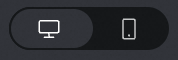
Minimum width and height of facet blocks | Set the minimum width and height for each chart. The configurable information varies depending on the layout style.
| |
Row and column pitch | Set the row and column pitch between charts. The configurable information varies depending on the layout style.
| |
Split labels | Position | Set the display position of dimension value labels. Set them to be Above the chart or Below the chart. |
Text | Set the font color and style of dimension value labels. | |
Alignment | Set the alignment of dimension value labels. | |


 button at the top of the current page.
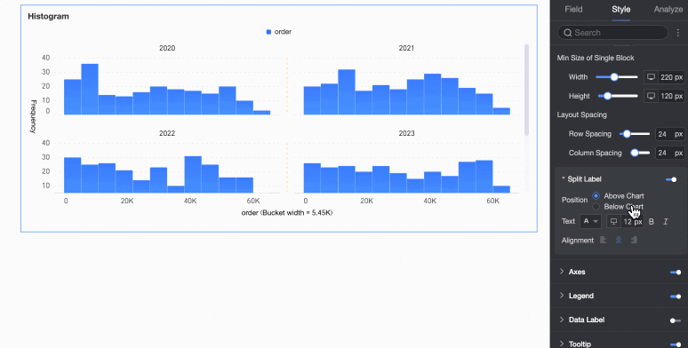

Axes
Under the Style tab, in the Axes section, configure axis appearance. Axes are displayed by default.
Chart configuration item | Configuration content | Description |
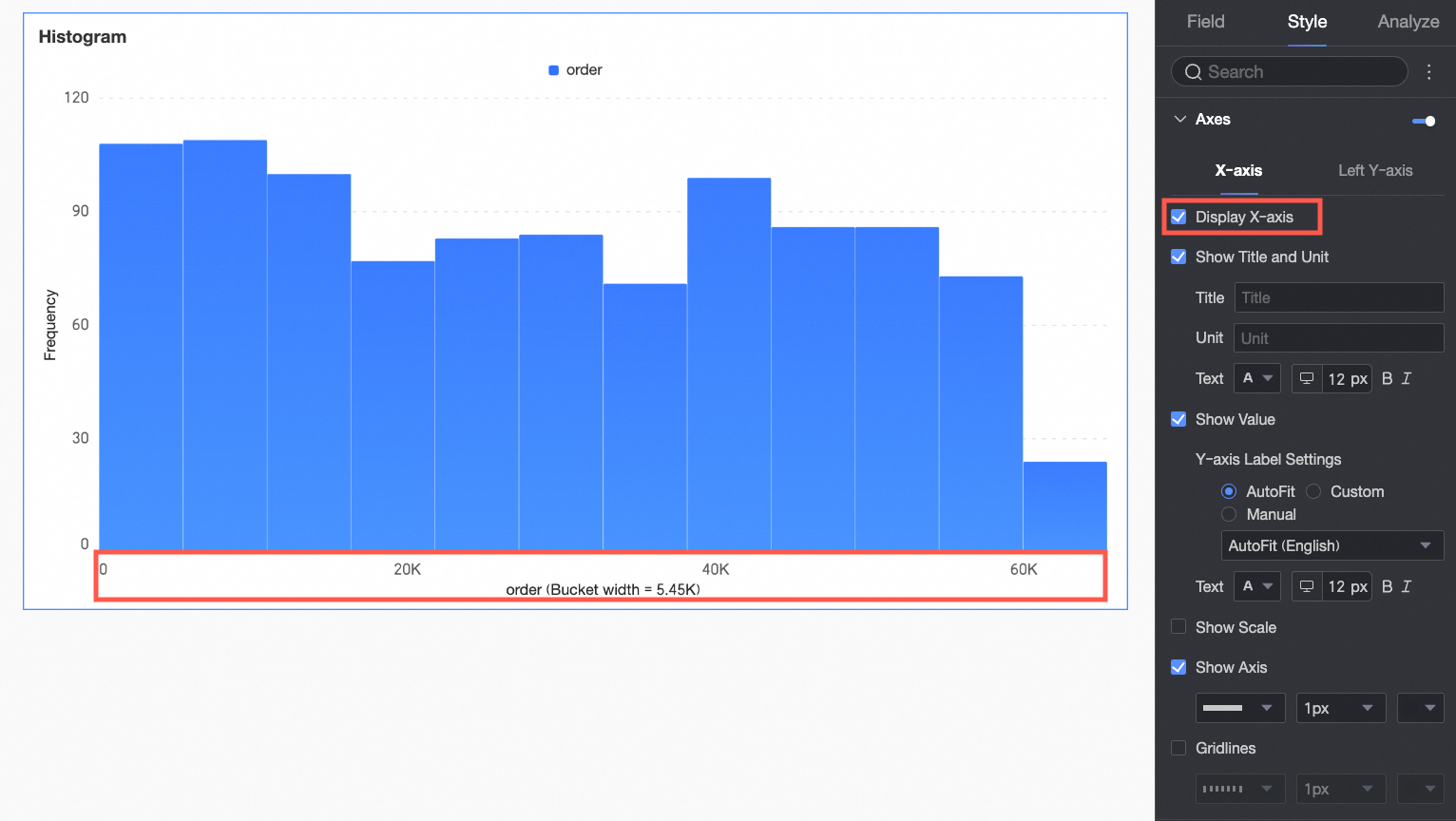
X-axis | Display X-axis | Set whether to display the X-axis. |
Display title and unit | Set whether to display the title and unit on the X-axis. Customize the title name and measurement unit to use, and configure the text style. | |
Display axis labels | Set whether to display axis labels on the X-axis. If displayed, set the display format and text style of the X-axis labels. | |
Display tick marks | Set whether to display tick marks on the X-axis. | |
Display axis | Set whether to display the X-axis line. If displayed, customize the axis style, including line type, line width, and color. | |
Display gridline | Set whether to display gridlines on the X-axis. If displayed, customize the gridline style, including line type, line width, and color. | |
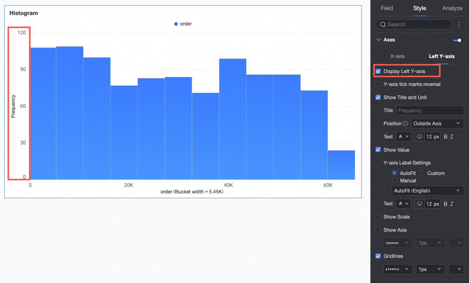
Left Y-axis | Display left Y-axis | Set whether to display the left Y-axis. |
Flip Y-axis scale | Set whether to flip the Y-axis. | |
Display title and unit | Set whether to display the title and unit of the left Y-axis. Customize the title name and configure the text style. | |
Display axis labels | Set whether to display labels on the left Y-axis. If displayed, set the display format and text style of the labels. | |
Display tick marks | Set whether to display tick marks on the left Y-axis. | |
Display axis | Set whether to display the left Y-axis line. If displayed, customize the axis style, including line type, line width, and color. | |
Display gridline | Set whether to display gridlines on the left Y-axis. If displayed, customize the gridline style, including line type, line width, and color. |
Legend
In the Legend section, click the  icon to enable the chart legend and configure its appearance.
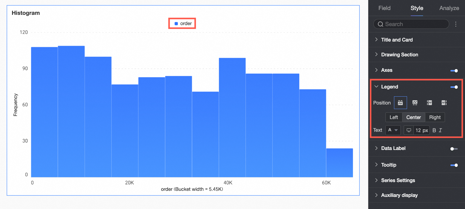
Chart configuration item | Description |
Position | Set the display position and alignment of the legend.
|
Text | Set the legend text style. Configure font color, size, weight, and italics. |
Mobile legend | PC and mobile legend settings are independent. Use the PC/Mobile switch button ( |
 ) at the top of the dashboard editing page to enter the mobile editing view. Set a separate legend for mobile. Customize the mobile legend's position and text style.
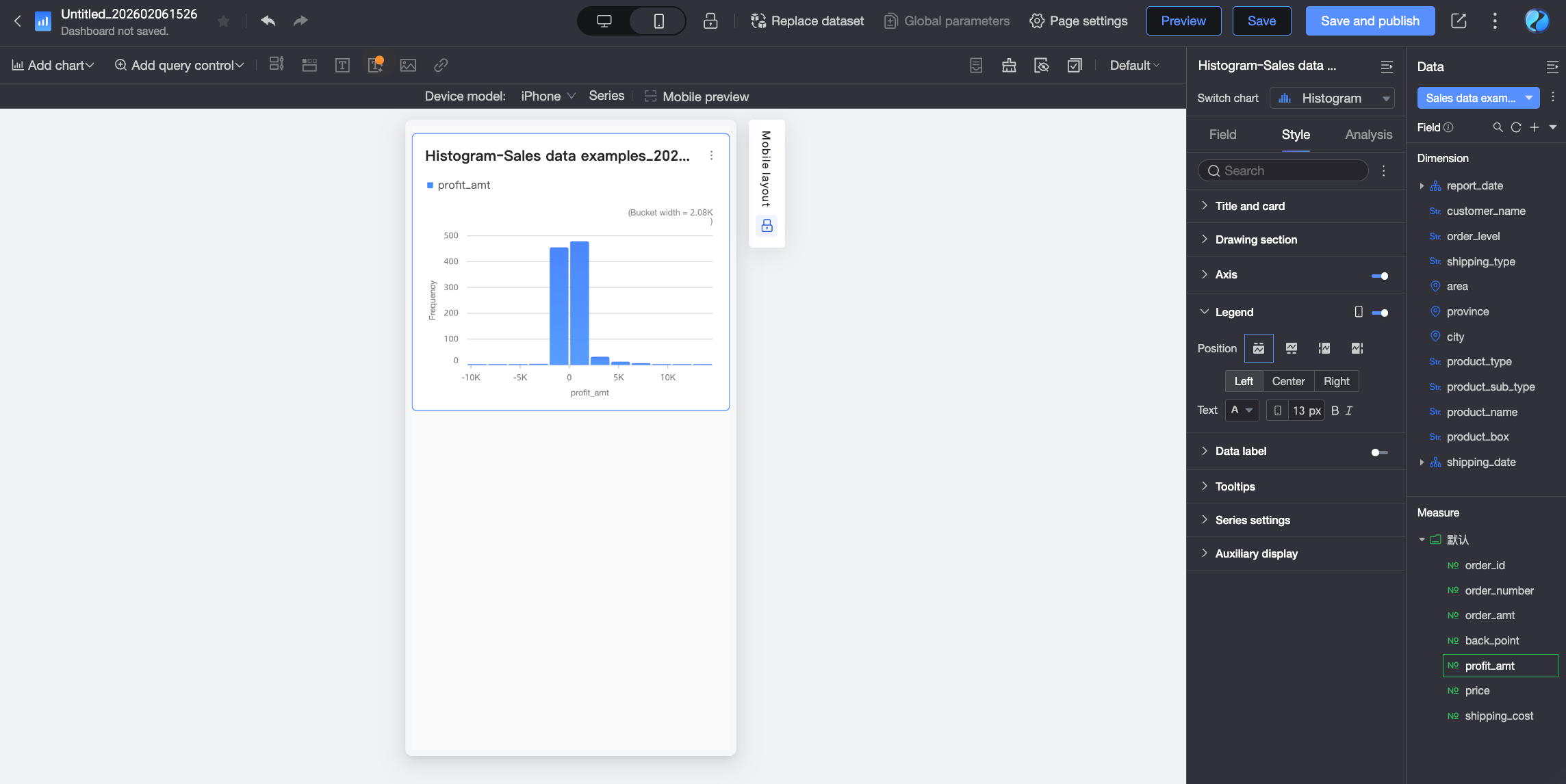
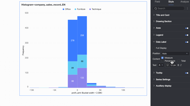
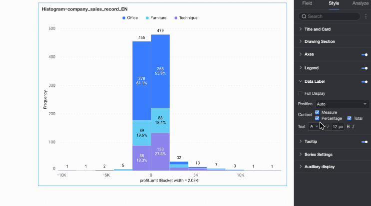
Data Labels
In the Data Labels section, configure whether to display data labels and their appearance.
The Position and Text settings for data labels apply globally. In Series Settings, configure data labels and formatting individually for each measure or dimension value.
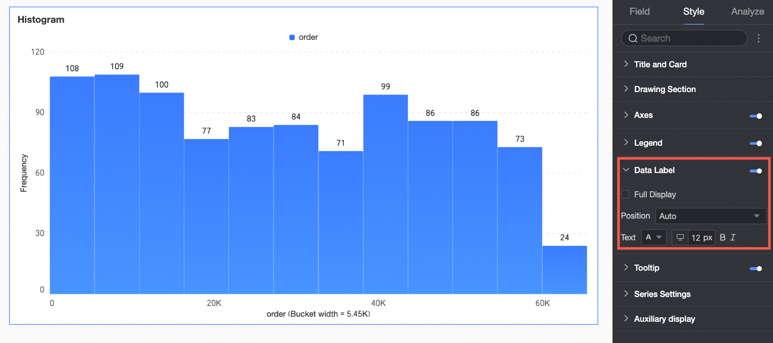
Chart configuration item | Description |
Content | Set the data content to display in the chart. |
Display all | If data labels are displayed, set whether to display all labels simultaneously. If labels are close together and space is limited, they overlap. Turn off 'Display all' for visual clarity. |
Position | Set the display position of data labels. Select Auto, Outside top, Inside top, Inside bottom, Inside center, or Inside left. |
Text | Set the format of the text in data labels. |
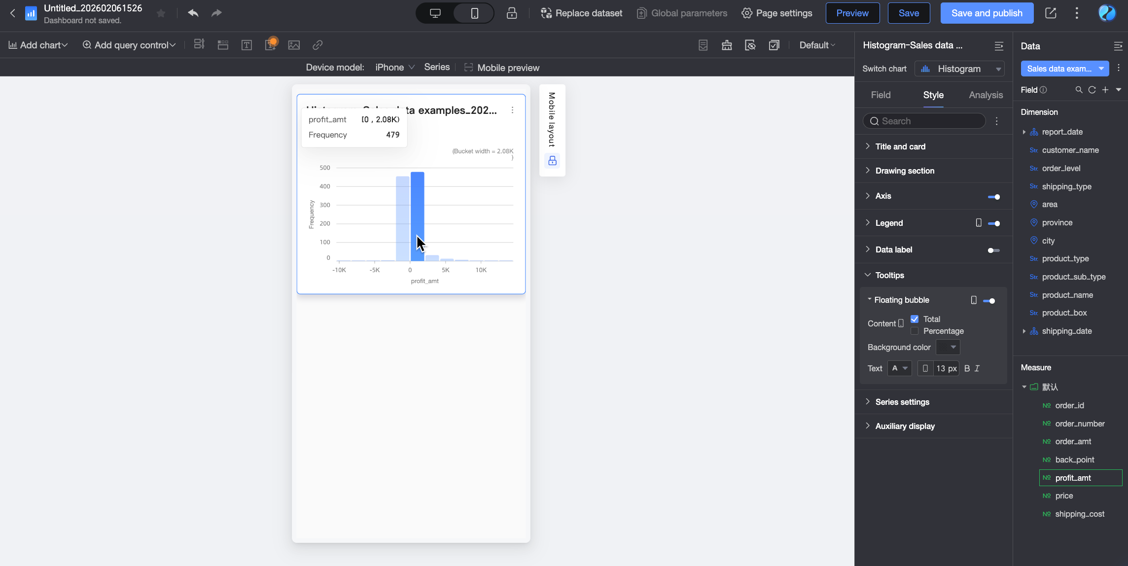
Tooltip
In the Tooltip section, click the icon to enable the tooltip and configure its appearance.
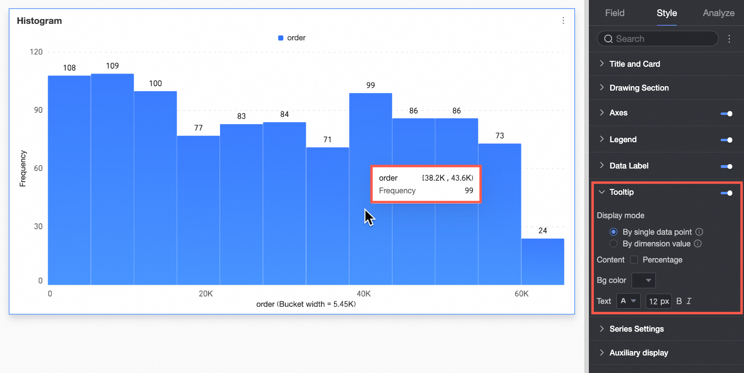
Chart configuration item | Description |
Display method | Set the display method for tooltip content. Select By single data point or By dimension value.
|
Content | Select the data content to display in the tooltip. The available display content varies under different configurations: If the display method is By single data point, it supports percentage. If the display method is By dimension value, it supports total and percentage.
|
Background color | Set the background fill color of the tooltip box. |
Text | Set the style of the text in the tooltip box. Configure font color, size, weight, and italics. |
Mobile tooltip | PC and mobile tooltip switches are independent. Use the PC/Mobile switch button ( |
Series Settings
In the Series Settings section, configure the appearance of individual series.
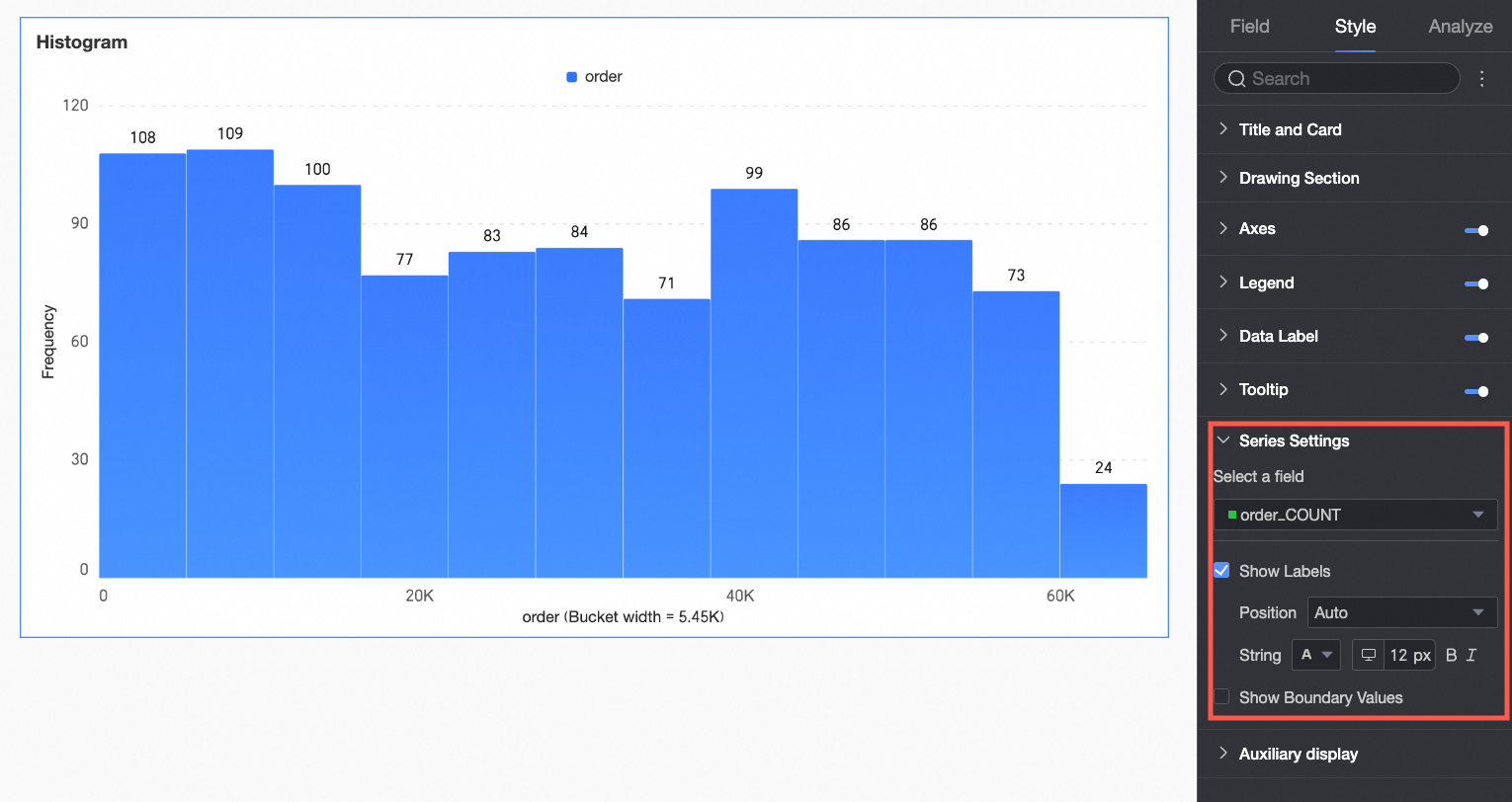
Configure aliases and value display formats in Series Settings only if Color Legend/Dimension is enabled in the Field configuration panel.
Chart configuration item | Description of Configuration Items |
Select field | Configure the measure or dimension value for label formatting as needed. |
Alias | Set the field name to match your business scenario. This item is configurable only when Color Legend/Dimension is configured. |
Display data labels | Select whether to display data labels, and set their color and position. |
Numeric display format settings | If data labels are displayed, configure the numeric display format within the data labels. Select from three formats: Auto-adapt, Custom adapt, and manual input. This item is configurable only when Color Legend/Dimension is configured. |
Display extreme values | Set whether to display labels for the maximum and minimum values in the measure. This item is configurable only when Color Legend/Dimension is not configured. |
Auxiliary Display
Under the Style tab, in the Auxiliary Display section, configure metric filtering display and the thumbnail axis.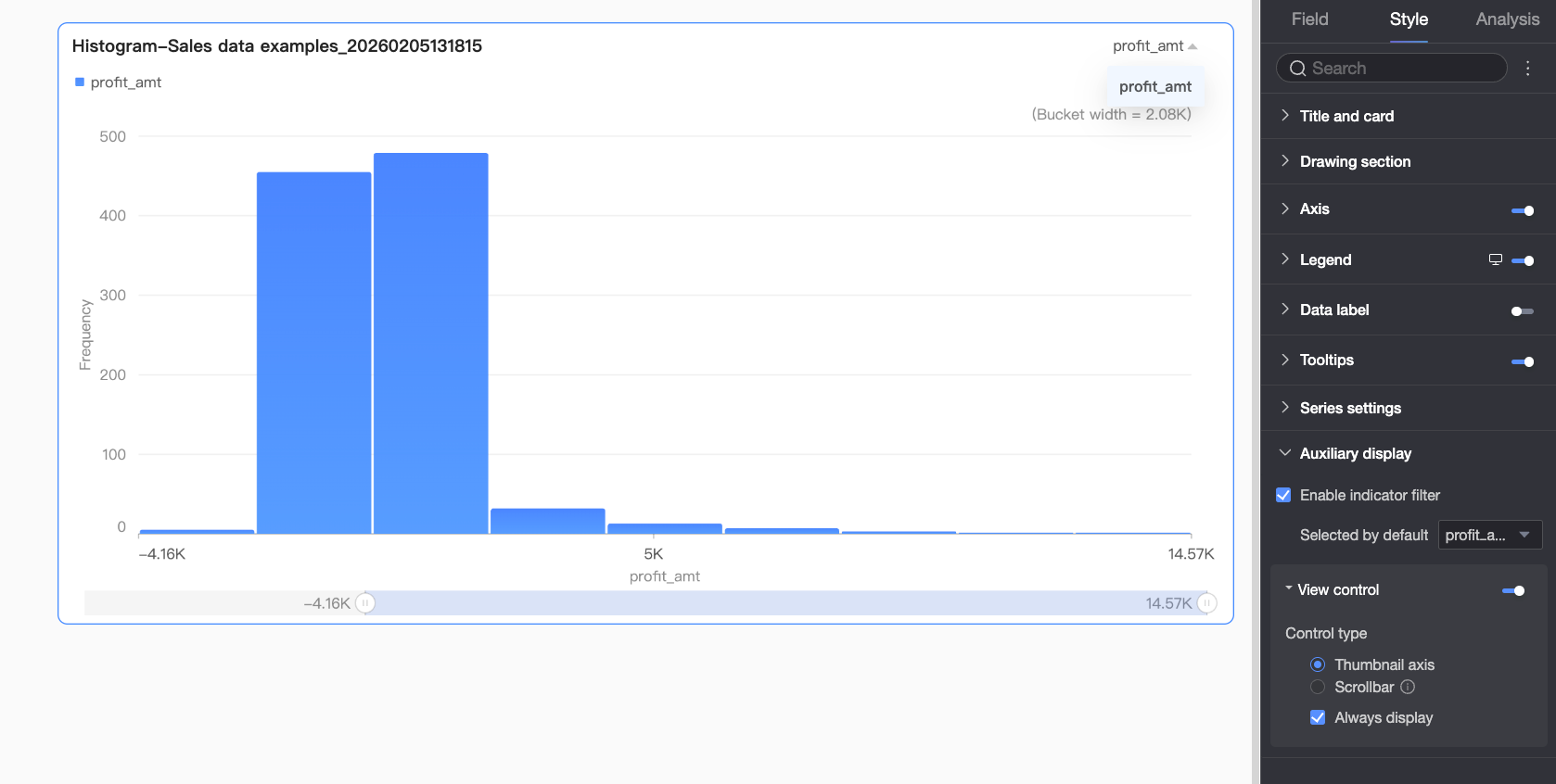
Chart configuration item | Configuration Item Description |
Enable metric filtering display | Set whether to enable the in-chart metric filter. After enabling, further set the default selected metric field. |
View controls | If the chart axis has a large and dense amount of data, and the current container size cannot fully display all data, click the It supports two control types to manage the visible range on the chart axis: Thumbnail axis and Scroll bar.
Note If the chart does not have visual controls configured, and the chart size is too small, the system automatically enables visual controls, selects the Thumbnail axis, and displays it only when the data volume exceeds the chart container's display width. |
 icon to enable chart view controls. This ensures data integrity and readability, allowing report viewers to dynamically adjust the chart's visible range by sliding, providing a flexible user experience.
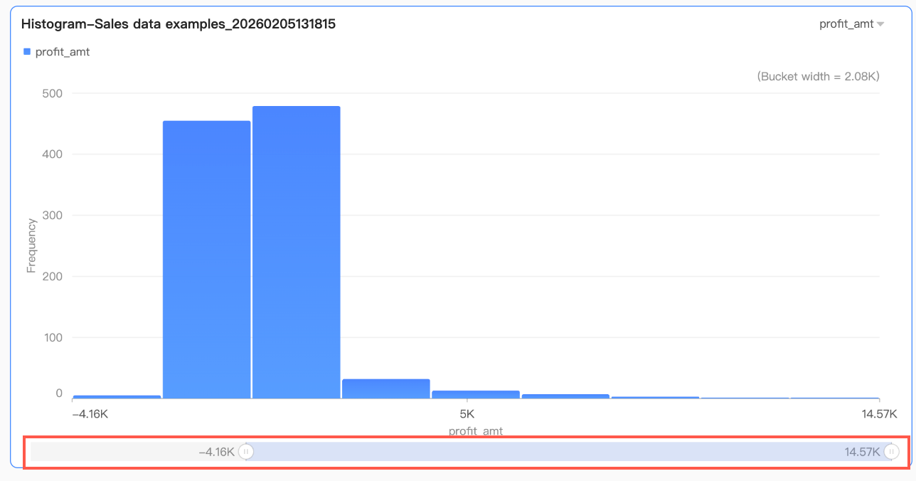 By default, the thumbnail axis appears only when the data volume exceeds the chart container's display width. If you need the thumbnail axis to always appear in the chart, check Always display. After checking, the thumbnail axis always appears even if the chart data does not fill the screen.
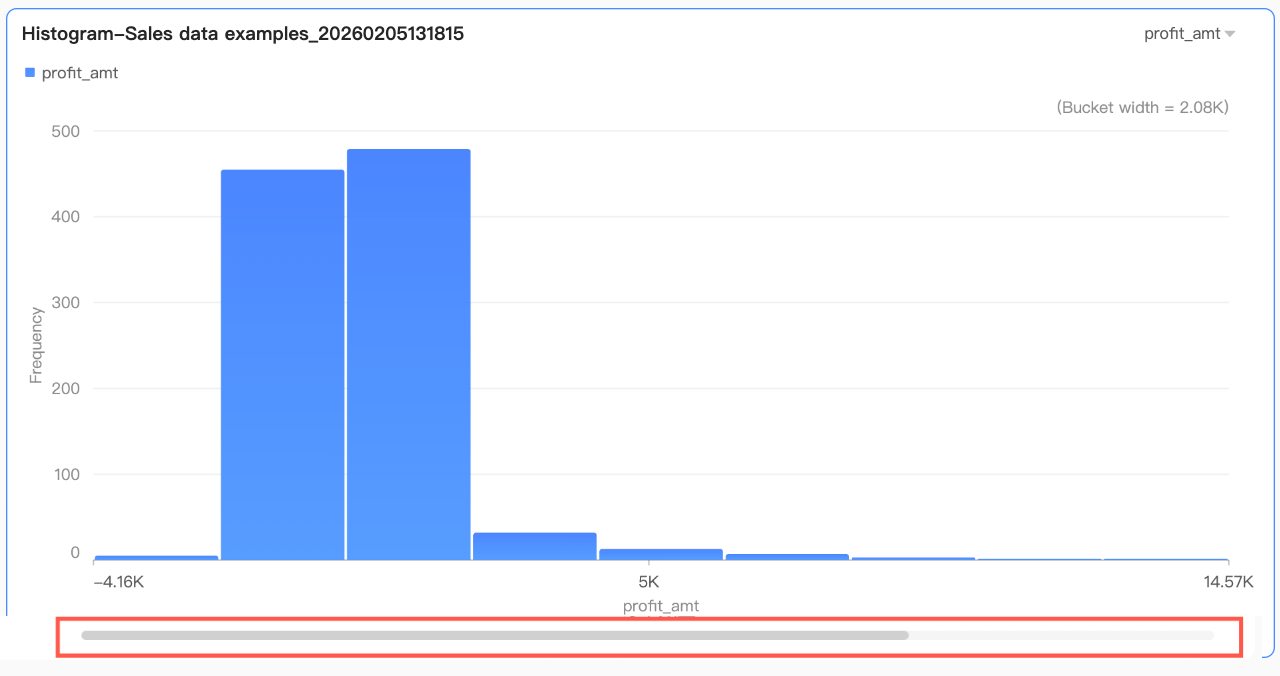 Further set the minimum category width of the scroll bar to limit the data volume within the chart's current window. This ensures clear scaling of chart content in the visible area and avoids visual clutter caused by overlapping data labels or excessively dense data points. The minimum category width defaults to 32 px, with a range of 16-100 px.
Configure Chart Analysis
Chart configuration item | Configuration content | Configuration Parameters |
Data interaction | Drilling | If you have configured drilling fields in the fields pane, set the drilling level row display style here. For more information, see Drilling. |
Filter interaction | If the data to be analyzed exists in different charts, use chart filter interaction to link multiple charts for data analysis. For more information, see Filter interaction. | |
Jump | If the data to be analyzed exists in multiple dashboards, use dashboard jumps to link multiple dashboards for data analysis. Jumps include three methods: In-product jump, In-page component, and External link. For more information, see Jump. | |
Analysis alerts | Auxiliary line | Use auxiliary lines to view the difference between the current measure value and the auxiliary line setting value. Auxiliary line setting values are divided into two types: static field and calculated value. Calculated values include four types: average value, maximum, minimum, and median. For more information, see Analysis alerts. |
Annotate | - | If data in the chart is abnormal or requires attention, use color highlighting, icons, comments, or data points for annotation. This helps identify anomalies and take appropriate action. For more information, see Annotate. |
What to do next
To allow others to view the dashboard, share it with specific users. For more information, see Share a Dashboard.
To build complex dashboards with navigation menus for thematic analysis, integrate your dashboards into the BI portal. For more information, see BI portal.