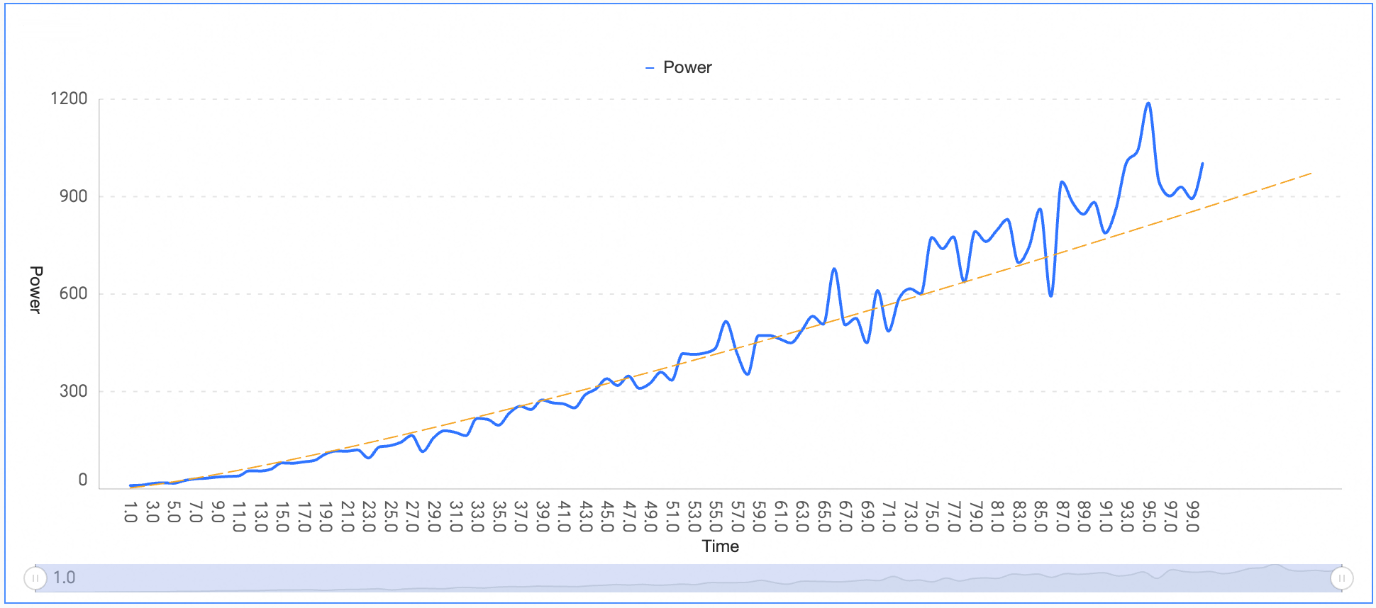
This topic describes two analysis methods: auxiliary lines and trendlines.
Background
Metric analysis lets you analyze data from multiple perspectives, visualize trends, and identify outliers.
Metric analysis currently supports two methods: auxiliary lines and trendlines.
ImportantTrendlines are available only in the Professional Edition.
Limitations
Metric analysis is supported for the following chart types.
Chart | Auxiliary line | Trendline |
Line chart | √ | √ |
Area chart | √ | √ |
Stacked area chart | √ | × |
100% stacked area chart | √ | × |
Vertical bar chart | √ | √ |
Stacked vertical bar chart | √ | × |
100% stacked vertical bar chart | √ | × |
Horizontal bar chart | √ | √ |
Stacked horizontal bar chart | √ | × |
100% stacked horizontal bar chart | √ | × |
Combination chart | √ | √ |
Trend indicator chart | × | × |
Scatter chart | √ | × |
Bubble chart | √ | × |
Leaderboard | √ | × |
Bullet chart | √ | × |
Box plot | √ | × |
Histogram | √ | × |
Auxiliary Line
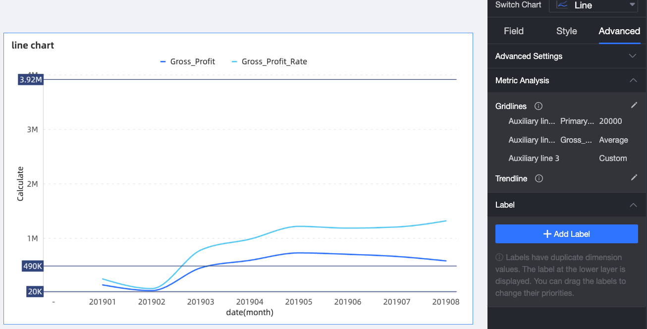
An auxiliary line shows the difference between a measure's current value and a reference value. The reference can be a fixed value, an aggregate value, or a custom value.
Log on to the Quick BI console.
On the Dashboards page, find the dashboard and click the
 icon.
icon.On the dashboard edit page, click the target chart.
In the data pane, on the Analysis tab, click the
 icon next to Metric Analysis > Auxiliary Line.
In the Auxiliary Line dialog box, click Add Auxiliary Line to create a new line. Then, configure the following parameters. The following example shows how to configure an auxiliary line for a line chart:

Parameter
Description
① Auxiliary Line Name
Enter a custom name for the auxiliary line. You can name it based on its business purpose.
② Reference Value
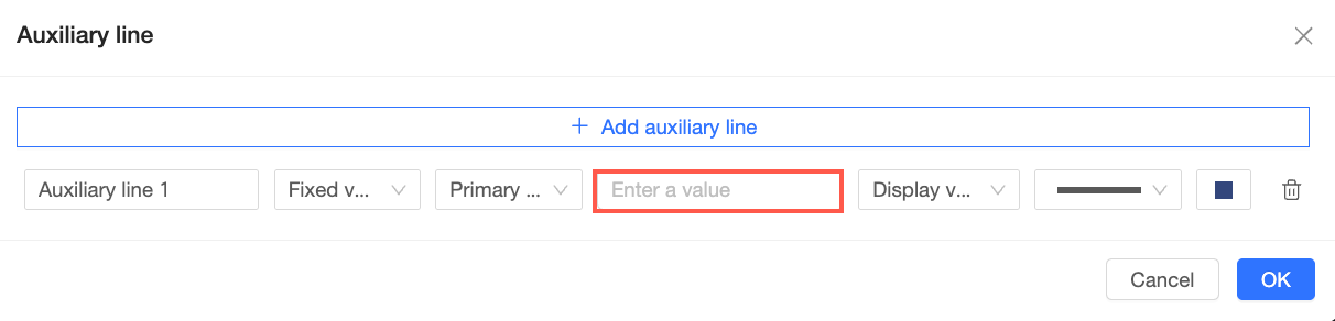
Fixed value
Sets the auxiliary line to a specific, constant numeric value.
If the chart has a primary axis and a secondary axis, you can choose which axis the line should follow.
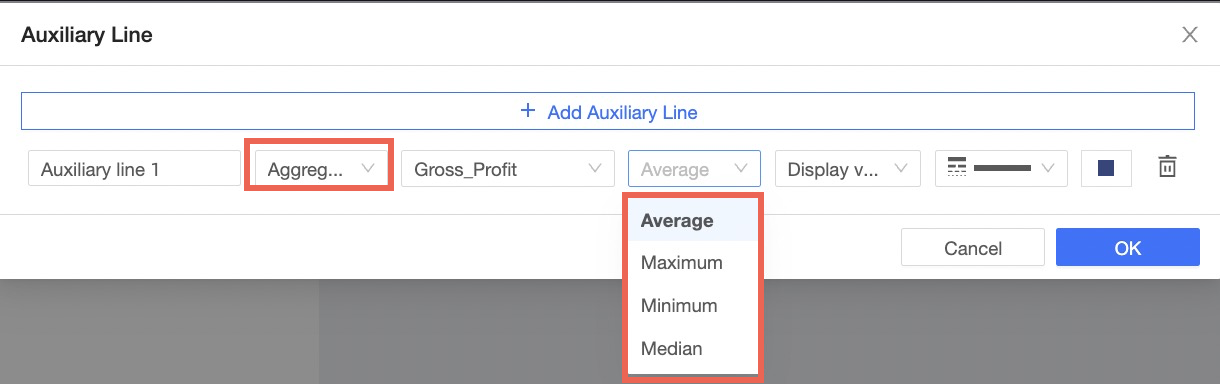
Aggregate value
Sets the auxiliary line to a calculated value, such as average, maximum, minimum, or median.
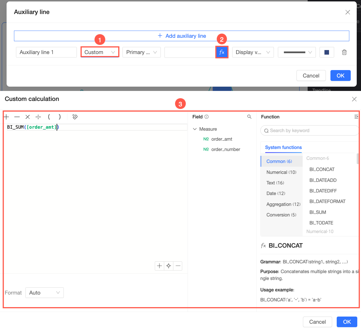
Custom
Sets the auxiliary line based on a custom calculation. You can use fields and functions to create your own formula.
If the chart has a primary axis and a secondary axis, you can choose which axis the line should follow.
③ Display Content
Select what to display for the auxiliary line:
Show Value: Displays only the reference value of the auxiliary line.
Show Name: Displays only the name of the auxiliary line.
Show Both: Displays both the name and the reference value.
④ Line Style
Select a style for the auxiliary line.
⑤ Line Color
Select a color for the auxiliary line.
⑥ Delete this auxiliary line
To delete the auxiliary line, click the
 icon.
icon.Click OK. The following figure shows an example of the auxiliary line.
Trendline
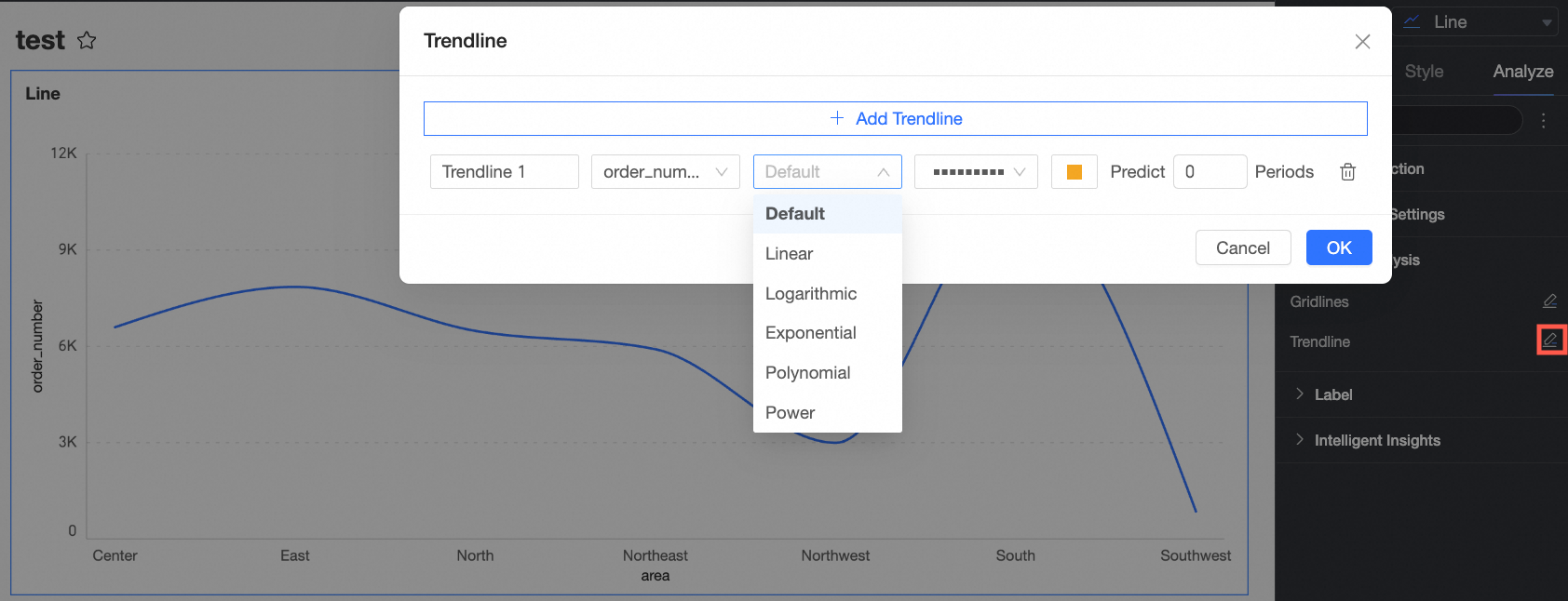
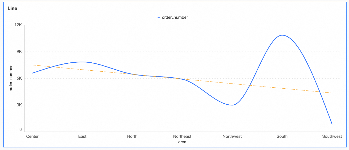
A trendline shows the overall trend of your data. The trendline type is set to Auto by default. You can also choose from five types: Linear, Logarithmic, Exponential, Polynomial, and Power. The Auto type selects the best-fit model for your data. If you are unsure which type to use, start with Auto.
Procedure
On the Dashboards page, find the dashboard and click the
 icon.
icon.On the dashboard edit page, click the target chart.
In the data pane, on the Analysis tab, click the
icon next to Metric Analysis > Trendline.In the Trendline dialog box, select the measure to analyze, the trend calculation method, the trendline type, and the forecast period.
Click OK. The following figure shows an example of the trendline.
Types
Linear
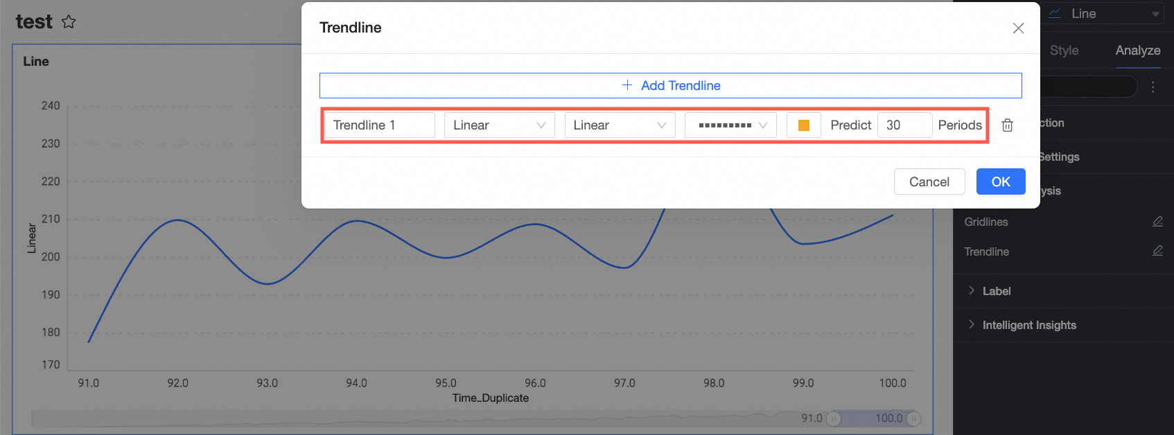
A linear trendline is a straight line best suited for linear datasets. If your data points form a pattern that resembles a line, use this trendline type.
You can configure a linear trendline as shown in the following figure.
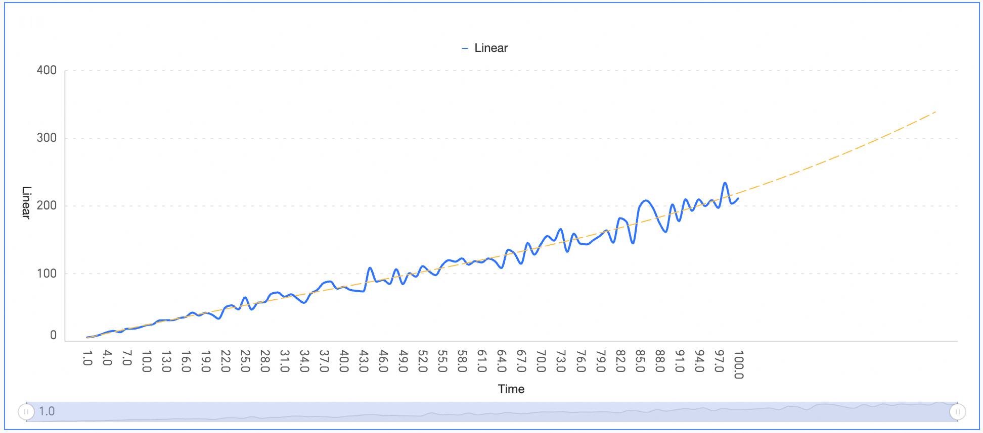
To make a simple forecast, you can configure a forecast period. In this example, the forecast period is set to 30.
Click OK to save the configuration.
The chart shows that the data follows a linear growth trend with slight random fluctuations. The linear model effectively smooths out these fluctuations to reveal the long-term growth trend.
Logarithmic
A logarithmic trendline is best for datasets where the rate of change increases or decreases quickly and then levels off.
You can configure a logarithmic trendline as shown in the following figure.
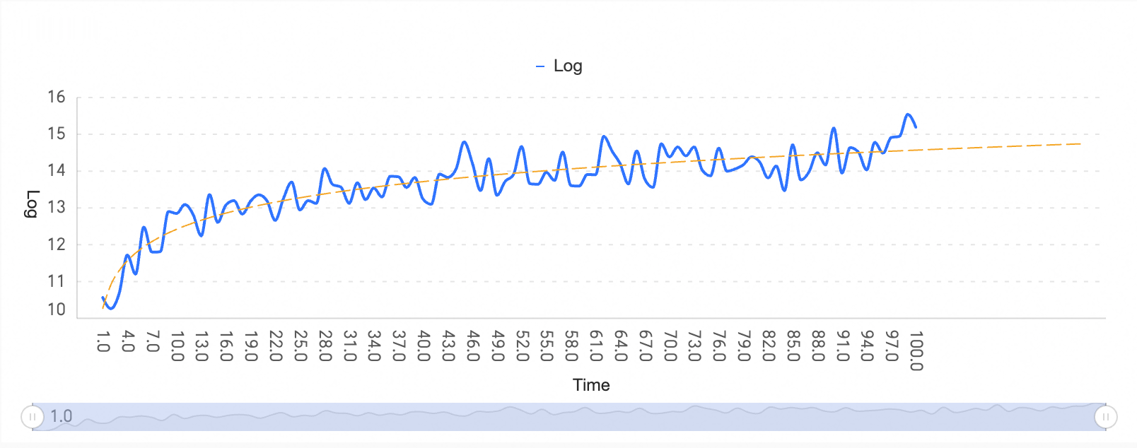
To make a simple forecast, you can configure a forecast period. In this example, the forecast period is set to 20.
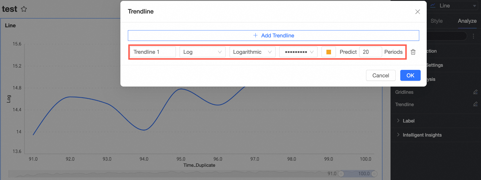
Click OK to save the configuration.
The chart shows that the data grows rapidly around the value 1, and the growth rate approaches 0 around the value 100.
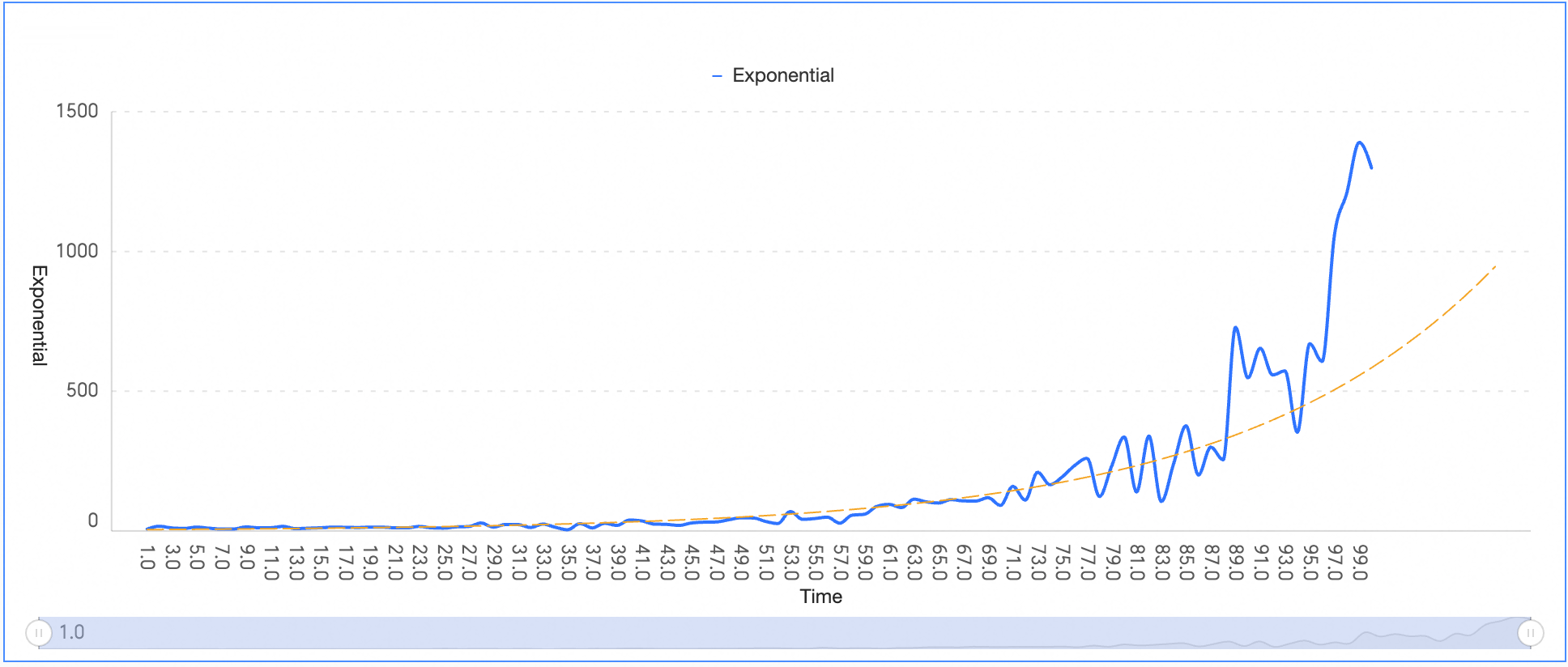
Exponential
An exponential trendline is used when data values rise or fall at an accelerating rate. Compared to a power trendline, an exponential trendline shows much faster growth or decline in later stages.
You can configure an exponential trendline as shown in the following figure.
To make a simple forecast, you can configure a forecast period. In this example, the forecast period is set to 10.
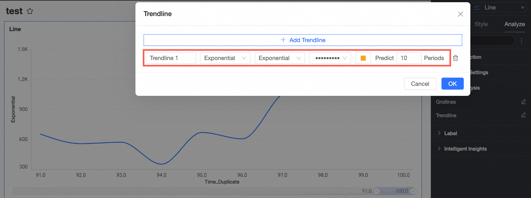
Click OK to save the configuration.
Polynomial
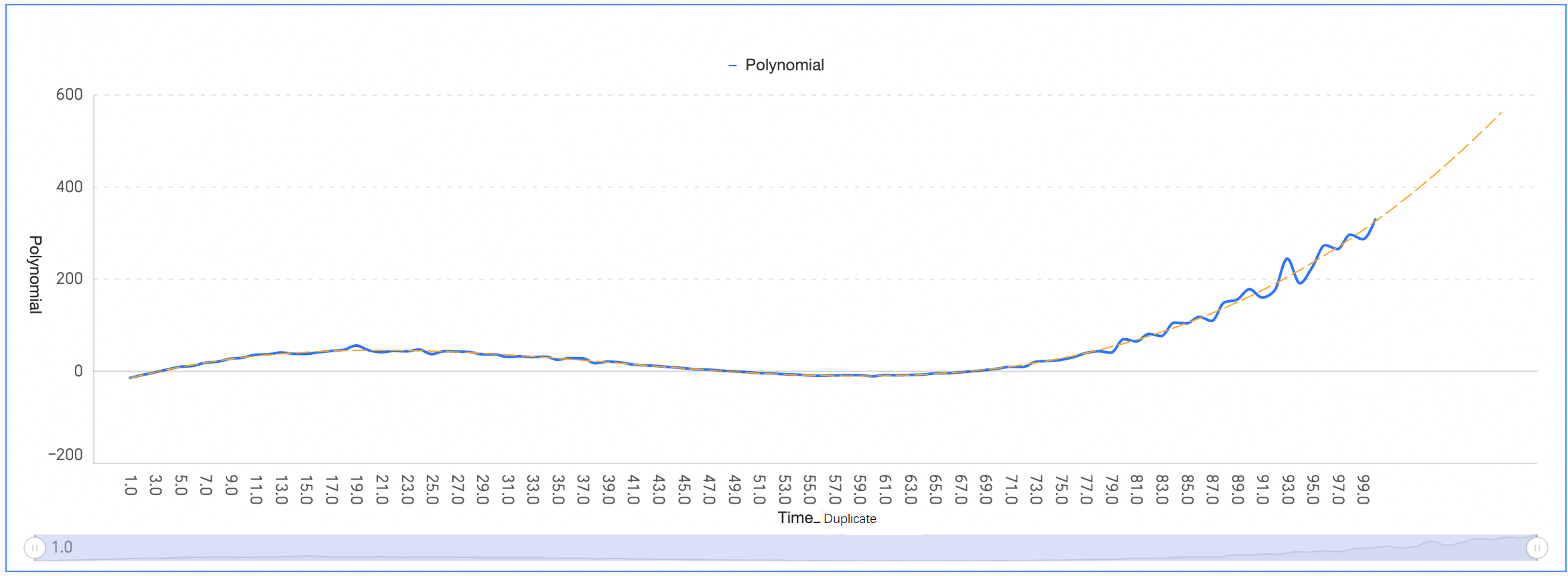
A polynomial trendline is a curved line used when data fluctuates.
You can configure a polynomial trendline as shown in the following figure.
To make a simple forecast, you can configure a forecast period. In this example, the forecast period is set to 10.
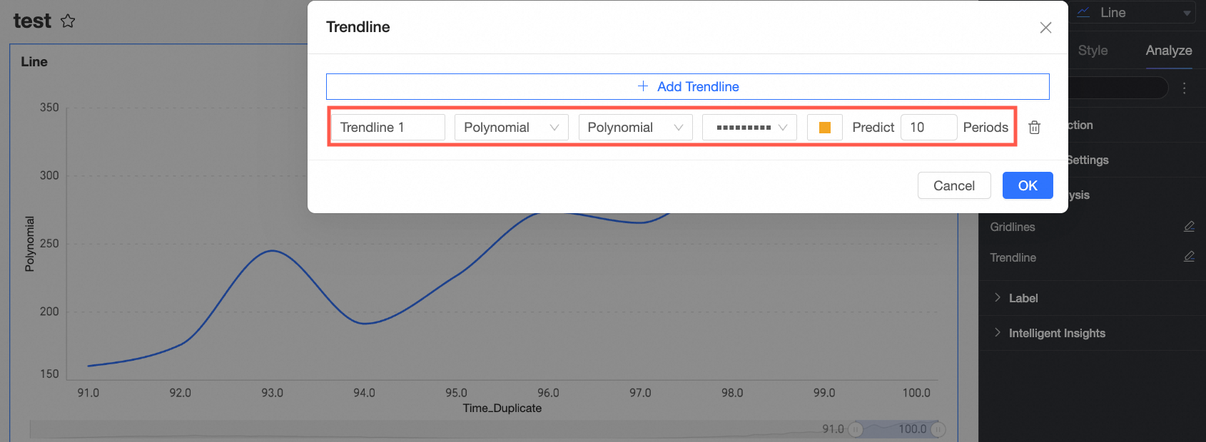
Click OK to save the configuration.
The chart shows two data fluctuations, corresponding to a cubic polynomial function. The first fluctuation peaks at approximately 19 and then begins to decline. The second fluctuation bottoms out at approximately 63 and then begins to increase.
Power
A power trendline is best for datasets that increase at a specific rate.
You can configure a power trendline as shown in the following figure.
To make a simple forecast, you can configure a forecast period. In this example, the forecast period is set to 10.
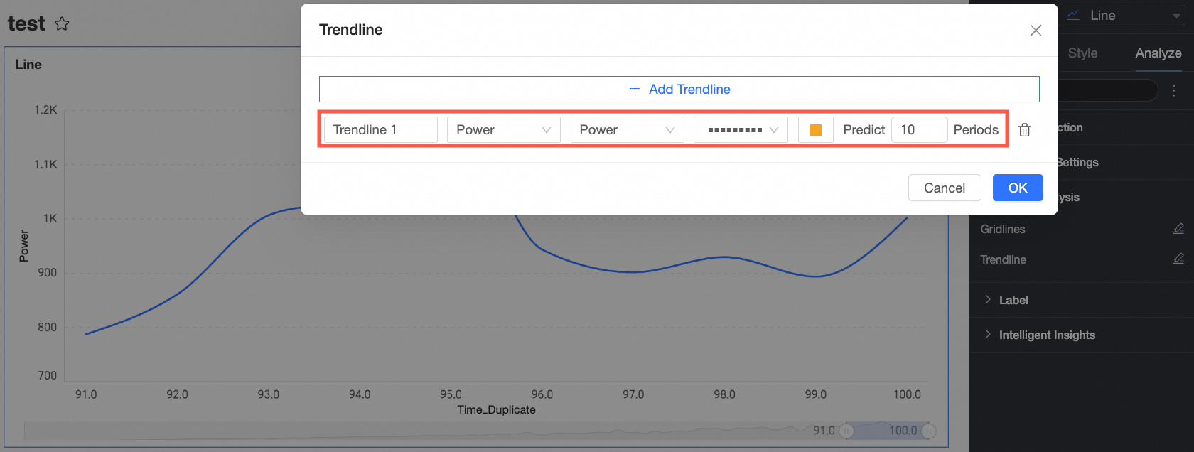
Click OK to save the configuration.