A bullet chart displays comparison results between data and different targets or project progress, helping you easily understand data performance. This article explains how to add data to a bullet chart and configure its style.
Prerequisites
You need to create a dashboard. For more information, see Create a Bashboard.
Overview
Scenarios
By adding measurement scales that match actual business scenarios, a bullet chart accurately presents data development in a specific stage. Bullet charts also support displaying multiple dimension values to compare homogeneous data. Common usage scenarios for bullet charts include the following:
Target completion assessment, such as company revenue evaluation and performance assessment.
Project progress display, such as project budget usage and project milestone completion.
Indicator comparison, such as comparison between current development status and industry benchmarks.
Advantages
Calculation capability: Has advanced calculation capabilities (such as cumulative calculation, period-over-period comparison, TopN) and supports adding intelligent auxiliary lines.
Visualization effect: Supports adjusting chart styles for more intuitive display effects and can add labels, legends, thumbnail axes, and other auxiliary configurations.
Data comparison annotation capability: Supports comparing data of different dimension values for the same period and making numerical annotations.
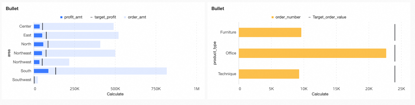
Example Chart
The main elements of a bullet chart include the following:
Measure bar: The main indicator for chart analysis.
Target value: The target value corresponding to the main indicator, which serves as the scale for the performance of the main indicator.
Background bar: Can represent another indicator for comparison with the main indicator or represent different levels or stages of project progress.
Configure a Bullet Chart
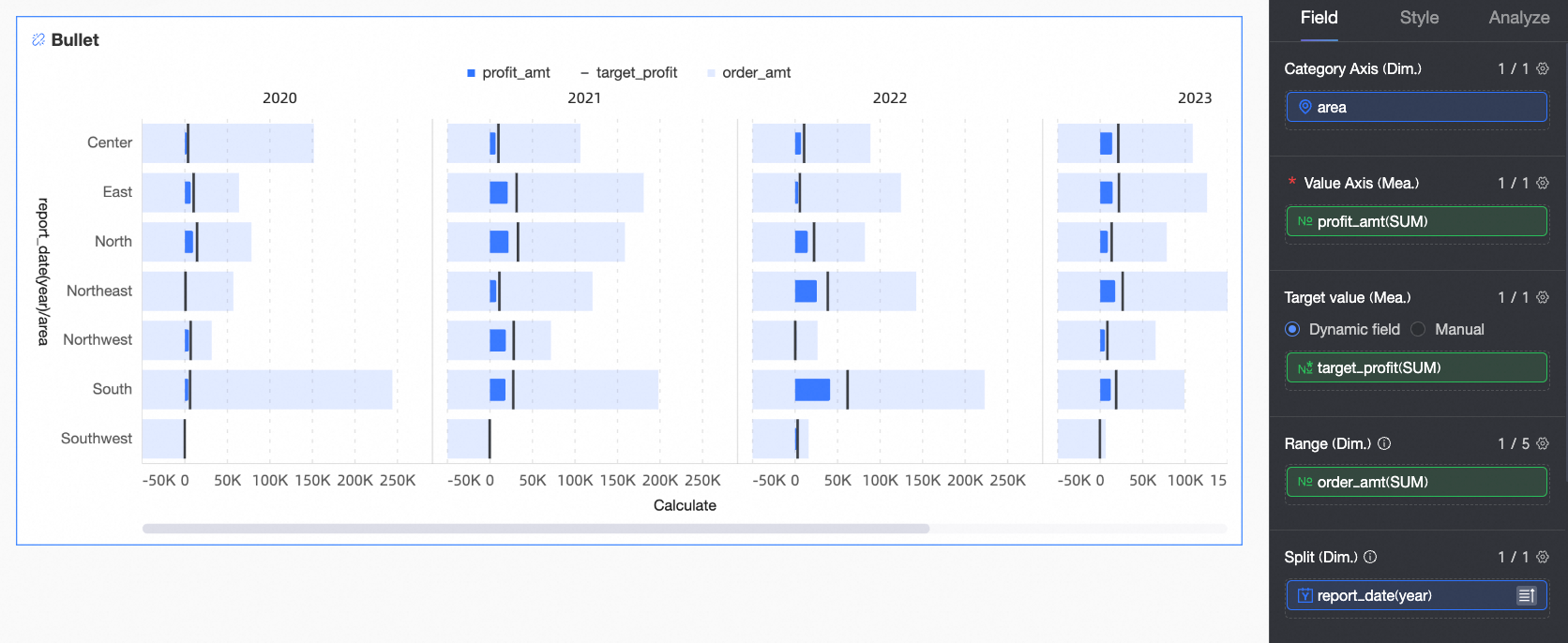
This article uses the profit completion status of various regions as an example to explain field configuration.
In the Data panel, select the required dimension fields and measure fields, and configure them to the corresponding areas under the Fields tab by double-clicking or dragging.
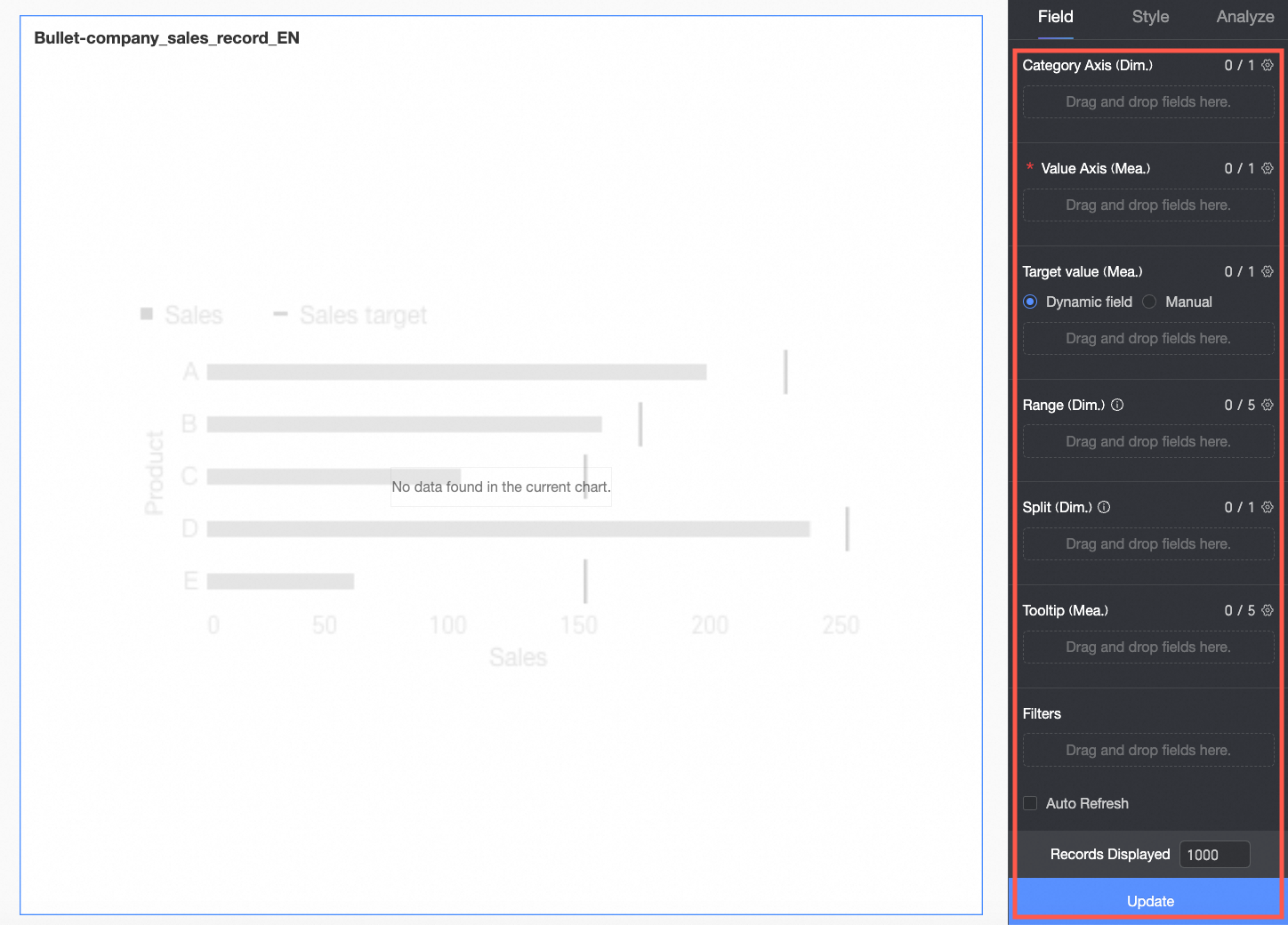
In the Category Axis/Dimension area, configure the dimensions for data comparison according to analysis requirements.
In this example, drag in the Region field to compare the profit completion status of each region in subsequent analysis.
In the Value Axis/Measure area, configure the main analysis indicator for the current chart.
In this example, drag in the Profit field as the main analysis indicator for subsequent analysis.
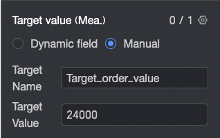
In the Target Value/Measure area, configure the target value corresponding to the main analysis indicator. Two configuration methods are supported:
Dynamic field: When the target value for each dimension value is different, you can drag in the relevant target field here to achieve a dynamic target effect.
Manual input: When the target value for each dimension value is the same, you can enter a fixed target value here and customize the target name.
In this example, the Dynamic field method is selected, and the Target Profit field is dragged in as the scale for the profit indicators of each region.
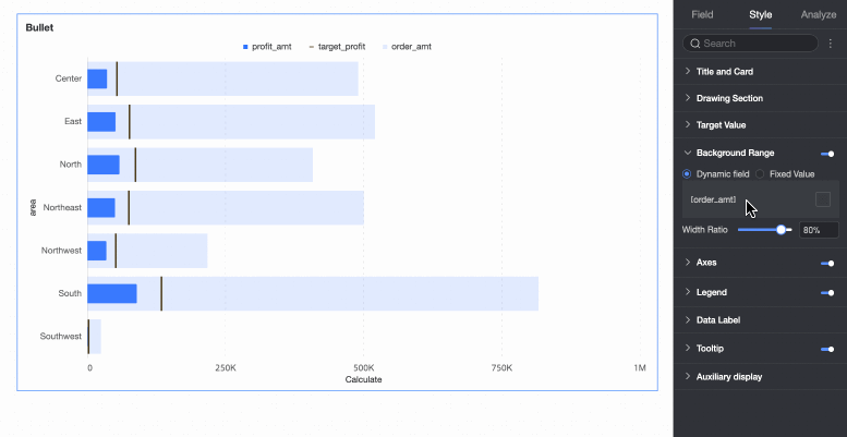
In the Background Area/Measure area, you can configure another indicator for dynamic comparison with the main analysis indicator, such as order amount. Alternatively, you can configure fixed numerical intervals to represent different levels or stages of project progress, such as poor, good, excellent. Fixed numerical intervals need to be configured under the Style tab. For specific operations, see Background Area > Fixed Value.
In this example, the dynamic field method is selected, and the Order Amount field is dragged in as a comparison for the main analysis indicator.
When you need to analyze data from different dimensions, you can configure other dimension fields in the Split/Dimension area as needed. After configuration, the chart will be split from one into several according to the number of dimension values in this field.
In this example, the Year field is dragged in, so you can analyze the profit situation in different years.
Click Update, and the system will automatically update the chart.
When you need to view the data information of a certain measure in the tooltip, you can add that measure to Tooltip/Measure.
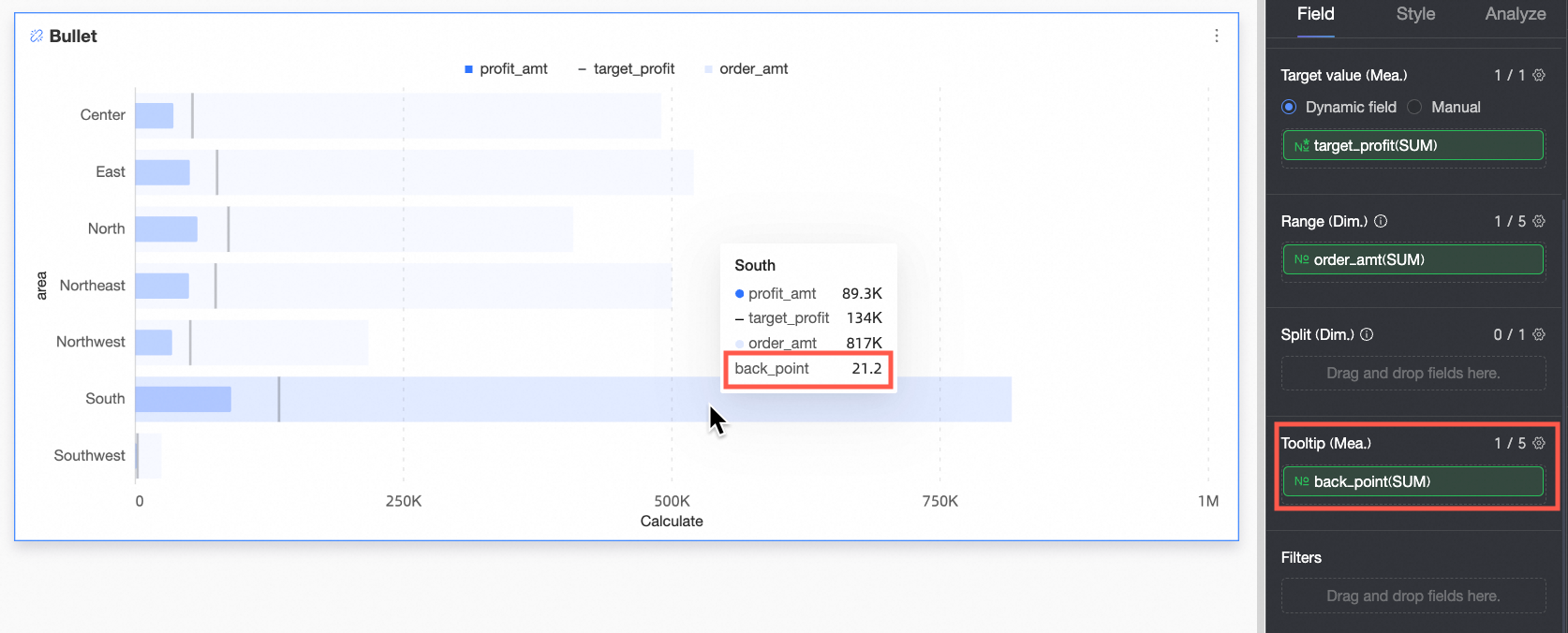
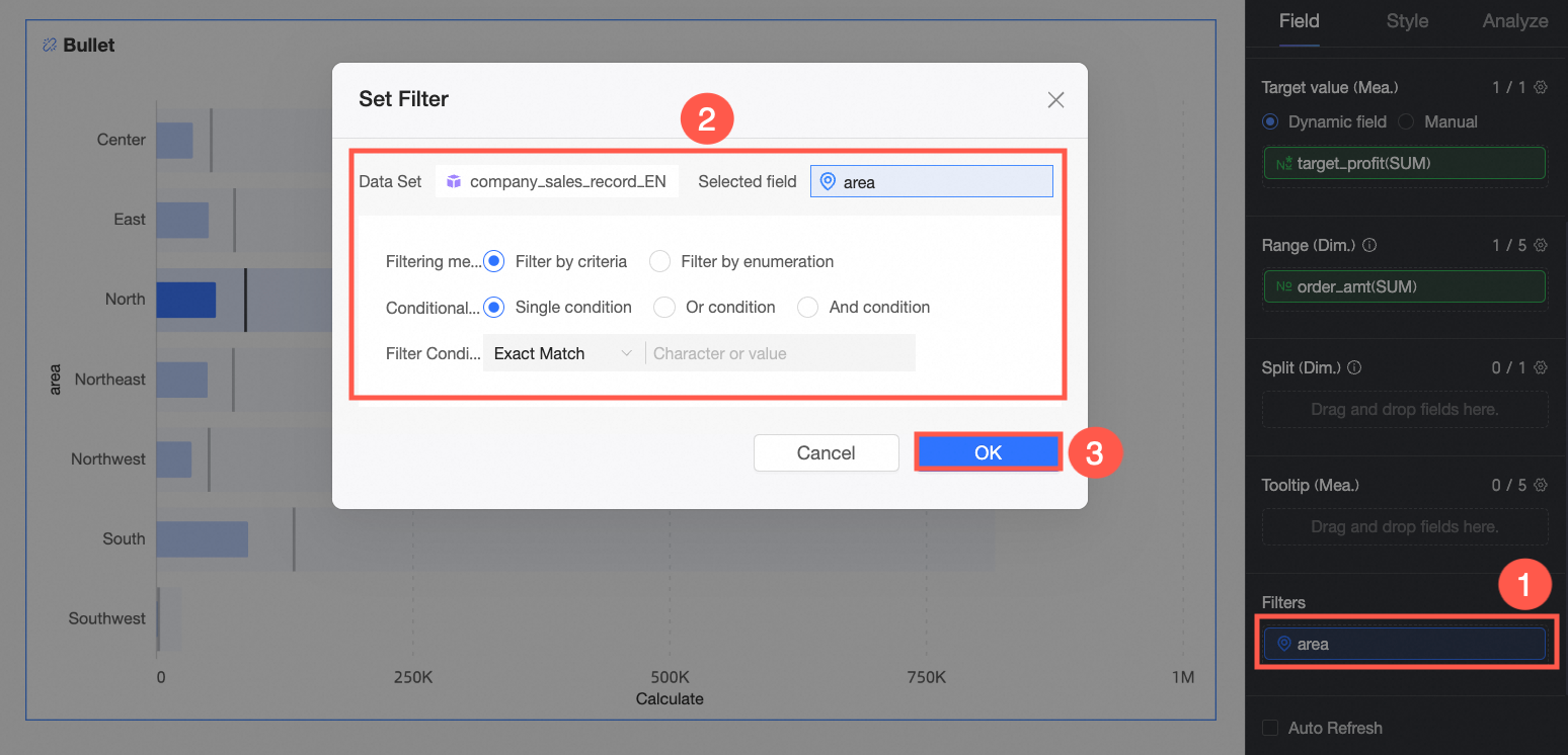
When you only need to view data in a certain Region, you can set a filter to filter out the required data.
Auto-refresh
After setting this option, the system will automatically refresh the chart data. For example, if you select this option and set the duration to 5 and the unit to Minutes, the system automatically refreshes the chart data every 5 minutes.
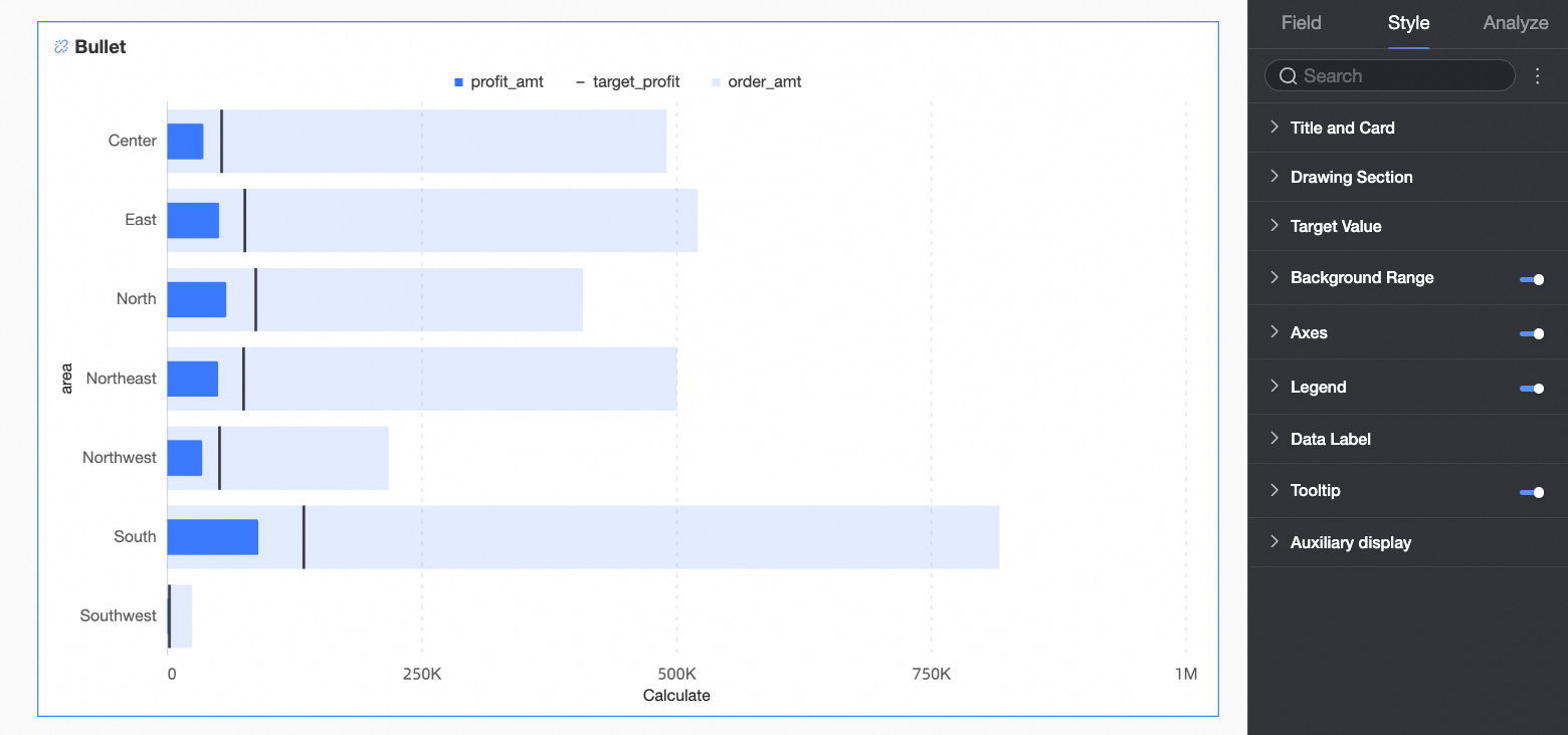
Configure the Style of a Bullet Chart
The following introduces the style configuration of the chart. For common style configurations of charts, see Configure the chart title.
Plot Area
In the Plot Area under the Style tab, set the bullet chart style.
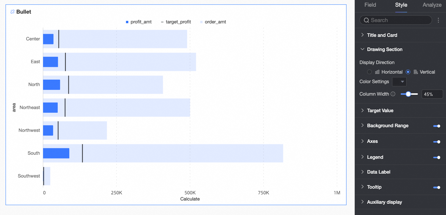
Chart configuration item | Description |
Chart display direction | Set the display direction of the bars in the chart, supporting Horizontal and Vertical. |
Bar color | Set the bar color for the field configured in Value Axis/Measure, supporting Solid Color or Gradient. |
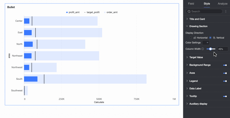
Bar width | Set the bar width for the field configured in Value Axis/Measure. |


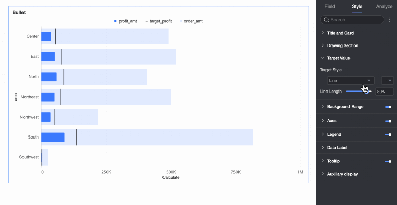
Target Value
In the Target Value under the Style tab, set the style of the graphic corresponding to the target value field. 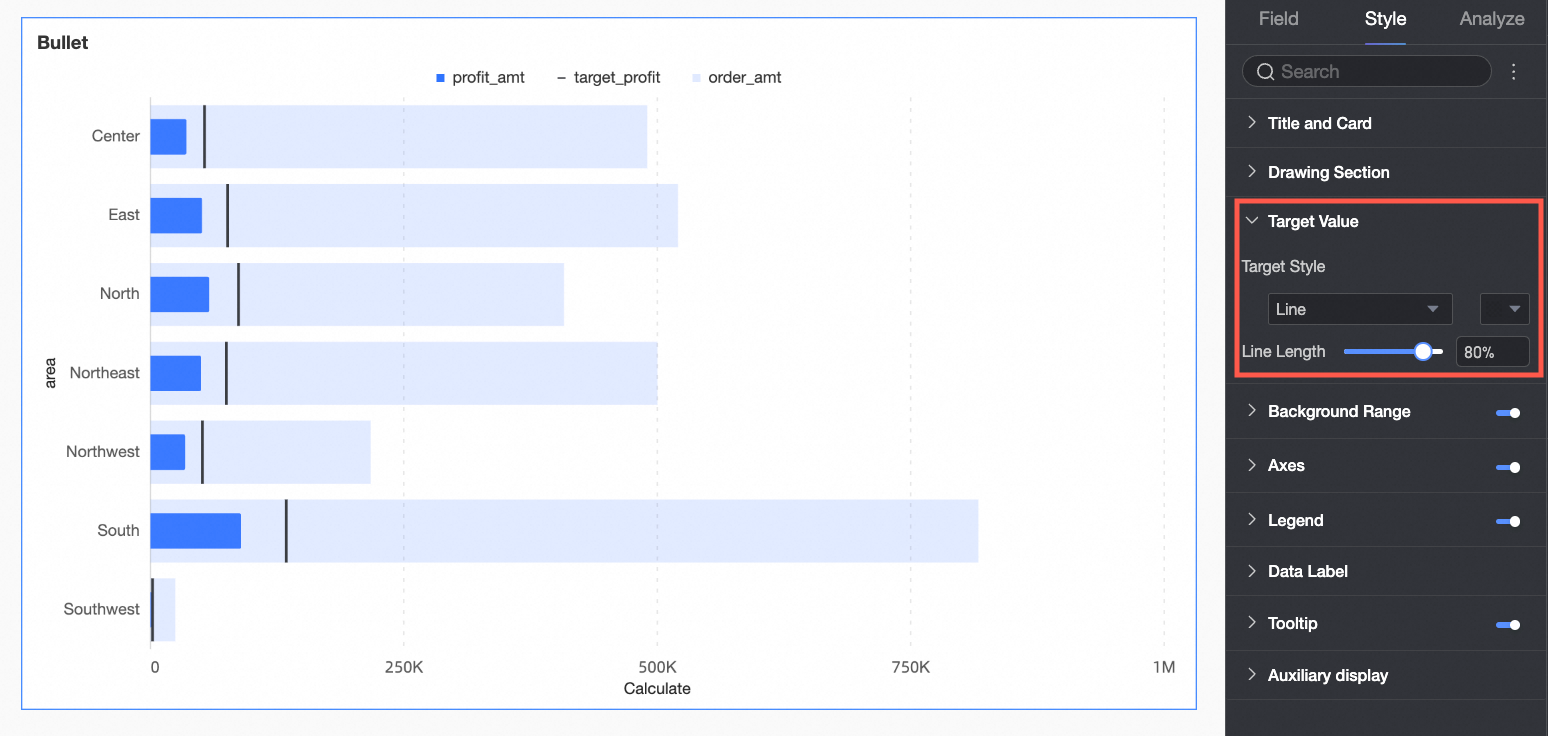
Chart configuration item | Description |
Target value style | Supports configuring the style and color of the graphic corresponding to the target value. |
Vertical line length | When the target value style is a vertical line, you can set the length of the vertical line. |
Background Area
In the Background Area under the Style tab, set the style of the chart background bar. The display of the background area is selected by default.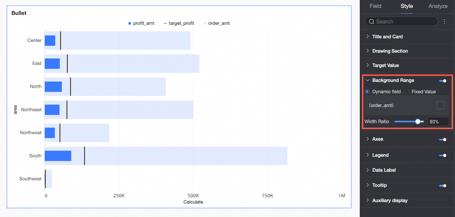
Chart configuration item | Description |
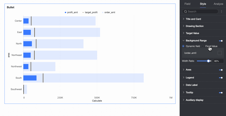
Dynamic field | When the chart background area is selected as a dynamic field, and the Background Area/Measure field has been configured under the Fields tab, you can customize the display name of the field legend and the color of the corresponding bar. |
Fixed value | When the chart background area is selected as a fixed value, the field configured in Background Area/Measure under the Fields tab will become invalid, and you need to reset the area background. The interval background set here is suitable for representing different levels or stages of project progress. You can set the Number of intervals, Interval value, Interval name, and Interval color here. |
Width ratio | Configure the width of the background area bar. |
Axis
In the Axis under the Style tab, set the axis style. The display of the axis is selected by default.
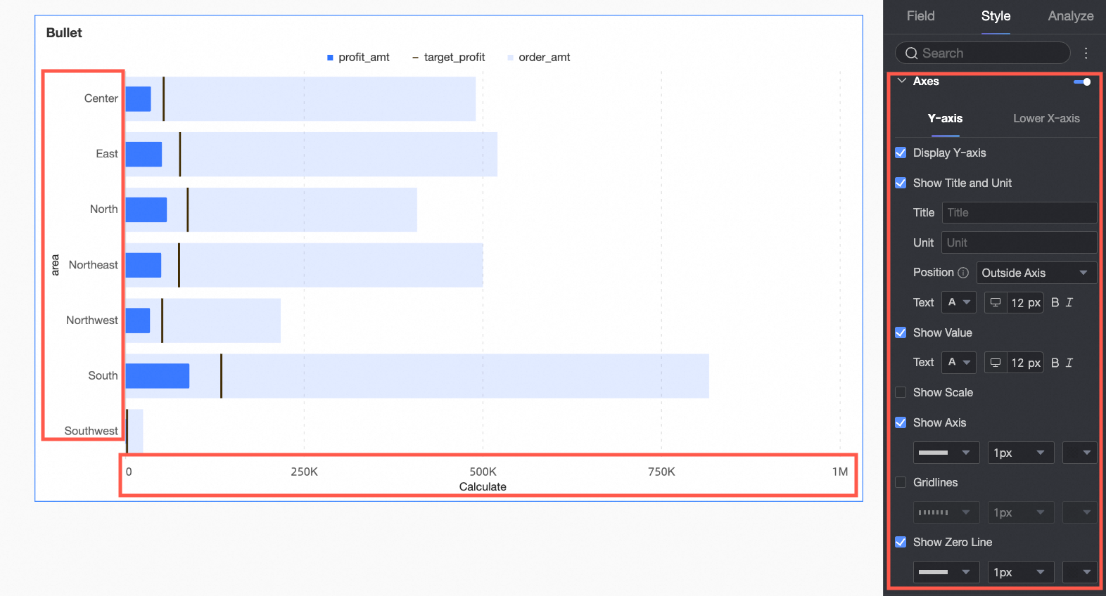
Chart configuration item | Configuration content | Description |
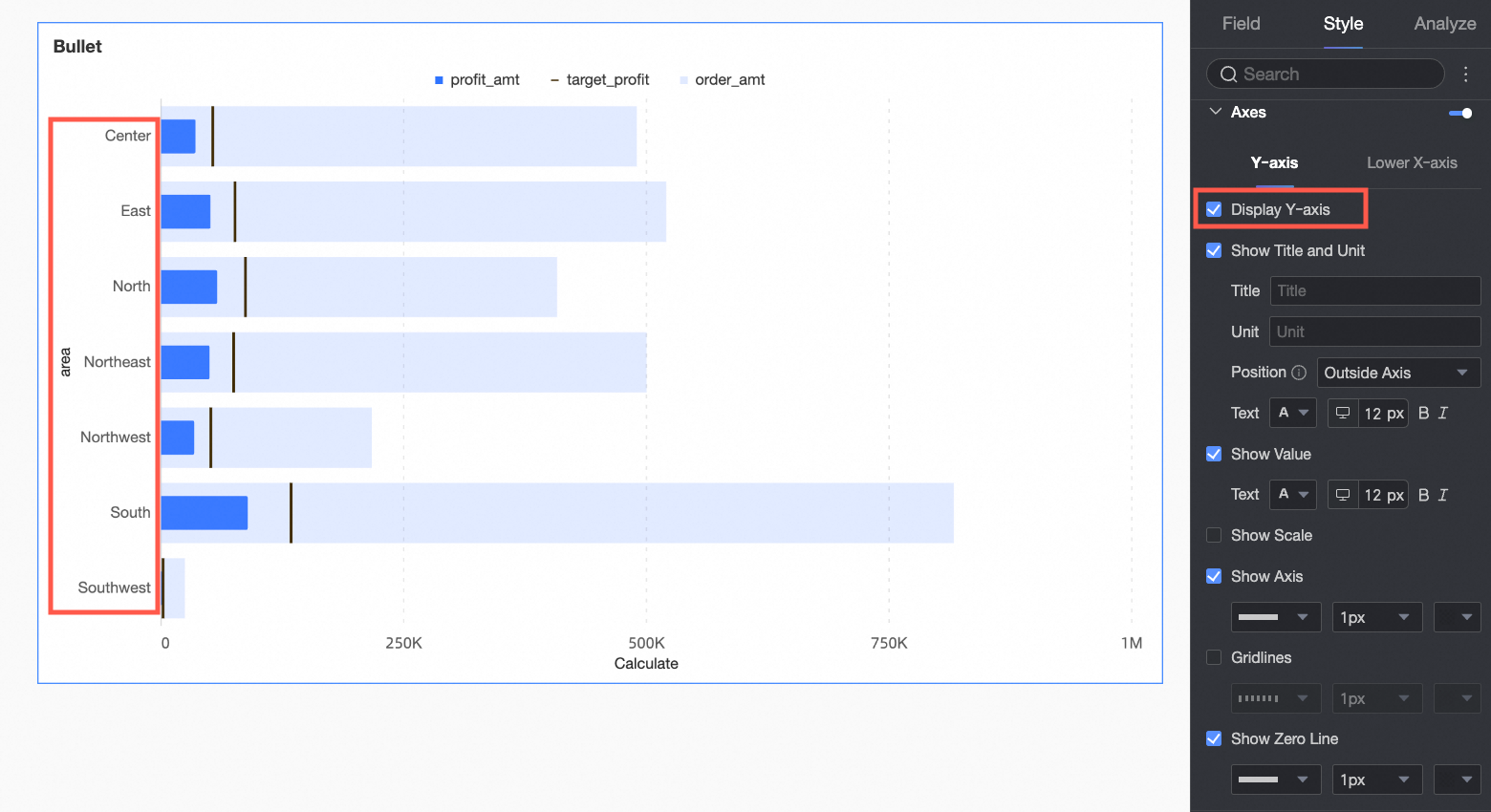
Y-axis | Show Y-axis | Set whether to display the Y-axis. |
Show title and unit | Set whether to display the axis title and unit on the Y-axis, and configure the text style. | |
Show axis labels | Set whether to display axis labels on the Y-axis, and the text style of the axis labels. | |
Show tick marks | Set whether to display tick marks on the Y-axis. | |
Show coordinate axis | Set whether to display the coordinate axis line of the Y-axis. When displayed, you can customize the coordinate axis style, including line type, line width, and color. | |
Show gridlines | Set whether to display gridlines on the Y-axis. When displayed, you can customize the gridline style, including line type, line width, and color. | |
Show 0 tick line | Set whether to display the 0 tick line on the Y-axis. When displayed, you can customize the 0 tick line style, including line type, line width, and color. | |
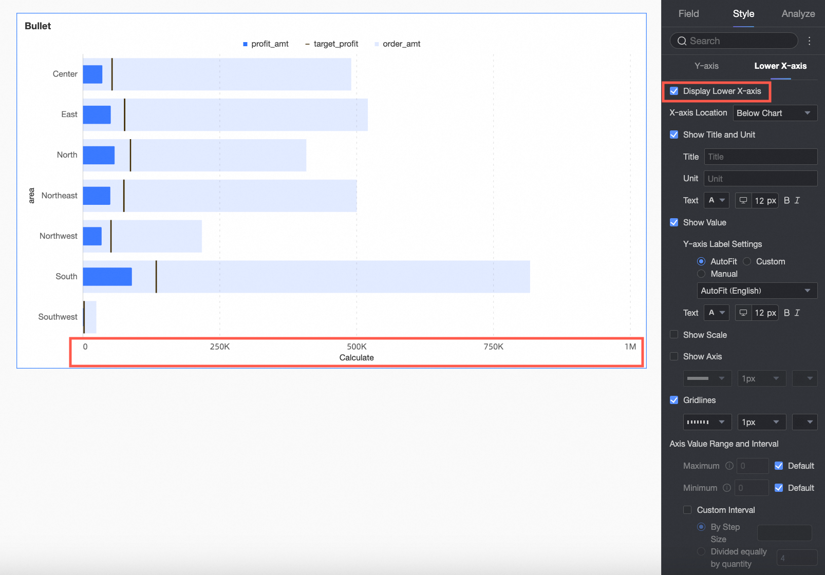
Bottom X-axis | Show bottom X-axis | Set whether to display the bottom X-axis. |
X-axis position | Set the display position of the X-axis in the chart, supporting Top of chart and Bottom of chart. | |
Show title and unit | Set whether to display the axis title and unit, and configure the text style. | |
Show axis labels | Set whether to display labels on the bottom X-axis, along with the label display format and text style. | |
Show tick marks | Set whether to display tick marks on the bottom X-axis. | |
Show coordinate axis | Specifies whether to show the left y-axis, including the line style, line width, and color of the left y-axis. | |
Show gridlines | Specifies whether to show gridlines on the left Y-axis, including the line style, line width, and color of the left Y-axis. | |
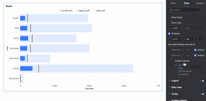
Axis value range and interval | Set the maximum and minimum values of the bottom X-axis values, along with the numerical interval size between each axis value.
|

Legend
In the Legend under the Style tab, set the style of the legend in the chart. 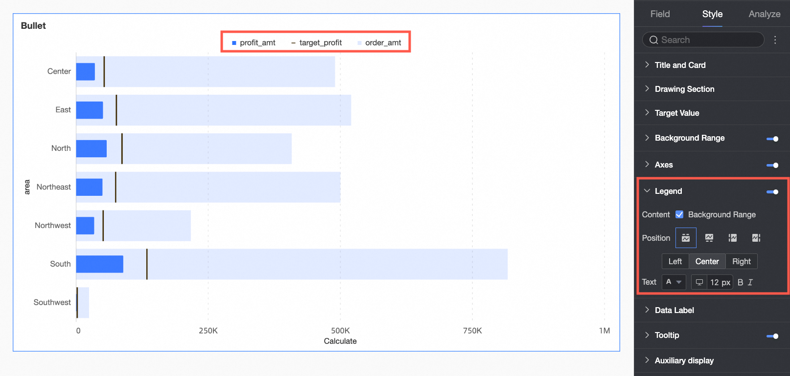
Chart configuration item | Description |
Content | Choose whether to display the background area indicators in the legend. |
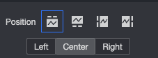
Position | Set the legend display position, supporting the following four legend presentation methods.
|
Text | Set the legend text style. The font size supports separate settings for PC and mobile terminals, while the other text styles are configured uniformly. |
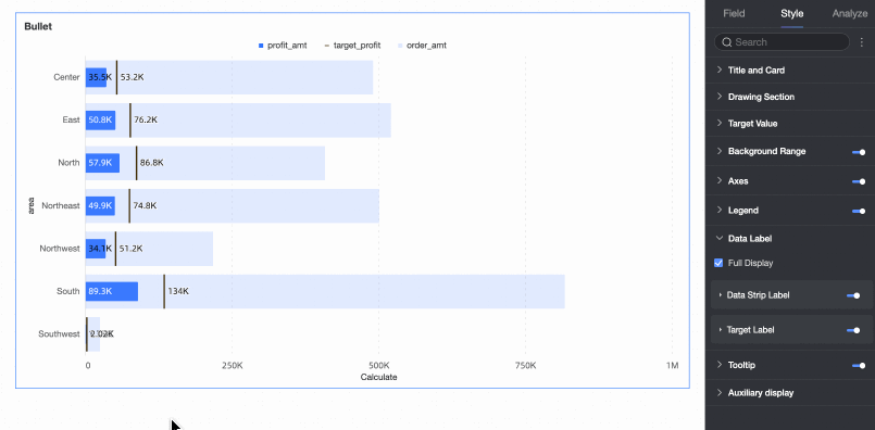
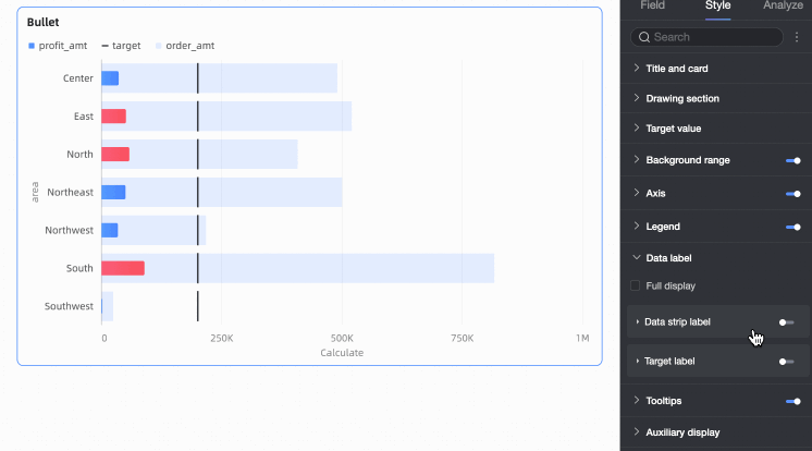
Data Labels
In Data Labels, set whether to display data labels and the label style.
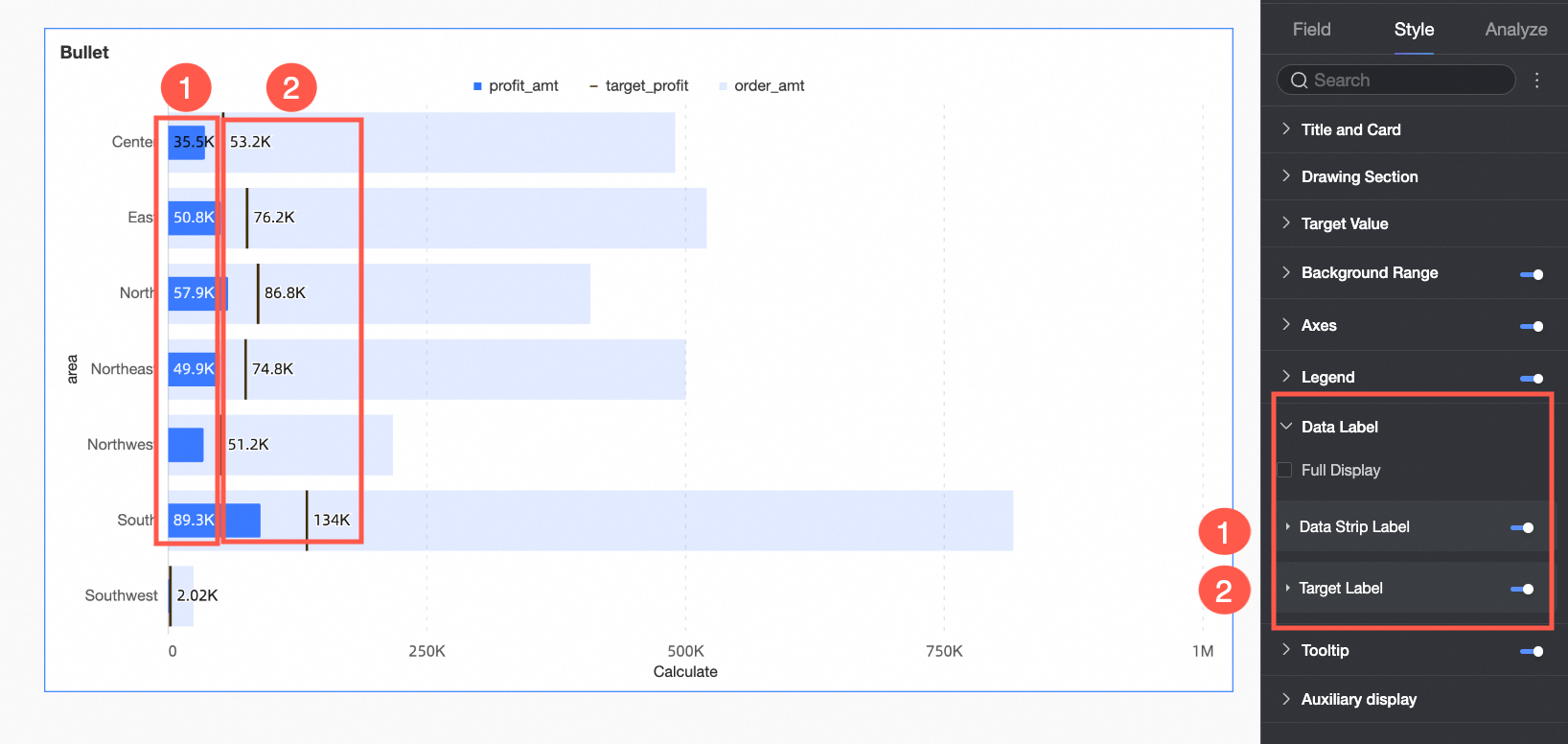
Chart configuration item | Description |
Show all | When both data bar labels and target value labels are enabled, set whether to display both data bar labels and target value labels simultaneously. For example: When the data value is close to the target value, and the positions of the two labels are close, the labels will overlap. You can achieve a visually clear effect by turning off Show all. |
Data bar label | Set whether to display data bar labels, and configure the label position and text style. |
Target value label | Set whether to display target value labels, and configure the label position and text style. |
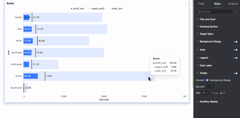
Tooltip
In the Tooltip under the Style tab, set the tooltip method.
Only PC terminals support setting tooltips.
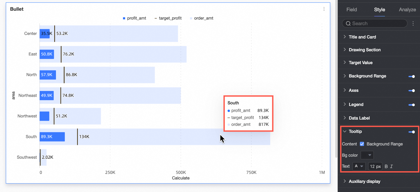
Chart configuration item | Description |
Content | Choose whether to display the background area field in the tooltip. |
Background color | Set the background color of the tooltip box. |
Text | Set the style of the tooltip text. |
Auxiliary Display
In the Auxiliary Display under the Style tab, set the thumbnail axis.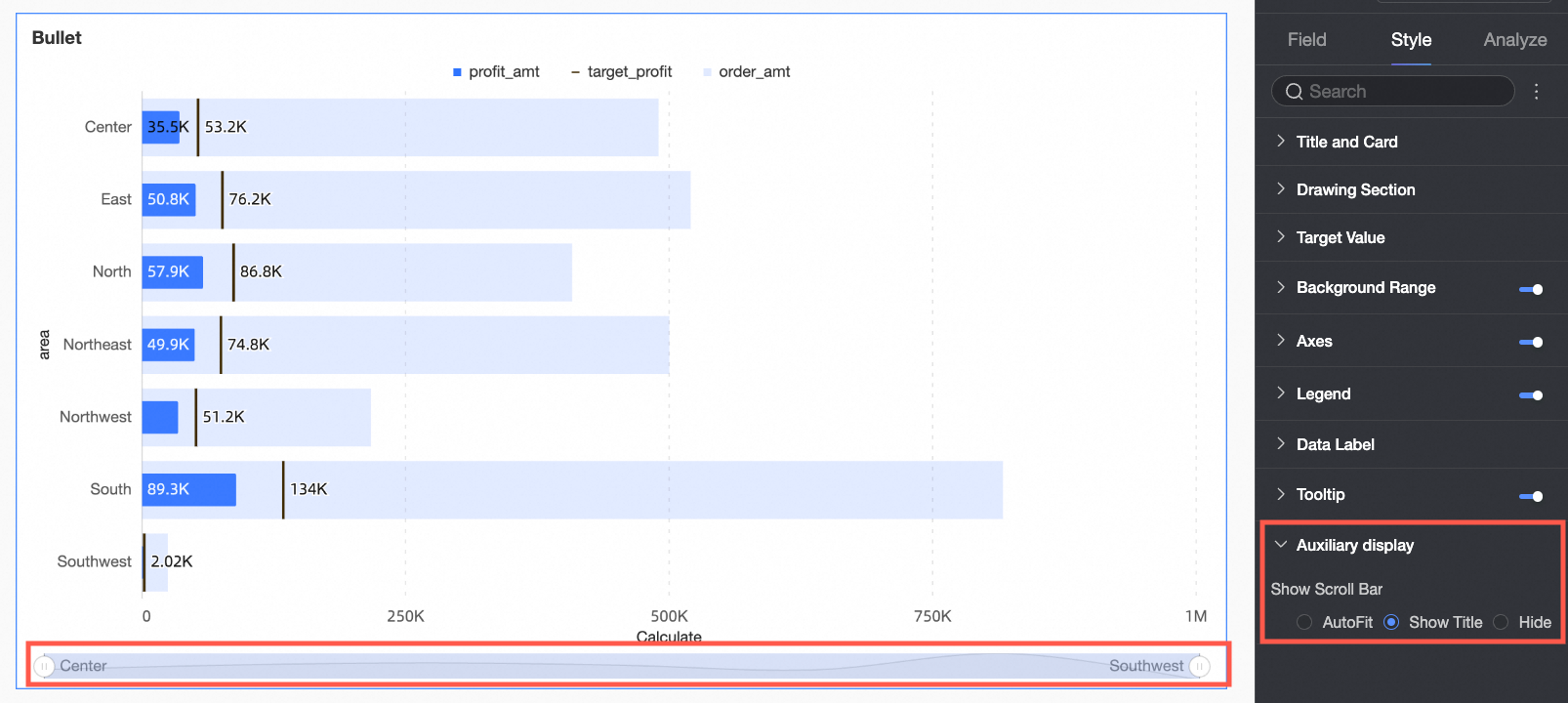
Chart configuration item | Description |
Show thumbnail axis | Set the thumbnail axis display method. |
Conditional Formatting
You can use Conditional Formatting to set different colors for different stages to visually present the different development stages of the data.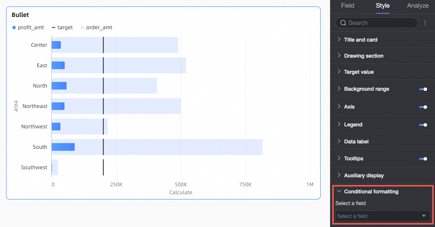
Chart configuration item | Description |
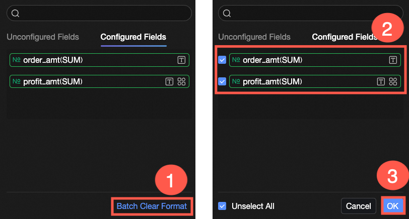
Please Select A Field | Select the measure field that needs to be configured with conditional formatting, that is, the measure field added to the Category Axis/Measure area. After the style configuration is completed, when you no longer need to use the configured conditional formatting, you can also click Batch Clear Format in the bottom right corner of the field panel, select the conditional formatting that needs to be cleared from the selection list, and click OK to complete the format clearing. |
Conditional Style | Click the Note When you need to set condition rules for the text color of a measure field, please ensure that Data Bar Label in Data Labels is turned on. |
 icon to set the condition rules for the currently selected measure field in the conditional formatting configuration panel, so that its text and text background are displayed in highlight colors. You can configure condition rules for the current field based on the values of other fields.
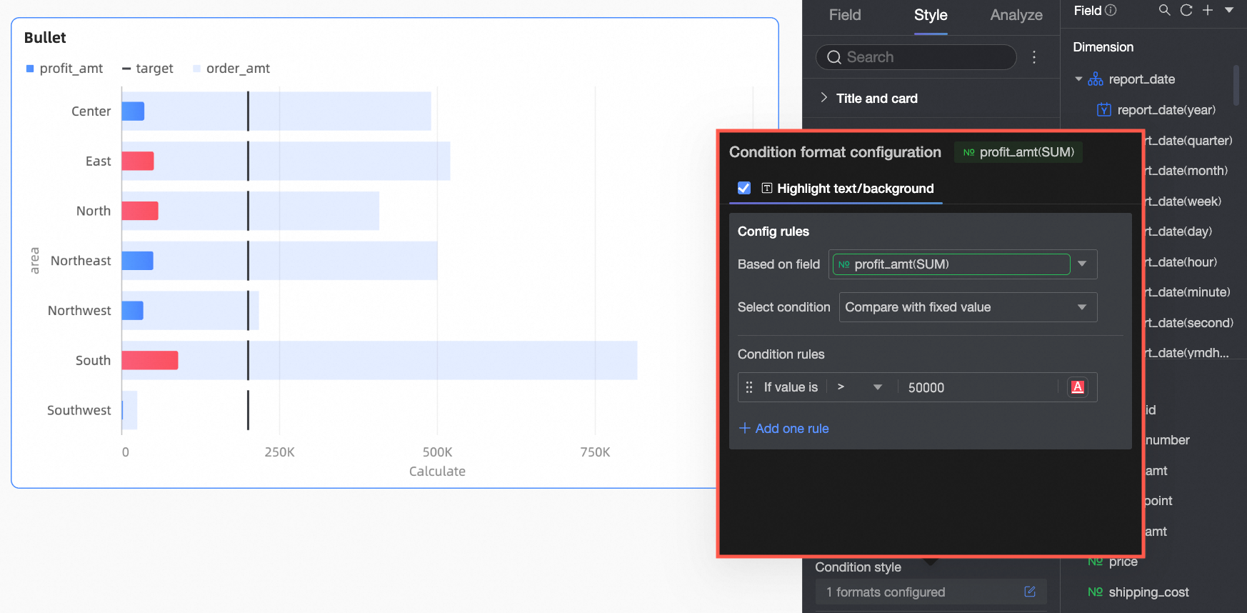
Configure Chart Analysis
Chart configuration item | Configuration content | Description |
Data interaction | Drilling | When you have completed setting up drilling fields in the field panel, you can set the display style of the drilling level rows here. For details, see Drilling. |
Filter Interaction | If the data that you want to analyze belongs to different charts or tables, you can configure this feature to associate the charts and tables, and then analyze the data. For specific settings, see Filter Interaction. | |
Hyperlink | When the data that you want to analyze belongs to different dashboards, you can configure this feature to associate the dashboards, and then analyze the data. Hyperlinks include three methods: Product internal jump, Page internal component and External link. For specific settings, see Hyperlink. | |
Analysis Alert | Auxiliary Line | An auxiliary line can be used to show the difference between the value of a measure and the reference value indicated by the auxiliary line. The reference value can be a fixed value or a calculated value. You can use the following calculated values: average, maximum, minimum, and median. For specific settings, see Auxiliary line. |
Annotation | - | If data in a chart is abnormal or requires additional attention, you can highlight the data or add icons, notes, or data points. This helps you detect exceptions and perform subsequent operations. For specific settings, see Annotation. |
What to do next
When others need to view the dashboard, you can share the dashboard with specific people. For more information, see Share a dashboard.
When you need to create complex dashboards with navigation menus for thematic analysis, you can integrate the created dashboards into a BI portal. For more information, see BI portal.