A bubble map uses a map outline as a background. Bubbles on the map show the magnitude, size, and distribution of data metrics for a country or region. For example, a bubble map can show the passenger traffic of tourist attractions or the per capita income of different regions. This topic describes how to add data to and configure the styles of a bubble map.
Prerequisites
You have created a dashboard. For more information, see Create a Dashboard.
Ensure that the geographic area field you want to add has been converted to geographic information. For more information, see Configure fields.
NoteFor example, if you want to add the area field to the chart, you can add it only after the
 icon appears, which indicates that the field has been converted to geographic information. For a comparison table with detailed information about each region, see public-area-info .xlsx. This table is for geographic area matching reference only and does not represent Quick BI’s political stance.
Limits
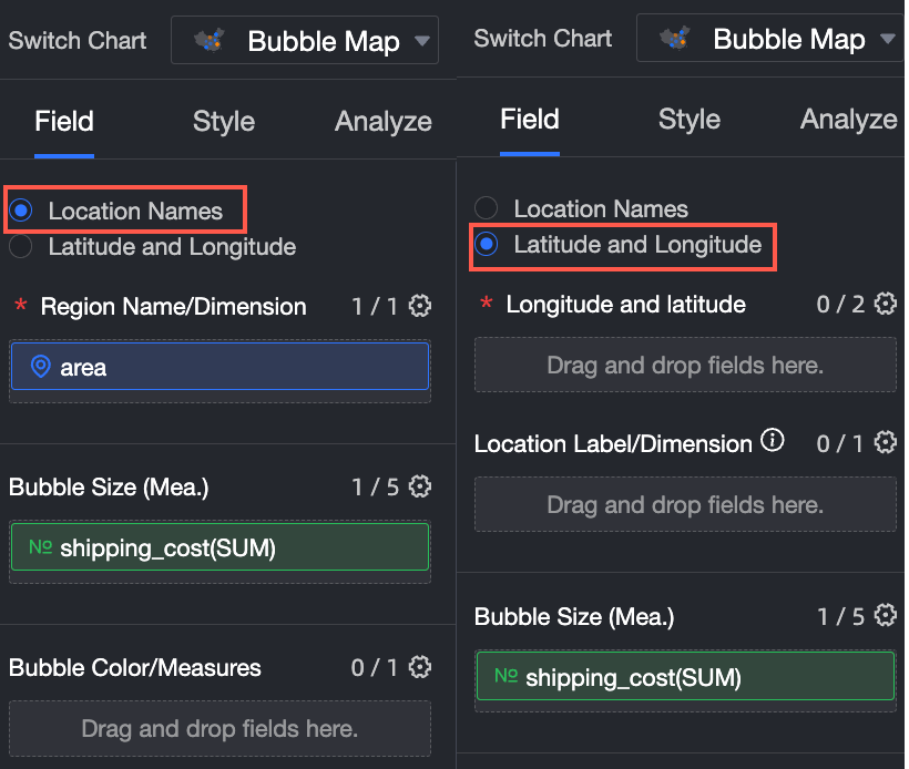
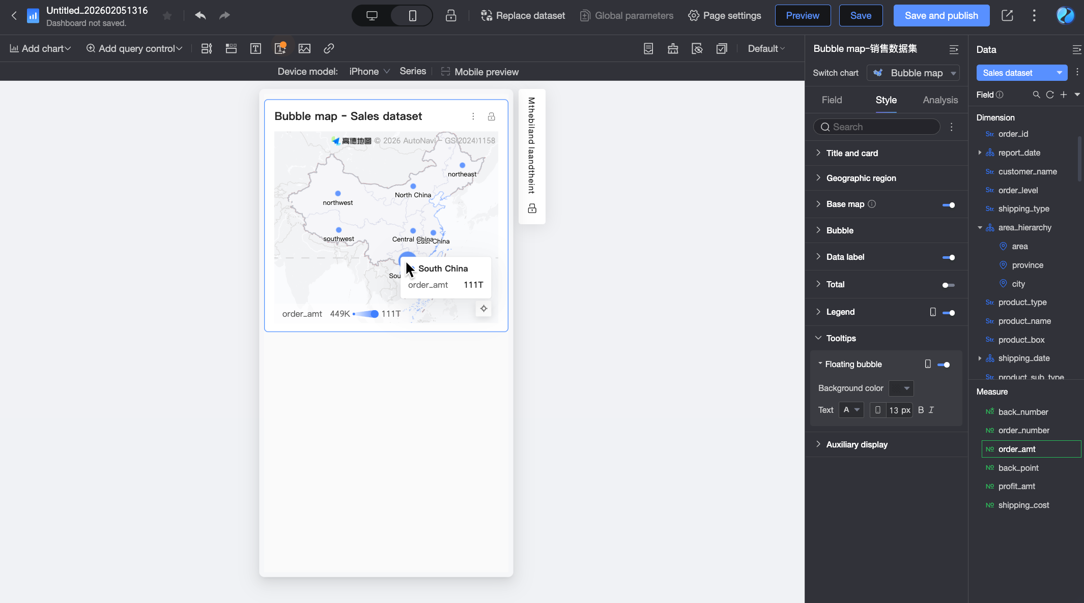
If you create a bubble map in Area Name mode, the map includes the following elements: Area Name/Dimension, Bubble Size/Measure, and Bubble Color/Measure.
The Area Name is determined by a data dimension. You can select only one dimension, which must be a geographic dimension, such as a province.
Bubble Size is determined by the data measure. You must select at least one measure and can select a maximum of five measures, such as shipping cost and order quantity.
Bubble Color is determined by the data measure. You can select a maximum of one measure, such as order amount.
If you create a bubble map in Longitude and Latitude mode, the map contains the following fields: Longitude and Latitude/Dimension, Location Label/Dimension, Bubble Size/Measure, and Bubble Color/Measure.
Longitude and Latitude are determined by the data dimension. You can select a maximum of one longitude field and one latitude field.
The Location Label is an optional setting that is determined by a string or geographic data dimension.
Bubble Size is determined by the data measure. You must select at least one measure and can select a maximum of five measures, such as shipping cost and order quantity.
Bubble Color is determined by the data measure. You can select a maximum of one measure, such as order amount.
Chart Overview
Scenarios
Bubble maps are often used to display data with spatial distribution. They are suitable for datasets with geographic location information, typically showing summarized, continuous information for specific regions. The geographic location of the data is represented by the position of the graphics. Data distribution across different geographic locations is mapped onto the map using bubbles.
Advantages
Visualization: Supports marker-style maps.
Interaction: Supports zooming by selecting an area, switching metrics, and filtering within the component.
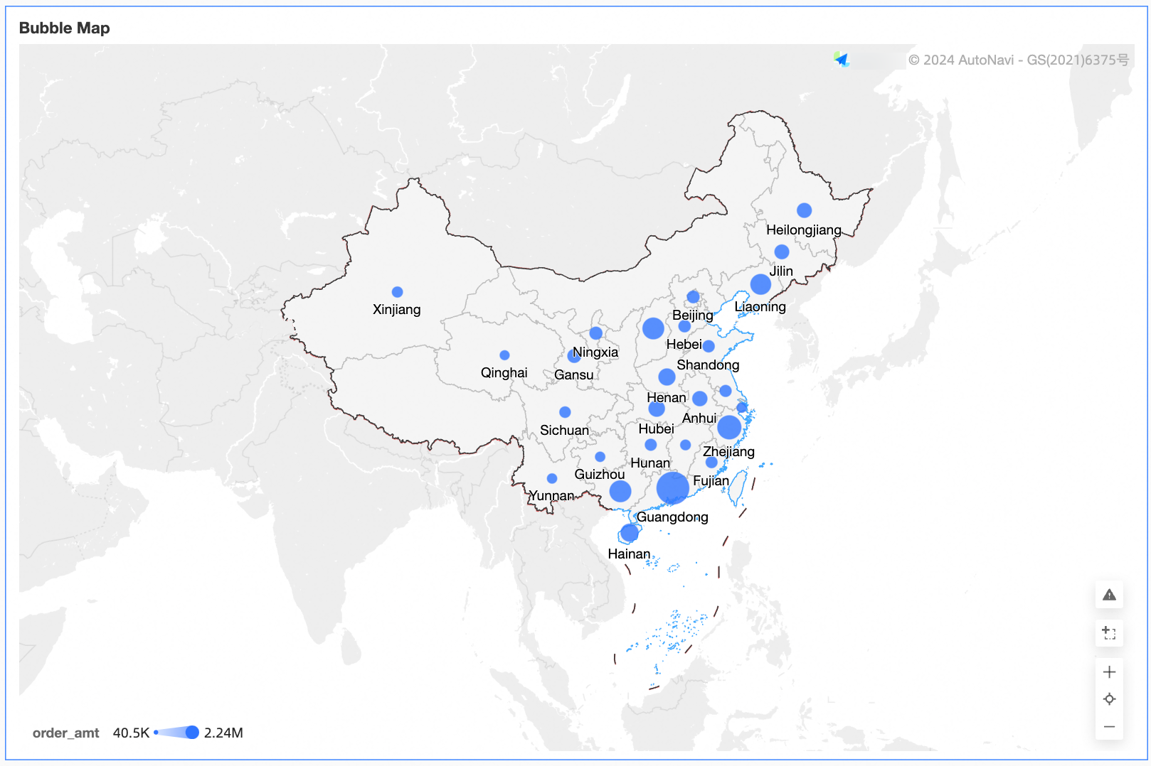
Sample rendering
Configure Chart Fields
On the Fields tab, select the required dimension and measure fields:
You can create Geographic Information using either Area Name or Longitude and Latitude.
If you select Area Name, you can double-click or drag province to Area Name/Dimension.
If you select Longitude and Latitude, double-click or drag the longitude and latitude fields to Longitude and Latitude/Dimension. Location Label/Dimension is optional.
In the Measures list, double-click or drag Order amount to Bubble Size/Measure.
In the Measures list, find shipping_cost, and double-click or drag it to Bubble Color/Measure.
Click Update to automatically update the chart.
Configure Chart Styles
This section describes how to configure the chart's styles. For general style configurations, see Configure the Chart Title.
You can enter a keyword in the Search box at the top of the configuration section to quickly find a configuration item. You can also click the  icon on the right to Expand/Collapse all categories.
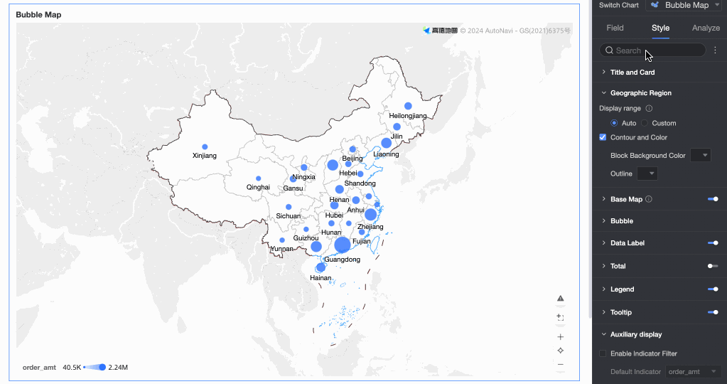
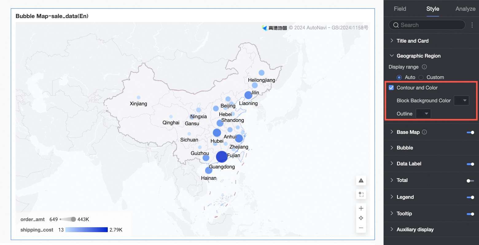
Geographic Area
In the Geographic Area section, you can set Display Range, Outline and Fill, and Show Basemap.
In the Display Range field, you can select Auto or Custom. For this example, select China.
NoteAuto display automatically adjusts based on the data range. Custom display lets you set the range manually. Interactive analysis scenarios always display automatically based on the data range.
Custom display ranges currently support global continents and countries, along with regions, provinces, and cities in China.

Enable Manual Adjustment to automatically generate the current Centroid and Scaling Value. You can then modify these values manually.

In the Outline and Fill section, configure the colors for the Area Background and the Outline.
NoteOutlines are not supported for some regions.
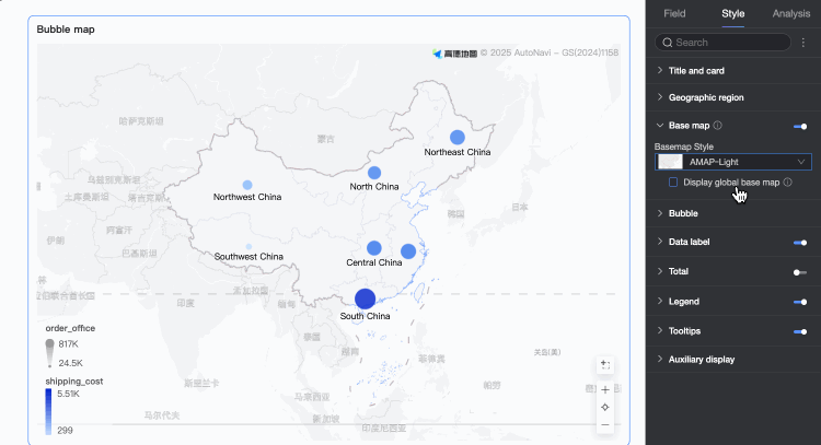
Basemap
In the Basemap section, you can configure whether to Show Basemap, what Basemap Style to use, and whether to Show Global Basemap.
Show Basemap: Click the
 switch to show or hide the basemap information.
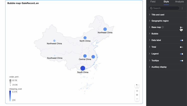
Basemap Style: Supports multiple styles of Amap basemaps.
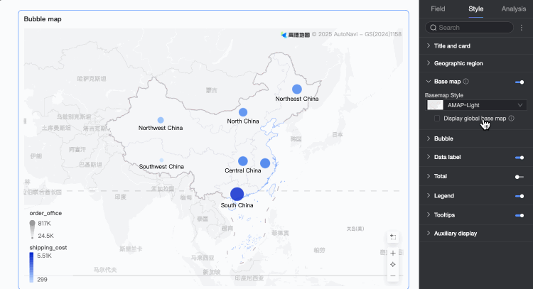
Show Global Basemap: Select this option to display global information, such as cities, on the basemap.
 Note
NoteGlobal Basemap Limits: Each Quick BI organization can preview map charts containing information from outside China up to 1,000 times per month (calculated by the number of basemap tile initializations). After the limit is exceeded, the map charts will display only basemap information from within China.
Bubbles
In the Bubbles section, you can set the Bubble Color, Max/Min Color Configuration, Bubble Shape, Bubble Size, and Zero Value Handling.
Bubble Color: Set the theme color, transparency, data mapping range, and number of intervals.
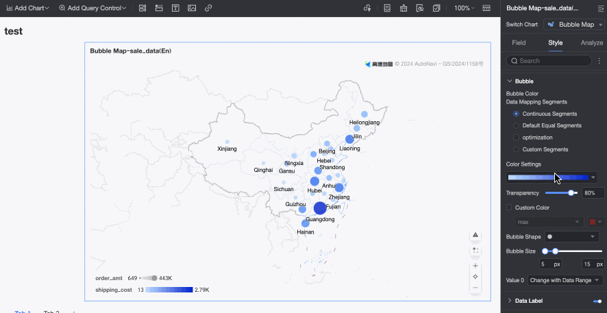
Max/Min Color Configuration: Configure colors for the maximum value, minimum value, top three values, and bottom three values.
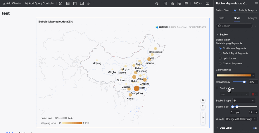
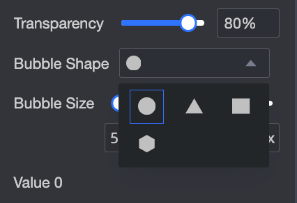
Bubble Shape: You can select from circle, triangle, rectangle, or diamond shapes.
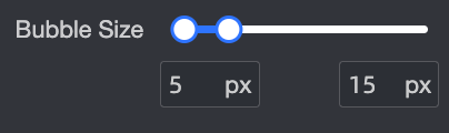
Bubble Size: Drag the pointer to adjust the bubble size.
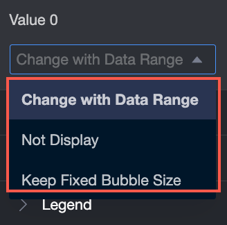
Zero Value Handling: Provides three options: do not display, follow data range, or fixed bubble size.
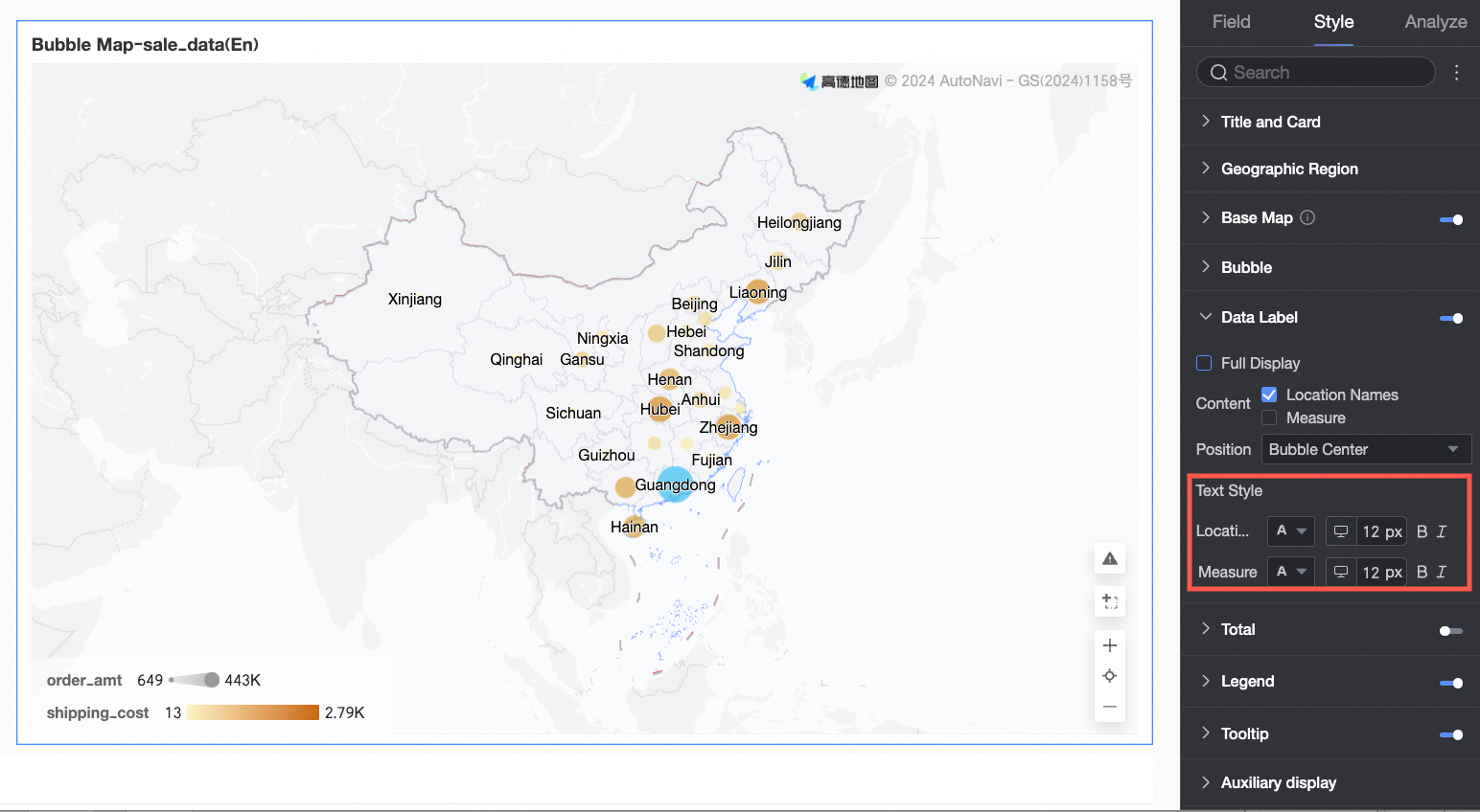
Data Labels
In the Data Labels section, configure Show Data Labels, Label Display Format, and Content, Position, and Text Style.
Show Data Labels:
In Area Name mode, a map can display both Area Name and Measure.
When you create a map in Longitude and Latitude mode, you can display both Longitude and Latitude and Measure.
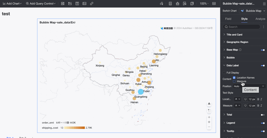
Position: The default is auto. You can choose to display labels Above Bubble, Below Bubble, or at the Bubble Center.
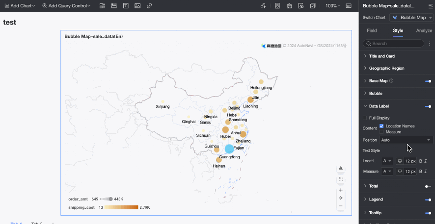
Label Display Format: Select Show All to display all label content.
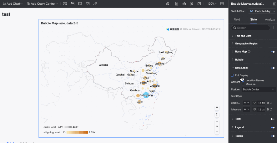
Text Style: Sets the text style for the following data labels: Area Name, Longitude and Latitude, and Measure.
Total
In the Total section, you can automatically calculate the sum of measure values in the current chart.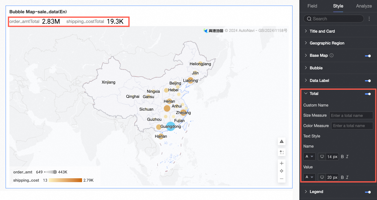
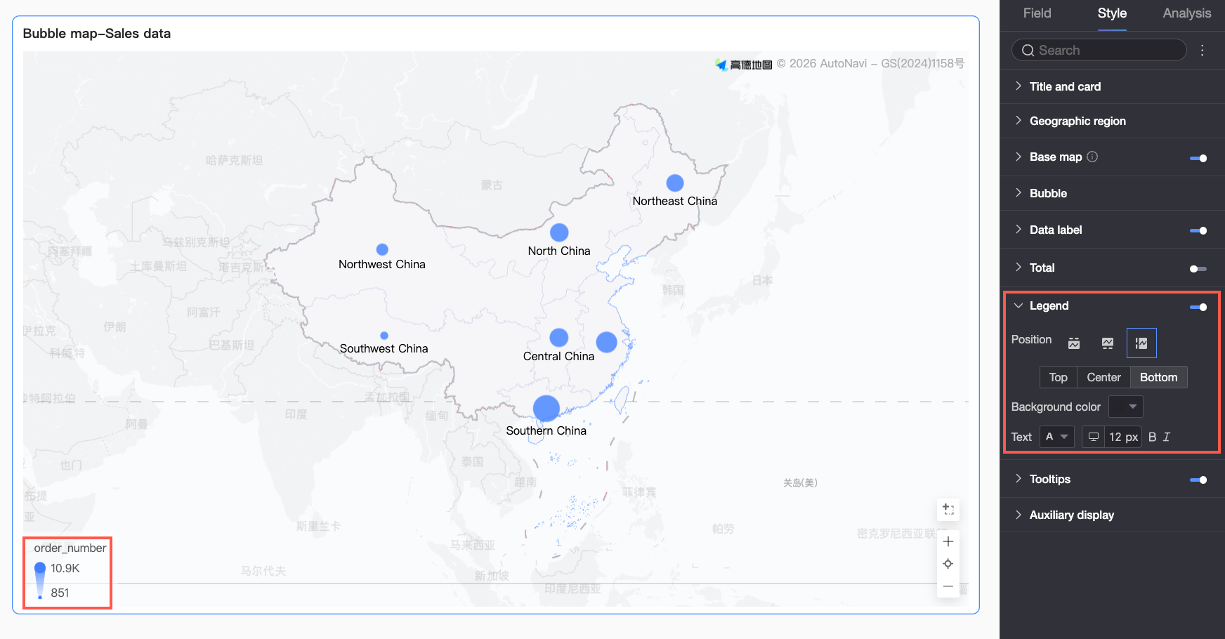
Legend
In the Legend section, click the  icon to enable the chart legend and configure its style.
Configuration item | Description |
Position | Set the display position and alignment of the legend.
|
Background color | Set the background fill color of the legend. |
Text | Set the text style of the legend. You can set the font color, size, weight, and whether it is italic. |
Mobile Legend Configuration | The legend settings for PC and mobile are independent. You can switch between PC and mobile editing views using the button ( |
 ) at the top of the dashboard edit page to set an appropriate legend for each terminal. You can customize the position, background color, and text style for the mobile legend.
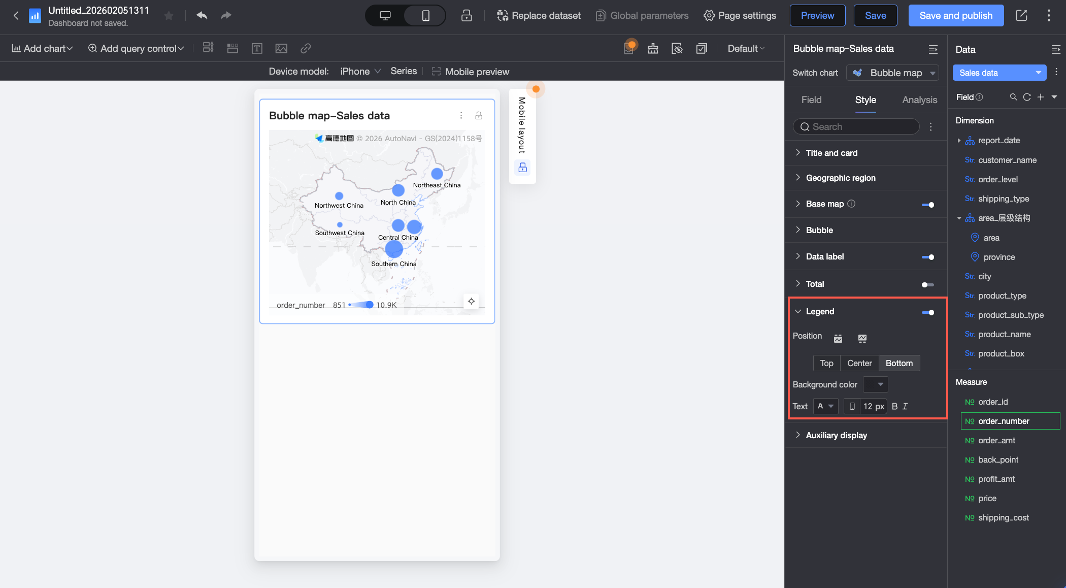
Tooltip
In the Tooltip section, click the icon to enable the tooltip and configure its style.
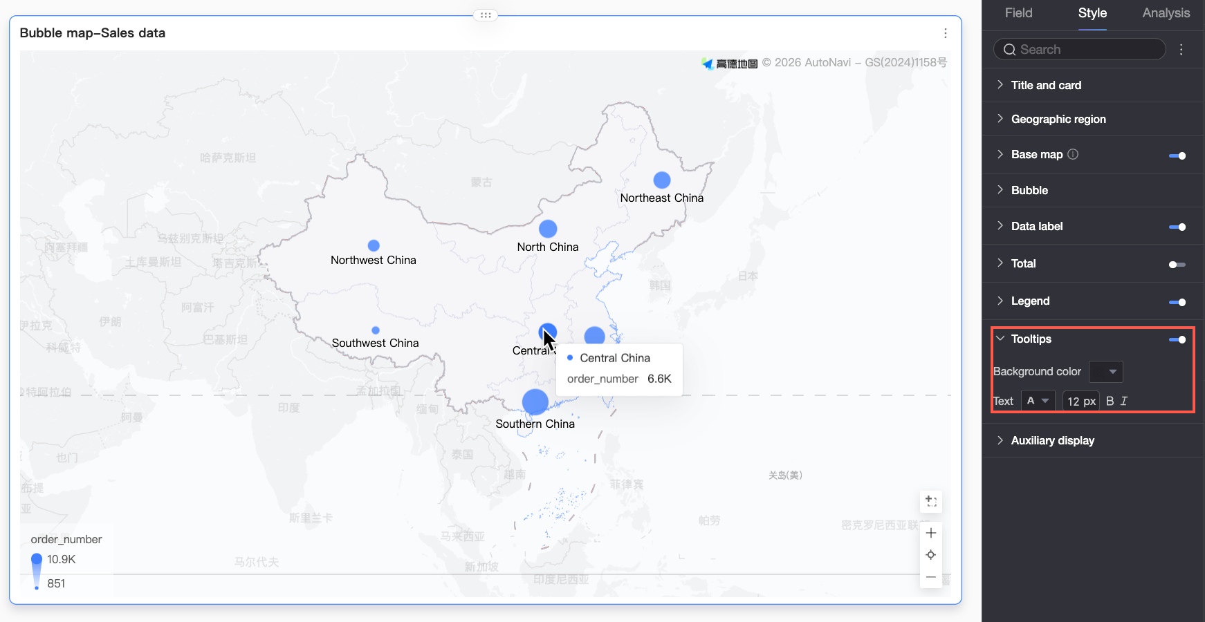
Chart Configuration Item | Configuration Item Description |
Background color | Set the background fill color of the tooltip box. |
Text | Set the style of the text in the tooltip box. You can set the font color, size, weight, and whether it is italic. |
Mobile Tooltip | The tooltip switches for PC and mobile are independent. You can enter the mobile editing view using the PC/mobile switch button ( |
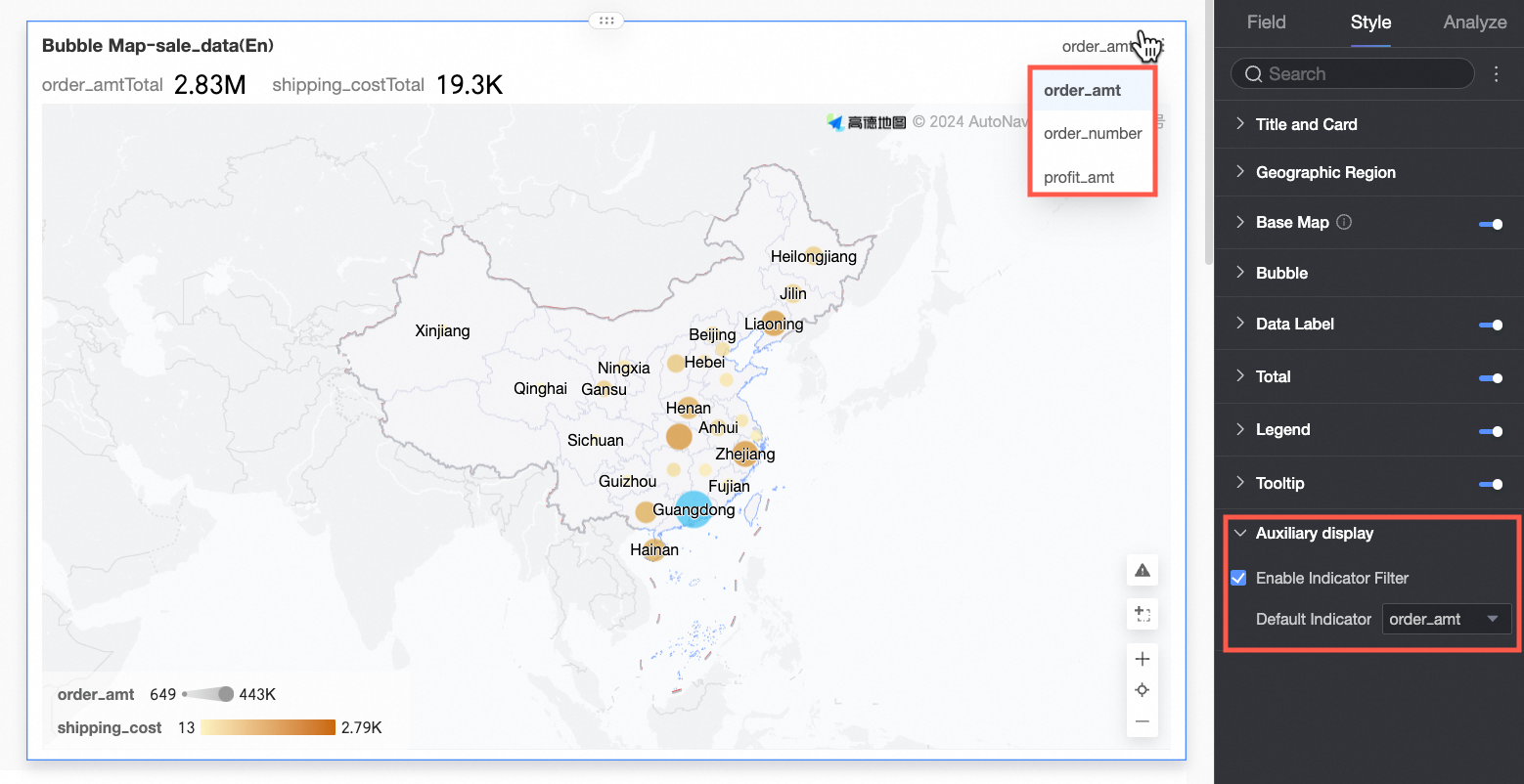
Auxiliary Display
In the Auxiliary Display section, select Enable Metric Filter to set the metric items to be displayed.
Advanced Chart Configuration
Configuration item | Name | Description |
Data Interaction | Drilling | When you have configured drill-down fields in the fields panel, you can set the display style for drill-down level rows here. For more information, see Drilling. |
Filter Interaction | When the data you need to analyze exists in different charts, you can use chart filter interactions to associate multiple charts for data analysis. For more information, see Filter Interaction. | |
Jump | When the data you need to analyze exists in multiple dashboards, you can use dashboard jumps to associate multiple dashboards for data analysis. Jumps include Parameter Jump and External Link. For more information, see Jump. | |
Annotate | - | When data in a chart is abnormal or requires special attention, you can use color highlights, icons, comments, or data points to annotate it. This helps you identify anomalies and take appropriate action.
|