Quick BI mobile lets you view reports, analyze data, and gain insights on your phone. Use it with DingTalk, Feishu, and Lark to track execution and embed data into business decisions across your enterprise.
Bind your Alibaba Cloud account to your DingTalk/Feishu/Lark account to use the mobile client. Each Alibaba Cloud account can bind only one DingTalk/Feishu/Lark account.
Only Professional Edition supports the mobile client. For account binding, see Activate DingTalk Mini-App (Public Cloud), Activate Feishu Mini-App (Public Cloud), and Activate Lark Mini-App (Public Cloud).
Quick BI provides a range of features that help enterprises view data, monitor data analysis, and implement collaborative decisions.
Mobile Dashboards
Log on to the or Quick BI console. Get mobile report examples from the template marketplace.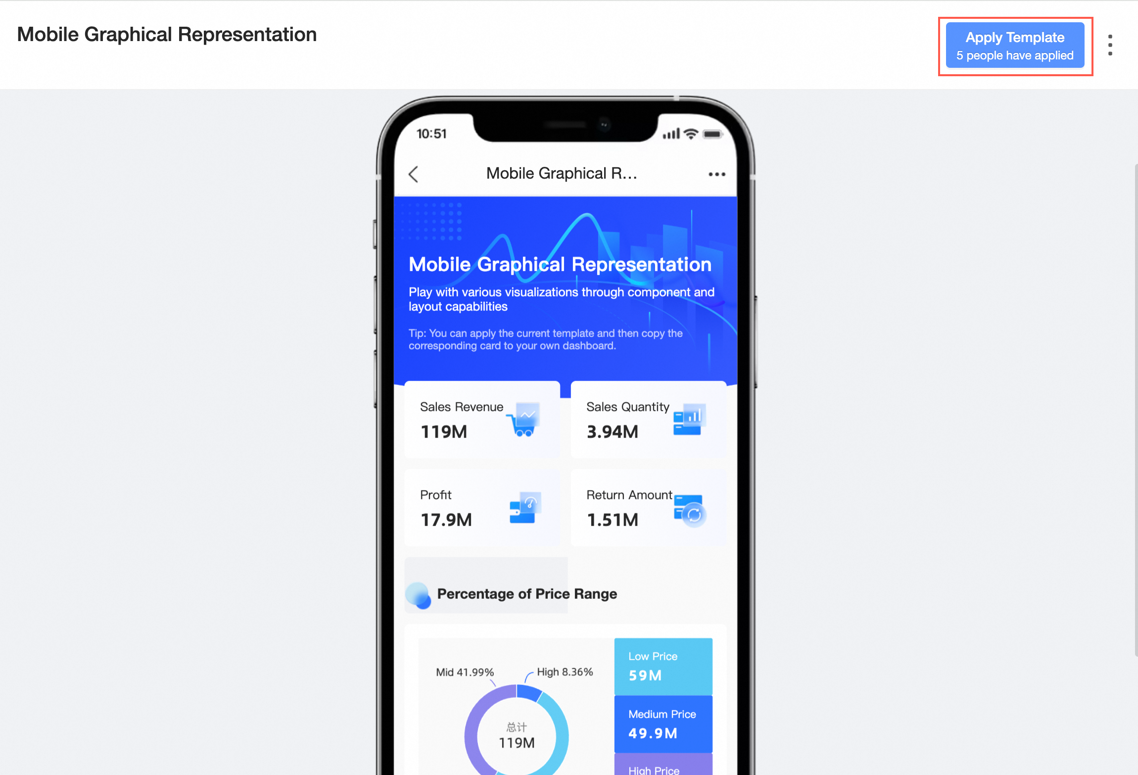
Rich Visualization Charts
Supports over 30 visualization chart components to clearly present data.
Optimizes display for some charts due to mobile screen limitations.
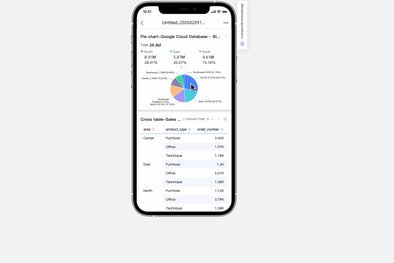
For example, the optimized cross table display on mobile is as follows.
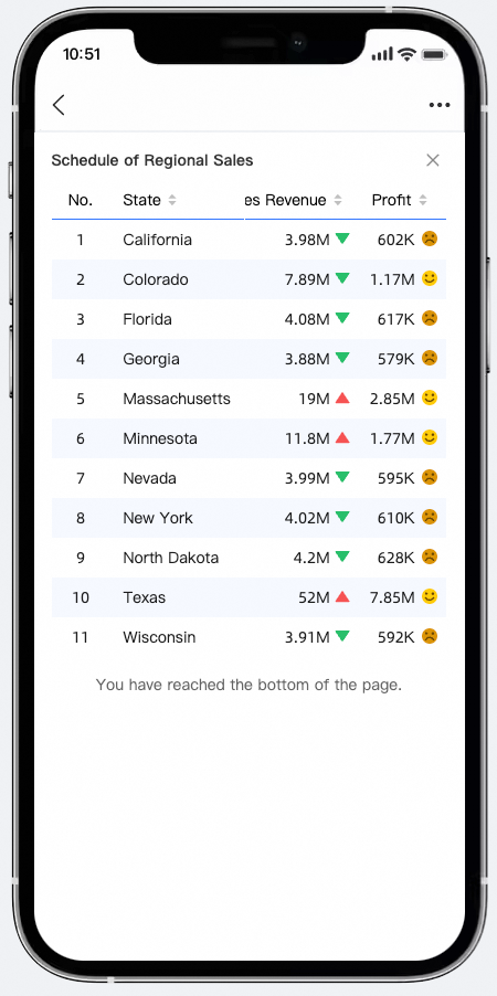 For configuration styles, see Cross Table.
Query Controls for Mobile
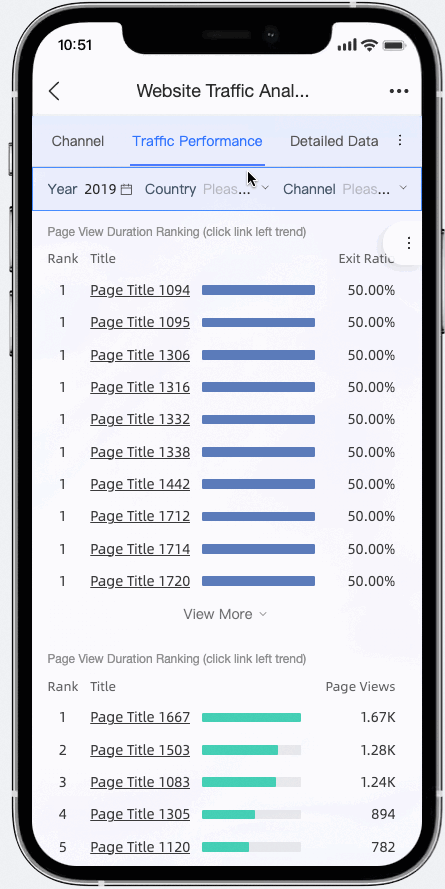
Supports five main categories and 20 sub-categories of filter conditions, including date, dropdown lists, and text input. It also supports query controls within tabs and at the single chart granularity, offering convenient display and quick operations to simplify data queries.
Interactive Analysis
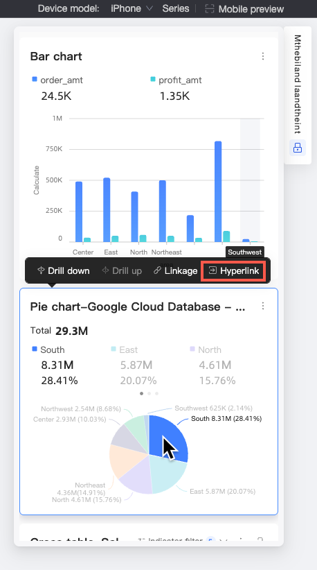
Supports interactive operations such as jump, filter interaction, and drill down for charts like line-column charts, pie charts, and maps (similar to the PC version). This helps analysts examine data from multiple dimensions, identify abnormal data, and uncover root causes to support decision-making. Select a chart component configured for interactive analysis. An interactive analysis action bar appears, showing available actions for that chart. The action bar disappears when you scroll the dashboard page. See the following figure:
 If the chart supports tooltips and the tooltip hover bubble is enabled, the drill-down entry appears in the tooltip hover bubble.
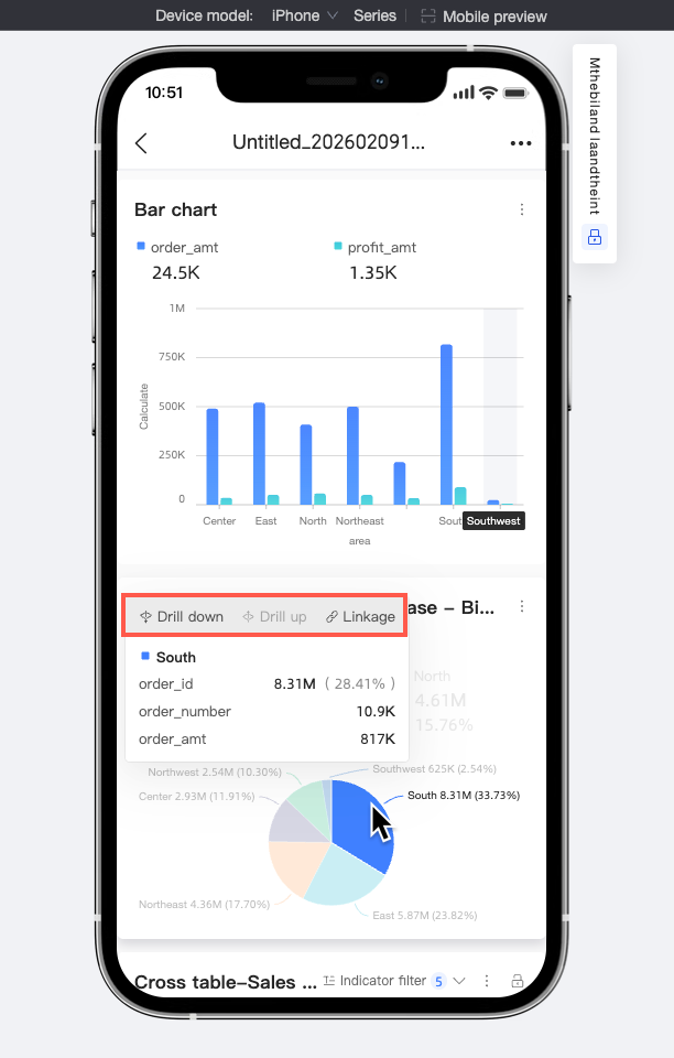
Jump
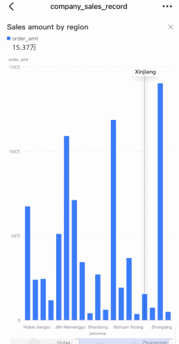
For example, a sales overview report displays sales data for various regions. Select a region. An interactive analysis action bar appears. Click Jump to quickly view its detailed data. Select different regions to switch and view data for each region, enabling efficient access to data of interest.
 If the chart supports tooltips and the tooltip hover bubble is enabled, the jump entry appears in the tooltip hover bubble.
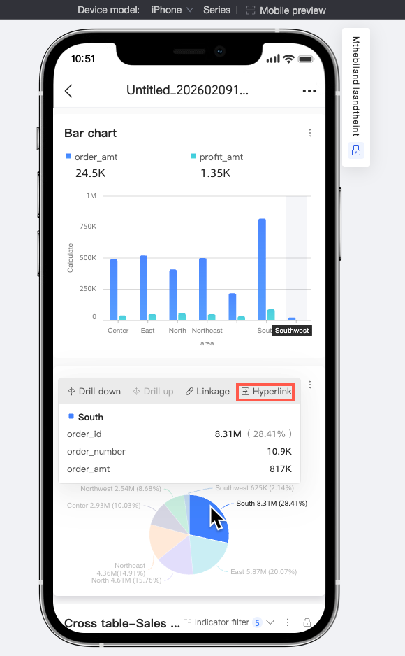
Drill Down
If sales data for a region is prominent or abnormal, click Drill Down to quickly analyze the reason by drilling down to dimensions such as provinces and cities. Select a region. An interactive analysis action bar appears. Click Drill Down to view detailed data for its corresponding provinces, cities, and other dimensions.
 If the chart supports tooltips and the tooltip hover bubble is enabled, the drill-down entry appears in the tooltip hover bubble.
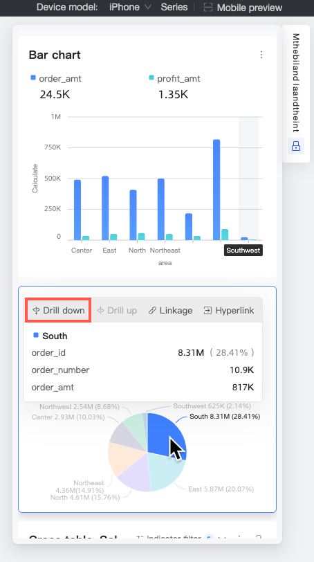
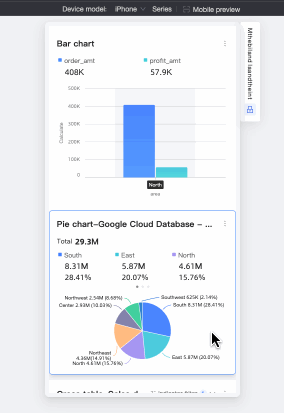
Filter Interaction
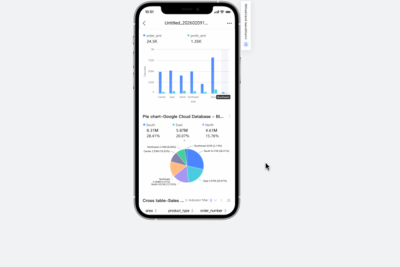
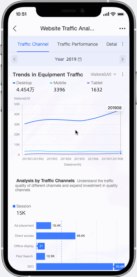
If the chart is configured only for filter interaction and you select the Mobile click directly interacts option in Advanced settings, you can quickly switch dimensions on one page. As shown in the figure below, switching regions updates the linked bar chart, letting you quickly view order amount distribution for different product types in each region.
 If the chart supports tooltips and the tooltip hover bubble is enabled, the drill-down entry appears in the tooltip hover bubble.
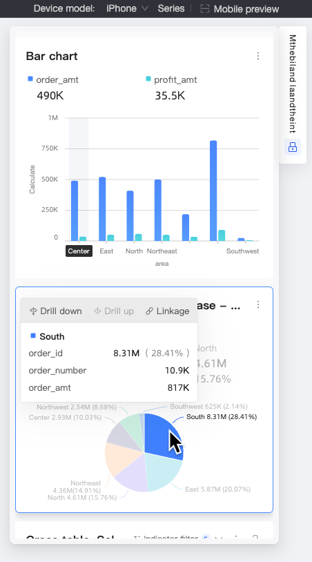 Note
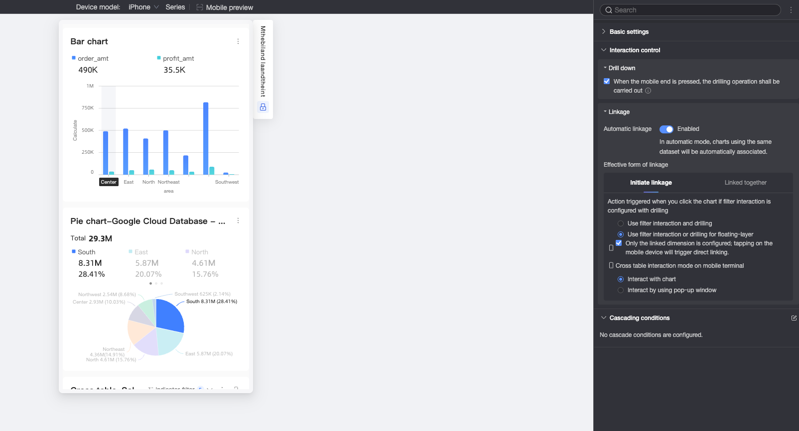
NoteFilter Interaction Settings at Page Bottom
If the filter interaction dimension is configured for drill down, click to select Apply Simultaneously or Floating Layer Select Filter Interaction or Drill Down.
When only the filter interaction dimension is configured, mobile clicks support setting to Direct Filter Interaction.
For mobile cross table filter interaction, choose between Direct Filter Interaction or Pop-up Filter Interaction. The default is Direct Filter Interaction.
Gesture Analysis
Use gestures to view data more easily. Pinch to zoom and adjust the data range. Slide with one finger to navigate to the desired data position.
Diverse Layout Components
Mobile dashboards often contain many charts, requiring constant scrolling and making it hard to find information. Quick BI offers TAB containers and page navigation to help you organize content and browse data more effectively.
Mobile BI Portal
To present large volumes of data, use a BI portal to organize the content.
Mobile Data Entry
Use the data entry feature to collect fragmented offline data through multiple channels and integrate this data online for secondary analysis.
Subscription
For example, Quick BI subscriptions can send data to email, DingTalk work notifications, and DingTalk groups.
Start each workday with data. Send data to work groups to boost interaction and integrate data into every part of your workflow.
Monitoring and Alerts
For example, if data is abnormal, Quick BI can send alert information via text messages, emails, DingTalk work notifications, and DingTalk groups.
Receive alerts promptly to avoid missing growth opportunities or abnormal risks.
Mobile Mini-Apps
Use mobile mini-apps to view common dashboards and discover more data.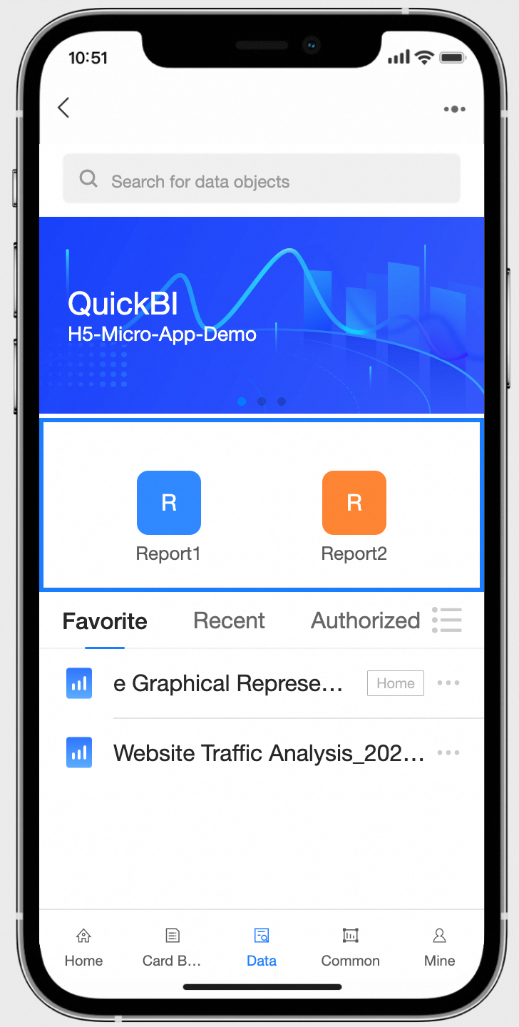
Collaborative Implementation
DingTalk To-Do, Calendar, and DING Integration
Quick BI also supports fast data sharing. Quickly DING the relevant owner.
For example, view sales data for various regions. If a region's KPI is far below expectations, directly DING the relevant regional owner.