A line chart displays trends in data over time. For example, you can use a line chart to analyze changes in product sales over time and predict future sales. This topic describes how to add data to a line chart and configure its style.
Prerequisites
You have created a dashboard. For more information, see Create a Dashboard.
Limits
A line chart consists of Value Axis/Measure, Category Axis/Dimension, and Color Legend/Dimension:
Specify at least one dimension for the category axis, such as date, province, or product type.
Specify at least one measure for the value axis, such as order quantity.
Specify only one dimension for the color legend, such as shipping method.
NoteEnable the color legend only when you select one measure field on the value axis.
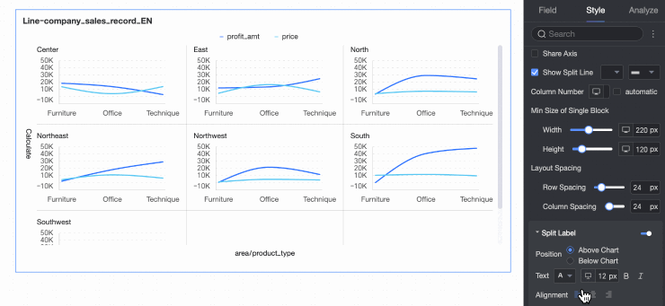
The split dimension is determined by the data’s dimension. Select only one dimension, such as product type or region.
Chart Overview
Scenarios
Trend widgets display continuous data that changes over a specified period. Use trend widgets to show overall data trends at equal intervals.
A line chart helps you identify overall data trends over time, such as increases, decreases, periodic changes, or exponential growth. You can also compare multiple line charts.
Benefits
Computing capabilities: One-click configuration of year-on-year and month-on-month comparisons, cumulative calculations, intelligent auxiliary lines, trend lines, prediction trends, anomaly detection, and fluctuation analysis.
Visualization effects: Supports curve and line chart rendering. Configure labels, legends, and thumbnail axes.
Data comparison and annotation capabilities: Supports period-on-period data comparison and numerical annotation.
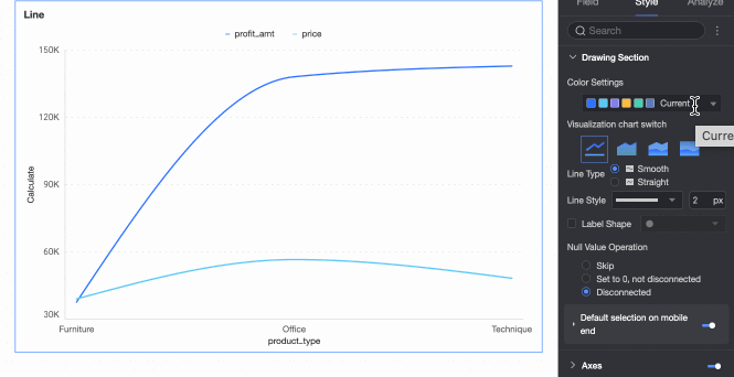
Rendering example
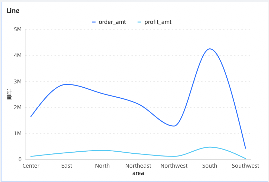
Chart Field Configuration
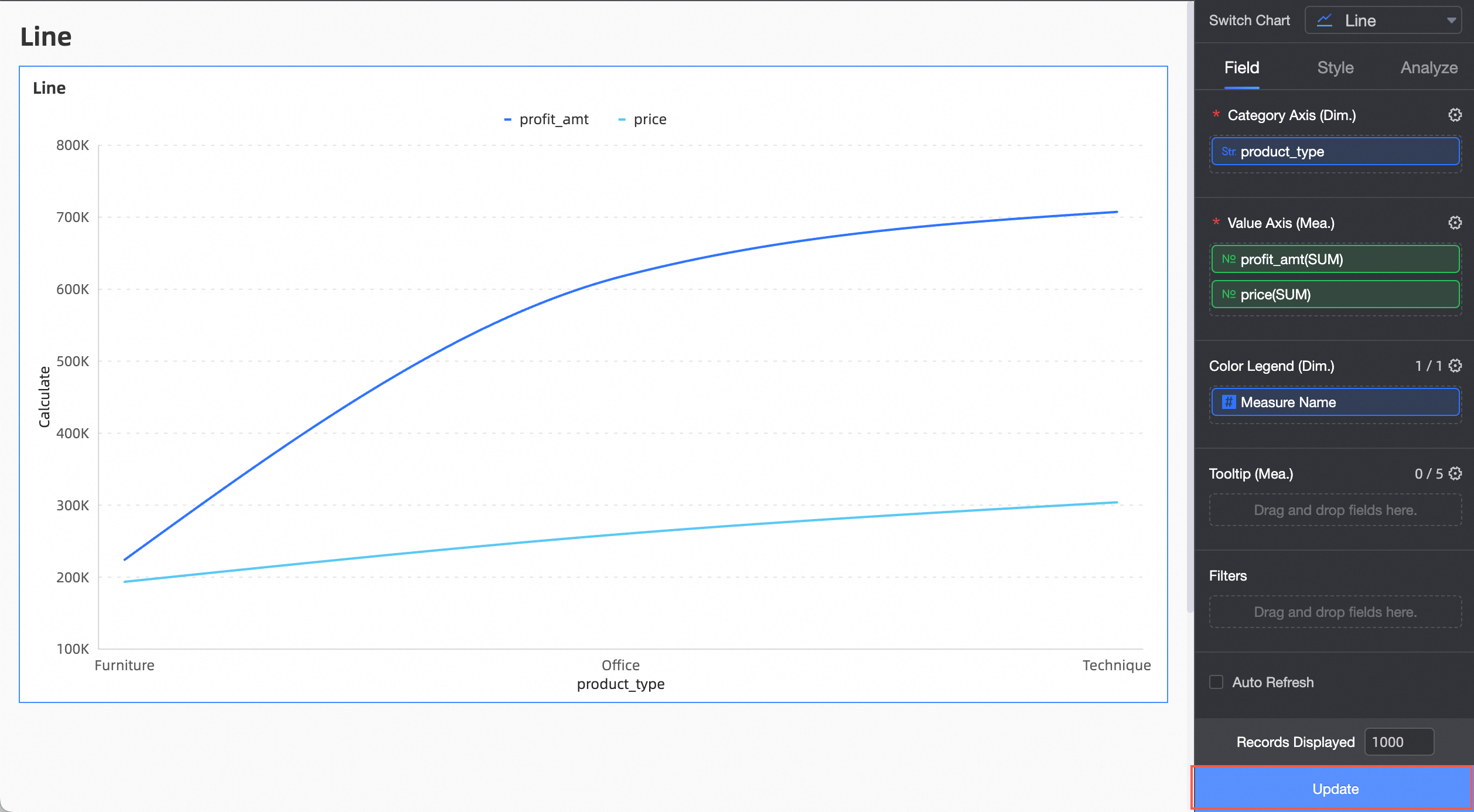
On the Fields tab, select the required dimension and measure fields:
In the Dimension list, locate Product Type. Double-click it or drag it to the Category Axis/Dimension area.
In the Measure list, locate Profit Amount and Unit Price. Double-click them or drag them to the Value Axis/Measure area.
NoteConfigure auto-refresh to automatically update chart data. Configure as needed.
Click Update. The system updates the chart.
(Optional) Add additional dimension fields to Split/Dimension to display data trends under different dimension values using facet mode.
NoteOnly one split dimension field is supported. Facet mode has the following functional limitations:
Fields: For fields in Split/Dimension, advanced calculation functions support only topN or none.
Style: The axis does not support configuring a secondary Y-axis. Auxiliary display does not support configuring a thumbnail axis.
Analysis: Only data interaction is supported. Advanced settings, analysis alerts, annotations, and intelligent insights are not supported.
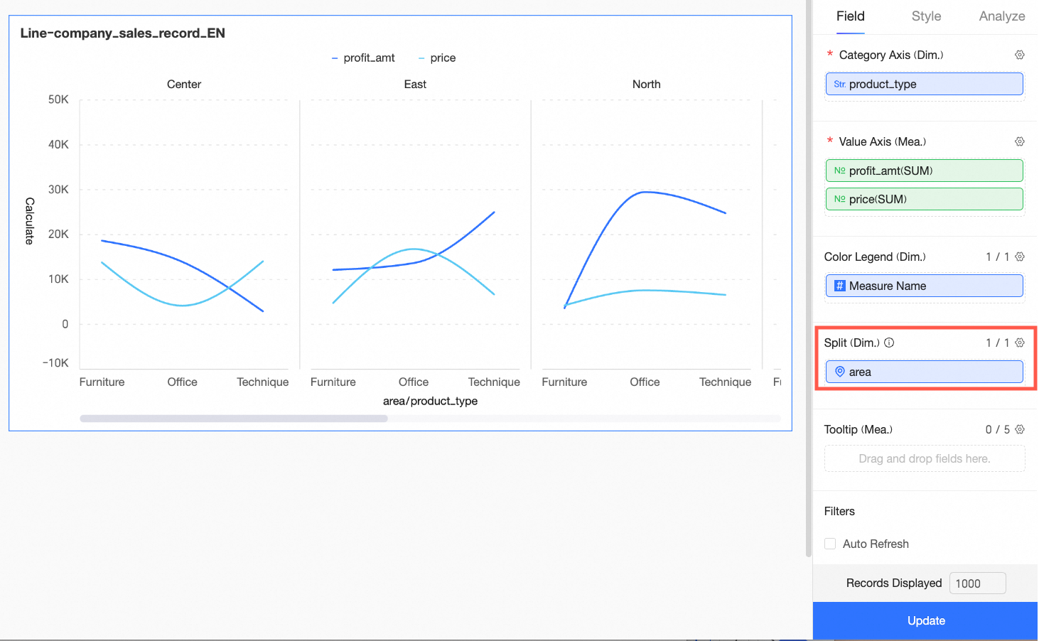
Chart Style Configuration
This section describes how to configure the style of a line chart on the Style tab. For general chart style configurations, see Configure the Chart Title.
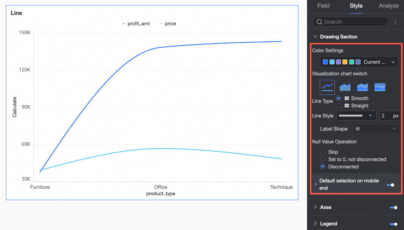
Plot Area
In the Plot Area, configure the line chart style.
Configuration Item | Parameter Descriptions |
Color Scheme Settings | Set the color scheme for lines. Use the system color scheme or a custom color scheme. |
Chart Type Switch | Set the chart type. Supports line chart, area chart, stacked area chart, and 100% stacked area chart. |
Line Type | Supports curve and straight line. |
Line Style | Set the line style and thickness. |
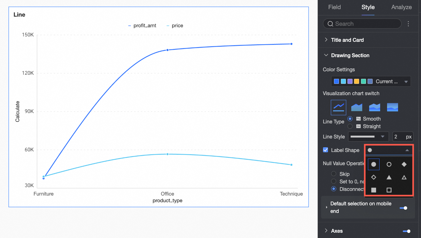
Show Marks | Set the shape of the marks.
|
Null Value Handling | Supports three methods: skip directly, set to 0 and do not break, and break line. |
Mobile Default Selection | After selection, the default selected item supports selecting the last global dimension value or the last dimension value of the specified series. |
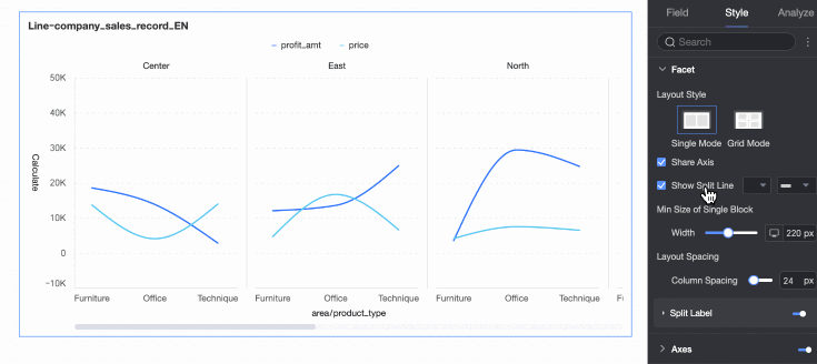
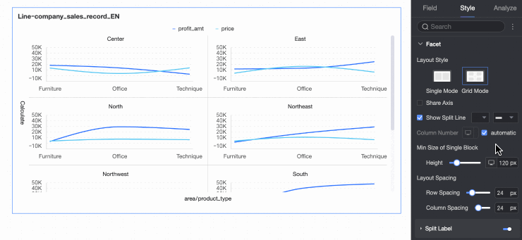
Faceting
In facet mode, configure the layout and style of chart arrangement in Faceting.
Facet mode takes effect only when you configure relevant fields in Split/Dimension.
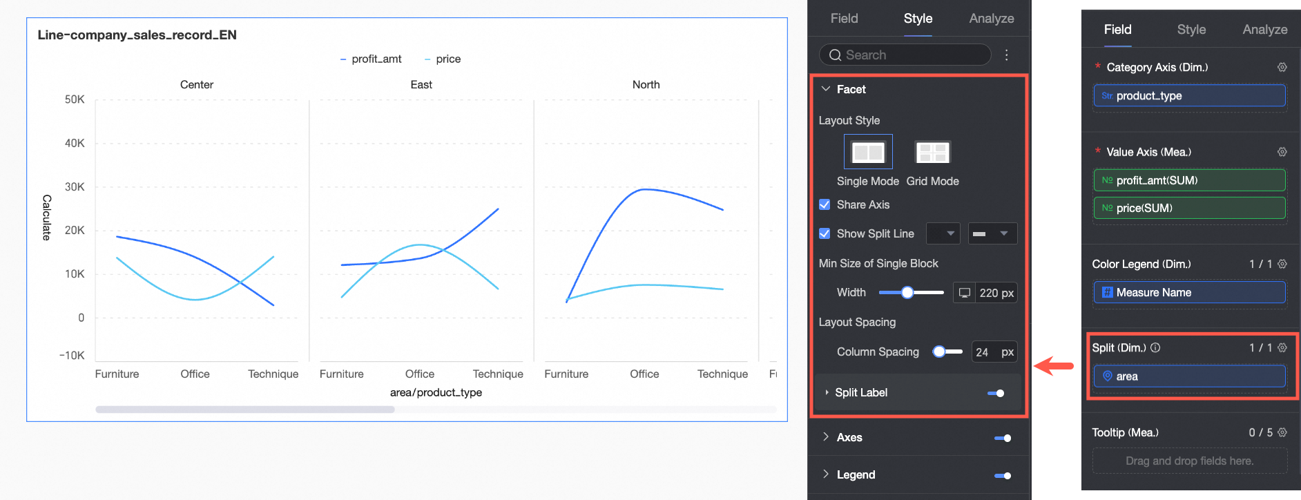
Configuration Item | Description | |
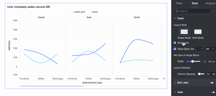
Layout Style | Set the chart arrangement layout. Supports two modes: single-column comparison and grid distribution. | |
Share Axis | Set whether charts need to share the same axis.
| |
Show Separator Line | Set whether to display a separator line between charts. When set to display, you can further configure the color and style of the separator line. | |
Number of Columns | When the layout style is set to grid distribution, configure the number of columns for chart arrangement. The default is automatic. You can also customize the number of columns as needed. Note
| |
Minimum Width and Height of Facet Block | Set the minimum width and height for each chart. The configurable information varies depending on the layout style.
| |
Row and Column Spacing | Set the row and column spacing between charts. The configurable information varies depending on the layout style.
| |
Split Label | Position | Set the display position of dimension value labels. Supports setting above the chart or below the chart. |
Text | Set the font color and style of dimension value labels. | |
Alignment | Set the alignment of dimension value labels. | |
 at the top of the current page.
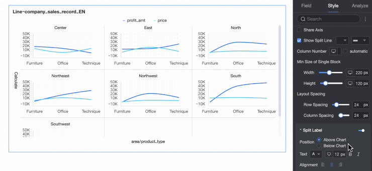
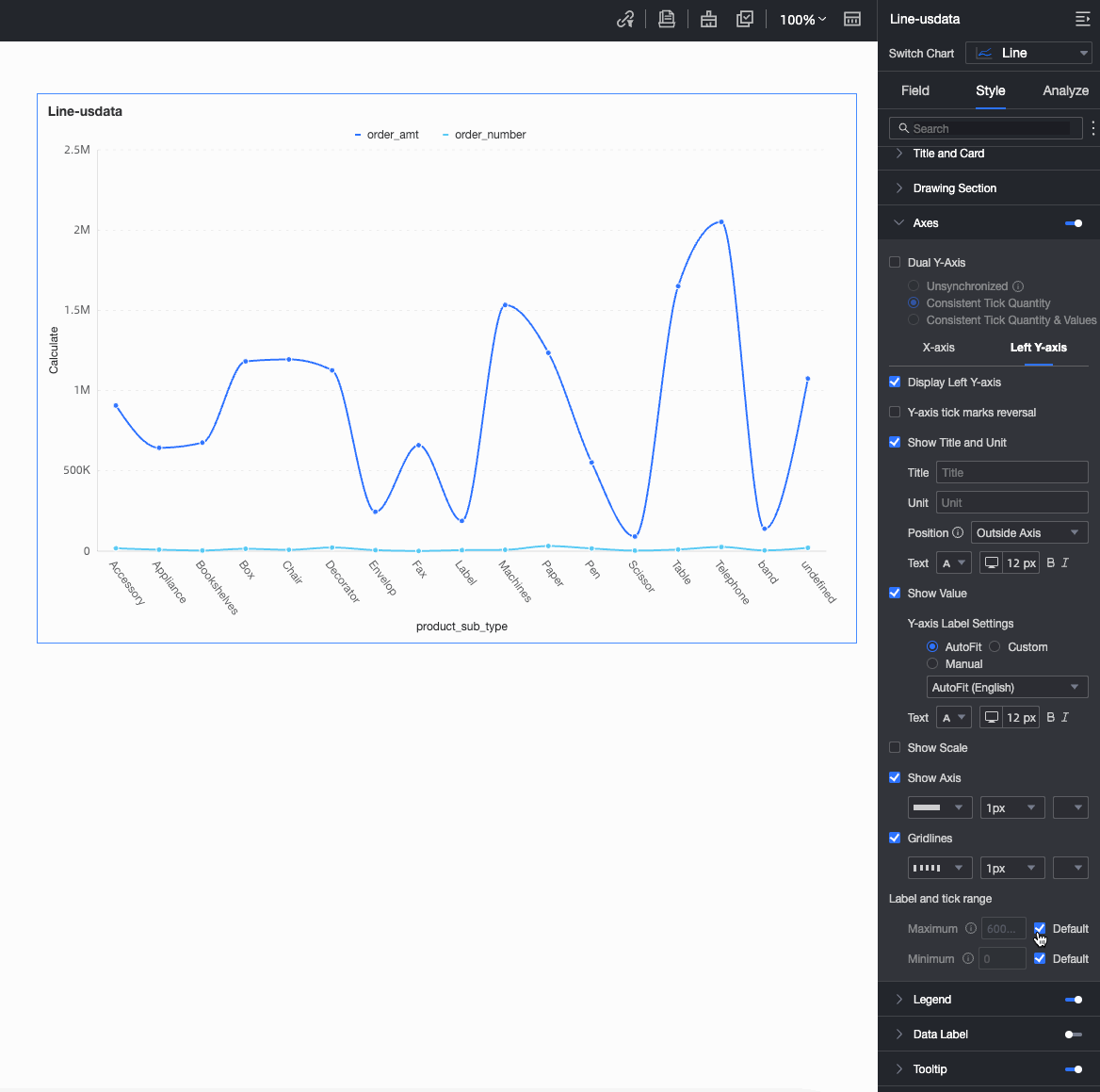
Axes
In Axes, configure the axis style. By default, the axis is displayed.
Select Show Secondary Y-Axis only when you add two or more measures. When selected, the Axes area displays the Right Y-Axis.
In facet mode, the Show Secondary Y-axis feature is not supported.
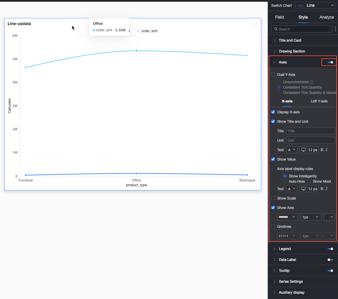
Name | Configuration Item | Description |
X-axis | Show X-axis | Set whether to display the X-axis. |
Show Title and Unit | Set whether to display the axis title and unit on the X-axis. | |
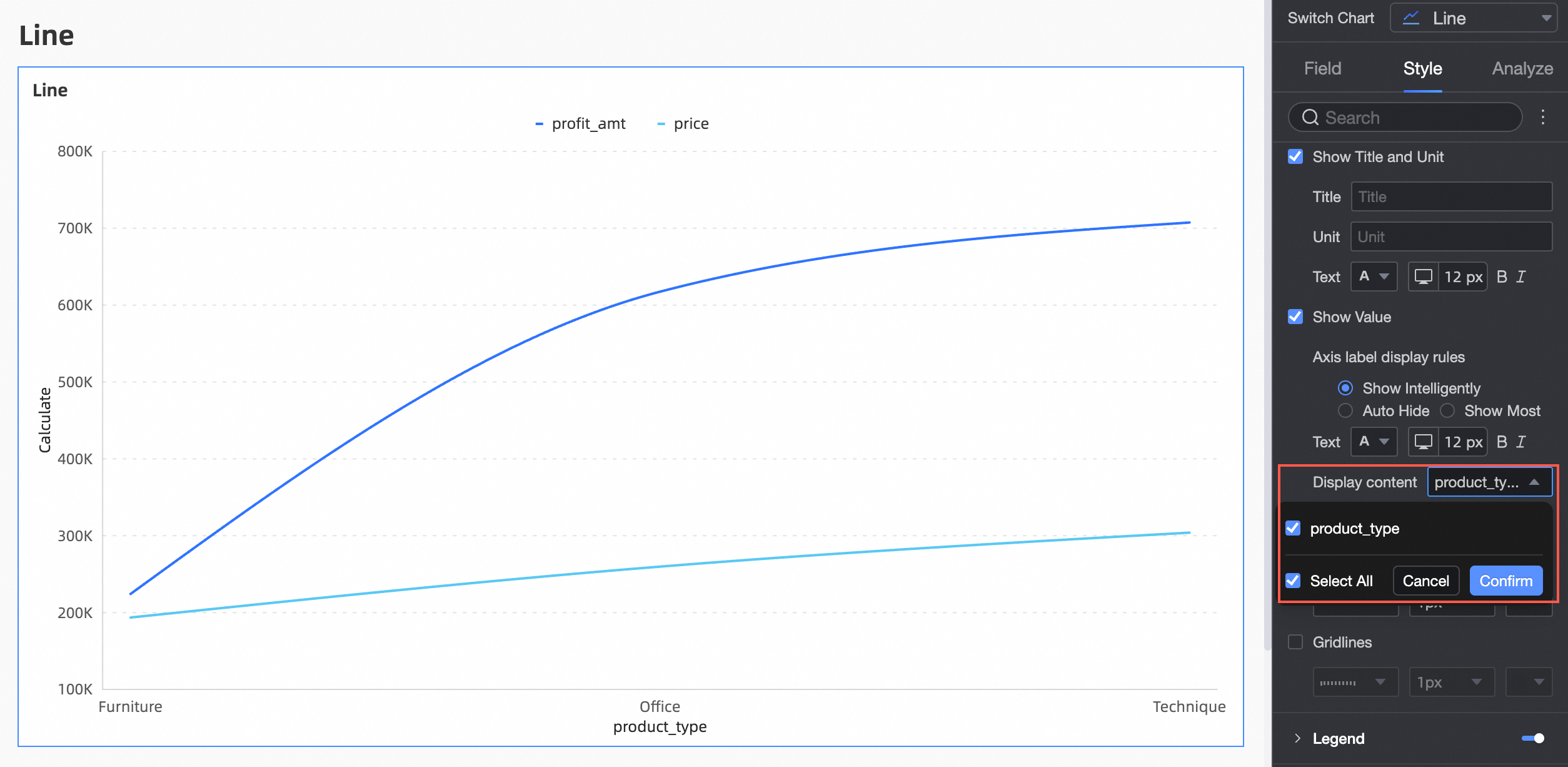
Show Axis Labels | Set whether to display labels on the X-axis, and configure axis label display rules and text style. | |
Display Content | Set the display content to partial or all dimensions.
| |
Show Tick Marks | Set whether to display tick marks on the X-axis. | |
Show Axis | Set whether to display the X-axis, including line type, line width, and color. | |
Show Gridlines | Set whether to display gridlines on the X-axis, including line type, line width, and color. | |
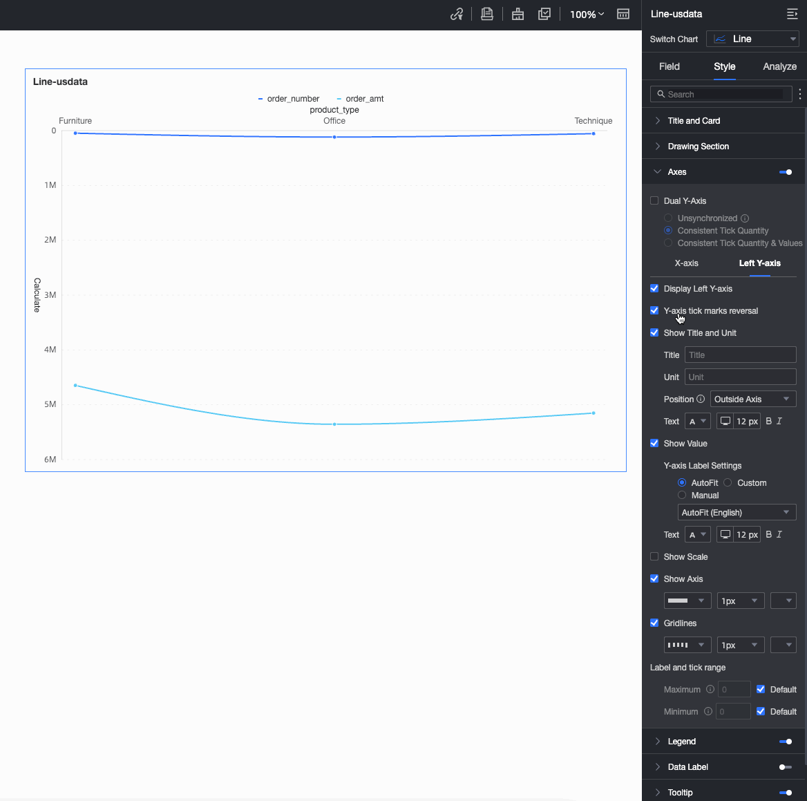
Left Y-axis | Flip Y-axis Scale | Flip the Y-axis scale values.
|
Show Left Y-axis | Set whether to display the left Y-axis. | |
Show Title and Unit | Set whether to display the axis title and unit. | |
Show Axis Labels | Set whether to display labels on the left Y-axis, and configure label and scale range, and axis label display format settings. | |
Show Tick Marks | Set whether to display tick marks on the left Y-axis. | |
Show Axis | Set whether to display the left Y-axis, including line type, line width, and color. | |
Show Gridlines | Set whether to display gridlines on the left Y-axis, including line type, line width, and color. | |
Axis Value Range and Interval |
|
Configure the Right Y-axis only when Show Secondary Y-axis is selected. The parameter configuration is the same as for the Left Y-axis.
Legend
In Legend, set whether to display the legend and its style.
PC Configuration
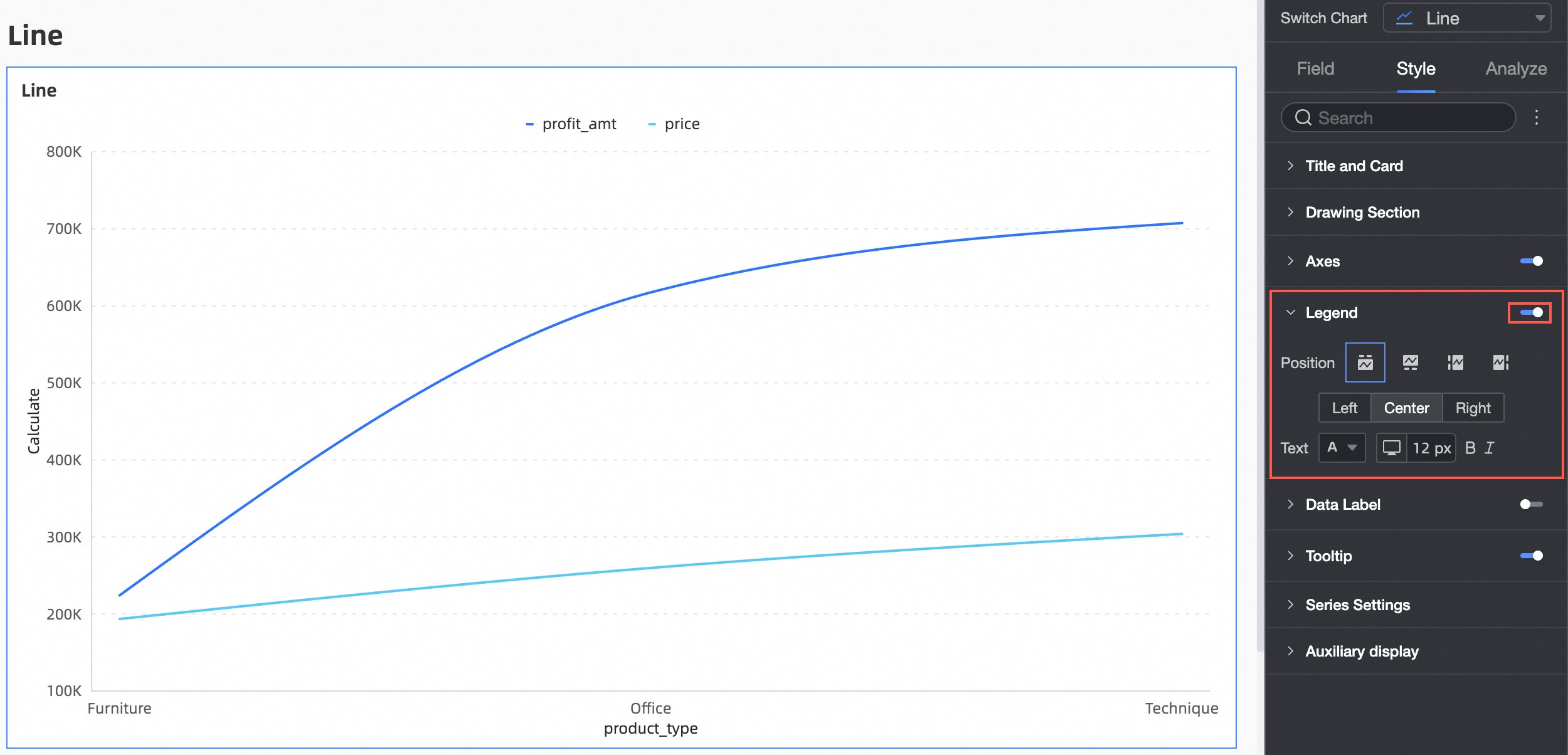
Configuration Item
Description
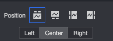
Position
Set the legend display position. Supports the following four legend rendering methods.
Text
Set the legend text style.
Mobile Configuration
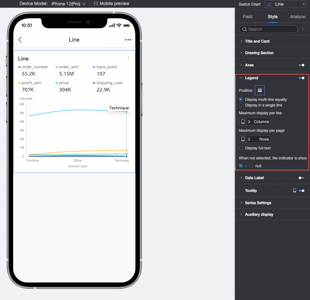
Configuration Item
Configuration item description
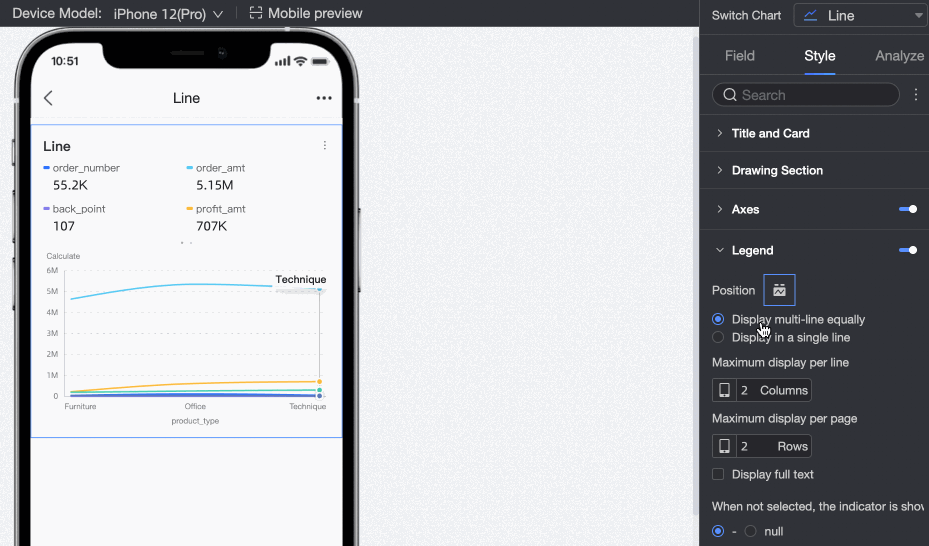
Position/Multi-row Equal Distribution Display
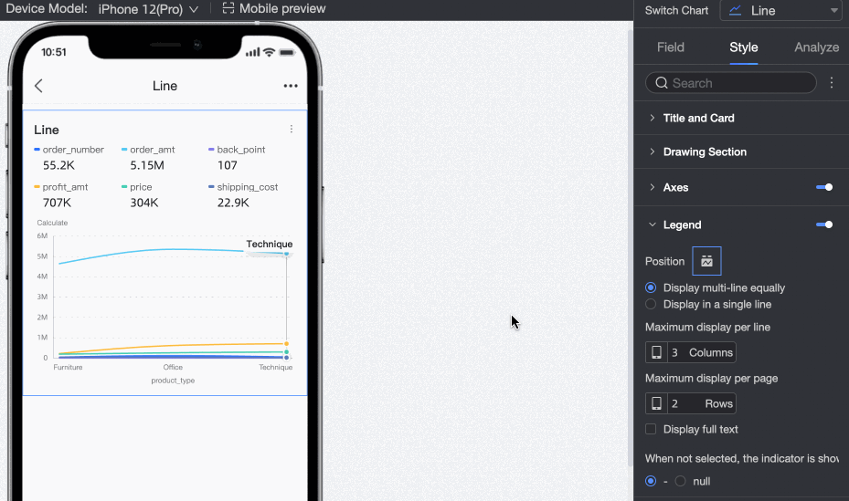
After selecting the multi-row equal distribution display method, display measure indicators in multiple rows, for example:
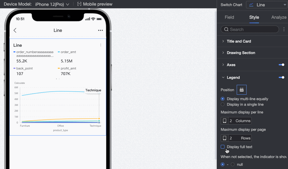
When the measure name is long and hidden in the multi-row equal distribution display method, use the full text display feature, for example:
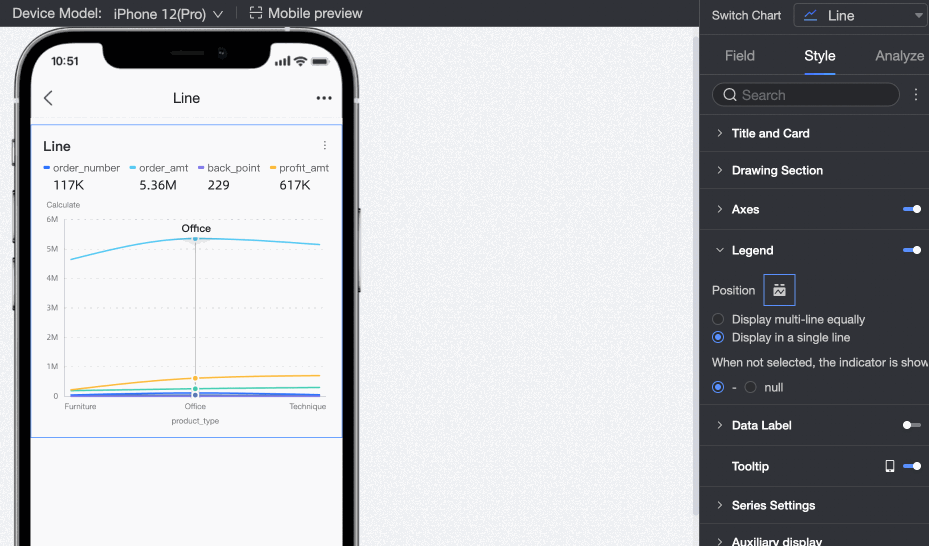
Position/Single-row Tile Display
Check to change multi-row measure indicators to a single-row tile display method.
Indicator Display
When the indicator is not selected, the display defaults to "-". Switch to an "empty" display effect.
Data Labels
In Data Labels, set whether to display data labels and their style.
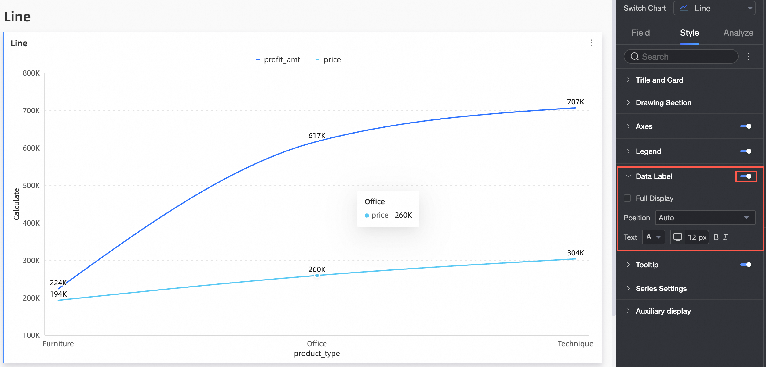
Configuration Item | Description |
Full Display | Set whether to fully display data labels. |
Position | Set the label display position. |
Text | Set the label text style. |
Tooltips
In Tooltips, configure the tooltip method.
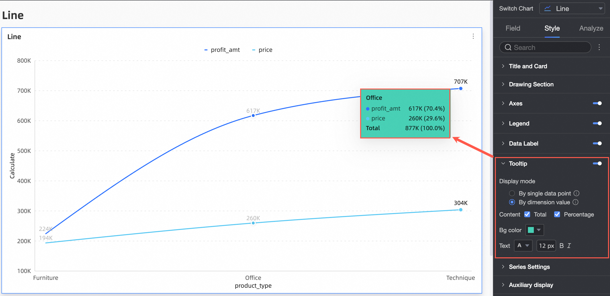
Configuration Item | Configuration Item Description |
Display Method | Set the tooltip display method. Supports two methods: by single data point and by dimension value. |
Content | When the display method is by single data point, percentage is supported; When the display method is by dimension value, total and percentage are supported. |
Background Color | Set the background color. |
Text | Set the tooltip text style. |
Switch to mobile layout to control whether to display mobile tooltips.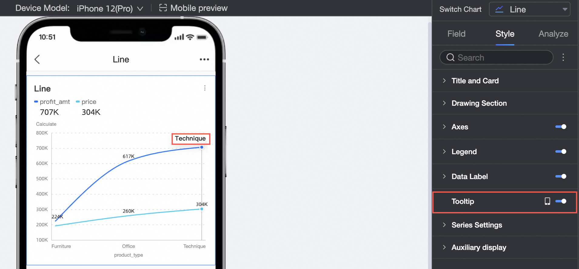
Series Settings
In Series Settings, configure the series style.
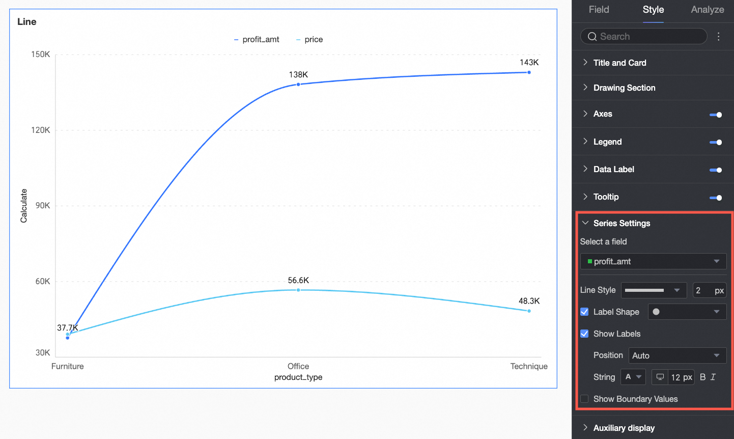
You must set the alias and numeric display format in the Series Settings only when you enable the Color Legend/Dimension in the Fields configuration panel.
Configuration Item | Description |
Select Field | Select a dimension or measure item based on your business scenario. |
Alias | Set a field name that fits the actual business scenario. This item is configurable only when Color Legend/Dimension is configured. |
Line Style | Set the line type and thickness of the line chart. Note Stacking and 100% stacking do not support this feature. |
Show Marks | Supports setting marks to display as circles, hollow circles, diamonds, and hollow diamonds. Note Stacking and 100% stacking do not support this feature. |
Show Data Labels | Select whether to display data labels, and set the label color and position. |
Number Display Format Settings | Provided that data labels are selected for display, configure the number display format in data labels. You can choose from three formats: automatic adaptation, custom adaptation, and manual input. This item is configurable only when Color Legend/Dimension is configured. |
Show Boundary Values | Set whether to display labels for the maximum and minimum values on the line chart. Note Stacking and 100% stacking do not support this feature. |
Auxiliary Display
In Auxiliary Display, configure indicator filtering display and thumbnail axis.
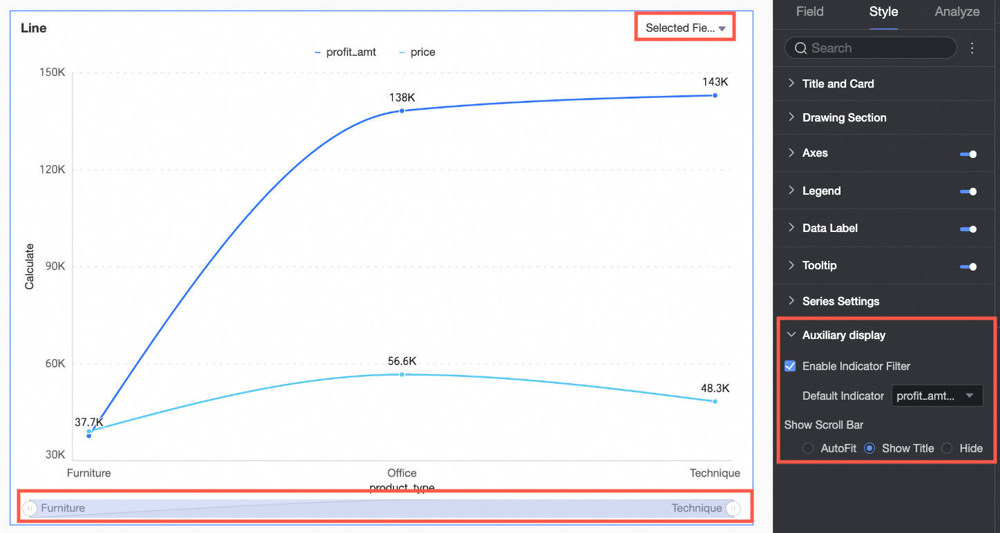
Configuration Item | Configuration Item Description |
Enable Indicator Filtering Display | Set whether to enable it. After enabling, set the default selected indicator field. |
Show Thumbnail Axis | Set the thumbnail axis display method. Note In facet mode, the show thumbnail axis feature is not supported. |
Chart Analysis Configuration
Configuration Item | Name | Description |
Data Interaction | Drilling | When you configure the drilling feature for a chart, configure the display style of drilling hierarchy rows. For more information, see Drilling. |
Filter Interaction | If the data to be analyzed exists in different charts, associate multiple charts through chart filter interaction to perform data analysis. For more information, see Filter Interaction. | |
Jump | If the data to be analyzed exists in multiple dashboards, associate multiple dashboards through dashboard jump to perform data analysis. Jump includes two methods: parameter jump and external link. For more information, see Jump. | |
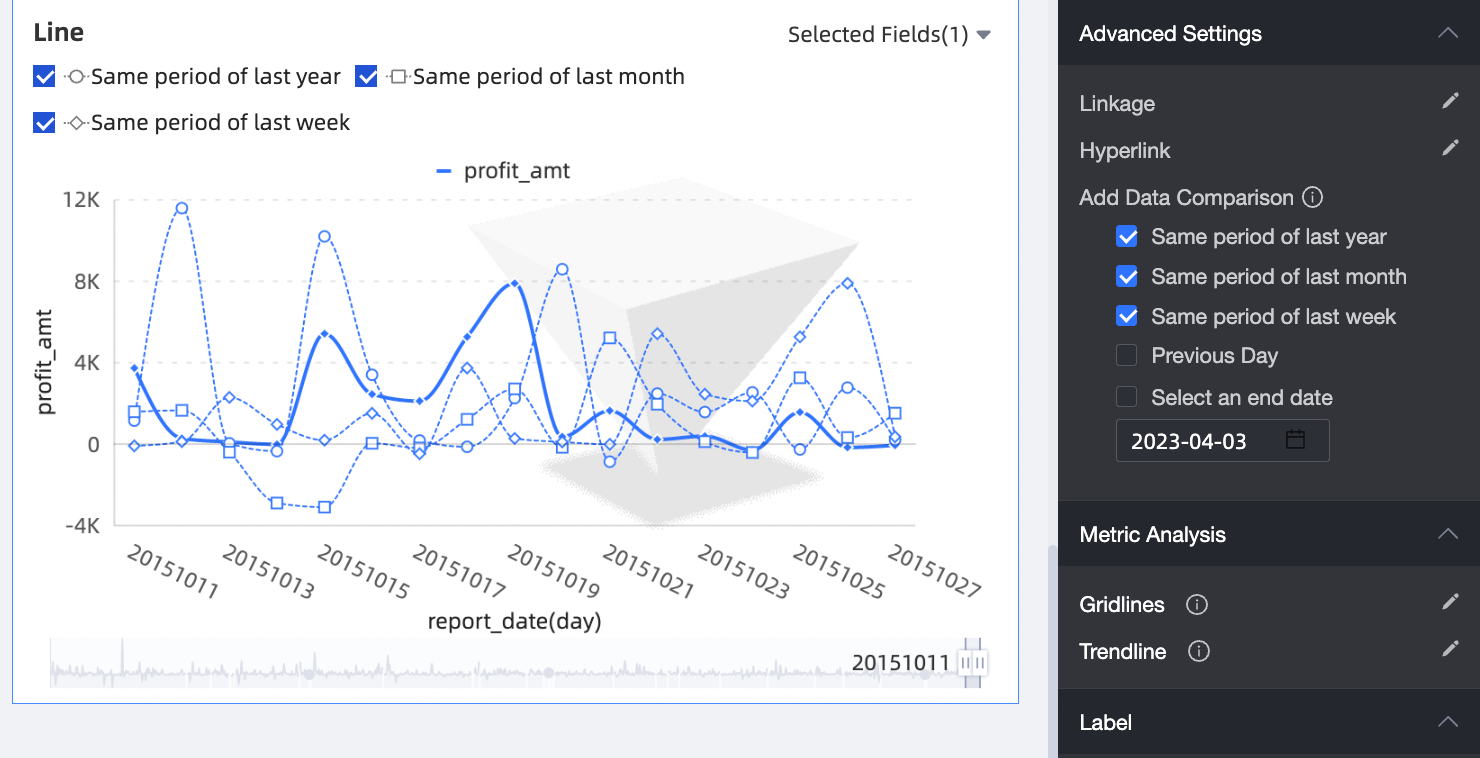
Advanced Settings | Add Data Comparison | When analyzing date dimension data, add data comparison. If the date field is set to day granularity, check same period last year, same period last month, same period last week, previous day, or custom end date for data comparison.
|
Analysis Alerts | Auxiliary Line | Auxiliary lines show the difference between the current measure value and the set auxiliary line value. Auxiliary line values are divided into two types: fixed values and calculated values. Calculated values include four types: average, maximum, minimum, and median. For more information, see Analysis Alerts. |
Trend Line | Trend lines show the overall development trend of the current data. Trend lines are divided into six types: intelligent recommendation, linear, logarithmic, exponential, polynomial, and power function. For more information, see Trend Line. | |
Annotate | - | When data in the chart is abnormal or requires special attention, use color highlighting, icons, comments, or data points for annotation to help identify anomalies and take appropriate action. For more information, see Annotate. |
What to do next
You can share a dashboard with specific users who need to view it. For more information, see Share a Dashboard.
To create a complex navigation menu for thematic analysis, integrate your dashboard into a BI portal. For more information, see BI portal.