Use the key-value table widget to display data in a two-column key-value format within your visualization applications.
Component overview
The key-value table displays data in a two-column format, with keys on the left and corresponding values on the right, enabling quick information retrieval within visualization applications.
Note: The key-value table is limited to two columns and cannot be expanded with additional columns.
Scenarios
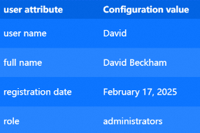
Ideal for displaying simple key-value pairs, such as user registration details.
Effect display
The following example shows user registration information in a key-value table.
Prerequisites
-
Create a data dashboard. You can use a template, use a blank canvas.
-
Your business data is prepared. For more information, see Data Source.
Add Key-Value Table
-
Access the DataV console.
-
On the Workbench page, in the Data Dashboards area, hover over the target dashboard and click Edit. The canvas editor opens.
-
In the left-side navigation pane, under the section, click the Key-value Table widget to add it to the canvas.
You can also use global search to find and add widgets.
Connect business data
After adding the widget, click it and select your data source in the right-side Data Source tab. 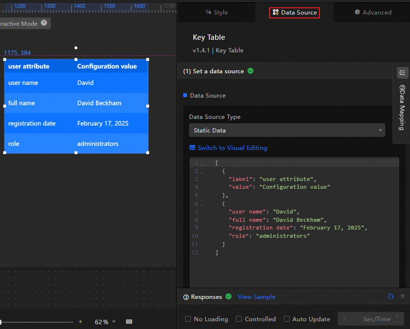
-
The following table describes the data fields accepted by the key-value table.
Field
Description
Explanation
label(Optional) The table header content of the first column.
Only when the is enabled, the
labelandvaluefields represent the table header.value(Optional) The table header content of the second column.
Custom field
Defines the main data of the table. The format is
{"Key of the first column":"Value of the second column",...}. The data can be customized and distributed in the corresponding rows and columns of the table according to the actual data order.The key-value table only supports two columns and cannot add new columns. You can increase the number of rows in the key-value table by configuring custom fields.
-
This section describes the core configuration items for the data source.
Configuration
Description
Select Data Source
Supports various data types, such as CSV files, APIs, and different databases. For more information, see Supported data source types. Edit data fields in a visual table or in code.
Configure Filter (Optional)
Customize filter code to transform, filter, display, and perform simple calculations on data. For more information, see Manage data filters.
Configure Data Mapping
Map fields from the selected data source to the widget's fields. This enables real-time data matching. Click the
 icon to configure field styles.
View Response Result
Displays the data connected to the widget in real time. When the widget's data source changes, this section shows the latest data.
-
Click the data response result to view the data field code.
-
Click View Example to see the array type and sample code that the data source accepts. You can write your fields based on the example.
Other data request configurations:
-
Disable Loading State: If you check this box, the widget's initial loading content does not appear when the widget updates or when you preview the data dashboard.
-
Controlled Mode: If you check this box, the widget does not request data when it initializes. Data requests can only be started by the blueprint editor or by global variable events.
-
Auto Update Request: If you check this box, the platform polls for data updates at the interval you set. If you do not check this box, you must refresh the page manually or use the blueprint editor or global variable events to trigger data updates.
-
Configure Key-Value Table
Click the key-value table widget to configure styles, interactions, and advanced settings in the right-side panel.
Style configuration
In the Style panel, configure the font, color, carousel animation, and other visual styles for the key-value table.
Tip: Click the  icon to quickly find configuration items using keyword search, which supports fuzzy matching. For more information, see Search Configuration Items.
|
Configuration item |
Description |
Illustration |
|
Global configuration |
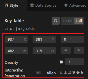
Defines the widget's position, transparency, and interaction passthrough in the data dashboard.
|
|
|
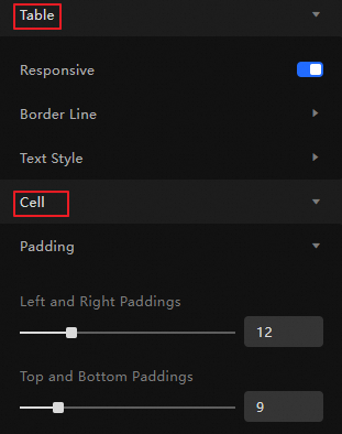
Overall style configuration of table and cell |
Defines the table adaptive behavior, border thickness, color, font style, and cell pitch.
|
|
|
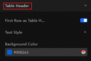
Table header configuration |
Defines the font style (size, thickness, etc.) and background color of the table header. When the First Row As Table Header configuration item is enabled, the platform will set the first row as the table header. When disabled, the key-value table will have no table header. |
|
|
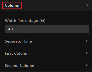
Column style configuration |
Defines the width ratio of the two columns of the key-value table, the line separator between columns, and the text style (font size, color, thickness, etc.), background color, and alignment of each column.
|
|
|
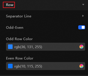
Row style configuration |
Defines the line separator between rows of the key-value table and the style of odd and even rows.
|
|
Advanced configuration
Define interactions between the key-value table and other widgets.
|
Configuration item |
Description |
Illustration |
|
Interaction occurrence |
Defines the interaction behavior with other widgets to achieve widget filter interaction. Click the |
|
 icon to define related interaction occurrences and interaction actions.
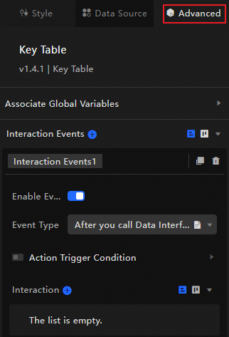
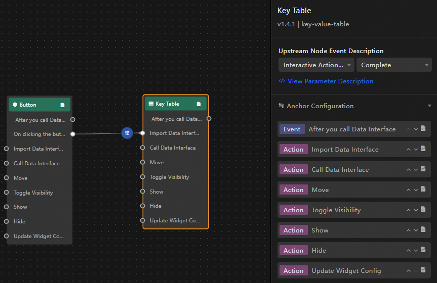
Blueprint interaction
Use the blueprint editor to visually define interaction logic between widgets.
Procedure
-
On the canvas editing page, click the
 icon at the top menu bar's left side to enter the blueprint editor.
 -
In the layer node list, hover over the key-value table widget and click the
 icon to add the widget to the main canvas.
 -
As needed, configure the interaction effects between related widgets using the connection method.
The following is an example.
Configuration item introduction
The following table describes the available interaction occurrences and actions.
Tip: Click the  icon next to an occurrence or action in the blueprint configuration interface for a detailed introduction of related parameters.
|
Category |
Subcategory |
Description |
|
Occurrence |
When Data Is Updated |
Triggered when the widget data is updated. |
|
When Request Status Changes |
Triggered when the request status changes. Status values include Void, Loading, Success, Error. |
|
|
Action |
Import Data |
Import pre-processed data directly into the widget for re-rendering without requesting server-side data again. Example data: |
|
Request Data |
Re-request server-side data. The data thrown by the upstream data processing node or layer node will be used as a parameter. For example, if the API data source configured for the key-value table is |
|
|
Shift |
Moves the widget to a specified position. The following code shows a data example. |
|
|
Switch Visibility |
Toggles the widget's visibility between shown and hidden. The following code shows a data example.
|
|
|
Show |
||
|
Hide |
||
|
Update Widget Configuration |
Dynamically updates the widget's style configuration.
|