This topic provides an overview of the configuration items available in the DataV component panel, facilitating a quick grasp of each component's common properties, rapid configuration, and batch configuration features. For unique properties, please consult the specific component's documentation.
Configuration panel
To access the configuration panel in the DataV service, select a data dashboard, click a component on the canvas, and the configuration panel will appear on the right side. It consists of three tabs: Style, Data Source, and Advanced.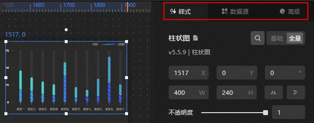
The Style tab allows you to configure Common Properties such as Size, Position, Rotation, and Opacity. For methods, see Common Properties below. Component-specific property styles vary, and their configuration methods are detailed in each component's documentation.
NoteFor non-data visual mapping-related color configurations, refer to Color Picker.
For data visual mapping-related color configurations, refer to Color Mapper Instructions.
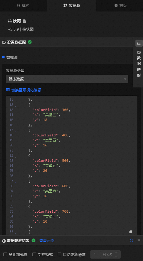
In the Data Source panel, you can switch data source types, switch edit styles (Visual Editor and Code Editor), set data mapping, copy data, and edit data in full screen. Among them, Switch Edit Style, Copy Data, and Edit Data In Full Screen are applicable to all components. For configuration methods, please refer to Copy Data and Edit Data in Full Screen.
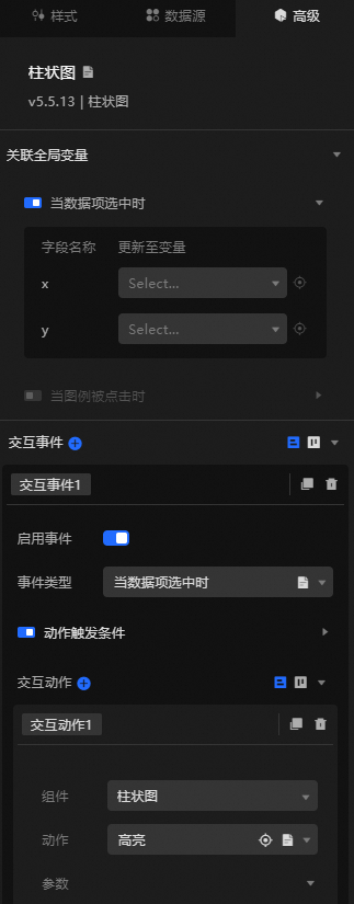
The Advanced tab lets you configure interactions between components and between components and global variables. For methods, refer to Component Interaction Configuration.
Basic properties
Selecting Style and choosing Basic displays the basic property configuration items for the current component, illustrated with a column chart.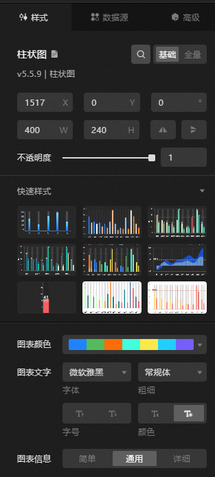
Basic property configuration items vary across different components.
Quick style
When a component's Basic properties are selected, Quick Style configuration items are displayed, as shown with a column chart.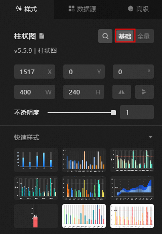
More components will be updated to support quick style configuration items in the future. Stay tuned.
Quick configuration
The quick configuration feature is new in version 7.0 and is available in the new console environment.
Selecting Basic Properties displays the quick configuration feature for Chart Components.
Chart Color: Quickly configure the display color of the current chart by selecting from different chart colors.
Chart Text: Easily set the font, font size, font weight, and text color (dark and light) for the chart text through simple selection.
Chart Information: Choose from Simple, General, and Detailed to quickly set the best display style for the current chart, with dynamic changes to the configuration items below.
Full properties
Selecting Style and choosing Full displays all configuration items for the current component, as demonstrated with a column chart.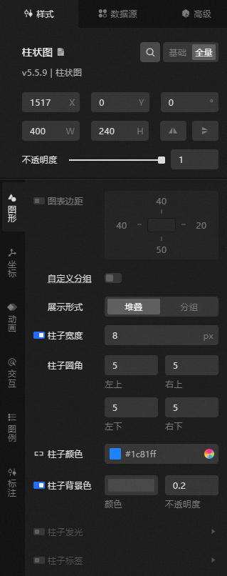
Full property configuration items differ among components.
Search configuration items
The search configuration items feature allows for quick location and modification of a component's configuration items, direct style adjustments on the search page, or reuse of similar configuration styles.
-
Access the DataV console.
On the Workbench page, select any data dashboard, click Edit, and enter the Canvas Editor page.
Click the Component Library tab in the left-side navigation pane, and add any component to the canvas.
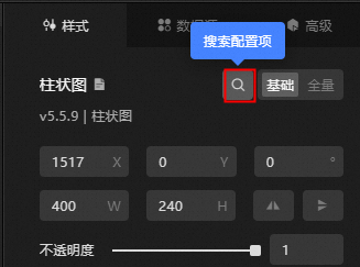
Click Search Configuration Items in the right configuration panel.
In the search configuration page's input box, type the name of the configuration item. Press the Enter key to initiate the search for relevant configuration items (supports fuzzy match) and display them on the page.
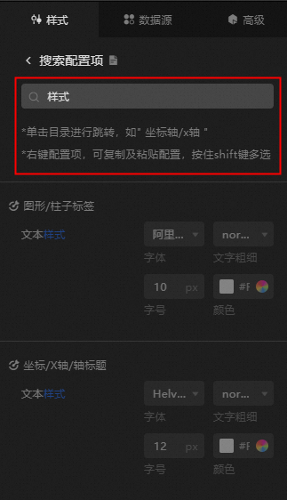
In the search results, you can modify and copy configuration styles, along with locate and jump to specific configuration items.
Select a configuration item to modify its style.
The updated configuration will be directly applied to the corresponding component on the data dashboard.
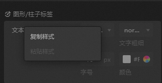
Right-click a configuration to copy its style. Right-click one or hold the shift key to select multiple configuration items of the same type, then select Paste Style to apply the copied style.
Click the directory bar of a configuration item or the
 icon on the left to jump to the specific location of the configuration item in the configuration panel.
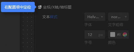
Common properties
The Common Properties module allows you to adjust the size, position, rotation angle, and opacity of the component.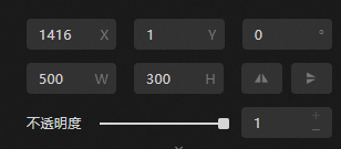
Size: Includes the width and height of the component, in pixels.
Position: Includes the X-coordinate and Y-coordinate of the component, in pixels. The X-coordinate is the distance from the left edge of the canvas to the component's upper left corner. The Y-coordinate is the distance from the top edge of the canvas to the component's upper left corner.
Rotation: Rotate around the component's center, in degrees (°).
Enter the angle value manually to control the component's rotation angle.
Click the
 icon to flip the component horizontally.
Click the
 icon to flip the component vertically.
Opacity: The opacity value ranges from 0 to 1. At 0, the component is invisible, while at 1, it is fully opaque. The default setting is 1.
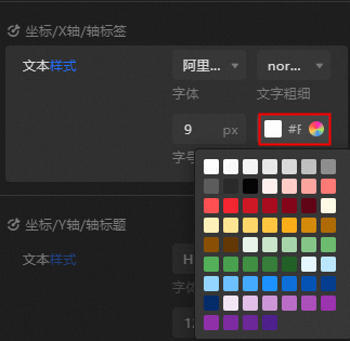
Color picker
The color picker allows you to set various component colors, such as font, axis lines, gridlines, and borders. For example, to adjust the canvas color, you can use one of the following methods:
Click the Common Color Block icon to choose a color. This feature provides quick access to standard colors, simplifying modifications and enhancing efficiency.
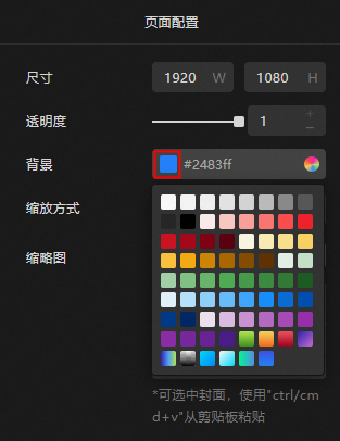
The common color block feature allows for quick and easy selection of system-provided colors, streamlining the process of modifying colors efficiently.
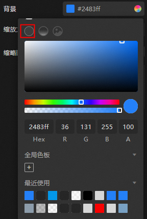
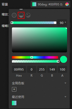
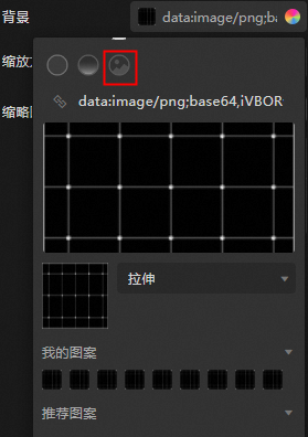
Click the Color Picker icon to access three fill styles:
Solid Fill: Choose a color, adjust transparency, add or delete from the global palette, and select from recently used colors.
Gradient Fill: Select gradient colors, adjust transparency, add or delete from the global palette, and choose from recently used colors.
Pattern Fill: Input a pattern URL, change and upload local patterns, adjust pattern display, save to 'My Pattern', or use recommended patterns.
For general color settings:
To adjust font color transparency, drag the slider or modify the A value.
To add or delete global colors, select a color in the picker and click the Global Palette icon below the
 icon. To remove a global color, drag it out of the Global Palette area.Note
Colors from the Global Palette can be applied across the entire dashboard and are available in the Recently Used section for each dashboard and component, facilitating reuse.
A maximum of 27 global palettes can be created.
To select recently used colors, click on a color block in the Recently Used section to apply it to the component.
To save a pattern, store the current background pattern in My Pattern. Click on a pattern under My Pattern to change the current pattern.
Copy data
In the Data Source tab, switch to code edit mode and click the  icon in the lower right corner to copy all data in the current data edit box.
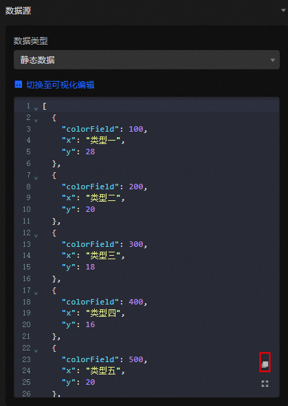
Edit data in full screen
In the Data Source tab, switch to code edit mode and click the  icon in the lower right corner to edit data in full screen mode.
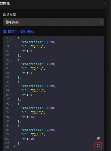
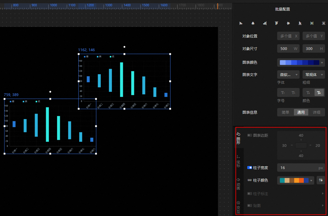
Batch configuration
After selecting multiple components, you can perform batch configurations in the right panel.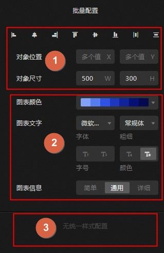
Ordinal number 1: Appears when any component is selected.
Alignment: Align multiple components, including options to align left, center, right, top, horizontally, and bottom.
Distribution: Distribute multiple components evenly, either horizontally or vertically.
Object Position: Set the position of the top-left vertex of multiple components relative to the canvas.
Object Size: Define the width and height values for multiple components.
Ordinal number 2: Displayed when all selected components support quick configuration. Refer to Quick Configuration Component List for specific components.
Chart Color: Set the chart color for multiple components.
Chart Text: Configure the font, font weight, font size, and color of the chart text for multiple components.
Chart Information: Choose the level of detail for the chart information of multiple components, with options including simple, general, and detailed.
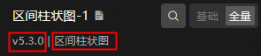
Ordinal number 3: The Unified Style option appears when all selected components are of the same type and share the same major version number. For instance, if all are interval column charts of version 5.x, they can be configured in batch.
References
For more information on common questions about configuration items, see Configuration Item FAQ.