This topic provides a guide for using the column chart component.
Overview
A column chart is a type of statistical chart that uses rectangles of equal width and varying lengths to represent different values, allowing for a visual comparison of data.
Scenarios
Column charts are commonly used for statistical comparisons and trend analysis of small data sets across various categories. Typical applications include the following:
Single Category Data Comparison: Comparing sales figures across different departments.
Time Series Data Comparison: Analyzing monthly sales within a department.
Multi-Category Data Comparison: Examining product sales across different regions.
Segmented Comparison: Assessing student numbers by grade and gender in a primary school.
Ranking Comparison: Ranking the top 10 departments by sales volume.
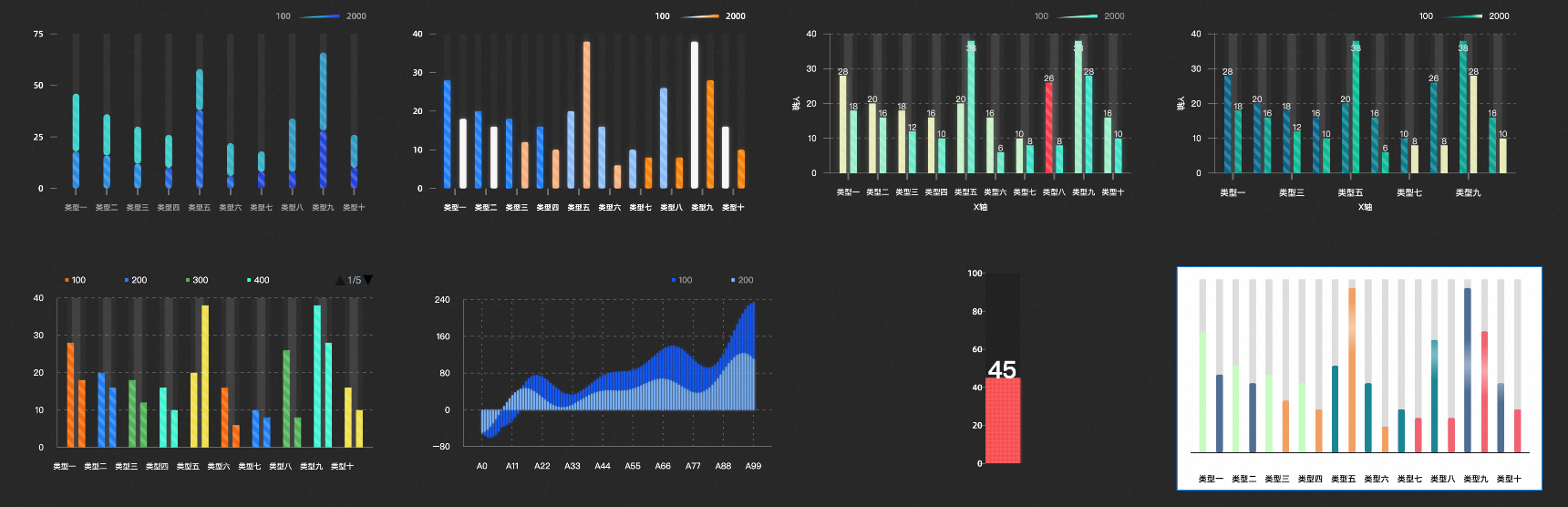
Effect Display
Limits
Data Limitations: The x-axis supports only categorical or time series data, while the y-axis is limited to numerical data. The ColorField can contain enumeration or numerical data.
Version Limitations: This guide applies to versions V5.0 and above.
Versions below V5.0 may not be directly upgraded due to compatibility issues. For the latest column chart features, it is recommended to add the chart anew. Versions V5.0 and above can be directly updated to the latest V5.x release.
Procedure
Creating a chart typically involves preparing the data, integrating it into the component, configuring the component's style, and setting up chart interactions.
Prerequisites
-
Access the DataV console.
An editable data dashboard has been created.
Business data is ready for use. For more information, see Data Source.
Data Integration
The column chart accepts specific parameters. For detailed data configuration steps, see Datasource Config.
Field | Description |
x | Used to configure the category of each column in the column chart, that is, the value of the x-axis. |
y | Used to configure the value of each column in the column chart, that is, the value of the y-axis. |
colorField | (Optional) Color mapping field used to set the color mapping style of the columns. |
trace | (Optional) Group mapping field used to set different group data under the same category. |
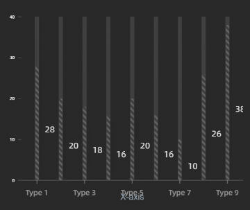
Below are examples of handling common data structures and their corresponding chart effects.
When your data does not have a default colorField or does not require color settings:
[
  {
    "x": "Type 1",
    "y": 28,
  },
  ...
]
The chart will display as follows:
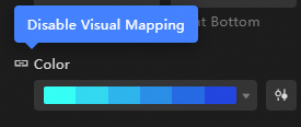
Currently, you can colorize the chart either by turning off the column color perspective mapping or by incorporating a colorField through data processing and assigning the same colorField value to all elements.
[
  {
    "x": "Type 1",
    "y": 28,
    "colorField": 300,
  },
  ...
]
The chart will display as follows: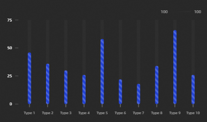
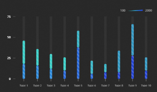
For x-axis data with category subdivisions, different subdivisions can be represented by varying colorField values.
[
  {
    "colorField": 100,
    "x": "Type 1",
    "y": 28
  },
  {
    "colorField": 200,
    "x": "Type 1",
    "y": 20
  },
  ...
]
The chart will display as follows:
Adjust Style
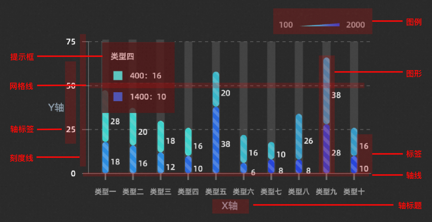
The chart supports configuration of elements such as graphics, coordinates, animation, interaction, legend, and annotation. For an overview of column chart elements, see the figure below.
Key properties are introduced below. For additional style configurations, refer to the configuration item section.
Stacked Group Display
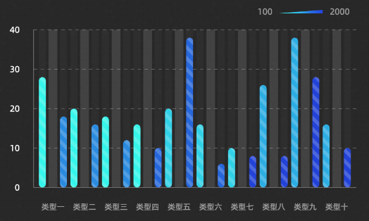
Display Form By default, the Stacked effect is used, stacking data of the same category but different colorField. Switching to the Grouped effect displays data with different colorField in groups. Optimal visual effects can be achieved by adjusting the Group Spacing.
Light Sweep Animation
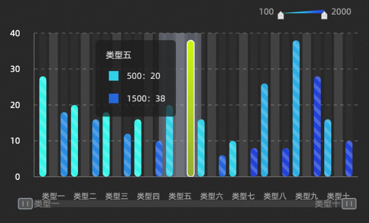
The Light Sweep Animation is enabled by default. Disable this option if configuring click interaction events.
Interaction Enhancement
The selected state is active. When the mouse clicks or hovers over a graphic, it highlights. Disable the light sweep animation for this feature to work.
With interaction enhancement active, a thumbnail axis or scrollbar appears below the x-axis, enabling data display range filtering. Disable the light sweep animation for this feature to work.
Annotation Analysis
Add auxiliary lines, boxes, and highlight columns for data analysis. The following configurations have been added:
Average auxiliary line, indicating the average level of group data.
Auxiliary box above the average, highlighting data exceeding the average.
Highlight specific columns that meet the condition, such as
colorField=100.
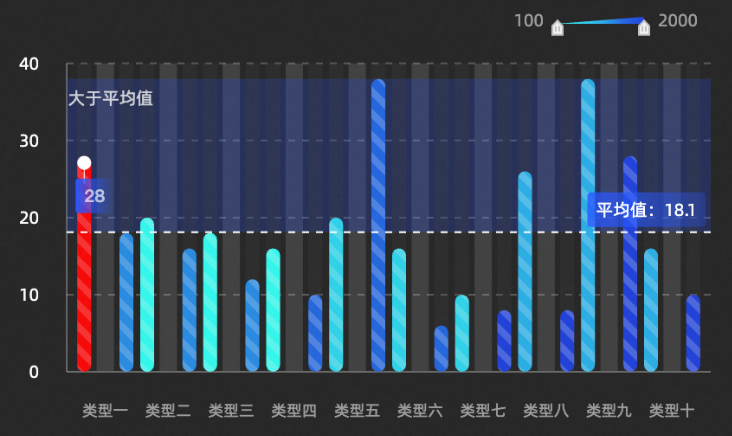
Chart Interaction
To view detailed table information for a specific category by clicking on a column, configure chart interaction accordingly.
For chart interaction operations, see Component Interaction Configuration.
Disable the Light Sweep Animation property in the style panel to activate the column chart data item click event.
Configuration Item Introduction
Style Panel
-
Search Configuration: Click the Style icon
 in the upper right corner of the panel to enter the name of the configuration item you wish to locate in the search field. The system supports fuzzy matching. For more information, see Search configuration item.
Size: indicates the size of a widget, including its pixel width and height. You can click the
 icon to proportionally adjust the width and height of a widget. After you click this icon again, you can adjust the width and height as needed.
Position: the position of a widget, which is indicated by pixel X and Y coordinates. X-coordinate indicates the pixel distance between the upper-left corner of the widget and the left border of the canvas. Y-coordinate indicates the pixel distance between the upper-left corner of the widget and the upper border of the canvas.
Rotation Angle: the angle of a rotation that uses the center point of a widget as the rotation point. The unit is degrees (°). You can use one of the following methods to control the rotation angle of a widget:
Directly enter the degrees in the Rotation Angle spin box or click the plus sign (+) or minus sign (-) to increase or decrease the value in the Rotation Angle spin box.
Drag the black dot in the
 icon.
icon.Click the
 icon to horizontally flip a widget.
Click the
 icon to vertically flip a widget.
Opacity: the opacity of a widget. Valid values: 0 and 1. If this parameter is set to 0, the widget is hidden. If this parameter is set to 1, the widget is completely displayed. Default value: 1.
Graphics
Parameter
Description
Chart Margin
Click the
 icon to control the visibility of the chart margin. After turning on the switch, you can configure the distance between the column chart area and the four boundaries of the component, with the default unit being px.
Custom Grouping
Turn on the switch, and you need to configure the trace split field in the data panel to achieve finer granularity of data splitting. After data splitting, it will become the style of Stacked Group. Turn off the switch, and it will be grouped by the colorField color mapping field in the data panel by default.
Intra-group Spacing
After data splitting, you can customize the spacing within the same category of columns, with the unit being px. It can be configured in the following two cases:
When the Custom Grouping configuration item switch is turned on, it can be configured.
When the Custom Grouping configuration item switch is turned off, and the Display Form is Grouped, it can be configured.
Inter-group Spacing
After data splitting, you can customize the spacing between columns of different categories, with the unit being px. It can be configured in the following two cases:
When the Custom Grouping configuration item switch is turned on, it can be configured.
When the Custom Grouping configuration item switch is turned off, and the Display Form is Grouped, it can be configured.
Display Form
The form of column classification when grouped by the colorField color mapping field in the data panel, including two display styles: Stacked and Grouped. It can only be configured when the Custom Grouping configuration item switch is turned off.
Column Width
The width value of the columns, with the unit being px. Click the
icon to control the visibility of the column width configuration item.Column Border Radius
The border radius value of the columns at the four corners, with the unit being px.
Column Color
The color of the columns. For more information, see Color Mapper User Guide to configure the mapping color style of different columns.
Column Glow
The glow style of the columns. Click the
icon to control the visibility of the column glow configuration item.Glow Color: Includes the switch for synchronizing columns and opacity. When the Synchronize Columns switch is turned off, the glow color can be set separately.
Blur Coefficient: Sets the blur coefficient of the column glow, ranging from 0 to 50. The larger the value, the more blurred the glow range between columns.
Shadow Offset: Sets the horizontal and vertical shadow offset of the column glow, with the default unit being px.
Column Label
The label style of the columns. Click the
icon to control the visibility of the column label configuration item.Label Field: The content of the label needs to correspond to the content of the field in the data panel.
NoteThe range field is used to display interval value content.
Value Format: Sets the value format of the label, with options including Default, 11 (integer), 11.1 (floating-point Number), 11.11 (floating-point Number), 11% (percentage), 11.1% (percentage), 1,111 (thousands Separator), and 1,111.1 (thousands Separator). For more data display formats, see Data Display Format Description. It is only displayed when the label field is selected as
rangeory.Prefix And Suffix: Sets the prefix and suffix content of the column label.
Label Position: Selects the display position of the label content, with options including Top, Middle, and Bottom.
Relative Offset: The relative offset of the column label to the column in the vertical and horizontal directions, with the unit being px.
Layout Optimization: Automatically optimizes covered text and boundary text.
Text Style: The text style of the column label, including the font style, font weight, font size, and color of the text.
Text Outline: The text outline style of the column label, including the thickness value and color of the outline line.
Texture
The texture style of the columns. Click the
icon to control the visibility of the texture configuration item.NoteThe texture background does not support gradient colors.
Type: The type of texture, including Dot, Line, Square, and Image.
Fill Style: Sets the fill style of the texture. For more information, see Color Picker Description to configure the color style of the texture.
Outline Style: Sets the outline style of the texture. For more information, see Color Picker Description to configure the color style of the texture. It is displayed when the type is selected as Dot or Square.
Additional Style: Other styles of the texture, including Graphic Size, Graphic Spacing, Line Spacing, Rotation Angle, and Interlaced switch. When the type is selected as Image, you can set the Image Address, Tile Width, Tile Height, Tile Spacing, and Rotation Angle.
Coordinates: Includes X-axis and Y-axis.
X-axis
X-axis Display: Toggle the x-axis style visibility within the component.
Data Type: Select between Categorical and Time data types for the x-axis.
Axis Line: Configure the x-axis line style, including type, thickness, and color. Click the
icon to toggle visibility.Axis Title: Set the x-axis title style. Click the
icon to toggle visibility.Parameter
Description
Title Display
The text content displayed by the axis title.
Display Method
The display method of the axis title, including the angle value and offset value of the title.
Text Style
The font style, font weight, font size, and color of the axis title text.
Axis Label: Adjust the x-axis label style. Click the
icon to toggle visibility.Parameter
Description
End Spacing
The distance between the x-axis label and the two ends of the axis line, with the unit being %.
Label Display
The display style of the label, including the number of axis labels, the prefix and suffix content of the label, the angle value, offset, and alignment method when the label is displayed.
Text Style
The font style, font weight, font size, and color of the axis label text.
Tick Line: Customize the x-axis tick line style, including length, thickness, and color. Click the
icon to toggle visibility.Gridline: Configure the x-axis gridline style, including line style, thickness, color, length, and spacing. Click the
icon to toggle visibility.
Y-axis
Y-axis Display: Toggle the y-axis style visibility within the component.
Display Range: Set the display range for the y-axis data values.
Parameter
Description
Minimum Value
The minimum value of the y-axis, supporting custom input and system selection of the Data Minimum Value, taking the minimum value in the data.
Maximum Value
The maximum value of the y-axis, supporting custom input and system selection of the Data Maximum Value, taking the maximum value in the data.
Axis Line: Customize the y-axis line style, including shape, thickness, and color. Click the
icon to toggle visibility.Axis Title: Set the y-axis title style. Click the
icon to toggle visibility.Parameter
Description
Title Display
The text content displayed by the axis title.
Display Method
The display method of the axis title, including the angle value and offset value of the title.
Text Style
The font style, font weight, font size, and color of the axis title text.
Axis Label: Adjust the y-axis label style. Click the
icon to toggle visibility.Parameter
Description
Display Format
The style of the y-axis label value display format, with options including Default, 11 (integer), 11.1 (floating-point Number), 11.11 (floating-point Number), 11% (percentage), 11.1% (percentage), 1,111 (thousands Separator), and 1,111.1 (thousands Separator). For more data display formats, see Data Display Format Description.
End Spacing
The distance between the y-axis label and the two ends of the axis line, with the unit being %.
Label Display
The display style of the label, including the number of axis labels, the prefix and suffix content of the label, the angle value, offset, and alignment method when the label is displayed.
Text Style
The font style, font weight, font size, and color of the axis label text.
Tick Line: Customize the y-axis tick line style, including length, thickness, and color. Click the
icon to toggle visibility.Gridline: Configure the y-axis gridline style, including line style, thickness, color, length, and spacing. Click the
icon to toggle visibility.
Animation: Set the animation effects for the column chart.
Entrance Animation: Choose the entrance animation style for the chart. Click the
icon to toggle visibility.Animation Effect: Select from a variety of animation effects, including Scale Fade-in, Slide In, Horizontal Growth, and Vertical Growth.
Animation Duration: Set the duration of the animation effect in milliseconds.
Light Sweep Animation: Configure the light sweep animation style. Click the
icon to toggle visibility.ImportantEnabling this animation disables the Selected State and other interaction functions.
Highlight Style: Adjust the highlight height and intensity for the light sweep animation.
Dynamic Effect: Set the animation duration and interval time for the light sweep animation in milliseconds.
Interaction: Configure the interaction effects for the column chart component.
Carousel Effect: Once the carousel is enabled, the settings for the Tooltip will take effect, and the Tooltip will not activate through interaction. Use the
icon to toggle the carousel effect's visibility.Tooltip: Style the tooltip that appears on hover or click in the preview or published page. Click the
icon to enable or disable the tooltip.Parameter
Description
Mode
The mode of the tooltip, with options including Concise and General.
Trigger Method
The method by which the tooltip is triggered, with options including Hover and Click.
Display Position
The display position style of the tooltip, with options including Top, Bottom, Left, and Right.
Title Spacing
The spacing between titles in the tooltip, with the unit being px.
Title Text
The style of the title text in the tooltip, including the font style, font weight, font size, and color of the text.
Content Display
Displayed when the Mode is selected as General. Click the right
 or
or  icon to add or delete a tooltip content display series. Click the
  or
or  icon to configure the arrangement style of multiple tooltip content display series. Click the
  icon to copy the configuration content of the currently selected tooltip content display series and add a new tooltip content display series with the same configuration.
Field Name: The field name of the tooltip content, which needs to match the field in the data panel.
Display Name: The display name of the tooltip content.
Suffix: The suffix of the tooltip content.
Content Spacing
The spacing between the content text of the tooltip, with the unit being px.
Content Text
The style of the content text in the tooltip, including the font style, font weight, font size, and color of the text.
Suffix
The suffix style of the content text in the tooltip.
Popup Background
The popup background style of the tooltip.
Background Margin: The margin value of the tooltip popup background in the horizontal and vertical directions.
Background Color: The background color of the tooltip.
Border Style: The style of the tooltip border, including the type of border line, border radius size, line width size, and border line color.
Axis Indicator
The style of the axis indicator of the tooltip, including the type, thickness value, and color of the axis indicator. Click the
icon to enable or disable the axis indicator.NoteWhen the line type is selected as Dashed Line or Dotted Line, you can also configure the length value of the line breaks and the distance between each line break.
Activation Area
The style of the activation area of the tooltip, including the fill color, transparency, and additional value for width adjustment of the area style.
Connection Area: Style the connection area between same series data of different category columns, triggered by Hover and Click. Click the
icon to toggle visibility.NoteThis feature is active when Graphics>Display Form is set to stacked.
Selected State: Style the state when a column is selected. Click the
icon to enable or disable the selected state style.ImportantEnabling Light Sweep Animation disables the selected state function.
Parameter
Description
Trigger Method
The method by which the column is selected and triggered, with options including Hover and Click.
Selection Method
The method of selecting columns, with options including Single Selection and Multiple Selection. When Single Selection is selected, the click event only throws one piece of data, the data format is an object, and only one column can be highlighted. When Multiple Selection is selected, the click event can throw multiple pieces of data, the data format is an array, and multiple columns can be highlighted.
Column Color
The color of the column in the selected state.
Column Outline
The style of the column outline line, including the type, thickness, and color of the outline line.
Interaction Enhancement: Set the style for interaction enhancement when there is an abundance of data in the interval column chart. Click the
icon to enable or disable the effect.ImportantEnabling Light Sweep Animation disables the interaction enhancement function.
Parameter
Description
Interaction Method
The method of data interaction, with options including Thumbnail Axis and Scrollbar.
NoteThe Time data type does not currently support massive data interaction functions.
Default Range
The data range displayed by the thumbnail axis, with the range value selectable from 0 to 1. This option is only displayed when the thumbnail axis style is enabled.
Slider Style
The style of the thumbnail axis slider, including the height value, foreground color, and background color of the slider. This option is only displayed when the thumbnail axis style is enabled.
Text Style
The style of the text on the thumbnail axis, including the font content, font weight, font size, and text color. This option is only displayed when the thumbnail axis style is enabled.
Handle Style
The style of the handles at both ends of the thumbnail axis, including the width and height values of the handle, the default background color and highlight color of the handle, the border radius value of the handle border line, and the border line color.
NoteThis option is only displayed when the Thumbnail Axis style is enabled.
Scrollbar Width
The width value of the scrollbar, with the unit being px.
NoteThis option is only displayed when the Scrollbar style is enabled.
Scrollbar Color
The color of the scrollbar, including the foreground color and background color of the scrollbar.
NoteThis option is only displayed when the Scrollbar style is enabled.
Legend: Configure the legend style for the column chart.
Parameter
Description
Legend Switch
Turn on the switch to configure the legend style. Turn off the switch to be unable to configure the legend style.
Legend Position
The position of the legend relative to the starting coordinates of the component, with options including Top Left, Top Center, Top Right, Bottom Left, Bottom Center, Bottom Right, Left Top, Left Center, Left Bottom, Right Top, Right Center, and Right Bottom.
Text Style
The font style, font weight, font size, and color of the legend text.
Categorical Legend
The style of the categorical legend. The legend is displayed as a categorical legend only when the Graphics>column Color>mapping Type in the component style panel is configured as Noun Classification.
Legend Mark: The shape and size of the legend mark.
Legend Spacing: The distance between different categorical legends in the horizontal and vertical directions.
Maximum Width: Sets the maximum width of the legend, with the unit being px.
Allow Paging: Turn on the switch to enable the legend paging function. You can configure the page number style and arrow style when the number of legends is too large and needs to be displayed in pages. Turn off the switch to display all legend content on one page, and paging display is not possible.
Maximum Rows: Sets the maximum number of rows allowed for paging, with the unit being rows.
Page Number Style: The style of the paging page number, including the font of the page number, the font weight of the text, the size of the font, and the color.
Arrow Style: The size of the arrow in the paging style, the default color of the arrow, and the disabled color.
Continuous Legend
The style of the continuous legend. The legend is displayed as a continuous legend only when the Graphics>column Color>mapping Type in the component style panel is configured as Numerical Continuous or Numerical Partition.
Slider Style
Type: The type of the legend sliding track, including Rectangle and Triangle.
Length: The length value of the legend sliding track.
Height: The height value of the legend sliding track.
Background Color: The background color of the legend sliding track.
Annotation Style: The style of the text annotation on the legend.
Alignment: The alignment method of the legend text annotation relative to the sliding track, including Top Alignment, Center Alignment, and Bottom Alignment.
Spacing: The distance between the legend text annotation and the sliding track.
Annotation: Describe the annotation style.
Auxiliary Line: Click the right
or icon to add or delete an auxiliary line series. Click the or icon to configure the arrangement style of multiple auxiliary line series. Click the icon to copy the configuration of the selected auxiliary line series and add a new one with the same settings.Type: Choose the type of auxiliary line, including horizontal or diagonal.
Data Value: Set the data value for the auxiliary line, such as average, median, maximum, or minimum value lines.
Line Style: Customize the line style of the auxiliary line, including type, thickness, length, spacing, and color.
Text Content: Style thecontent of the auxiliary line, including text, data display switch, rotation angle, horizontal and vertical offset, and alignment.
Text Background: Set the text background for the auxiliary line, including fill color and border radius.
Text Style: Style the text content of the auxiliary line.
Auxiliary Box: Click the right
or icon to add or delete an auxiliary box series. Click the or icon to configure the arrangement of multiple auxiliary box series. Click the icon to copy the configuration of the selected auxiliary box series and add a new one with the same settings.Endpoint Position: Define the start and end coordinates for the auxiliary box.
Background Fill: Choose the background color for the auxiliary box.
Line Style: Customize the line style of the auxiliary box, including type, thickness, length, spacing, and color.
Area Coloring: Set the color value for the area coloring of the auxiliary box series. This is not applicable when Light Sweep Animation or Column Background Color is enabled.
Text Content: Style the content of the auxiliary box, including text, horizontal and vertical offset, rotation angle, and display position.
Text Background: Set the text background for the auxiliary box, including fill color and border radius.
Text Style: Style the text content of the auxiliary box.
Column Style: Click the right
or icon to add or delete a conditional style. Click the or icon to configure the arrangement of multiple conditional styles. Click the icon to copy the configuration of the selected conditional style and add a new one with the same settings. For specific instructions on configuring conditional styles, see Conditional Tree User Guide.Column Color: Toggle the switch to configure the color for columns under this conditional style. Disabling the switch prevents color configuration for this condition.
Text Annotation: Style the text annotation for the current condition.
Text Content: Set the content for the text annotation.
Offset: Adjust the horizontal and vertical offset for the text annotation in pixels.
Orientation: Choose the orientation of the text annotation relative to its point, with options such as Up, Right, Down, and Left.
Text Background: Set the background for the text annotation, including fill color and border radius.
Text Style: Style the text content of the text annotation.
Text Line: Customize the line style for the text annotation, including type, color, thickness, and length.
Text Annotation Point: Set the fill color, radius, and outline switch for the text annotation point.
NoteThe outline style matches the line style.
Datasource Panel
Field | Description |
| Used to configure the category of each column in the column chart, that is, the value of the x-axis. |
| Used to configure the value of each column in the column chart, that is, the value of the y-axis. |
| (Optional) Color mapping field used to set the mapping configuration style of various colors of the columns. |
Data Item Configuration |
Description |
Data Source |
The component's data source displays the data fields contained within the component using code editing or visual editor. You can also modify the data type to flexibly configure the component's data. |
Data Mapping |
When you need to customize chart field configurations, you can set different field mappings in the Data Mapping module to map these fields to the corresponding fields of the component. This allows for real-time data matching without altering the data source fields. Additionally, click the |
Filter |
Open the Filter to select an existing data filter or create a new one, and configure the data filter script to achieve data filtering capabilities. For more information, see manage data filters. |
Data Response Result |
This feature displays the component's data in real-time. When the component's data source changes, the data response result will display the latest data accordingly. In case of a delayed system response, you can click the |
Disable Loading State |
Check the check box to hide the loading content during component updates and data dashboard previews. Unchecking will display the loading content. The default setting is unchecked. |
Controlled Mode |
Check the check box to prevent data requests upon the component's initialization. Data requests will only be initiated through global variables or methods configured in the blueprint editor. Unchecking allows for automatic update requests. The default setting is unchecked. |
Automatic Update Request |
Check the check box to manually set the polling frequency for dynamic polling. Clearing this option disables automatic updates, requiring manual page refreshes or data request triggers through the blueprint editor and global variable events for updates. |
 icon to configure field styles individually.
 icon on the right to check the current data response result, or click the
  icon on the right to obtain the most recent data for the component. You can also click to view examples to see sample response results for the current component.
Blueprint Interaction
Click the
 icon in the upper left corner of the page to access the Blueprint page.
In the Layer Node tab, add the current component to the main canvas.
Review the blueprint configuration parameters.
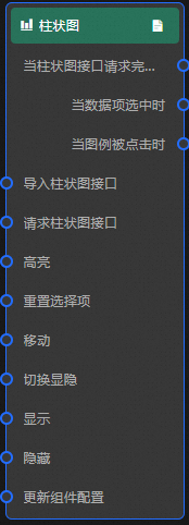
Event
Event
Description
When The Column Chart Interface Request Is Completed
An event is triggered after the data interface request returns and the data is processed by the filter. The processed data in JSON format is also provided. For specific data examples, refer to the Data Source tab on the right configuration panel of the widget in the canvas editor, in the Data Response Result section.
When A Data Item Is Selected
An event is triggered upon clicking a column in the column chart, and the corresponding data item is provided.
When The Legend Is Clicked
An event is triggered when the legend is clicked, and the corresponding data item is provided.
Action
Action
Description
Import Column Chart Interface
After processing the data in the widget rendering format, import the widget and render it again. There is no need to request server-side data again. For specific data examples, see the Data Source tab in the configuration panel on the right side of the widget in the canvas editor, in the Data Response Result area.
Request Column Chart Interface
Re-request server-side data. The data thrown by the input data processing node or layer node will be used as parameters. For example, if the column chart is configured with an API data source as
https://api.test, and the data passed to the Request Column Chart Interface action is{ id: '1'}, then the final request interface will behttps://api.test?id=1.Highlight
data: The data item that needs to be highlighted.
Single highlight
{
  x: 'Shanghai',
  y: 100
}
Batch highlight
[
  {
    x: 'Shanghai',
    y: 100},
  {
    x: 'Shenzhen',
    y: 75
  }
]
style: The selected style. Such as: fillStyle, stroke, opacity, etc. If the highlight style is not provided, the default style (the selected state style in the configuration) is used.
Reference data example
{
  "data": {},
  "style": {}
}
Reset Selection
Clear the data of the reset widget selection. No parameters are needed.
Shift
Shift the widget to the specified position. Refer to the reference data example.
    {
      // Shift method. Absolute positioning: to. Relative positioning: by. Default value: to.
        "positionType": "to",
      // Specified position. x coordinate, y coordinate.
      "attr": {
        "x": 0,
        "y": 0
      },
      // Animation method.
      "animation": {
        "enable": false,
        // Animation delay in ms.
        "animationDuration": 1000,
        // Animation curve. Optional values are: linear|easeInOutQuad|easeInOutExpo.
        "animationEasing": "linear"
      }
    }
Switch Visibility
Switch the widget to show or hide. No parameters are needed.
Display
Display widget, reference data example.
{
  "animationType": "",//Animation method, optional value: fade. No animation if not filled.
  "animationDuration": 1000,//Animation latency, unit ms.
  "animationEasing": ""//Animation curve
}
Hide
Hide the widget. See the reference data example.
{
  "animationType": "", // Animation method. Optional values: fade. Leave empty for no animation.
  "animationDuration": 1000, // Animation latency in milliseconds (ms).
  "animationEasing": "" // Animation curve.
}
Update Widget Configuration
Dynamically update the style configuration of the widget. First, in the Style panel of the widget, click Copy Configuration To Clipboard to obtain the widget configuration data. Then, change the field values of the corresponding styles in the data processing node on the blueprint editor configuration page as needed.
FAQ
How to troubleshoot when the chart displays blank during the configuration procedure?
First, check the to ensure the returned data meets the format requirements. If the data is correct, review for any inappropriate configurations. For instance, for charts with a colorField, verify the color mapping type is correct. For charts requiring a texture, ensure the texture is enabled.
If the chart effect does not meet expectations, can it be customized?
DataV-Board supports personalized customization through custom widgets and dashboard development.
If the chart version is not the latest version, how to update and upgrade?
For chart updates, a one-click upgrade option is available for existing widgets. Select the widget, click the Update Version button in the widget settings, and follow the prompts. If the major version number differs (i.e., the 'x' in x.y.z), a direct upgrade is not possible, and the chart must be re-added.
What font size is suitable for chart text? How to adapt well on devices with different resolutions?
The default resolution for PC dashboards is 1920×1680. The resolution for mobile dashboards can be customized. The system provides a default font size for each chart. If you find the font unsuitable, you can find in Batch modify widget fonts to scale the font uniformly. For more information, see .