Configuring the datasource is a crucial step in widget creation and business data visualization. It encompasses data integration, processing, and real-time updates. This guide details the configuration process for widget data.
Feature description
DataV-Board supports the integration of various business data, including static data, databases, and application gateways. Datasource configuration allows for the integration and adaptation of business data to widgets, while optimizing data loading performance, widget parameter interactions, and real-time updates through settings such as Disable Loading State, Controlled Mode, and Automatic Update Requests.
Operation flow
Prerequisites
Log on to the DataV-Board 7.0 console.
Prepare and add relevant data sources.
Enter the dashboard editing page and create a widget.
Configure data
Widgets are equipped with default static data. The following example illustrates configuring a widget's datasource using static data, global variables, and data sources, exemplified by integrating data for a column chart.
Static data adaptation for widgets
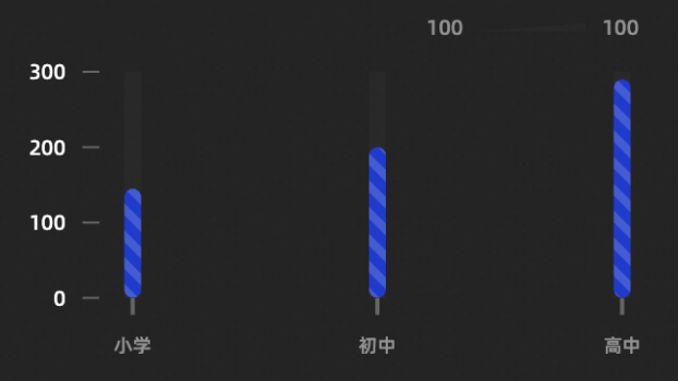
This example demonstrates how to adjust static data to display a column chart that compares the number of students across different educational stages in a school.
Create and select a Column Chart widget, navigate to the Datasource panel, and click Data Mapping to review the default data and structure of the column chart.
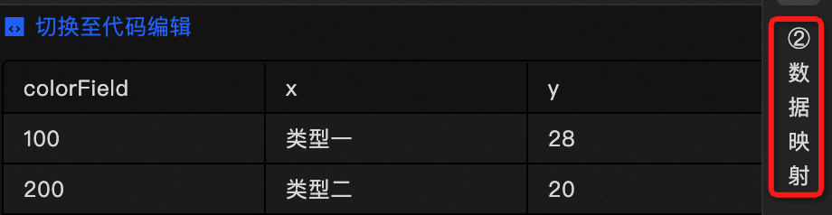
Examine the data structure. The column chart requires the
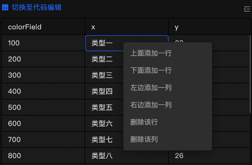
xfield for x-axis data, theyfield for y-axis data, and thecolorFieldfield for color stack grouping. For a comprehensive explanation, see column chart parameter description.In the visual editor, you can directly modify the static data.
Click
 to switch to the code editor mode. Here, you can edit the datasource by adding, deleting, or modifying the JSON formatted code.
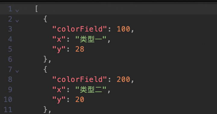
Adjusting the JSON data as shown below will result in the column chart displaying a comparison of student numbers across different educational stages in a school.
 Note
NoteAfter configuring the data, you may adjust the style as needed. For instance, you can conceal the legend, add axis titles, and enhance the chart's clarity.
Global variable adaptation for widgets
Widgets can utilize global variables as input data. This example shows how to integrate column chart data into a widget using the schoolInfo global variable.
Navigate to the Global Variable tab, create a new variable, and rename it to
schoolInfo.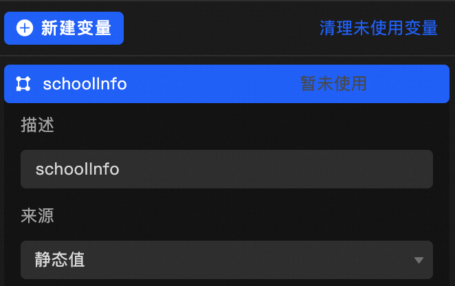
Update the content of Initial Value as described below.
Create and select a Column Chart widget, navigate to the Datasource panel, and click Data Mapping to review the default data and structure of the column chart.
Examine the data structure. The column chart requires the xfield for x-axis data, theyfield for y-axis data, and thecolorFieldfield for color stack grouping. For a comprehensive explanation, see column chart parameter description.Set the Datasource Type to global variable and choose
schoolInfoas the data source for the widget.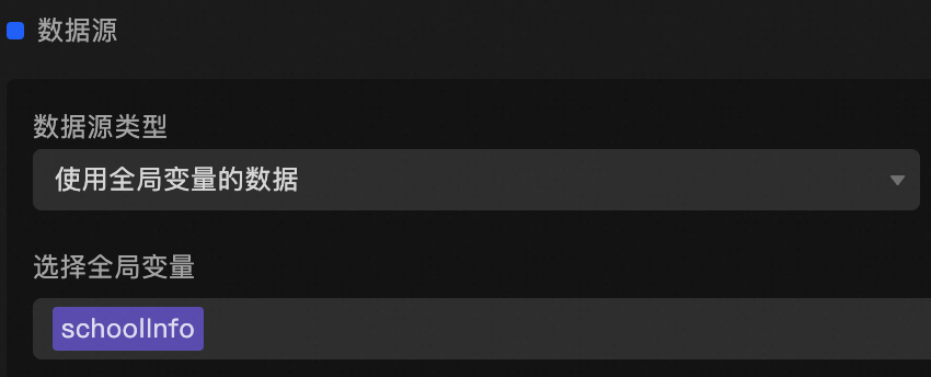
The widget data will align with the static data, eliminating the need for adaptation. The column chart will then display the comparison of student numbers across different educational stages in a school.
NoteGlobal variables are versatile and can be used for more than just passing static values. For more information, see Using Global Variables.
Datasource adaptation for widgets
To integrate business data through a datasource, first integrate the data, then compare the business data structure with the widget's requirements using Data Response Results. Adapt the data using Data Mapping or Filters to achieve the desired format. This example uses a retail store dataset with key fields category for product category and quantity for sales volume to illustrate sales conditions for different product categories in a column chart.
Create and select a Column Chart widget, navigate to the Datasource panel, and click Data Mapping to review the default data and structure of the column chart.
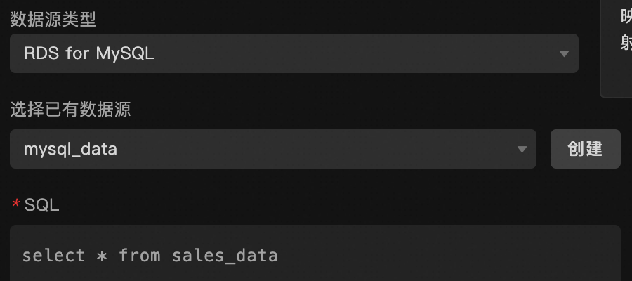
Examine the data structure. The column chart requires the xfield for x-axis data, theyfield for y-axis data, and thecolorFieldfield for color stack grouping. For a comprehensive explanation, see column chart parameter description.Choose Datasource Type as RDS for MySQL, select an existing datasource, and use SQL to fetch the prepared business data.
Click Data Response Results to inspect the returned data structure.
[
  {
    "id": 1,
    "category": "Electronics",
    "sales_amount": 15000,
  },
  {
  ...
  }
]
Adapt the data to match the column chart's requirements, as the current data structure does not conform. Employ Data Mapping or Filters for this purpose.
NoteBoth filters and data mapping can be used to process business data, with filters being applied first.
Method 1: Data mapping
Configure the
xandyfields in data mapping as shown below.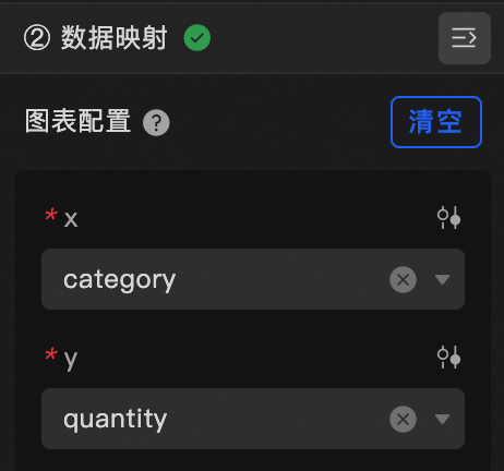
Without configuring the
colorField, the sales column chart will appear as follows: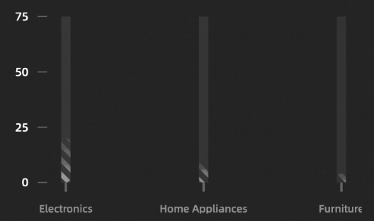
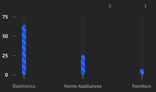
Method 2: Filters
Apply filters to process the data as shown in the following code:
function filter(data){
  return data.map(item => {
    return {
      x: item.category,
      y: item.quantity,
      colorField: 1
    }
  });
}
The resulting sales column chart will be as depicted:
Configuration item description
Data Item Configuration |
Description |
Data Source |
The component's data source displays the data fields contained within the component using code editing or visual editor. You can also modify the data type to flexibly configure the component's data. |
Data Mapping |
When you need to customize chart field configurations, you can set different field mappings in the Data Mapping module to map these fields to the corresponding fields of the component. This allows for real-time data matching without altering the data source fields. Additionally, click the |
Filter |
Open the Filter to select an existing data filter or create a new one, and configure the data filter script to achieve data filtering capabilities. For more information, see manage data filters. |
Data Response Result |
This feature displays the component's data in real-time. When the component's data source changes, the data response result will display the latest data accordingly. In case of a delayed system response, you can click the |
Disable Loading State |
Check the check box to hide the loading content during component updates and data dashboard previews. Unchecking will display the loading content. The default setting is unchecked. |
Controlled Mode |
Check the check box to prevent data requests upon the component's initialization. Data requests will only be initiated through global variables or methods configured in the blueprint editor. Unchecking allows for automatic update requests. The default setting is unchecked. |
Automatic Update Request |
Check the check box to manually set the polling frequency for dynamic polling. Clearing this option disables automatic updates, requiring manual page refreshes or data request triggers through the blueprint editor and global variable events for updates. |
 icon to configure field styles individually.
 icon on the right to check the current data response result, or click the
  icon on the right to obtain the most recent data for the component. You can also click to view examples to see sample response results for the current component.
FAQ
For assistance with configuration issues, refer to the datasource configuration FAQ.