An area chart displays data trends over time and shows the proportion of the total that each data series represents. This topic describes how to add data to an area chart and configure its style.
Prerequisites
A dashboard has been created. For more information, see Create a dashboard.
Overview
Scenarios
An area chart helps you understand the overall trend of data over a period of time. For example, you can see whether data increases, decreases, changes periodically, or increases exponentially over a specific period.
Advantages
Analytical capabilities: You can configure year-on-year and month-on-month comparisons, cumulative calculations, intelligent auxiliary lines, trend lines, predictions, anomaly detection, and volatility analysis with one click.
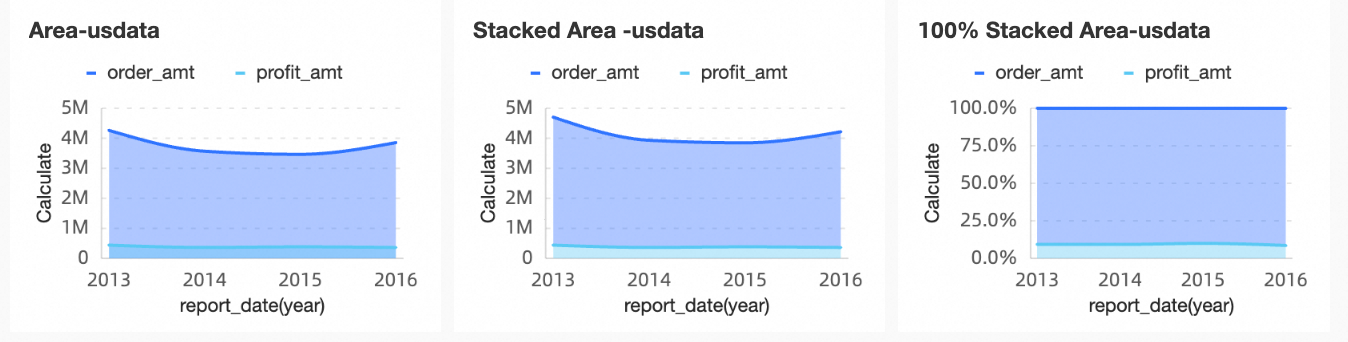
Visualization: Supports area charts, stacked area charts, and percentage-stacked area charts. You can also display labels, legends, and thumbnail axes.
Data comparison annotations: You can compare data against a previous period and add numeric annotations.
Example Visualization
Limits
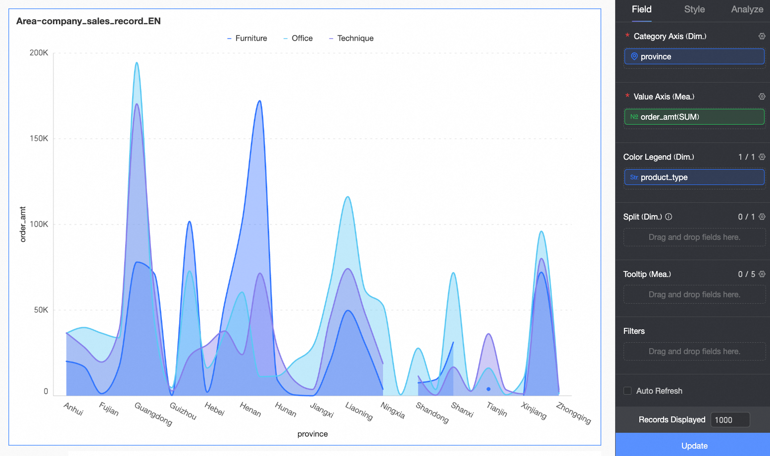
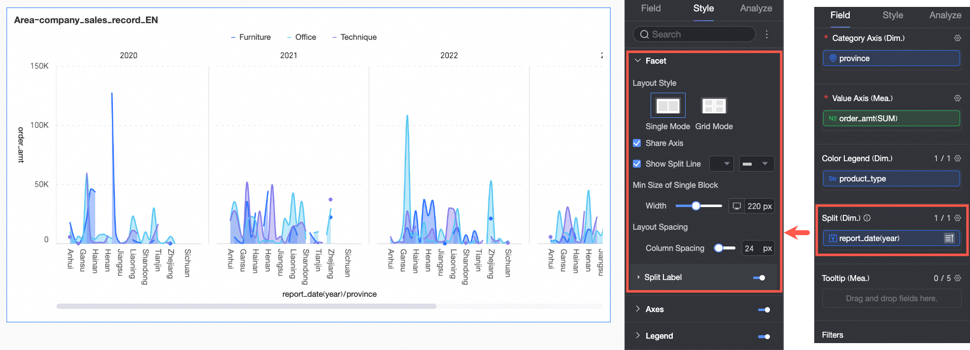
An area chart consists of a Value Axis/Measure, a Category Axis/Dimension, and a Color Legend/Dimension.
Category Axis (Dim.): Requires at least one dimension, such as date, province, or product type.
Value Axis (Mea.): Requires at least one measure, such as order amount.
Color Legend (Dim.): Supports only one dimension, such as shipping method.
NoteIf you have multiple measures on the Value Axis (Mea.) and add a dimension to the Color Legend (Dim.), you must enable the in-chart metric filter to switch between metrics in the chart.
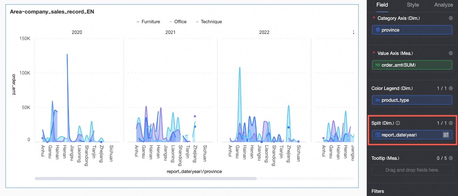
Facet (Dim.): Supports only one dimension, such as product type.
Configure chart data
On the Data tab, select the required dimensions and measures:
In the Dimension list, double-click or drag province to the Category Axis (Dim.) field.
In the Dimension list, double-click or drag product_type to the Color Legend (Dim.) field.
In the Measure list, double-click or drag Order amount to the Value Axis (Mea.) field.
Click Update.
(Optional) You can add a dimension to Facet (Dim.) to display data trends for each dimension value in a faceted layout.
NoteYou can add only one facet dimension. The faceted layout has the following limits:
Fields: Only Top N and no calculations are supported for fields in Facet (Dim.).
Style: The axis does not support a secondary Y-axis. Auxiliary displays do not support a thumbnail axis.
Analysis: Only data interaction is supported. Advanced settings, metric analysis, annotations, and AI insights are not supported.
Configure chart style
This section describes how to configure the chart style. For information about how to configure the chart title, see Configure the Chart Title.
You can use the Search box at the top of the configuration panel to quickly find a configuration item. Click the  icon on the right to expand or collapse all categories.
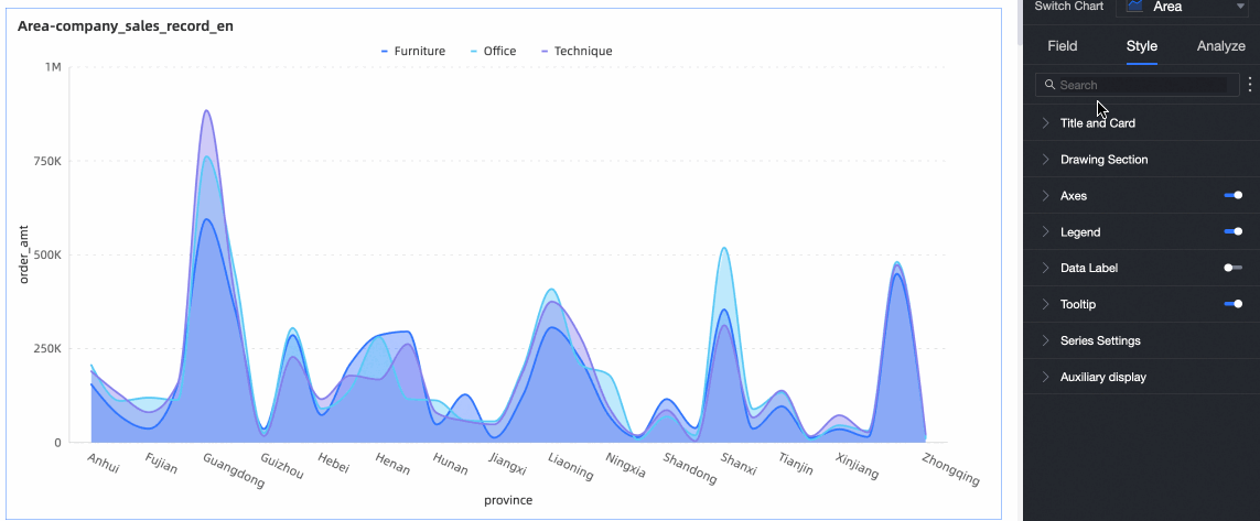
Plot Area
In the plotting area, you can set the line chart style.
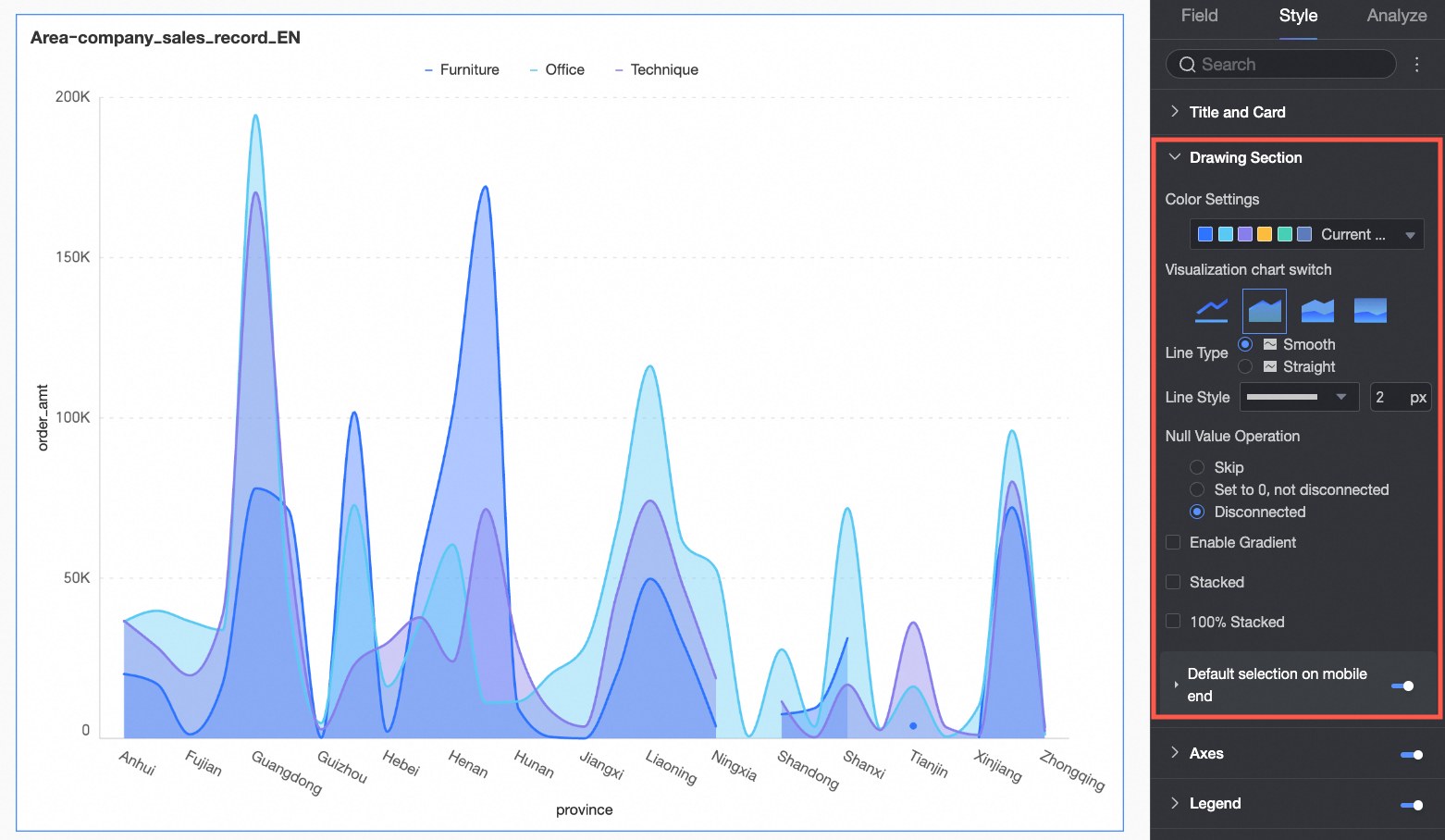
Configuration item | Configuration item descriptions |
Color settings | Set colors for the area. Use the system color scheme or define custom colors. |
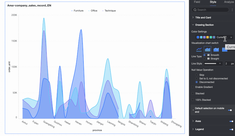
Visualization Chart Switching | Select a chart type: Line chart, Area chart, Stacked area chart, or 100% stacked area chart. |
Line type | Select a line style: Curve or Straight line. |
Line style | Set the line type and thickness. |
Null value handling | Choose from Skip directly, Set to zero (no break), or Break line. |
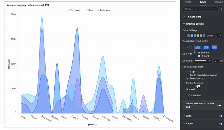
Enable gradient effect | Enable this option to display the area in a gradient color. |
Stacked and 100% Stacked | Switch between area charts, stacked area charts, and 100% stacked area charts.
|
Default selection on mobile | When enabled, set the default selection to Last dimension value (global) or Last dimension value (series). |

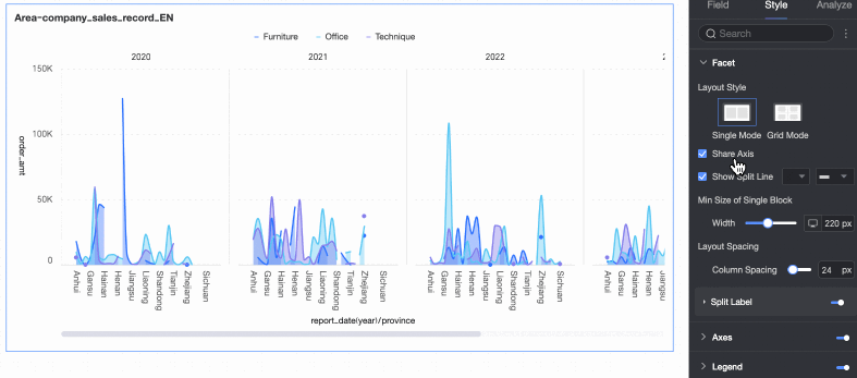
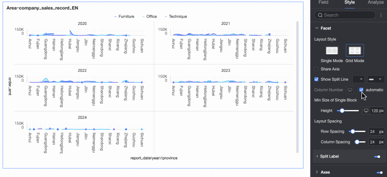
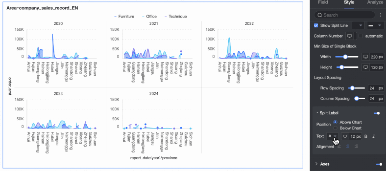
Facet
In faceted mode, you can configure the layout and style of charts in the Facet section.
Faceted mode is enabled only when a field is configured in Facet (Dim.).
Configuration item | Description | |
Layout style | Select a layout: Single-column comparison or Grid distribution. | |
Shared axis | Specify whether charts share the same axis.
| |
Show separator | Specify whether to show separators between charts. When enabled, configure the separator color and style. | |
Column count | When Grid distribution is selected, set the number of columns. The default value is Automatic. You can also customize the number of columns as needed. Note
| |
Minimum facet block size | Set the minimum width and height for each chart. Supported options vary by layout style.
| |
Row and column spacing | Set spacing between rows and columns. Supported options vary by layout style.
| |
Split Tags | Position | Set where to display dimension value labels: Above chart or Below chart. |
Text | Set font color and style for dimension value labels. | |
Alignment | Set alignment for dimension value labels. | |

 icon above the page to switch devices.
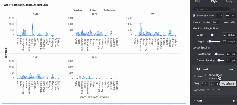
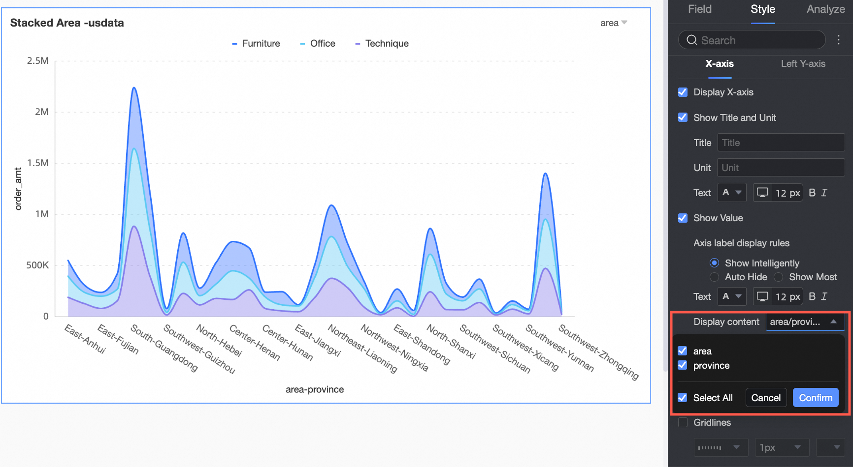
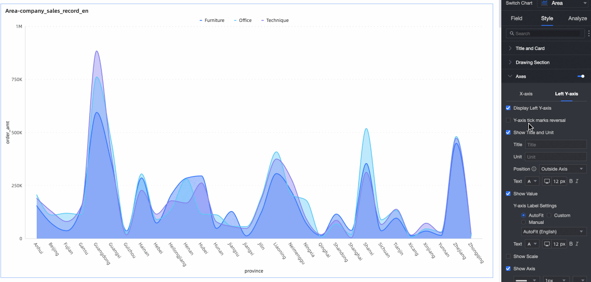
Coordinate Axis
In the Axes section, you can configure the axis styles. By default, the axes are displayed.
Select Display dual Y-axis. This setting takes effect only when you add two or more measures. When selected, the Right Y-Axis appears in the Axes section.
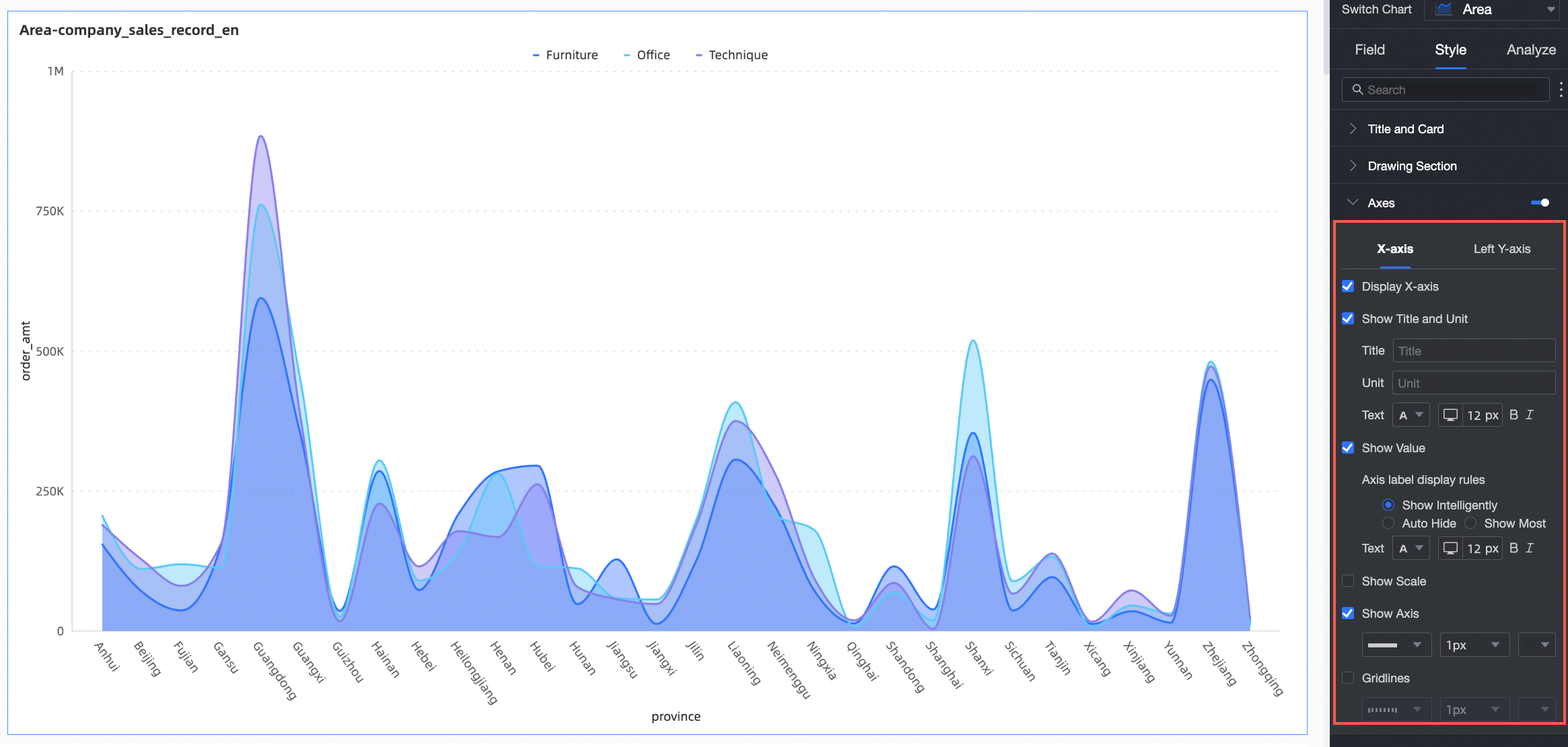
Name | Configuration item | Description |
X-axis | Display X-axis | Specify whether to display the X-axis. |
Show title and unit | Specify whether to display the axis title and unit on the X-axis. | |
Show axis labels | Specify whether to display labels on the X-axis, including label display rules and text style. | |
Content | Display partial or all dimensions.
| |
Show scale | Specify whether to display scales on the X-axis. | |
Show axis | Specify whether to display the X-axis, including line style, line width, and color. | |
Show axis labels | Specify whether to display labels on the X-axis. | |
Show gridlines | Specify whether to display gridlines on the X-axis, including line style, line width, and color. | |
Left Y-axis | Flip Y-axis scale | Flip the Y-axis scale values.
|
Display left Y-axis | Specify whether to display the left Y-axis. | |
Show title and unit | Specify whether to display the axis title and unit. | |
Show axis labels | Specify whether to display labels on the left Y-axis, including label and scale range and label display format. | |
Show scale | Specify whether to display scales on the left Y-axis. | |
Show axis | Specify whether to display the left Y-axis, including line style, line width, and color. | |
Show gridlines | Specify whether to display gridlines on the left Y-axis, including line style, line width, and color. | |
Axis value range and interval |
|
You can configure the Right Y-axis only when Display dual Y-axis is selected. The configuration options are the same as those for the Left Y-axis.
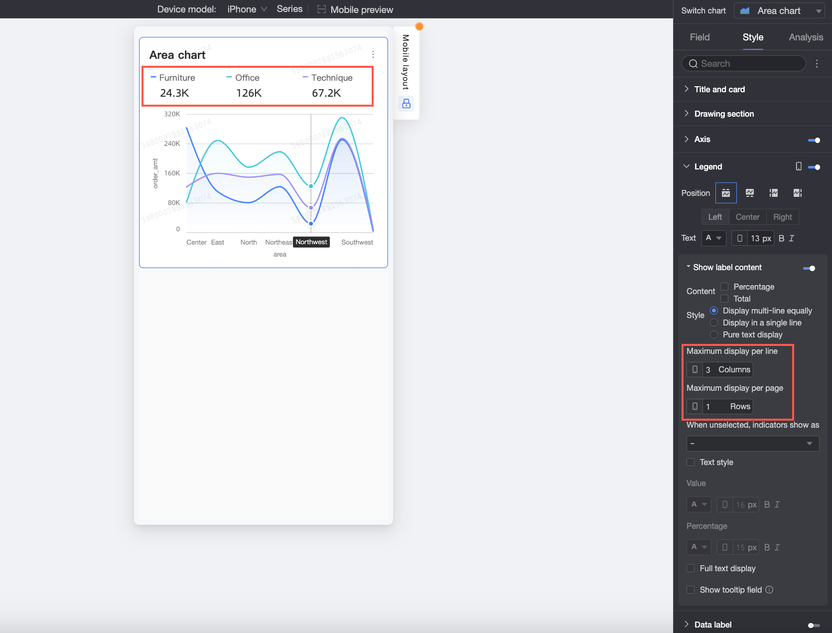
Legend
In the Legend section, click the  icon to enable the legend and configure its style.
PC configuration
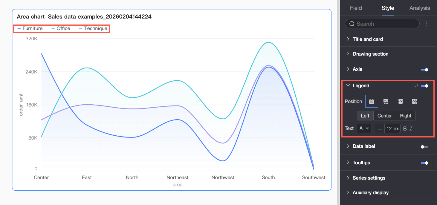
Configuration item
Description
Position
Set the legend position and alignment for PC.
When position is Top or Bottom: Choose left, center, or right alignment.
When position is Left or Right: Choose top, center, or bottom alignment. You can also set the distance between the legend and chart content.
Text
Set text style for the PC legend, including font color, size, weight, and italic.
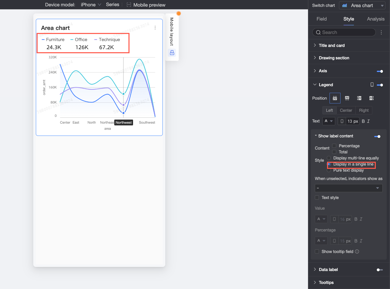
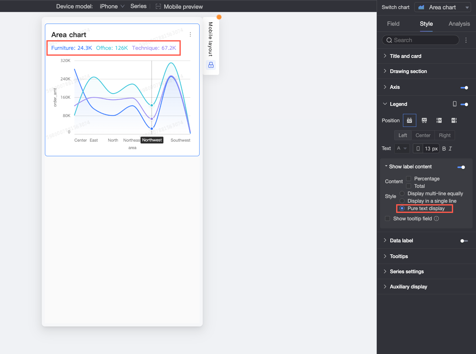
Mobile configuration
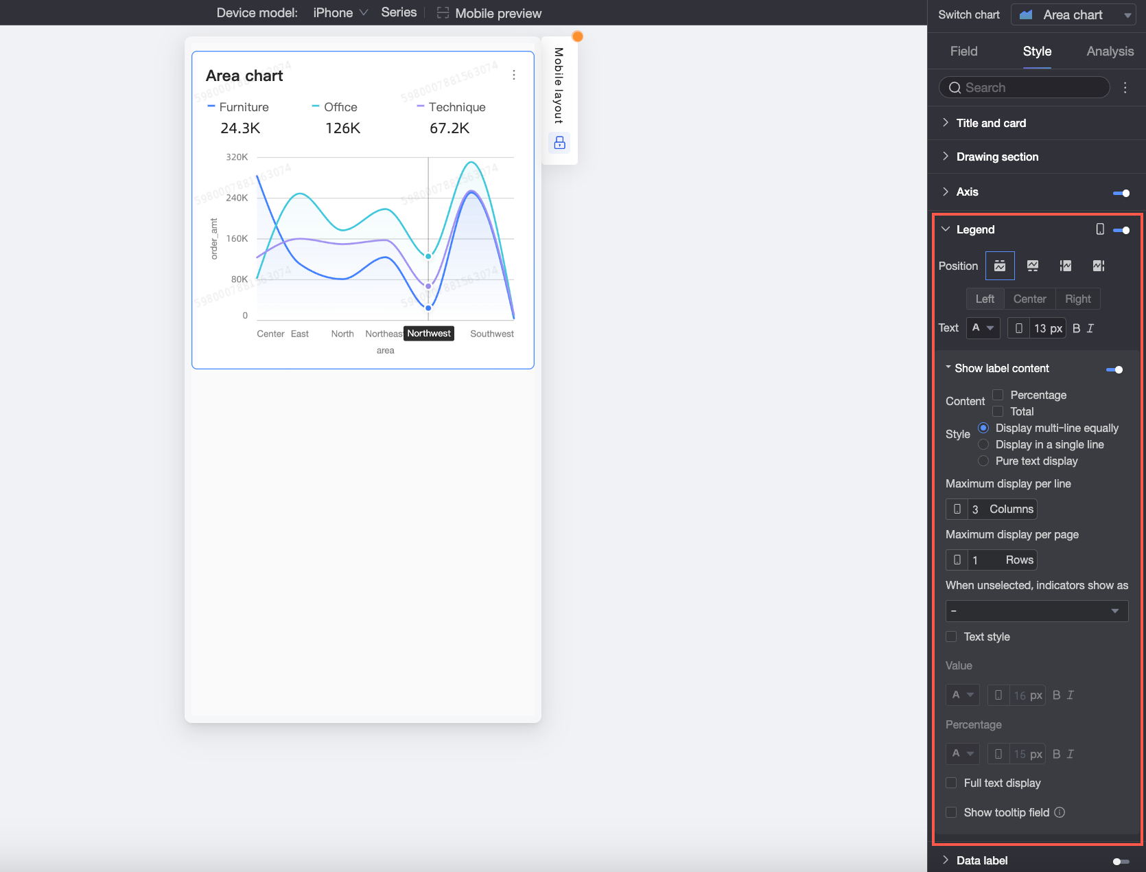
Configuration item | Parameter descriptions | |
Position | Set the legend position and alignment for mobile.
Note When position is Top, enable legend sub-labels. | |
Text | Set text style for measure names in the mobile legend, including font color, size, weight, and italic. | |
Display Tag Content When Position is Top, click the | Content | Select what data to show in legend sub-labels: Percentage or Total.
|
Style | Set text layout for legend sub-labels. Options:
| |
Display when unselected | When Style is Multi-line equal division or Single-line tiling, choose how to display metrics when users do not select a legend item: - or Empty. | |
Percentage position | When Content includes Percentage and Style is Multi-line equal division or Single-line tiling, set where to show percentages: Below or Right of numeric labels. | |
Text style | When Style is Multi-line equal division or Single-line tiling, set text style for Numeric values. When Content includes Percentage, set separate formatting for percentage text to visually distinguish it from Numeric labels. | |
Percentage decimal places | Adjust decimal places for percentages when Content includes Percentage. | |
Full text display | When Style is Multi-line equal division or Single-line tiling, long measure names may be truncated. Select Full text display to show complete names. | |
Show tooltip fields | When selected, fields configured in the Tooltip/Measure panel appear in the legend. Note Tooltip fields are not supported when splitting by dimension (i.e., color legend is a dimension). | |
Data labels
In Data Labels, you can set whether to display data labels and the label style.
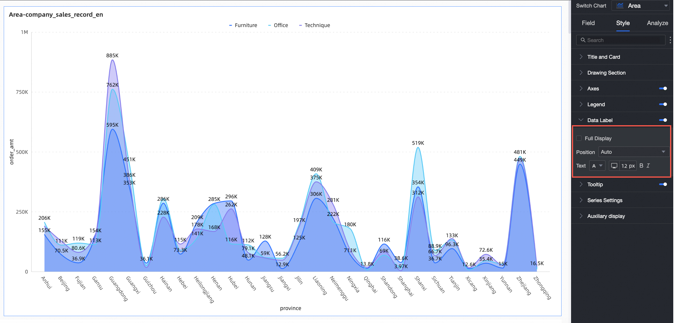
Configuration item | Configuration Item Descriptions |
Full display | Specify whether to show all data labels. |
Position | Set where to display labels. |
Text | Set label text style. |
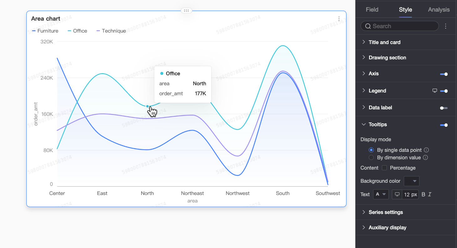
Tooltip
In the Tooltip section, click the icon to enable tooltips and configure their behavior.
PC configuration
Configuration item
Configuration Item Description
Display mode
Select how to display tooltip information: Per data point or Per dimension value.
Content
Select data to show in tooltips. Available options depend on the display mode:
For Per data point: Percentage is supported. For Per dimension value: Total and percentage are supported.
Percentage: The percentage of a data point within a dimension relative to the total. Example: Profit amount as a percentage of total revenue for office supplies.
Total: The sum of all measures within a dimension. Example: Total sales across regions for 2025.
Background color
Set the background fill color for the tooltip box.
Text
Set text style for the tooltip box, including font color, size, weight, and italic.
Mobile configuration
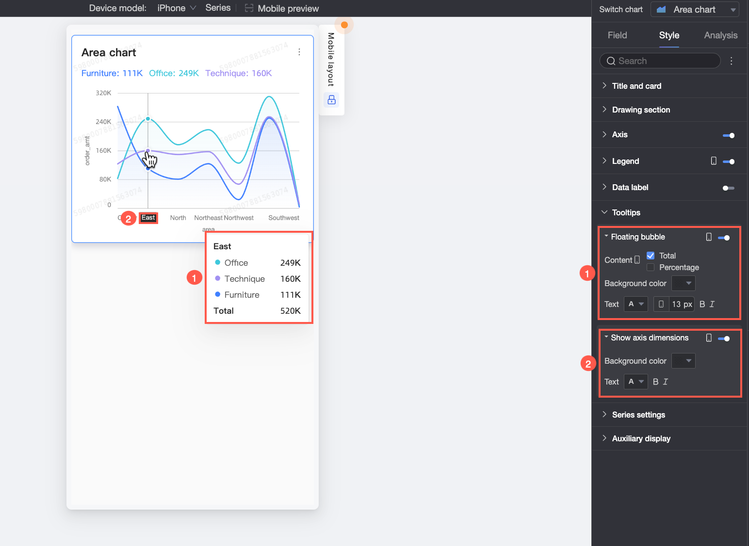
Configuration item
Description
Hover bubble
Click the
 icon to enable hover bubbles (①)
Content
Select data to show in hover bubbles: Percentage or Total.
Percentage: The percentage of a data point within a dimension relative to the total. Example: Profit amount as a percentage of total revenue for office supplies.
Total: The sum of all measures within a dimension. Example: Total sales across regions for 2025.
Background color
Set the background fill color for hover bubbles.
Text
Set text style for hover bubbles, including font color, size, weight, and italic.
Axis dimension
Click the
icon to enable axis dimension display (②)Background color
Set the background fill color for axis dimension labels.
Text
Set text style for axis dimension labels, including font color, weight, and italic.
Series settings
In the Series settings section, you can configure the series styles.
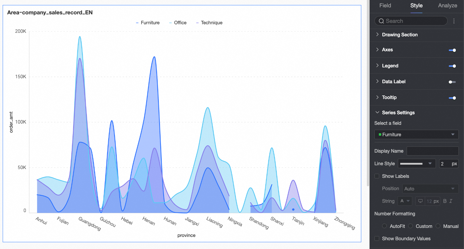
You can configure display names and number formatting in the Series settings section only when a field is added to Color Legend (Dim.) on the Fields tab.
Configuration item | Description |
Select field | Select a dimension or measure based on your business scenario. |
Alias | Set a field name that matches your business context. This option is available only when Color Legend (Dim.) is configured. |
Line style | Set line type and thickness. Note This feature is not supported for stacked or 100% stacked area charts. |
Show marker points | Choose marker point shapes: circle, hollow circle, diamond, or hollow diamond. Note This feature is not supported for stacked or 100% stacked area charts. |
Show data labels | Specify whether to show data labels and set their color and position. |
Number formatting | When data labels are enabled, set the display format for numeric values. Options: AutoFit, Custom, or Manual. This option is available only when Color Legend (Dim.) is configured. |
Show Extreme Values | Specify whether to show labels for the maximum and minimum values in the area chart. Note This feature is not supported for stacked or 100% stacked area charts. |
Auxiliary display
In the Auxiliary display section, you can configure metric filters and view controls.
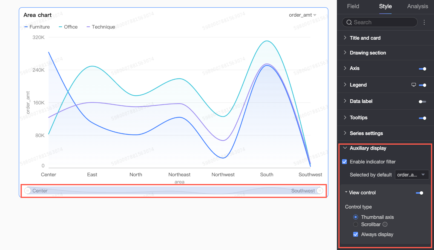
Configuration item | Description |
Enable metric filter | Specify whether to enable the in-chart metric filter. When enabled, set the default selected metric field. |
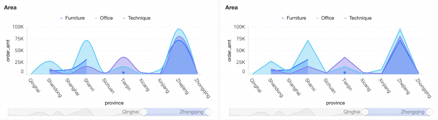
View controls | When data on chart axes is dense and exceeds the container size, click the Two control types manage the visible axis range: Scroll bar and Mini chart.
Note If no view controls are configured and the chart is too small, the system automatically enables view controls, selects Mini chart, and shows it only when data width exceeds the container width. |
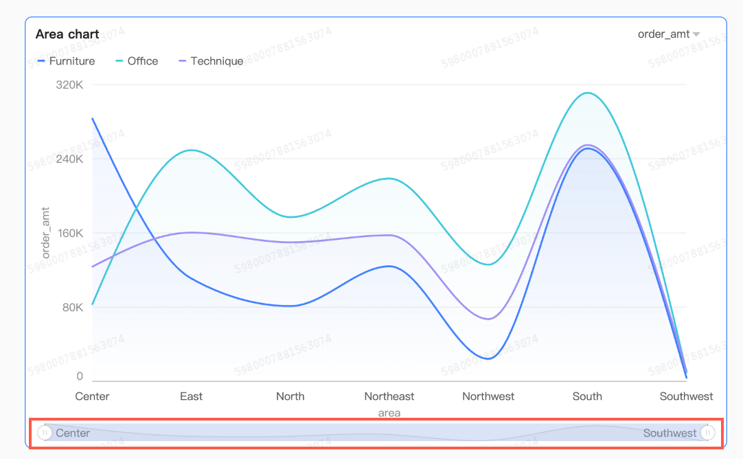 Mini charts appear only when the total data width exceeds the chart container width. To always show mini charts, select Always show. When selected, mini charts appear even if data does not fill the screen.
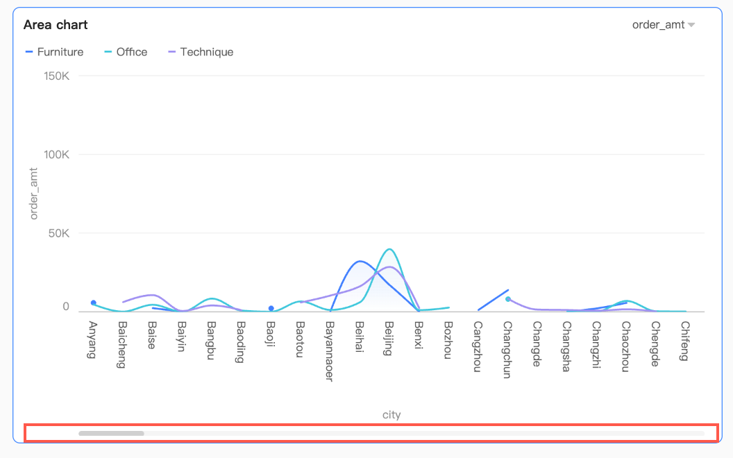 Set the minimum category width to limit data volume in the current view window. This ensures clear axis ticks and prevents label overlap or visual clutter from overly dense data points. Default minimum category width is 32 px, with a range of 16–100 px.
Configure chart analysis
Configuration item | Name | Description |
Interactive analysis | Drilling | When drilling is configured, customize the display style for drill-down levels. For more information, see Drilling. |
Filter interaction | Link multiple charts to analyze data across them. For more information, see Filter interaction. | |
Go | Link multiple dashboards to analyze data across them. Hyperlinks support Parameter and External link. For more information, see Hyperlink. | |
Analysis Alerts | Auxiliary Line | Compare current measure values against gridline reference values. Reference values can be static or calculated. Calculated values include average, maximum, minimum, and median. For more information, see Metric analysis. |
Trendline | Show overall data trends. Trendline options: Intelligent, Linear, Logarithmic, Exponential, Polynomial, and Power. For more information, see Trendline. | |
Label | - | Highlight anomalies or key data points using color, icons, comments, or data points. For more information, see Label. |
What to do next
Share the dashboard with specific people. For more information, see Share a dashboard.
Integrate the dashboard into the BI portal to create a navigation menu for thematic analysis. For more information, see BI portal.