A decomposition tree chart lets you decompose core metrics to identify the key channels or members that affect them. For example, you can use a decomposition tree chart to view the contribution of each member across multiple dimensions. You can also decompose a measure into one or more groups to analyze the data in each group. This topic describes how to add data to a decomposition tree chart and configure its style.
Prerequisites
You must have created a dashboard. For more information, see Create a Dashboard.
Overview
Scenarios
This chart is used to decompose a value into multiple groups and analyze the proportion of each group.
Preview Example
Limits
A decomposition tree chart consists of Analysis (Measure) and Decomposition Basis (Dimension):
For the decomposition basis, you can select from 1 to 10 dimensions, such as region, province, city, and product name.
For the analysis, you can select up to 1 measure, such as order quantity or sales amount.
When a decomposition tree chart splits fields, it displays a maximum of 10 rows vertically and 500 columns horizontally.
Configure Chart Data
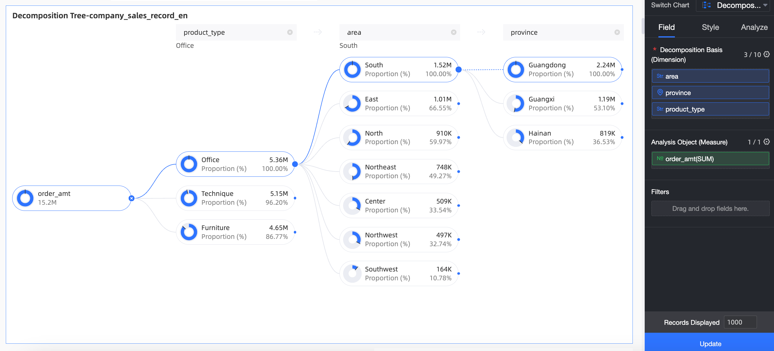
On the Data tab, select the required dimension and measure fields:
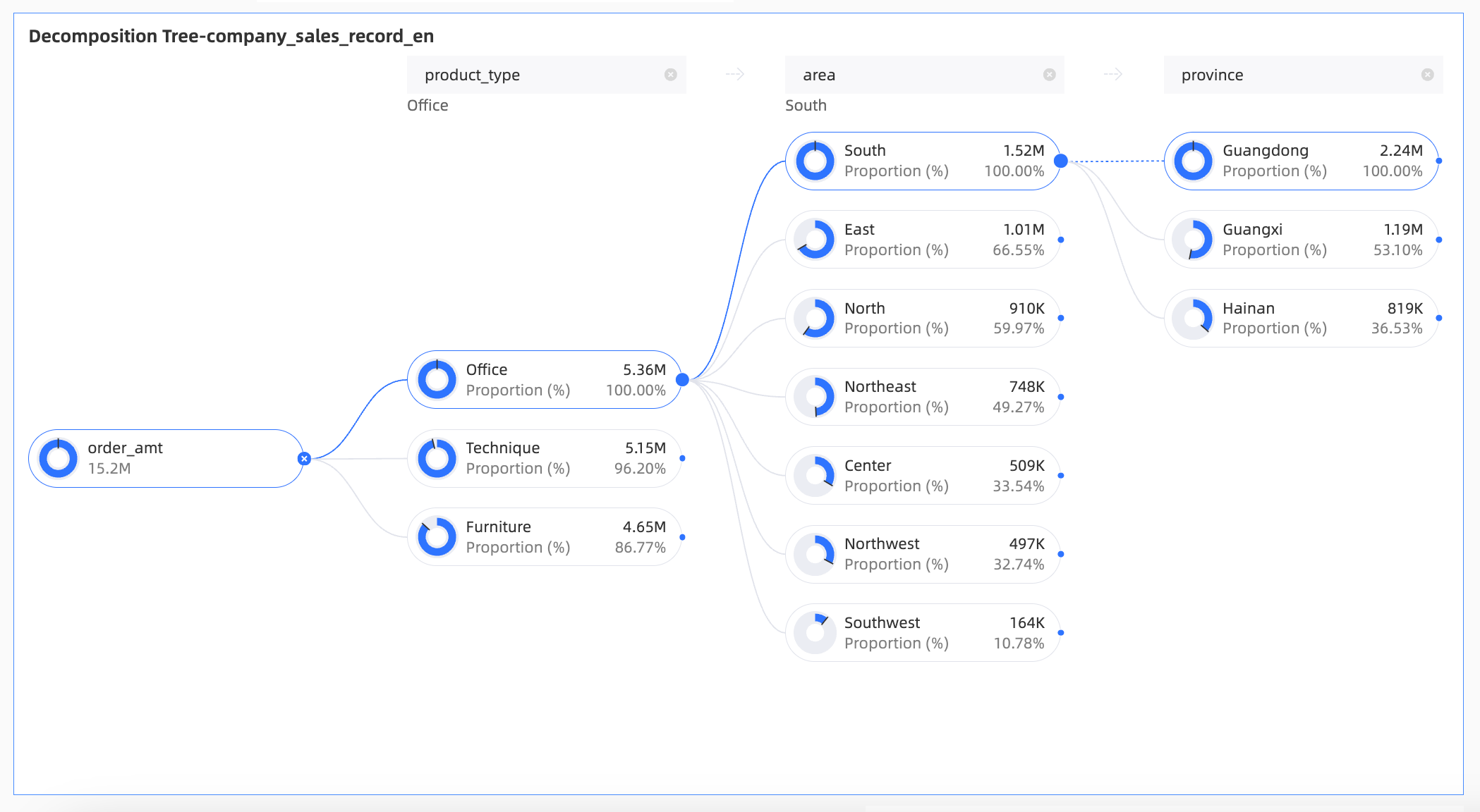
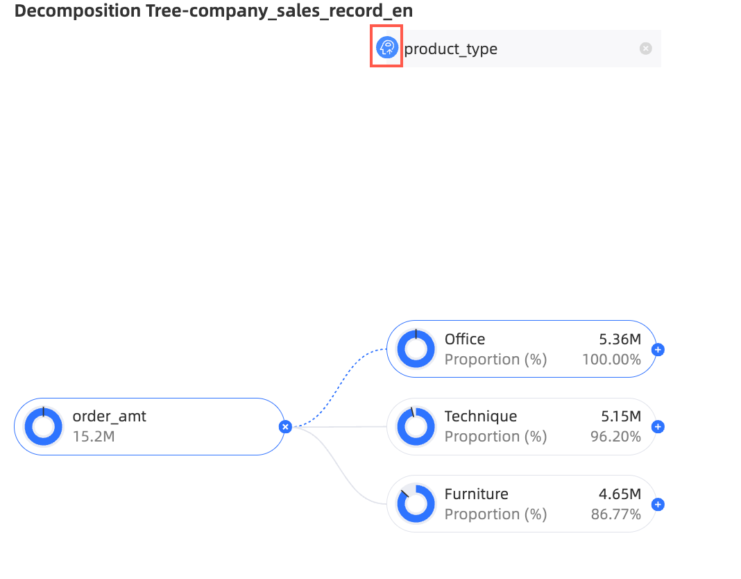
In the Dimension list, double-click or drag region, province, and product type to the Decomposition Basis (Dimension) area.
In the Measure list, double-click or drag Order amount to the Analysis (Measure) area.
Click Update. The system automatically updates the chart.
Analyze Decomposition Metrics
After you configure the chart data, you can set decomposition items on the chart to analyze the data.
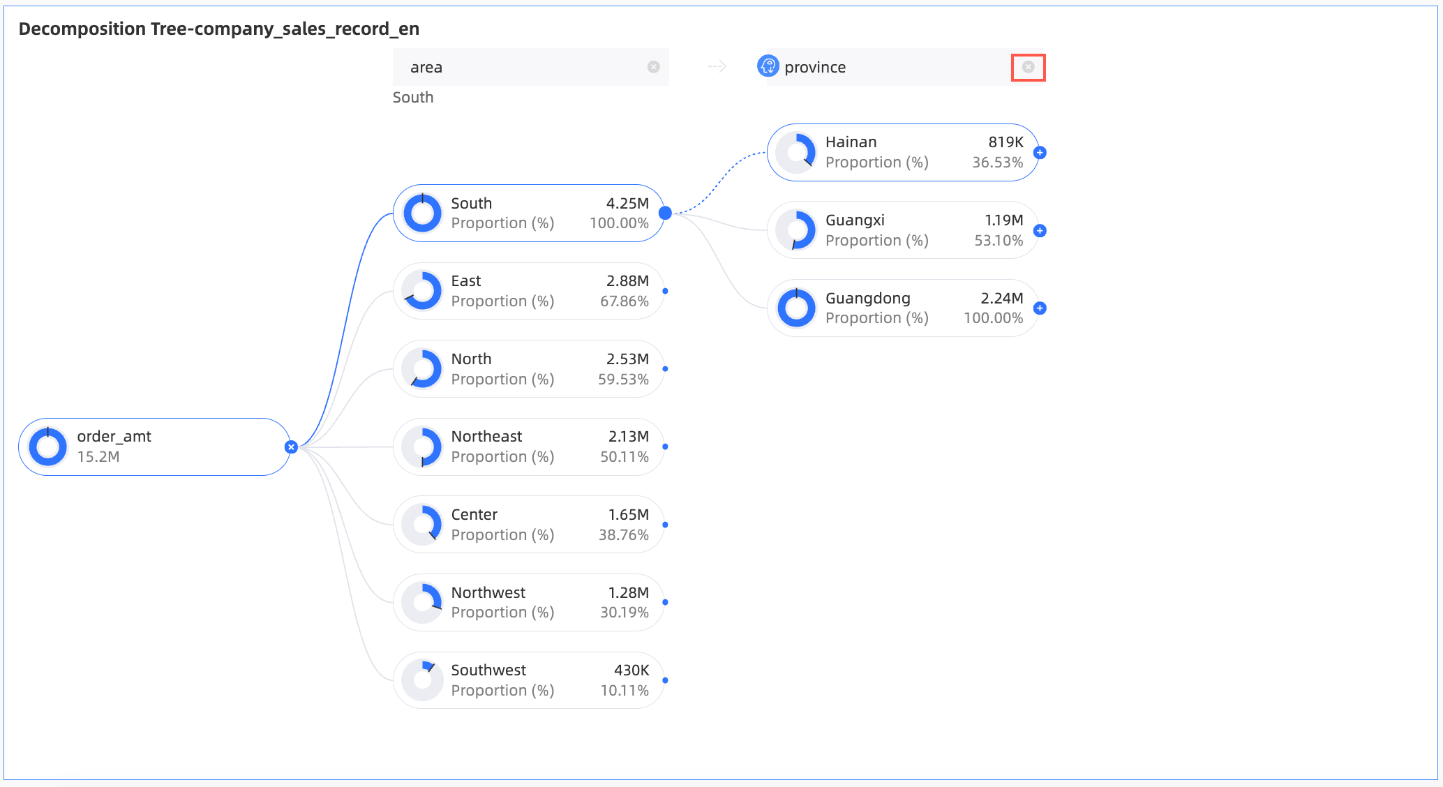
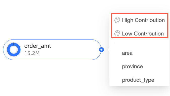
On the chart editing page, move the pointer over the node icon, as shown in the following figure.
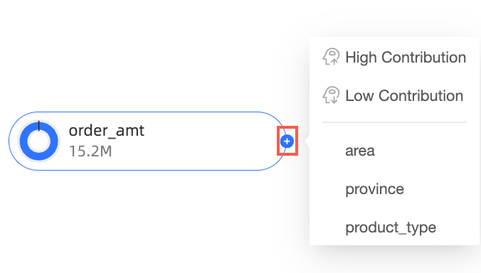
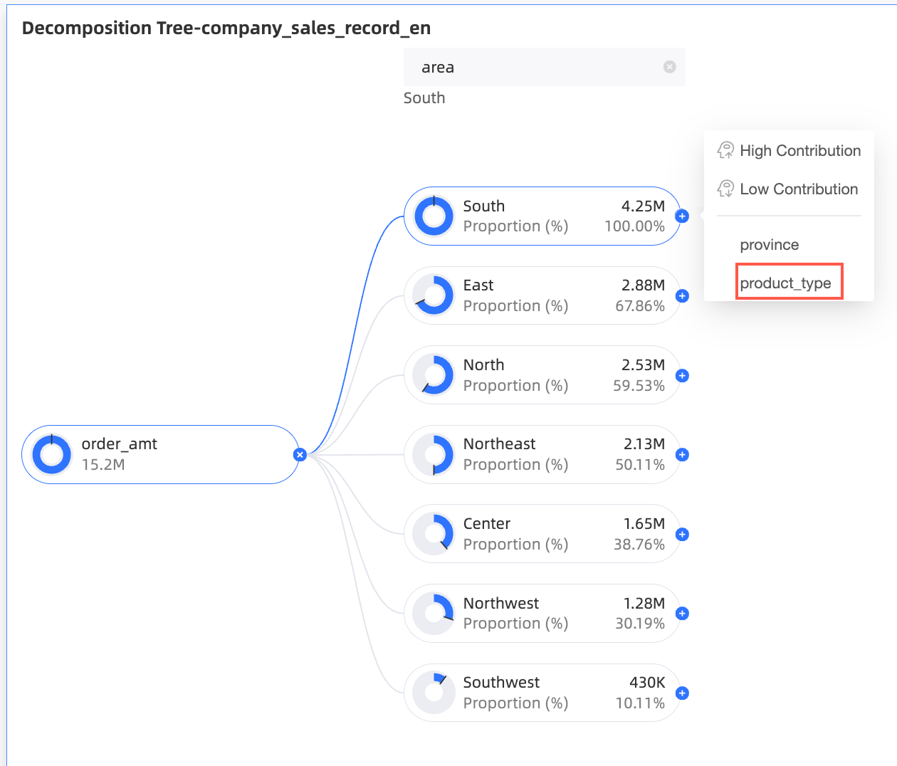
Select a decomposition method:
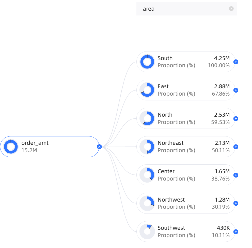
Custom decomposition: The available decomposition dimensions are the fields that you added to the Decomposition Basis (Dimension) area on the Data tab. You can select the dimensions for decomposition as required.
In this example, you can decompose by Region, province, or product type.
Smart decomposition: This method supports two options: High Contribution and Low Contribution. The system uses AI to decompose the data based on your selection.
In this example, decompose by High Contribution.
 Note
NoteIf you use Smart decomposition and set the decomposition path to product type > province, the path is saved with the dashboard. When you reopen the dashboard, the default decomposition path remains product type > province. To view the latest smart recommendation results, you can continue to edit the dashboard.
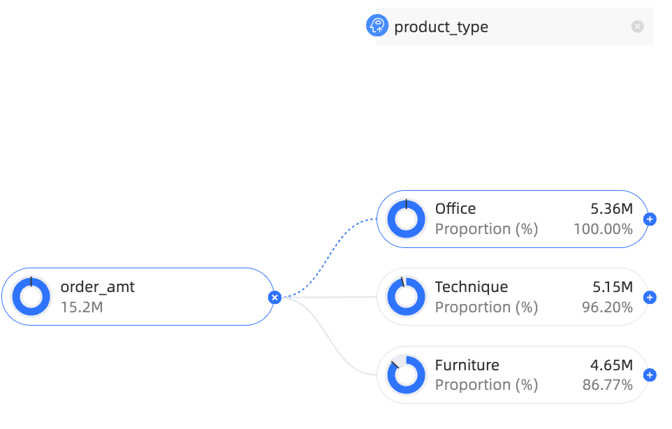
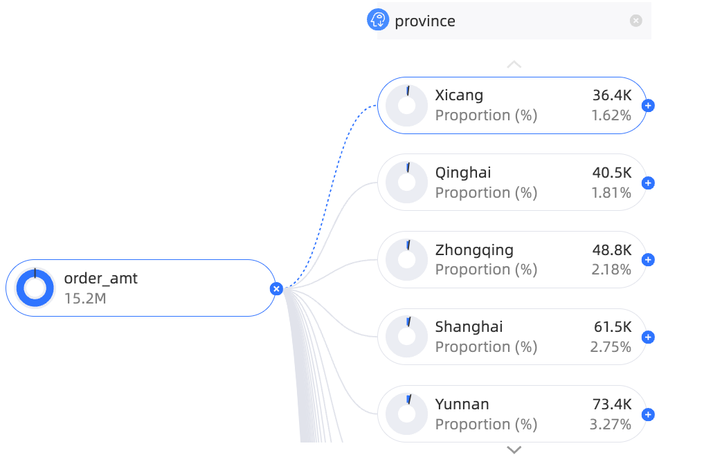
Modify a decomposition item.
For example, change the intelligent-type Province to the custom-type Product Type.
Click the delete icon to the right of the province area, as shown in the following figure.
Move the pointer over the target area and select product type.
Configure Chart Style
This section describes the style settings for the chart. For more information about general chart title settings, see Configure the Chart Title.
You can enter a keyword in the search box at the top of the configuration pane to find a configuration item. You can also click the ![]() icon on the right to Expand/Collapse all categories.
icon on the right to Expand/Collapse all categories.
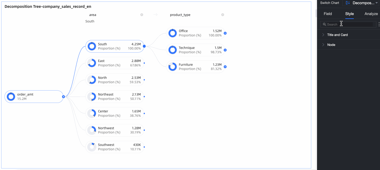
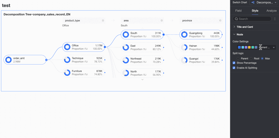
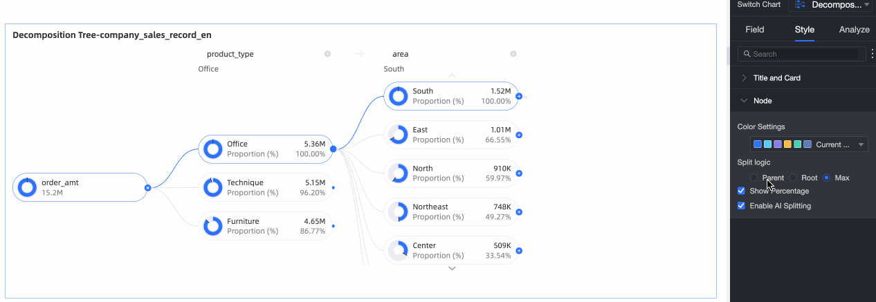
Node
In the Node section, you can configure Visualization color configuration and Visualization splitting logic.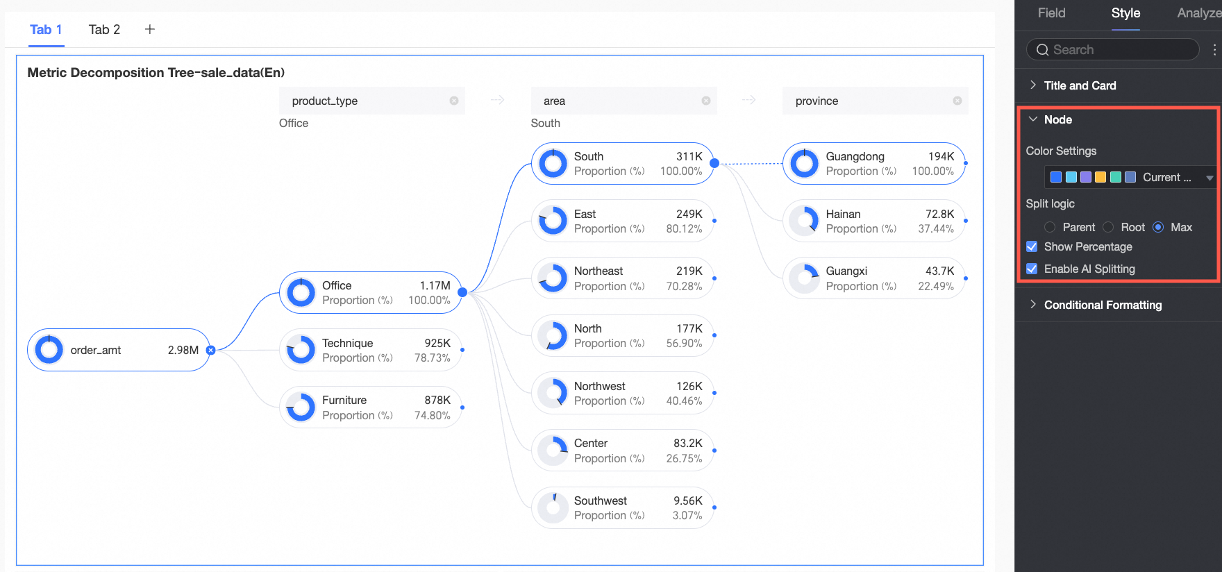
Chart configuration item | Parameter description |
Positive and negative value colors | Configure colors for the positive and negative values of the measure in the Analysis (Measure) area.
|
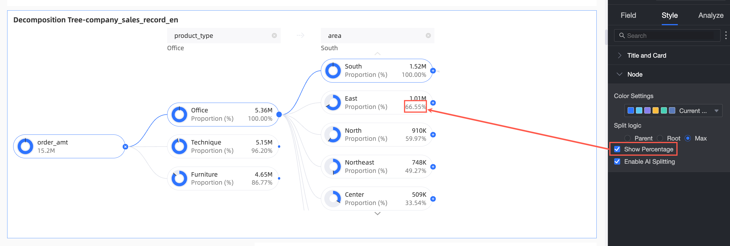
Splitting logic | Set the statistical method for the value percentage in the donut chart. The options are Parent node, Root node, and Highest node.
|
Show Percentage | Specify whether to show the percentage.
|
Enable AI Splitting | Specify whether to Enable AI Splitting. The supported AI analysis type is Absolute Analysis. After you enable this feature, the chart appears as follows.
Absolute Analysis: Analyzes the absolute value of the numbers. In this example, the measure is Order amount, and the decomposition dimensions are province and product type (such as technology products, furniture products, and office supplies):
|
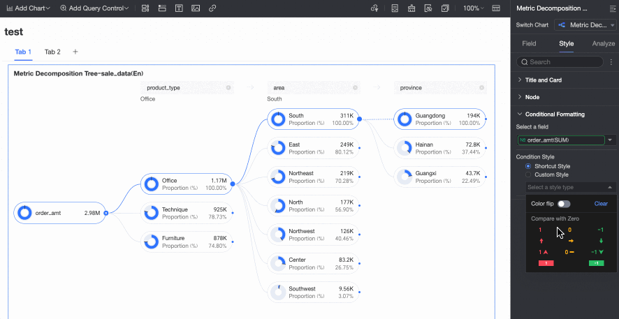
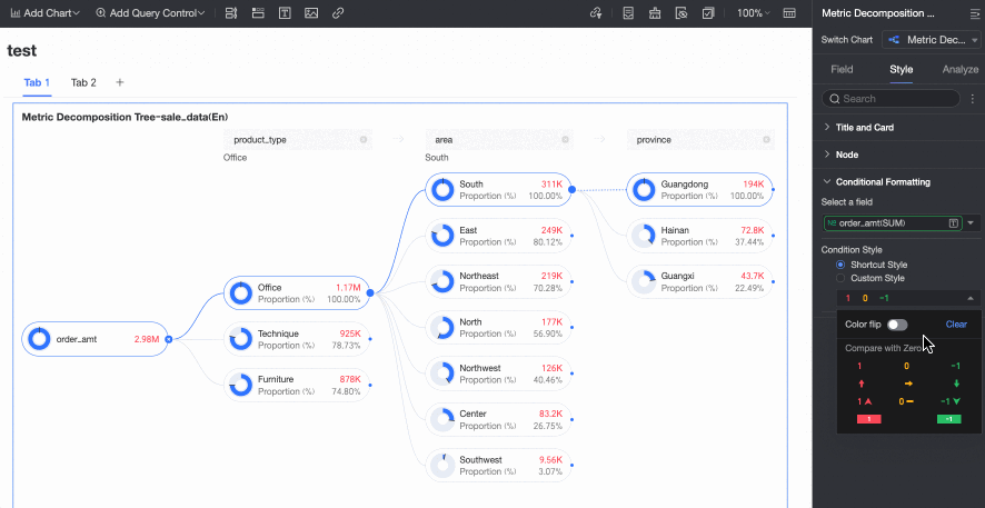
Conditional Formatting
In the Conditional formatting section, you can configure the conditional format for measure fields.
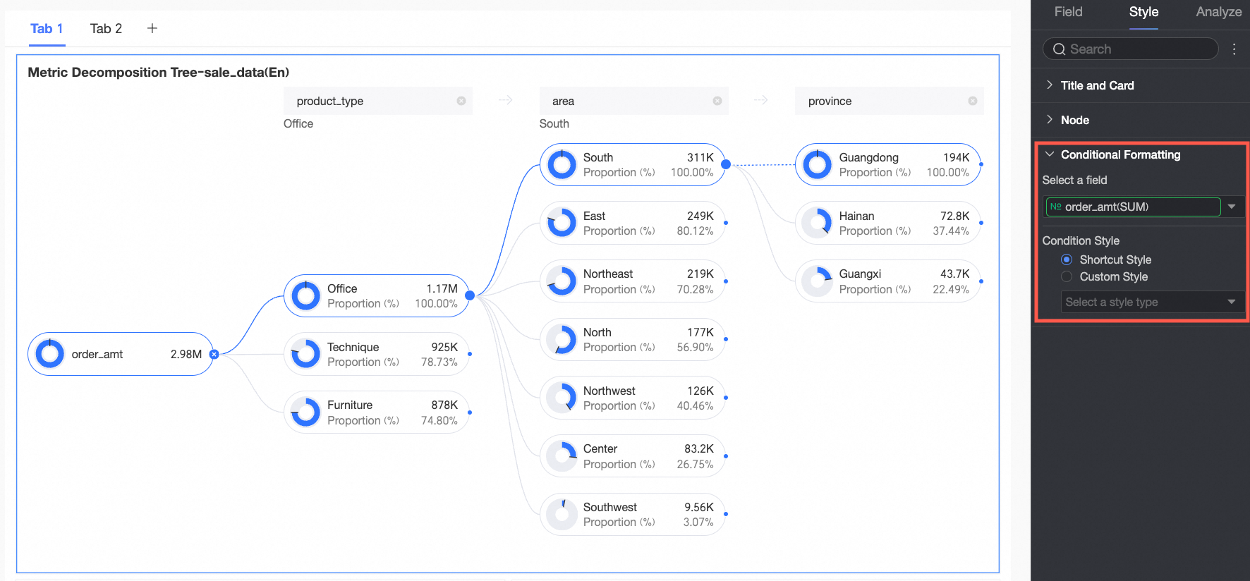
Chart configuration item | Description | |
Select field | Select the measure field for which you want to configure conditional formatting. You can only select measures that are added to the Analysis (Measure) area of the field pane. | |
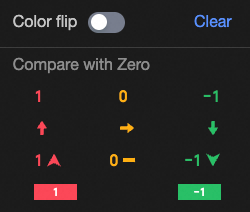
Conditional format | Quick style | Select a quick style, click Select a style type, and then choose a conditional format for the current measure field from the system styles in the drop-down list.
|
Custom style | In addition to the system-provided quick styles, you can also configure custom styles for the current measure field as needed. You can set conditional formatting by comparing with a static value.
| |

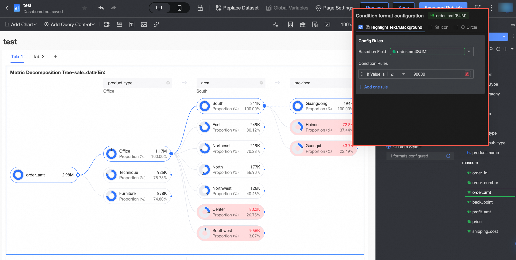 You need to configure the following information.
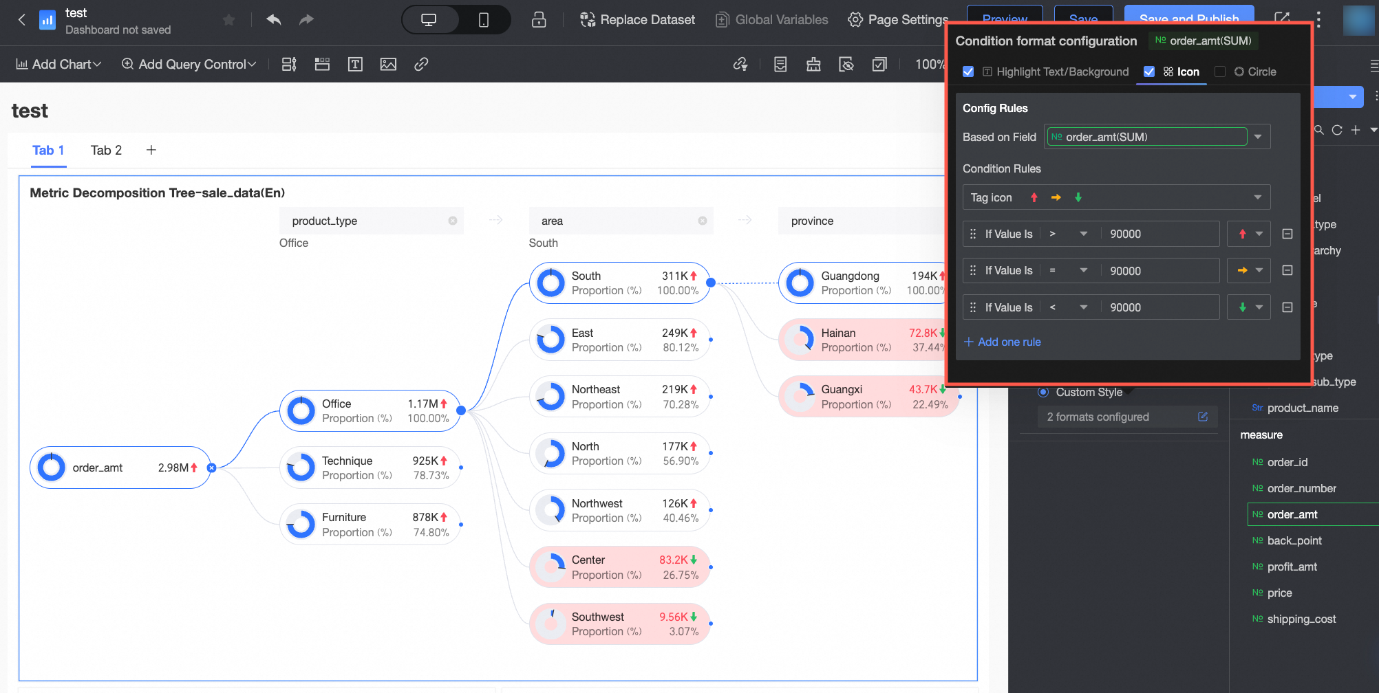 You need to configure the following information.
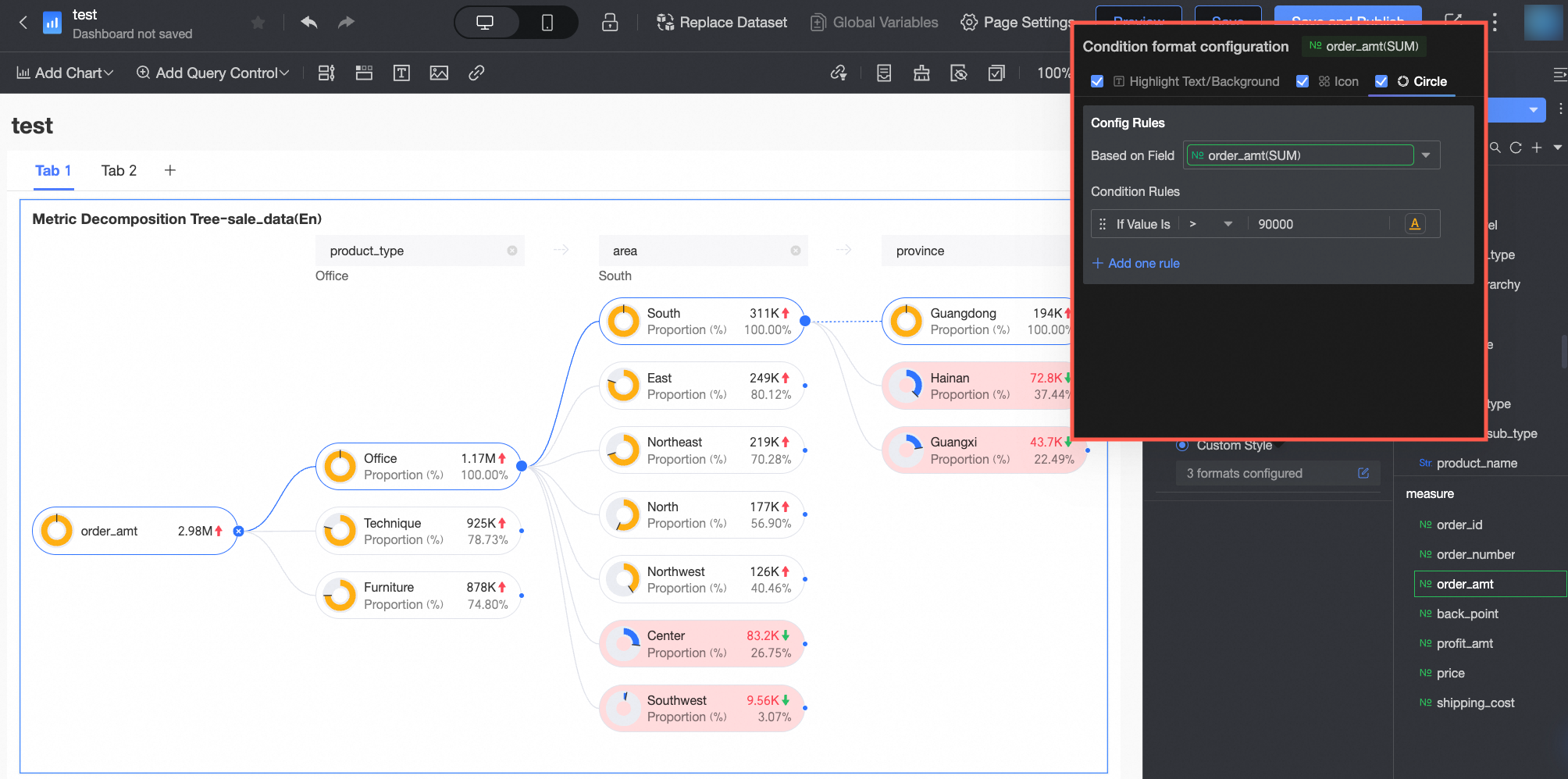 You need to configure the following information.
Configure Chart Analytics
Configuration item | Name | Description |
Interaction analysis | Filter interaction | If the data you need to analyze exists in different charts, you can use chart filter interaction to associate multiple charts for data analysis. For more information, see Filter interaction. |
What to do next
If you want other people to view the dashboard, you can share it with them. For more information, see Share a Dashboard.
When you need to create a complex navigation menu for thematic analysis, you can integrate your dashboard into the BI portal. For more information, see BI portal.