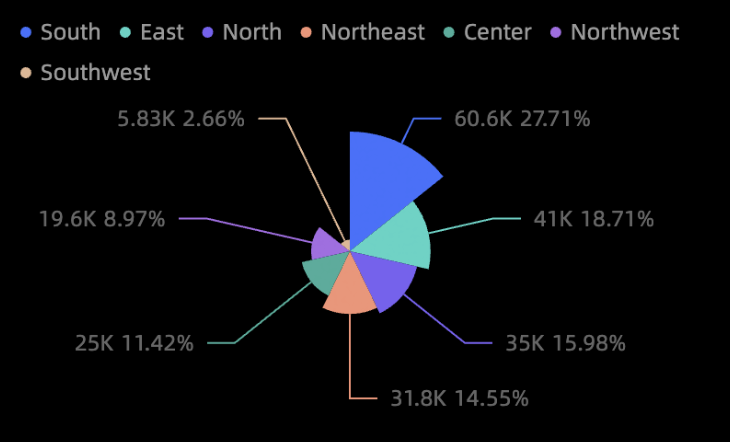
Rose charts display data distribution across dimensions or compare values across categories, and are well suited for categorical data. You can add data and configure chart styles such as sector areas, legends, and data labels.
Prerequisites
You have created a data dashboard. For more information, see Create a data dashboard.
Example
Configure data
-
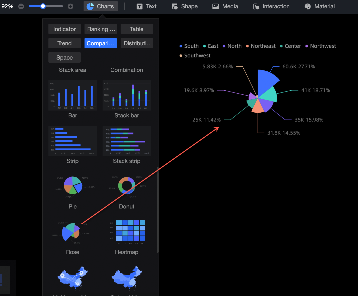
In the component library area, under Charts, find the rose chart and drag it to the canvas.
-
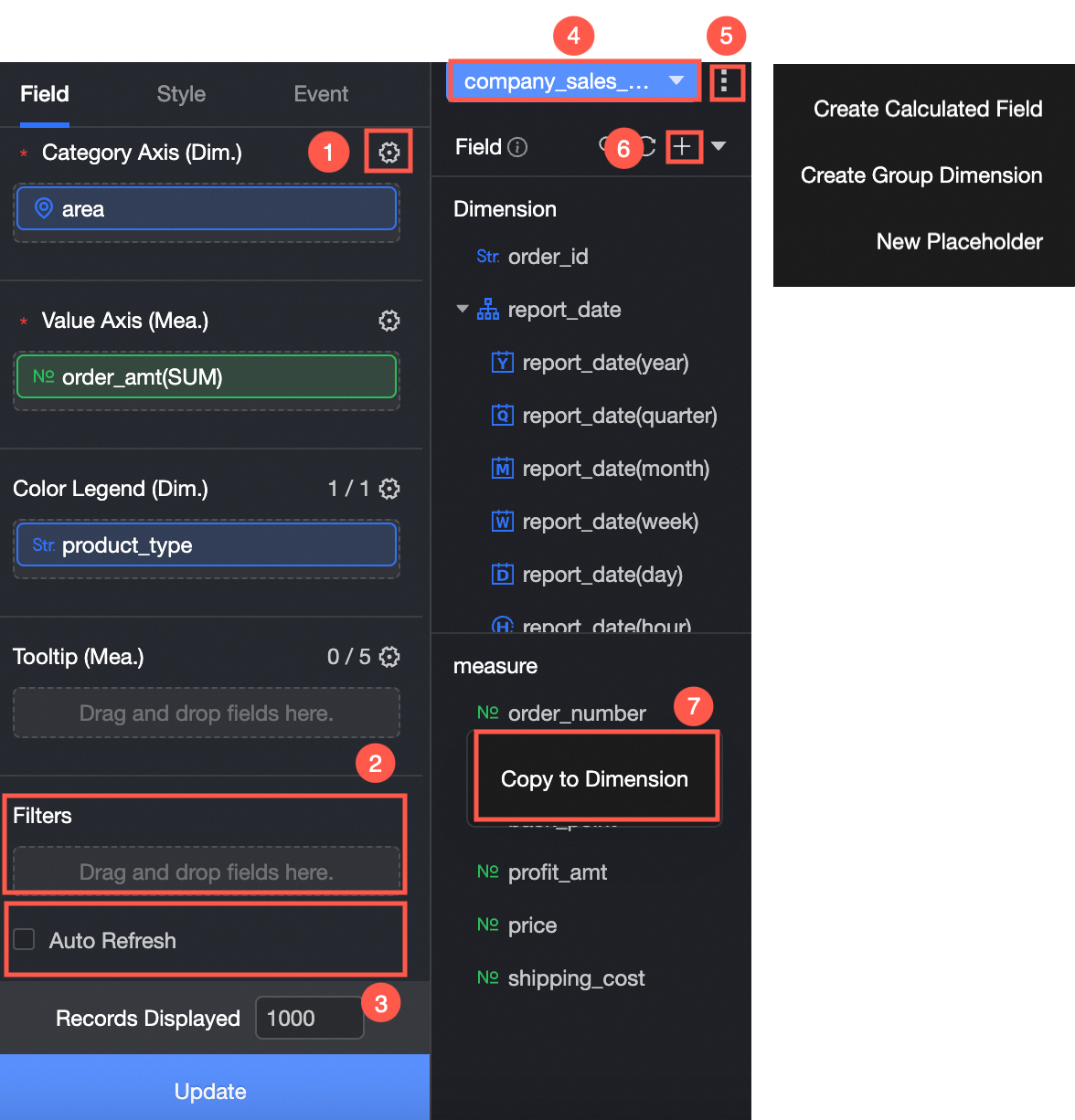
Click Select Dataset and add data as shown in the following figure.
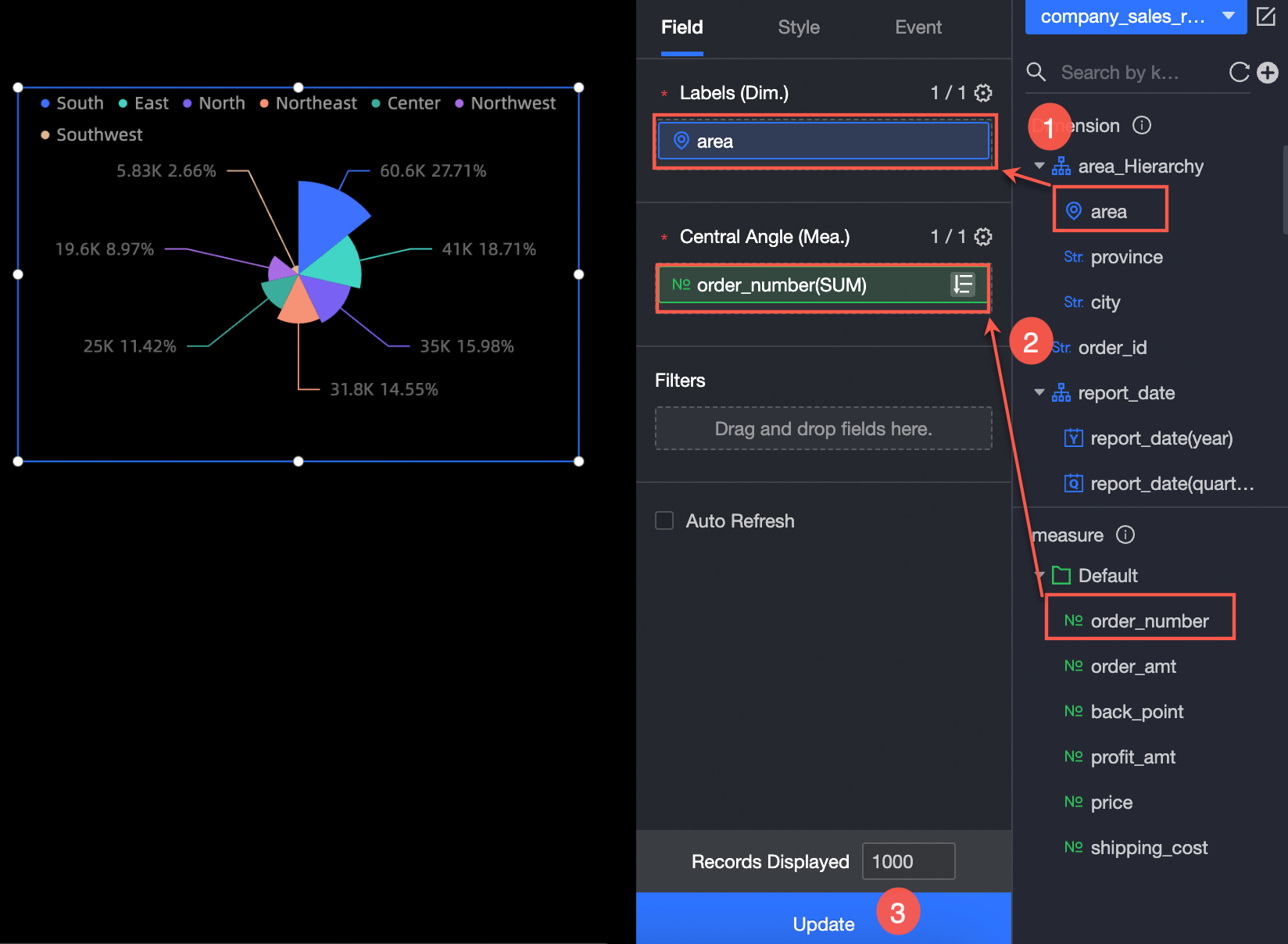
You can also perform the following operations on the data:
-
Configure field styles in batches (①). For more information, see Configure field styles in batches.
-
Filter fields (②). For more information, see Filter data.
-
Set up automatic data updates (③). For more information, see Schedule an automatic data update.
-
Switch the dataset (④). For more information, see Switch a dataset.
-
Edit the dataset (⑤). For more information, see Edit a dataset.
-
Process data (⑥). For more information, see Create a calculated field, Create a grouped dimension, and Create a placeholder.
-
Copy a field (⑦). For more information, see Copy a dimension.
Chart styles
Position and size
Set the alignment, position, size, and rotation of the component:
-
Set the horizontal alignment to
Align left,Align center, orAlign right. -
Set the X and Y coordinates to position the component relative to the top-left corner.
-
Set the
Rotation Angleto rotate the component. -
Set the
W(width) andH(height) values to resize the component. -
Lock component: Prevents changes to the component's size and position.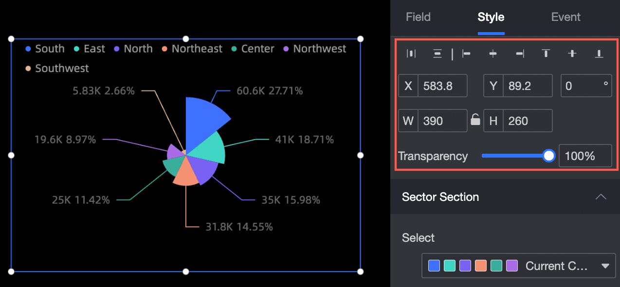
Sector area
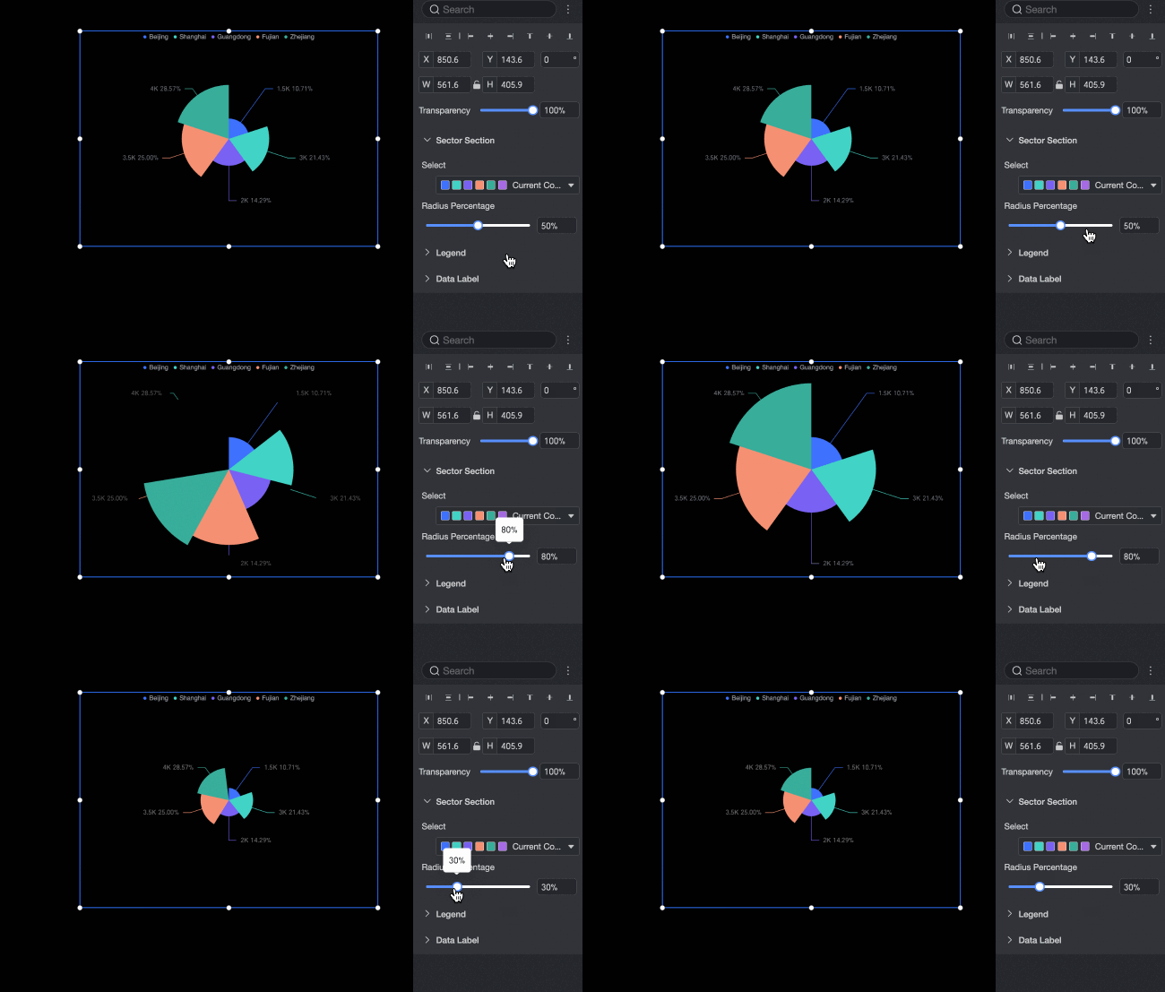
Set the color and radius of the sectors:
-
Set the
Colorfor each sector. -
Set the
Radius Ratioto adjust the sector radius.
Legend
Set the position, style, and text of the legend:
-
Set the legend position to
Top,Bottom,Left, orRight. -
Set the
Text Spacingvalue to adjust the space between legend items. -
Set the legend
Iconstyle toCircle,Rectangle,Rounded Rectangle, orTriangle. -
Customize the legend's
Text Style, includingColor,Font Size,Bold, orItalic.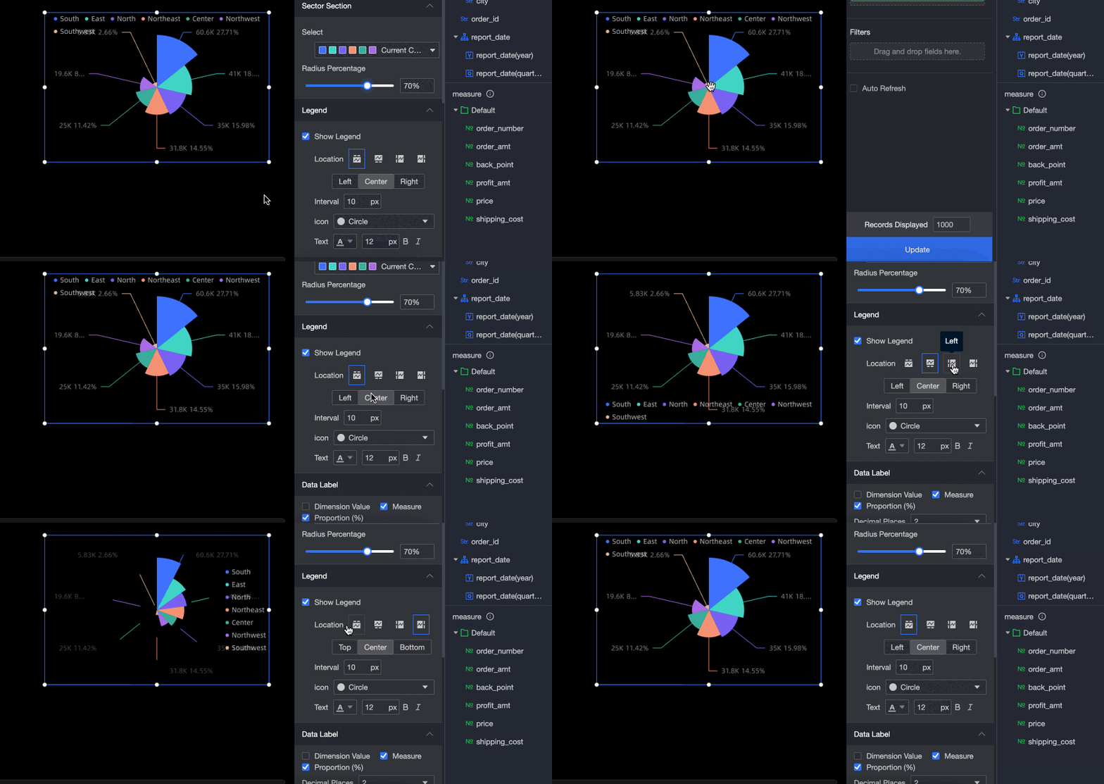
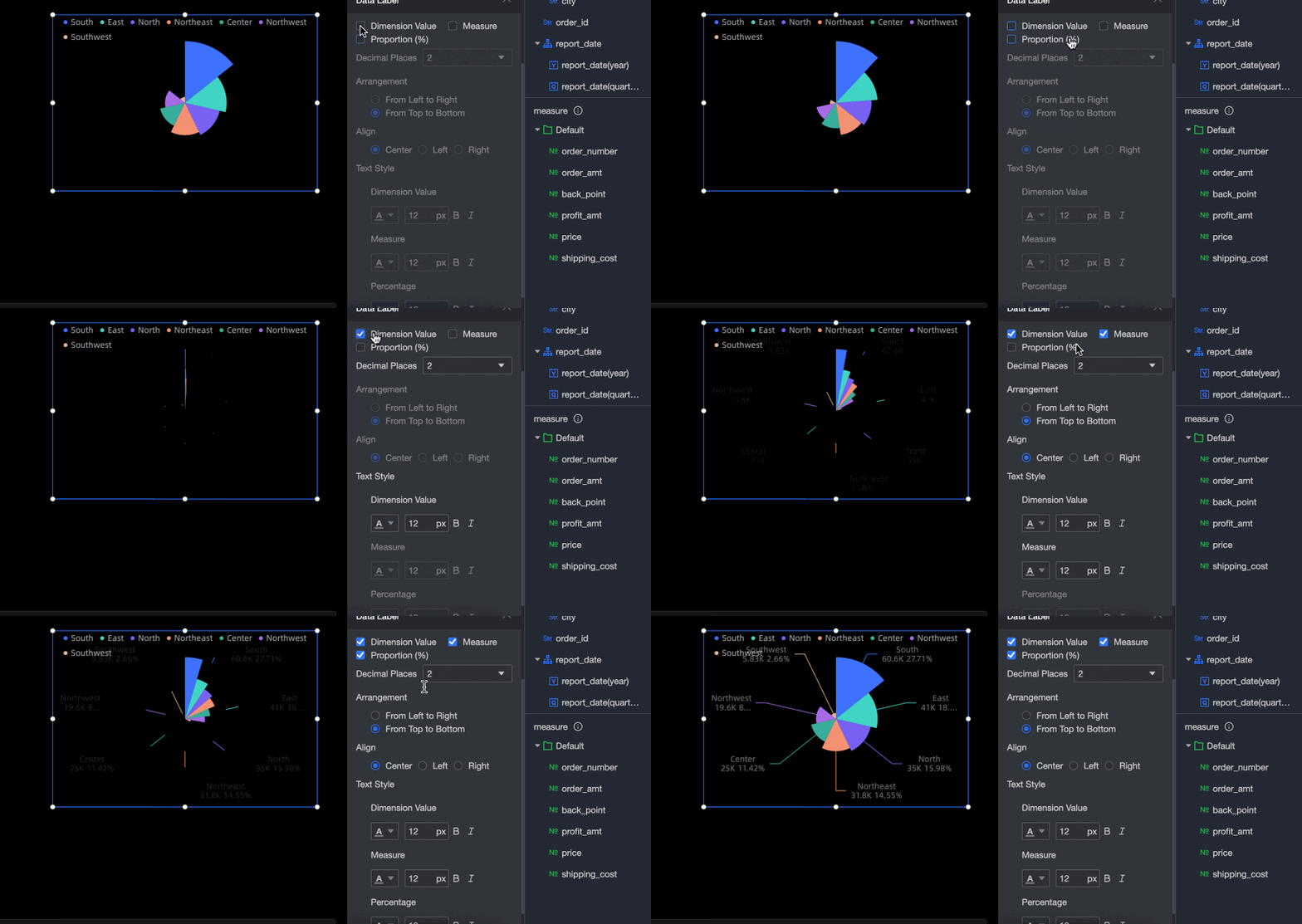
Data labels
Set the content, layout, and style of the data labels:
-
Select one or more data types to display in each sector:
dimension value,measure, andpercentage. -
Set the
Number of Decimal Places for Percentageto 0, 1, or 2. -
Set the data layout to
HorizontalorVertical. -
Set the data alignment. When the layout is set to
Vertical, you can align the data to theCenter,Left, orRight. -
Customize the
Text Stylefor the data labels, includingColor,Font Size,Bold, orItalic.