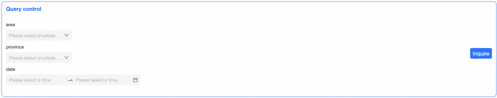
This topic explains how to configure the display style of the query control after setting the query conditions.
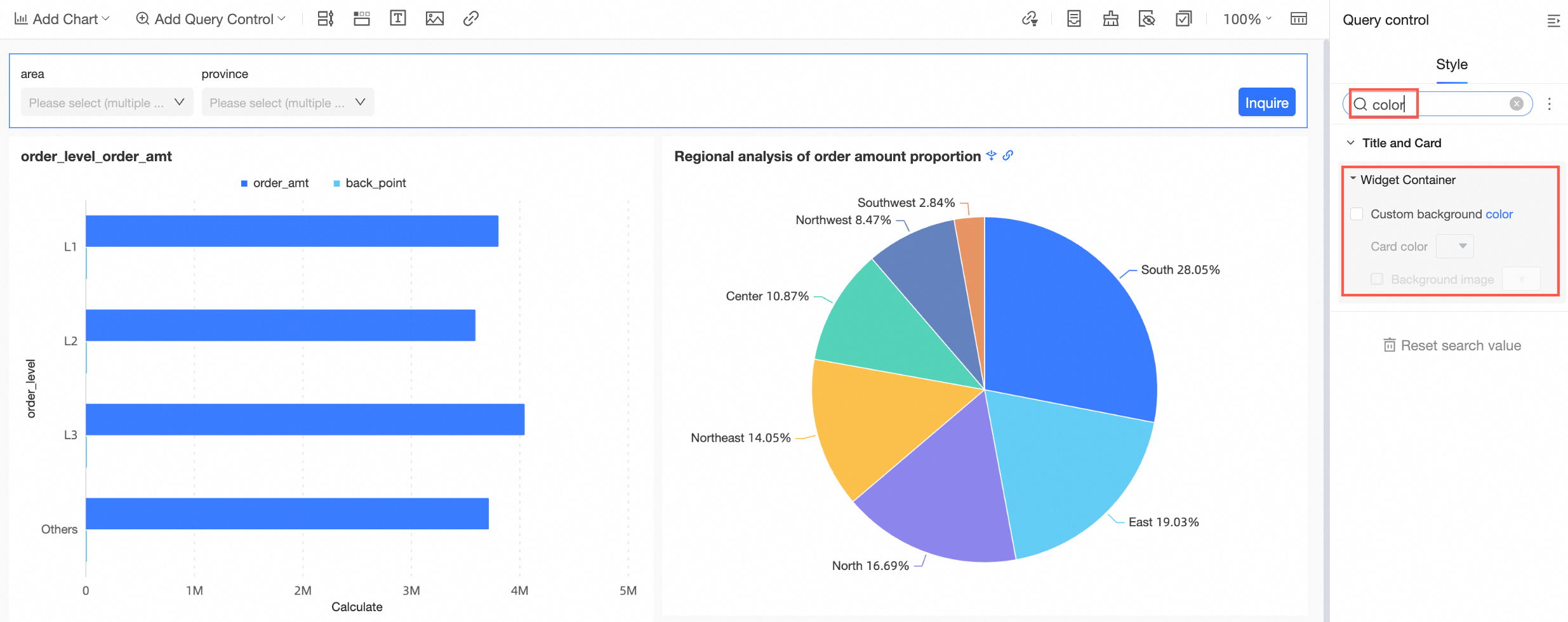
Enter keywords into the search box at the top of the style configuration area to swiftly locate configuration items.
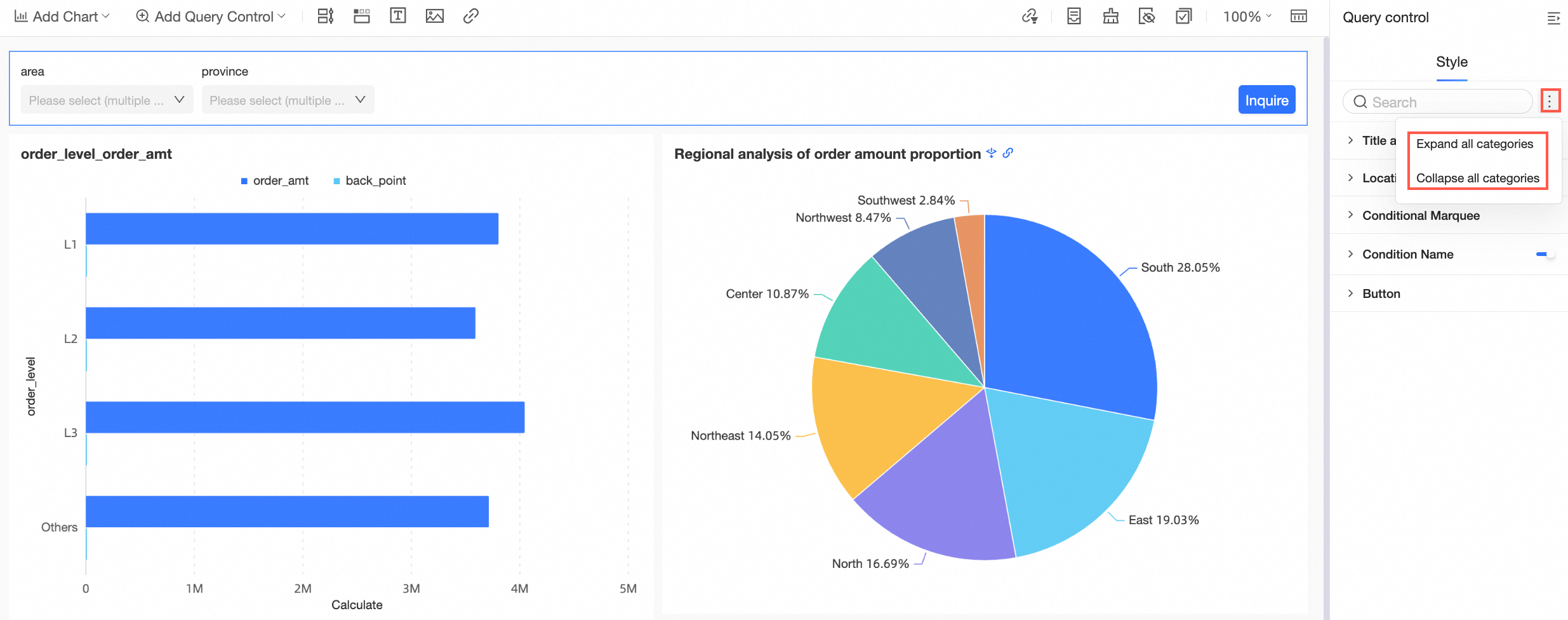
Click the icon on the right  to toggle the expand/collapse all categories feature.
PC style configuration
The IE 11 browser does not support settings for font (size, color, etc.), border, background color, or pitch.
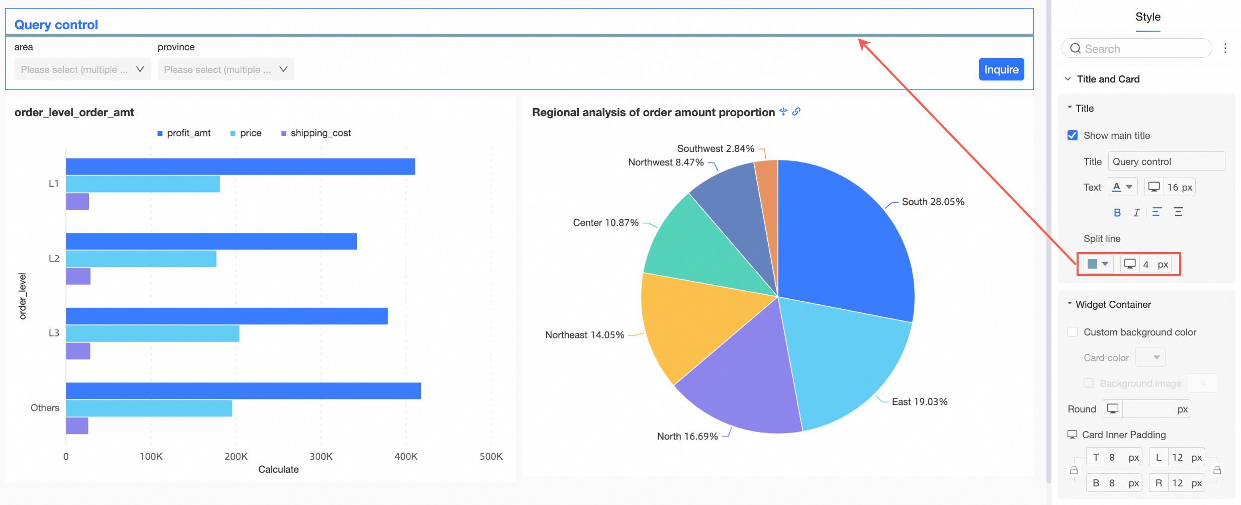
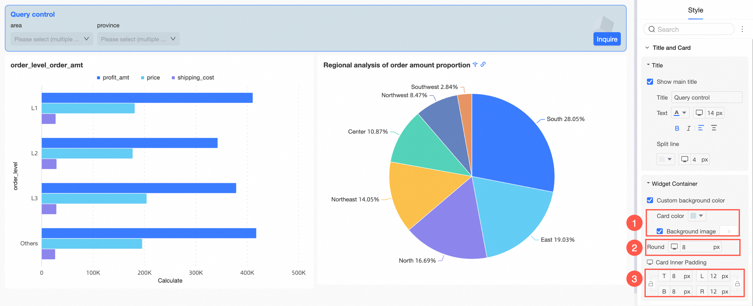
Configure the title and component container in the title and card section.
Configuration item
Description
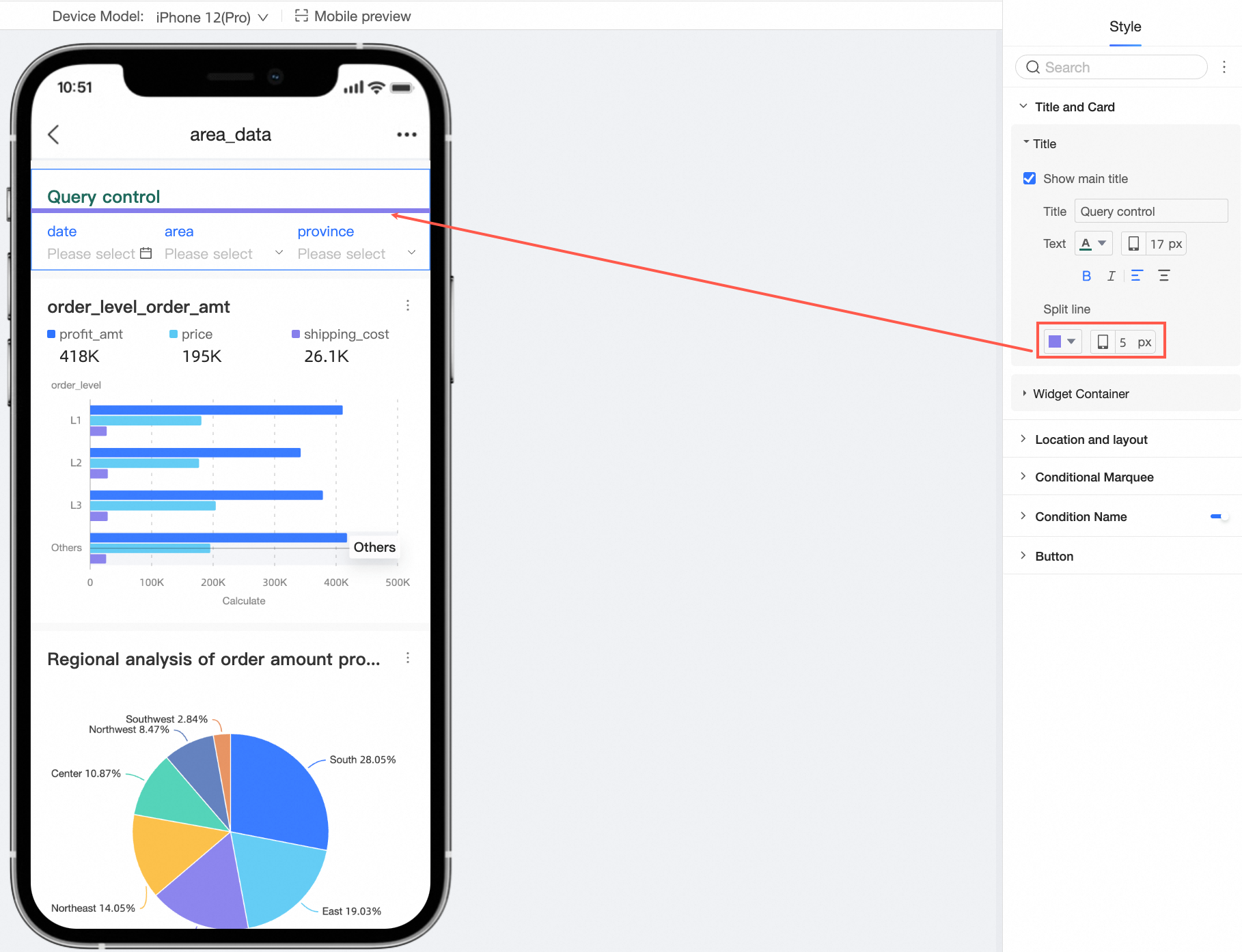
Title
Support setting whether to display the main title and configure the style of the title.
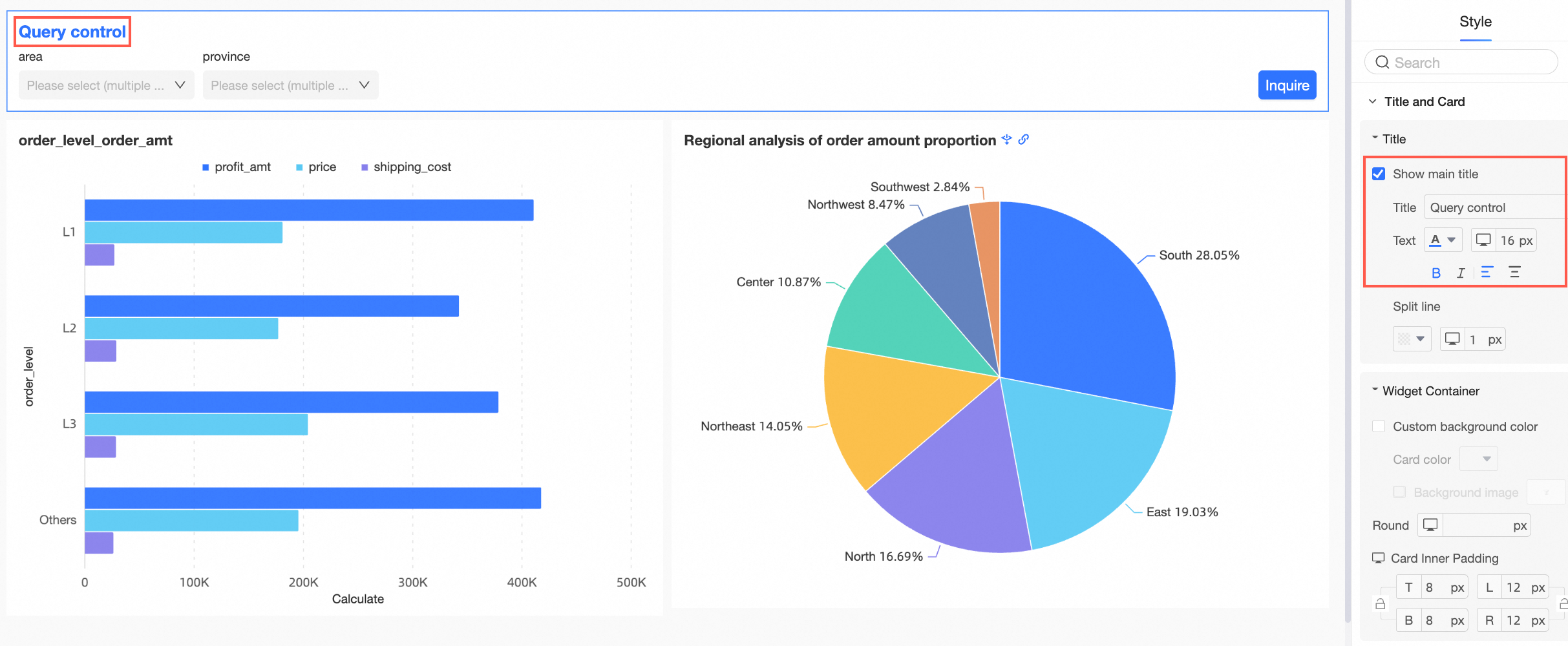
Support setting the line separator.
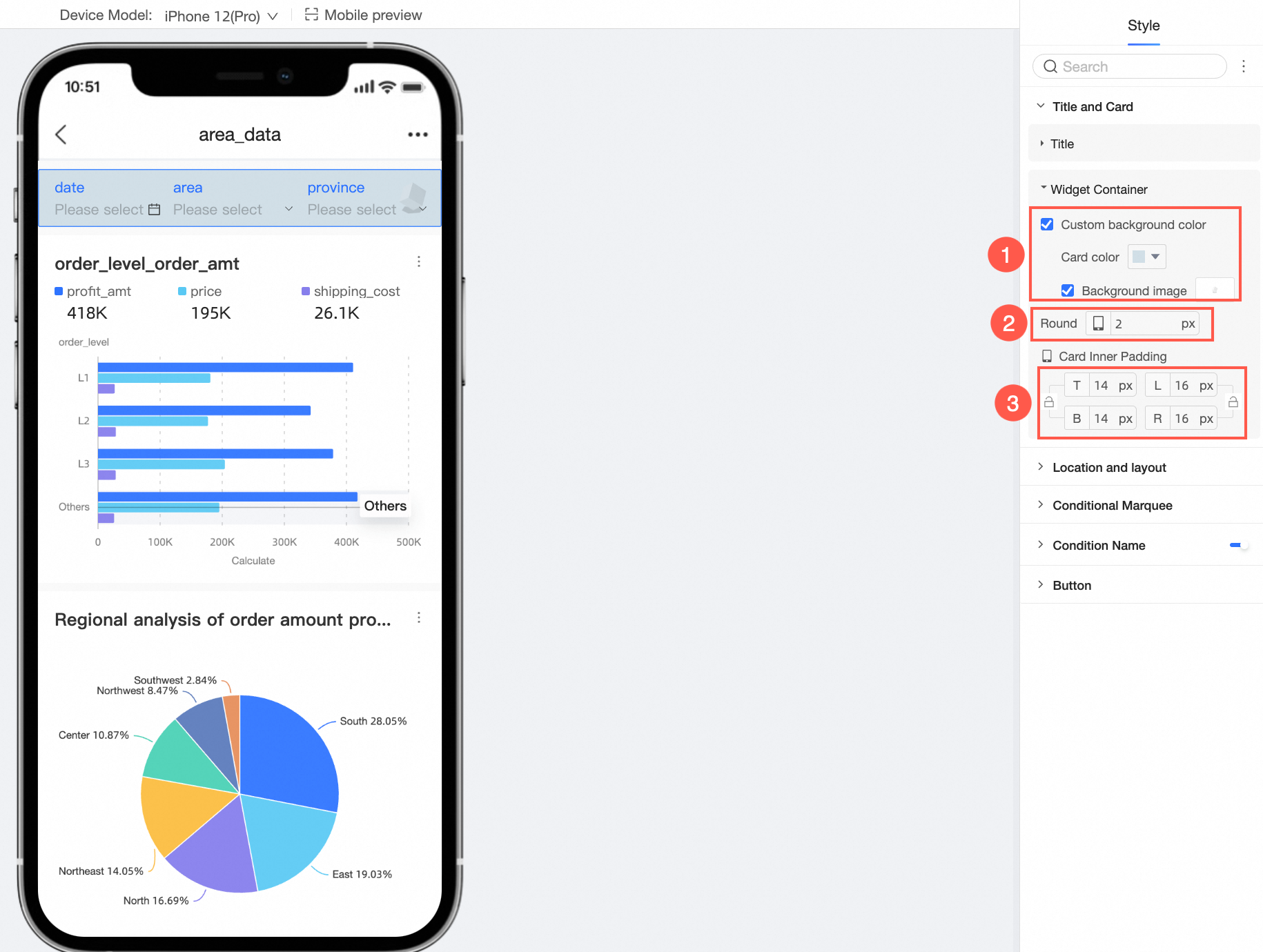
Component container
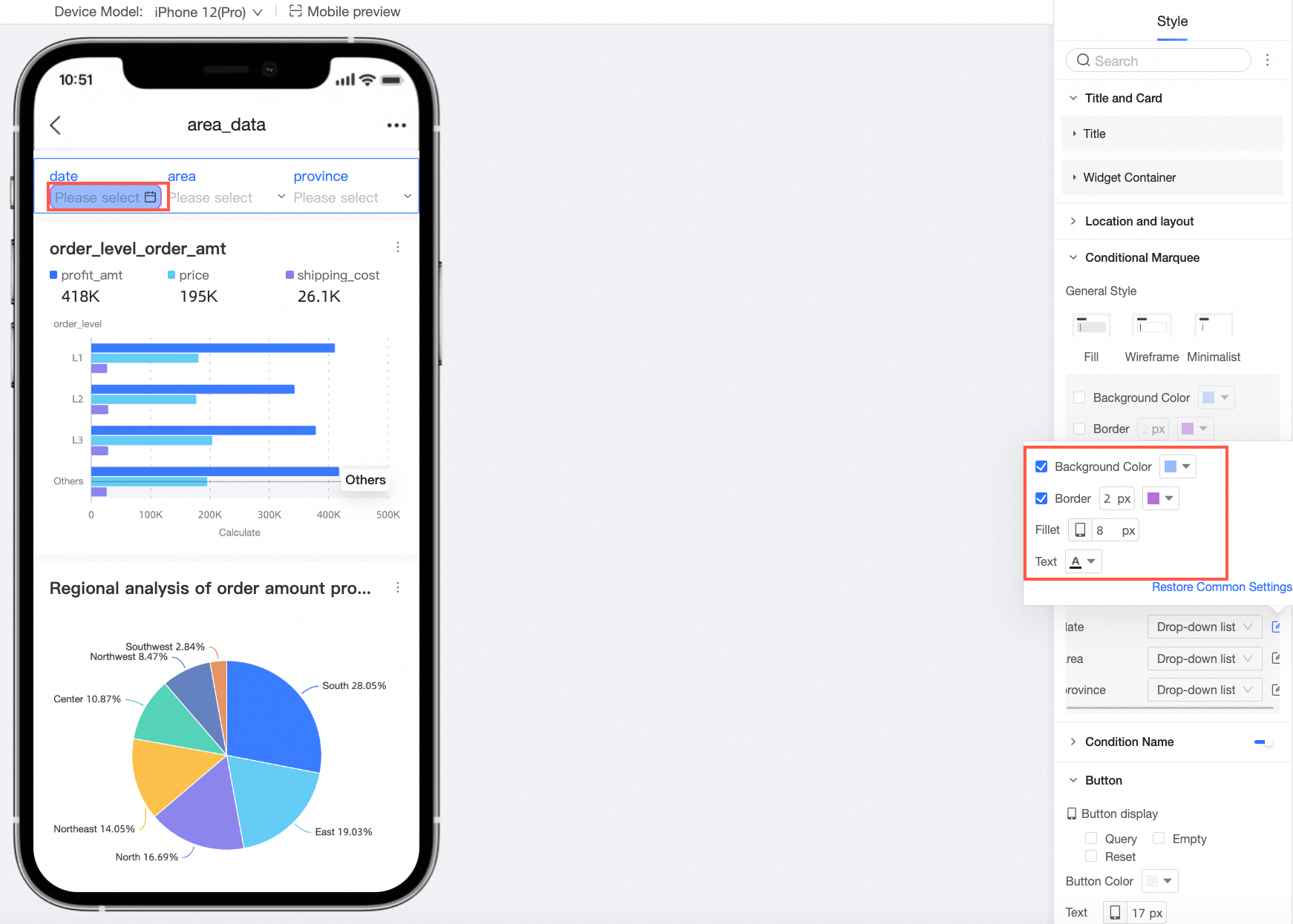
Support setting custom background fill (①), border radius (②), and card inner padding (③).
In the position and layout section, make the following configurations.
Configuration item
Description
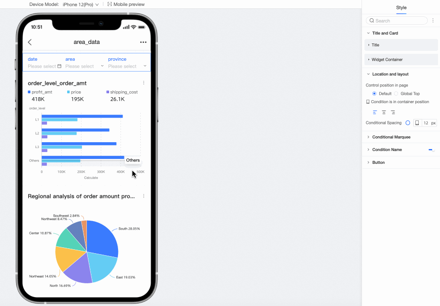
Control position on the page
Support default or global top. When set to global top, the control remains at the top when scrolling the page.

Default expand all filter conditions
Support setting default expand all filter conditions.
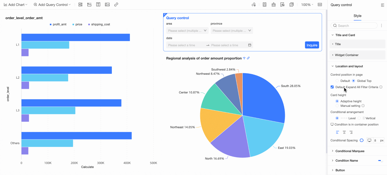
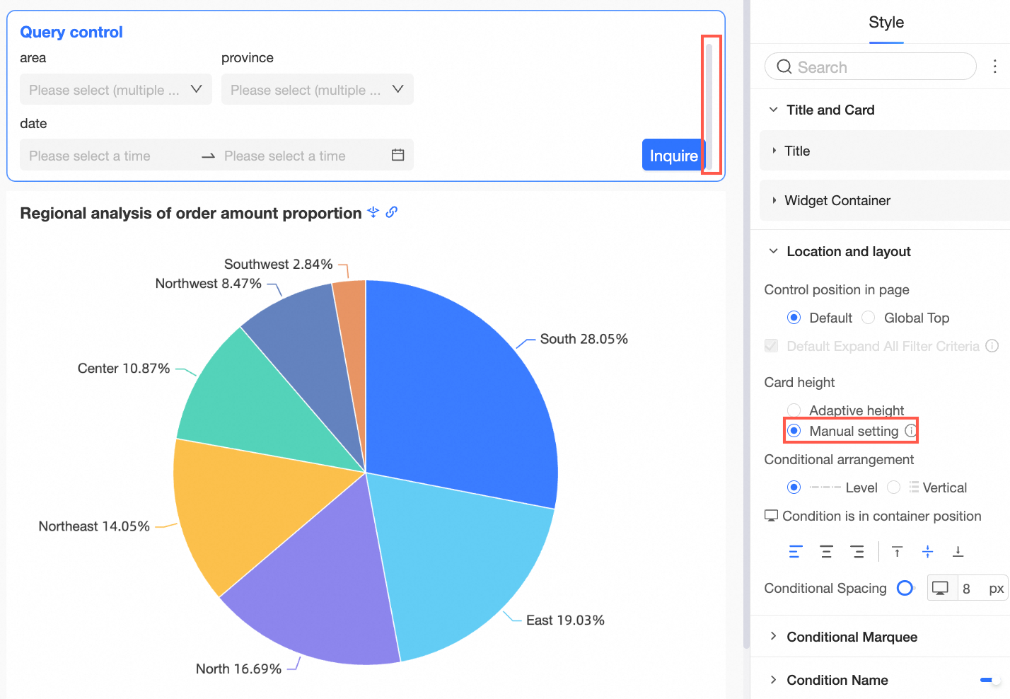
Card height
When default expand all filter conditions is checked, support setting card height to automatic rotation or manual setting.
Among them, Manual setting refers to drag-and-drop adjustment. When exceeded, a portrait scroll bar is displayed. When the height is manually set, all filter conditions cannot be collapsed.
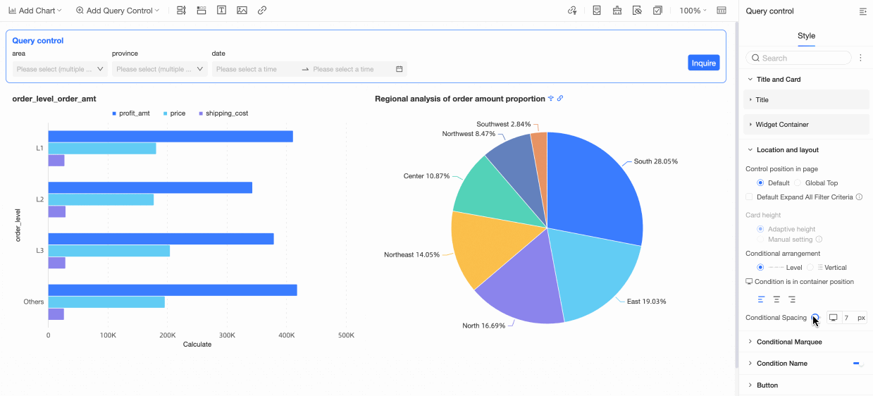
Condition alignment
Support setting condition alignment to horizontal or vertical.
Horizontal:
Vertical:
Condition position within the container
Support align left, align center, align right.
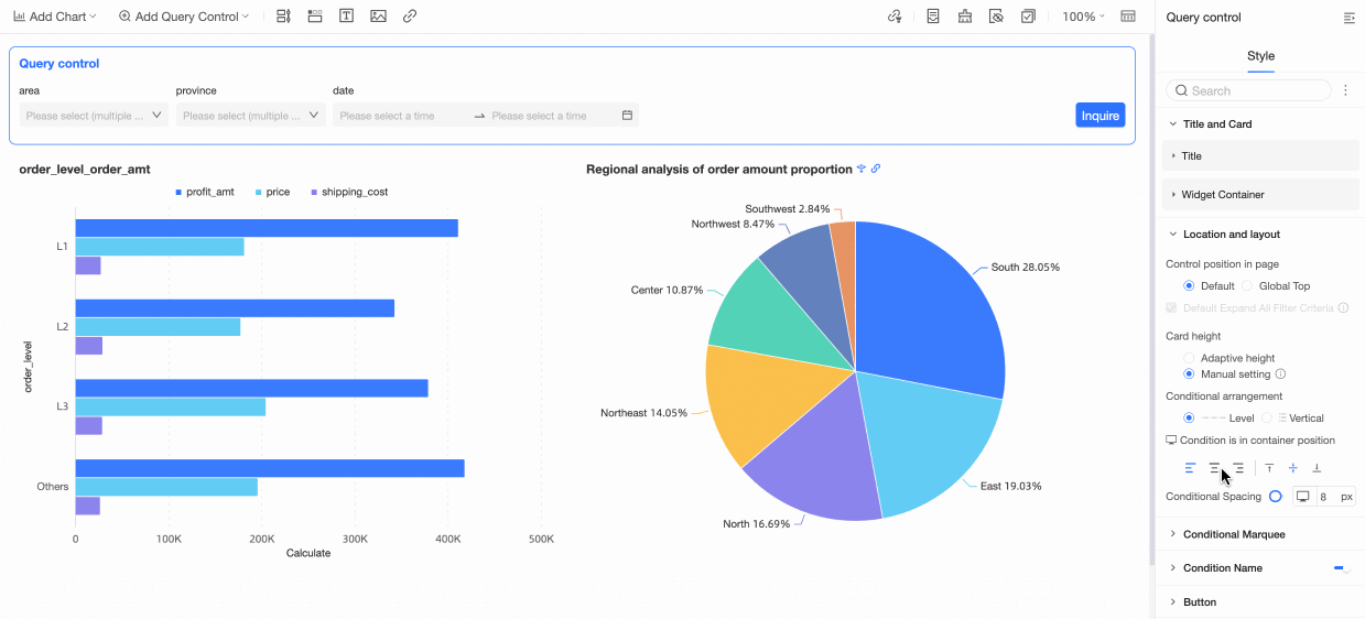
Condition pitch
Support setting condition pitch.
In the condition selection box, make the following configurations.
Configuration item
Description
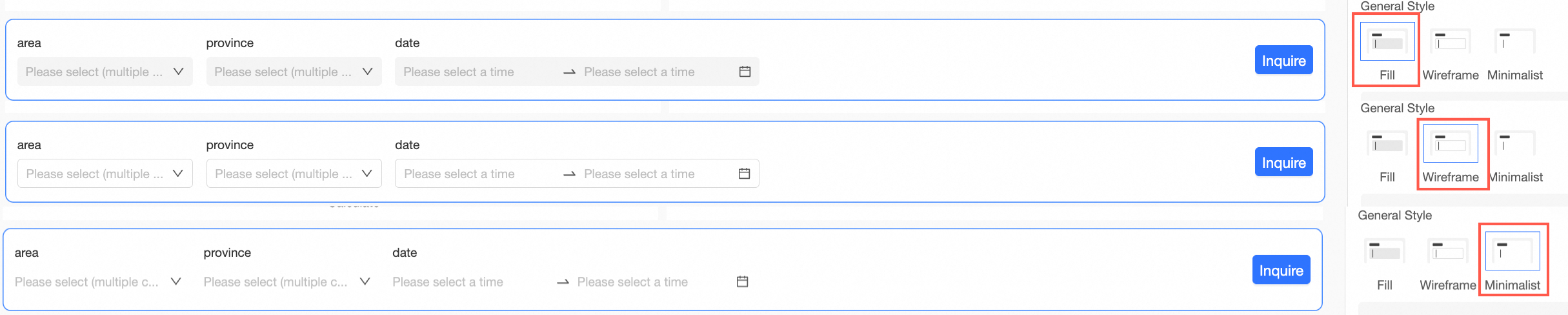
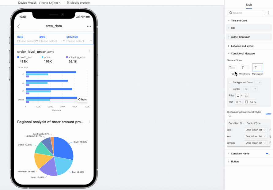
Selection box style
Selection box style supports fill, line frame, minimalist.
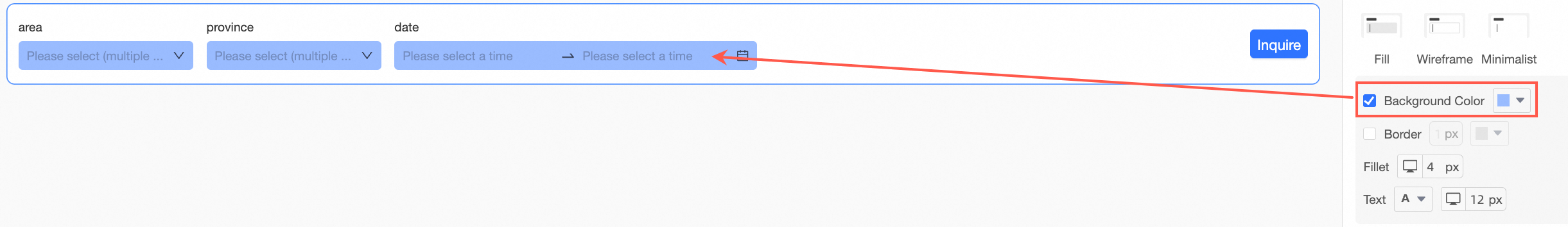
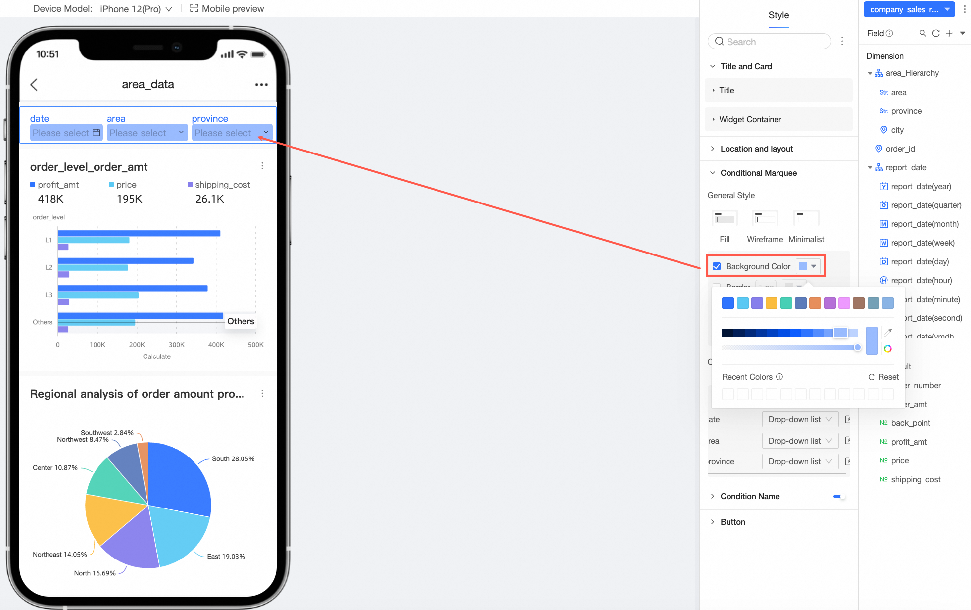
Background color
Support setting the background color of the condition selection box.
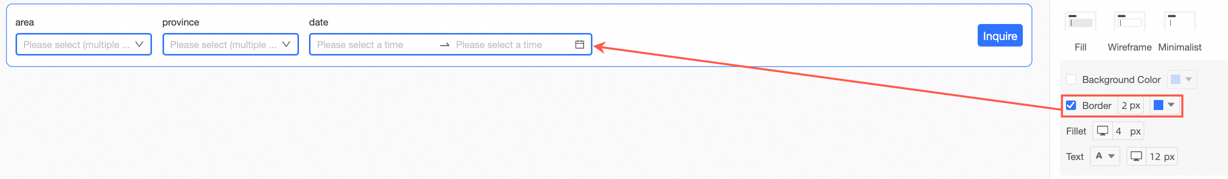
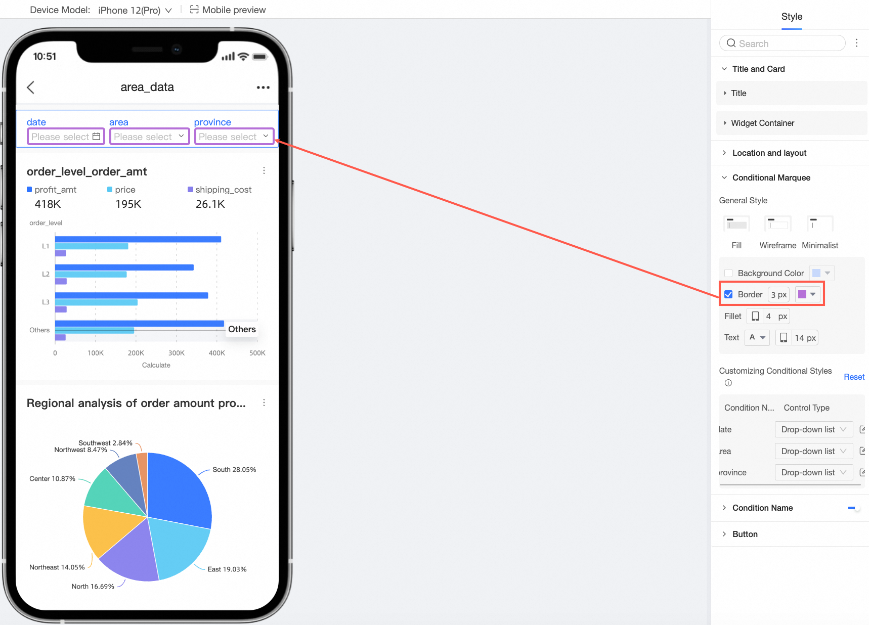
Border
Support setting the border thickness and color of the condition selection box.
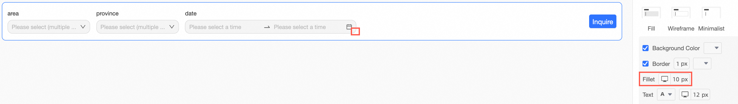
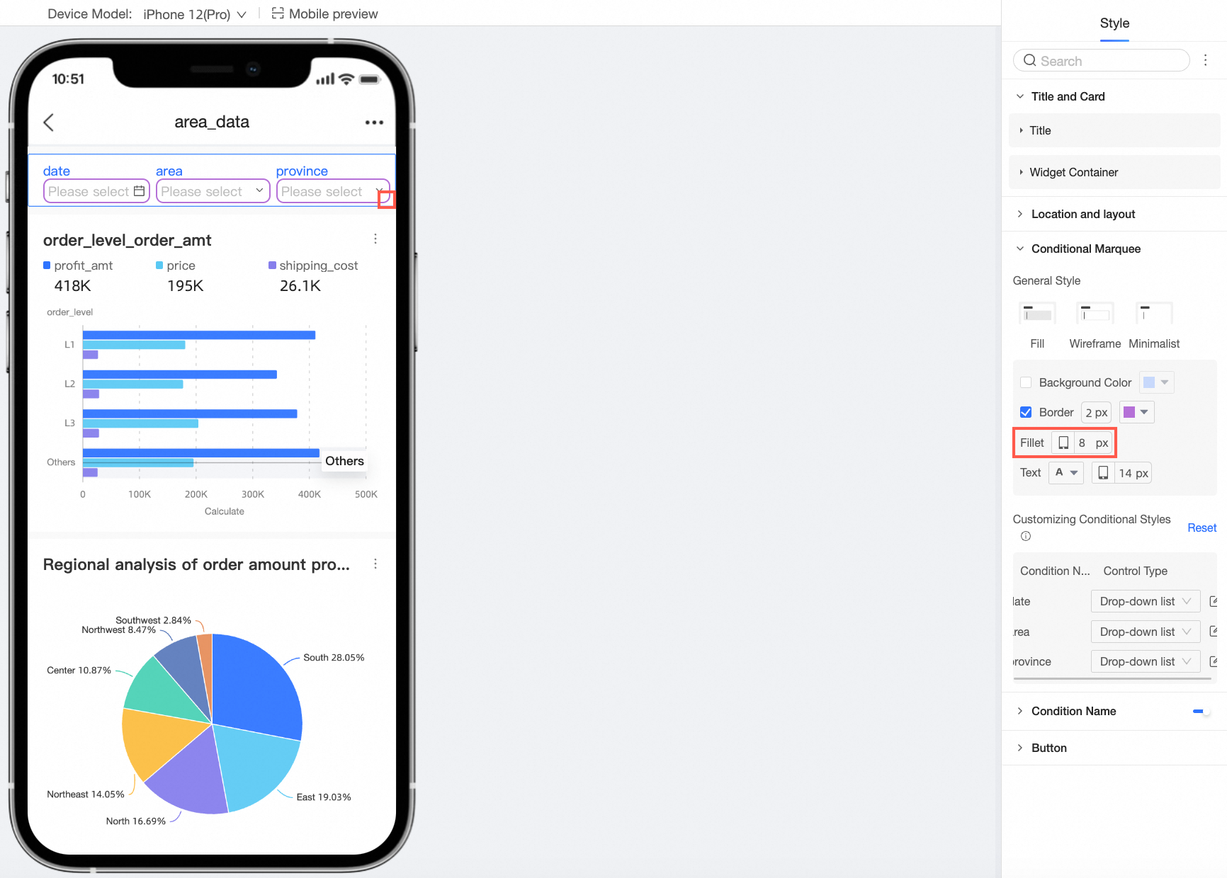
Border radius
Support setting the border radius size of the condition selection box.
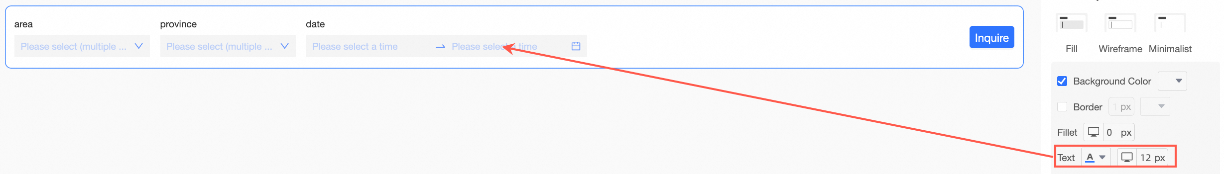
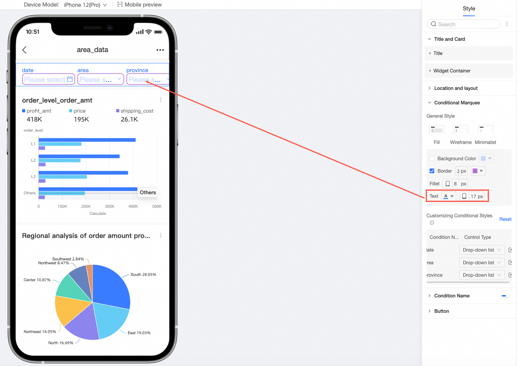
Text
You can set the text color and font size of the condition check box.
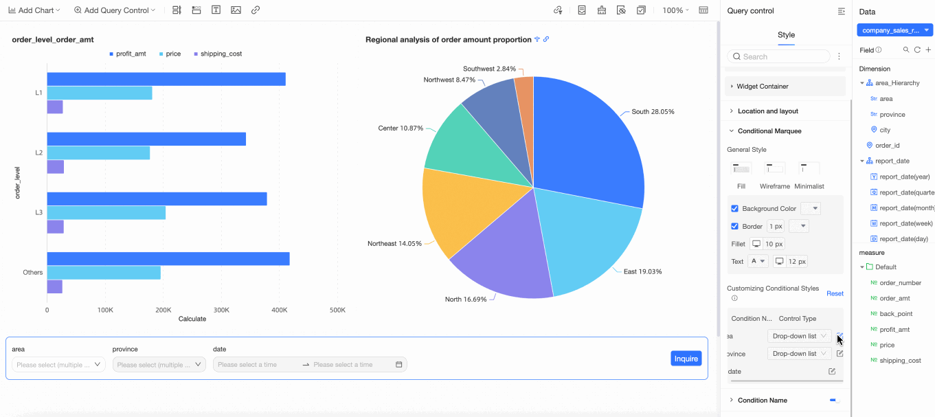
Custom condition style
You can perform more customized style configurations for individual query conditions based on different display types of query conditions.
NoteIf objects are duplicated, custom styles will overwrite the general styles above. You can choose to reset to recover the default.
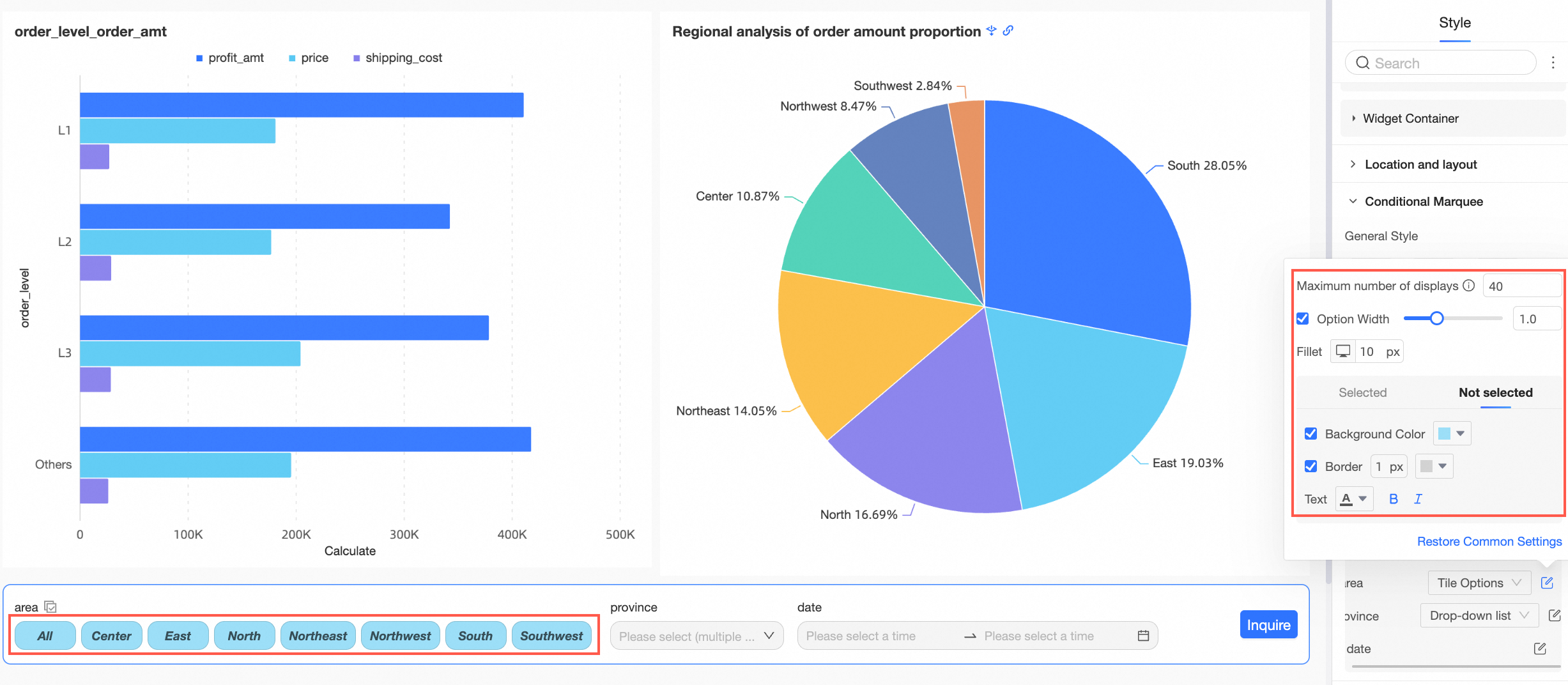
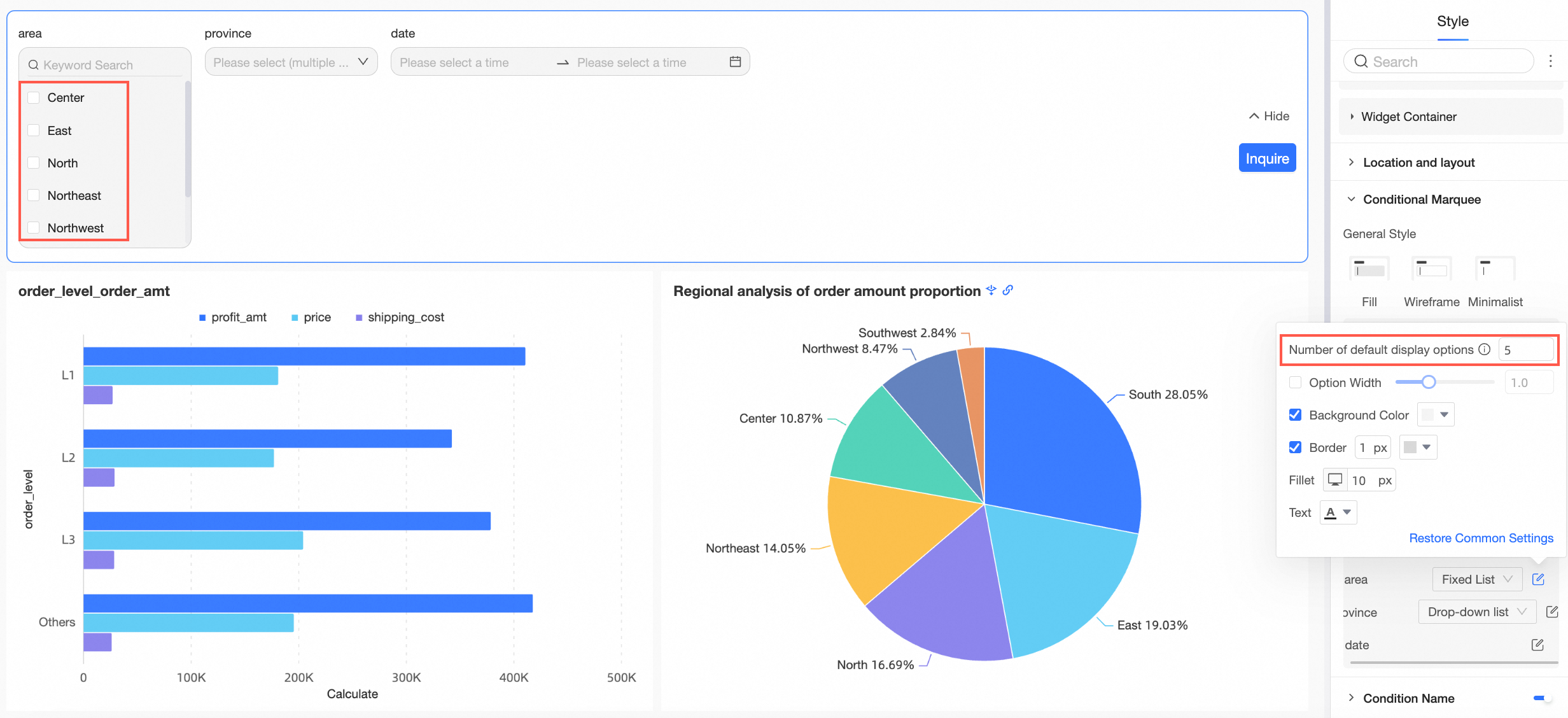
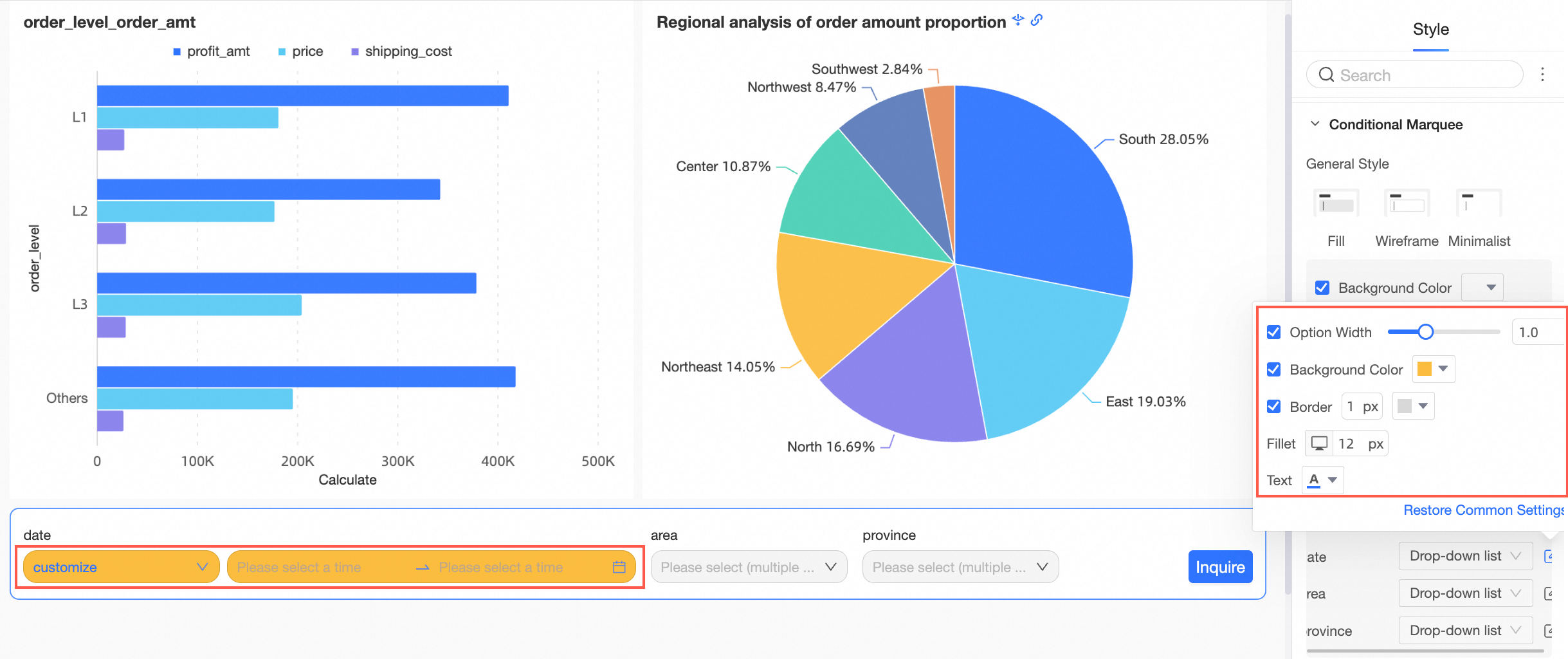
When the display type of the query control is drop-down list, text input box, numeric input box, tree drop-down, and regular date selection, support setting each condition's option width, background color, border, border radius, and text color.
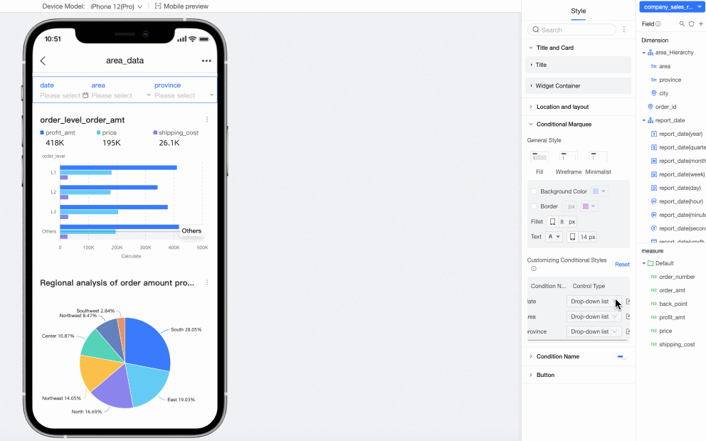
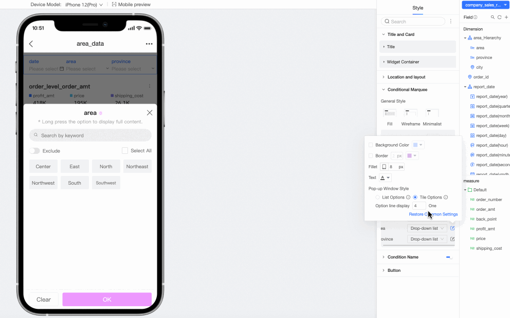
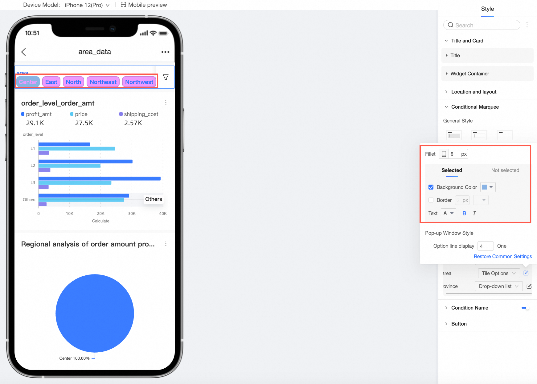
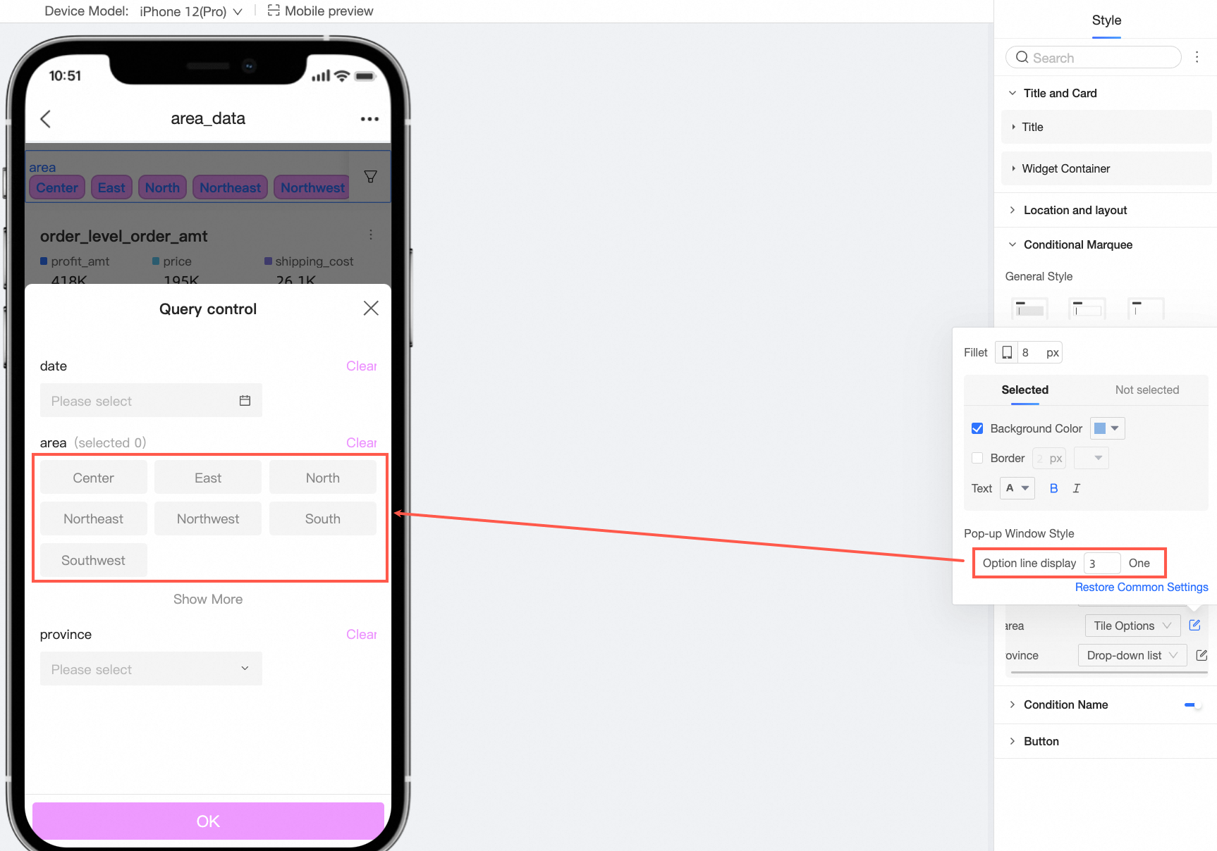
When the display type of the query control is drop-down list, support switching to tile options or fixed list.
When the control type is tile options, support setting the maximum number of displays, selected, and unselected styles.
When the control type is fixed list, support setting the default number of display options.
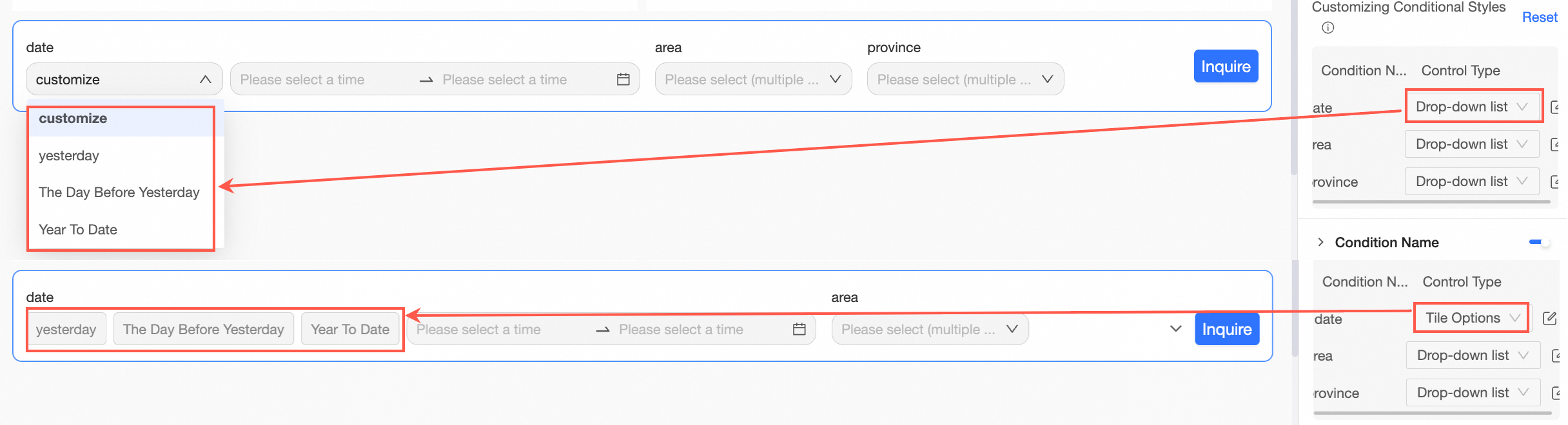
When the display type of the query control is date selection and the date condition enables quick interval, support selecting drop-down list and tile options to drop down or tile different interval types of the quick interval.
 Note
NoteThe tile button style only supports cases where the quick interval options do not exceed five.
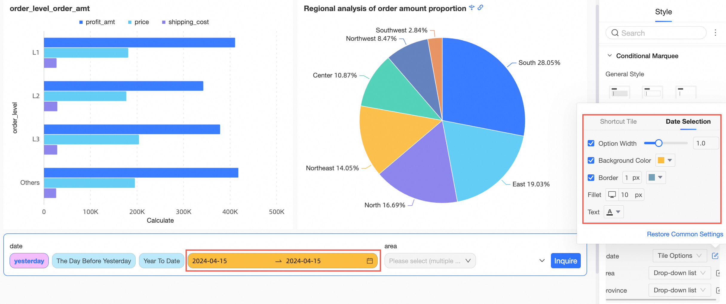
Drop-down list supports setting the style of the entire selection box.
Tile options support setting the styles of quick interval tiling and date selection.
Quick interval tiling
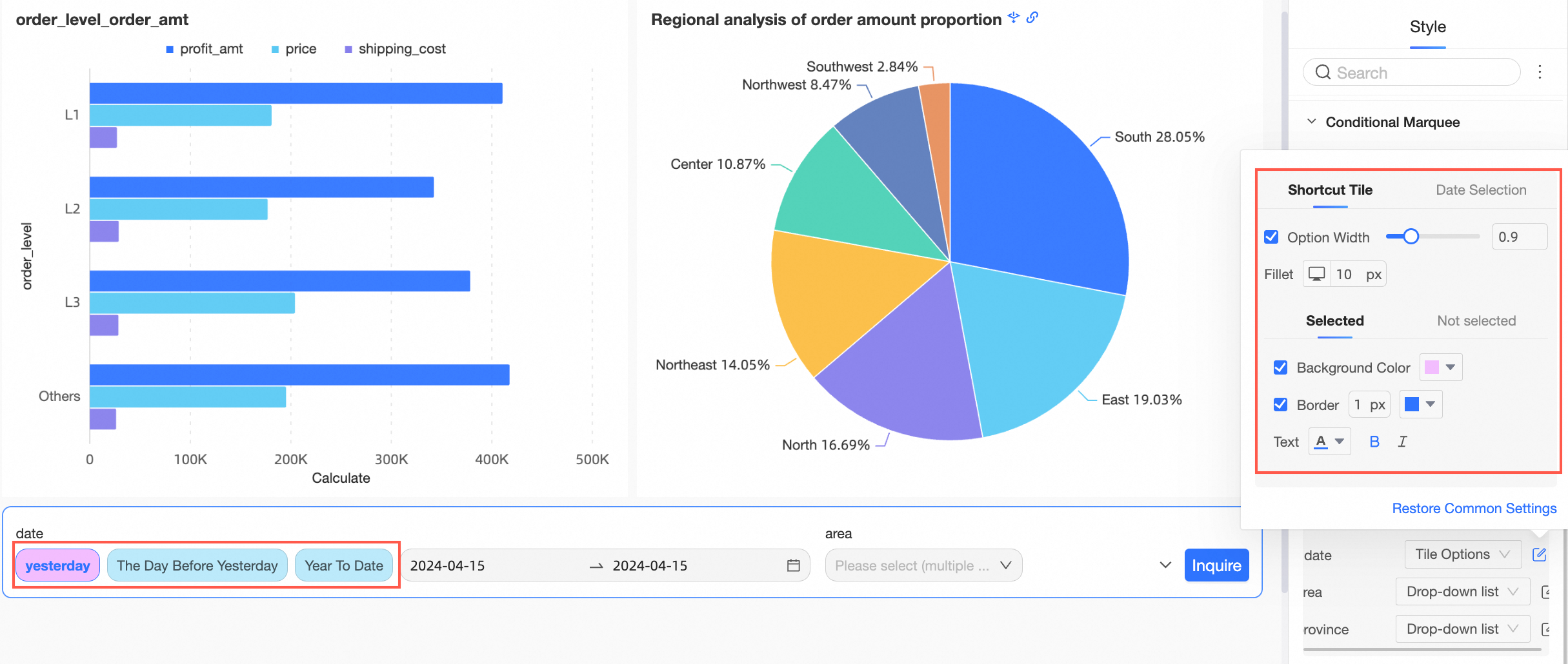
Date selection
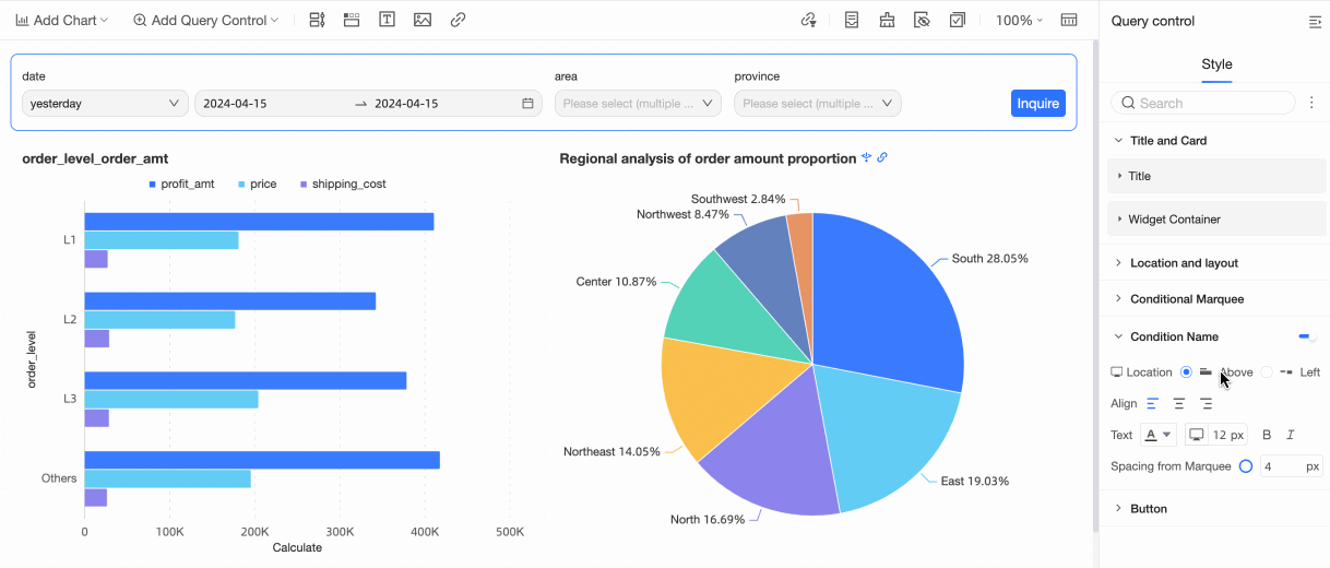
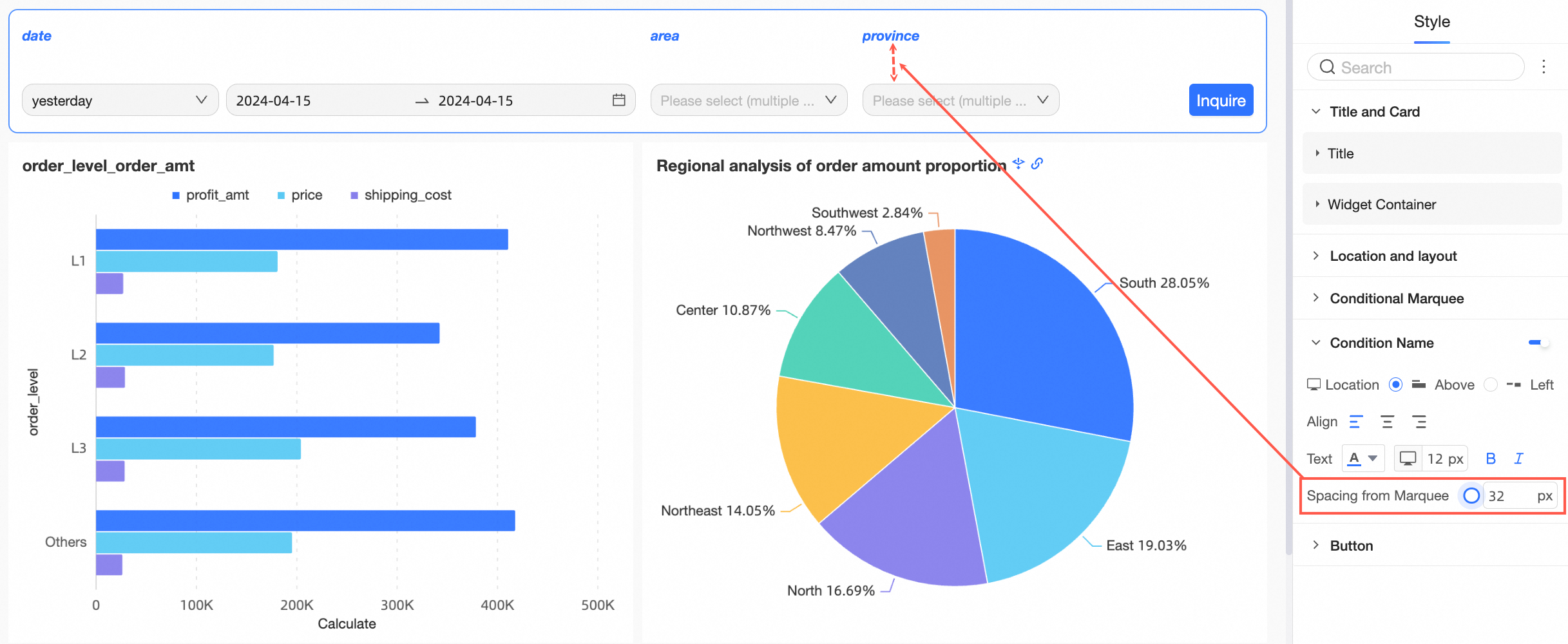
Enable or disable the display of the condition name and configure its position, text, and pitch with the selection box.
Configuration item
Description
Position
Support the position of the condition name to be above or left. When set to above, support alignment to be align left, align center, and align right.
Text
Support setting the text style of the condition name.
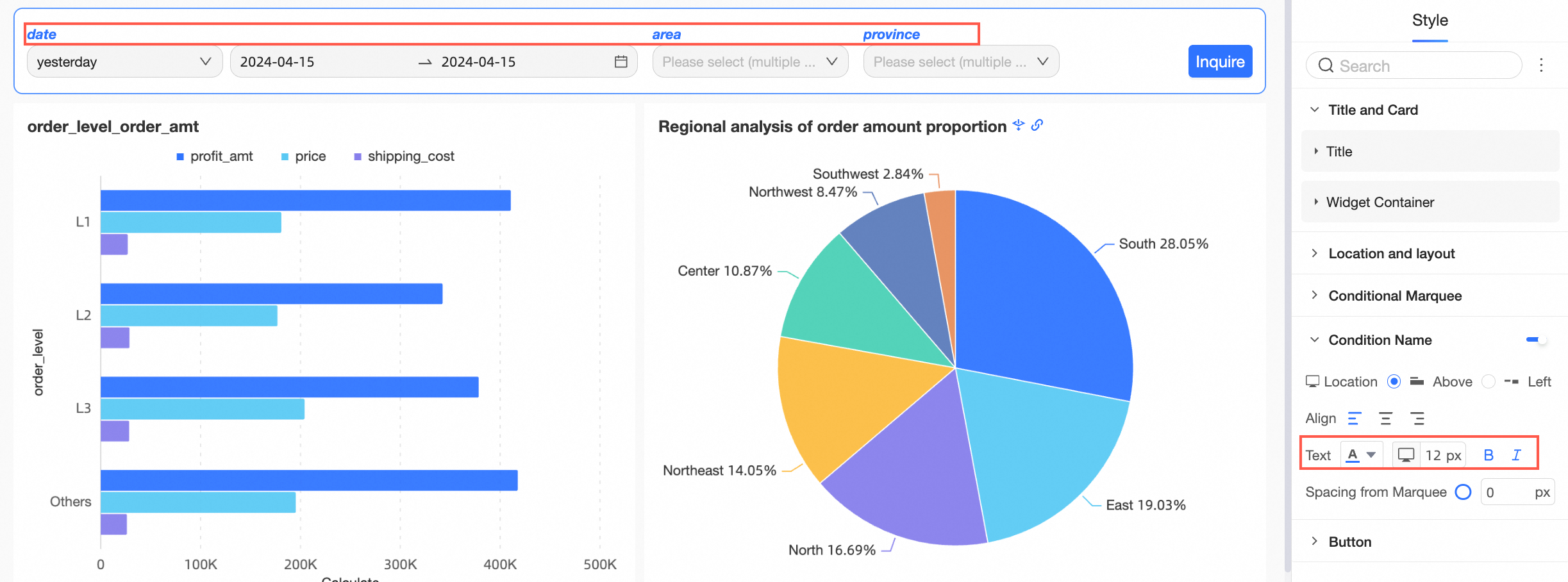
Pitch with the selection box
Support setting the pitch with the selection box of the condition name.
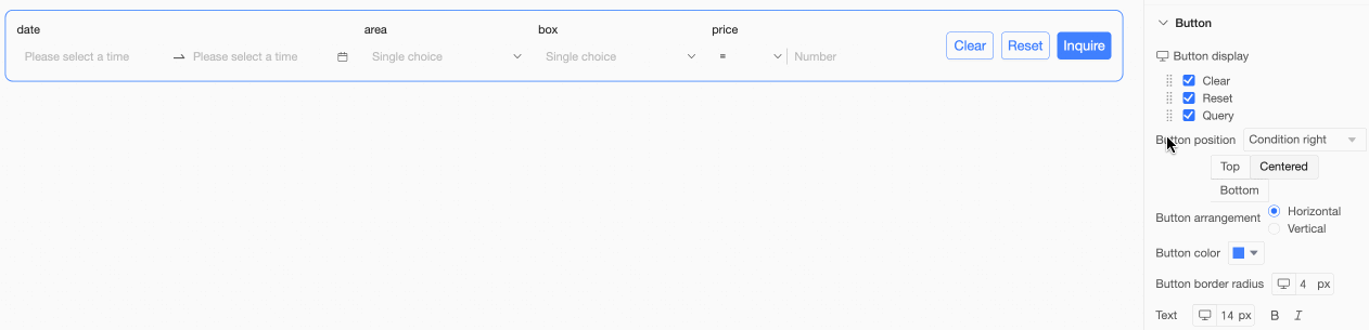
In the button section, set the button display, button position, button color, button border radius, and text style.
Configuration item
Description
Button display
 Note
NoteOnly when the button display configuration item is selected as clear and display, the reset and clear buttons will appear.
Reset: Indicates that the query conditions are restored to the default values set.
Clear: Indicates clearing the values displayed in the query conditions.
For example, if Filter Bar A is cascaded with Filter Bar B, Filter Bar A is the upper level of Filter Bar B. If Filter Bar A is reset or cleared, Filter Bar B is also reset or cleared. If Filter Bar B is reset or cleared, Filter Bar A does not change.
Support setting the display order of buttons by dragging the
 icon on the left.
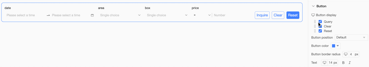
Button position
Support default, right of condition, below condition, and follow condition.
Right of condition

In this case, support setting the button at the top, center, and bottom, along with button arrangement as horizontal or vertical.
Below condition

In this case, support setting the button to align left, align center, align right, along with button arrangement as horizontal or vertical.
Follow condition

Button color
Support setting button color.

Button border radius
Support setting button border radius.
Text
Support setting the text style of the button.
Mobile style configuration
Configure the title and component container in the title and card section.
Configuration item
Description
Title
Support setting whether to display the main title and configure the style of the title.
Support setting the line separator.
Component container
Support setting custom background fill (①), border radius (②), and card inner padding (③).
In the position and layout section, make the following configurations.
Configuration item
Description
Control position on the page
Support default or global top. When set to global top, the control remains at the top when scrolling the page.
Condition position within the container
Support align left, align center, align right.

Condition pitch
Support setting condition pitch.

In the condition selection box, make the following configurations.
Configuration item
Description
Selection box style
Selection box style supports fill, line frame, minimalist.
Background color
Support setting the background color of the condition selection box.
Border
Support setting the border thickness and color of the condition selection box.
Border radius
Support setting the border radius size of the condition selection box.
Text
Supports setting the text color and font size of the conditional check box.
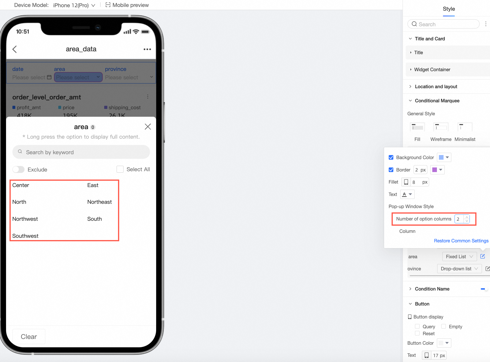
Custom condition style
You can perform more customized style configurations for individual query conditions.
NoteIf objects are duplicated, custom styles will overwrite the general styles above. You can choose to reset to recover the default.
Drop-down list
Support setting the background color, border, border radius, and text style of the condition.
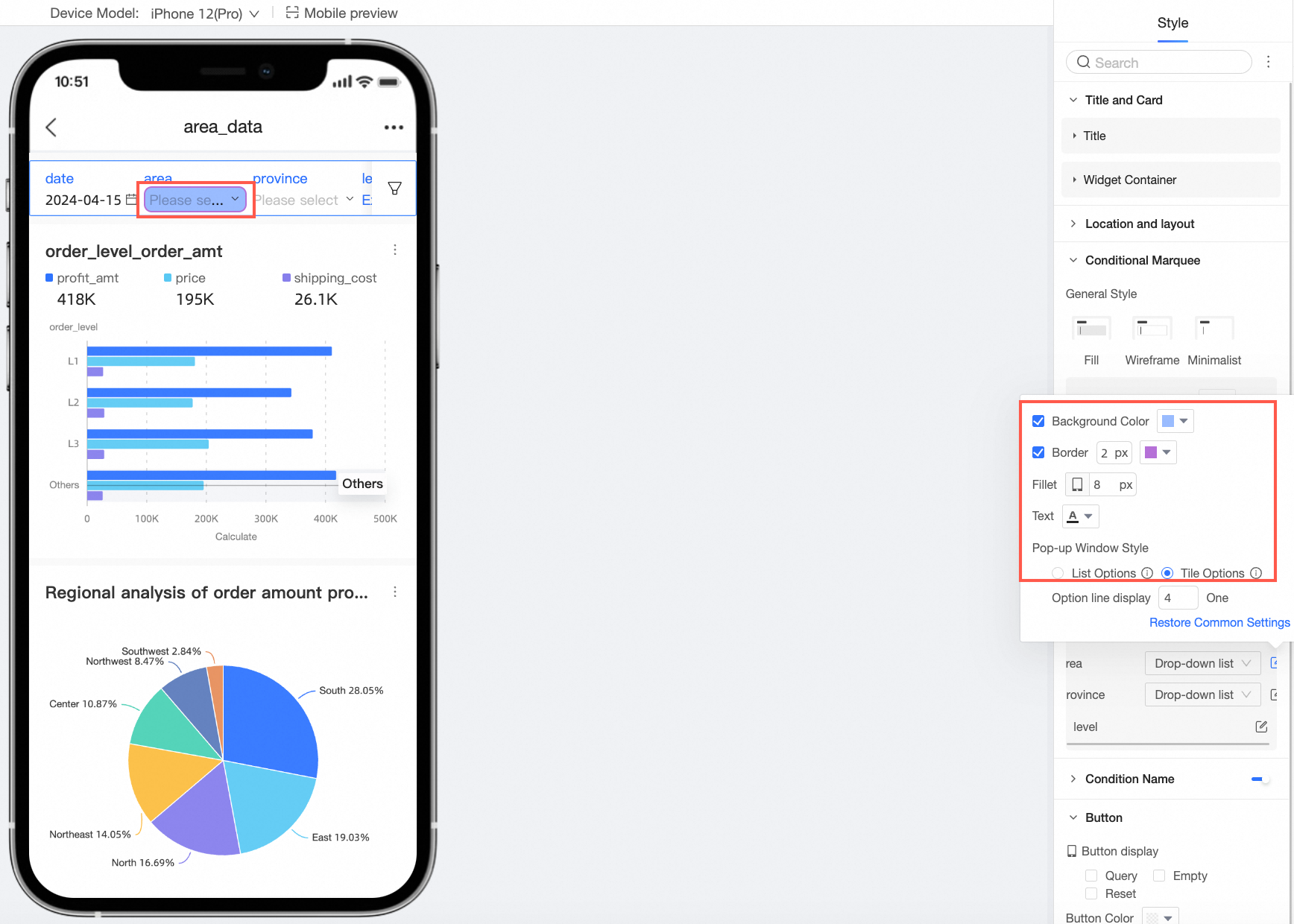
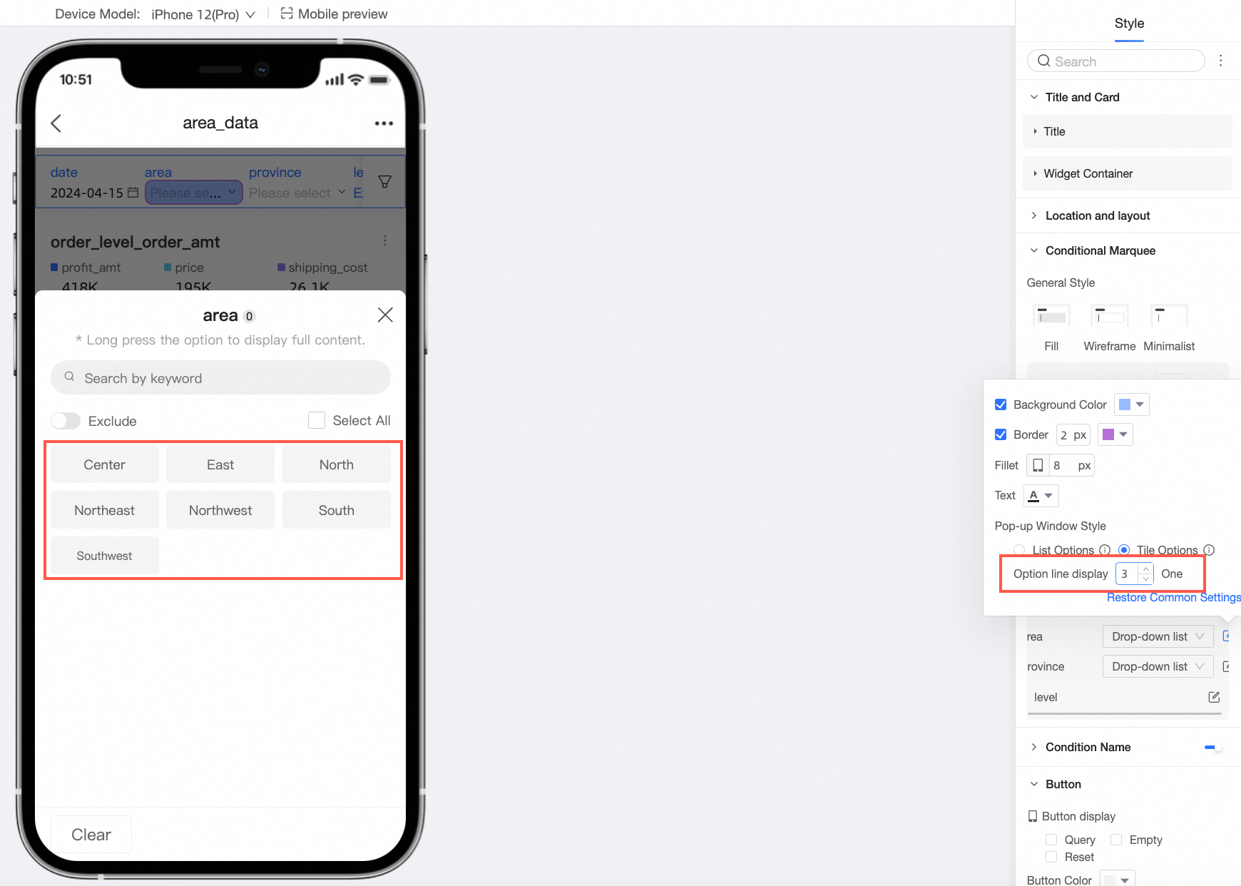
Support setting the drop-down option style to list options or tile options and setting the number of columns or the number of displays in a row.
Tile options
Support setting the border radius, selected, and unselected styles.
Support setting the number of displays in a row.
Fixed list
Support setting the background color, border, border radius, and text style.
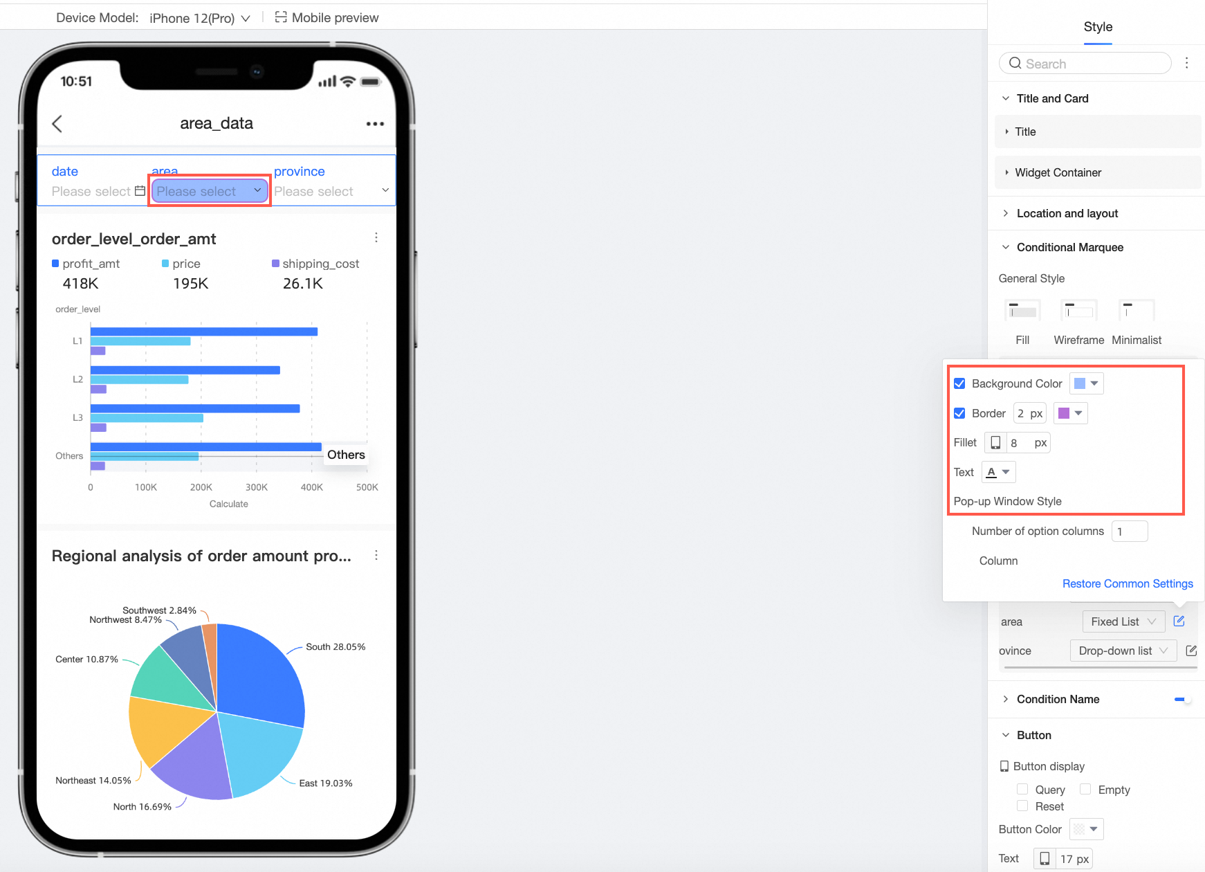
Support setting the number of selection columns.
Date selection
When the date condition enables quick interval, support selecting drop-down list and tile options.
Drop-down list supports setting the background color, border, border radius, and text style.
Tile options support setting the styles of quick interval tiling and date selection.
NoteThe tile button style only supports cases where the quick interval options do not exceed five.
Quick interval tiling supports setting the border radius, selected, and unselected styles.
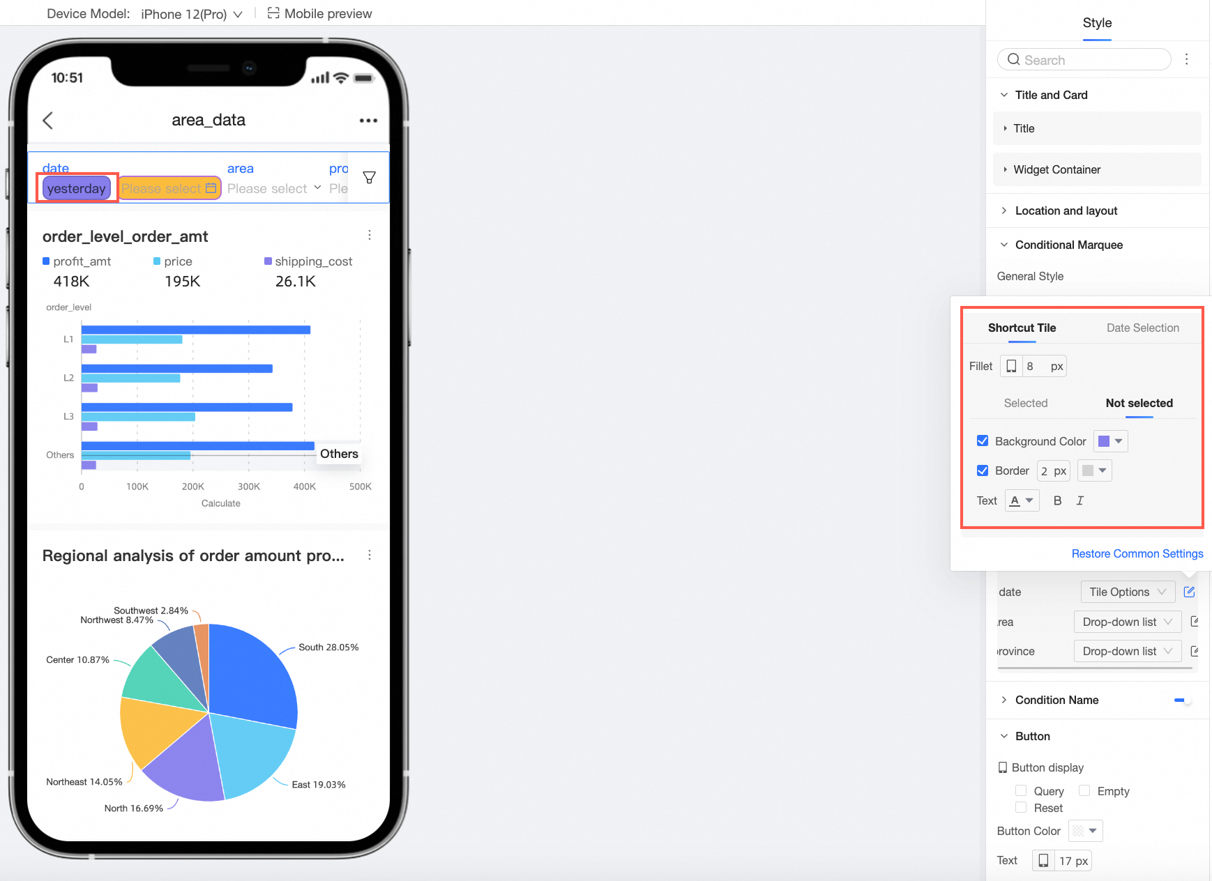
Date selection supports setting the background color, border, border radius, and text style.
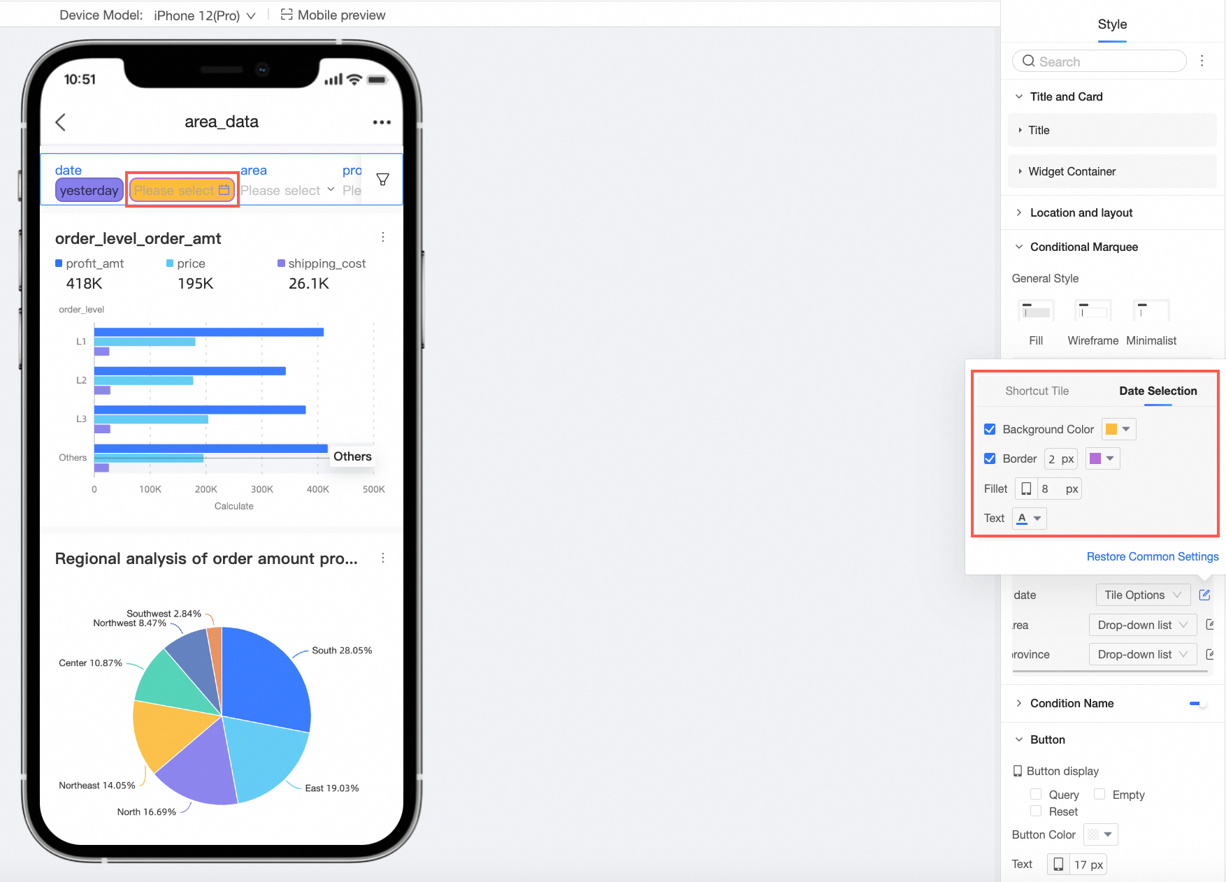
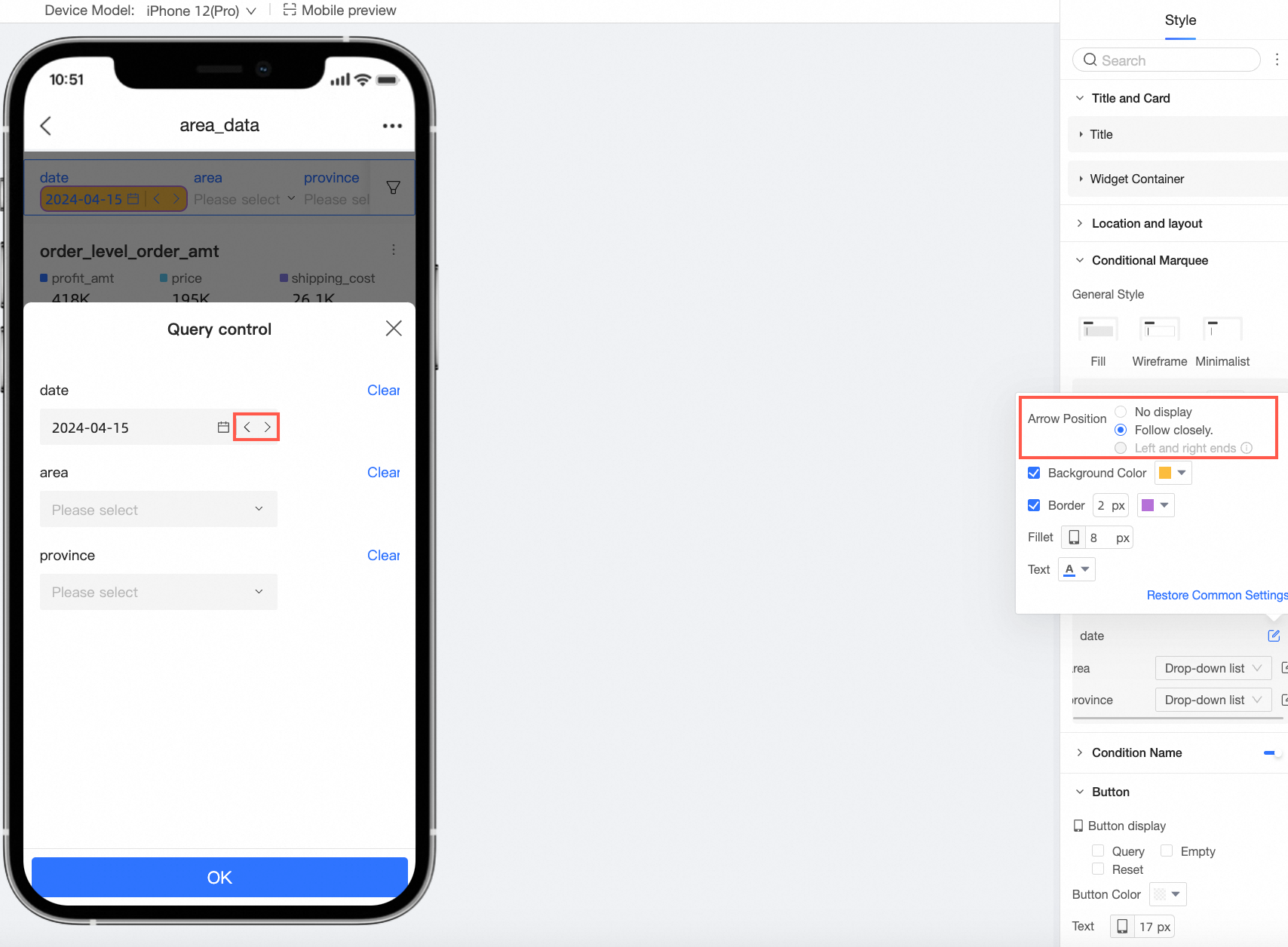
Date selection single date (such as single year, single day, single month, single week, etc.) or interval type is start at, end at, support setting the arrow position.
Input box
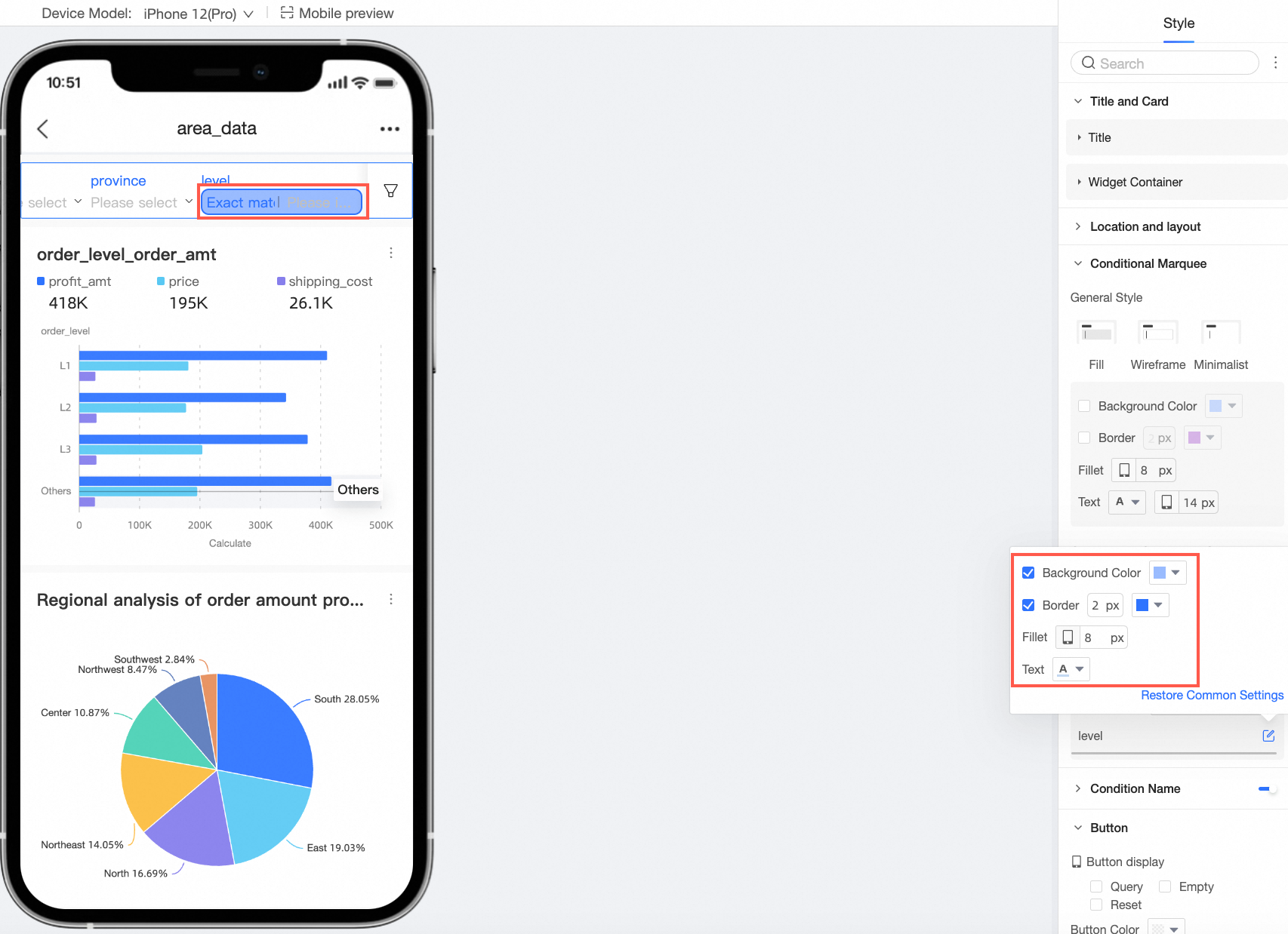
Text input box and numeric input box support setting the background color, border, border radius, and text style.
Tree drop-down
Support setting the background color, border, border radius, and text style.
Support setting the number of selection columns.
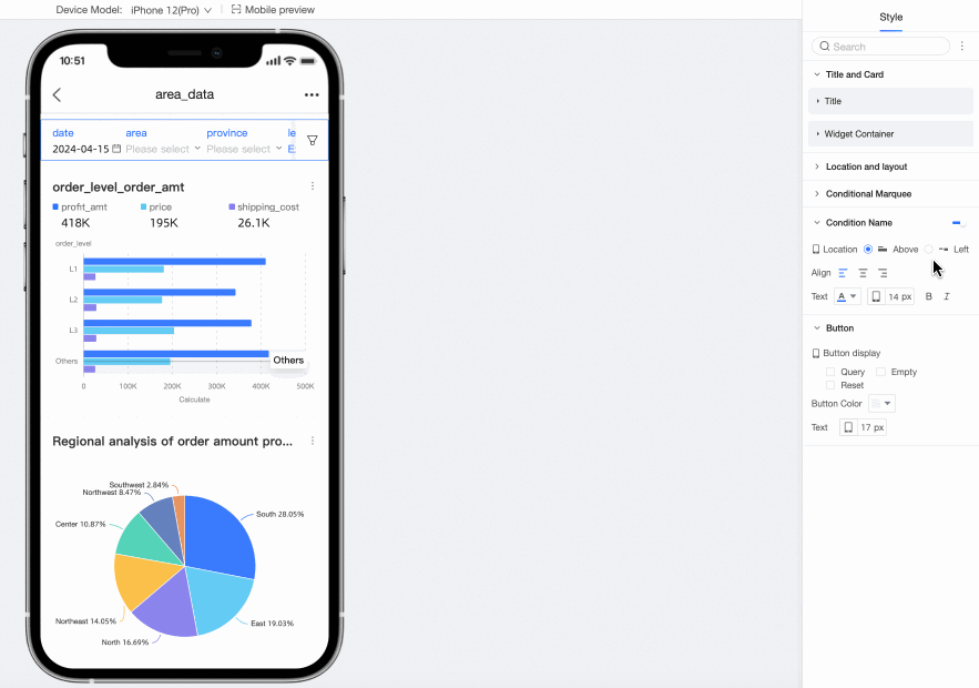
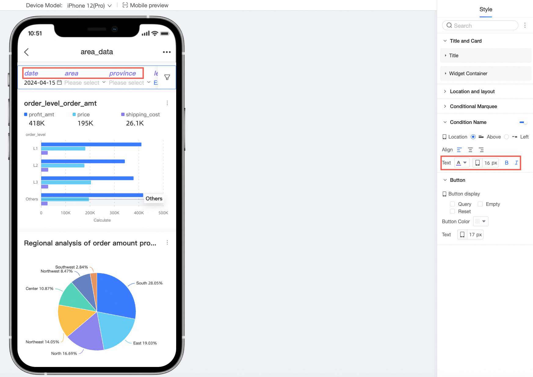
Enable or disable the display of the condition name and configure its position, text, and pitch with the selection box.
Configuration item
Description
Position
Support the position of the condition name to be above or left. When set to above, support alignment to be align left, align center, and align right.
Text
Support setting the text style of the condition name.
In the button section, set the button display, button color, and text font size.
