Use Quick BI Standard to connect to a data source, analyze data, and build a dashboard report.
Overview
Quick BI is a self-service BI platform that provides visual tools and multidimensional analysis for data-driven business decisions.
This tutorial walks through a real-world e-commerce analysis case and demonstrates smart reports for DingTalk business analytics.
Imagine you are a data analyst for a large e-commerce company. Your manager has just received the monthly operations analysis data for August 2019 and noticed that the company's performance has been poor. The gross profit for August dropped significantly compared to previous months, putting the third-quarter gross profit target at risk.
Therefore, you must analyze the reasons for the decline in gross profit in August using data such as order information and traffic channel information. You then need to share your findings with the team to help the relevant business departments make decisions and take action to increase the company's overall gross profit.
Procedure
The workflow includes the following steps:
-
Step 1: Connect to a data source
Connect to a data source for this tutorial.
-
Join tables to create a data model for analysis.
-
Create a dashboard with charts and use filter interactions for visual analysis.
-
Add the dashboard to a BI portal, export it, or share it for collaborative editing.

Example report
Preparations
-
Create an Alibaba Cloud account and complete your account information.
You must have a registered and verified Alibaba Cloud account.
-
Activate Quick BI.
You must have purchased Quick BI or requested a free trial. Purchase, upgrade, renew, or handle overdue payments for Quick BI.
-
(Optional) Prepare a data source.
-
Create a data source in the destination region: Create a database data source or Create a file data source.
-
If you use a file data source, upload the local file to Quick BI. Sample files: Channel Information Dimension Table.xlsx and Order Information Detail Table.xlsx.
-
-
Set the operation permissions for works in the workspace.
The organization administrator must set Feature Permissions to Works Can Be Public and Works Can Be Authorized for the target workspace. Create and manage workspaces.
Step 1: Connect to a data source
Connect to a data source before analyzing data and building reports.
-
Log on to the Quick BI console.
-
In the Quick BI console, connect to a data source as shown below.
-
Add a data source as shown below.
-
Navigate to the data source creation page. Create a data source.
-
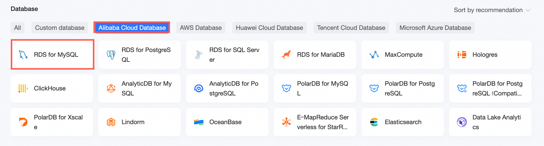
On the Alibaba Cloud Databases tab, select RDS for MySQL.
-
-
In the Configure Connection dialog box, configure the following parameters.
Parameter
Description
Example
Display Name
The display name of the data source.
The name can contain Chinese characters, letters, digits, underscores (_), and hyphens (-).
Demo data source
Database Address
The public endpoint of the MySQL database.
rm-uf***********.mysql.rds.aliyuncs.com
Port
The port for the MySQL database public endpoint.
3306
Database
The custom name of the MySQL database.
quickbi_***
Username
The MySQL database username.
quickbi_***
Password
The MySQL database password.
quickbi_***
Database Version
Select a database version:
-
Select 5.7. This version is compatible with MySQL 5.7 and earlier.
-
Select 8.0. This version is compatible with MySQL 8.0.
5.7
VPC Data Source
If you use an Alibaba Cloud Virtual Private Cloud (VPC) to connect to the database, select VPC Data Source and configure the parameters.
Not applicable
-
-
Click Test Connection to verify the connection to the data source.

-
After the test is successful, click OK to add the data source.
Demo Data Source now appears in the data source list, indicating a successful connection.

Step 2: Data modeling
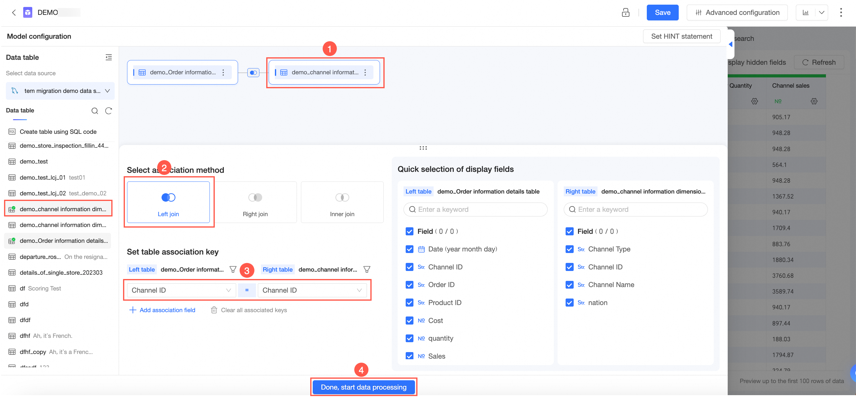
After connecting to the data source, join tables to create a data model for analysis.
-
On the Data Sources page, select the target data tables and create a dataset as shown below.

-
On the dataset editing page, join the data tables as shown below.
-
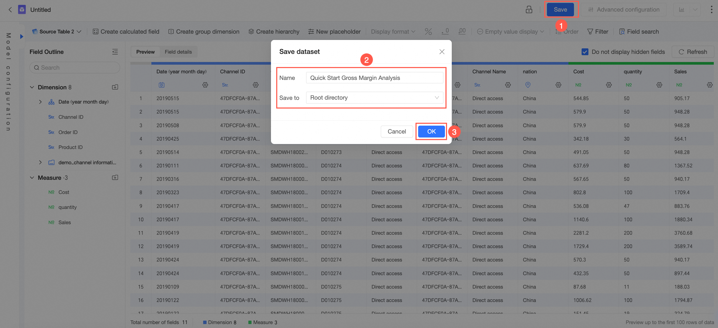
Preview and save the dataset.
-
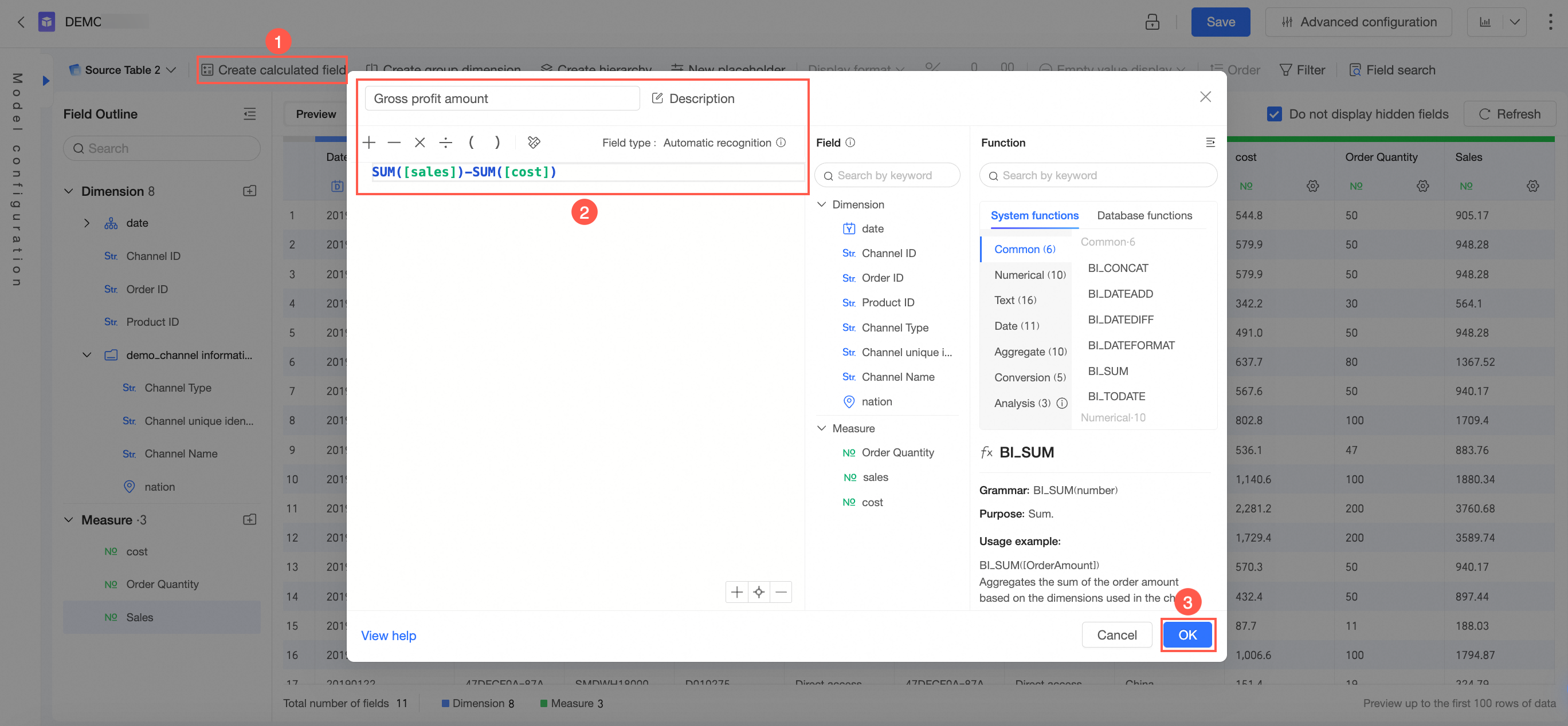
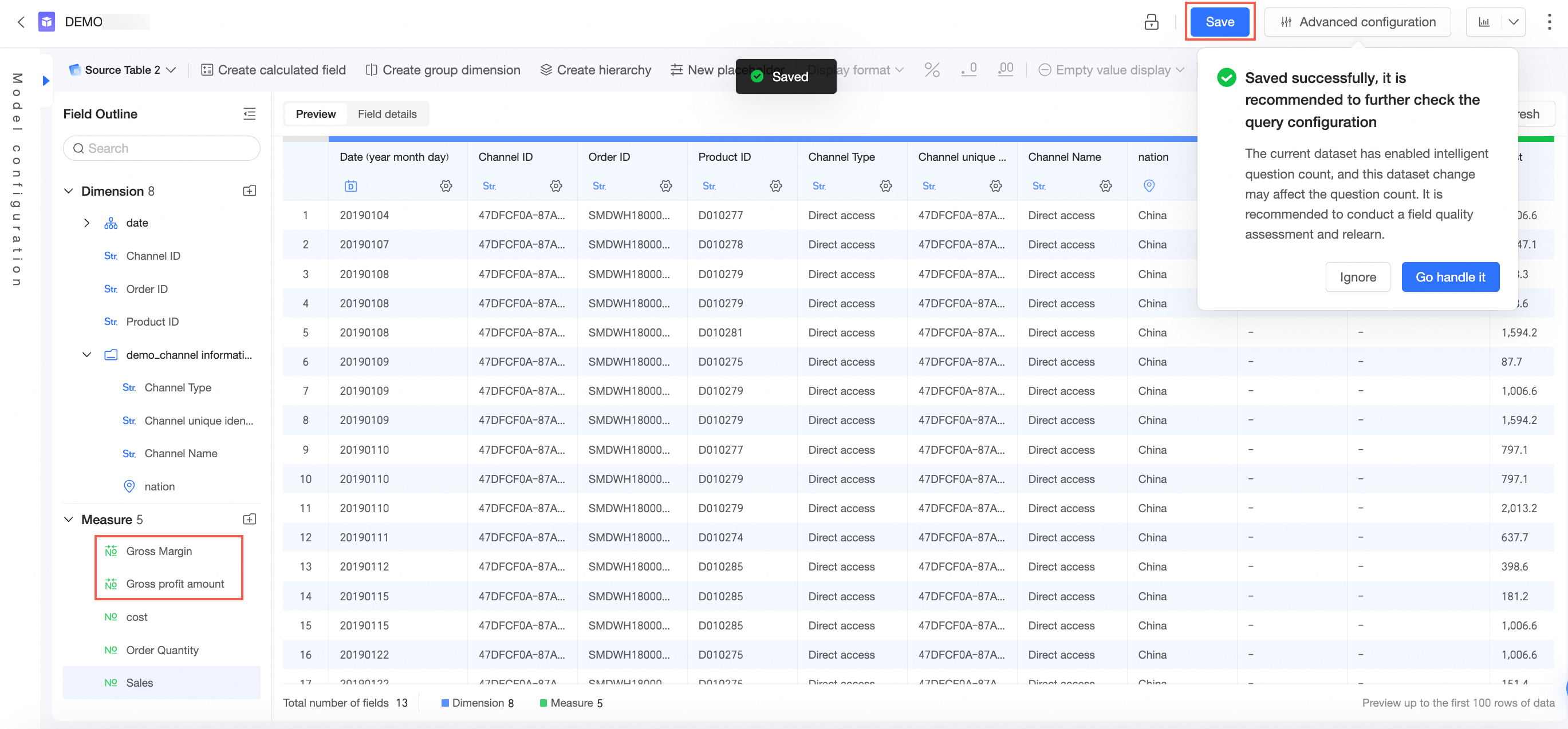
Add the gross profit and gross profit margin fields to the measures.
Add the gross profit and gross profit margin fields as shown below.
Parameter
Description
Example
Original Field Name
The name can contain Chinese and English characters, digits, underscores (_), forward slashes (/), backslashes (\), vertical bars (|), parentheses (()), and brackets ([]). The name can be up to 50 characters in length.
-
The expression for the gross profit field is
SUM([Sales])-SUM([Cost]) -
The expression for the gross profit margin field is
(SUM([Sales]-[Cost]))/SUM([Sales])
Expression
Enter a left square bracket (
[) to display a list of dimension and measure fields that you can insert.Data Type
The supported data types are Dimension and Measure.
Measure
Field Type
The supported field types are Text and Numeric.
Numeric
Format Expression
The following data formats are supported:
-
Automatic (retains the default data format)
-
Integer, 1 decimal place, or 2 decimal places
-
Percentage, 1 decimal place percentage, or 2 decimal place percentage
-
Custom or manual input
Automatic
Field Description
Enter a description for the field.
Gross profit = Sales - Cost
-
-
After adding the fields, click Save.
Step 3: Visual analytics
Create a dashboard with charts and use filter interactions for visual analysis.
-
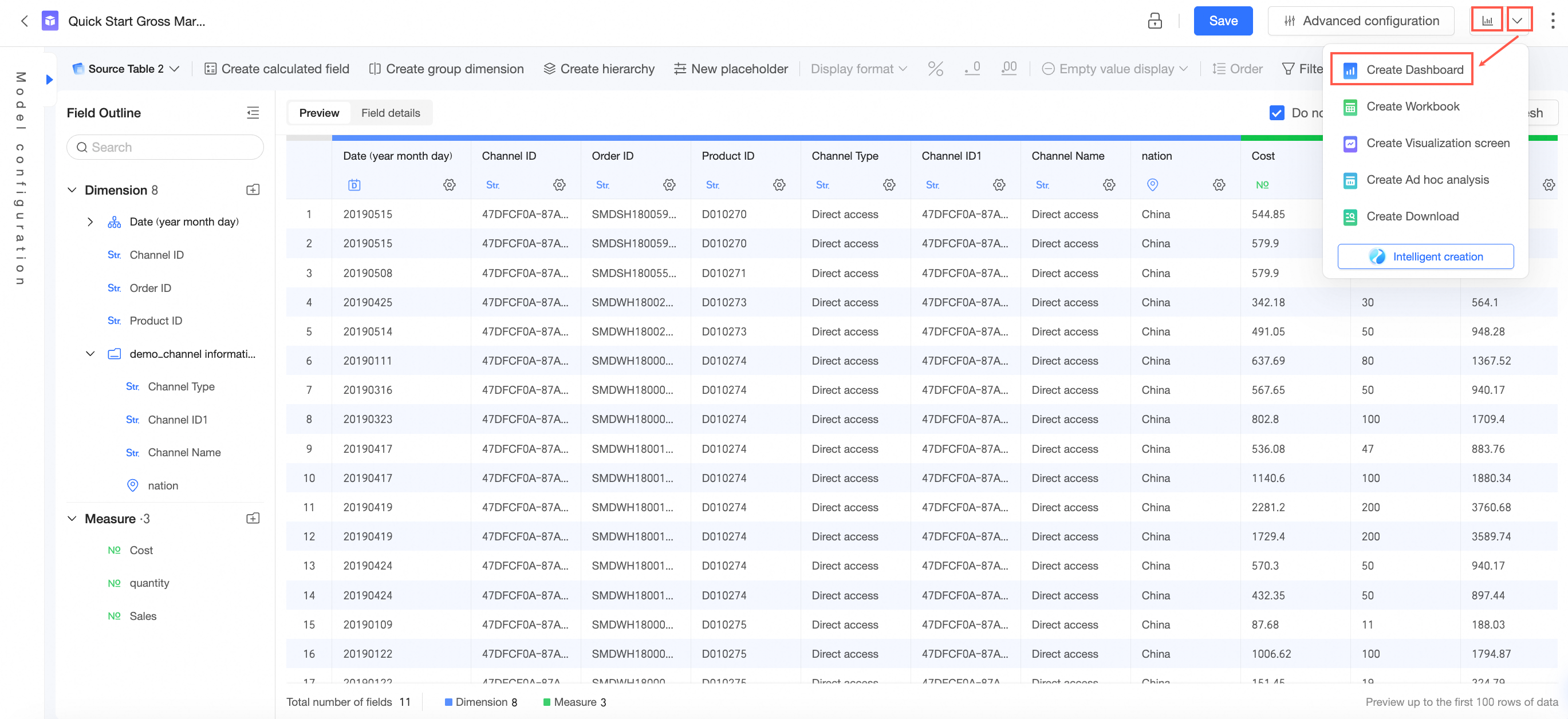
On the dataset editing page, click Create Dashboard in the top navigation bar.
-
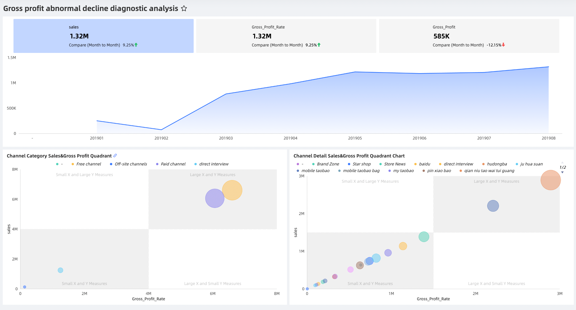
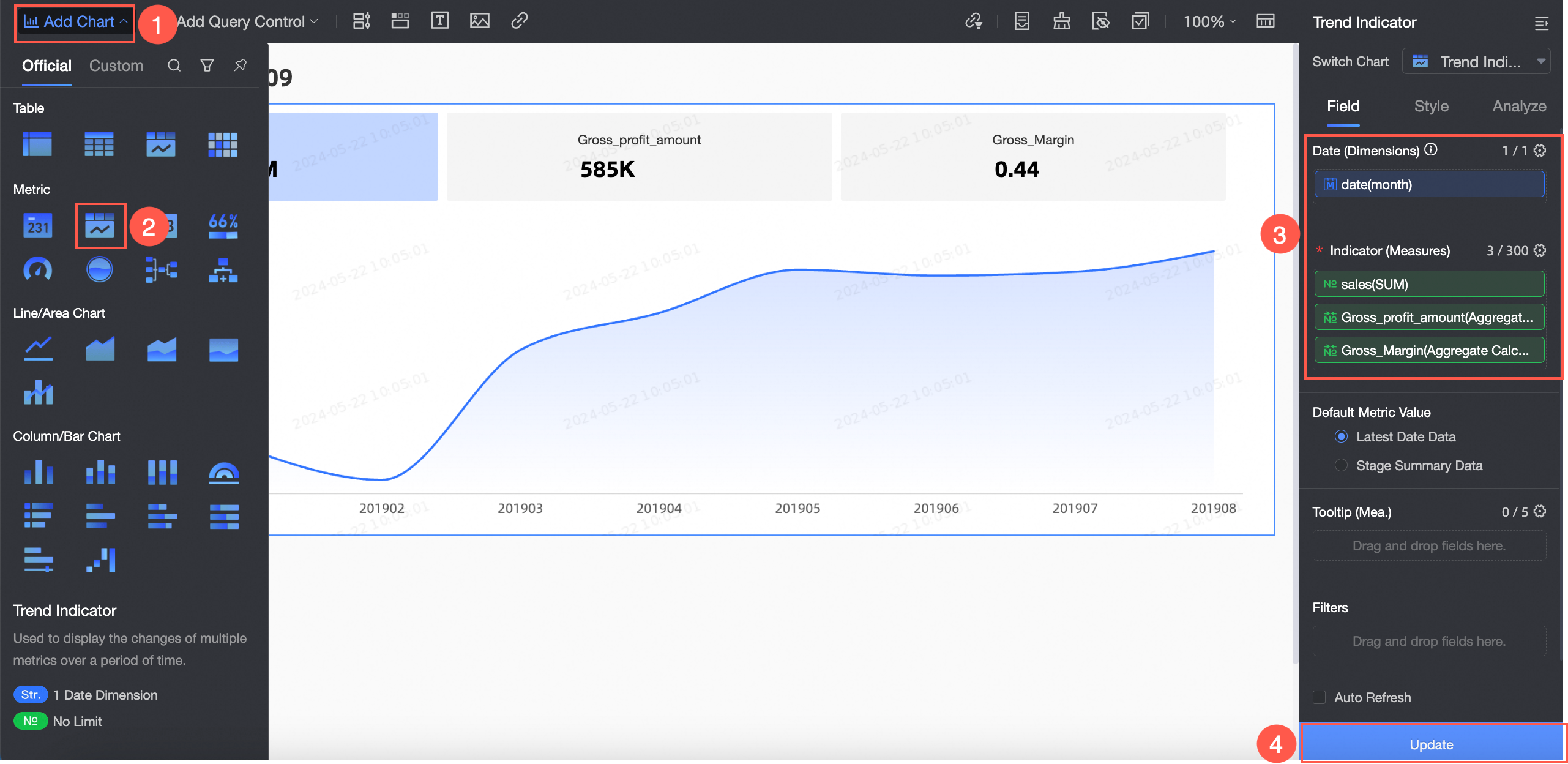
Create a metric trend chart to analyze the monthly core sales, gross profit, and gross profit margin.
To best visualize the trends for the three key metrics (sales, gross profit, and gross profit margin) across different months, you can use a Metric Trend chart.
-
Create a metric trend chart as shown below.
-
On the Data tab, go to the Advanced Settings section, enable Secondary Metric, and configure the chart style.
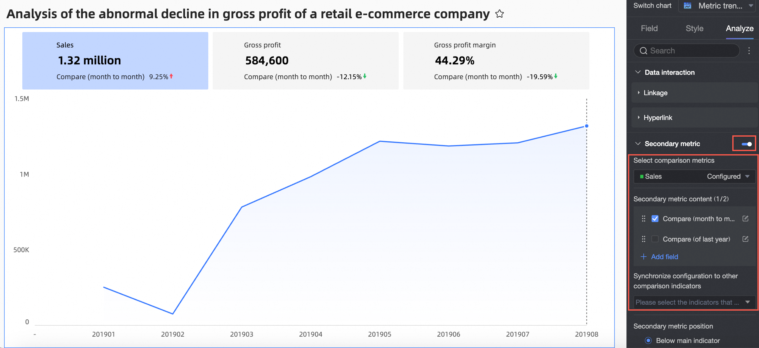
Configure only the following parameters. Use default values for others.
Parameter
Description
Example
Comparison Metric
Select the metric that you want to use for comparison.
Sales
Secondary Metric Content
You can configure the content of the secondary metric and set a Quick Style in the conditional formatting settings.
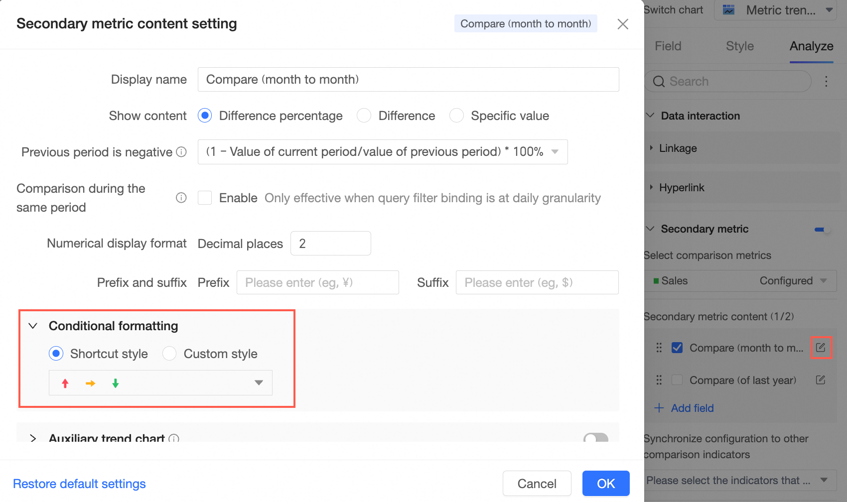
Month-over-month
Sync Configuration To Other Comparison Metrics
You can sync the configuration of the current metric to other metrics.
Gross profit and Gross profit margin
-
-
Create a bubble chart to analyze sales and gross profit data by channel category.
A Bubble Chart is ideal for displaying sales, gross profit margin, and gross profit for different channel categories.
-
Create a bubble chart as shown below.
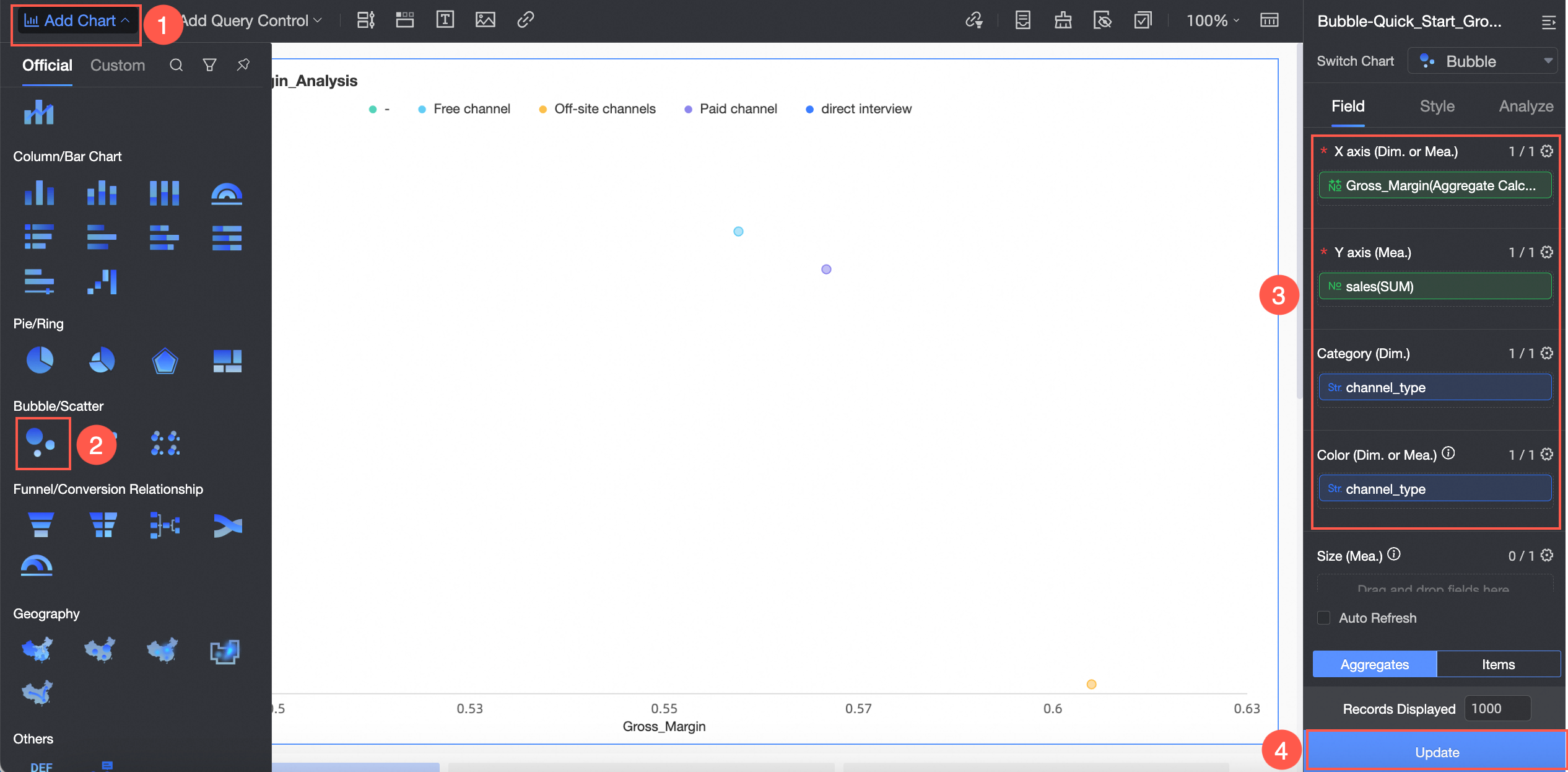
-
Set a filter to view the data for August 2019 as shown below.

In the Set Filter dialog box, the following table lists example parameter settings for the Date (month) field.
Parameter
Description
Example
Filter Method
Supports Single Month and Month Range.
Single Month
Filter Condition
Supports Relative Time and Exact Time.
Exact Time
Date
Supports custom dates.
2019-08
-
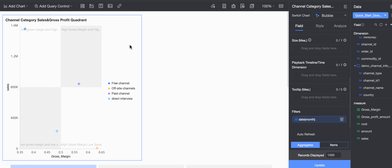
On the Style tab, you can configure the chart style.

Configure only the following parameters. Use default values for others.
Configuration Item
Parameter
Example
Title And Card
Show Title
Select Show Title
Title
Channel Category Sales & Gross Profit Quadrant Chart
Legend
Position
Right (
 )
)Chart Area
Quadrant
Select Enable Quadrant
Quadrant Names
Configure the names as follows:
-
Top-right Quadrant: High Gross Profit Margin, High Sales
-
Top-left Quadrant: Low Gross Profit Margin, High Sales
-
Bottom-left Quadrant: Low Gross Profit Margin, Low Sales
-
Bottom-right Quadrant: High Gross Profit Margin, Low Sales
-
-
-
Create a bubble chart to analyze sales and gross profit data by channel detail.
You can use a Bubble Chart to best display detailed sales, gross profit, and gross profit margin data for each channel.
-
Create a bubble chart as shown below.
To avoid repeating steps, this example copies the bubble chart created in the previous step and replaces the Channel Category field with the Channel Name field.
-
On the Style tab, you can configure the style of the chart.

Configure only the following parameters. Use default values for others.
Configuration Item
Parameter
Example
Title And Card
Show Title
Select Show Title
Title
Channel Detail Sales & Gross Profit Quadrant Chart
-
-
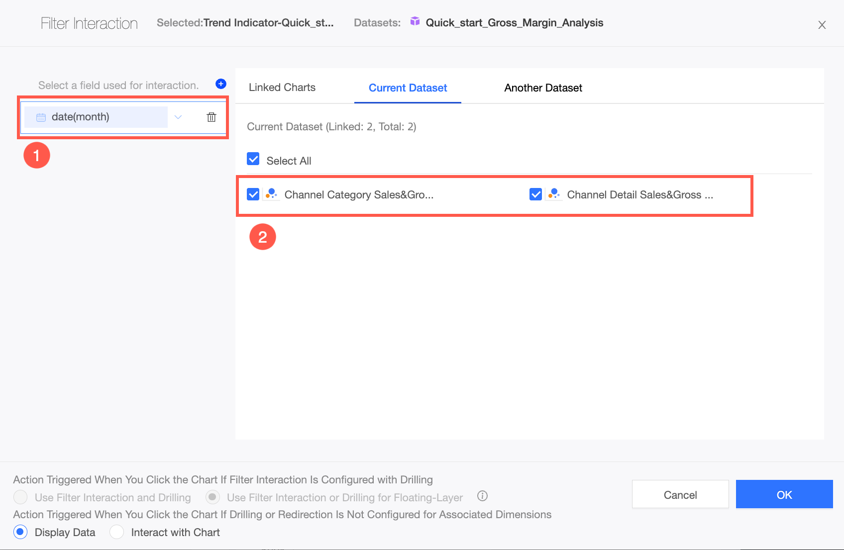
Use a filter interaction to analyze the gross profit margin data of channel details for August 2019.
Configure a filter interaction from the metric trend chart to both quadrant charts to view sales and gross profit margin data for each channel category in August 2019.
-
Configure the chart filter interaction as shown below.

-
In the Chart Filter Interaction dialog box, link the charts as shown in the following figure.
After the filter interaction is configured, click the data point for August 2019 in the metric trend chart. The data in the Channel Category Sales & Gross Profit Quadrant Chart and the Channel Detail Sales & Gross Profit Quadrant Chart is filtered to show only the data for August 2019.
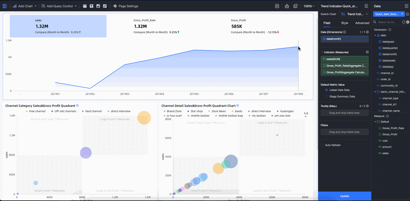
After you analyze the sales and gross profit margin data for each channel category in August 2019 in the Channel Category Sales & Gross Profit Quadrant Chart, you will see that the Free Channel is in the high-sales, low-gross-profit-margin quadrant. This is an abnormal range. In the next step, you will analyze which channel details caused this anomaly.
-
-
Analyze the sales and gross profit margin data for each channel name under the Free Channel category for August 2019.
Configure a filter interaction from the Channel Category Sales & Gross Profit Quadrant Chart to the Channel Detail Sales & Gross Profit Quadrant Chart to analyze each channel name under the Free Channel category.
-
Configure the chart filter interaction as shown below.

-
In the Chart Filter Interaction dialog box, link the charts as shown in the following figure.
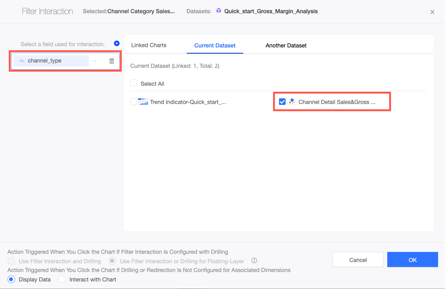
After the filter interaction is configured, click the data point for the Free Channel in the Channel Category Sales & Gross Profit Quadrant Chart. The data in the Channel Detail Sales & Gross Profit Quadrant Chart is filtered to show only the data for the Free Channel in August 2019.
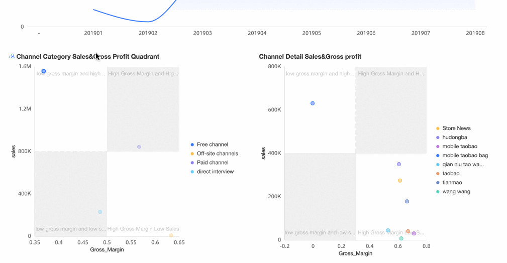 After you analyze the sales and gross profit margin data for each channel name in August 2019 in the Channel Detail Sales & Gross Profit Quadrant Chart, you will see that the Taobao Coupon Package is in the high-sales, low-gross-profit-margin quadrant. This is an abnormal range and the root cause of the abnormal drop in gross profit.
-
Conclusion: An investigation revealed that in August 2019, some employees misused many internal coupons. They used the Free Channel - Taobao Coupon Package to make fraudulent purchases for profit. This activity caused an abnormal decline in the company's overall gross profit. The relevant data has been submitted to the audit department. In the following month, the company's operations returned to normal, and performance metrics such as sales and gross profit reached new highs.
Step 4: Publish and share
Add the dashboard to a BI portal, export it, or share it for collaborative editing.
-
Publish the dashboard as shown below.
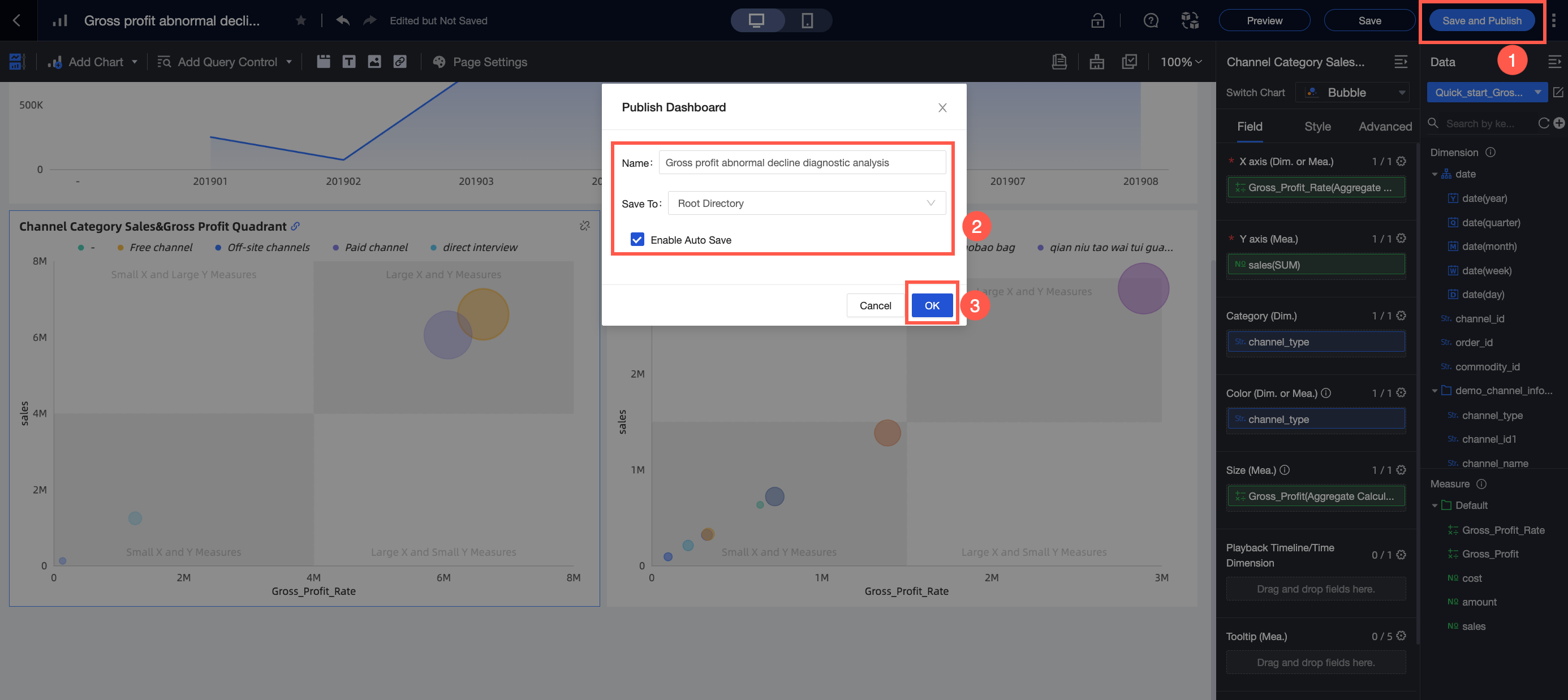 Note
NoteThe Publish Dashboard dialog box appears only the first time you publish a dashboard.
Parameter
Description
Example
Name
The name of the dashboard.
Diagnostic Analysis Report on Abnormal Decline in Gross Profit of a Retail E-commerce Company
Location
The location where the dashboard is stored.
Root directory
Enable auto-save for subsequent edits
If you select this option, the dashboard is automatically saved during subsequent edits.
Select this option.
-
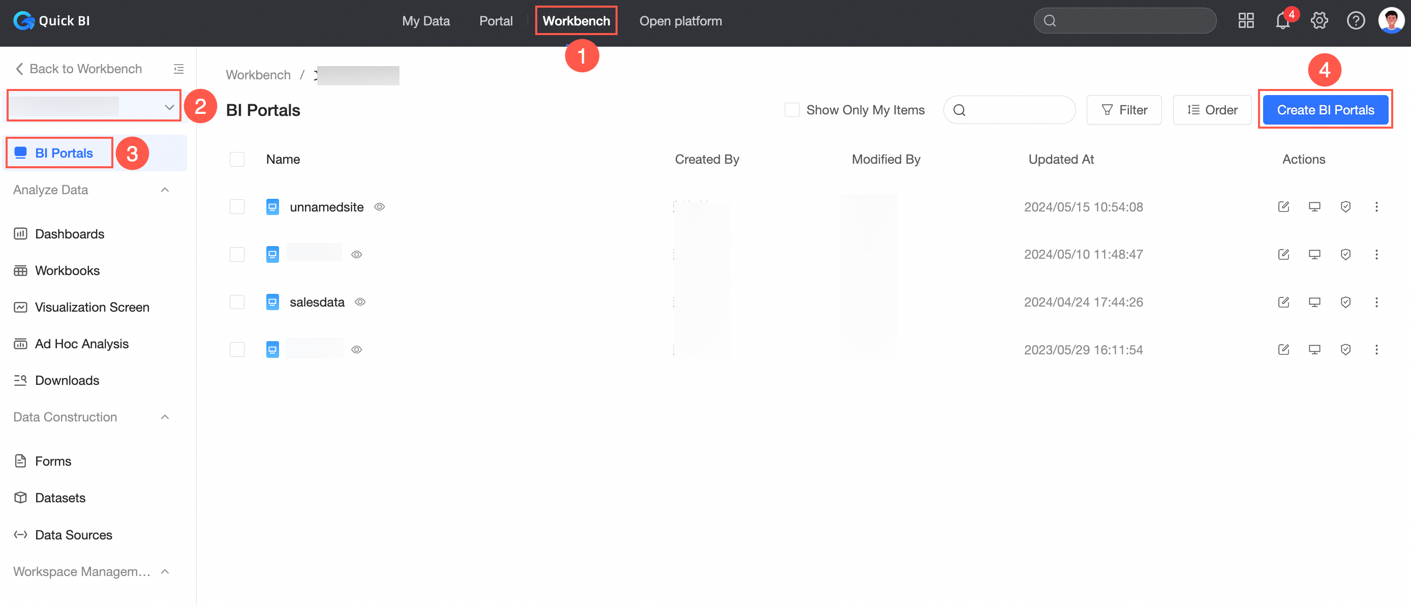
Build a BI portal.
A BI portal (data product) organizes dashboards into a structured navigation menu for thematic analysis. You can integrate dashboards into a BI portal and export them.
-
Create a BI portal as shown below.
-
Add and configure the portal menu as shown below.
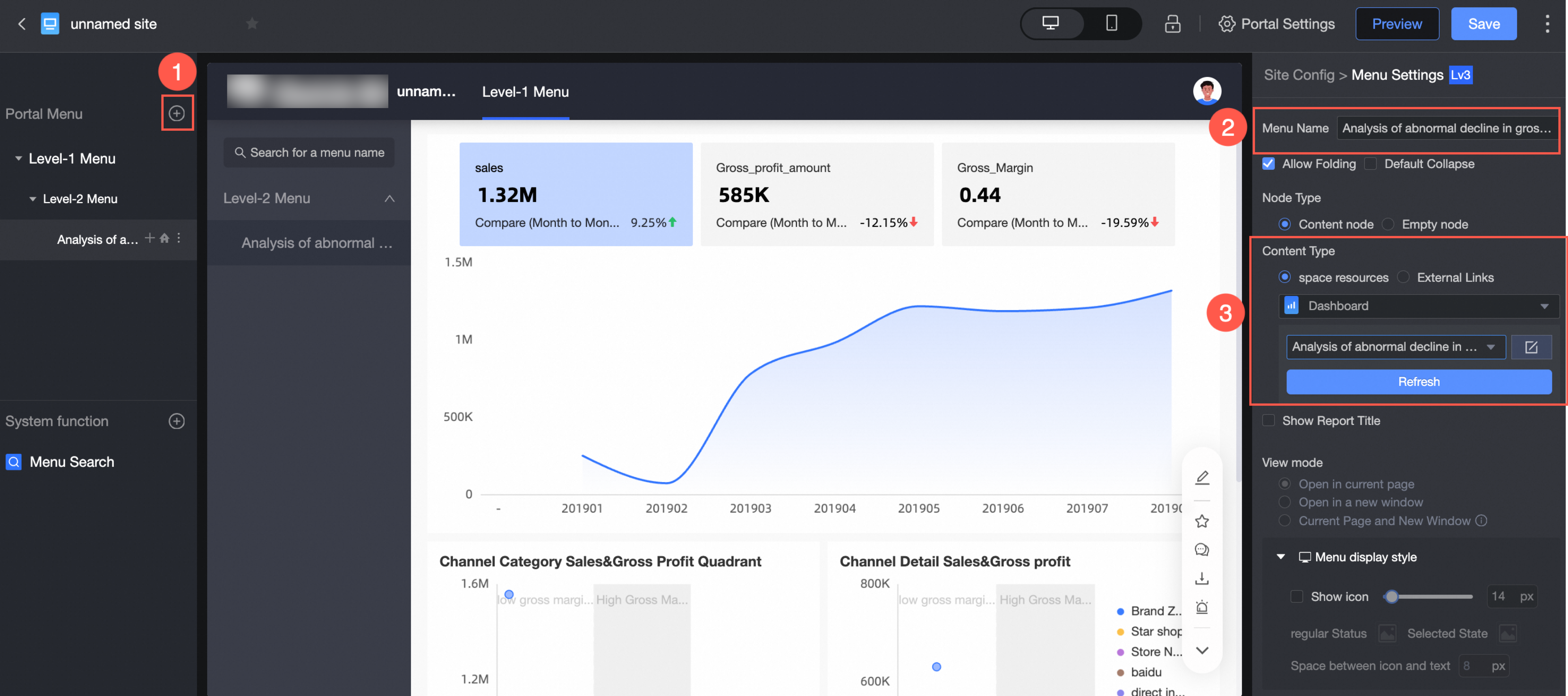
In the Content Settings section, configure the following required parameters. Use default values for others.
Parameter
Example
Menu Display Name
Diagnostic Analysis Report on Abnormal Decline in Gross Profit of a Retail E-commerce Company
Content Settings
Select Dashboard. On the dashboard search page, find Diagnostic Analysis Report On Abnormal Decline In Gross Profit Of A Retail E-commerce Company.
-
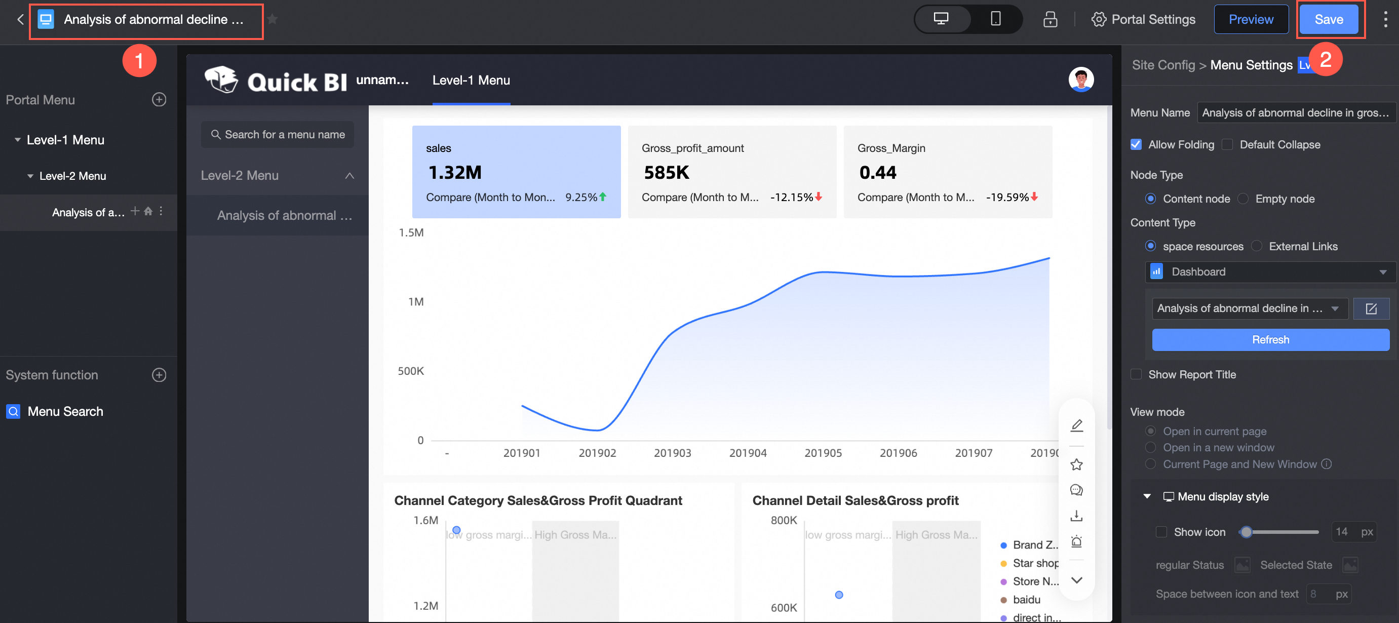
Save the BI portal as shown below.
In this example, the BI portal is named Diagnostic Analysis Report on an Abnormal Decline in Gross Profit of a Retail E-commerce Company.
-
-
Export the BI portal as shown below.
Parameter
Example
Export Name
Diagnostic Analysis Report on Abnormal Decline in Gross Profit of a Retail E-commerce Company
File Format
Select Image
Export Channel
Select Local
-
Share the dashboard.
NoteBefore you publish or share a dashboard, ensure that works in the workspace can be made public and authorized. Create and manage workspaces.
-
Make the dashboard public or share it as shown below.
-
Public Sharing links can be accessed by anyone without logging in to an Alibaba Cloud account.
-
Only authorized users can access the link generated for Private Sharing.
-
-
Configure collaborative editing for the dashboard as shown below.

-