This topic describes the configuration items of a trajectory layer.
Chart style
The trajectory line layer is a subcomponent of the basic flat map 4.0. It supports independent styles and data configurations and can represent the movement of people or objects in the form of a batch of trajectory points. 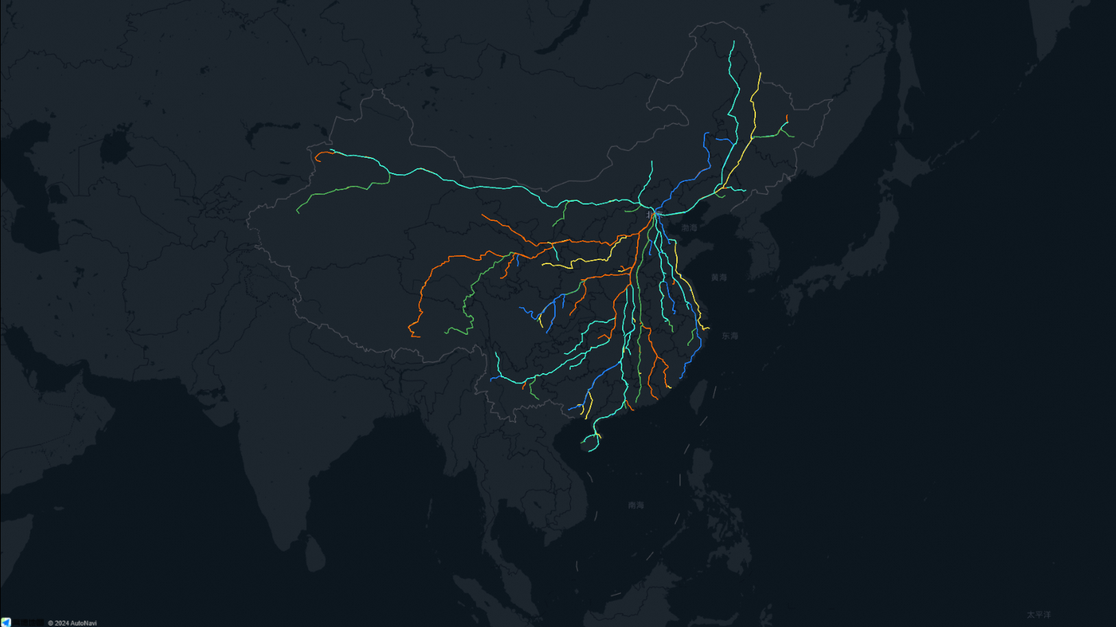
Style Panel 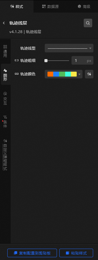
Search Configuration: Click the Search configuration items icon
 in the upper-right corner of the Style panel. In the Search Configuration panel, enter the name of the configuration items that you want to search for and locate the configuration items. Fuzzy match is supported. For more information, see Search configuration items.
 General: Configure common parameters for the trajectory layer.
Metric
description
Visible Level
Set the visibility level of the trajectory layer. The trajectory layer is visible within the specified level range and invisible outside the level range. Valid values: 0 to 22. Unit level.
Opacity
The opacity of the trajectory layer. Valid values: 0 to 100. Unit: %. The larger the number, the more opaque the heat layer style.
Graphics: Set the graphics style parameters for the trajectory layer.
Metric
description
Trajectory Linetype
Click the drop-down list and select a trajectory type. By default, the system has four built-in trajectory types.
Trajectory thickness
For more information about how to set the thickness of a trajectory line, see Use the dimension mapper.
Trail Color
The color of the trajectory line corresponding to
colorFieldfield value in the data. For more information about how to configure the color mapper, see Use color mapper.Interaction: the interaction configuration items of the trajectory layer.
graphical interaction
Metric
description
Click to focus
Click the icon on the left
 to enable or disable the click-to-focus interaction function. After you turn on the switch, you can click the trajectory to focus on the trajectory. The value of the margin in the focus range ranges from 0 to 300. Note
Maps can be rendered only when they are immersed, previewed, or published.
Hover Style
Click the
icon on the left of Hover Style to enable or disable the hover interaction feature. If you turn on this switch, you can set the color and thickness of the trajectory line when you move the pointer over. The trajectory thickness ranges from 0 to 20. Unit level. NoteMaps can be rendered only when they are immersed, previewed, or published.
Condition: the description of the condition style.
Conditional Style: Click the
 or
or  icon to add or remove a conditional style. Click the
  or
or  icon to configure the arrangement style of multiple conditional styles. Click the
  icon to copy the selected conditional style configuration and add a conditional style. For more information about how to configure a conditional tree, see Usage notes.
 Graphic: If you turn on the switch, you can configure the graphic configuration items of the style. If you turn off the switch, you cannot configure the graphic configuration items of the style.
Metric
description
Trajectory Linetype
Select a trajectory type from the drop-down list. By default, four types of trajectory are built-in. You can use the
icon to confirm whether the current style is applied when the current conditions are met. Trail thickness
The thickness of the trajectory. Valid values: 0 to 20. Unit: px. You can use the
icon to confirm whether the current style is applied when the current conditions are met. Trail Color
Configure the color of the trajectory line. You can use the
icon to check whether the current style is applied when the current conditions are met. Custom pop-up style: Set the custom pop-up style in the trajectory layer.
Metric
description
Bomb switch
If you turn on the switch, you can click or hover to trigger the pop-up.
Display Mode
The display mode of the trajectory layer popup. You can select Click or Hover.
Relative Offset
The horizontal and vertical pixel offsets of the pop-up window. Valid values: -1000 to 1000. Unit: pixels.
Text Style
Set the text style in the dialog box, including the font style, font size, color, and weight of the text.
Display NULL Value
If you turn on the switch, the pop-up box can be displayed as "no data" on the object without
infofields or emptyinfofields. if you turn off the switch, the corresponding pop-up box will not pop up for the data withoutinfofields.Box Style
Padding: specifies the distance between the content of the popup text and the top, bottom, left, and right sides.
Border Style: Specify the rounded corners, line width, and color of the popup border.
Background Color: the background color of the dialog box.
Projection Style: specifies the blur color, blur radius, X offset, and Y offset of the pop-up projection.
Close Button: If you turn on the switch, the Close button and the color of the button are displayed in the dialog box of the trajectory layer.
Pointing Arrow: If you turn on the switch, a pointing arrow is displayed in the dialog box of the trajectory layer.
Data Sources panel 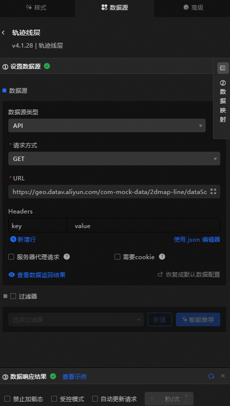
Column | Description |
| Required. The plane spatial data of the trajectory. |
| Optional. The name of the trajectory. |
| Optional. The value of the trajectory. |
| Optional. The unique ID of the trajectory. |
| Optional. The line width mapping field of the trace line. |
| Optional. The color mapping field of the trajectory line. |
| Optional. The pop-up type. This parameter must be used together with the secondary development feature. |
| Optional. The custom content field of the dialog box. HTML snippets are supported. |
Configure data items | Description |
Data sources | You can use the code editor or visual editor to view the data fields contained in the widget. You can also modify the data type to flexibly configure the component data. |
Data Mapping | If you need to customize chart field configurations, you can set different field mapping content in the Data Mapping module and field mapping these content to the corresponding fields of the widget. This allows you to match data without modifying the fields in the data source. You can also click the |
Configure a filter | Turn on Filter, select an existing data filter or create a data filter, and configure a data filter script to filter data. For more information, see Manage data filters. |
Data Response Result | The Data Response Result section displays widget data in real time. If the data source of the widget changes, this section displays the latest data. If the system response is delayed, you can click the |
Forbid Loading | If you select the check box, you will not see the loaded content during component initialization when you update the component and preview the data kanban. If you select the check box, the opposite is true. By default, the status is deselected. |
Controlled Mode | If you select the check box, the component does not request data in the initialized state, and only requests data by using global variables or the method configured in Blueprint Editor. If you clear the check box, you can use automatic update to request data. By default, the status is deselected. |
Auto Data Request | Select the check box to manually enter the time frequency of polling to set dynamic polling. If you clear the page, the page is not automatically updated. You need to manually refresh the page or use Blueprint Editor and global variable events to trigger a request to update data. |
 icon to configure the field style.
  icon on the right to view the data response result. You can also click the
  icon on the right to obtain the latest data of the widget. You can also click View Example to view an example of the response result of the current component.
 Advanced Panel 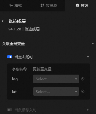
If you turn on the switch to enable the associated global variable function, you can trigger a data request when you click a line or move the mouse over the line, and throw a temporary variable to dynamically load the data of different lines when you click or move the mouse over the line. By default, the lng and lat values of the clicked area are displayed. For more information, see Component interaction configuration.
Blueprint Interaction
Click the
 icon in the upper-left corner to go to the Blueprint page.
 On the Layer Nodes tab, add the widget to the main canvas.
View blueprint configuration parameters.
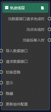
Event
Event
Description
When the data interface request is completed
The event is triggered with the processed JSON data after a data interface request is responded and processed by a filter. For more information about specific data examples, see the Data Response Result track on the Data Source tab in the right-side configuration panel of the canvas editor.
When the line is clicked
Data is thrown when a line in the trajectory layer is clicked.
When the mouse moves in
When the mouse moves into a line of the trajectory layer, the event is triggered and data is thrown.
Action
Action
Description
Import data
After data of a widget is processed in accordance with its drawing format, the widget is imported for redrawing. You do not need to request server data again. For more information about specific data examples, see the Data Response Result track on the Data Source tab in the right-side configuration panel of the canvas editor.
Request Data Interface
This action is performed to request the server data again. The data sent by an upstream data processing node or layer node is used as a parameter. For example, if the API data source is
https://api.testand the data passed to the request data interface is{ id: '1'}, the final request interface ishttps://api.test?id=1.Switch Display /Display
Specifies whether to show or hide a widget. No parameters are required.
Display
Display the widget. For more information, see Data example.
{
  "animationType": "",// The animation method. Valid value: fade. If you do not specify this parameter, no animation is generated.
  "animationDuration": 1000,// The animation delay. Unit: ms.
  "animationEasing": ""// animation curve
}
Hide
Hide the component. For more information, see Data example.
{
  "animationType": "",// The animation method. Valid value: fade. If you do not specify this parameter, no animation is generated.
  "animationDuration": 1000,// The animation delay. Unit: ms.
  "animationEasing": ""// animation curve
}
Update component configurations
Style configurations of widgets are dynamically updated. In the Style panel, click Copy Configuration to Clipboard to obtain the configuration data of the widget. After that, change the style field for the data processing node in Blueprint Editor.