Switch
This topic provides a guide on using the switch widget.
Component overview
The switch is a control widget that simulates a physical switch, allowing users to toggle between on and off states. Configurable interactions enable it to work in tandem with other widgets to manage content visibility, render different states, and more.
Scenarios
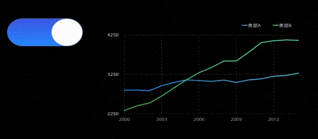
Switches are typically used in visualization applications to toggle the display or concealment of specific content based on the switch's state. For instance, a switch can be used to enable or disable sound or to show or hide sidebar configurations.
Effect display
Static Switch

Interactive Scenarios
Prerequisites
A data dashboard is available that supports creation using a template, a blank canvas.
Business data is ready for use. For more information, see Data Source.
Add a switch
Access the DataV console.
Navigate to and select the desired dashboard to access the canvas editing page.
In the list in the left-side navigation pane, click the Switch widget to add it to the canvas.
You can also use global search to add related widgets.
Connect to business data
After adding the widget, connect it to prepared business data for display. Click the switch, and in the Data Source tab on the right, select the data for the widget to render. 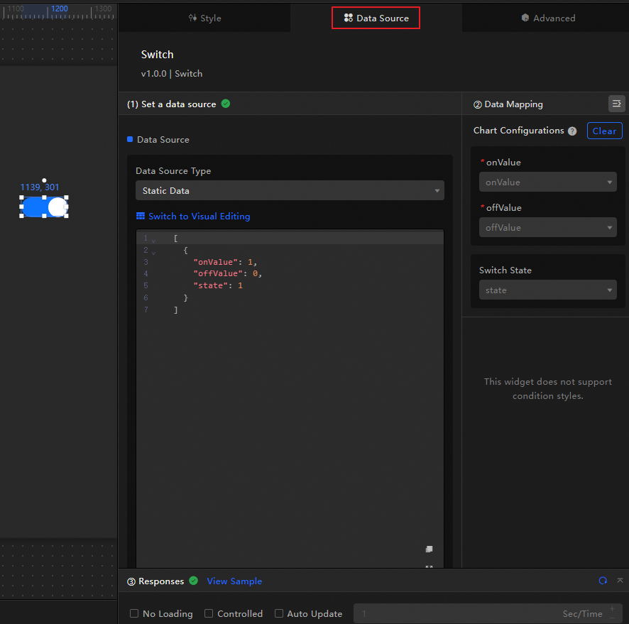
The data fields received by the switch are as follows.
Field
Description
onValueThe value emitted when the switch is turned on. The default is 1.
offValueThe value emitted when the switch is turned off. The default is 0.
stateThe on or off state of the switch. This parameter value can only be configured as the value of
onValueoroffValue. The default is 0 or 1, where 0 indicates the switch is off, and 1 indicates the switch is on.Below is the data structure and effect display of a sample switch.
// Turn on the switch
[
  {
    "onValue": 1,
    "offValue": 0,
    "state": 1
  }
]

// Turn off the switch
[
  {
    "onValue": 1,
    "offValue": 0,
    "state": 0
  }
]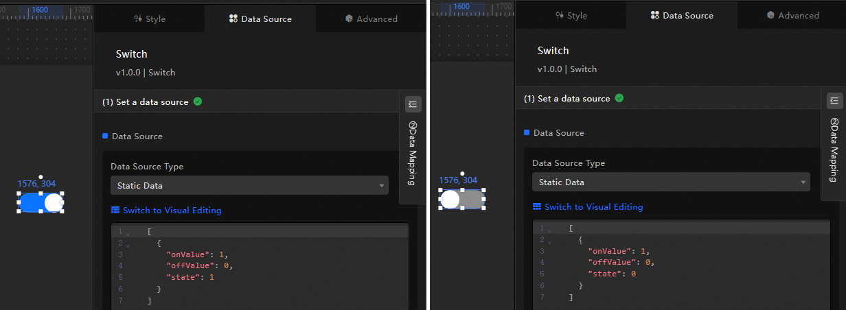
The key configuration items for the data source are as follows.
Configuration Item
Description
Select Data Source
Supports integrating various types of data such as CSV files, APIs, and various databases. For more information, see Data Source. You can edit data fields using a visual table or code.
Configure Filter (Optional)
Used to customize filter code to achieve data structure transformation, filtering, display, and simple calculations. For more information, see Manage Data Filters.
Configure Data Mapping
Used to map fields from the selected data source to the corresponding fields of the widget to achieve real-time data matching. Click the
 icon to configure field styles.
View Response Results
Used to display the data integrated into the widget in real-time. When the widget data source changes, the latest data will be displayed here.
Click the data response result to view the code of the data fields written.
Click to view the example to see the array type and code example received by the data source. You can refer to the example to write related fields.
Other data request configurations:
Disable Loading State: When selected, the loading content during widget initialization will not be displayed when updating or previewing the data dashboard.
Controlled Mode: When selected, the widget will not request data in the initialization state. At this time, data requests can only be initiated through the blueprint editor or global variable events.
Automatic Update Request: When selected, the platform will dynamically poll and update data according to the polling time you set. If not selected, you need to manually refresh the page or trigger a request to update data through the blueprint editor and global variable events.
Configure the switch
Click the switch widget to access its configuration options for basic styles, global variables, interaction occurrences, and other advanced settings, along with blueprint interaction configurations, in the right-side panel.
Style configuration
In the Style panel, configure the default state, background color, and border style of the switch. The configuration items are detailed below.
Quickly find configuration items by clicking the  icon and using keywords to search, which supports fuzzy matches. For more information, see Search for Configuration Items.
The configuration items are described below.
Configuration item | Description | Illustration |
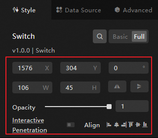
Global configuration | Defines the position distribution, transparency, and interaction penetration of the widget in the data dashboard.
|
|
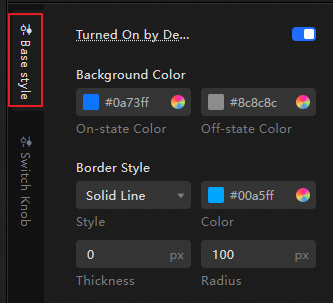
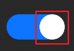
Basic style configuration | Defines the default selected state, background color, and border styles such as color, thickness, and border radius of the switch. The related descriptions are as follows:
|
|
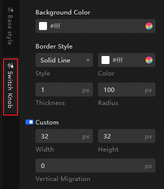
Switch handle configuration | Defines the color, border style, width, height, and vertical position offset of the switch handle. The switch handle is typically used to control the on and off states of the switch. |
|
Advanced configuration
Define the interactions between the switch and other widgets. The configuration items are detailed below.
Configuration item | Description | Illustration |
Interaction occurrences | Defines the interaction behavior with other widgets to achieve widget linkage. Click the |
|
Associate global variables | You can associate global parameters in the widget to enable parameter passing between widgets and achieve widget interactions. Click the When the state of the switch changes (that is, when the switch is turned on or off), it triggers a data request and emits the configured value in the data source panel. Turning on the switch emits the |
 icon to define related interaction occurrences and actions.
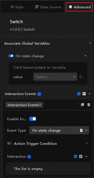
 icon to enable the corresponding instruction and associate the required
 Blueprint interaction
Visually define the interaction relationships and behavior logic between widgets using the Blueprint Editor.
Procedure
On the canvas editing page, click the
 icon at the top left of the menu bar to enter the blueprint editor.
Hover over the switch widget in the layer node list and click the
icon to add it to the main canvas.Configure the blueprint interaction effects for related widgets using connections as required.
Below is an example.
 icon at the top left of the menu bar to enter the blueprint editor.
 icon to add it to the main canvas.
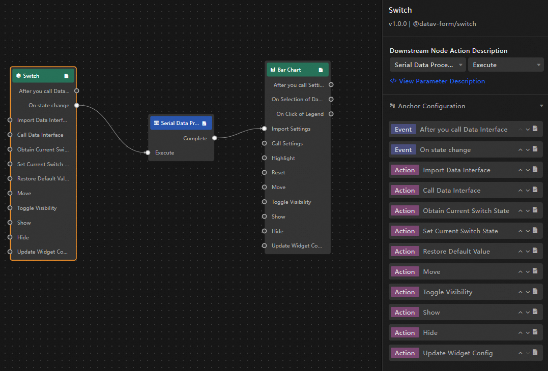
Configuration item description
The interaction occurrences and actions are detailed below.
Click the  icon next to an occurrence or action in the blueprint configuration interface for detailed parameter descriptions.
Category | Subcategory | Description |
Event | When Data Is Updated | This event is emitted when the widget data is updated. |
When The Request Status Changes | This event is emitted when the data request status changes. The status values include Void, Loading, Success, and Error. | |
When The State Changes | This event is emitted when the state of the switch changes, along with the corresponding data item for that state. An example is shown below. | |
Action | Import Data | Processes data according to the widget rendering format and imports it into the widget for re-rendering without re-requesting server-side data. An example is shown below. |
Request Data | Re-requests server-side data. The data emitted by upstream data processing nodes or layer nodes will be used as parameters. For example, if the API data source configured for the switch is | |
Obtain The Current Switch State | Obtains the current state of the switch. | |
Set The Current Switch State | Sets the current state of the switch. An example is shown below. | |
Reset The Widget To Default Values | Reverts the widget to its default values. | |
Move | Move the widget to a specified position. The data example is as follows. | |
Toggle Visibility | Switch the widget to show or hide. The data example is as follows.
| |
Show | ||
Hide | ||
Update Widget Configuration | Dynamically update the style configuration of the widget.
|