This article describes the meaning of each configuration items of the single-point column layer.
Chart style
A single-point bar layer is a subcomponent of a 3D flat map (v3.x). It supports independent styles and data configurations, including the shape, height, fill color, and top side style of the pillars. It can represent different values and other information in different geographic coordinates in a 3D histogram. 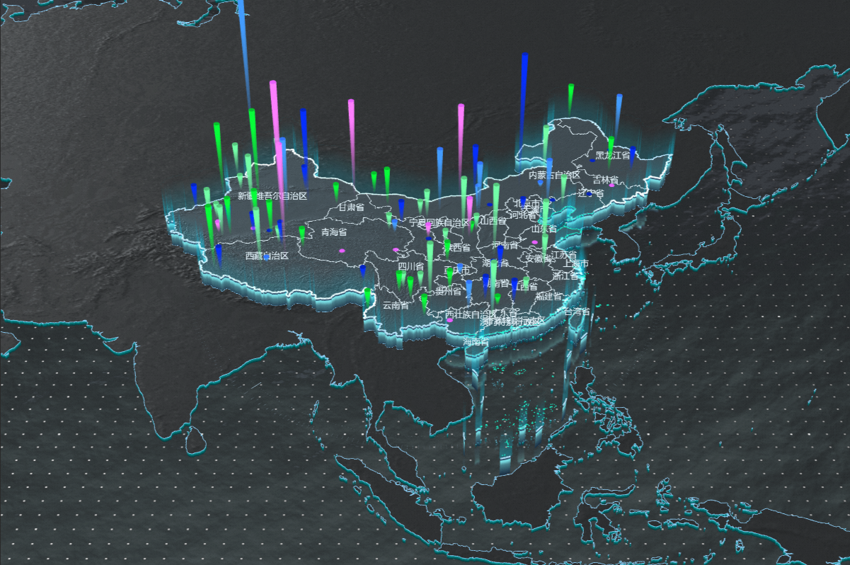
Style Panel 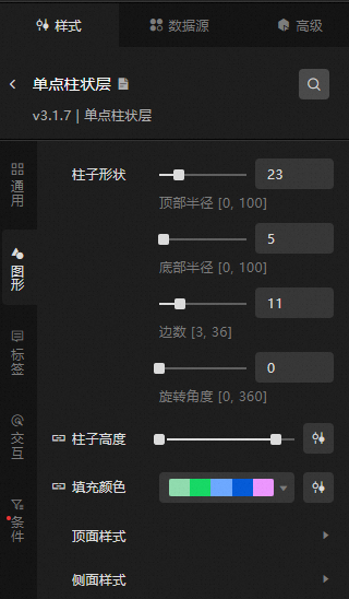
Search Configuration: Click the Search configuration items icon
 in the upper-right corner of the Style panel. In the Search Configuration panel, enter the name of the configuration items that you want to search for and locate the configuration items. Fuzzy match is supported. For more information, see Search configuration items.
 General: Set the general configuration items of the single-point bar layer.
Metric
description
Opacity
The opacity of the single-point bar layer. Valid values: 0 to 100. The larger the value, the more opaque the layer.
Graphics: specifies the graphics configuration of the single-point bar layer.
Pillar Shape: Set the shape of the column, including the radius of the top and bottom, the number of edges of the column, and the rotation angle of the column.
Column Height: the height of the column. For more information, see Use the dimension mapper.
NoteThe value field in the data panel adapts to the height of the column.
Fill Color: the fill color of the column. The fill color is adaptive based on the value of the value field. For more information, see Use the color mapper.
Top Style: the style of the top surface of the column.
Metric
description
Metallic texture
Drag the slider to set the metal texture of the top surface of the single-point bar layer. The value range is from 0 to 100.
Texture mapping
The texture map style for the top face of the column.
Glow Map
The style and intensity of the luminescence map on the top of the column. You can customize the URL of the input image to obtain the image of the map. You can also click or drag a local image to the luminescence map style box to obtain the image of the map. Click the
 icon to the left of the luminescence map to control the display of the luminescence map.
 Side Style: the style of the side of the column.
Metric
description
Metallic texture
Drag the slider to set the metal texture of the top surface of the single-point bar layer. The value range is from 0 to 100.
Texture mapping
Texture map style for the side of the column.
Glow Map
The glow map style for the side of the column. Click the
icon to the left of the luminescence map to control the display of the luminescence map. Map: Set the style of the profile glow map.
Intensity: Drag the Intensity slider to set the luminous intensity of the map. The value range is from 0 to 100.
Horizontal Speed: Drag the horizontal speed slider to set the horizontal speed of the texture. Valid values: -100 to 100.
Vertical Speed: Drag the horizontal speed slider to set the vertical speed of the texture. Valid values: -100 to 100.
Label: the style of the label in a single-point columnar layer.
Metric
description
Show Label
Turn on the switch to set the style of the single-point bar layer display label.
Display Mode
The display mode of the single-point bar label. Valid values: Full Display and Click.
Altitude Offset
Drag the slider to adjust the height offset value of the one-point histogram label. The value range is 0 to 100.
Content Style
Sets the content style of the animated bubbles layer label. Click the
 or
or  icon on the right side of Style per Line to add or delete a style for each line. Click the
  or
or  icon to configure the arrangement of multiple content styles per row. Click the
  icon to copy the current selected content style configuration and add a new line of content with the same configuration.
 Row Field: the name of the row field, which must match the field in the data panel.
Field Style: Specify the style of the line field, including the font style, font size, color, and weight of the field.
Field Prefix: Specify the content, interval, font, font size, color, and weight of the field. Click the
icon to the left of Field Prefix to control the display of Field Prefix. Field Suffix: specifies the content, interval, font, font size, color, and weight of the field suffix. Click the
icon to the left of Field Suffix to control the value of Field Suffix. Field Width: the width of the field that is displayed on the label, including the adaptive type of the field. Valid values: Adaptive and Fixed Width. Set the width of the field based on the adaptive type. Unit: pixels.
Row Height Ratio: the row height ratio of the tag. Valid values: 1 to 2.
Content Stroke: the content stroke style of the tag, including the color and weight of the stroke. You can click the
icon to the left of Content Stroke to control the appearance or concealment of the Content Stroke. Content Shadow: the content shadow style of the tag, including the shadow color, shadow blur value, and shadow offset value in the x and y directions. You can click the
icon to the left of Content Shadow to control the visibility of Content Shadow.
Background Style
Set the background style parameters for the labels in the single-dot bar layer. Click the
icon to the left of the Background Style parameter to control the appearance and concealment of the Background Style parameter. Background Type: the type of the background of the tag. You can select Vector or Image.
Background Color: Set the background color of the tag. This parameter is available only when you set Background Type to Vector.
Border Style: Set the border style of the label, including the line type, line width, and color of the border. This parameter is available only when you set the Background Type parameter to Vector.
Border Fillet: the rounded corners of the label border. Unit: pixels. This parameter is available only when you set the Background Type parameter to Vector.
Image Template: Select a template style for the background image. This option is available only when you select Image for Image Template.
Opacity: the opacity of the background image. Valid values: 0 to 100. This parameter is available only when you select Image for Image Template.
Content Margin: Specify the distance between the content in the tag and the content in the tag.
Interaction: the interaction configuration items of the single-point bar layer.
Graphic Interaction: Click the
icon on the left of Graphic Interaction to control the display or concealment of Graphic Interaction. Metric
description
Multiple Choices
If you turn on the switch, multi-selection interaction is supported. If you turn off the switch, multi-selection interaction is not supported.
Click Style: Click the
icon to the left of Click Style to control the display of Click Style. Metric
description
Fill Color
Sets the fill color of the column when clicked.
Condition: the description of the condition style.
Conditional Style: Click the
or icon to add or remove a conditional style. Click the or icon to configure the arrangement style of multiple conditional styles. Click the icon to copy the selected conditional style configuration and add a conditional style. For more information about how to configure a conditional tree, see Usage notes. Graphic: If you turn on the switch, you can configure the graphic configuration items in the conditional style. If you turn off the switch, you cannot configure the graphic configuration items in the conditional style.
Metric
description
Column height
Click the
icon to the left of Column Height to control the display of the column height style. Fill Color
Click the
icon to the left of Fill Color to control the color of the column.
Data Sources panel 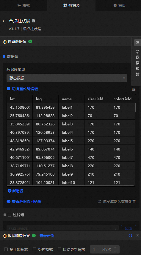
Column | Description |
| The longitude of the column. |
| The latitude of the column. |
| The numeric value of the column. The column height and color are determined by the column height and color configuration items. |
| Optional. The column height mapping field. |
| Optional. The color mapping field of the column. |
Configure data items | Description |
Data sources | You can use the code editor or visual editor to view the data fields contained in the widget. You can also modify the data type to flexibly configure the component data. |
Data Mapping | If you need to customize chart field configurations, you can set different field mapping content in the Data Mapping module and field mapping these content to the corresponding fields of the widget. This allows you to match data without modifying the fields in the data source. You can also click the |
Configure a filter | Turn on Filter, select an existing data filter or create a data filter, and configure a data filter script to filter data. For more information, see Manage data filters. |
Data Response Result | The Data Response Result section displays widget data in real time. If the data source of the widget changes, this section displays the latest data. If the system response is delayed, you can click the |
Forbid Loading | If you select the check box, you will not see the loaded content during component initialization when you update the component and preview the data kanban. If you select the check box, the opposite is true. By default, the status is deselected. |
Controlled Mode | If you select the check box, the component does not request data in the initialized state, and only requests data by using global variables or the method configured in Blueprint Editor. If you clear the check box, you can use automatic update to request data. By default, the status is deselected. |
Auto Data Request | Select the check box to manually enter the time frequency of polling to set dynamic polling. If you clear the page, the page is not automatically updated. You need to manually refresh the page or use Blueprint Editor and global variable events to trigger a request to update data. |
 icon to configure the field style.
  icon on the right to view the data response result. You can also click the
  icon on the right to obtain the latest data of the widget. You can also click View Example to view an example of the response result of the current component.
 Advanced Panel 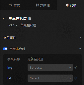
Turn on the switch to enable the widget interaction feature. When a point is clicked, a data request is triggered and a temporary variable is thrown. This way, data at different points is dynamically loaded when the point is clicked. By default, the lng and lat values of the clicked area are displayed. For more information, see Component interaction configuration.
Blueprint Interaction
Click the
 icon in the upper-left corner to go to the Blueprint page.
 On the Layer Nodes tab, add the widget to the main canvas.
View blueprint configuration parameters.
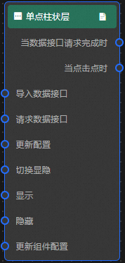
Event
Event
Description
When the data interface request is completed
The event is triggered with the processed JSON data after a data interface request is responded and processed by a filter. For more information about specific data examples, see the Data Response Result section of the Data Source tab in the right-side configuration panel of the canvas editor.
When you click a point
Data is thrown when a point within a single-point bar is clicked.
Action
Action
Description
Request Data Interface
This action is performed to request the server data again. The data sent by an upstream data processing node or layer node is used as a parameter. For example, if the API data source is
https://api.testand the data passed to the request data interface is{ id: '1'}, the final request interface ishttps://api.test?id=1.Import data
After data of a widget is processed in accordance with its drawing format, the widget is imported for redrawing. You do not need to request server data again. For more information about specific data examples, see the Data Response Result section of the Data Source tab in the right-side configuration panel of the canvas editor.
Switch Display /Hide
Specifies whether to show or hide a widget. No parameters are required.
Display
Display the widget. For more information, see Data example.
{
  "animationType": "",// The animation method. Valid value: fade. If you do not specify this parameter, no animation is generated.
  "animationDuration": 1000,// The animation delay. Unit: ms.
  "animationEasing": ""// animation curve
}
Hide
Hide the component. For more information, see Data example.
{
  "animationType": "",// The animation method. Valid value: fade. If you do not specify this parameter, no animation is generated.
  "animationDuration": 1000,// The animation delay. Unit: ms.
  "animationEasing": ""// animation curve
}
Update component configurations
Style configurations of widgets are dynamically updated. In the Style panel, click Copy Configuration to Clipboard to obtain the configuration data of the widget. After that, change the style field for the data processing node in Blueprint Editor.