This topic provides a usage guide for the multiple lines of text widget.
Overview
The multiple lines of text widget is designed to display content spanning several lines, enhancing text information visibility. It supports interactions with other widgets, line breaks, and hyperlink insertion, allowing for customizable formatting and layout.
Scenarios
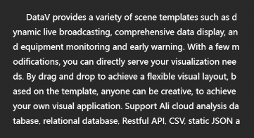
It is commonly used to present extended text content in visualization applications, including feature introductions, product descriptions, and annotations.
Effect display
Static Text
Dynamic Text
Text with Links
Interaction Scenario
Prerequisites
A data dashboard has been created, supporting creation using a template, creation using a blank canvas.
Business data has been prepared. For more information, see data source.
Add multiple lines of text
Access the DataV console.
In the , click the target dashboard to enter the canvas editing page.
In the left-side navigation pane under the list, click the Multiple Lines of Text widget to add it to the canvas.
You can also use global search to add related widgets.
Integrate business data
After adding the widget, integrate the prepared business data for display. Click the multiple lines of text widget, and on the right-side Data Source tab, select the data to be rendered by this widget. 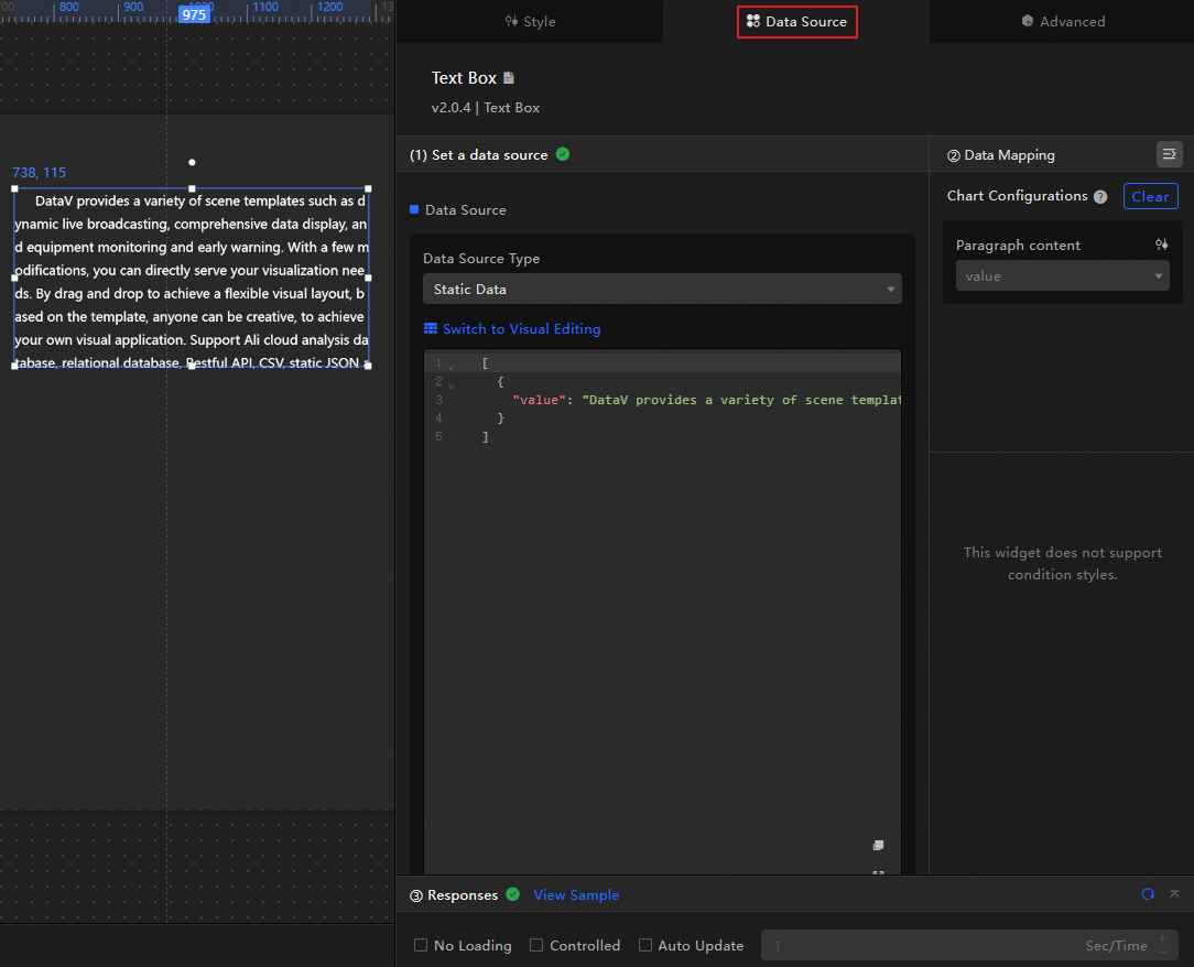
The data fields received by the multiple lines of text widget are as follows.
Field
Description
valueThe text content displayed by the widget supports some HTML tags (such as <a>, <br>). If not empty, it will overwrite the configuration in the style. If empty, it will use the content in the configuration item.
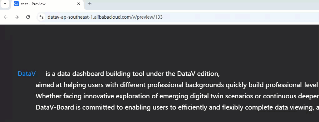
The data structure and effect display of the example multiple lines of text are shown below.
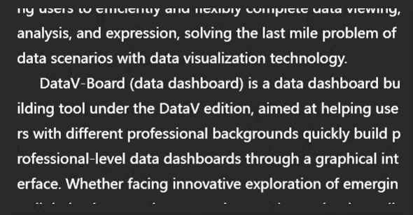
[
  {
    "value": "DataV-Board (data dashboard) is a data dashboard building tool under the DataV edition, aimed at helping users with different professional backgrounds quickly build professional-level data dashboards through a graphical interface. Whether facing innovative exploration of emerging digital twin scenarios or continuous deepening in traditional data scenarios, DataV-Board is committed to enabling users to efficiently and flexibly complete data viewing, analysis, and expression, solving the last mile problem of data scenarios with data visualization technology."
  }
]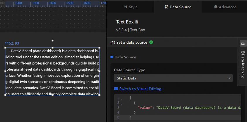
The key configuration items for the data source are as follows.
Configuration Item
Description
Select Data Source
Supports integrating various types of data such as CSV files, APIs, and various databases. For more information, see Data Source. You can edit data fields using a visual table or code.
Configure Filter (Optional)
Used to customize filter code to achieve data structure transformation, filtering, display, and simple calculations. For more information, see Manage Data Filters.
Configure Data Mapping
Used to map fields from the selected data source to the corresponding fields of the widget to achieve real-time data matching. Click the
 icon to configure field styles.
View Response Results
Used to display the data integrated into the widget in real-time. When the widget data source changes, the latest data will be displayed here.
Click the data response result to view the code of the data fields written.
Click to view the example to see the array type and code example received by the data source. You can refer to the example to write related fields.
Other data request configurations:
Disable Loading State: When selected, the loading content during widget initialization will not be displayed when updating or previewing the data dashboard.
Controlled Mode: When selected, the widget will not request data in the initialization state. At this time, data requests can only be initiated through the blueprint editor or global variable events.
Automatic Update Request: When selected, the platform will dynamically poll and update data according to the polling time you set. If not selected, you need to manually refresh the page or trigger a request to update data through the blueprint editor and global variable events.
Configure multiple lines of text
Click the multiple lines of text widget to configure its basic style and interaction on the right-side panel, including advanced configuration and blueprint interaction settings.
Style configuration
On the Style panel, configure the text size, layout, overflow method, and other styles for the multiple lines of text. The related configuration items are as follows.
Click the  icon for a keyword search of configuration items, which supports fuzzy match. For more information, see Search Configuration Items.
The related configuration items are introduced as follows.
Configuration item | Description | Illustration |
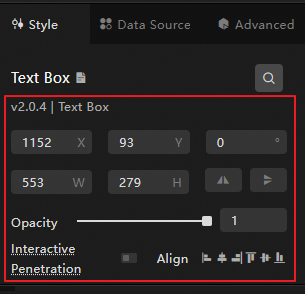
Global configuration | Defines the position distribution, transparency, and interaction penetration of the widget in the data dashboard.
|
|
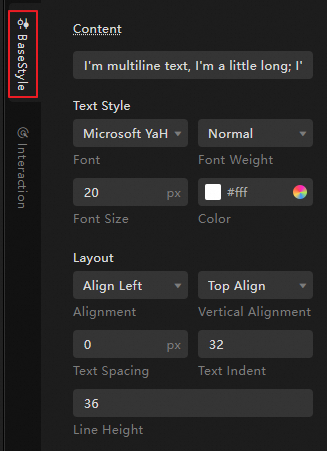
Basic style configuration | Defines the size, layout, color, and other styles of the text. |
|
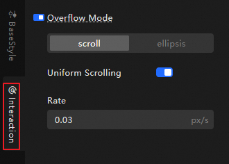
Interaction configuration | Defines the overflow method of the text. When the text content overflows, the following methods are supported:
Note If there is a lot of text content and the overflow configuration is not enabled, the overflow text will be truncated and cannot be viewed. |
|
Advanced configuration
Define the interaction between multiple lines of text and other widgets. The related configuration items are as follows.
Configuration item | Description | Illustration |
Interaction occurrence | Defines the interaction behavior with other widgets to achieve widget filter interaction. For example, when the content of the word cloud widget is updated, the related content will be synchronized and displayed in the multiple lines of text widget. Click the |
|
 icon to define the related interaction occurrence and interaction action.
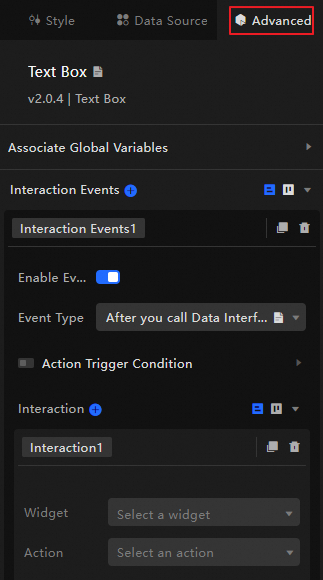
Blueprint interaction
Use the blueprint editor to visually define interaction relationships and behavior logic between widgets.
Procedure
On the canvas editing page, click the
 icon on the left side of the top menu bar to access the blueprint editor.
In the layer node list, hover over the multiple lines of text widget and click the
 icon to add it to the main canvas.
Configure the blueprint interaction effects for related widgets as needed.
Below is an example.

Configuration item introduction
The related interaction occurrences and actions are as follows.
Click the  icon after the corresponding occurrence or action on the right side of the blueprint configuration interface for a detailed introduction of related parameters.
Category | Subcategory | Description |
Occurrence | When Data Is Updated | This occurrence is thrown when the widget data is updated. |
When Request Status Changes | This occurrence is thrown when the request status changes. Status values include Void, Loading, Success, Error. | |
Action | Import Data | After processing the data according to the widget rendering format, import it into the widget for re-rendering. There is no need to request server data again. An example of the data is as follows. |
Request Data | Request server data again. The data thrown by the input data processing node or layer node will be used as parameters. For example, if the API data source configured for multiple lines of text is | |
Shift | Move the widget to the specified position. An example of the data is as follows. | |
Switch Visibility | Switch the widget to show or hide. An example of the data is as follows.
| |
Show | ||
Hide | ||
Update Widget Configuration | Dynamically update the style configuration of the widget.
|
Case demonstration
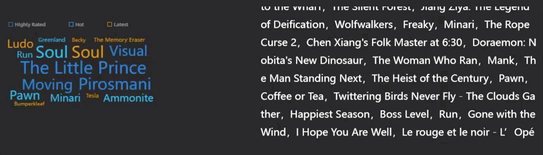
This case demonstrates obtaining content from the word cloud widget and displaying it in the multiple lines of text widget.
Add the widget to the canvas.
-
Access the DataV console.
Select any data dashboard, click Edit to enter the canvas editor.
In the list in the left-side navigation pane, click Word Cloud and Multiple Lines of Text to add the widgets to the canvas.
-
Configure the scrolling style of multiple lines of text.
Click Multiple Lines of Text on the canvas, and on the Interaction tab of the style panel, set the overflow method to uniform scrolling overflow with a speed of 0.05px/s.
Configure blueprint interaction.
Scroll and display the text obtained from the word cloud in the multiple lines of text widget using blueprint interaction.
Click the
 icon in the upper left corner of the page to enter the blueprint editor.
On the Layer Node tab on the left, hover over the widgetand click the
 icon to add the widget to the main canvas.
Perform this operation sequentially to add both the multiple lines of text and word cloud widgets to the main canvas.
On the Logic Node tab on the left, hover over the serial data processing node and click the
icon to add it to the main canvas.Connect the widgets as illustrated below to import the corresponding data into the multiple lines of text when the word cloud data updates.
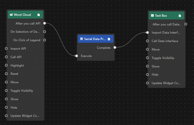
Click the serial data processing node to configure its processing method.
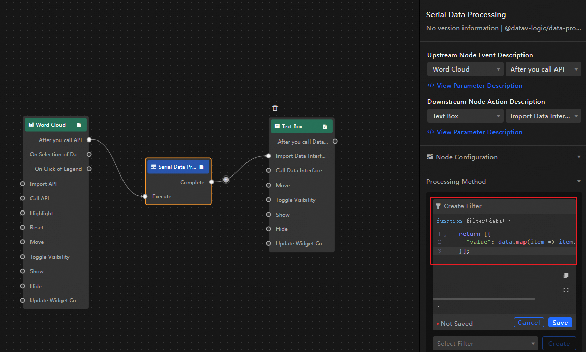
return [{"value": data.map(item => item.name).join(',')}]; // Retrieve the name field information in the word cloud widget in sequence.
Click Preview in the upper right corner of the page to preview the display result.
