This topic provides a guide on how to use the general title.
Overview
The general title is an information widget designed to convey the core content or important information of a module. In a data dashboard, you can use multiple general title widgets to display the titles or central ideas of various submodules in the dashboard.
Scenarios
The general title is commonly used in visualization applications to add titles and explanatory information to clarify the subject of related content, helping you to quickly and intuitively understand the core content. It also supports interaction with other widgets, allowing the title to control the presentation of different dimensional views or data content.
Effect Display
Static Title

Interactive Scenario

Link Jump
Prerequisites
A data dashboard has been created, supporting creation using a template, creation using a blank canvas.
Business data is prepared. For more information, see Data Source.
Add General Title
Access the DataV console.
In the , click the target dashboard to enter the canvas editing page.
In the list on the left-side navigation pane, click the General Title widget to add it to the canvas.
You can also use global search to add related widgets.
Integrate Business Data
After adding the widget, you can integrate the prepared business data into the widget for display. Click the general title and select the data to be presented by the widget on the Data Source tab on the right. 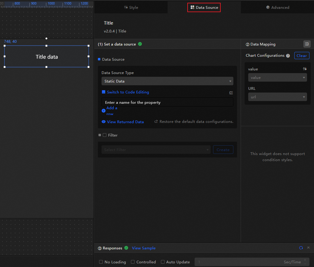
The data fields received by the general title are introduced as follows.
Field
Description
value(Optional) The content of the title. If not empty, it will overwrite the configuration in the style. If empty, it will use the content in the configuration item.
url(Optional) The hyperlink address for the title jump. If not empty, it will overwrite the configuration in the style. If empty, it will use the URL in the configuration item.
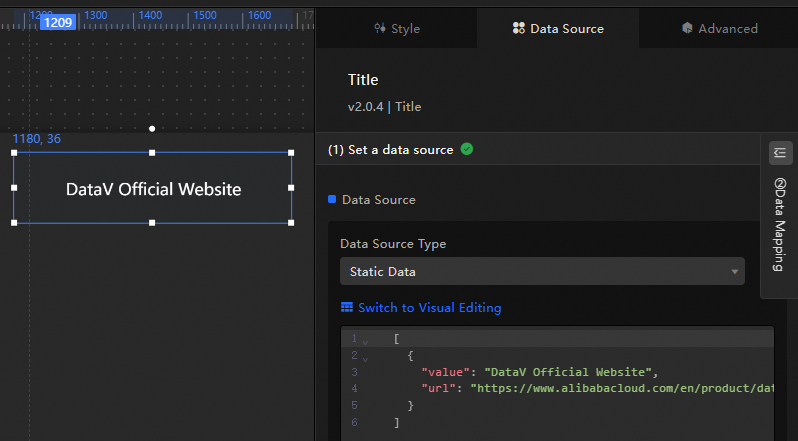
The data structure and effect display of the sample general title are as follows.
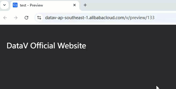
[
  {
    "value": "DataV Official Website",
    "url": "https://www.alibabacloud.com/en/product/datav?_p_lc=1&spm=a2c63.p38356.6791778070.263.36702771FLuZOw"
  }
]
In the preview or publish interface, click the widget to jump to the corresponding link.
The key configuration items for the data source are as follows.
Configuration Item
Description
Select Data Source
Supports integrating various types of data such as CSV files, APIs, and various databases. For more information, see Data Source. You can edit data fields using a visual table or code.
Configure Filter (Optional)
Used to customize filter code to achieve data structure transformation, filtering, display, and simple calculations. For more information, see Manage Data Filters.
Configure Data Mapping
Used to map fields from the selected data source to the corresponding fields of the widget to achieve real-time data matching. Click the
 icon to configure field styles.
View Response Results
Used to display the data integrated into the widget in real-time. When the widget data source changes, the latest data will be displayed here.
Click the data response result to view the code of the data fields written.
Click to view the example to see the array type and code example received by the data source. You can refer to the example to write related fields.
Other data request configurations:
Disable Loading State: When selected, the loading content during widget initialization will not be displayed when updating or previewing the data dashboard.
Controlled Mode: When selected, the widget will not request data in the initialization state. At this time, data requests can only be initiated through the blueprint editor or global variable events.
Automatic Update Request: When selected, the platform will dynamically poll and update data according to the polling time you set. If not selected, you need to manually refresh the page or trigger a request to update data through the blueprint editor and global variable events.
Configure General Title
Click the general title widget to configure the basic style, global variables, interaction occurrences, and other advanced configurations, along with blueprint interaction settings, on the right panel.
Style Configuration
On the Style panel, you can configure the text size, layout, background color, and other styles of the general title. The related configuration items are introduced as follows.
You can also click the  icon to search for keywords and quickly locate the required configuration items. The search supports fuzzy match. For more information, see search configuration items.
The related configuration items are introduced as follows.
Configuration Item | Description | Illustration |
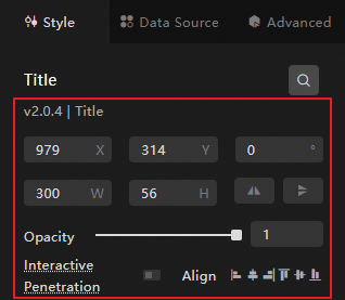
Global Configuration | Defines the position distribution, transparency, and interaction penetration of the widget in the data dashboard.
|
|
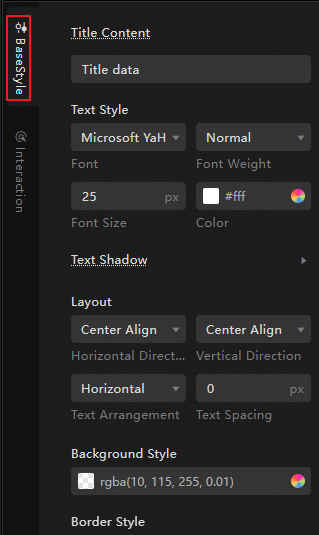
Basic Style Configuration | Defines the title content, text size, layout, color, and whether to use ellipsis for overflow. When overflow ellipsis is enabled, the overflowing text will be filled with ellipsis. |
|
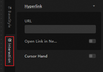
Interaction Configuration | Sets the hyperlink and gesture cursor for the general title.
|
|
Advanced Configuration
Defines the interaction and data transmission relationships between the general title and other widgets. The related configuration items are introduced as follows.
Configuration Item | Description | Illustration |
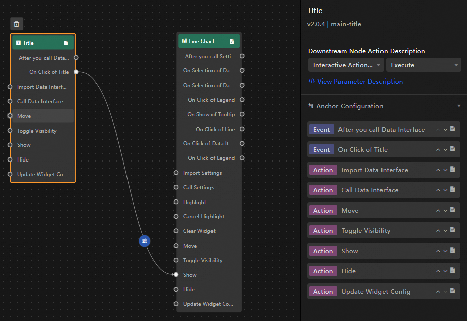
Interaction Occurrences | Defines the interaction behavior with other widgets to achieve widget linkage. Click the |
|
Associate Global Variables | Associates global parameters in the widget to achieve parameter transmission and widget interaction. Click the When Clicking The Title, a callback value will be thrown, by default throwing the |
 icon to define the related interaction occurrences and interaction actions.
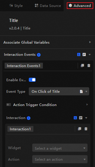
 icon to enable the corresponding instruction and associate the required
 Blueprint Interaction
Use the blueprint editor to define the interaction relationships and behavior logic between widgets using a visual connection method.
Procedure
On the canvas editing page, click the
 icon on the left side of the top menu bar to enter the blueprint editor.
In the layer node list, hover the mouse over the general title widget and click the
 icon to add the widget to the main canvas.
Configure the blueprint interaction effects of related widgets as needed through the connection method.
The example is as follows.
Configuration Item Introduction
The introduction of related interaction occurrences and actions is as follows.
You can also click the  icon after the corresponding event or action on the right side of the blueprint configuration interface to view the detailed introduction of related parameters.
Category | Subcategory | Description |
Event | When Data Updates | This event is thrown when the widget data updates. |
When Data Request Status Changes | This event is thrown when the data request status changes. Status values include Void, Loading, Success, Error. | |
When Clicking The Title | The event thrown when clicking the title, along with the corresponding data item. The data example is as follows. | |
Action | Import Data | After processing the data in the component rendering format, import it into the component and redraw it. There is no need to request server data again. The data example is as follows. |
Request Data | Request server data again. The data thrown by the input data processing node or layer node will be used as parameters. For example, if the API data source configured for the general title is | |
Shift | Move the widget to the specified position. The data example is as follows. | |
Switch Visibility | Switch the widget to show or hide. The data example is as follows.
| |
Show | ||
Hide | ||
Update Widget Configuration | Dynamically update the style configuration of the widget.
|
Demo
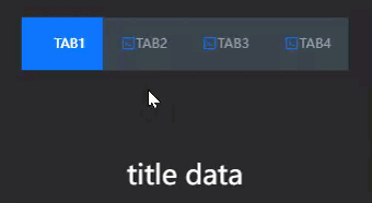
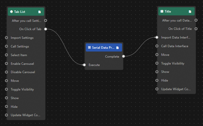
This demo uses the carousel function of the Tab list to achieve dynamic display of the general title.
Add widgets to the canvas.
-
Access the DataV console.
Select any data dashboard and click Edit to enter the canvas editor.
In the widget library on the left-side navigation pane, click the Tab List and General Title widgets to add them to the canvas.
-
Configure blueprint interaction.
Click the
 icon in the upper left corner of the page to enter the blueprint page.
On the Layer Node tab on the left, hover the mouse over the widget and click the
 icon to add the widget to the main canvas.
You need to perform this operation in sequence to add the general title and Tab list widgets to the main canvas.
On the Logic Node tab on the left, hover the mouse over the serial data processing node and click the
icon to add the widget to the main canvas.Connect the widgets as shown below to import the corresponding data into the general title when clicking theTab list.
Click the serial data processing node to configure the processing method of the node.
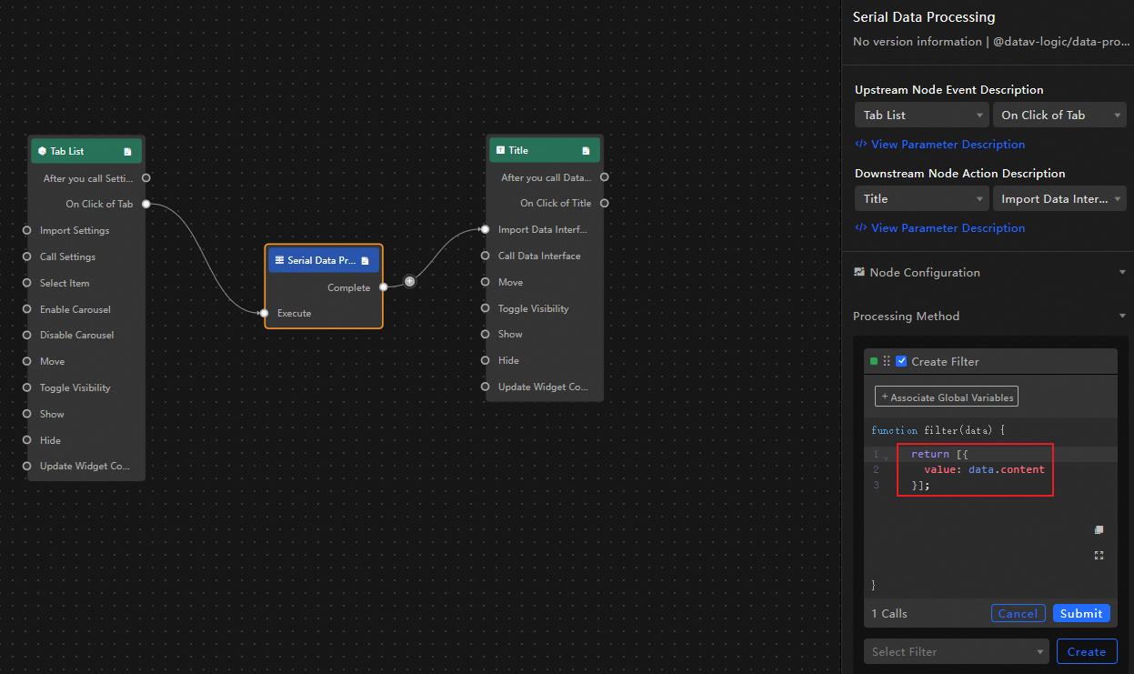
return [{value:data.content}];
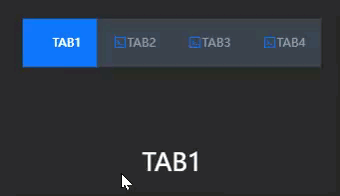
Click Preview in the upper right corner of the page to preview the display result.
(Optional) If you need to jump to a specific Tab page, you can add a Condition Judgement node before the serial data processing node to execute the processing method when the condition is met. If not met, the default value is displayed. For example, do not display the content of the first Tab page.
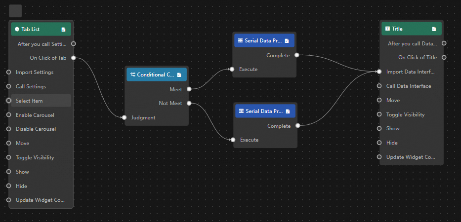
Condition Judgement Node
return data.id > 1;Serial Data Processing: Met
return [{value:data.content}];Serial Data Processing: Not Met
return [{value: "I am title data"}];
Click Preview in the upper right corner of the page to preview the display result.