This topic describes the configuration items of the choropleth layer.
Chart style
The regional thermal layer is a sub-component of the basic flat map 3.0. It supports independent styles, data, and interaction configurations, including regional labels, colors, edges, mouse interaction events, and location information. It can represent geographic regional information in the form of thermal regions. 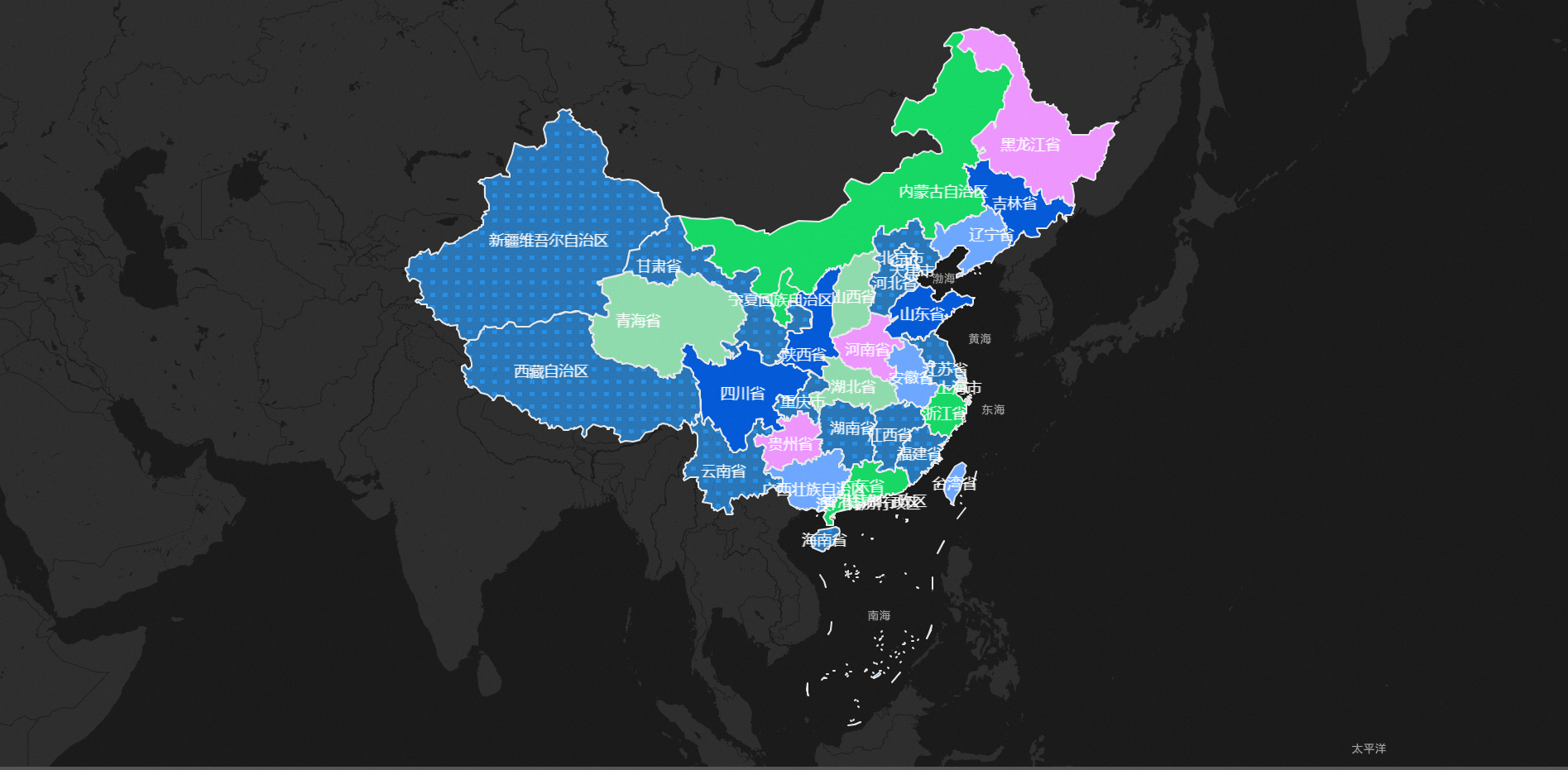
Style Panel 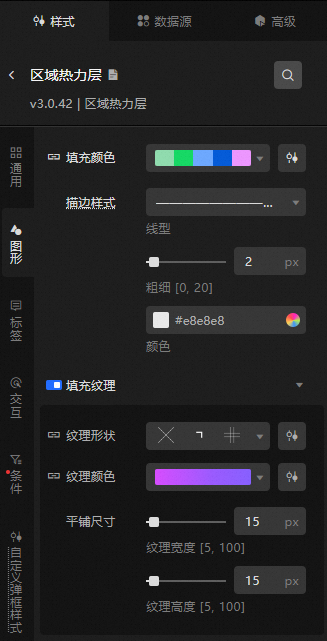
Search Configuration: Click the Search configuration items icon
 in the upper-right corner of the Style panel. In the Search Configuration panel, enter the name of the configuration items that you want to search for and locate the configuration items. Fuzzy match is supported. For more information, see Search configuration items.
 General: Configure common parameters for the regional heating layer.
Metric
description
Visible Level
Set the visibility level of the zone heat layer. The zone heat layer is visible within the specified level range, but not visible outside the level range.
Opacity
Sets the opacity value of the regional heat layer. The value range is 0 to 100, in %. The larger the number, the more opaque the heat layer style.
Graphic: Set the graphic style parameters for the area heat layer. Area fill color and edge style parameters.
Metric
description
Fill Color
The color of the area corresponding to the maximum, minimum, and empty value values in the data. For more information about how to configure the color mapper for different regions, see Use the color mapper.
Stroke Style
The color, thickness, and line type of the edge of each area of the regional thermal layer.
NoteThe line type supports numeric input, such as 4,4. The first number indicates the length of the solid line, and the second number indicates the length of the interval.
Fill Texture
Click the
 icon on the left side of Fill Texture to control the display of the fill texture style of the area block.
 Texture Shape: the shape of the texture in different regions. For more information, see Use the shape mapper.
Texture Color: For more information, see Use the color mapper.
Tile Size: the tile size of the region texture. You can adjust the width and height of the texture. Unit: pixels.
Label: Set the label configuration items parameter for the area at the area thermal layer.
Display Label: the label style of the area. You can click the
icon to the left of Display Label to display or hide the label. Display Mode: the display mode of the area label. Valid values: Full Display, Click, and Hover.
Content Style: The content style parameter of the region tag is configuration items.
Metric
description
Style per line
Click the
 or
or  icon on the right side of Style per Line to add or delete a style for each line. Click the
  or
or  icon to configure the arrangement of multiple content styles per row. Click the
  icon to copy the current selected content style configuration and add a new line of content with the same configuration.
 Row Field: the name of the row field. The name must match the field in the data panel.
Field Style: Specify the style of the line field, including the font style, font size, color, and weight of the field.
Field Prefix: specifies the content, interval, font, font size, color, and weight of the field. Click the
icon to the left of Field Prefix to control the display of Field Prefix. Field Suffix: Specify the content, interval, font, font size, color, and weight of the field suffix. Click the
icon to the left of Field Suffix to control the value of Field Suffix.
Field Width
The width of the field that is displayed in the area label. You can select Adaptive or Fixed Width to specify the width of the field. Unit: pixels.
Row height ratio
The row height ratio value of the area label. Valid values: 1 to 2.
Content Stroke
The content stroke style of the area label, including the color and weight of the stroke. You can click the
icon to the left of Content Stroke to control the appearance or concealment of the Content Stroke. Content Shadow
The content shadow style of the area label, including the shadow color, shadow blur value, and shadow offset value in the x and y directions. Click the
icon to the left of the content shadow to control the visibility of the content shadow. Background Style: Set the background style of an area tag. You can click the
icon to the left of Background Style to control the appearance or appearance of the Background Style. Metric
description
Background Type
The type of the tag background. You can select Vector or Image.
Background Color
The background color of the tag. This field is available only when you select Vector for Background Type.
Border Style
Sets the style of the label border, including the line type of the border, the value of the line width, and the color. This parameter is available only when you set the Background Type parameter to Vector.
Border Fillet
Specifies the value of the rounded corners of the label border in four directions, in px. This parameter is available only when you set the Background Type parameter to Vector.
Image Template
The template style of the background image. This parameter is available only when you set Image Template to Image.
Opacity
The opacity of the background image. Valid values: 0 to 100. This parameter is available only when you select Image for Image Template.
Content Margin
Set the distance between the content in the label and the top, bottom, left, and right.
Interaction: the interaction configuration items at the regional thermal layer.
graphical interaction
Metric
description
Click to focus
Click the icon on the left
to enable or disable the click-to-focus interaction function. If this feature is enabled, you can click the area to focus on a certain scale based on the area position. You can see the effect only when you preview or publish. Hover Style
Click the
icon on the left of Hover Style to enable or disable the hover interaction feature. If you turn on this switch, you can set the fill color, stroke color, and thickness of the area when you move the pointer over. You can see the effect only when you preview or publish.
Condition: the description of the condition style.
Conditional Style: Click the
or icon to add or remove a conditional style. Click the or icon to configure the arrangement style of multiple conditional styles. Click the icon to copy the selected conditional style configuration and add a conditional style. For more information about how to configure a conditional tree, see Usage notes. Graphic: If you turn on the switch, you can configure the graphic configuration items of the style. If you turn off the switch, you cannot configure the graphic configuration items of the style.
Metric
description
Fill Color
Click the
icon to the left of Fill Color to control the color of the area. Fill Texture
Click the
icon on the left of Fill Texture to control the display of the fill texture in the specified area. Texture Shape: Click the
icon to the left of Texture Shape to specify whether to display the texture shape in the specified area. Texture Color: Click the
icon to the left of Texture Color to control the color of the texture in the specified area. Tile Size: You can click the
icon to the left of Tile Size to specify whether to display the tile size in the specified area. Includes the width and height values of the adjustable texture in px.
Custom pop-up style: Set the custom pop-up style parameters at the regional heating layer.
Metric
description
Bomb switch
If you turn on the switch, you can click or hover to trigger the pop-up.
Display Mode
The display mode of the pop-up box at the regional heating layer. You can select one of the following options: Click and Hover.
Relative Offset
The horizontal and vertical pixel offsets of the pop-up window. Valid values: -1000 to 1000. Unit: pixels.
Text Style
Set the text style in the dialog box, including the font style, font size, color, and weight of the text.
Display Nulls
If you turn on the switch, the pop-up box can be displayed as "No Data" on an object with no
infofield or an emptyinfofield.Box Style
Pin: the distance between the content of the pop-up text and the left and right sides.
Border Style: Specify the rounded corners, line width, and color of the popup border.
Background Color: Set the background color of the dialog box.
Projection Style: Specify the blur color, blur radius, X offset, and Y offset for the pop-up projection.
Close Button: If you turn on the switch, the Close button and the color of the button are displayed in a pop-up box at the regional heating layer.
Pointing Arrow: If you turn on the switch, a pointing arrow appears in the dialog box of the zone layer.
Data Sources panel 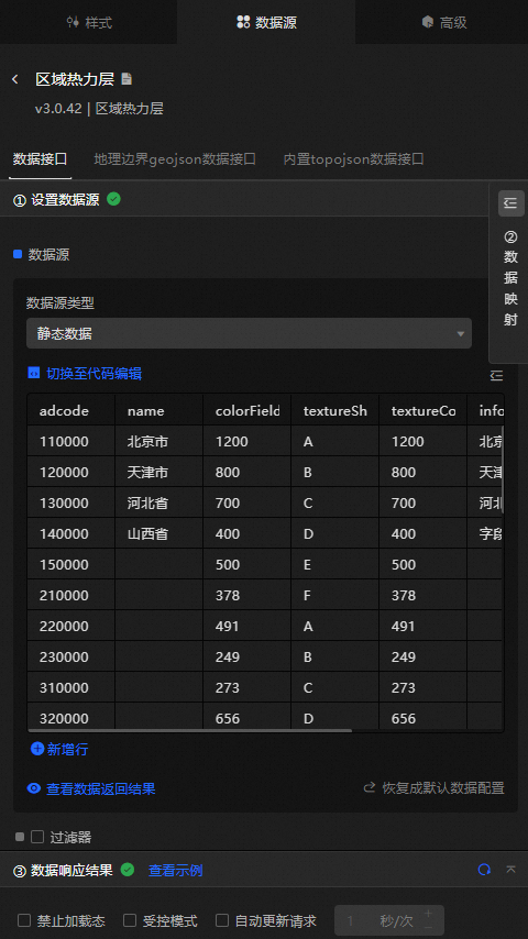
Data operations
You can customize the style of the regional thermal layer by configuring the data interface. The regional thermal layer supports data-first rendering.
On the Data tab of the Regional Thermal Layer component, select Data Interface.
Click Configure Data Source. In the Configure Data Source panel, set Data Source Type to Static Data. The following table describes the parameters.
Column
Description
adcodeThe adcode number of the region, which can be obtained by DataV.GeoAtlas.
name(Optional) The name of the region.
valueOptional. The value of the area. This parameter can be used together with the maximum, minimum, and no data configuration items values of the fill color in the configuration panel to control the color of the corresponding area.
NoteThe scale interval is obtained based on the value interval of the data to calculate the color gradient interval from the largest to the smallest.
geometry(Optional) Plane spatial data for the region.
colorField(Optional) The color mapping field for the region.
textureShapeField(Optional) The texture shape map field for the region.
textureColorField(Optional) The texture color mapping field for the region.
popupTypeOptional. The type of the pop-up window. The pop-up window must be used with the secondary development feature.
infoOptional. Customize the content of the pop-up window.
Data application.
Configure the extracted data to DataV as follows.
On the Data Source tab of the Regional Thermal Layer component, select Geo Boundary Geojson Data Interface.
In the Set Data Source panel, set Data Source Type to API.
Paste the extracted JSON API into the data input area.
In the preceding figure, the boundary information of the subareas in Zhaoqing is extracted. The sample API is as follows:
https://geo.datav.aliyun.com/areas/bound/441200_full.jsonPublish the project on the dashboard. You can view the configured regional thermal layer.
During data configuration, the area text label may be offset. The solution is as follows.
Check the version of your regional thermal layer. Currently, available regional thermal layer components include regional thermal layer v0.2.4 and later. If you use an earlier version of a regional thermal layer, you must delete the layer and add it again.
The data in the GeoJSON extraction tool has been updated. You must use the new GeoJSON data file.
The parameters that you want to modify.
For example, the GeoJSON data of Zhaoqing City at the district and county level is marked with an offset in the text of Gaoyao District.
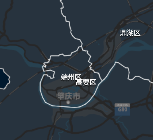
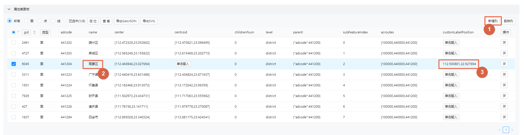
Use the DataV.GeoAtlas boundary generator tool to upload the GeoJSON data file of Zhaoqing at the district and county level, and add customLabelPosition property parameters in the Property Sheet panel.
In the Property Sheet panel, find the parameters in the Highlights section, edit and add a column of customLabelPosition attribute column, and add custom "customLabelPosition": [112.500801,22.927694] properties.
Modifying Attributes
 Viewing Modified Attributes
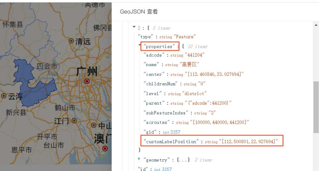
After you save the modifications, download the GeoJSON file to your local computer and upload the GeoJSON file to your server or OSS to generate a new API.
Choose Regional Thermal Layer Data > Data Interface.
In the Set Data Source panel, set Data Source Type to API.
Paste the newly generated JSON API URL into the data input field. After the configuration is complete, the Highlights label is displayed as expected.
Configure data items | Description |
Data sources | You can use the code editor or visual editor to view the data fields contained in the widget. You can also modify the data type to flexibly configure the component data. |
Data Mapping | If you need to customize chart field configurations, you can set different field mapping content in the Data Mapping module and field mapping these content to the corresponding fields of the widget. This allows you to match data without modifying the fields in the data source. You can also click the |
Configure a filter | Turn on Filter, select an existing data filter or create a data filter, and configure a data filter script to filter data. For more information, see Manage data filters. |
Data Response Result | The Data Response Result section displays widget data in real time. If the data source of the widget changes, this section displays the latest data. If the system response is delayed, you can click the |
Forbid Loading | If you select the check box, you will not see the loaded content during component initialization when you update the component and preview the data kanban. If you select the check box, the opposite is true. By default, the status is deselected. |
Controlled Mode | If you select the check box, the component does not request data in the initialized state, and only requests data by using global variables or the method configured in Blueprint Editor. If you clear the check box, you can use automatic update to request data. By default, the status is deselected. |
Auto Data Request | Select the check box to manually enter the time frequency of polling to set dynamic polling. If you clear the page, the page is not automatically updated. You need to manually refresh the page or use Blueprint Editor and global variable events to trigger a request to update data. |
 icon to configure the field style.
  icon on the right to view the data response result. You can also click the
  icon on the right to obtain the latest data of the widget. You can also click View Example to view an example of the response result of the current component.
 Advanced Panel 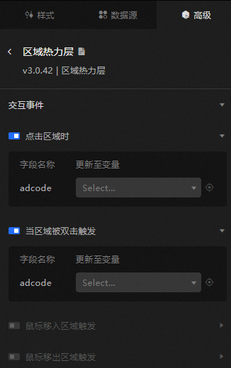
Turn on the switch to enable the widget interaction feature. You can click, double-click, move the mouse in, or move the mouse out of an area to trigger a data request and throw a temporary variable to dynamically load data in different areas when you click, double-click, or move the mouse in or out of an area. By default, the adcode value of the clicked region is displayed. For more information, see Component interaction configuration.
Blueprint Interaction
Click the
 icon in the upper-left corner to go to the Blueprint page.
 On the Layer Nodes tab, add the widget to the main canvas.
View blueprint configuration parameters.
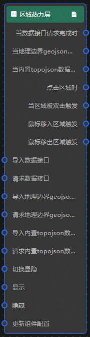
Event
Event
Description
When the data interface request is completed
The event is triggered with the processed JSON data after a data interface request is responded and processed by a filter. For more information about specific data examples, see the Data Response Result section of the Data Source tab in the right-side configuration panel of the canvas editor.
When a geo-boundary geojson data interface request is completed
The event that is thrown after the geo-boundary geojson data interface request is returned and processed by the filter. It also throws the processed JSON-formatted data. For more information about specific data examples, see the Data Response Result section of the Data Source tab in the right-side configuration panel of the canvas editor.
When the built-in topojson data interface request is completed
The built-in topojson data interface requests the event that is returned and processed by the filter. It also throws the processed JSON data. For more information about specific data examples, see the Data Response Result section of the Data Source tab in the right-side configuration panel of the canvas editor.
When you click a region
Thrown when an area of the regional thermal layer is clicked.
Triggers when a region is double-clicked
Data is thrown when an area of the regional thermal layer is triggered by double-clicking.
Triggered by moving the mouse into a region
Triggers an event and throws data when the mouse moves into an area block in the area heat layer.
Trigger when the mouse moves out of the region
Triggers an event and throws data when the mouse moves out of an area block in the area heat layer.
Action
Action
Description
Import data
After data of a widget is processed in accordance with its drawing format, the widget is imported for redrawing. You do not need to request server data again. For more information about specific data examples, see the Data Response Result section of the Data Source tab in the right-side configuration panel of the canvas editor.
Request Data Interface
This action is performed to request the server data again. The data sent by an upstream data processing node or layer node is used as a parameter. For example, if the API data source is
https://api.testand the data transferred to the request data interface is{ id: '1'}, the final request interface ishttps://api.test?id=1.Import geo-boundary geojson data interface
After data of a widget is processed in accordance with its drawing format, the widget is imported for redrawing. You do not need to request server data again. For more information about specific data examples, see the Data Response Result section of the Data Source tab in the right-side configuration panel of the canvas editor.
Request geo-boundary geojson data interface
This action is performed to request the server data again. The data sent by an upstream data processing node or layer node is used as a parameter. For example, if the API data source is
https://api.testand the data passed to the request geographic boundary geojson data interface is{ id: '1'}, the final request interface ishttps://api.test?id=1.Import built-in topojson data interface
After data of a widget is processed in accordance with its drawing format, the widget is imported for redrawing. You do not need to request server data again. For more information about specific data examples, see the Data Response Result section of the Data Source tab in the right-side configuration panel of the canvas editor.
Request a built-in topojson interface
This action is performed to request the server data again. The data sent by an upstream data processing node or layer node is used as a parameter. For example, if the API data source is
https://api.testand the data passed to the request built-in topojson data interface is{ id: '1'}, the final request interface ishttps://api.test?id=1.Switch Display /Hash
Specifies whether to show or hide a widget. No parameters are required.
Display
Display the widget. For more information, see Data example.
{
  "animationType": "",// The animation method. Valid value: fade. If you do not specify this parameter, no animation is generated.
  "animationDuration": 1000,// The animation delay. Unit: ms.
  "animationEasing": ""// animation curve
}
Hide
Hide the component. For more information, see Data example.
{
  "animationType": "",// The animation method. Valid value: fade. If you do not specify this parameter, no animation is generated.
  "animationDuration": 1000,// The animation delay. Unit: ms.
  "animationEasing": ""// animation curve
}
Update component configurations
Style configurations of widgets are dynamically updated. In the Style panel, click Copy Configuration to Clipboard to obtain the configuration data of the widget. After that, change the style field for the data processing node in Blueprint Editor.