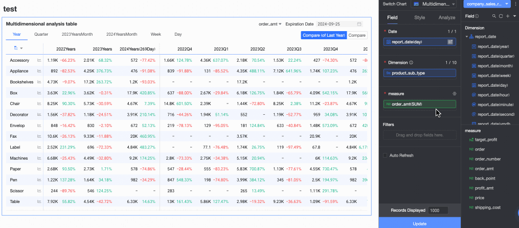
The multidimensional analysis table is a powerful data visualization component in Quick BI, belonging to the table chart category. Unlike trend analysis tables that focus on metric changes over time, multidimensional analysis tables introduce dimension fields on the basis of time series analysis. This allows users to not only see how various metrics (measures) change across different time granularities (such as day, week, month), but also gain insights into data from multiple business dimensions (such as region, product category, channel), analyzing data performance and mutual influences across different dimension combinations at the same time point. It is particularly suitable for complex scenarios requiring multi-angle business analysis, user behavior analysis, and more.
Chart Overview
Scenarios
Compared to the trend analysis table which focuses on displaying data trends over time from a purely metric/measure perspective, the multidimensional analysis table extends the ability to analyze the mutual influence and combined effects of data across different dimensions at the same time point by introducing dimension fields.
Sample Effect

Core Advantages
Multi-dimensional cross analysis: Supports the simultaneous introduction of time and multiple business dimensions for cross analysis.
Balance between trends and structure: Can display both time trends and reveal data structure across different dimensions.
Limits
Prerequisites
You have completed data modeling. The dataset must contain a date field with day granularity, such as Order Date (day). For more information, see Create a dataset.
Create a dashboard. For more information, see Create a dashboard.
Field configuration limits
The number of columns in a multidimensional analysis table is determined by the date field and the number of time periods. You can select only one date field with day granularity. The number of time periods cannot exceed 100.
The number of rows in a multidimensional analysis table is determined by the number of dimension values and the number of measure fields. You must select at least one dimension and a maximum of 10 dimensions. You must select at least one measure and a maximum of 50 measures.
The number of measures × the number of dimension values in the chart cannot exceed 200,000.
The number of cells in the chart cannot exceed 2,000,000.
Calculation limits: The "Display xxx rows" setting only affects the frontend display and does not reduce the number of cells calculated by the backend. This is because of the special calculation logic of the table. If your table reports an error because the number of cells or the product of dimension values and measures exceeds the limit, you must reduce the number of dimension and measure fields. Alternatively, you can change the data retrieval method to Incremental Data Retrieval.
Configure Chart Fields
On the Chart Design > Fields tab, select the required dimension fields and measure fields.
In the Date list, find the field with the dimension of Date (day), and double-click or drag it to the Date area.
In the Dimensions list, find the Dimension Fields, and double-click or drag them to the Dimensions area one by one.
In the Measures list, find the Measure Fields, and double-click or drag them to the Measures area one by one.
Based on your analysis requirements, configure sorting, aggregation methods, advanced calculations, and other settings for the chart fields. You can set sorting for measure fields within a specified time period, as shown in the following figure.
For more information about chart field configuration, see Configure chart fields.
Click Update, and the system automatically updates the chart.

Configure Chart Styles
On the Style tab, configure the style of the multidimensional analysis table. For information about common chart style configurations, see Configure the chart title.

In the Table Basic Style section, configure the basic style items of the table.

Configuration item
Description
Custom table theme
Sets the appearance style of the multidimensional analysis table.
Theme style: Supports four types: Default, Border, Simple, and Minimalist.
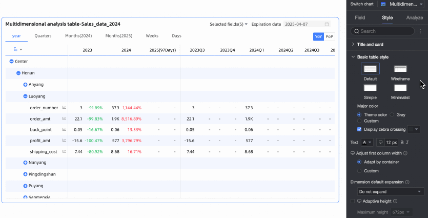
Main color scheme: When the table theme style is Default, Border, or Simple, you can select the main color scheme for the multidimensional analysis table. Options include following the Theme Color, Gray, or Custom.
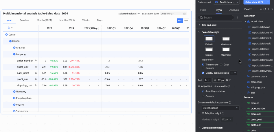
Display zebra stripes: Choose whether to display zebra stripes in the multidimensional analysis table and their color.
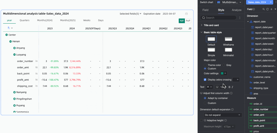
First column width adjustment
Sets the width of the first column in the trend analysis table. You can switch the preview mode
 at the top of the page to set the first column width for the trend analysis table on PC and mobile devices. The supported adjustment methods include the following:
Adapt to container: The system automatically adapts the column width based on the field values.
Custom: Set the display width of field values. Unit: pixels. Default value: 160.
Default dimension expansion: Supports custom setting of dimension expansion levels, with a maximum of 3 levels. This configuration item takes effect on both PC and mobile devices.
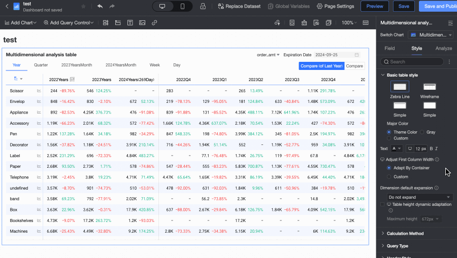
Table height dynamic adaptation
Sets whether the table height automatically adjusts based on the table content.
You can switch between PC and mobile device settings by clicking the
 icon at the top of the page. When this feature is enabled, the table container height will automatically adjust based on the data content, which may affect the overall layout of the report. Please decide whether to enable it based on your actual needs.
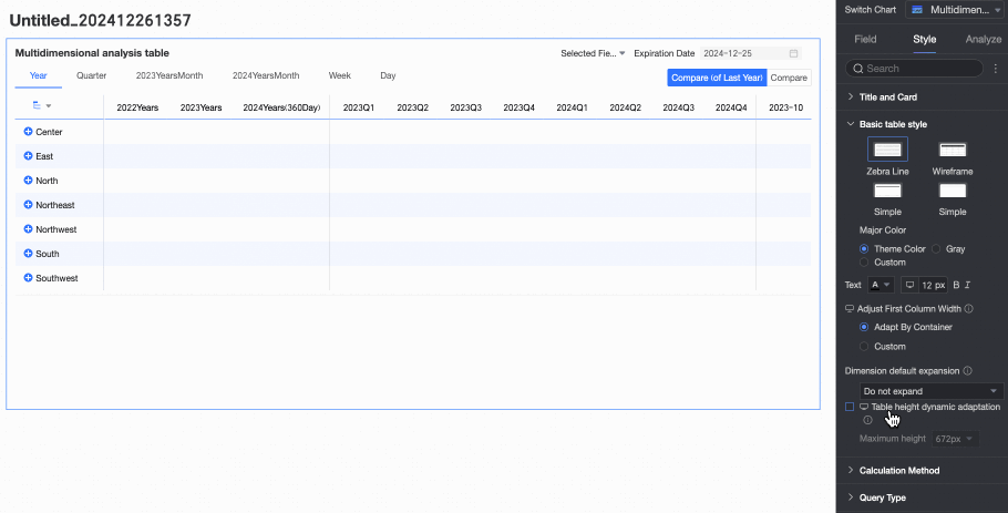
When table height dynamic adaptation is enabled, you can set the maximum value for the adaptive height. After setting, the table will adjust its height based on the set maximum height value during dynamic adaptation. That is, when the adaptive height is greater than the maximum height, the table height takes the maximum height; when the adaptive height is less than the maximum height, the table height takes the adaptive height.
You can switch between PC and mobile device settings by clicking the
icon at the top of the page. The supported heights include the following: 192px (about 5 rows), 352px (about 10 rows), 672px (about 20 rows), 1632px (about 50 rows), and custom.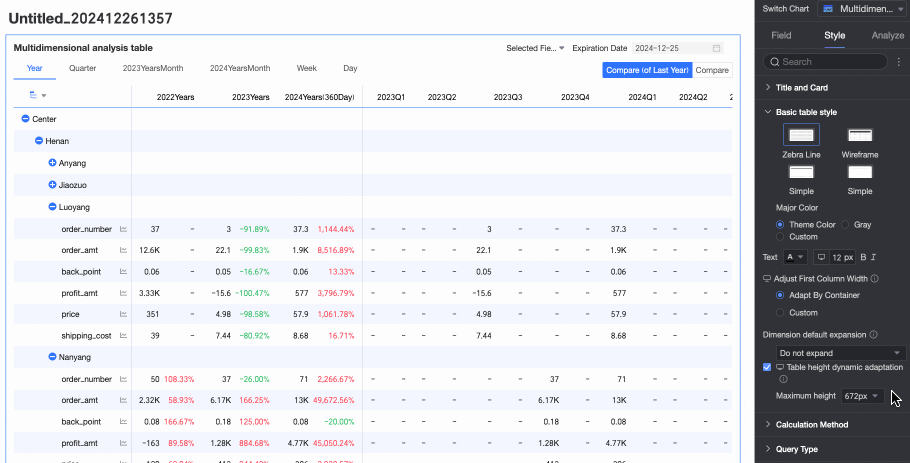
In the Calculation Method section, set the calculation method for the multidimensional analysis table.

Configuration item
Description
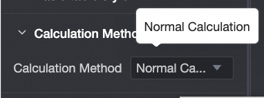
Calculation method
Supports setting the calculation method for the multidimensional analysis table.
The calculation method can be Average/Cumulative or Regular Calculation. The default is Average/Cumulative.
NoteFor data sources that support regular calculation and average/cumulative, see Data Source Function Item List.
If you click Average/Cumulative, you need to configure related settings. If you switch to Regular Calculation, no configuration is needed.
NoteRegular Calculation: Quick BI aggregates data within the date range of week/month/quarter/year/custom date granularity according to the aggregation method configured for the metric (such as month range, calculation method is month cumulative numerator/month cumulative denominator). It is suitable for scenarios where you need to analyze data changes within a certain time range.

Select Enable Average/Cumulative Switch, and the chart will display the Average and Cumulative toggle buttons in the upper right corner. The button color will follow the settings in the table's Main Color Scheme.

Select the Custom Average/Cumulative Switch checkbox to manually set the Average/Cumulative calculation method for each measure.

In the Data Retrieval Method section, set how the table loads data. You can choose Full Data Retrieval or Incremental Data Retrieval.

Full Data Retrieval: The table loads all data at once when it is loaded, subject to the result display quantity limit configured in the field panel (maximum 10,000). Data exceeding the limit will not be retrieved. This is suitable for scenarios with a small overall data volume or a relatively simple table structure.
Incremental Data Retrieval: After the table initially loads data, each time a new node is expanded, a new data retrieval action is performed. Each retrieval is subject to the result display limit configured in the field panel (maximum 10,000), but the overall data retrieval quantity of the table can exceed the limit through multiple retrievals. This is suitable for scenarios with large table data volumes and complex structures.
In the Header Style section, set the style of row and column headers.

Configuration item
Content
Description
Column header
Background fill
Sets the background fill color for column headers.
Text
Sets the text style for column headers.
Row header
Background fill
Sets the background fill color for row headers.
Text
Sets the text style for row headers.
In the Time Period section, set the period switching and default end date value.

Configuration item
Description
Time period switching
Supports switching by Year, Quarter, Month, Week, Day, Fiscal Year, and also supports Custom Time Granularity periods.
 Note
Note1. Supports configuring the Fiscal Year Cycle Start Month, which can be selected from January to December, with April as the default.

2. Week range definition: When the calculation method is "Regular Calculation", or the aggregation method is "Start Time Point" or "Last Time Point", you need to download the function script and run it on the corresponding data source for custom weeks.
For the list of data sources that currently support custom weeks (week start time), see Data Source Function Item List.
Default end date value
Set Display Date Filter and set the default value. When you select the Display Date Filter checkbox, End Date will appear in the upper right corner of the chart.
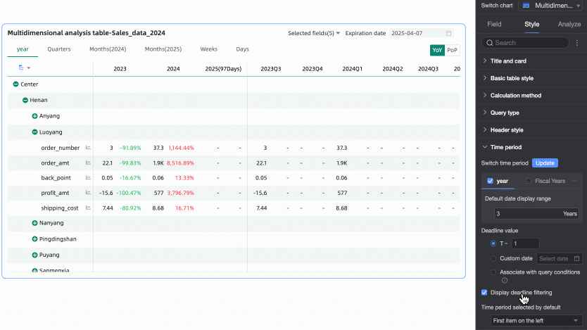
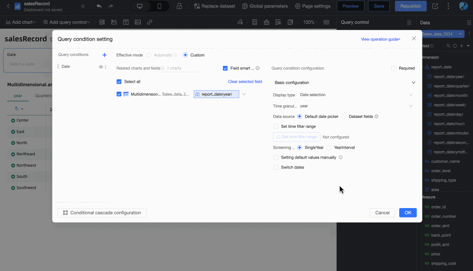
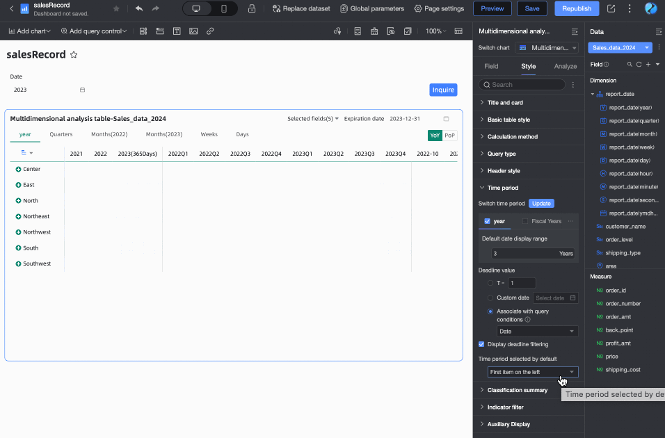
The End Date Value can be set to T-X, Custom Date, or Associated with Query Condition.
T-1: The deadline value is the Xth day counting backward from the current time (Today). The value of X can only be a positive integer. For example, when X is 1 and the current time is 2024-1-16, the deadline displays 2024-1-15.
Custom Date: The end date value is customized as needed.
Associated with Query Condition: The end date value is associated with the time-type query condition of the current table. During preview, the corresponding value of the selected query condition will be written into the table's end date to improve data viewing efficiency. This is suitable for scenarios such as using query controls to control the data display range of multiple trend/multidimensional analysis tables. The specific rules are:
When adding a regular query control to the dashboard, you need to select the associated chart and its date field in the Associated Charts and Fields section, and the query control's Display Type must be Date Selection.

When the query condition's Filter Method is Range, the Range Type cannot be Starting From, but other options are available (i.e., it should include a time that can be parsed as an end date). After selection, the end date will take the end date of the range. For example: if the range is set to October 19, 2023 - November 30, 2023, the end date will be November 30, 2023.
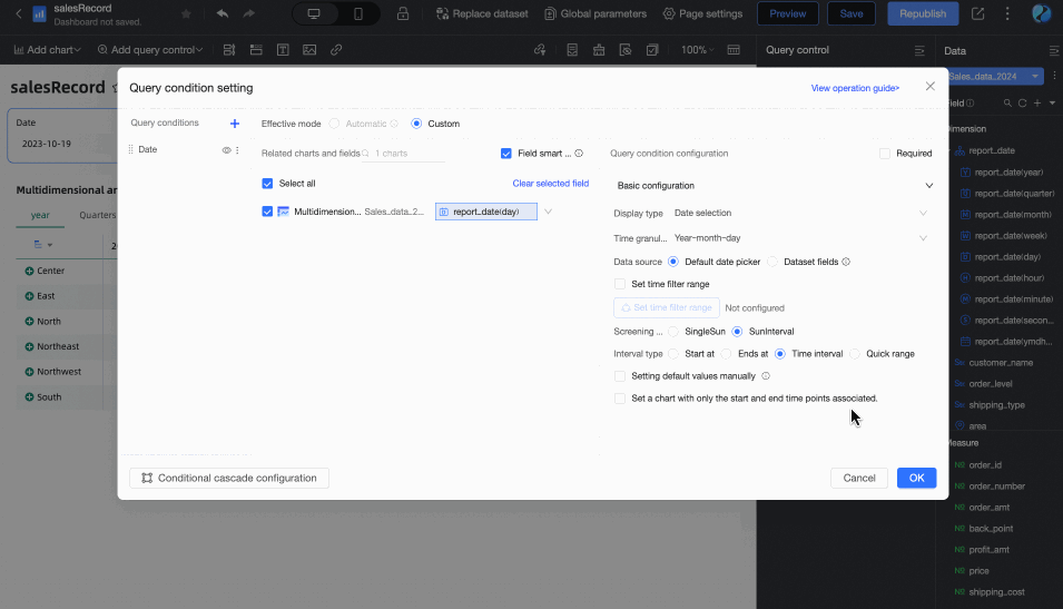
When the query condition's Filter Method is Single Day/Month/Year, the end date will take its last day. For example: the last day of 2024, the last day of December.
When Associated with Query Condition is selected, but no specific query condition is set in the dropdown list, the end date is considered to be T-X. For example: if today is December 13, 2024, the end date will be December 12, 2024.
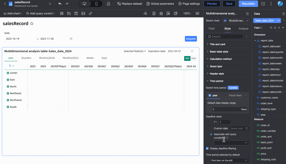
Default selected time period
You can customize the Default Time Period option. The default is the first item on the left.
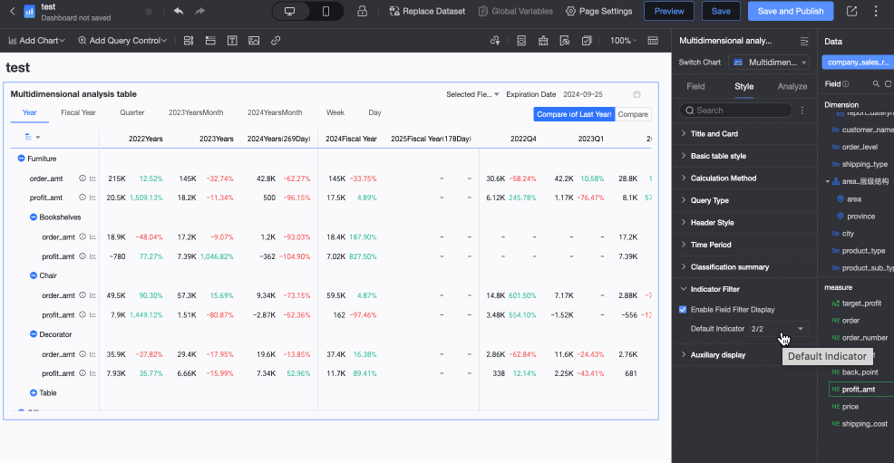
Supports custom configuration of Category Summary.

In the Metric Filtering section, you can change the Default Selected Value of fields according to your needs.
In the Auxiliary Display section, you can set the Scrollbar Display Method and Scrollbar Thickness.
When you set the display method to Show on Mouse Hover, the scrollbar is only displayed when you place your mouse on the table.
When you need the scrollbar to be always visible, you can select Always Show.
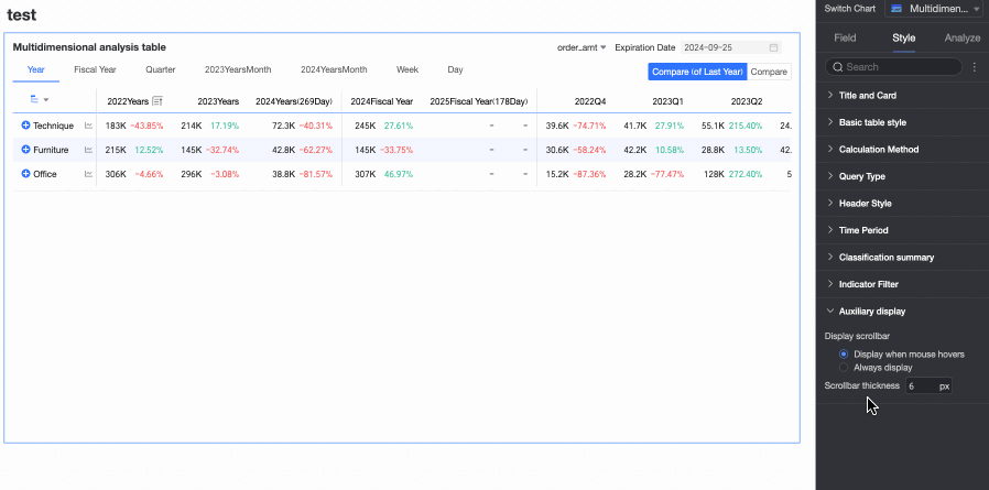
When you need to make the scrollbar more noticeable, you can adjust the thickness of the scrollbar.
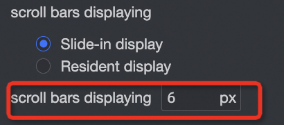
Chart analysis Configuration
In the Data Interaction section of the Analysis tab, the multidimensional analysis table only supports being triggered by other charts for linkage.

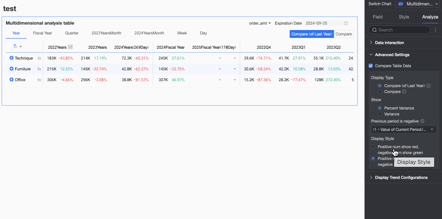
In the Advanced Settings section of the Analysis tab, configure data comparison for trend analysis.
Select the Enable Table Data Comparison checkbox, and Year-on-year and Chain Ratio will appear in the upper right corner of the chart.

Display Type: Supports two types of comparison content: Year-on-year and Chain Ratio.
NoteThe date fields that are used in the trend analysis fact table are of the day granularity. Therefore, you can configure the Year-on-year and Chain ratio parameters for data of the day, week, month, quarter, and year granularities, and custom periods. You can compare data as needed.
Display Content: Supports Difference Percentage and Difference Value.

Difference Value = Current period data - Previous period data.
Difference Percentage = [(Current period data - Previous period data) / Previous period data] × 100%
Display Style: Supports configuring the display style for positive and negative numbers. Options include Follow Global Semantic Color Settings (i.e., follow the settings in Page Settings > Global Style > Semantic Colors), Positive Numbers in Red, Negative Numbers in Green, and Positive Numbers in Green, Negative Numbers in Red.
Configure Trend Analysis
Click the trend icon in the chart (as shown in ① below) to see the trend analysis chart for that metric (②).

You can configure the trend analysis chart in the Popup Trend Settings section of the Analysis tab in Chart Design.

Configuration item | Description |
Start The Daily Trend and Start Monthly Trend | After you turn on Start the daily trend and Start monthly trend, you can view the daily trend and monthly trend of the metric on the trend analysis chart. |
Data Comparison Analysis | Includes Same Period Last Year, Same Period Last Month, Same Period Last Week, Previous Day, and Custom Date.
|
Special Value And Other Analysis | Includes Remove Peak, Mean Line, and Normalization. You can analyze special values for data analysis and decision-making. |
Comparison Metrics, Comparison Dimensions | You can select multiple metrics or dimensions simultaneously for data analysis.
Note After configuring comparison dimensions, comparison periods and reference lines will be disabled. |

Chart Preview Configuration
On the preview page of the multidimensional analysis table, you can adjust the display effect of the table to improve data viewing efficiency and experience.
Hide Empty Value Columns
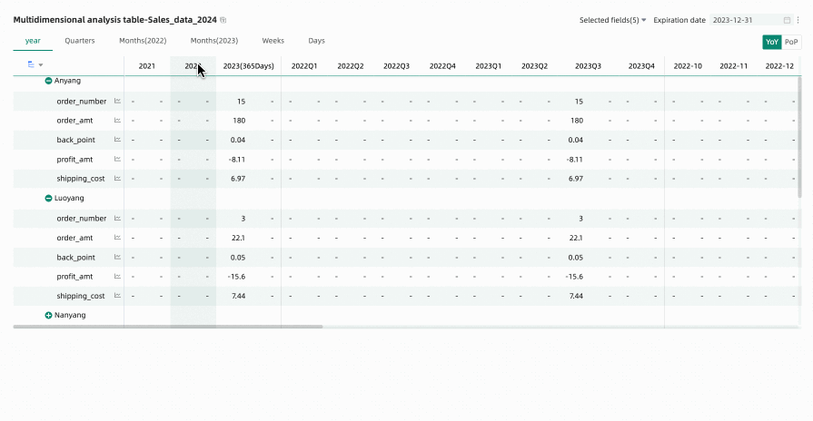
When previewing a multidimensional analysis table, if you have performed time filtering or other operations, many empty columns may appear (because they do not display data as they are not within the filtered time range). In this case, you can use the hide all empty value columns feature to quickly hide interfering columns. You can choose Hide Single Column or Hide All Empty Value Columns.
Hide All Empty Value Columns: Click any column header and select Hide All Empty Value Columns from the dropdown list. This will batch hide columns that contain only empty values (displayed as '-') based on the cell data already displayed in the table.
You can click the
 icon to unhide certain columns, or click the column header again and select Show All Hidden Columns from the dropdown list to unhide all empty value columns.Note
Unexpanded rows are not included in the empty value judgment. For example, Anyang in the figure below.

Hide Single Column: When editing or previewing a multidimensional analysis table, if you temporarily do not want specific time columns to be displayed, you can hide specific columns using the hide column feature. Click the header of the target column you want to hide and select Hide Column from the dropdown list.
Click the
icon to unhide.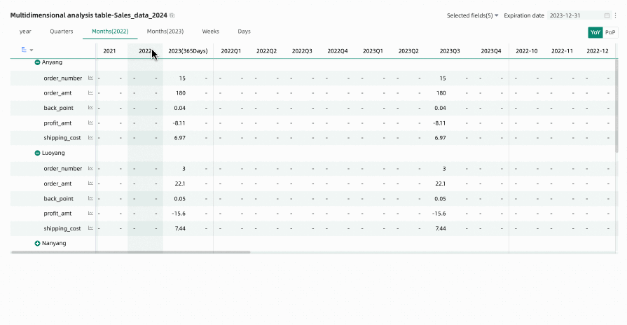
Restore Default Filter Fields
Through the field filtering panel, you can select the measure metrics that need to be displayed in the multidimensional analysis table as needed. After reselecting fields, to restore the default selected fields, you can click the  icon in the upper right corner of the table, or click Restore Default in the upper right corner of the field filtering panel to reset the filter fields to their default state.
FAQ
1. What are the main differences between multidimensional analysis tables and trend analysis tables?
Answer: The main difference is in the dimensions. Trend analysis tables focus on showing how one or more measures change over time. Multidimensional analysis tables build on this by adding dimension fields, allowing users to observe measure changes from different business dimensions (such as region, product line) combined with time, enabling deeper cross-analysis.
2. How do I set up year-on-year and month-on-month comparisons in a multidimensional analysis table?
Answer: In chart editing mode, go to the Analysis tab, find Advanced Settings, and select the Enable Table Data Comparison checkbox. Then you can choose the comparison type you want to display (Year-on-year, Chain Ratio) and the display content (Difference Value, Difference Percentage), and configure the corresponding display style. After setting up, Year-on-year/Chain Ratio toggle buttons will appear in the upper right corner of the chart during preview.
3. What should I do if the chart loads slowly after adding many dimensions?
Answer: First, check if the number of dimensions you added exceeds the recommended limit of 10, as too many dimensions significantly increase database query pressure. Second, you can try changing the Full Data Retrieval to Incremental Data Retrieval in Style > Data Retrieval Method. In incremental data retrieval mode, the chart does not load all data at once but loads it step by step as you expand dimension nodes, which helps improve performance with large data volumes or complex structures.
4. How can I quickly hide columns showing "-" (empty values) during preview?
Answer: In preview mode, hover your mouse over any column header, click the dropdown arrow that appears, and select Hide All Empty Value Columns from the menu. The system will automatically identify and hide columns where all visible cells are empty values. You can also restore hidden columns through the prompt information above the chart.