Add a line chart with multiple y-axes
Use multiple y-axes in a line chart to display different types of data or data with significantly different scales on the same graph. This topic describes how to create such a chart.
Prerequisites
-
You have created a dashboard. For more information, see Quickly create a dashboard.
-
You have ingested logs into the target LogStore. For more information, see Data ingestion overview.
-
You have configured an index. For more information, see Create an index.
Background information
A line chart with multiple y-axes clearly displays change trends for data with vastly different scales that a single y-axis cannot effectively represent. This topic uses website access logs from Company A as an example. The resource information and log sample are as follows:
-
Resource information
-
Project: test-demo
-
LogStore: website_log
-
Dashboard: website
-
-
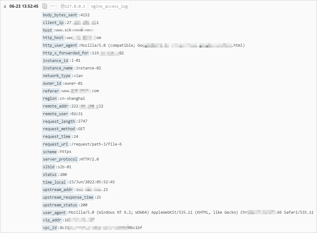
Log sample
Single query analysis scenario
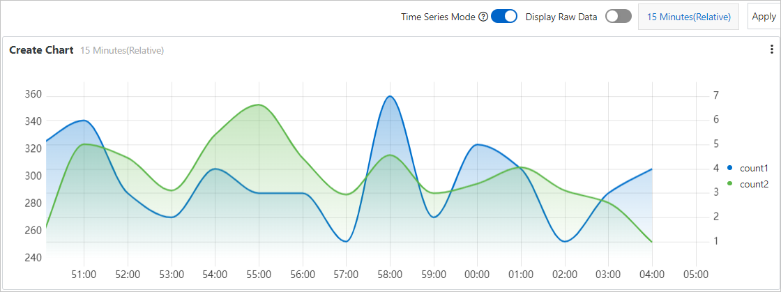
Track request volumes from the China (Shanghai) and China (Hangzhou) regions and display their change trends in a line chart. The blue line shows the trend for Shanghai requests. The green line shows the trend for Hangzhou requests.
1. Add a statistical chart
On the target dashboard page, click Edit. In edit mode, click .
2. Configure the statistical chart
-
Set general configurations: As shown in the following figure, on the right side of the page, set the Chart Type and Query and Analysis Configurations. On the left side, configure the time range, LogStore, and query and analysis statement. Then, click Apply at the top of the page to preview the chart.
* | select __time__ - __time__ % 60 as time, count_if(region='cn-shanghai') AS count1, count_if(region='cn-hangzhou') AS count2 GROUP BY time order by time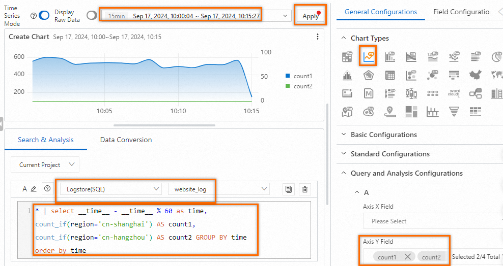
-
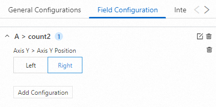
Set the y-axis: Because the request volumes from the two regions differ greatly, using a single y-axis makes the trend for Hangzhou requests unclear. Use Field Configuration to add a second y-axis on the right side of the chart, scaled appropriately for Hangzhou request volumes.
-
Preview the result: The line chart now has two y-axes with different scales. The left y-axis fits Shanghai request volumes. The right y-axis fits Hangzhou request volumes, as shown in the following figure.
-
Save the chart and dashboard: In the upper-right corner of the chart editing page, click OK to save the chart. On the dashboard editing page, click Save in the upper-right corner to save the dashboard.
Multiple query and analysis scenarios
Two query and analysis scenarios
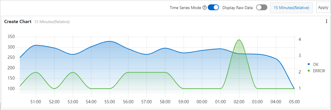
Track successful and failed request volumes per minute and display their change trends in a line chart. The blue line shows successful requests. The green line shows failed requests.
1. Add a statistical chart
On the target dashboard page, click Edit. In edit mode, click .
2. Configure the statistical chart
-
Set general configurations: On the right side of the page, set the Chart Type to Line Chart Pro. On the left side, configure the time range, LogStore, and query and analysis statements. Then, click Apply at the top of the page to preview the chart.

Query and analysis A: Count successful requests per minute.
status in [200 299] | SELECT __time__-__time__ % 60 AS Time, count(1) AS OK GROUP BY Time ORDER BY Time LIMIT 1000Query and analysis B: Count failed requests per minute.
NOT status in [200 299] | SELECT __time__-__time__ % 60 AS Time, count(1) AS ERROR, status GROUP BY Time, status ORDER BY Time LIMIT 1000 -
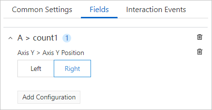
Set the y-axis: Because successful and failed request volumes differ greatly, using a single y-axis makes the trend for failed requests unclear. Use Field Configuration to add a new y-axis on the right side of the chart for failed requests (ERROR).
-
Preview the result: The line chart has two y-axes with different scales. The left y-axis fits successful request volumes. The right y-axis fits failed request volumes, as shown in the following figure.
-
Save the chart and dashboard: In the upper-right corner of the chart editing page, click OK to save the chart. On the dashboard editing page, click Save in the upper-right corner to save the dashboard.
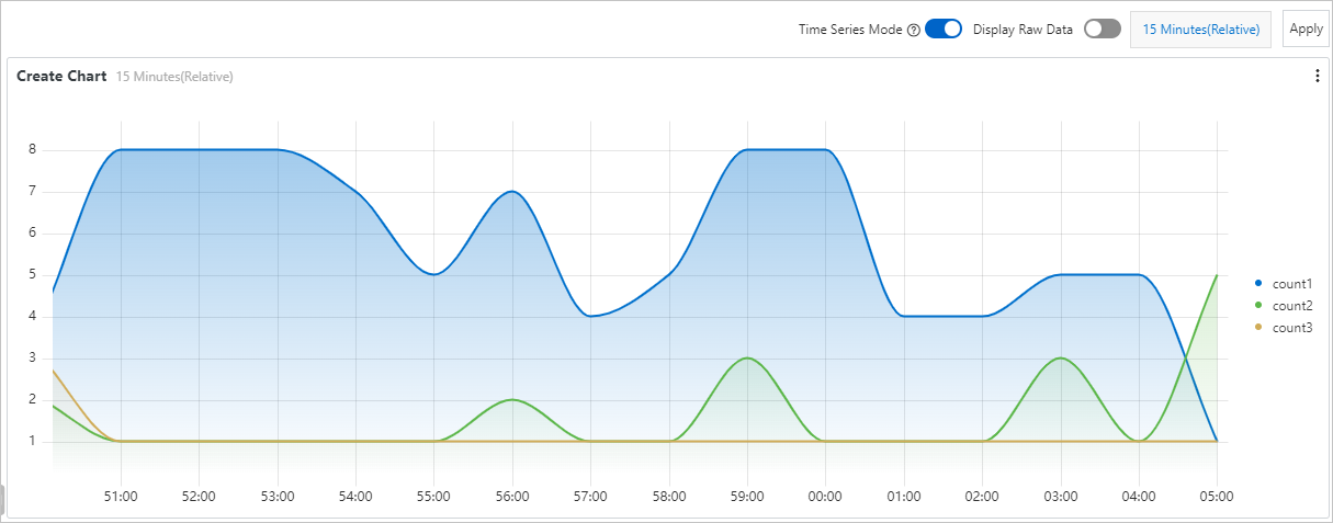
Three query and analysis scenarios
Track request volumes per minute, categorized by request duration (10–50 seconds in blue, 50–100 seconds in green, >100 seconds in yellow), and display their change trends in a line chart.
1. Add a statistical chart
On the target dashboard page, click Edit. In edit mode, click .
2. Configure the statistical chart
-
Set general configurations: On the right side of the page, set the Chart Type to Line Chart Pro. On the left side, configure the time range, LogStore, and query and analysis statements. Then, click Apply at the top of the page to preview the chart.
-
Query and analysis A: Count requests with durations between 10 and 50 seconds.
request_time in [10 50) | SELECT __time__-__time__ % 60 AS Time, count(1) AS count1, request_time GROUP BY Time, request_time ORDER BY Time LIMIT 1000 -
Query and analysis B: Count requests with durations between 50 and 100 seconds.
request_time in [50 100) | SELECT __time__-__time__ % 60 AS Time, count(1) AS count2, request_time GROUP BY Time, request_time ORDER BY Time LIMIT 1000 -
Query and analysis C: Count requests with durations greater than or equal to 100 seconds.
request_time >= 100 | SELECT __time__-__time__ % 60 AS Time, count(1) AS count3, request_time GROUP BY Time, request_time ORDER BY Time LIMIT 1000
-
-
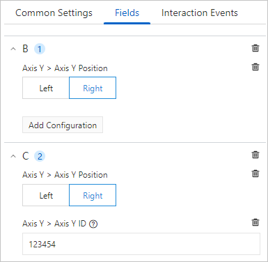
Set the y-axis: Because request volumes vary greatly by duration, using a single y-axis makes the trends for count2 and count3 unclear. Use Field Configuration to add one y-axis for the results of query and analysis B and another for the results of query and analysis C.
ImportantWhen adding two or more y-axes on the same side, set y-axis > y-axis ID to distinguish between them.
-
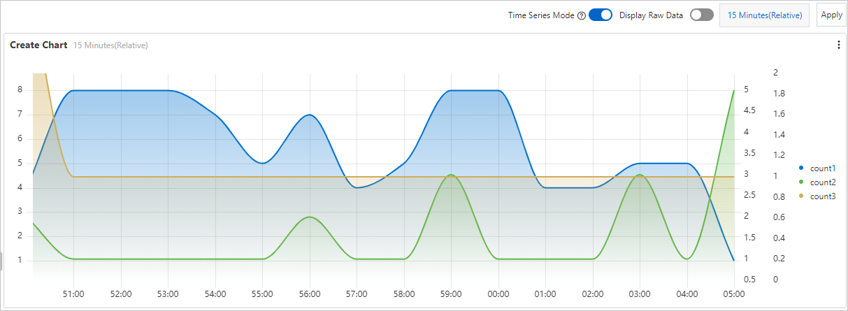
Preview the result: The line chart has three y-axes with different scales, each corresponding to a different request duration range, as shown in the following figure.
-
Save the chart and dashboard: In the upper-right corner of the chart editing page, click OK to save the chart. On the dashboard editing page, click Save in the upper-right corner to save the dashboard.
References
-
When adding a statistical chart, you must configure a query and analysis statement. For more information, see Query and analysis.
-
For metric descriptions when configuring chart fields, see Field configuration.