XiaoQ Reports lets you add charts from a dashboard while editing a report. This topic describes how to add a chart during this process.
Prerequisites
You have created a XiaoQ Report.
Scenarios
When editing a XiaoQ Report, you can add a chart directly from an existing dashboard. This saves you from having to recreate the chart if it already contains relevant data.
Limits
You cannot add metric decomposition trees, metric relationship graphs, or custom components.
Procedure
In the XiaoQ Report editor, click Add chart.
Alternatively, you can hover over a blank line, click the
 icon that appears in the top-left corner, and then select Insert chart.
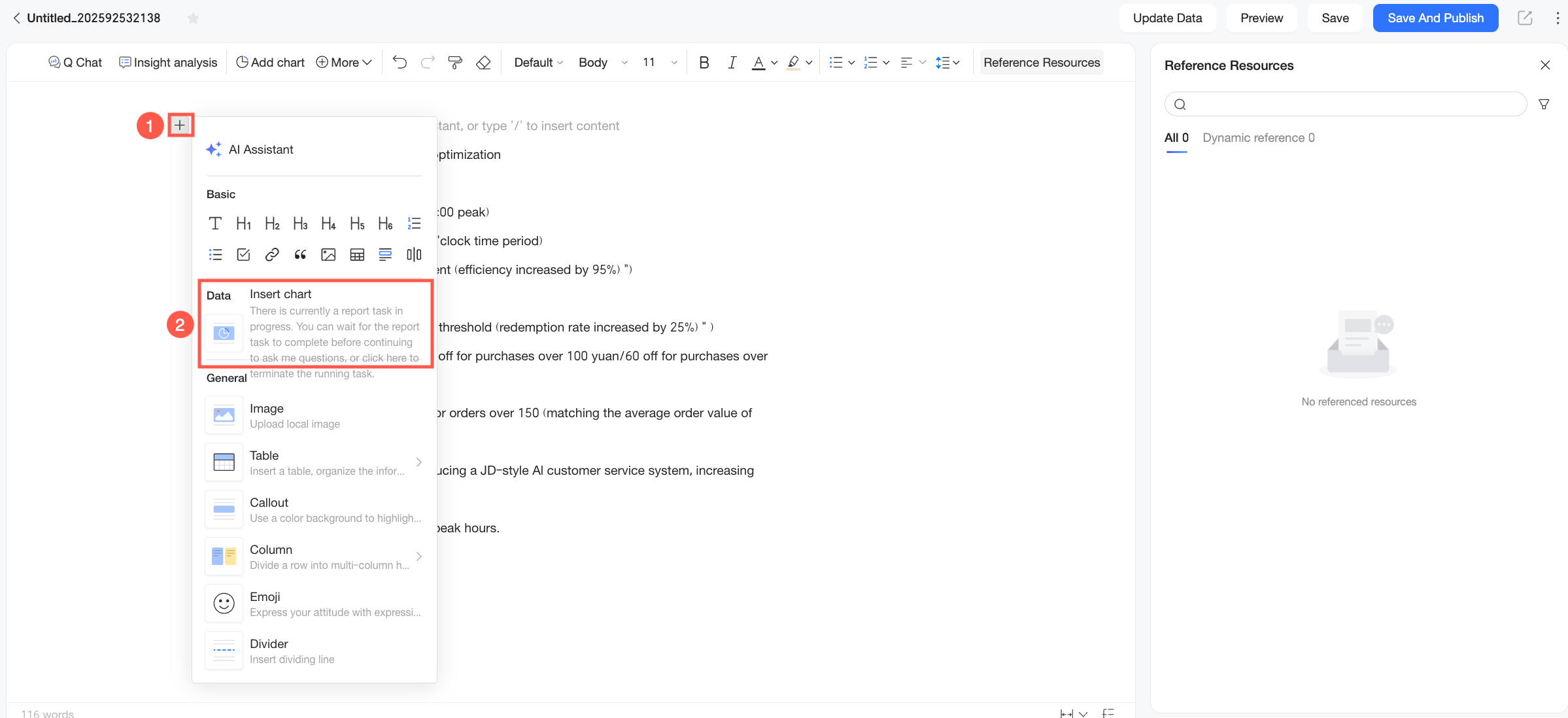
You can select a work and check the card.
You can select charts from dashboards in My favorites, Recently accessed, Shared with me, or I created.
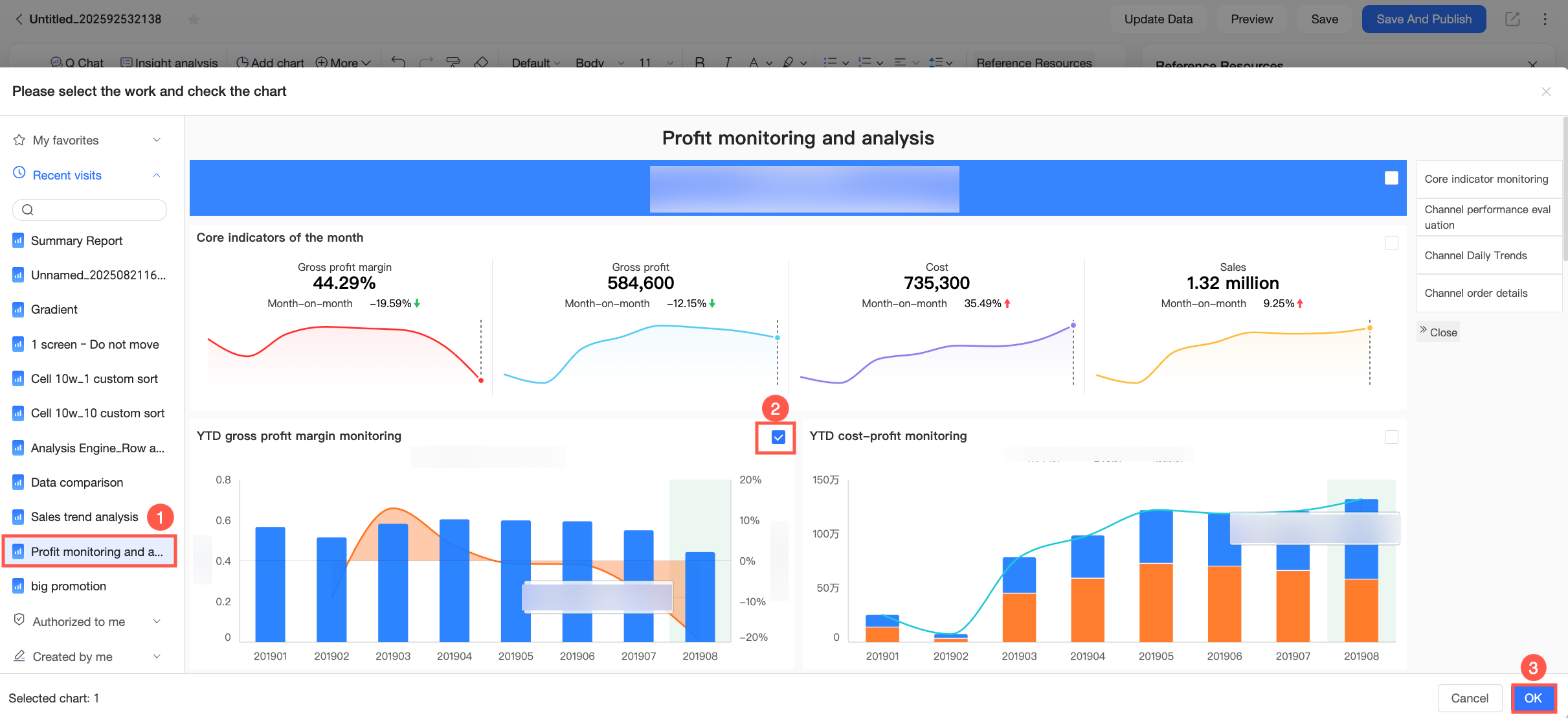 You can also use the search function to quickly locate the target dashboard.
 You can manually select filter values before adding a chart.
For example, to add a detail table with the status “Unprocessed” to the report, use the query control to filter the data. Then click Query and select the relevant chart.
NoteWhen you update data, time-based and non-time-based filter conditions behave differently:
During data updates, time-based filter conditions are reset to ensure the latest data is displayed, and any manually selected values are cleared. If a default value is set for the time filter control, the control reverts to that default value.
Non-time-based filter conditions remain unchanged during data updates. They are not affected by changes to the default values of the original chart’s filters.
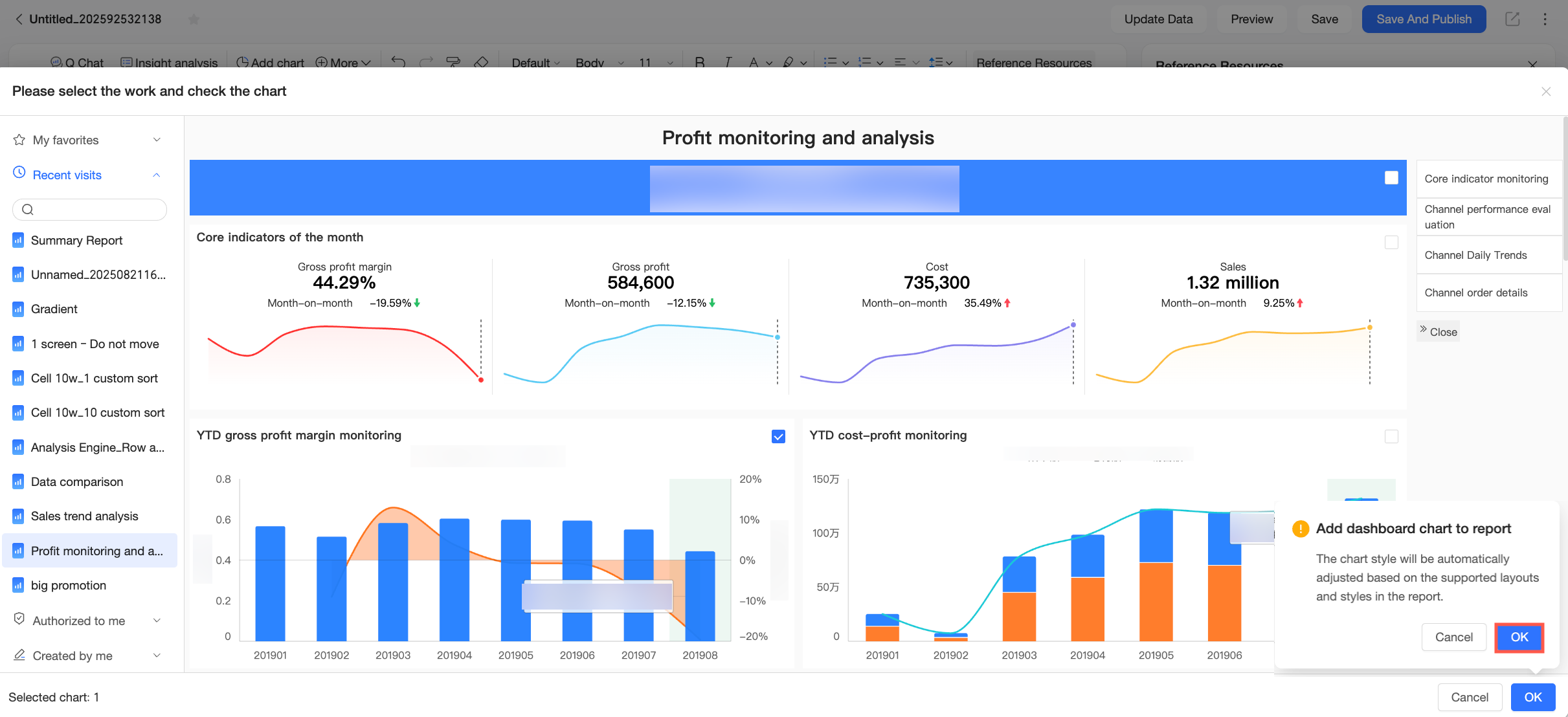
Click OK. In the confirmation dialog box, click OK again.
NoteA report can contain a maximum of 20 dashboard chart components.
After you add a chart, its content updates automatically when the source dashboard is updated. You can also manually detach the chart from its source within the report. After a chart is detached, updates to the source dashboard no longer affect the chart. The chart's styling automatically adjusts to match the layout and style of the report.
The selected chart appears in the report.
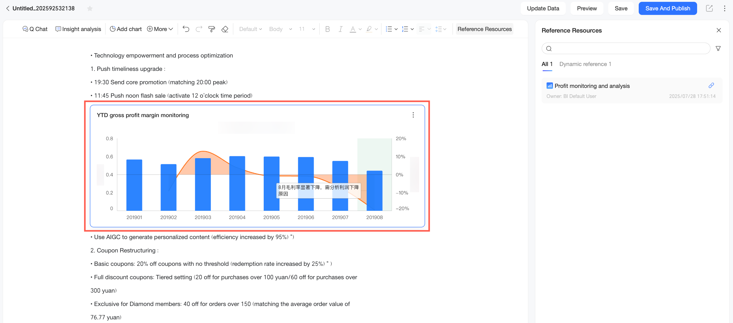
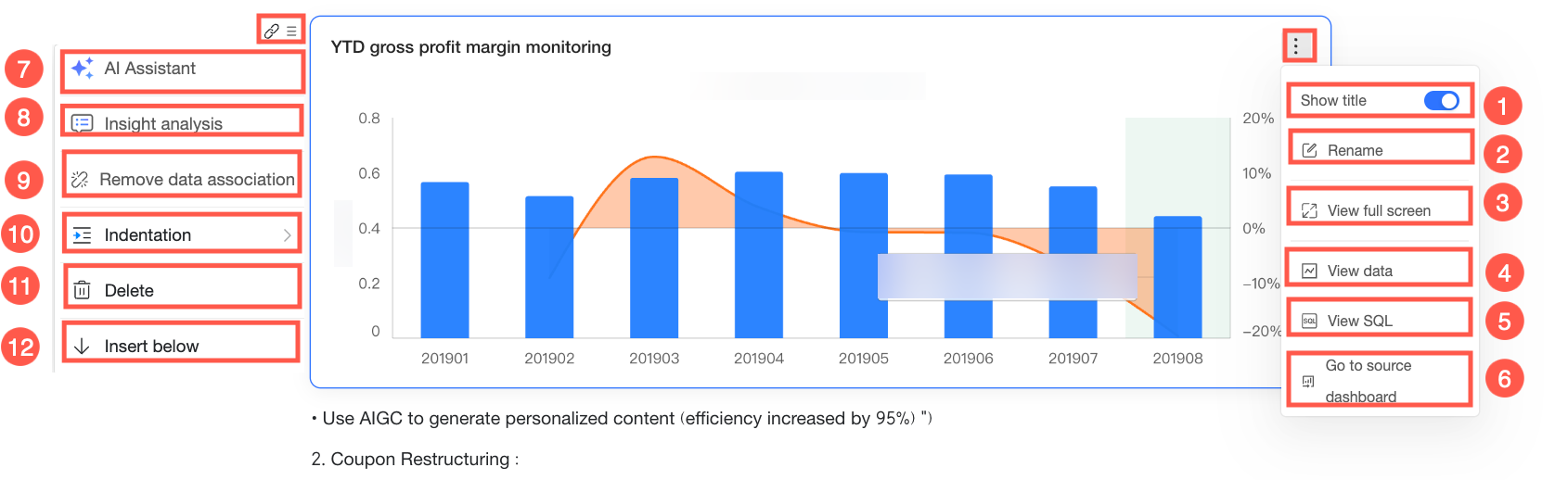
You can perform the following actions on the chart.
Ordinal number
Action
Description
①
Show title
Turn on to show the chart title above the chart’s top-left corner. Turn off to hide the title.
②
Rename
You can double-click to rename directly, or click the Rename button.
③
Full-screen view
View the chart in full screen.
Click Exit full screen in the top-right corner to exit.
④
View data
View the chart’s underlying data. You can view formatted data or raw data. Click Copy data at the bottom of the panel to copy all table data to the clipboard.
NoteThe View data feature works only for non-table charts. It does not work for cross tables, detail tables, trend analysis tables, multidimensional analysis tables, or heatmaps.
⑤
View SQL
Click to open a pop-up window named SQL and view the underlying query statement for the chart. This helps you validate data logic.
⑥
Go to source dashboard
Click to go to the preview page of the dashboard where the chart resides.
⑦
In-Report AI Assistant
Open RDS Copilot to ask questions about your data or run insight analysis. For more information, see In-Report AI Assistant.
⑧
Insight Analysis
Run data interpretation and generate an insight analysis report for the chart component. For more information, see Insight Analysis.
⑨
Detach dynamic reference
After detaching, the chart no longer updates with the source chart or when you update data manually.
⑩
Indent
Increase or decrease indentation. The effect looks like this:
⑪
Delete
Delete the current chart.
⑫
Insert below
Insert other content below the current paragraph where the chart appears.
What to do next
To further analyze the inserted chart, you can use RDS Copilot to perform an insight analysis. For more information, see Insight Analysis.
To configure report styling, see Styling configuration.